The Daily Promo – Norman Maslov Agent Internationale


Norman Maslov Agent Internationale


Who printed it?
The Agency promo catalog was printed in Asia in coordination with The Workbook.

Who designed it?
Designed by Anita Atencio at the Workbook and our upcoming promo-catalogue has been revised by the Workbook’s new designer, Andy Carey. The booklet is an expanded extension of our Workbook directory advertising.  

Who edited the images?
My photographers submit images to me and we discuss what we want to showcase each year. I edit the order. 

How many did you make?
2500 copies each year. Mailed to creatives nationally and given out at portfolio shows. 

How many times a year do you send out promos?
This is the one full agency group mailing we do once a year. The only one that includes all of our talent. Other mailings throughout the year are separate pieces from the individual artists. 

Where did you get the buttons made?
Buttons made by the Busy Beaver Button Company in Chicago. Designed by Scott Miller

What photo is on that button and why?
The photo is an image that has been a primary part of our identity for over twenty years. We have modified its use over time depending on the application. Hats are an ongoing part of the Agency’s image identity. The round button version was adapted by designer Scott Miller. 

Tell us about the Hat theme.
We’ve been doing the Hat Cover theme on our promotional catalogs for about 12 years. Each year I select one of my photographers to create the wrap around cover/back image. I send them a selection of my hats and they can concept and shoot anything they want with any of the hats as long as it fits the booklets design and front and back cover needs.

The Daily Promo: Elizabeth Cecil

Elizabeth Cecil


Who printed it?

 Hemlock Printing

Who designed it?
Claire Lindsey 

Who edited the images?
Melissa McGill  

How many did you make?
 100. Each booklet is 22 pages. The inside pages are recycled paper and the cover has a matte, soft-touch finish.

How many times a year do you send out promos?
 2-3 times a year

Are you booklets seasonal?
When we decided to create this small booklet for a promo, we went into the project planning to do a small series. We have done three booklets, Fall, Summer, Winter/Spring. It was fun to think about the booklets in a series and to tailor the work to somewhat represent the season. We did a small run with the intention of really targeting our audience with this special piece. We had great feedback, one being that people have kept the books. We hoped that they would stay with people and create a little visual library of the work. 

The Daily Promo: Kate Mathis

Kate Mathis


Who printed it?
GHP Media

Who designed it?
Jaspal Riyait, Design Director for Martha Stewart Living, who designed the book that this image was created for. She came up with all of the great graphics ideas, how they would work with the folds and appear inside the clear envelope.

Who edited the images?
This was self-edited, with some feedback from creatives in the industry. I had been wanting for a long time to do a promo in some kind of fold-out poster format and thought that images from this project would be perfect. Ultimately I went with a single image, with the reverse side being text and graphics only.

How many did you make?
2000

How many times a year do you send out promos?
At least twice

Was this image part of a bigger series?
This image is from a book project I did with Livia Cetti who is an amazing botanical stylist and crafter of paper flowers. Titled “The Exquisite Book of Paper Flowers”, it was just released this month. Each chapter features beauty shots of a different flower along with complete instructions for making. The image I ended up using for the promo was one of many that we shot in a gorgeous, abandoned building in Hudson, NY that is in a beautifully distressed condition… peeling paint, cracked plaster and rich color everywhere!


The Daily Promo: Michael David Wilson


Michael David Wilson


Who printed it?
It was printed through School Paper Express.
A great company in Upstate New York. Their website has a vintage 1997 feel, but the customer service and turnaround is out this world! 

Who designed it?
I designed it with a minimal knowledge of Indesign.  

Who edited the images?
I did the editing but had lots of feedback from my partner and friends about how it flowed.

How many did you make?
It was a print run of 700. 

How many times a year do you send out promos?
I am trying to get two printed promos out a year and a monthly email promo. I am trying to target clients that I feel my work might be a good fit for, or clients that I would love to work for, rather than large email blasts. I’m testing this theory this year, we’ll see how well that goes. 

Was there a connection to Maine logging and newspaper for this project?
This series was photographed for a show at the Press Hotel in Portland Maine. I was trying to do a project that spoke to both the history of Maine logging and paper manufacturing as well as the historical nature of the press hotel building as a former newspaper printing hub. This promo was designed in part as a take away from the show and to send to prospective clients. After the promos were printed I made some phone calls and found that likely the paper stock for these was produced, in part, from pulp sourced from Maine timber. Which means some of the woodsmen in this promo may have cut the wood for the paper their portraits are printed on. I felt like that really brought everything full circle.

The Daily Promo – Walter Smith Photography + Motion


Walter Smith Photography + Motion


Who printed it?

It was printed by Innovation Printing in Philadelphia. They always do a wonderful job. we’ve been working together for 10 years on promos.

Who designed it?
Designed my Marco Chavez at TODA. 15 years and counting working on promos together. The 3rd in a “self-published” series is already in the works.

Who edited the images?
Edited by Edward Buerger, my agent at SIDECAR as well as Marcos and myself.

How many did you make?
1200 cards of each.  5 total.

How many times a year do you send out promos?
Every two months give or take.

I noticed you wrote me a nice note, did you do this for everyone?
We completed this series of promo cards to go out between the larger self-published promos. I wanted the cards to have a lot of white space so that I could write notes to folks.  Out of 1000 that are mailed I write notes to approximately 400 people. My hand still hurts. I think it important to acknowledge people with something other than an email.  Something funny…something honest. I try not to be a name dropper unless someone asks about clients. I feel like that’s a lot of what social media is these days…..LOOK AT ME…LOOK AT ME! To support the promos and  the newly printed portfolio I’ve been going on as many targeted appointments as possible. Many with people that are familiar with my work…current clients…past clients…people that I’d just love to meet for no other reason than they do beautiful work. So far 25 agencies and approximately 50 creatives. What I’ve learned from these appointments is an article all its own!

The Daily Promo – Apostrophe Reps: Kelly Montez

Apostrophe Reps

Who printed it?
Serbin Communications printed the piece. They are the machine behind AtEdge, and by partnering with them on the printing we were able to access their press in China who does beautiful four-color printing, something that is quite difficult to find these days as most presses are now digital.

Who designed it?
We collaborated with Todd Richards at TAR Design Studio in San Francisco. He has been managing Apostrophe’s design identity for close to 15 years now. In addition to showcasing new images from our artists, we were also debuting our new logo. We worked with Todd on our visual rebranding as well.

The foil stamping is beautiful, what make you choose that tone?
This piece was not only a beautiful promotion of our roster akin to the one we did in 2014, it also marked our 15th anniversary as an agency. Our signature color is a very bright fuchsia, and we thought the rose gold was a nod to the past while also celebrating our future.

Who edited the images?
Did the agents choose the images to be edited or did your photographers submit?

Our agents worked closely with each photographer to select images that best represented them. We wanted to strike the right balance of practical and aspirational, so some of the work is commissioned and some is purely personal. In terms of the final edits and layouts, it was a collaboration between the artist, Apostrophe and the designer.For some artists, we selected an image, and then the designer worked up a few layout versions for us to react to.

Did each artist get the same amount of images?
Each artist has the same amount of real estate, meaning the same number of pages. However, depending on the number of images we wanted to showcase for an artist, we changed how we utilized the space available. Their layouts go hand in hand with their work: Some have more of a storytelling style and as such chose to feature a grid of images on a page; while other are very graphic and therefore went with a single image full bleed. We wanted a consistent style throughout that also allowed each artist to find small variations and make it their own.
Each page was perforated so that clients could pick out their favorite images and put them on their walls or frame or file them.

How many did you make?
We printed 2,500 copies, so it was somewhat of a limited run. We never want to just send something out to the masses, we try our best to promote with intent. Developing the mailing list for this promo has been an intense process as we have tried to go through and verify each name. Of course the mailer went out to prospective clients with whom we are eager to develop relationships, but we also sent it to many of our close contacts in hopes that they would celebrate our anniversary with us and enjoy the artwork.

How many times a year do you send out promos?
A piece like this is certainly more of an investment, in time and money. So we send  them out every other year, which makes each one feel more precious as well.Developing this promo, creating the final edits, printing and shipping took well over a year as we were thoughtful about both the design and the content that went into it. We wanted clients to feel like they were receiving a gift when they opened it. We wanted them to experience an evolution of our brand and get excited for the next 15. Aside from this promo, we print a smaller version with one single image per photographer about 2-3 times a year.

Letter From Kelly:

My first experience with Apostrophe was as a client. It was the middle of the dot-com boom (the first one), and I was working as an account manager in advertising. Business was good, but it wasn’t, shall we say, fulfilling. Then, with one assignment, everything in my life started to change.

Knowing I was fascinated by photography, my over-burdened manager passed me a project that allowed me to work closely with one of Apostrophe’s photographers. As I’d hoped, the job connected me back with my artistic self and challenged me as a creative person. What I couldn’t have predicted was how well I would click with Apostrophe’s owner at that time, Jonathan, and what that would lead to.

We stayed in touch and two years later, he casually mentioned a desire to open a west coast office. He had just signed an amazing California-based photographer, fresh out of art school – Dwight Eschliman, I met the two of them for dinner, we drank too much wine, had great conversation, and the rest is history. When Jonathan came back to “train” me a few months later, we drove all over California, portfolios in tow, visited a bunch of clients and smoked a ton of pot – those were fun times.

Almost immediately, I could feel that things in the business were changing and we would need to get serious. Digital cameras had taken over, and the number of photographers and competition grew. The hustle was getting tougher—I loved it. It was exciting to be in such a dynamic industry. I leaned in and moved to New York to take over the company. With my sun-shiny Californian attitude and optimism I thought, “How hard could this be?” Answer: Hard

The recession hit and choices had to be made. I promised myself at that time that I would do what I thought was right and focus on the best talent. Not just people who could shoot amazing pictures, but people who were also passionate about this industry, saw opportunities in change, and were good souls. Individuals whose businesses you wanted to fight for and whose lives you wanted to see grow. I believed then, and still believe today, that you can have a successful business based on artistry, ethics, and integrity.

As it turns out, I was right. But I didn’t do it alone. Over the years, I’ve met some amazing people and have grown an incredible team. My co-workers are among my closest friends and together we’ve found rare and wonderful individuals who are also amazing artists. We feel blessed to be making art everyday and we know that none of this would be possible if it weren’t for our clients, who trust in us to bring their ideas to life.

So I want to take this opportunity to say thank you for joining us on this amazing journey. Thank you for supporting our artists, our vision, and most of all for supporting the idea that teamwork and passion are the key ingredients of the most successful and stunning projects. Your trust in us – and in the creativity of our artists – is the thing I’m most proud of at this 15-year mark.


As Always,
Kelly Montez

Owner, Apostrophe
www.apostrophereps.com


The Daily Promo: Jim Krantz


Jim Krantz


Who printed it?

Regal Printing in Omaha Nebraska
I have been using them for 25 years!!

Who designed it?
Pace Kaminsky in NYC

Who edited the images?
I did

How many did you make?
I did 3 pieces of 1000 each, they are kept  together in one stay-flat envelope and sent as a group

How many times a year do you send out promos?
2 to 3 times a year

Who wrote the text for you?
The text was written by Andreas Rottenschlager, a writer from the Red Bulletin in Vienna Austria

I know the Wall of Death images were from a story we worked on together for The Red Bulletin, what about the other images?
The Marc Marquez story was photographed in Lleida, Spain, his hometown racetrack he learned to ride on. Daniel Ricciardio was photographed on the Targa Florio race course in the mountains of Sicily near Palermo and Charlie Ransom was photographed in Port Charlotte, Florida

I know you have a love of motorcycles, how did that translate into this the theme of the promo?
The collection of the three pieces were all shot for Red Bull’s Red Bulletin magazine. I have always loved anything with motors, especially motorcycles, the common denominator of all of the men profiled is their drive. The drive to be the best that they can, the drive to perform at a very high level and the drive to emotionally be able to handle whatever comes their way in pursuing their profession. I relate to the mindset to be 150% percent dedicated to a profession, the tenacity to stay in the game and the deep love for their passion for always working at the highest level possible. As in any dedicated sport or interest winning and loosing is part of it but ultimately staying in the game and pushing yourself to work at the highest level possible is mandatory. I love each of these individuals dedication and commitment to doing what they love. Each person depicted is also a wonderful individual on a personal level, that is also most attractive in a champion.

The Daily Promo: Newspaper Club


Newspaper Club

Instagram


Heidi: Why do you specialize in newspaper?
Newspaper Club: Newspaper is really versatile and great for all kinds of storytelling, but historically it’s only been available to massive publishers printing thousands of copies. We want everyone to be able to share their ideas quickly and easily with newsprint, even if they just need one copy. 

It’s been interesting to see the reaction to newsprint in a technology-focused world. Digital products tend to be sleek and flawless, and we’ve found people welcome a format that’s tangible and imperfect, and that doesn’t take itself too seriously.

Are you a global company?
Yes. Our newspapers are all printed in the UK, but our business is totally online and we can deliver just about anywhere. So far we’ve sent newspapers to 22 different countries!

How many clients do you service in the US and what are the shipping costs (average)?
About 20% of our orders come from the US. Prices start at $36 and larger runs can cost as little as $0.24 per copy. Shipping is included in the price, so there are no hidden fees. 

Do you have designers to help the clients?
We don’t have designers, but we do have templates, guides and our free layout tool, ARTHR.

When you upload a file, our system automatically checks that it’s set up correctly and will flag up issues like low resolution or spot colors. We also have a friendly support team ready to answer any questions along the way.

What is the largest segment of your client base?
That’s hard to say! We work with some big companies likes MailChimp and Spotify, but most of our customers are creative individuals – art students, graphic designers, illustrators and definitely lots of photographers.

We try to share a good overview of what we’re printing on our blog, and our monthly roundups show what a mix it can be. Last month we printed Handsome Frank’s annual promo, a catalogue for an architecture exhibition and a set of posters for a furniture studio – to name just a few!

What has been a unique application of the service?
We’re surprised all the time by the ways people think to use newsprint! A few examples that come to mind: Fresh Flowers offers an alternative to short-lived bouquets, Eye of the Beholder has 25 animal eyeballs printed at life size (the giant squid’s just fit across a tabloid spread!) and a few years ago Canadian band The Famines released a “newsprint single” – a really cool poster that has a link to download the music.

We’ve printed newspapers for every part of life’s cycle – from birth announcements to birthdays, weddings, anniversaries and funerals. A couple weeks ago a customer tweeted us a photo of his proposal – he hid behind a broadsheet on one knee! That made our day.

Tell us about your tag line, “Print’s not dead” where does the love of print come from?
It’s very special to hold something you’ve made in your hands, and we don’t think people will ever get tired of that.

Newsprint is an effective medium that still has a lot of life in it. You don’t need batteries to read a newspaper and everyone knows how to use one. We love flipping through newspapers our customers have made and hanging favorites up in the office.

It’s not about print vs. digital, but rather the two working together to change how people can share ideas. Now, you can upload a file from your computer on a Sunday night, from just about anywhere in the world, and find your newspapers on the doorstep a few days later. That’s a great feeling.

The Daily Promo: Drew Gurian

Drew Gurian

Who printed it? 
Prestone Printing in Queens, NY printed the piece.

Who designed it?
Catherine Gray– an amazing creative director who splits her time between New York City and London.

Who edited the images?
Catherine and I worked on the image edit together.  I’ve depended on a group of friends, as well as hiring photo editors to help with image edits, who generally have an editorial background.  This was a bit different for me, in that I worked with someone embedded in the advertising world who’s not a photo editor by trade.  I really loved her perspective on my work, and since I’ve been meeting with lots of agencies, it made perfect sense to work with her.

How many did you make?
100

How many times a year do you send out promos? 
In the past, I’ve sent out small promos 4-5 times per year, but this promo is much more substantial (and costly).  With that said, this will certainly be my main promo for the year, marketing to a very specific group of people.  I plan to follow-up with some more simple promos as well throughout the year.

The Daily Promo – Andrew White

 
Who printed it?
I printed this piece as well as my print book at Soli in Kansas City. They’ve always been good to me, and guided me through paper stocks and printing processes. Added bonus that I can pedal from the studio to check out proof sheets, and they let me bring my bike inside.

Who designed it?
Gage Wente at RW2 and I designed it. We wanted different dimensions than an internet printed 8.5 x 11 book so that it had more impact, but close to it to capitalize on shipping and envelope costs. It ended up being a taller format based off the cover option that worked best.

Who edited the images? and did the pairings?
I edited the images with input from Lyndon Wade of The Wade Brothers. My work is split among sports, music, and portraiture, and all needed to be represented evenly. Similarly, I made sure there was a good mix of advertising, label, editorial, and personal work.

How many did you make?
I printed 250. 100 went in the mail, 50 were handed out in person, and the rest are on hand for leave behinds or for new contacts that come up.

How many times a year do you send out promos?
This piece is pretty comprehensive of my work from the past 18 months so I don’t imagine I’ll do another like it till next year. But I plan on sending out specific project promos. I just wrapped a book for the Nashville Visitors Bureau, so I’ll do a piece with those images around mid-year. And I’m directing a live action sports project which I’ll do an accompanying marketing campaign for.

I had this piece set to release in December, but held off until January. Didn’t want it to get lost in holiday party hangovers, better to land on desks when work ramps up and budgets are fresh. Here’s a digital version to check out. It’s a not as cool as the printed version but at least I’m certain the mailman won’t lose it!

The Daily Promo: Patrick Marinello

Patrick Marinello

Who printed it?
I got my promos printed at Overnight Prints.

Who designed it?
I designed the promos.

Who edited the images?
I edited the photos.

How many did you make?
I originally made 30 but I went the cheap route and didn’t go with the hard-cover for the booklet thinking it would save money, and that it would look fine. When I got the them they looked unfinished so I decided to make another 30 which I was pretty happy with, minus some color issues.

How many times a year do you send out promos?
This was the first promo I’ve ever made; I wanted to do something different. I didn’t want to put my best work on a postcard and then have the same images on my website. I wanted to do some something unique and really creative. Plus even if you hate the promo who’s going to forget someone mailed you a booklet that resembles a sandwich?

What made you want to do bread and cheese?
The idea behind the sandwich promo was that I was shooting a photo series on cold cuts. I wasn’t really sure what I was going to do with the series. At the same time I was figuring out how to get paid photo work. I’ve never made a promo before so I came up with this crazy idea to turn the cold cuts into a booklet that resembles a sandwich. I told a few people and they thought it was a great idea so I  decided to make the booklets. I figured photo editors get so many promos, I really needed to stand out.

How many slices of bread did you review before picking that one for the closing image?
There is a bakery I go to by my house and I tried 2 styles of bread. A round loaf and a more classic pullman loaf. I shot a couple slices from the round loaf and then a day later I wasn’t happy with the the shape of the bread so I went with the pullman since it’s more of a classic sandwich bread.

The Daily Promo: Sam Zide


Sam Zide

Who printed it?
The portfolio piece was printed by GSB digital in Long Island City. Their print shop was located above our Macy’s photo studio, I took a tour of the facility and got to know the designers. They do a lot of commercial catalogs, but have passion for working with artists for portfolio pieces. I thought they were perfect for this larger piece.
Who designed it?
The piece was designed by myself, but was shown to 3-4 designer / art directors for feed back on the entire process. Working in the Macy’s studio was great resource for talent, a few of the freelance Senior Art Directors sat with me through out the process.
Who edited the images?
The edit was made myself and one Art Director I work closely with, I thought it best to get direction from one source, whose work I admire. We sat down daily over a weeks time, and edited the images down to the ones seen.  I did all the retouching and color balancing

How many did you make?
Only 25 were printed at this time. I like the idea of keeping the run very small on this larger promo piece, and sending them out numbered and in series.
My wife and I just made the move to Oakland from Brooklyn, I have been on staff shooting for Macy’s the past 2 years full-time. Before that I was freelance working mainly in NYC for the 10 previous years. I tried to send out promos twice a year, now I need to get back in the swing of things, and would like to send out quarterly postcard pieces, with an annual large piece showcasing the years work to a much tighter pool of clients and friends. Going from full-time to freelance while moving across the country is quite an undertaking, but I pan to have my next card promo out and new website relaunched in early February.
What inspired you during your creative process?
While I was putting this piece together, I was listening to Leonard Cohen a lot, He has a lyric from his song Famous Blue Raincoat were he says “I hope you’re Keeping Some Kind of Record” The lyric just stuck out to me while editing through the images. The images shown I feel represent a very wide gamut of my work, while I might want my next book to have a more specific theme. So I thought that name for this book was a perfect fit.

The Daily Promo: Drew Anthony Smith

Drew Anthony Smith

Who printed it?
Thomas Graphics in Austin.

Who designed it?
I designed it.

Who edited the images?
I selected and toned the images.  Two were used in the Cosmo feature while the others were some of my favorites.

How many did you make?
300

How many times a year do you send out promos?
I send a physical promo piece out about every quarter.

Did you write the copy and cast this model?
Irvin Randle has gained Instagram fame by being the man behind #MrStealYourGrandma.  This was an assignment for Cosmopolitan and part of their Internet’s Most Fascinating series.  In addition to this shoot, I also flew to Charlotte the same week to photograph Ryan Lochte as part of the collection.


I spent more time driving to Houston than photographing Irvin.  My assistant and I hit the ground running when we arrived and knocked out a dozen locations in about two hours.  Irvin had a great attitude and was ready to go with his slick outfits.  My assistant got a work out because in addition to helping me, Irvin kept asking her to shoot behind the scenes shots.  Gotta get that fresh Instagram content.

The Daily Promo: Michael Becker

Michael Becker

Who printed it?
Anthony Wright at AW Litho

Tell us about your experience with AW.
Anthony was amazing to work with.  We initially wanted to do the promos as lithographs on a beautiful matte paper.  Ultimately, I felt these particular images were a bit dark for the process and media, and after a couple test runs decided to go with a digital print on a luster photo paper.  Anthony was incredibly patient and tenacious about getting it right.  Big thanks to AW Litho!

Who designed it?
Heidi Volpe! Fortunately for me the editor I work with, Lisa Thackaberry, thought you’d be a great fit to design this promo and sent you the images unbeknownst to me.  We wanted to do a tri-fold with a strong, clean design to showcase the images.   Next thing I knew, Lisa sent me your mock up which was beautiful and exactly what I had hoped for.

Who edited the images?
Lisa Thackaberry.  I initially approached Lisa 3 years ago to help me prep for the Palm Springs portfolio reviews.  We have been working together ever since.  Working with Lisa has given me a much deeper understanding about the power of the edit.  It has changed the way I shoot.

How many did you make?
We made 200 pieces for this promo.

How many times a year do you send out promos?
I’ve been doing one or two a year for the last few years, but plan on doing more this year to reflect my commissioned work and personal projects.

The Daily Promo: Ian Bates

screen-shot-2016-12-30-at-7-42-41-pm

screen-shot-2016-12-30-at-7-42-49-pm
Ian Bates

Who printed it?
SmartPress.com

Who designed it?
I did.

Who edited the images?
I did.

How many did you make?
140

How many times a year do you send out promos?
Up until now, I’ve sent 2 a year since starting my career two years ago. This year I’m sending a postcard a month that will reflect the nature of my commissioned work and project work.

How did you determine what images to use?
For this promo I wanted to show how my work is translated over various platforms. I picked a commissioned picture, a picture from a project and a personal picture from a trip I took earlier last year. My work is best seen in groupings or projects, as I believe that pictures work really well leading off each other.


The Daily Promo: Dwight Eschliman

screen-shot-2017-01-08-at-6-42-22-pm

screen-shot-2017-01-08-at-6-42-29-pm

screen-shot-2017-01-08-at-6-42-34-pm

screen-shot-2017-01-08-at-6-42-41-pm

screen-shot-2017-01-08-at-6-42-50-pm

Dwight Eschliman

Heidi: Did you have someone with cattle experience on set?
Dwight: We worked with a cowboy out in Oakdale, California who has experience as a stuntman for film. His knowledge from being on set was incredibly helpful since he both understood what we were looking for and how difficult it would be to actually achieve. We also learned that cowboys like to drink Keystone beer all day (which seems to have no impact on job performance!)
Was it difficult to get the Corriente cattle to pose?
Yes! While cattle may be considered to be domestic animals, these cows are in no way trained. By nature they are completely uninterested in following directions or turning their heads just so. Originally, the cowboy we worked with said getting the cows to stand still long enough for their “portrait” couldn’t be done. Somehow, over the stretch of a couple of days, he figured out a way to make it possible.
cow20-355-1
What inspired you to create this body of work?
Cataloging has been a consistent theme in my studio’s work – such as Bicycle San Francisco and Ingredients:. I’ve always been fascinated with herds of cattle, but wanted to shoot them in our distinct style. Having them pose for individual portraits is what really makes the project ours.
Who printed it?
Oscar Printing Company in San Francisco – we’ve worked with them on several projects and they are located close to the studio which is convenient for press checks.
Who designed it?
Our friends over at Manual Creative. They designed a similar poster for our Bicycle San Francisco project a few years ago and we thought the format would lend itself well to the Cattle project.
Who edited the images?
Jamie and Taylor at my studio did the initial prep work on the files, I took them from there and then my longtime retoucher – Alex Katz at blinklab – finished them.
How many did you make?
We made 2,500 and sent out about 2,000. My rep, Kelly Montez at Apostrophe Reps, will use some as leave behinds and we keep the rest around the studio to hand out.
How many times a year do you send out promos?
We try to send printed promos about 4 times a year but in reality we get 2-3 out. We generally send out postcards and once a year feature a special project, like the cattle.

The Daily Promo: Caitie McCabe

screen-shot-2016-12-30-at-8-27-04-pm
screen-shot-2016-12-30-at-8-27-10-pm screen-shot-2016-12-30-at-8-27-15-pm

screen-shot-2016-12-30-at-8-27-21-pm
screen-shot-2016-12-30-at-8-27-30-pm

Caitie McCabe


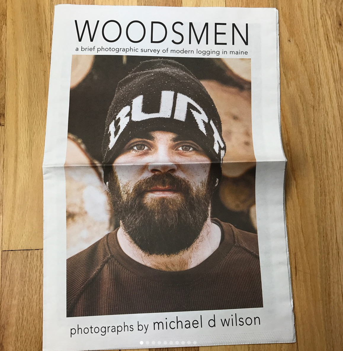
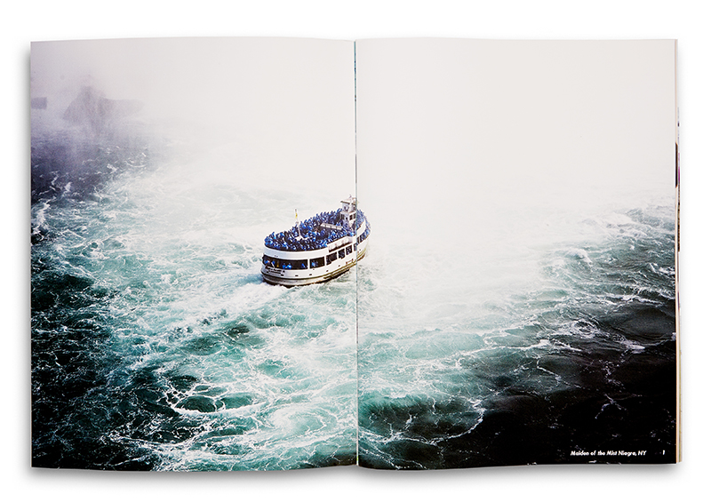
Who printed it? Created the box
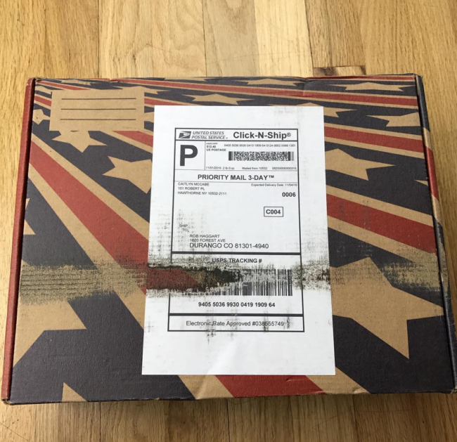
The box was printed by Packlane, a custom packaging company based in California.
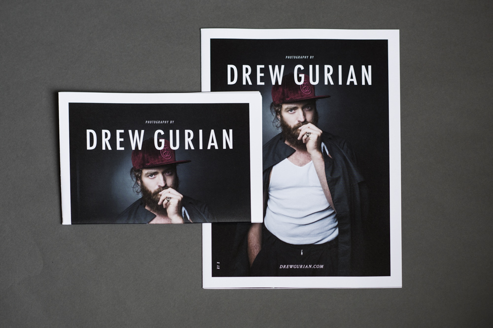
Who designed it?
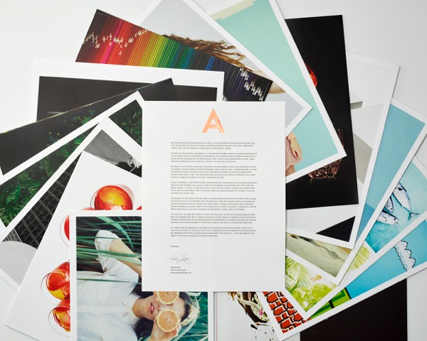
Because the project was so multi-faceted; I collaborated with several, wonderfully talented— creatives. They did an incredible job of bringing my vision to life; making a fun, cohesive project with an “All-American” feel.

Packaging Design: Ryan Bolhman
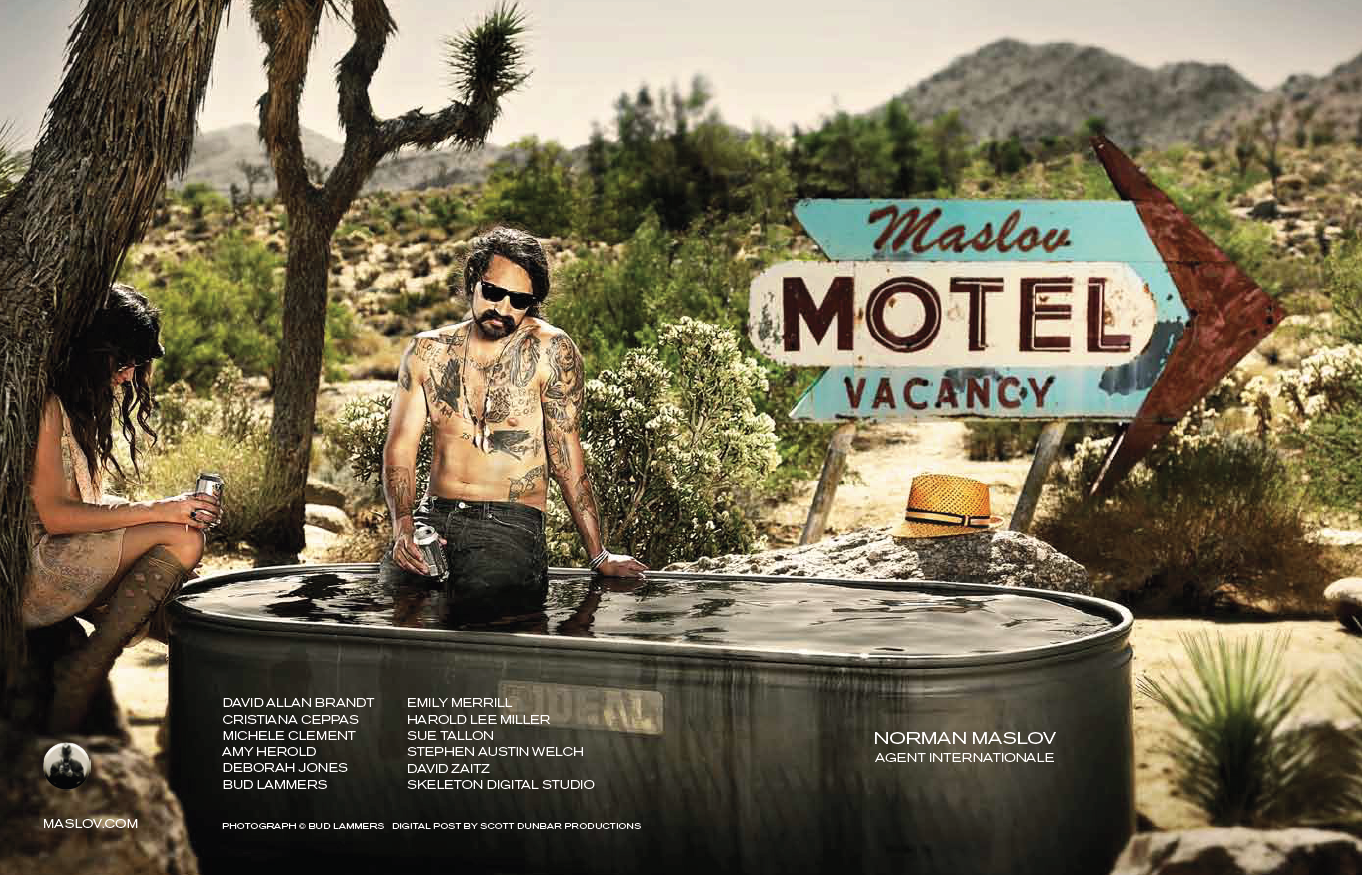
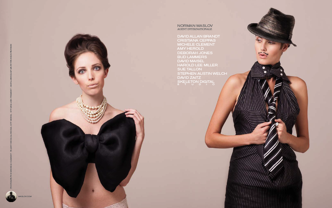
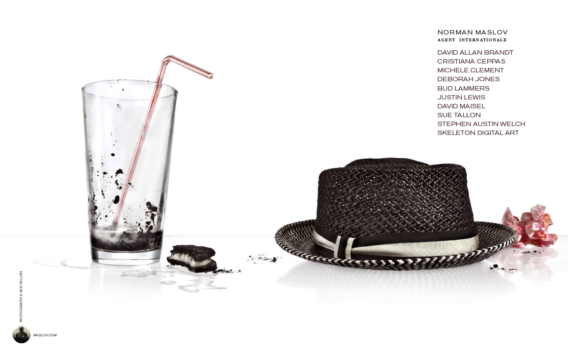
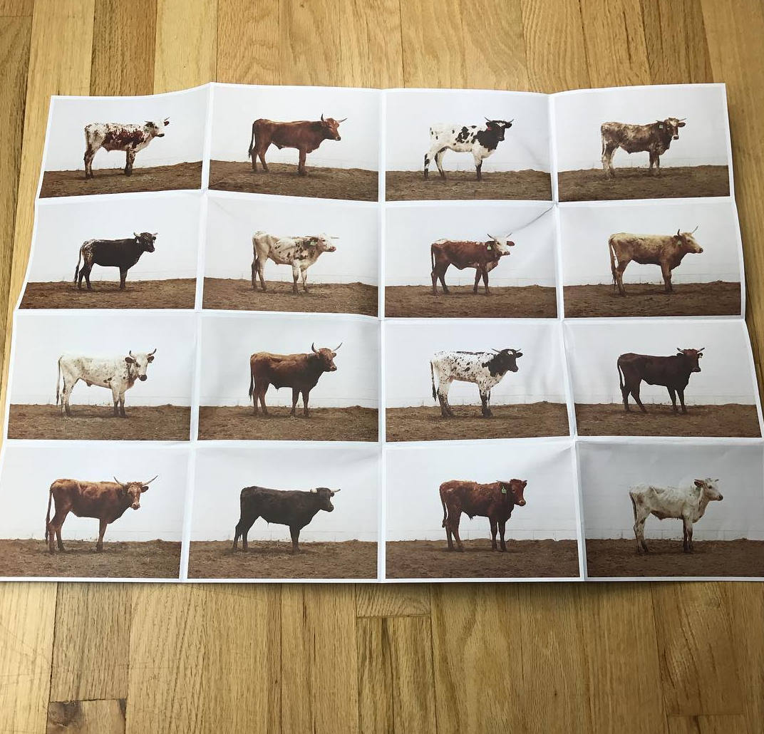
Rebrand Design: Caitlyn Dailey, Erika Saraniero, Matt Conte, Emily Menton, Augie Viera, Vincent Maltese, Tom Finnerty
Video Production: Laura Laperche http://goodandstickycontent.com
Copy: Hilary Giorgi, Matt Conte, Emily Menton
Website Design: Heidi Volpe

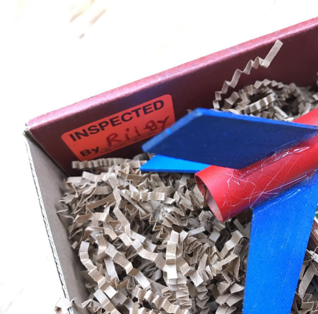
Who inspected the box?
A crew or 35 amazing volunteers (fueled mainly by pizza and beer) who helped throughout all of what we called “Rocket Weekend.” Each member of the team helped to pack and inspect the boxes. They even had their own personalized “inspected by” stickers! You can check out the behind-the-scenes video to get a pretty good idea of how hard everyone was working, AND how much fun we all had putting this together: You can also meet the whole rocket team here:

I was excited – and extremely fortunate – to work with Peter Dennen on this project, who I’ve been working with for the past three years. He also helped on the site redesign: overhauling the internal promo, the leave-behind pieces, and the overall vision of my brand.

How many did you make?
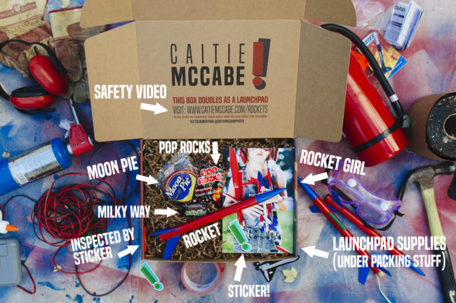
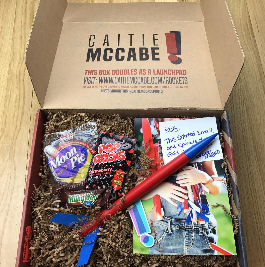
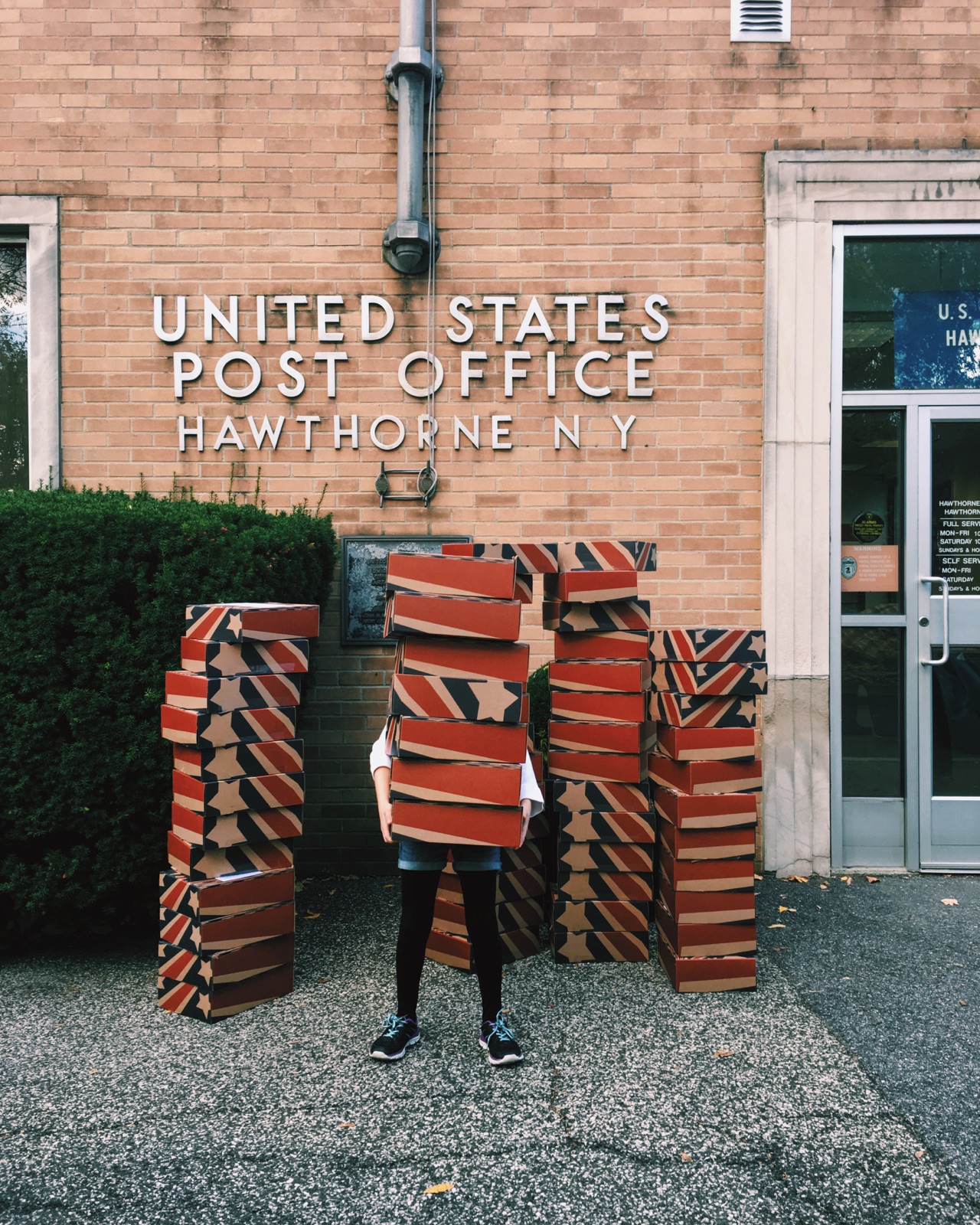
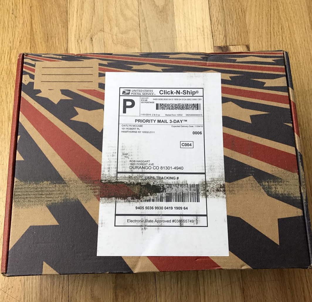
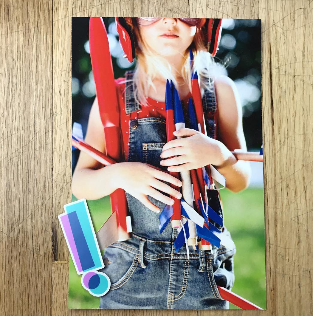
All together, we assembled 250 boxes and more than 400 rockets. Each rocket was hand painted and constructed by members of the team. Frankly, I’m flabbergasted that these people still talk to me!


Caitie McCabe Photography

10-caities-little-helper

How many times a year do you send out promos?
Because these large-scale promotions – like the Rocket Box – take an astounding amount of collaboration and effort, I only do them about once a year. I’ll send smaller promos, mailers, and email posters more frequently; but these big projects require a lot more attention. It’s easily six months of planning, designing, shooting, and assembly. And they’re always a project I take great pride in, so getting it just right is super important.

The interactive element to this box added some extra production time. We filmed a full safety and instructional video for the working rockets included, as well as made the box capable of becoming its very own launch-pad.


How did this project come about?
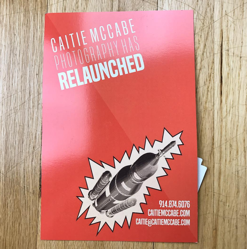
At the start of 2016,  it was time to re-launch my brand. I created a new logo, figured out new and exciting ways to show off all these samples of my work, and completely overhauled my website. I was pumped. I’m not one to do ANYTHING quietly, I found myself searching for the perfect way to announce all of these new and exciting business developments. That’s when serendipity took over.
Randomly – as one often does – I struck up a conversation with a man who accidentally bought $20,000 worth of model rockets. After the confusion – and thousands of questions –  the lightbulb went off.  I had begun the six month process of developing the most insane promo piece I’d ever done.
I’m NOT a rocket scientist – just a girl with a head full of ideas and several hundred explosive devices – it took a bit of help to fully “launch” Rocket Boxes. Luckily, I’m surrounded by people who were more than willing to come by in their free time to help build rockets, set up launch pads, assemble boxes, and hammer out those tiny details that made these promo pieces work. Whenever I had an idea – however crazy – my amazing team was right there to make it possible.
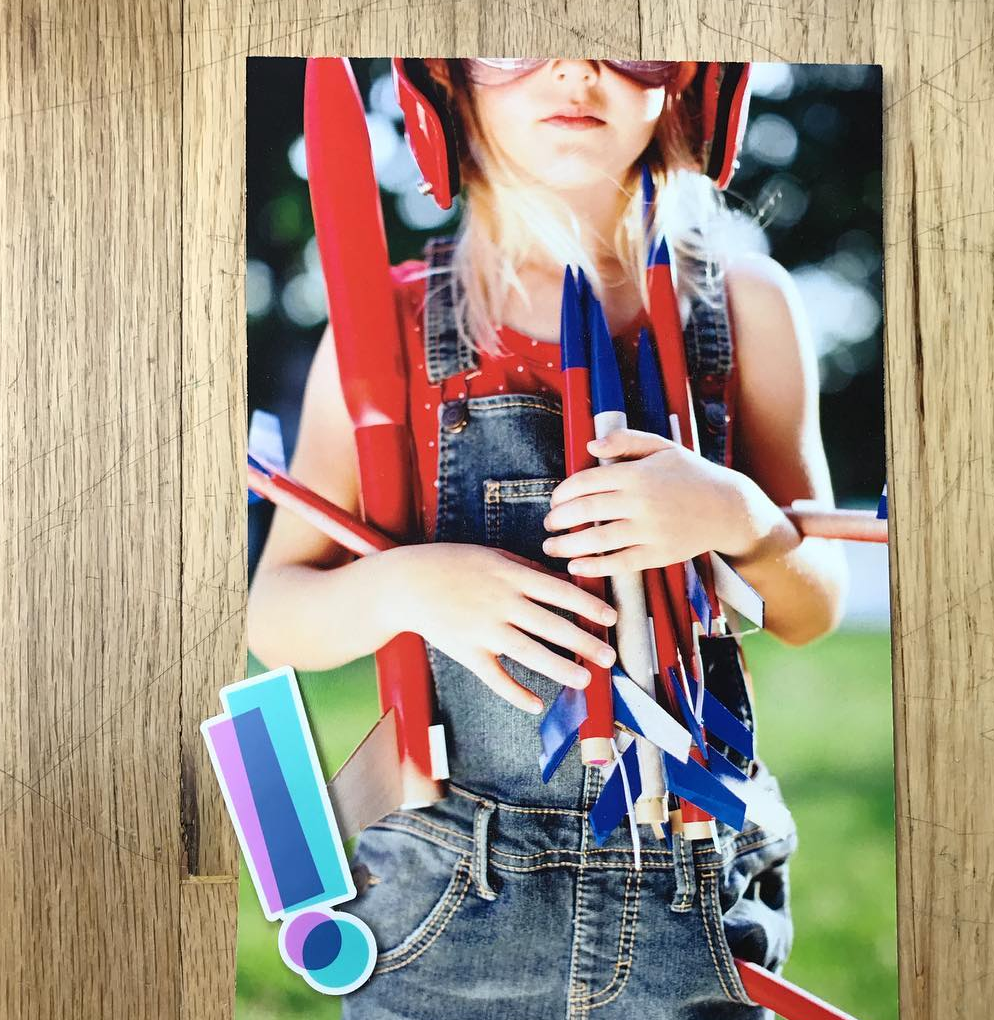
What we ended up with were 250 beautiful boxes, an incredibly well designed physical mailer, a poster, scripted and behind-the-scenes videos, a new website that I’m insanely proud of, and some AMAZING memories.
Of course; since I sent hundreds of rockets through U.S. mail, there’s an itsy-bitsy chance I’m now on a government watch list. But, honestly, I wouldn’t have it any other way.

The Daily Promo: Sara Remington

screen-shot-2017-01-08-at-6-44-11-pm
screen-shot-2017-01-08-at-6-43-29-pm
screen-shot-2017-01-08-at-6-43-48-pm
screen-shot-2017-01-08-at-6-43-56-pm

screen-shot-2017-01-08-at-6-43-13-pm

Sara Remington

Who printed it?

Essence Printing in South San Francisco.  They’re always 100% spot-on with their color matching; it’s fantastic.

Who designed it?
A friend of mine, Francesca Bautista, who designed a few cookbooks I worked on (‘The Blue Chair Jam Cookbook’ and ‘Blue Chair Cooks’).

Who edited the images?
I gave Francesca a general idea of what I wanted, and sent her my top 25 – 30 images to play with.  From there, we did a little back and forth to make sure things flowed nicely and were relevant to the overall ‘natural dyeing’ story.

How many did you make?
I made about 250, and carefully curated a list of people that had close ties to still life and food accounts.

How many times a year do you send out promos?
I send a promo this size about twice a year, and try to send a few more smaller, less multi page ones sprinkled throughout the year if I can.

What project did these images from come?
Most of these images came from one of my favorite books I shot to date, ‘The Modern Natural Dyer’ by Kristine Vejar.  It was an inspiring, multi-week shoot that involved capturing natural dyeing techniques, combined with how-to’s and high end projects to tie in those dyeing techniques with a finished product.  I have never felt so creative and alive and slightly out of my element on a commissioned project.  I’m used to having a time limit on the images I shoot, since most of what I shoot is food and drink, but for this project, we had the leisure to tweak and tweak until everything was exactly how we wanted.  I had the full trust in the editor, Melanie Falick (who at the time was with Abrams Publishing) to be as creative and wild as possible with our brilliant stylist, Alessandra Mortola.  We captured such a luscious portfolio of colorful, layered imagery that it had to be shared in a mini book promo, with the main objective being to showcase my work beyond the food world.