

Niki Cutchall
Who printed it?
I printed the magazine through Blurb. Another photographer recommended them. After comparing their products to a few other companies, Blurb was my best option for the type of promo I created. They made it easy to start with an Adobe InDesign plugin, and I appreciated that I could order a single copy as a hard proof. I went with their magazine and upgraded to premium paper. The postcard was printed through Moo.
Who designed it?
I did! I don’t have a background in graphic design, but I felt confident that I could create something that made me proud. I started it in Adobe InDesign because Blurb had a template and plugin for the tool. My photography trends towards a more minimal, elegant style, and I wanted the magazine’s design to complement that. This was my first print promo, so I wore every hat on this project, from creative director and graphic designer to photographer and stylist. It pushed my creativity as a photographer and made me appreciate all the work that each function puts into a piece of content.
Tell me about the images.
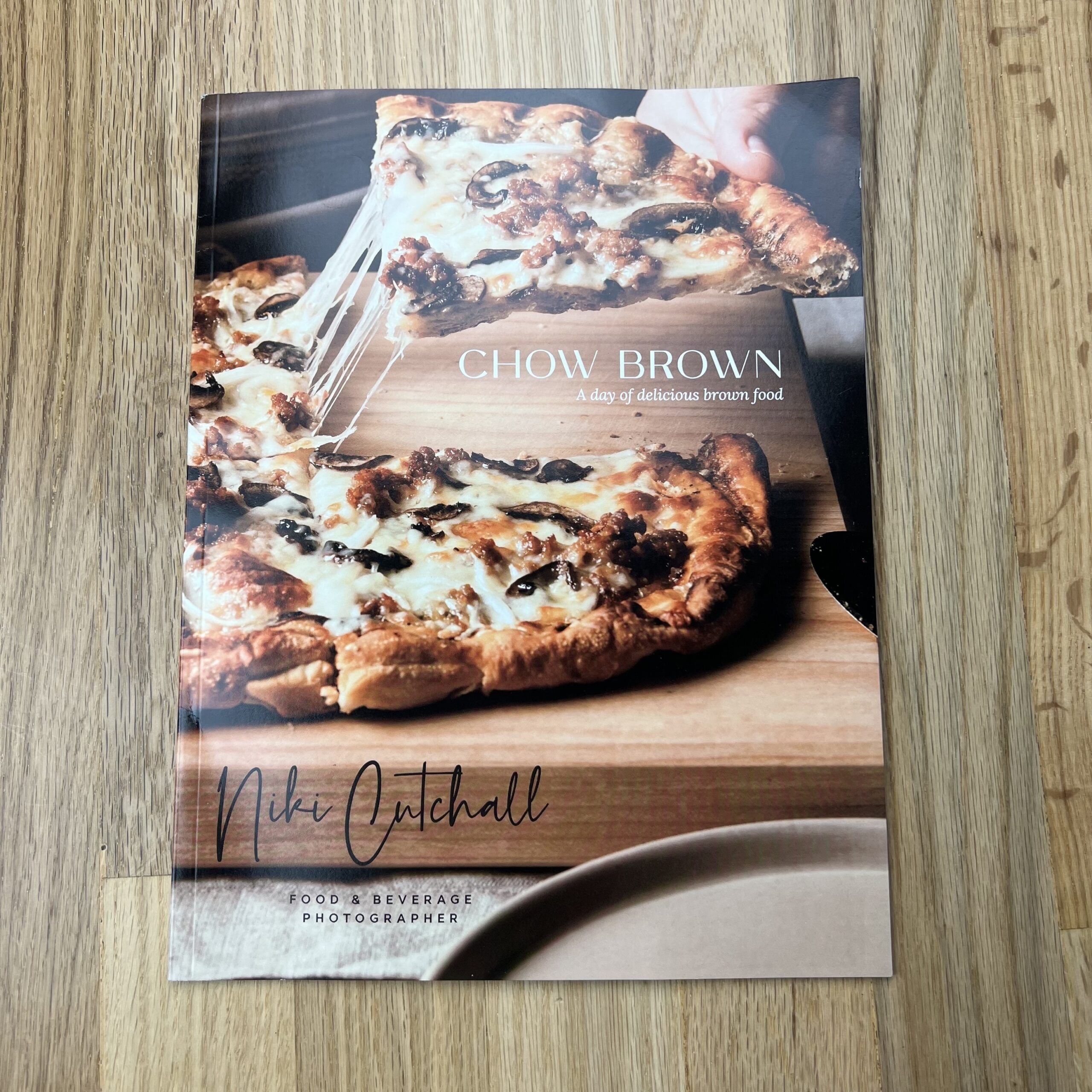
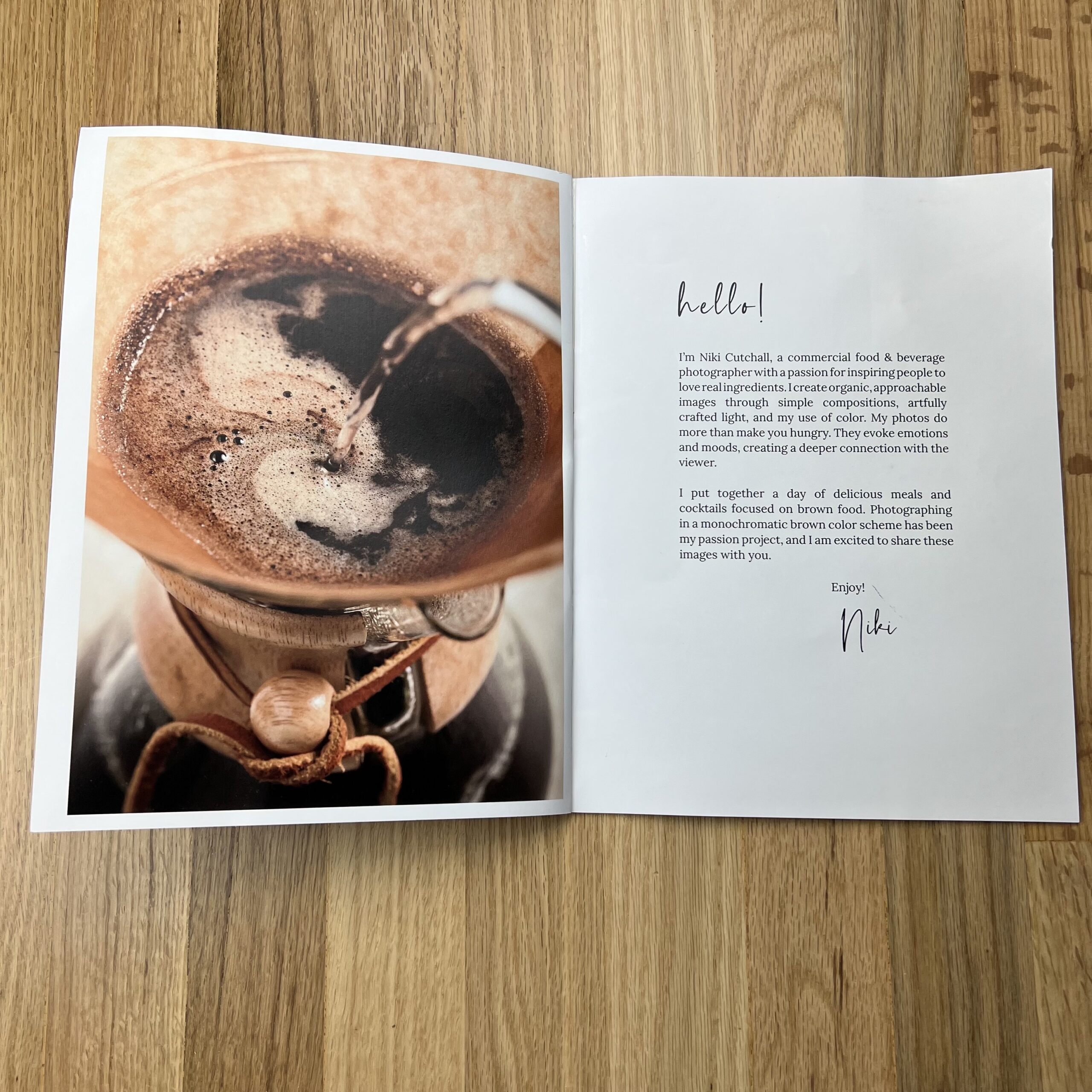
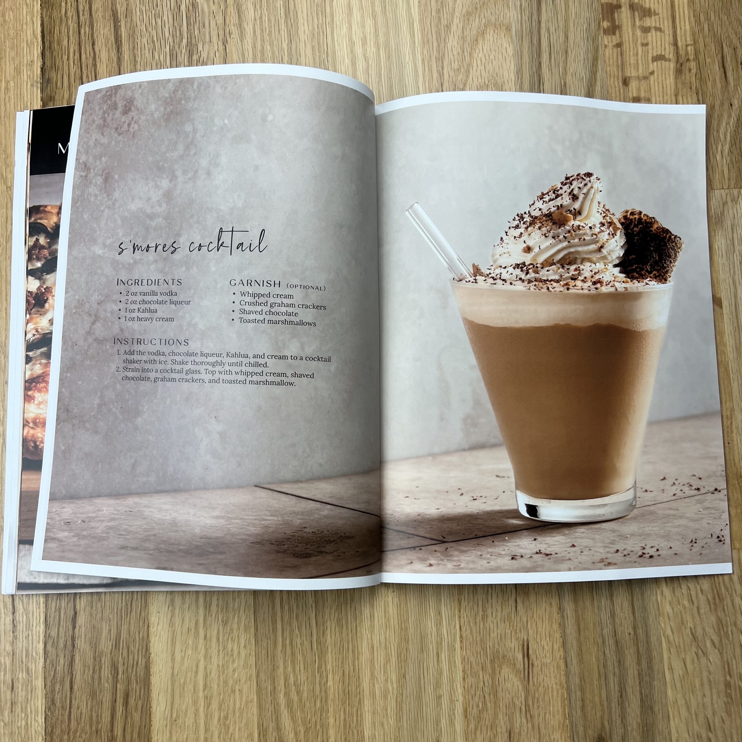
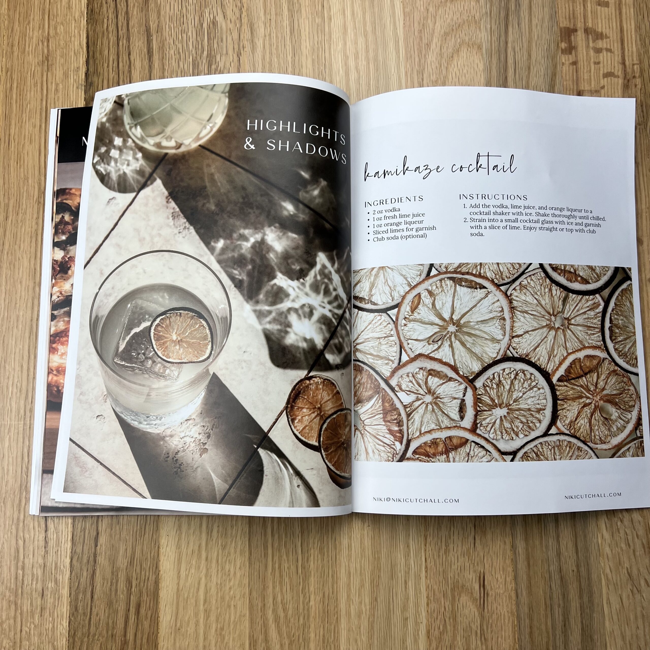
This was my first print promo, and it started as an assignment in a small group fellowship run by Andrew Scrivani. I wanted to create something that felt like me and powerfully debut my work. As I was brainstorming ideas, I kept returning to an image I shot of brownie batter (the image on the postcard) and an idea I had to do a monochromatic series on brown food. It’s a color I love working with, and I knew I could capture it beautifully. Andrew encouraged me to run with the idea, and I took off with it.
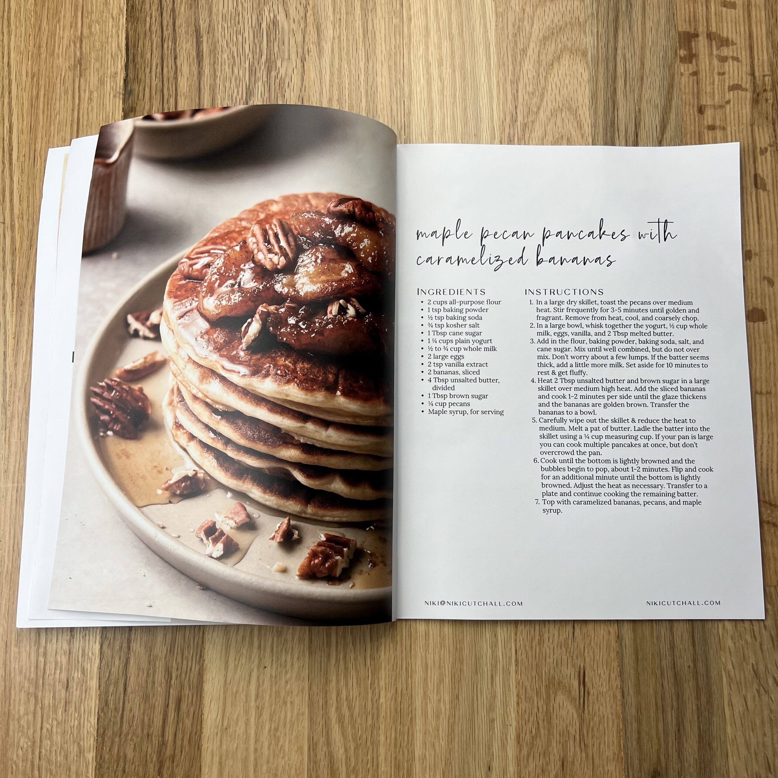
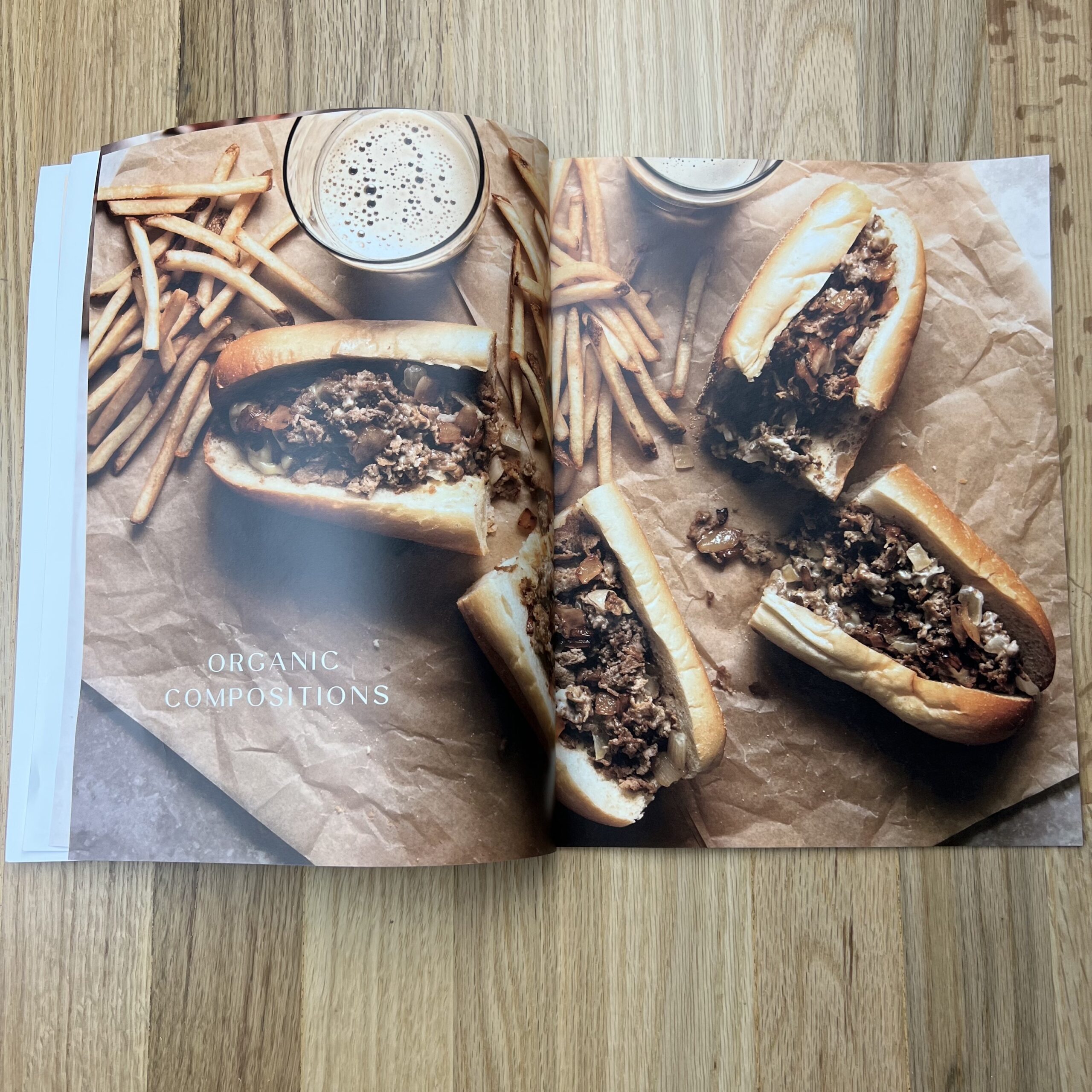
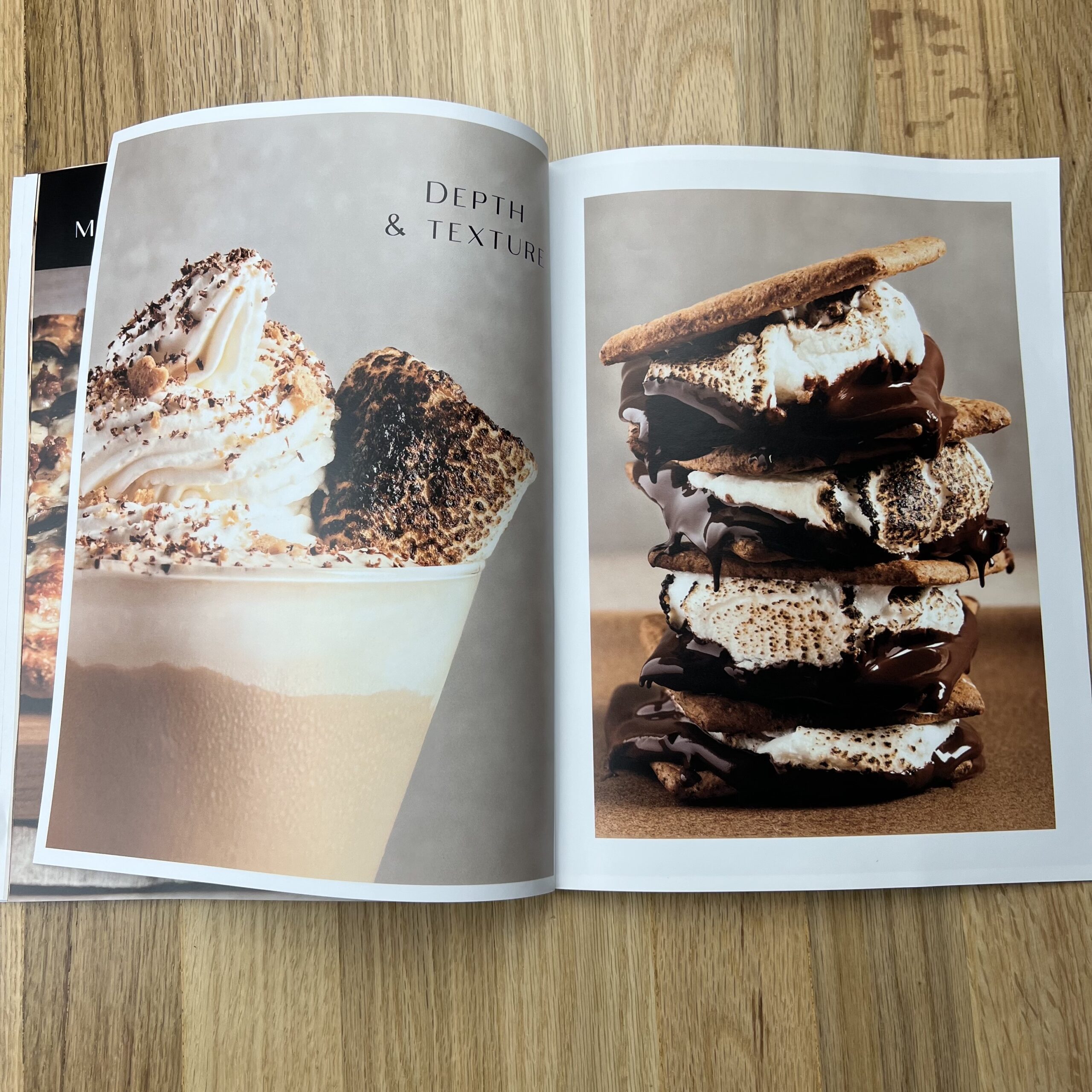
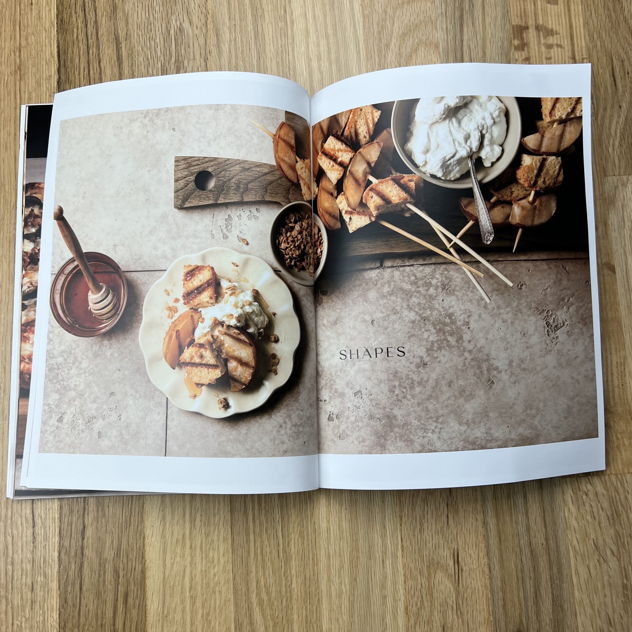
I started by brainstorming a list of brown foods. I knew I wanted to include recipes and focus them around a meal. I ended up going with a breakfast, lunch, dinner theme because it gave me a good range of foods to choose from. The challenging part was identifying recipes that are naturally monochrome. I could have included some images of single ingredients to keep with the brown theme, but I wanted the challenge of photographing a final dish that was entirely brown. I decided on four recipes and a cocktail; then, I sketched out my shots. I planned each recipe to have one main hero image and 2-3 supporting photos. I shot and styled all the photos, specifically for the promo. As I was designing the magazine, I had some additional space that I didn’t plan for initially. The Kamikaze was a last-minute addition. It was shot for a different purpose, and it was a happy accident that it worked with the brown color palette.
I live outside of Philly, so I had to include a cheesesteak! Those photos are my favorite in the series. I love the composition, the lighting, and the texture; everything about them. They are an excellent example of bringing the idea in your head to life.
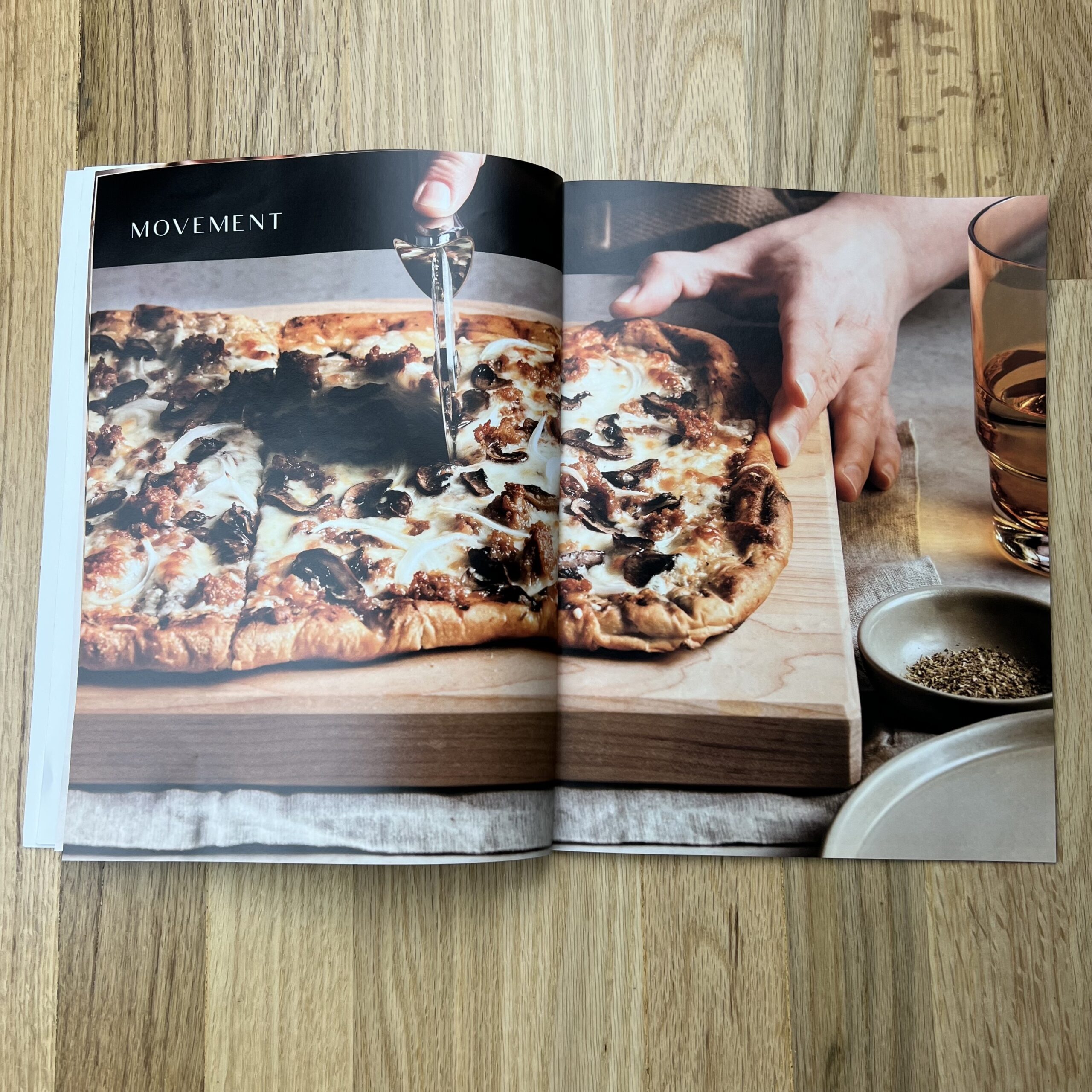
The hero image for each recipe includes a descriptive word or phrase. These are words I use to describe my style. I included them as a way to clearly express my strengths without being too lengthy or adding in additional text. I planned to include them initially, but I did not shoot specific recipes to match a particular description. I matched them up after everything was shot based on the strongest qualities in the photo.
Lastly, I like creating GIFs, and I wanted to include those because it’s part of my services. I planned a GIF for each recipe. Then I made a dedicated page for the series on my portfolio. I included a QR code on the back of the magazine that would take you to that page.
How many did you make?
I printed 85. I thought it was a good number for my first promo. Not so large that I would struggle to mail them out, but not so small that I would have a hard time choosing who gets one.
How many times a year do you send out promos?
This was my first promo, but I plan on sending them out at least twice a year. They won’t always be on this scale. The next one I have planned will be something simple, like a postcard.
Do you think printed promos are effective for marketing your work?
I think it’s too soon to tell. I think it’s a long game and part of a broader marketing strategy. I’m going to keep trying, see if it works, and reassess at a later time.
How can you tell what works and what doesn’t?
Food photography is a second career for me. I was a data analyst for several large corporations for ten years. I specialized in web analytics, looking at how clients are moving and interacting with the companies website. I use a lot of the same techniques in my photography business now. Collecting data can get overlooked, but I think it’s important to understand the health and growth of your business. From the beginning, I intended this promo to live across multiple channels. I knew I could track traffic to my portfolio from social and email, but I was a little disappointed that I couldn’t follow it from the print version. It would be nice to know if the print promo drove traffic to my site. Then I realized the QR code I included on the back serves as that tracker. I created a unique URL called a UTM tracking URL. It’s a URL with additional parameters at the end where I could specify that this link came directly from my printed promo. I embedded the UTM tracking URL into my QR code. Anytime someone with the print promo scans the QR code, I see a marketing channel called “print” come through in my Google Analytics. This only works if the recipients scan the QR code, but regardless, it’s better than not tracking interactions with the promo at all.