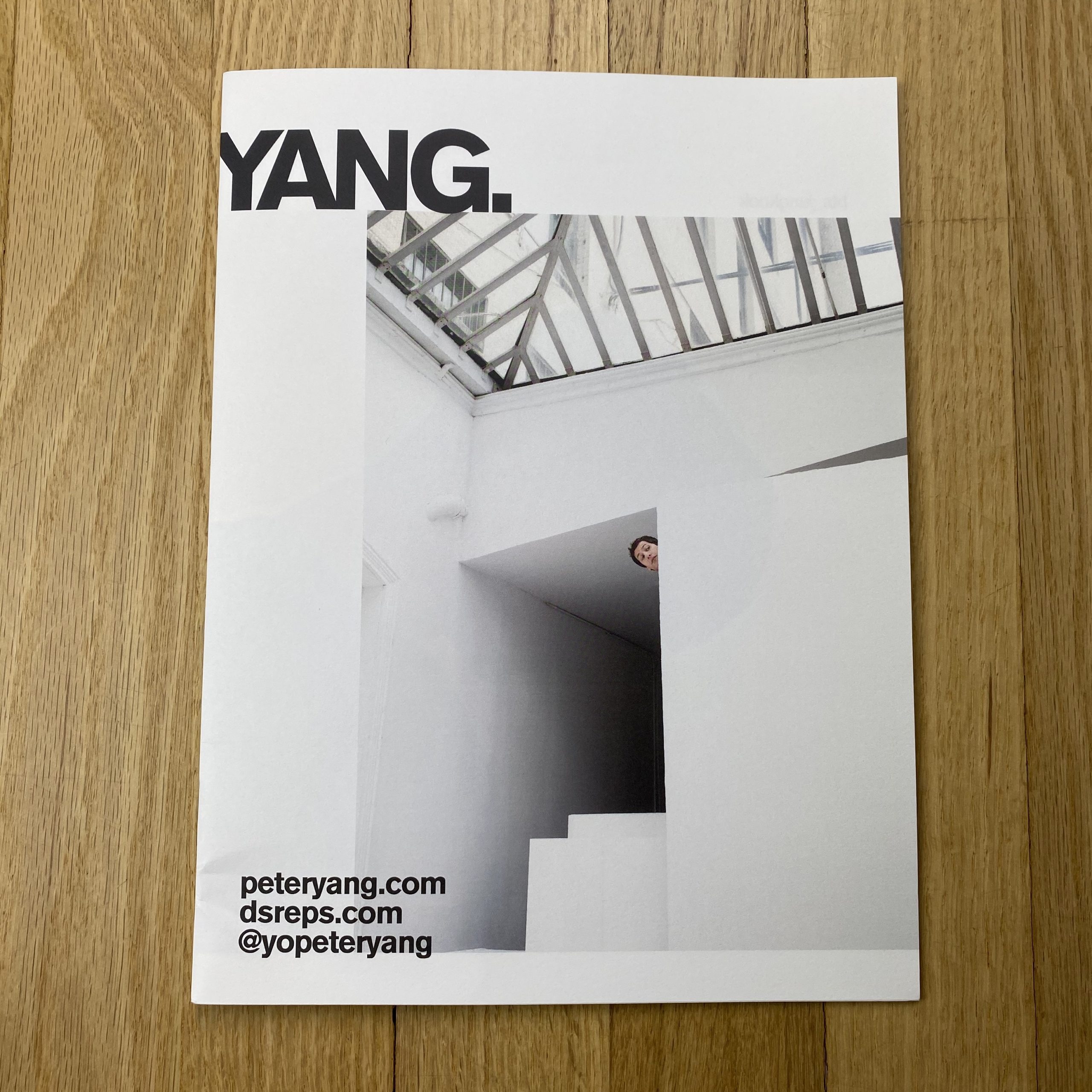


Peter Yang
Who printed it?
Madison Print Solutions
Printed on with a 4 color process on an HD Indigo 12000
Who designed it?
David Calderley of Graphic Therapy
Tell me about the images?
Andy Samberg: This was shot quite a while back at Sun Studios in NY. It was one of my favorite spots and was sad to see when they closed. During the Andy shoot, I noticed this really cool spot architecturally and thought it would be funny to see Andy’s head peeking around the corner. It kinda reminds me of a moment in an old cartoon. It was actually a pretty tough shot to execute, to get his head that high and that horizontal. There’s a lot of core work and balancing going on behind the scenes. I also recall we had a photo assistant grabbing his belt so he wouldn’t fall over ledge. I could be mixing that up with the many times I’ve shot over a ledge with a hand on my belt. Safety first.
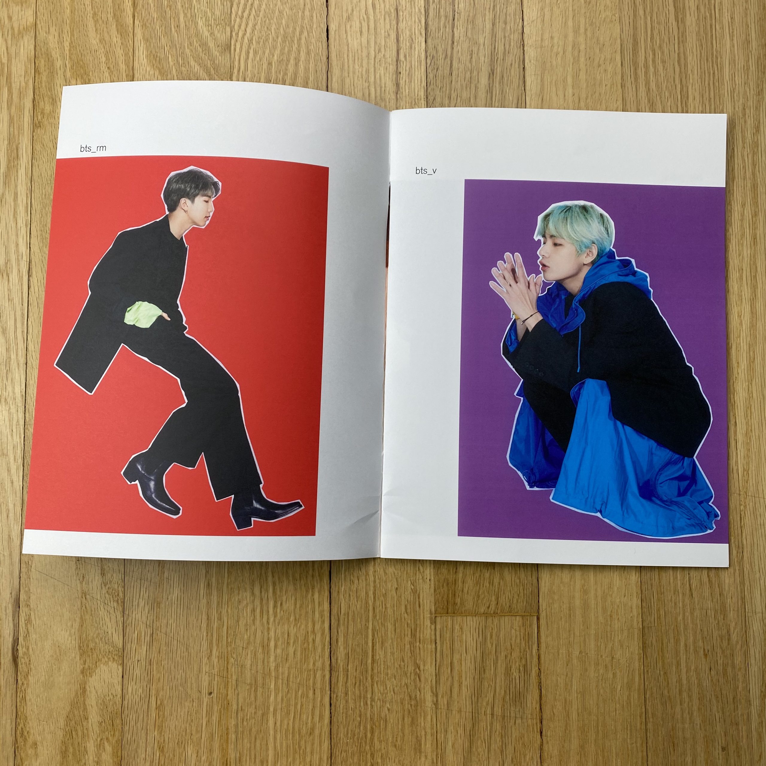
BTS: The graphic treatment on the singles was inspired by old Interview magazine covers. The band was a rad group of guys. You could tell they were exhausted from their travels and their schedules but they were so nice and super pro. On the group shot, I was laying on the ground with a silver tarp draped over me to bounce up light. I had purchased a dozen full apple boxes (I’m always looking for excuses to buy photo equipment) and surrounded myself with these boxes to help the band members stand further above camera. I kept the members walking in the circle, and stopping over once in a while for the still moment.
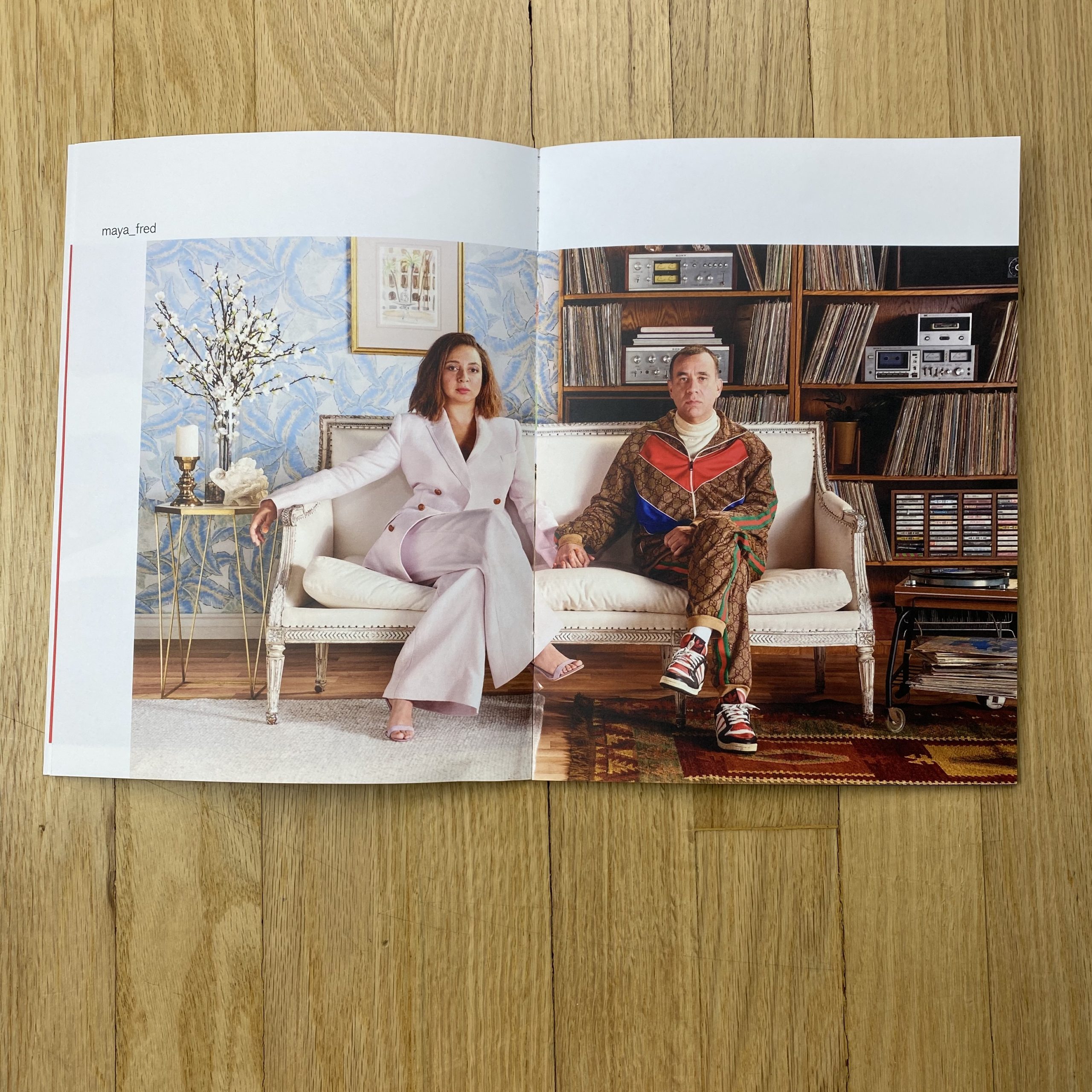
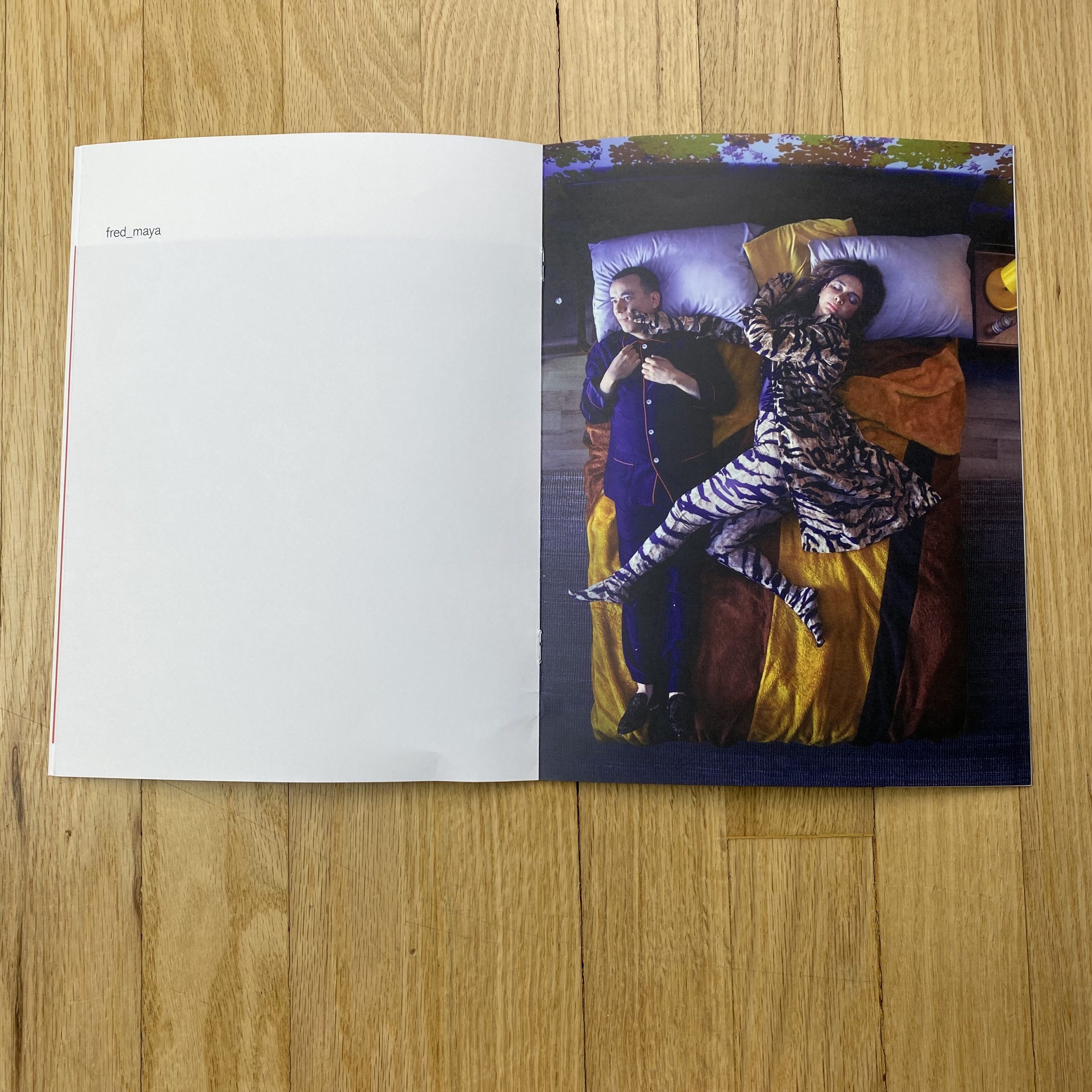
Maya Rudolph and Fred Armisen: Big ups to Meagan and Kendall Faeth for this awesome set build. Since it was editorial, they built four sets in the am while stills were lighting, and we shot in the afternoon. I don’t recommend it..heart attack city. Fred and Maya were a joy to work with. I’m a big fan of theirs so it was a thrill to work with them.
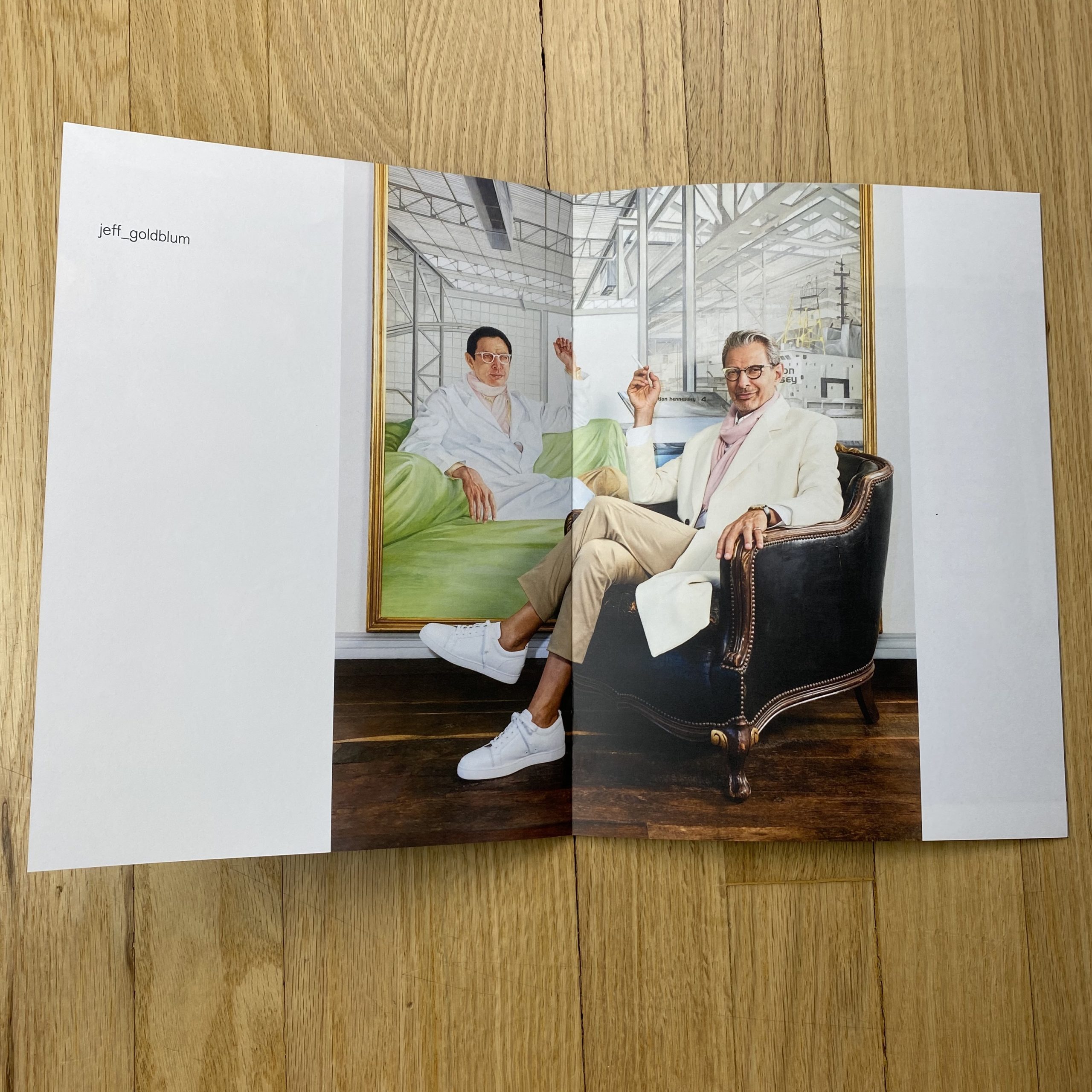
Jeff Goldblum: What more is there to say, awesome dude in front of a giant painting of himself? The painting is from The Life Aquatic and Jeff actually had this painting at his house. We had to put it to use.
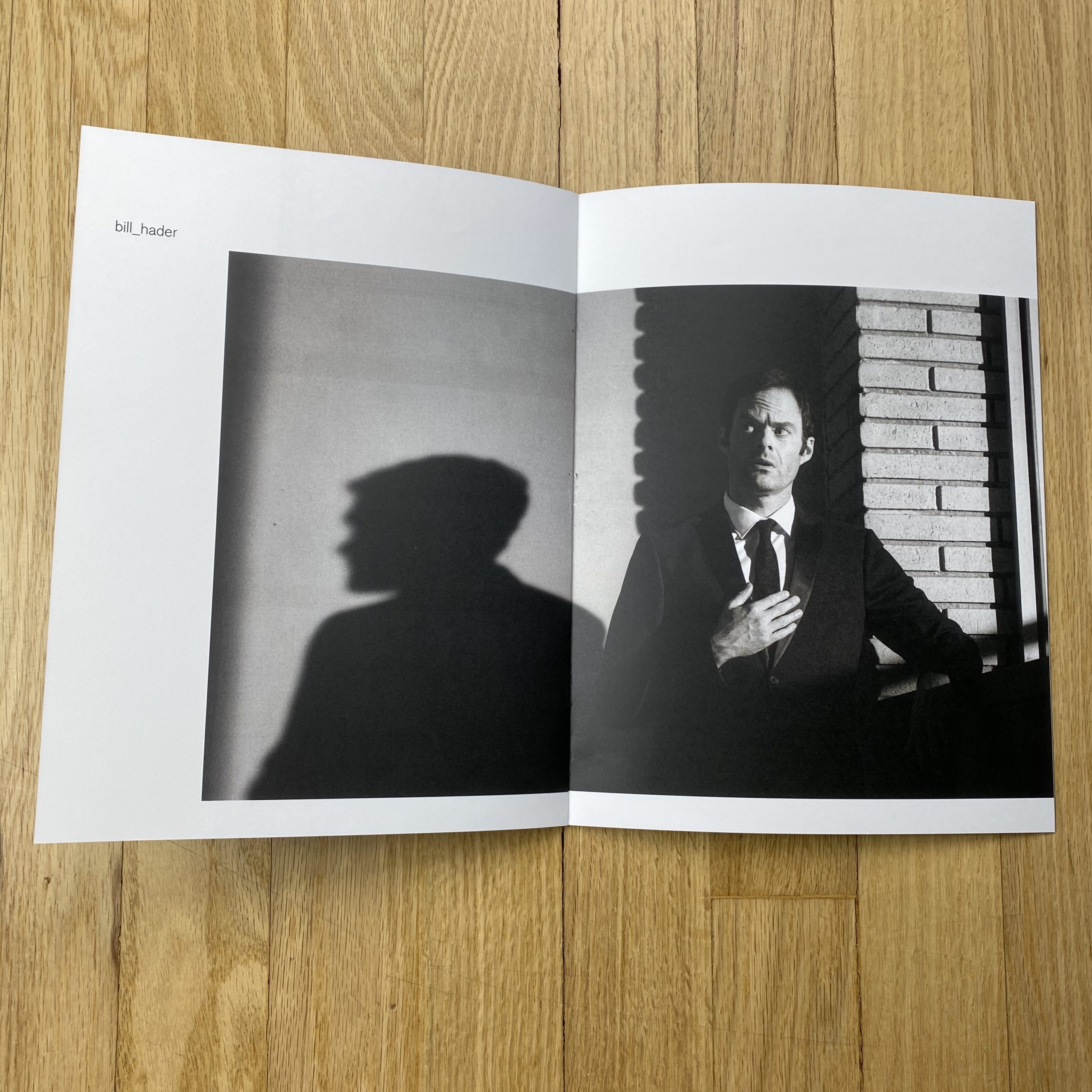
Bill Hader: I wanted to create a Twilight Zone meets film noir kind of vibe where a lot of detail was lost in the shadows. We were able to shoot on the set of Barry just as they were wrapping up the season and there were all these cool corners and wall textures to play with. I’ve shot often with will Bill over the years and he’s super fun to work with. He’s so great with facial expressions and can say so much while doing so little.
Jordan Peele: In this concept, we were speaking to race and the fact that Jordan is biracial. I really wanted to find a subtle and clever approach to illustrate this. We ended up painting this gradation of colors on the cyc and painting Jordan on-site to match the background. I had my camera locked in place so the lines would match. It wasn’t the initial intention to show the edges of the paint but it looked so cool that I shot this wider version. Also, I have a shot of him giving me the bird with a Freddy Krueger glove but it didn’t make the cut.
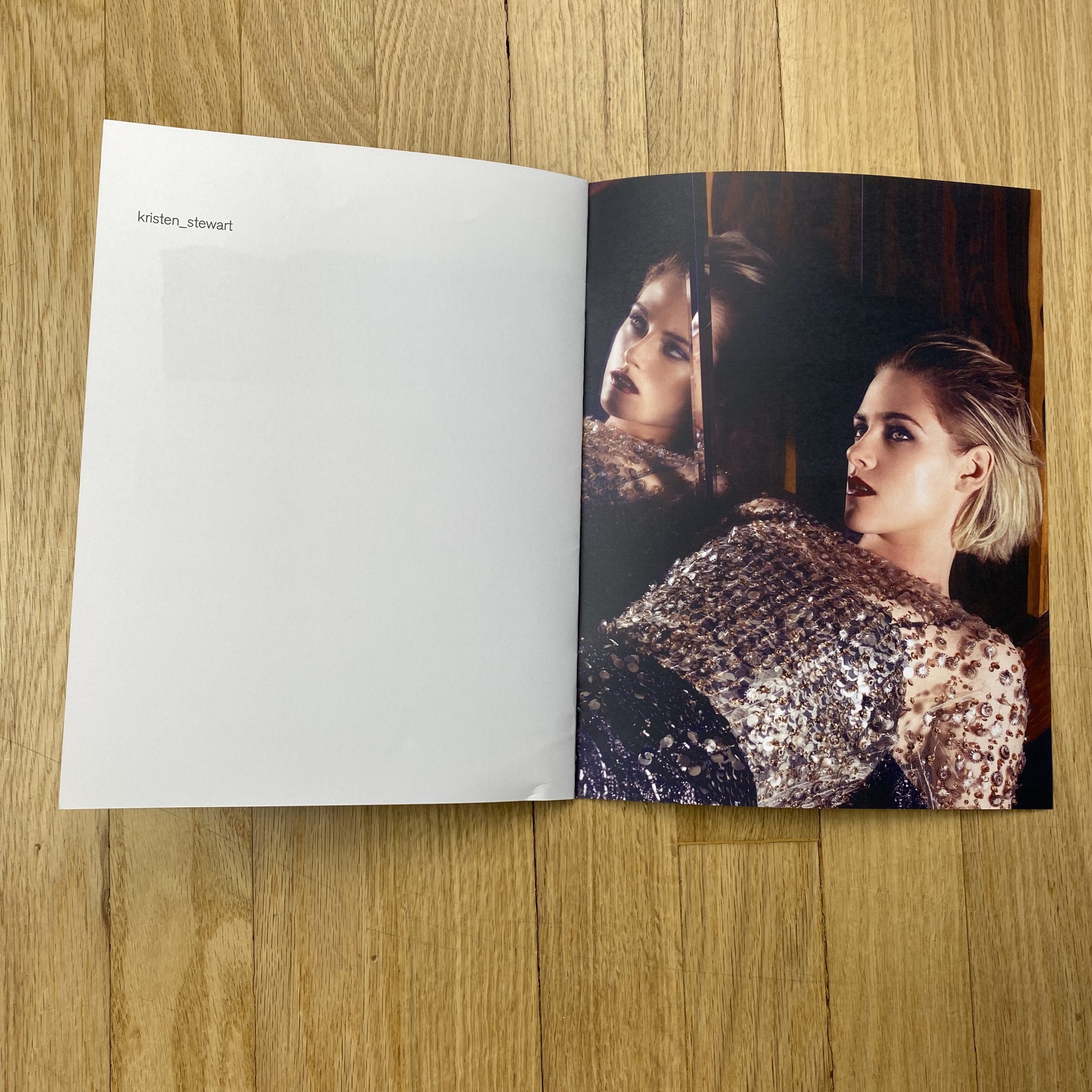
Kristen Stewart: I did this shoot this in a fairly generic hotel room and this shot came from trying to find interesting spaces within that room. This was a small mirror at the base of a bar. I knew if Kristen would be game to squeeze in this tiny uncomfortable corner we’d get a cool shot. Luckily she was game and when I asked she was fine being all scrunched in there, she replied, I’m cool dude.
How many did you make?
1250
How many times a year do you send out promos?
Not often enough. Probably twice a decade.
Do you think printed promos are effective for marketing your work?
I’m not sure honestly. I hope so. I really enjoy the process of curating images and working with a designer.
2 Comments
Spectacular work, spectacular promo.
Dope photographer!
Comments are closed for this article!