


Michael Rudin
Who printed it?
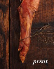
Mag Cloud did the printing.
Who designed it?
I did the original design and Paul Morris who is an Art Director and Graphic Designer refined it and really helped pull it together.
Who edited the images?
I edited the images.
How many did you make?
I did a small run of fifty.
How many times a year do you send out promos?
I do an annual zine and a few postcards a year.
What made you decided to use such bold language?
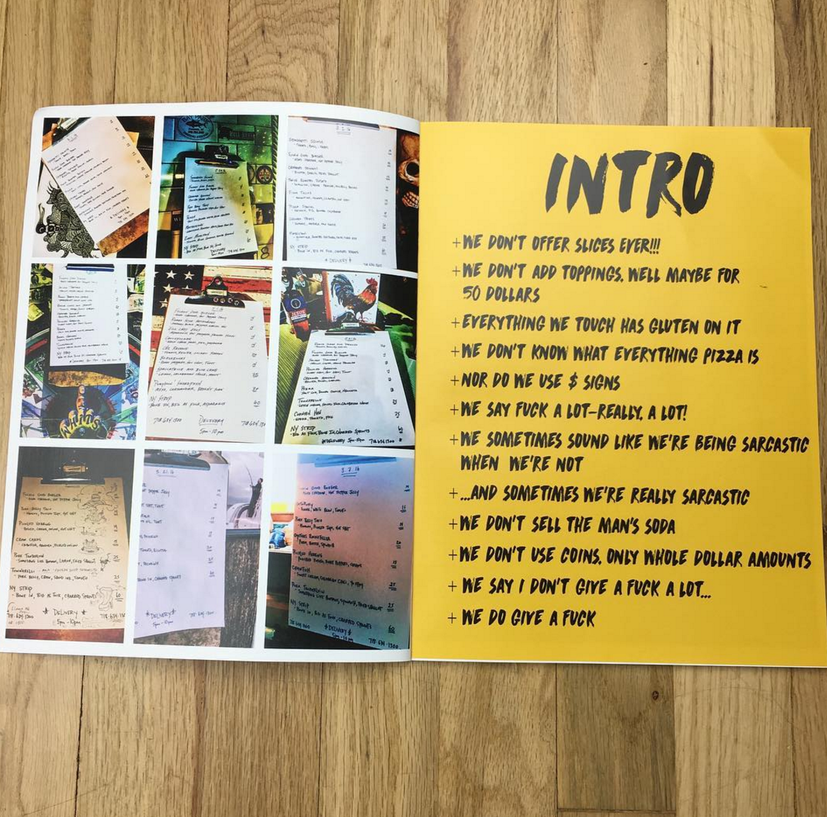
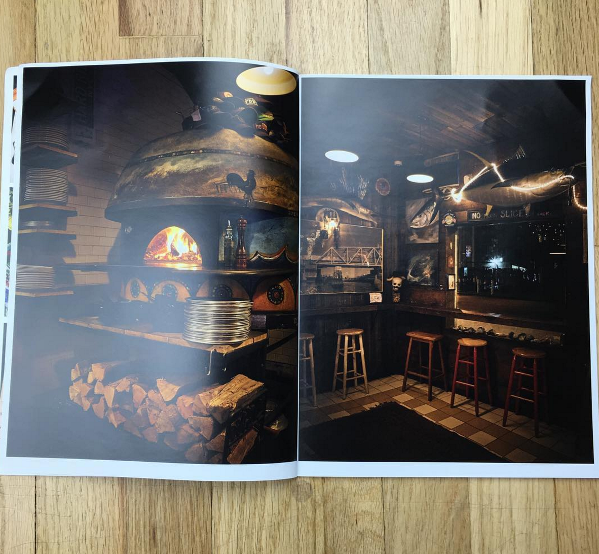
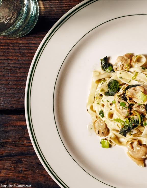
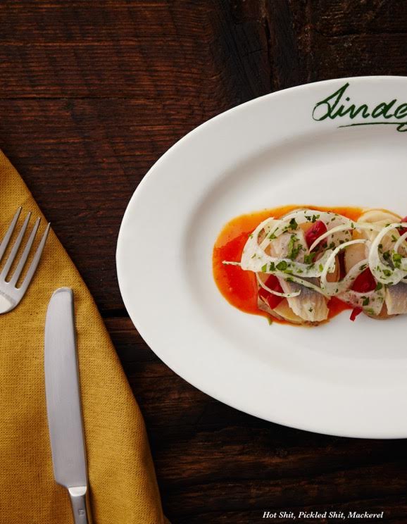
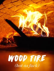
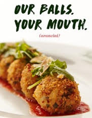
I really wanted to capture the spirit of Whit’s End and give viewers a sense of what it is like there. The restaurant is very small with a salty but loving crew. They are putting out amazing food in an open kitchen while this kind of banter is tossed around. Their daily specials menu reads with bold language too so it only seemed fitting.
Did you write this yourself?
I worked closely with Whit and his crew to come up with appropriate text. We kind of brainstormed the language at the restaurant during service, over beers and in passing. Honestly I don’t even remember the things that didn’t make the cut, nothing was written down. We knew when we got the right thing because everyone was into it and that’s what stuck.
What has the feedback been like?
The feedback has been great! Lots of positive response from everyone who has received one.
3 Comments
Nice job. Really pops OUT
Terrific promo Rudin! Great design, beautiful photos and very entertaining. You captured Whit’s perfectly.
This make me so hungry. The pictures are so vibrant!!
Comments are closed for this article!