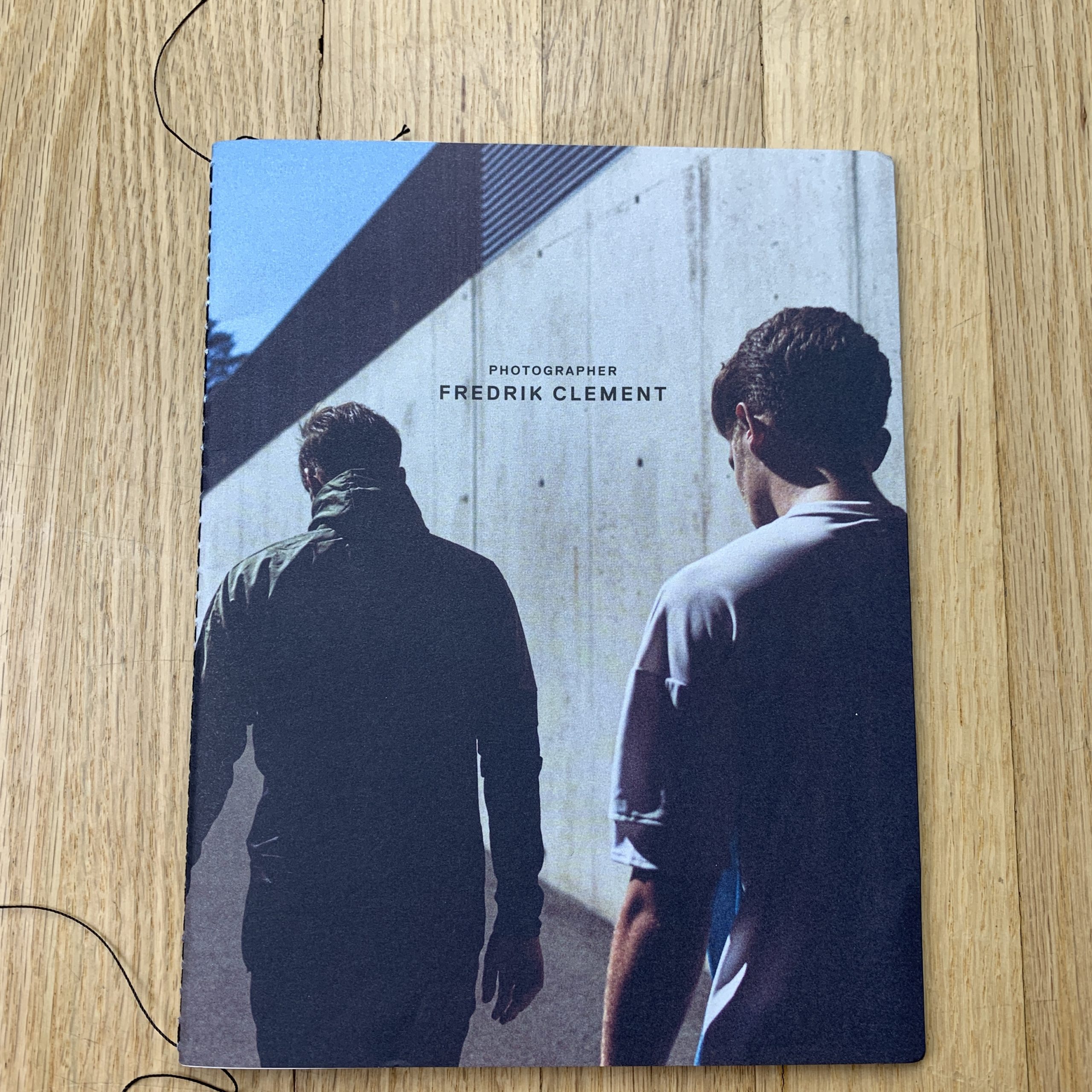
David McClister
Who printed it?
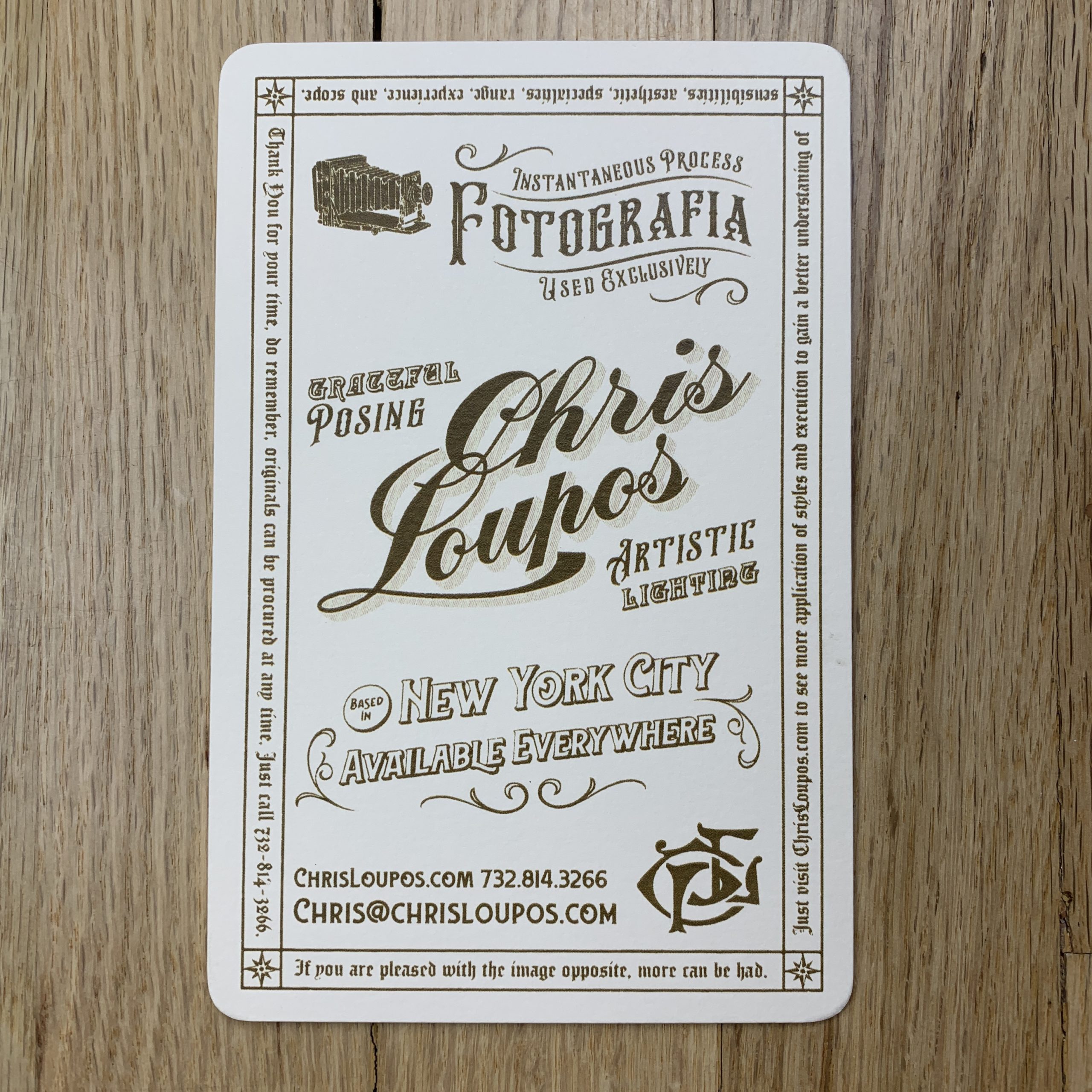
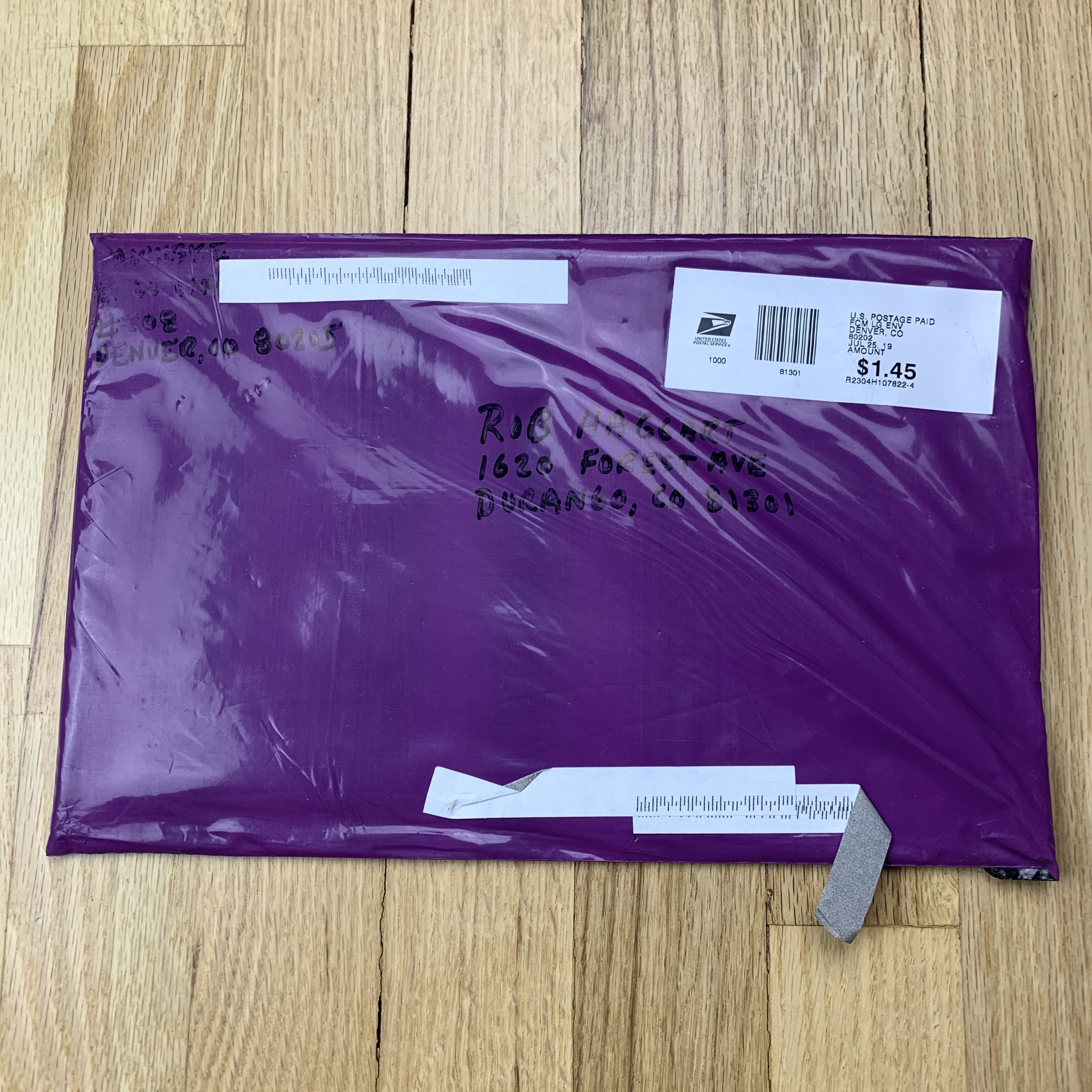
I went back to Overnight Prints for this current series of postcards, a vendor I used many times in previous years, mainly due to ease since I had their templates already set up on my computer. I like their price (they have special offers several times a year), but I wish they offered proofs. I used Smartpress earlier this year for a book of work, as well as another run of postcards. They do offer proofs (at a small price). Their overall pricing was competitive, and the quality of their work was strong, but it was not an easy process for my designer (more so on the book than on the cards).
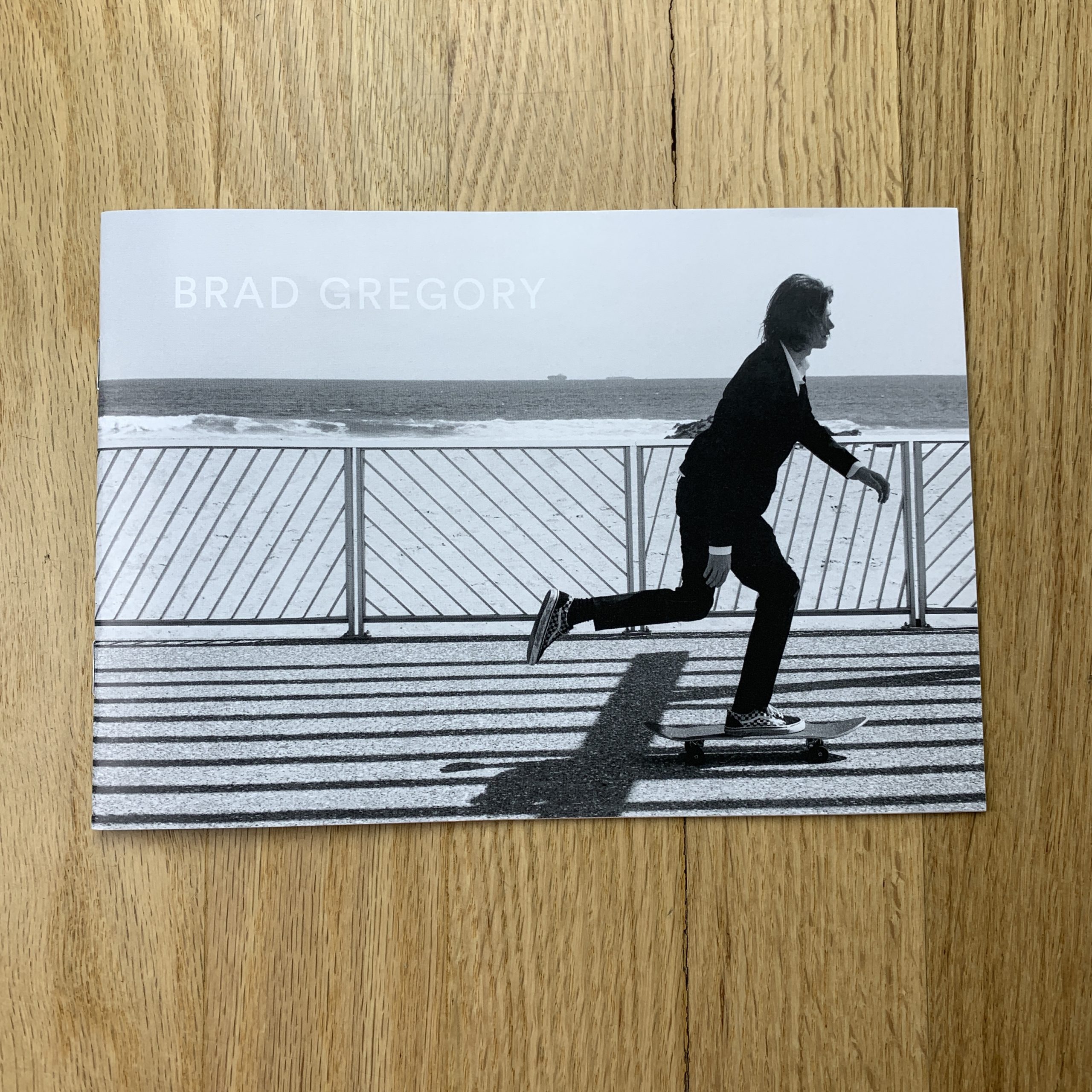
Who designed it?
I typically do the editing, the initial layouts, and the copy to start with, then pass it on to a professional designer to fine-tune the layouts, type, and color (if necessary). I have always worked with Gina R Binkley/ Altar Ego Design for all of my design needs.
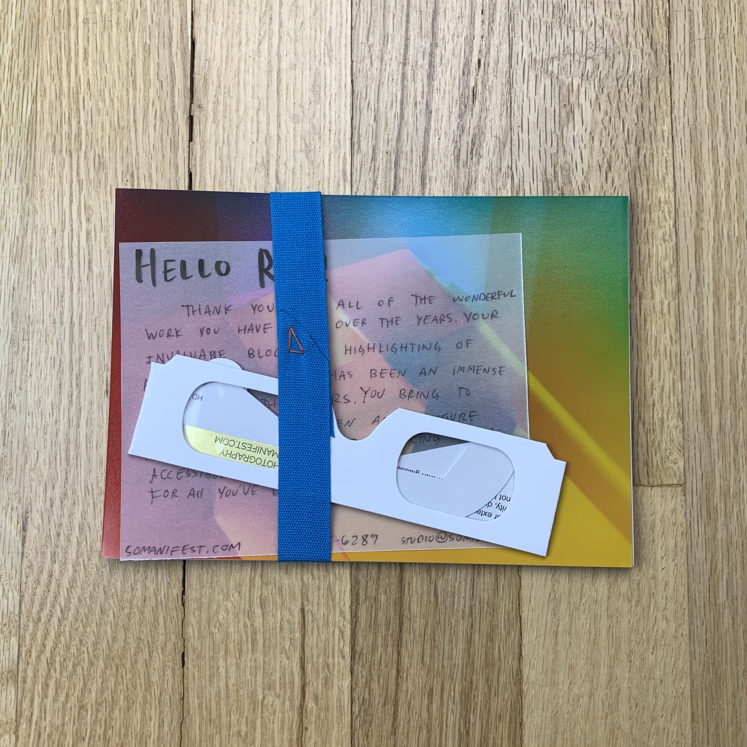
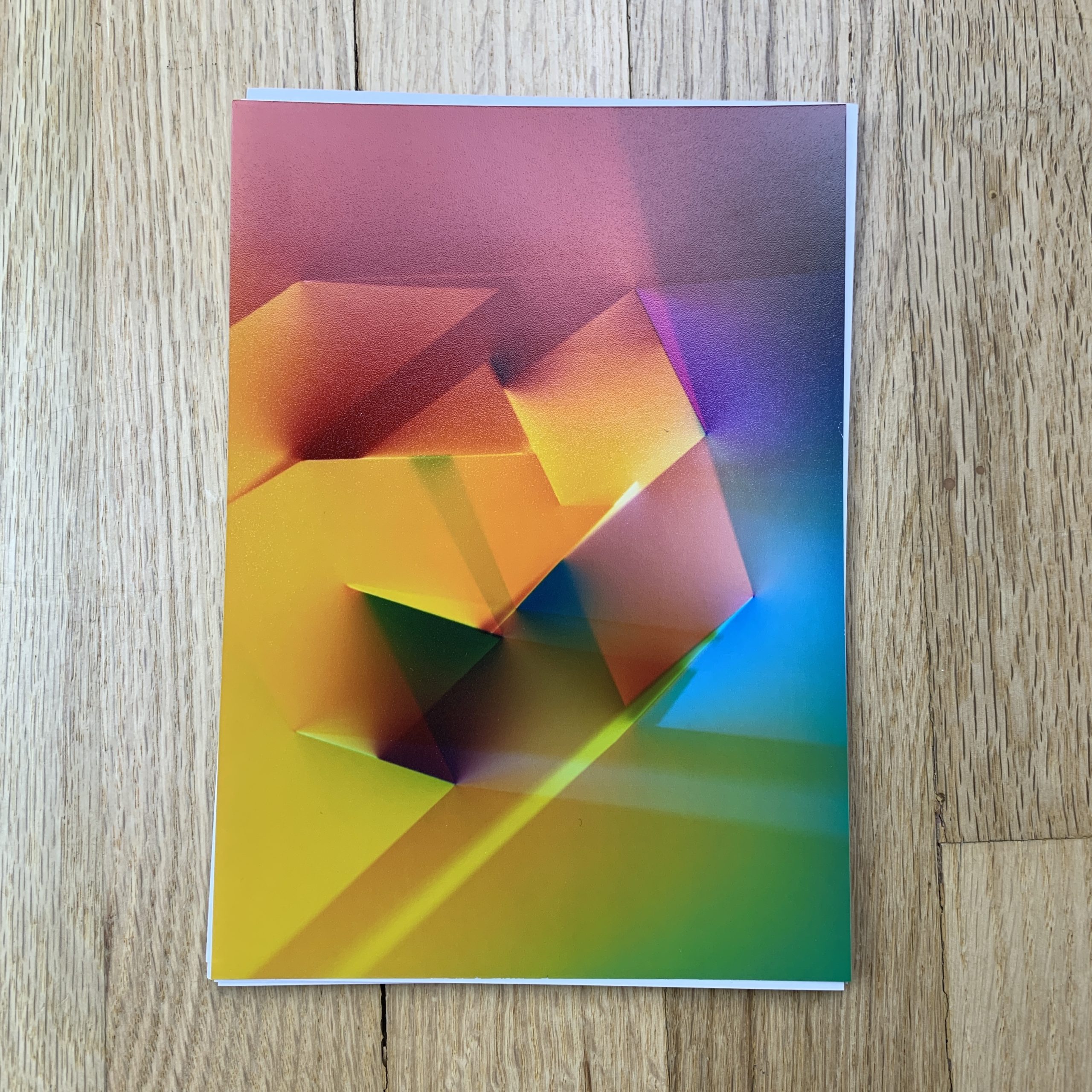
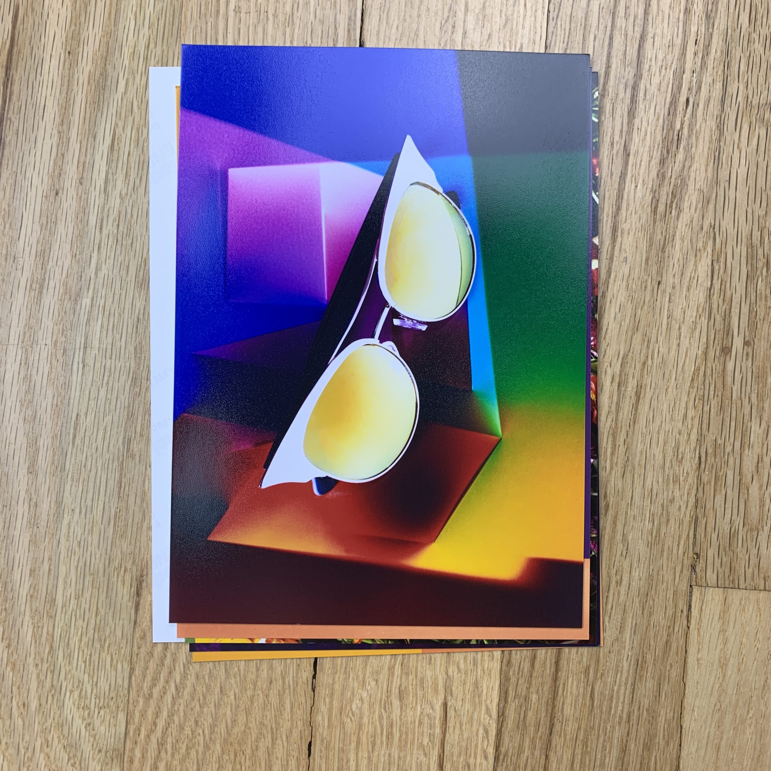
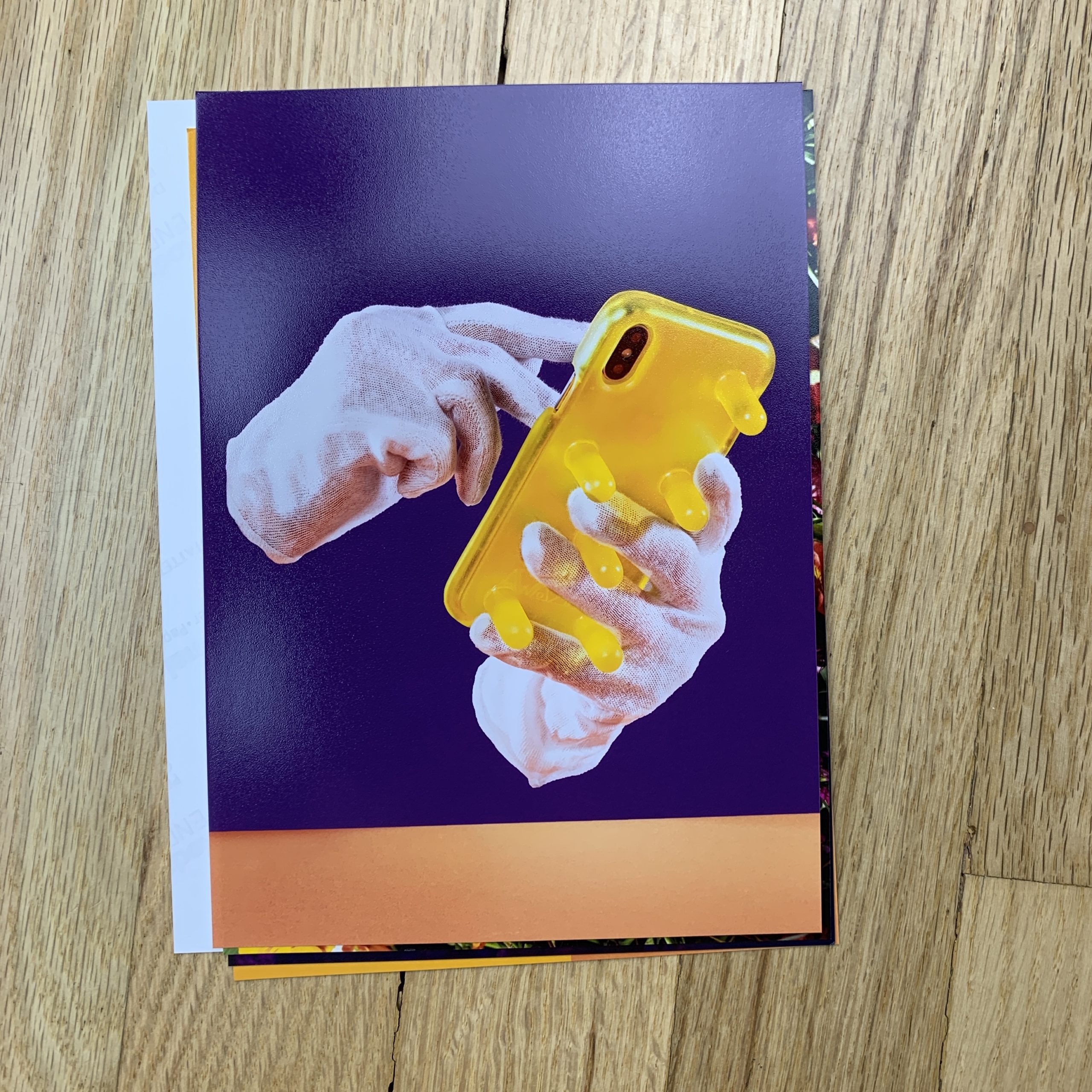
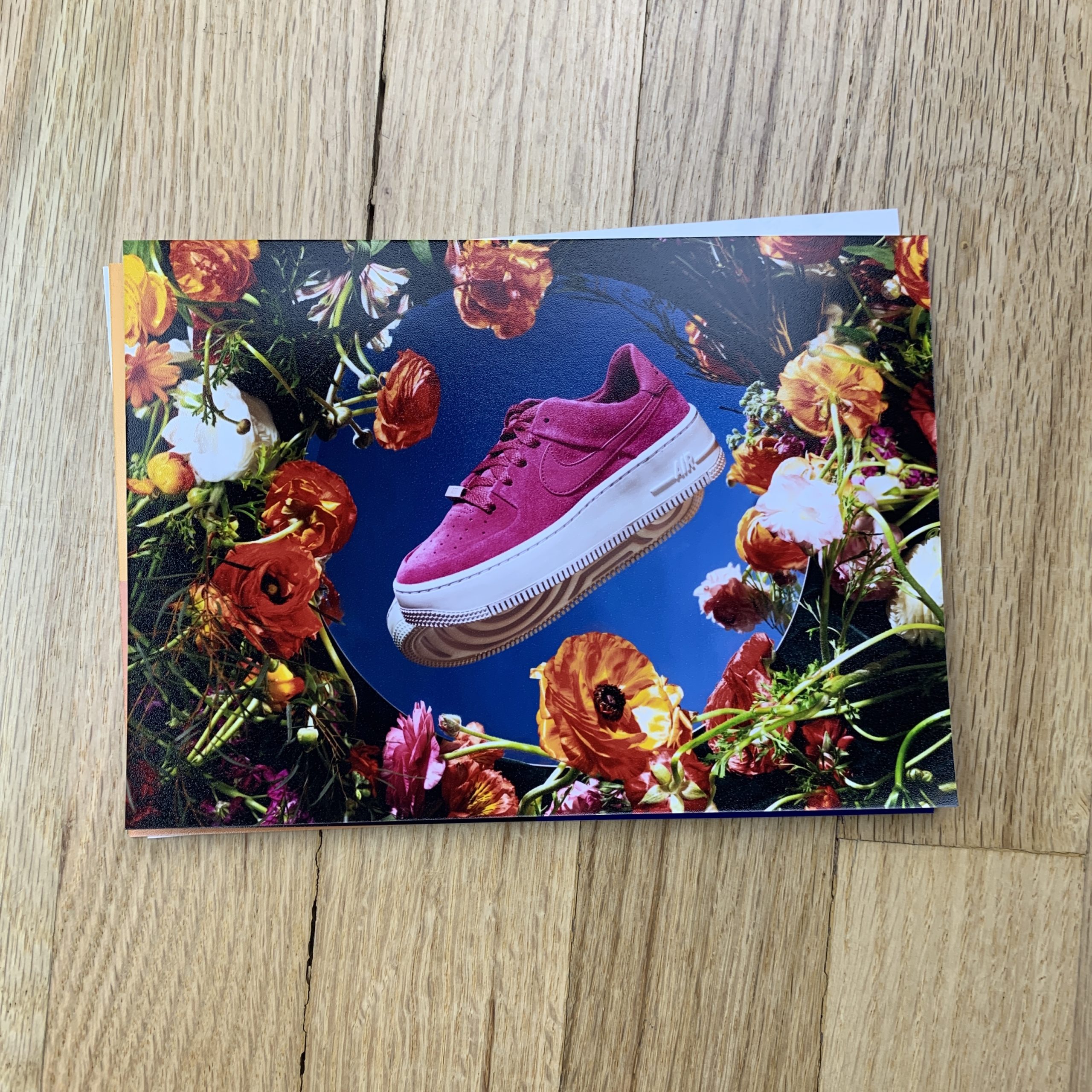
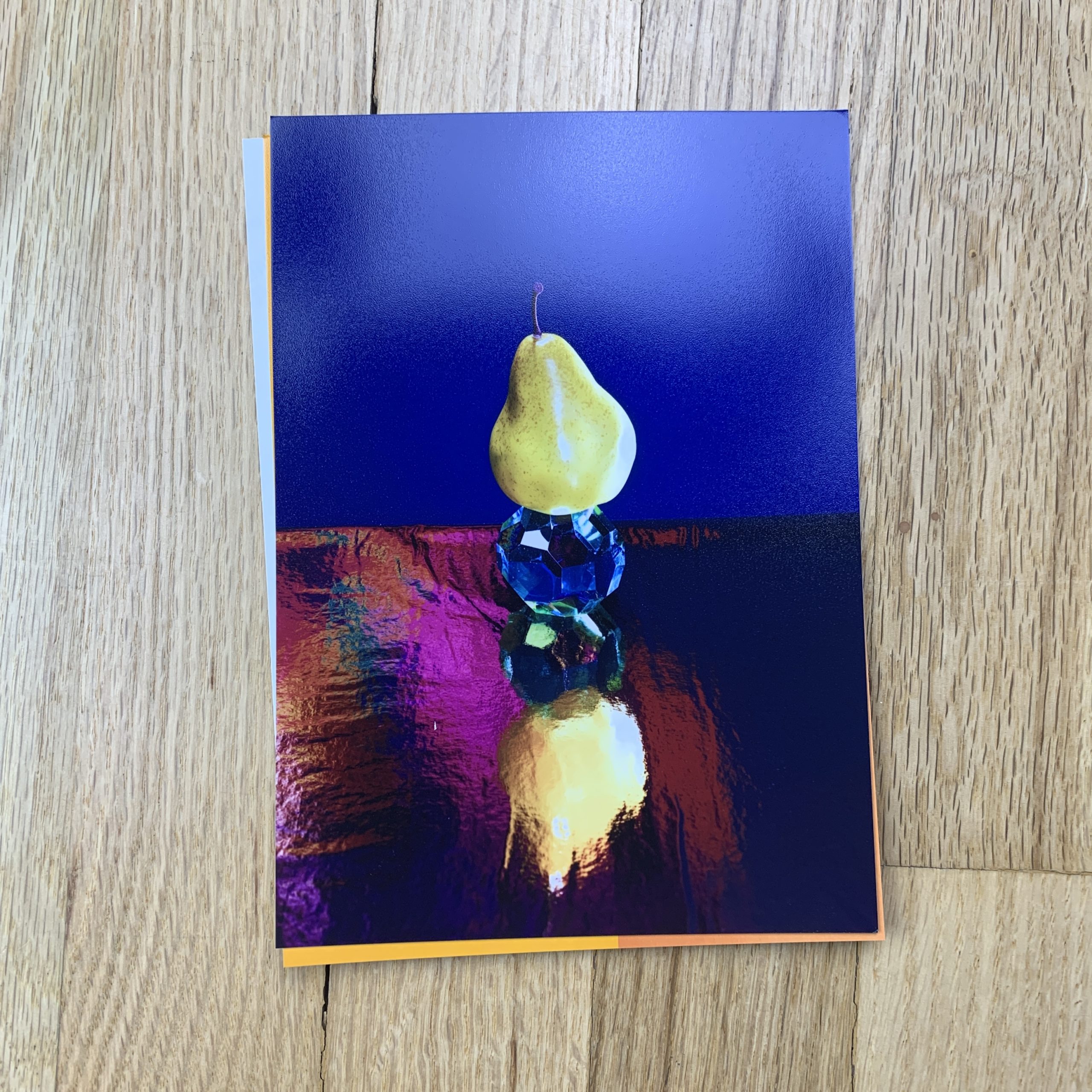
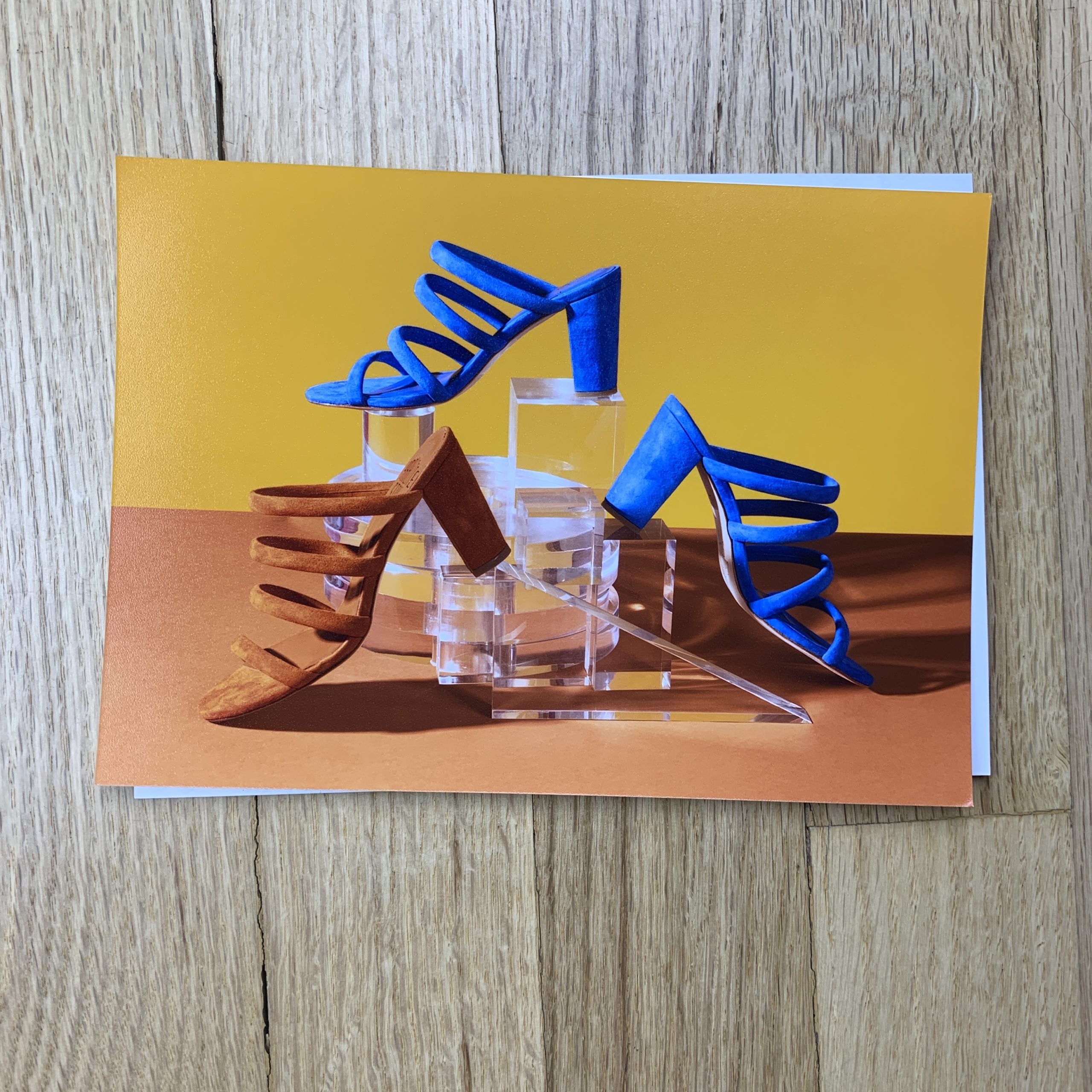
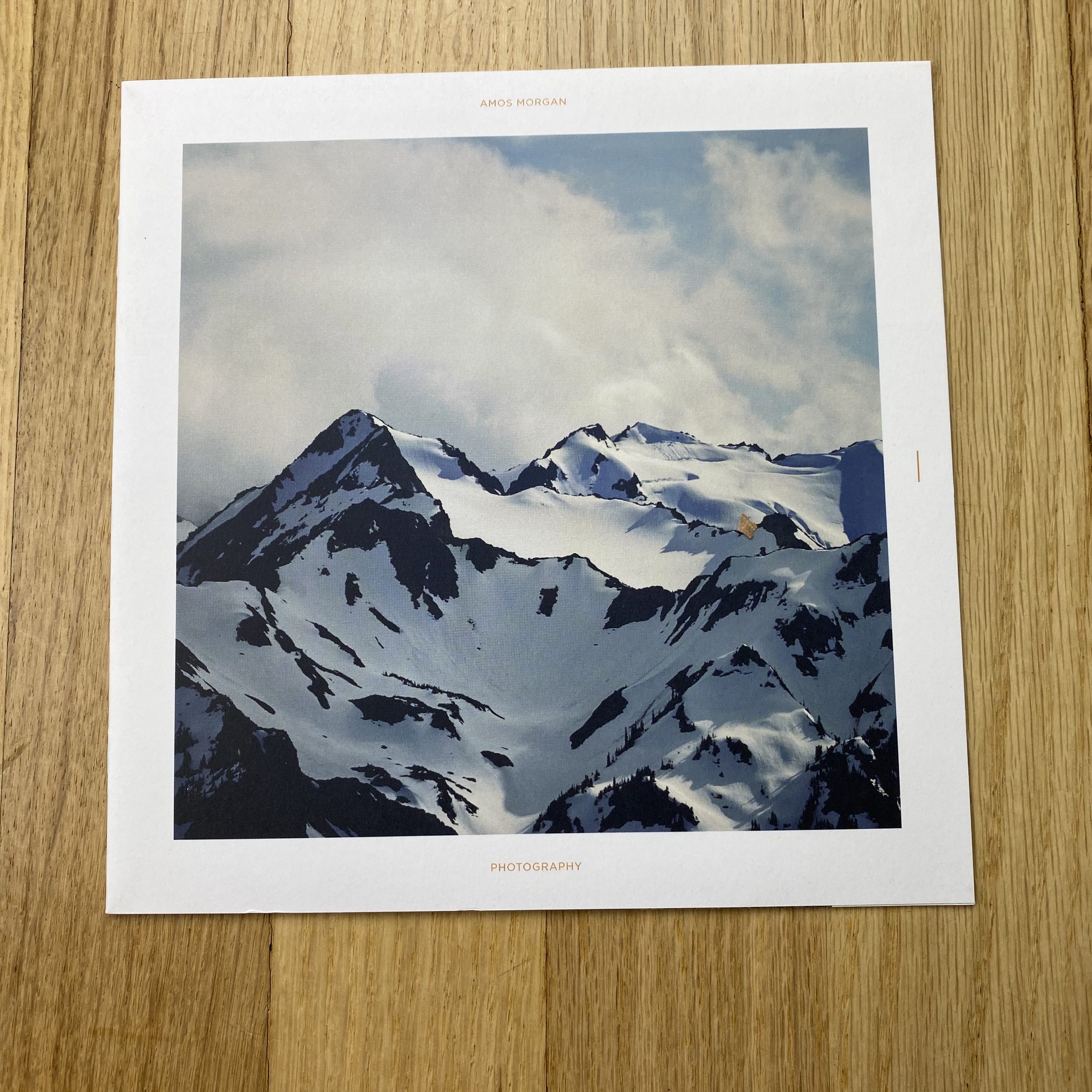
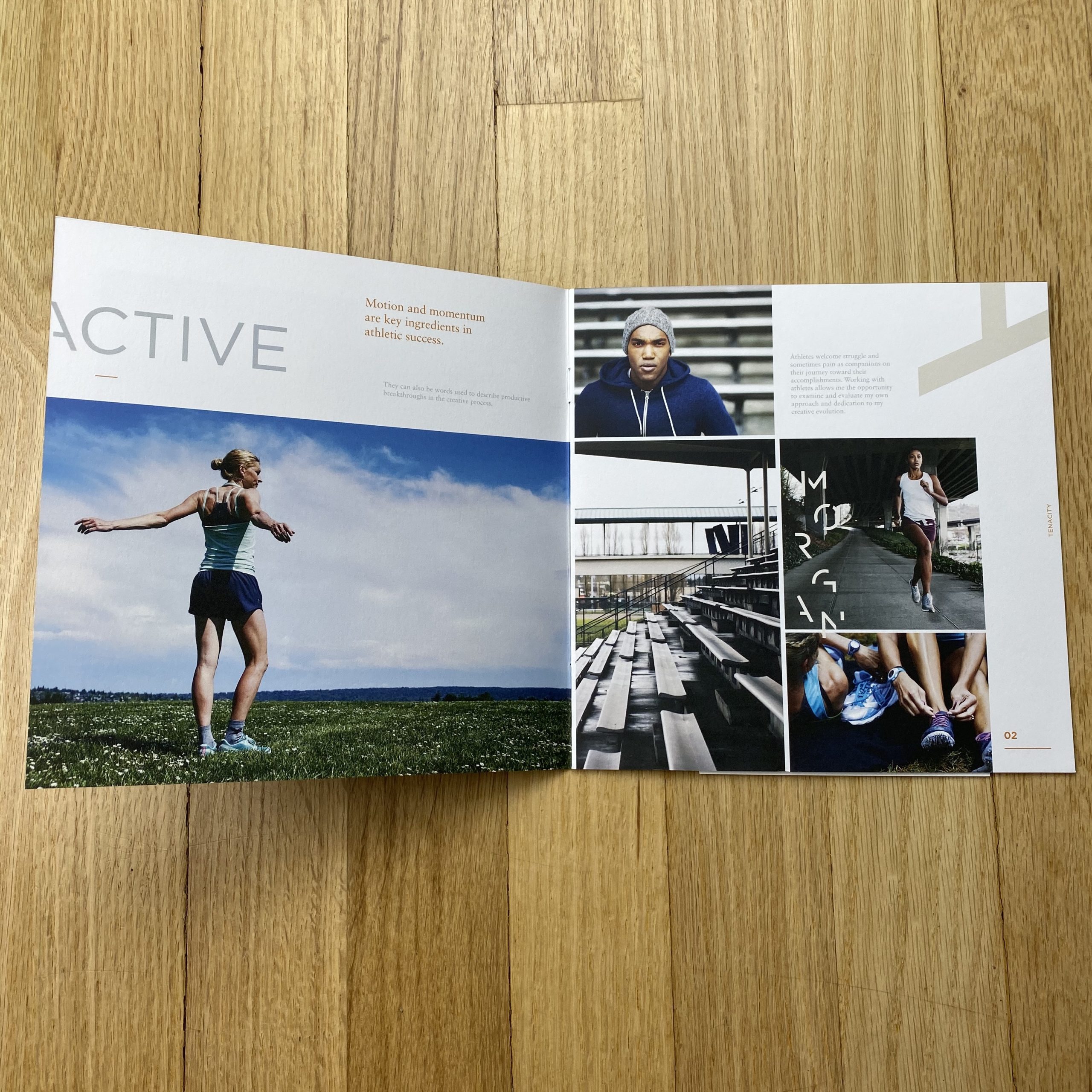
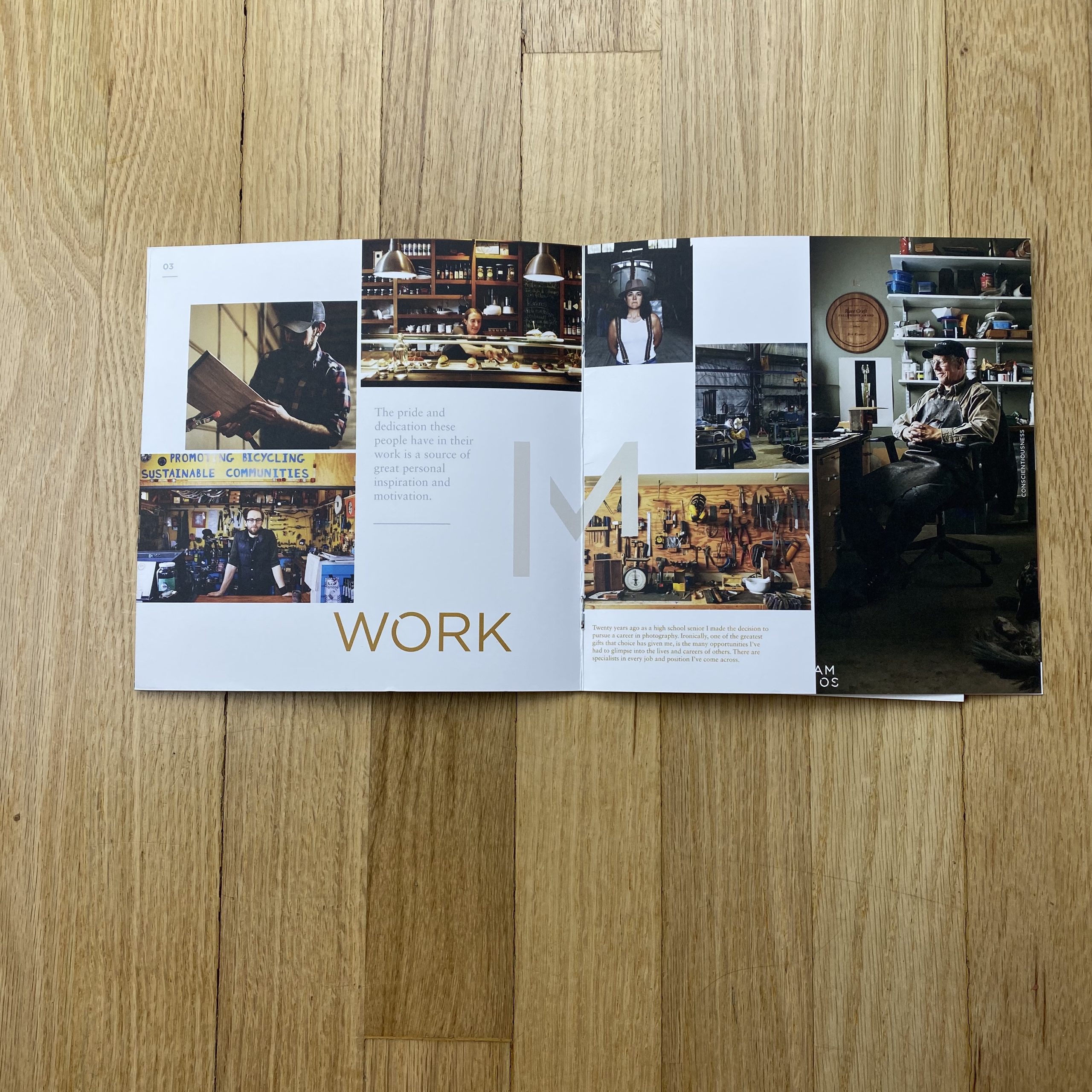
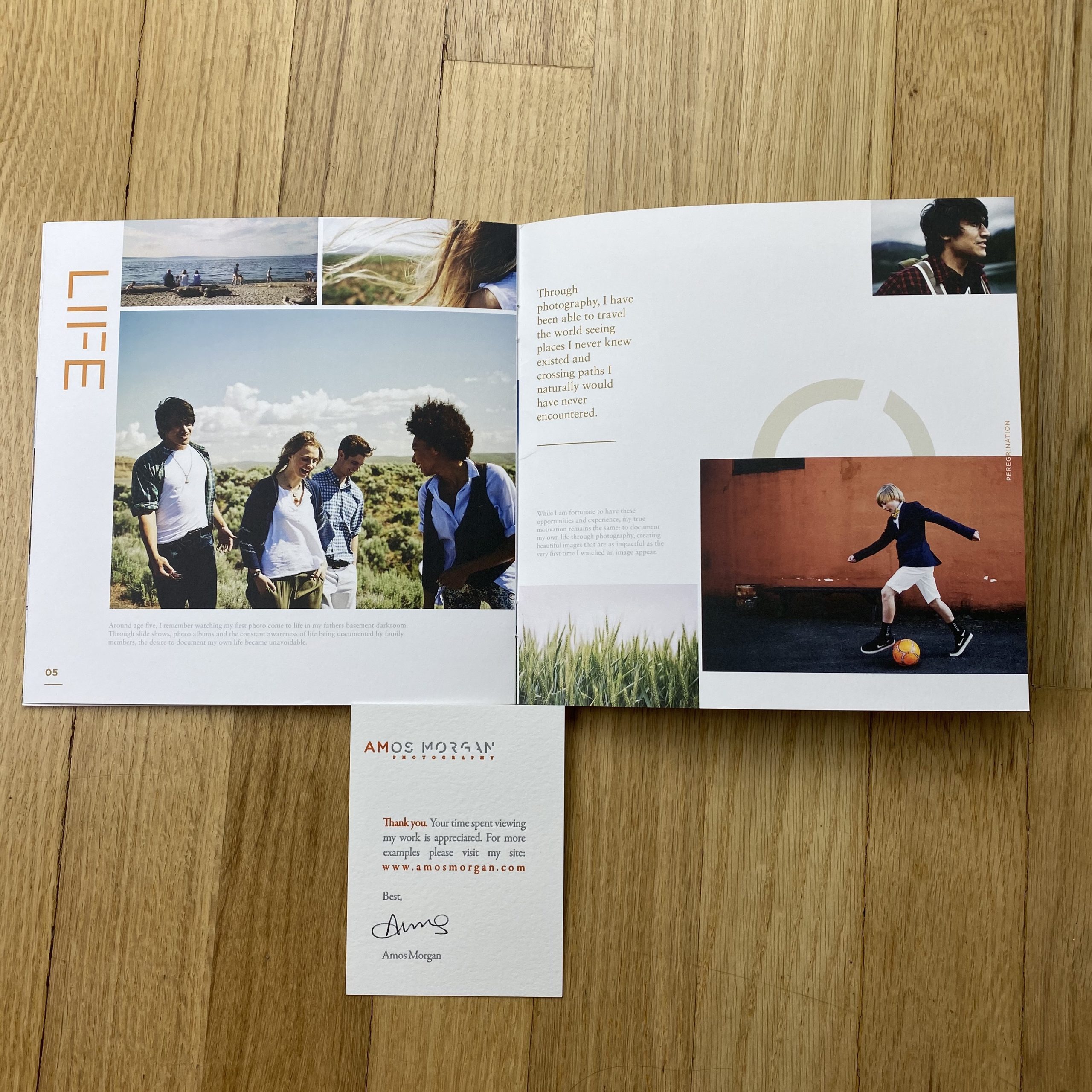
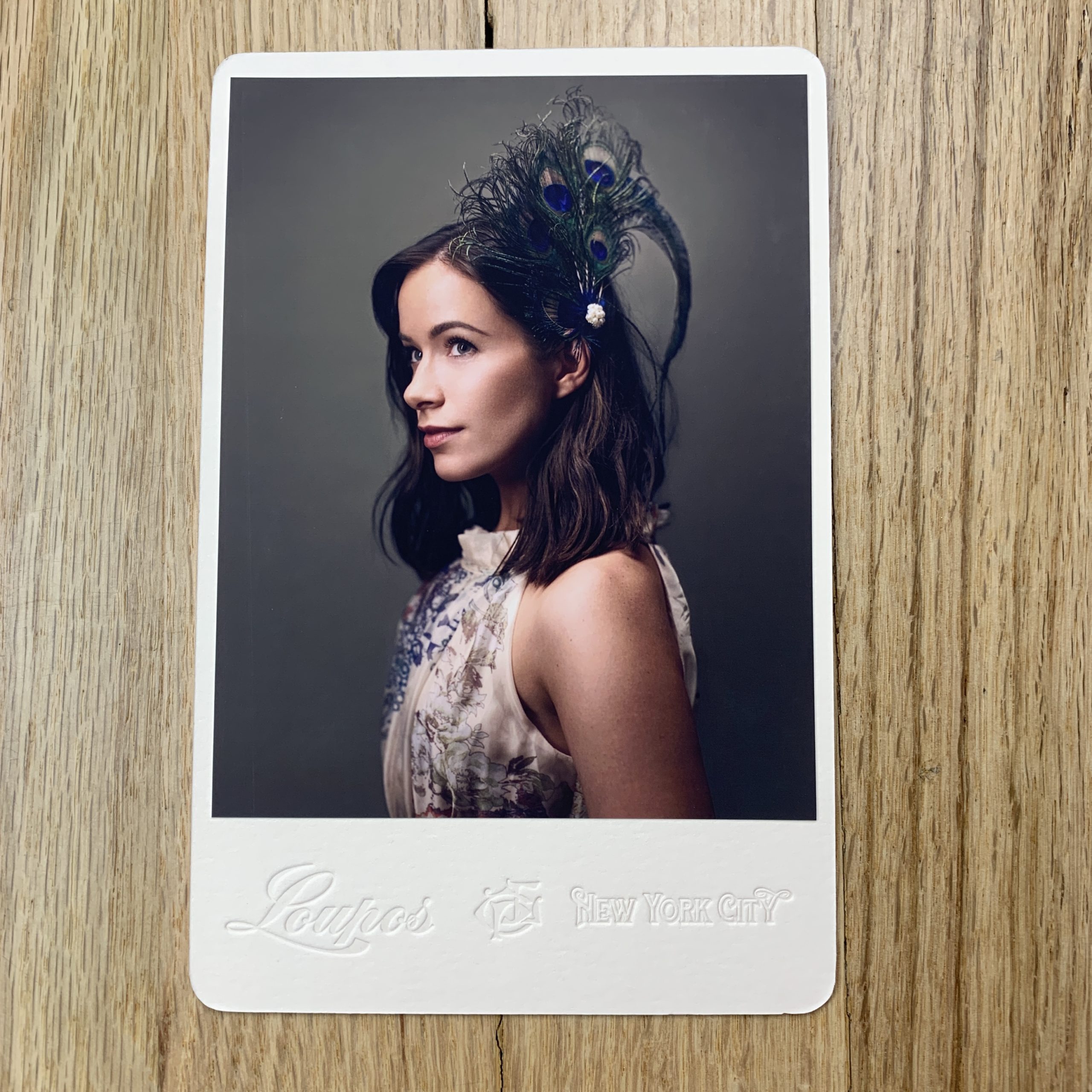
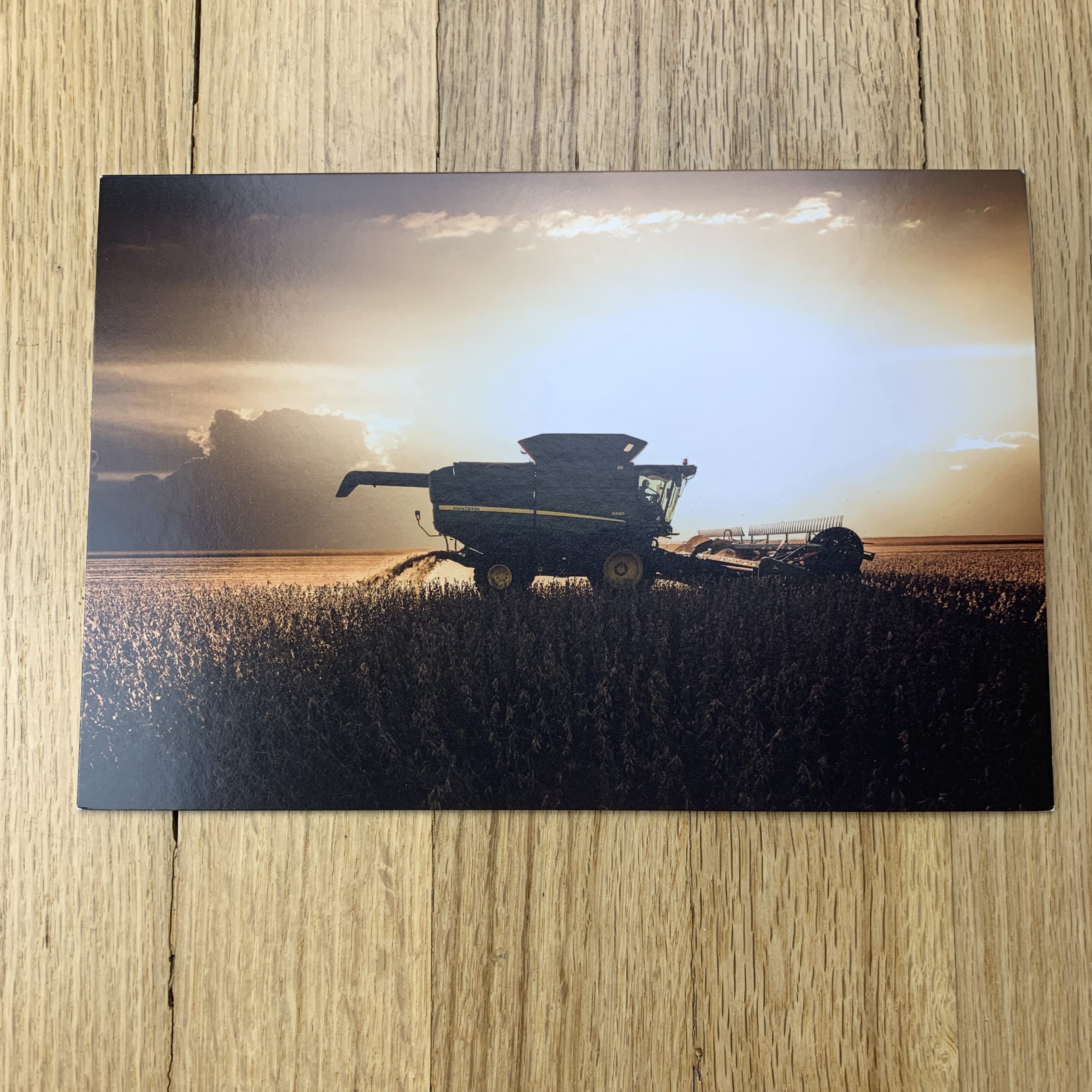
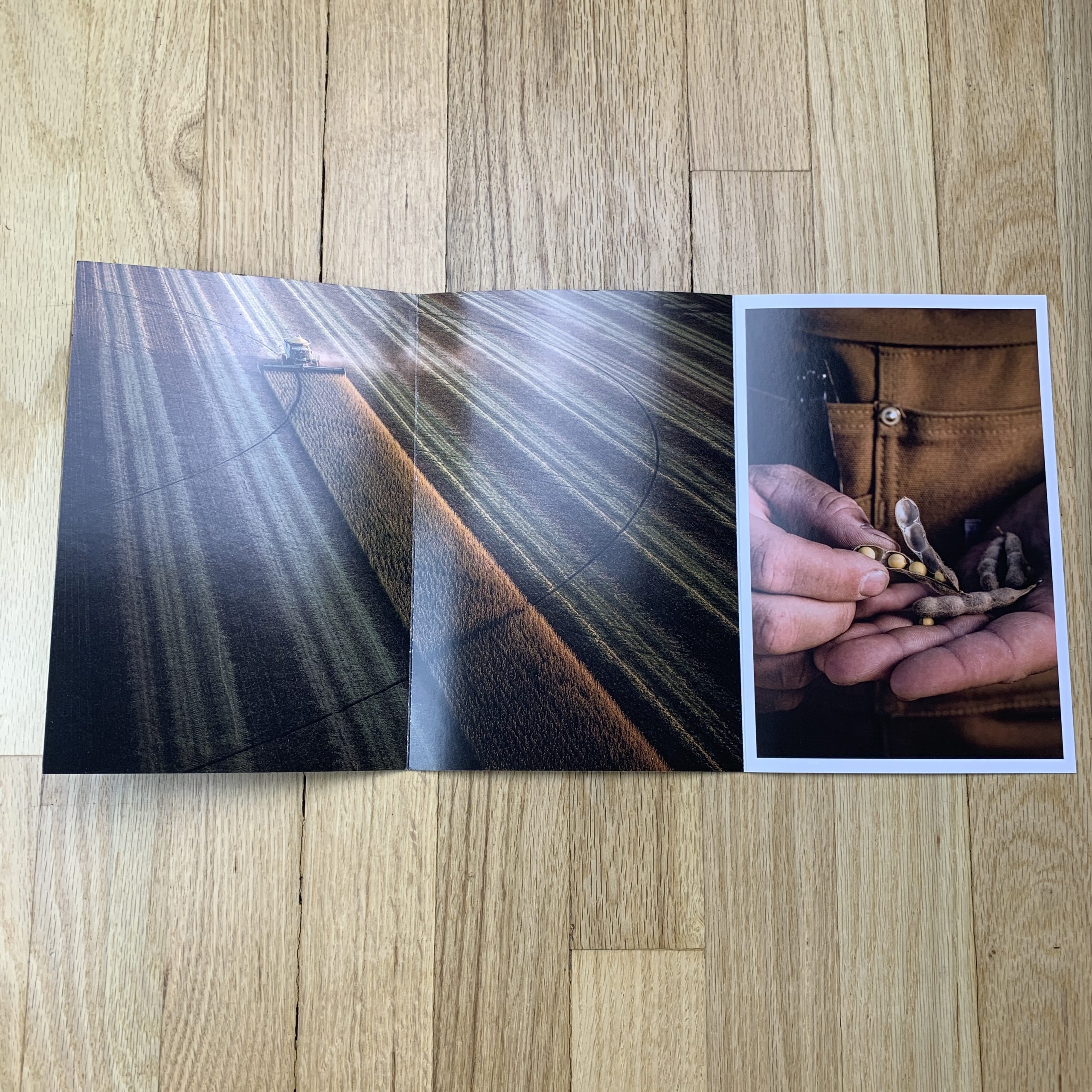
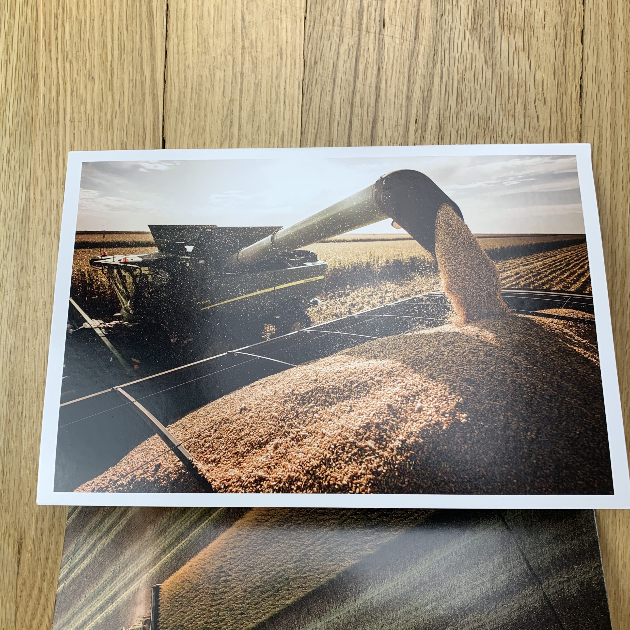
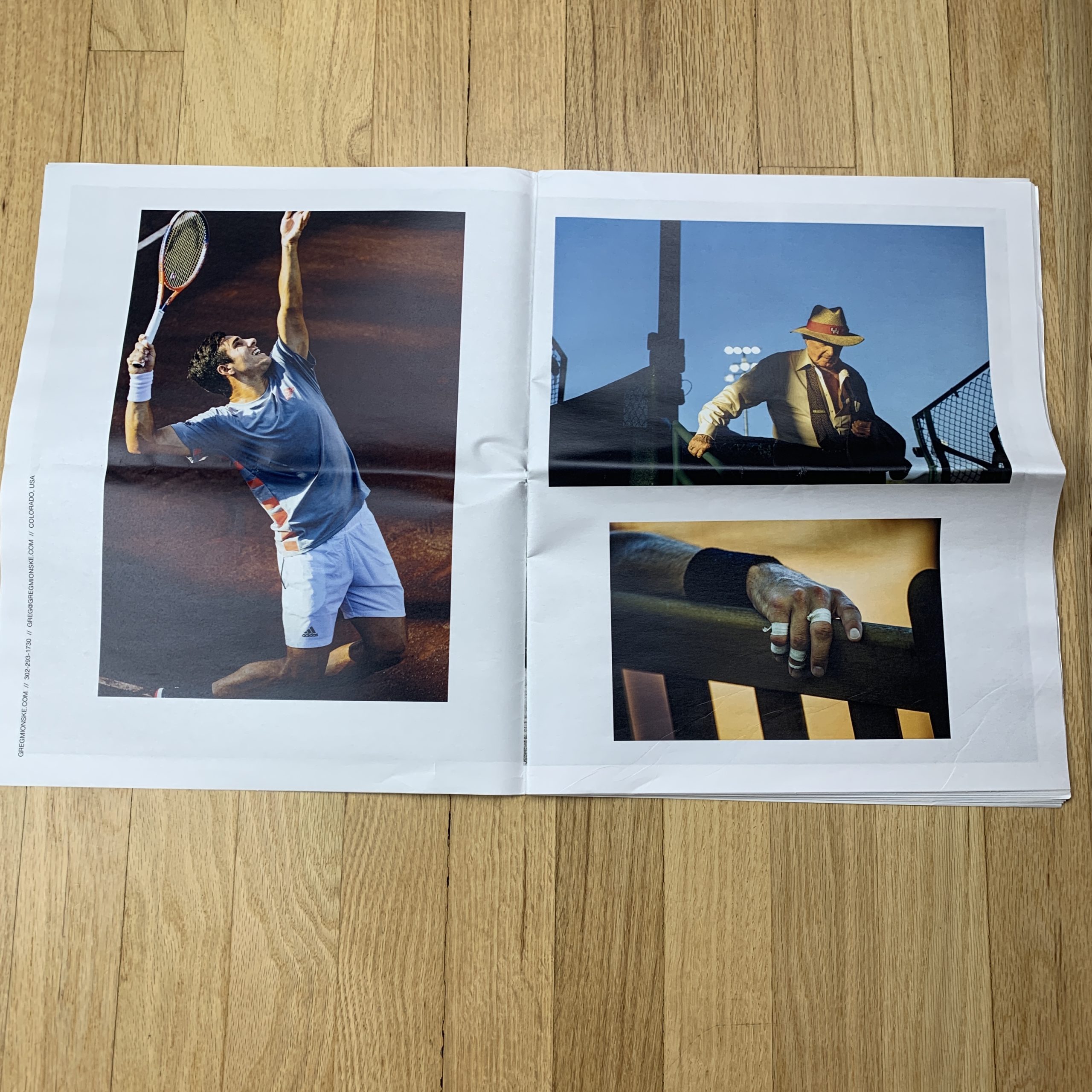
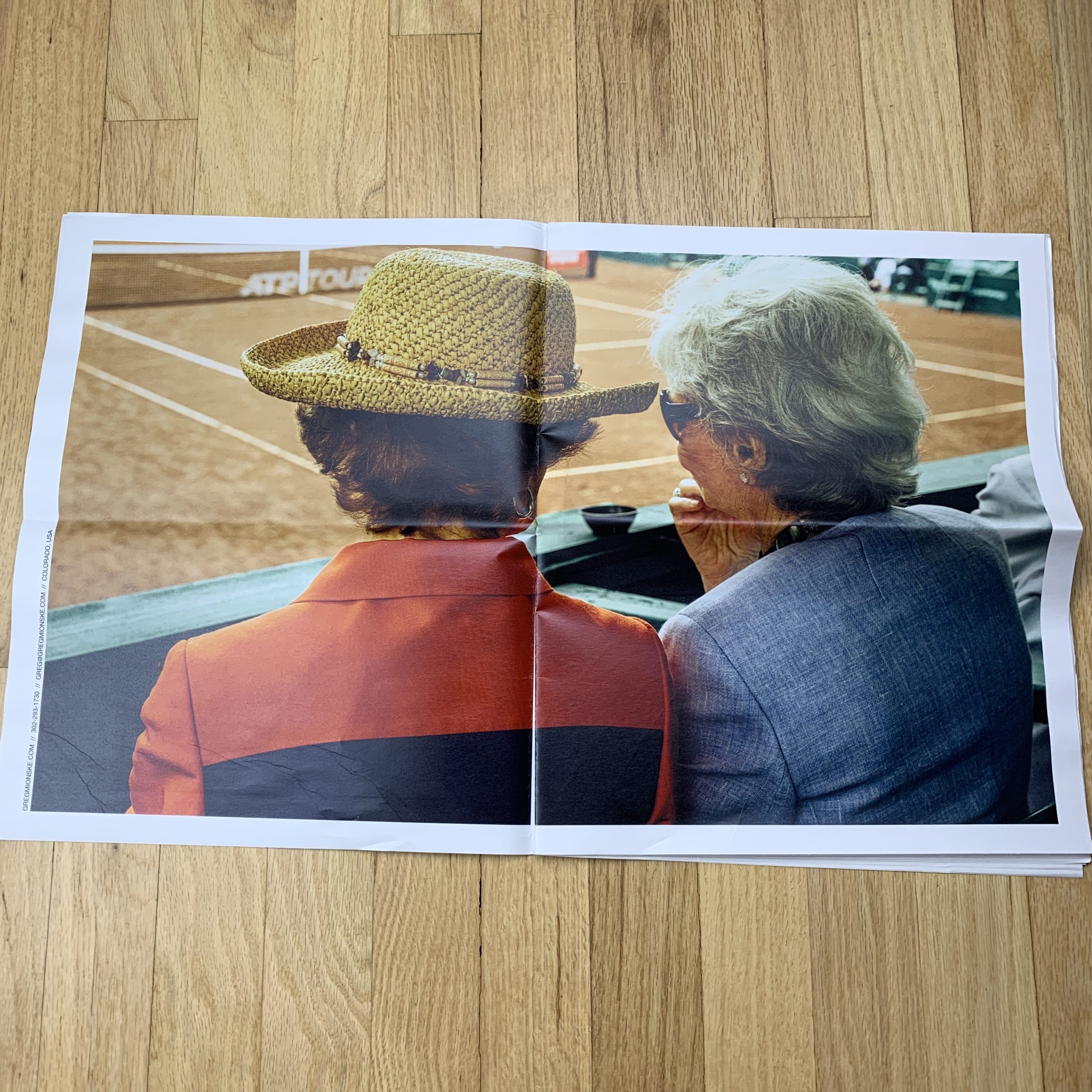
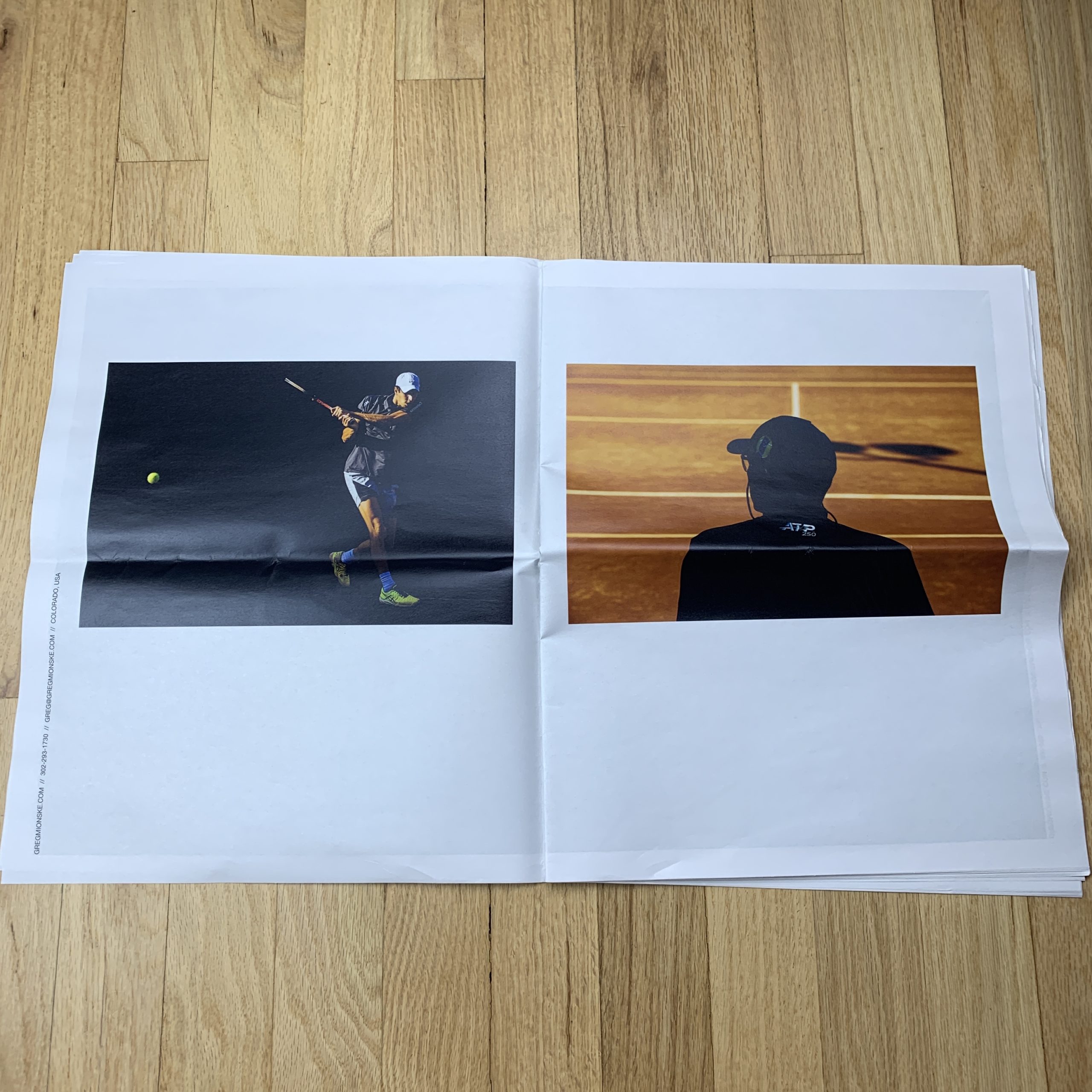
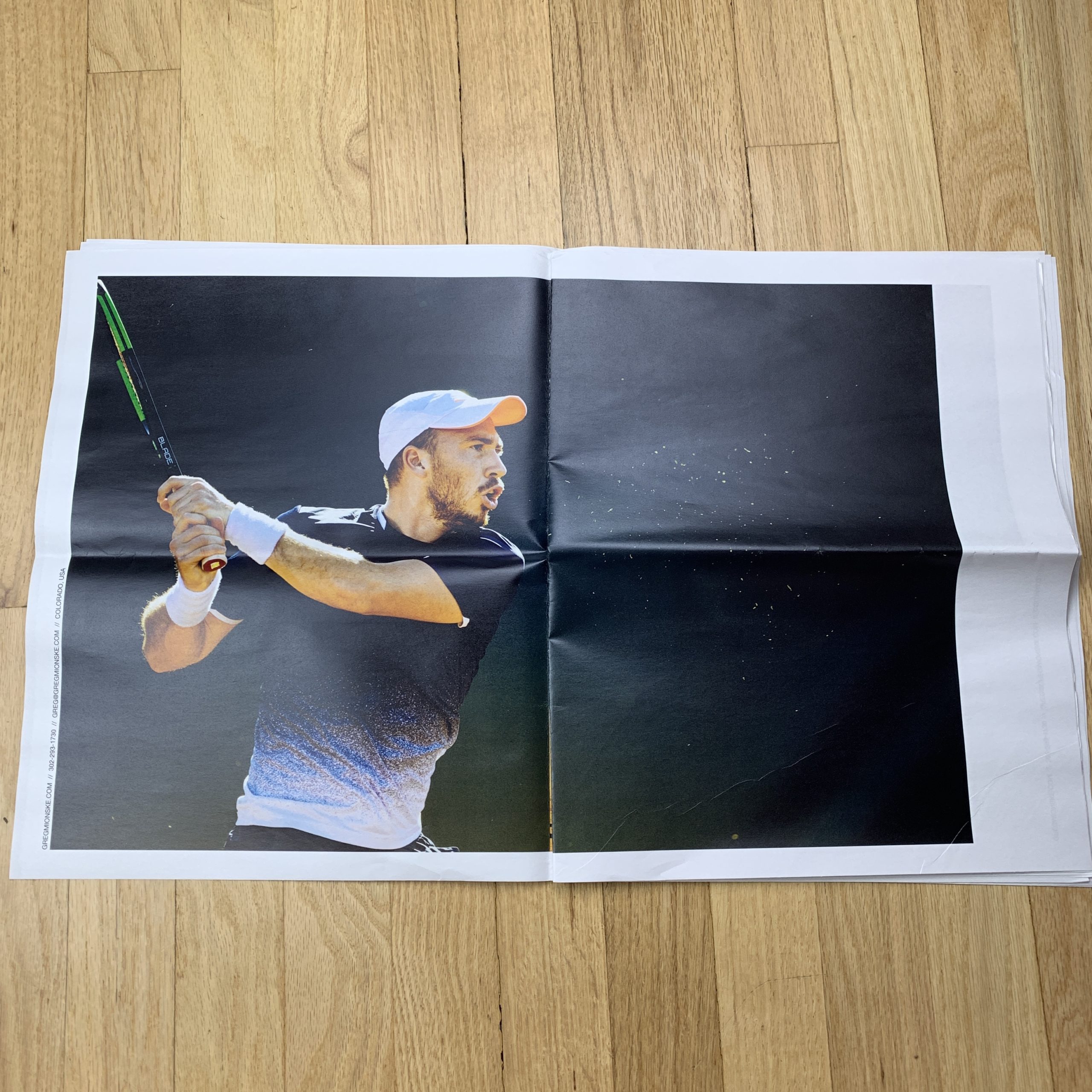
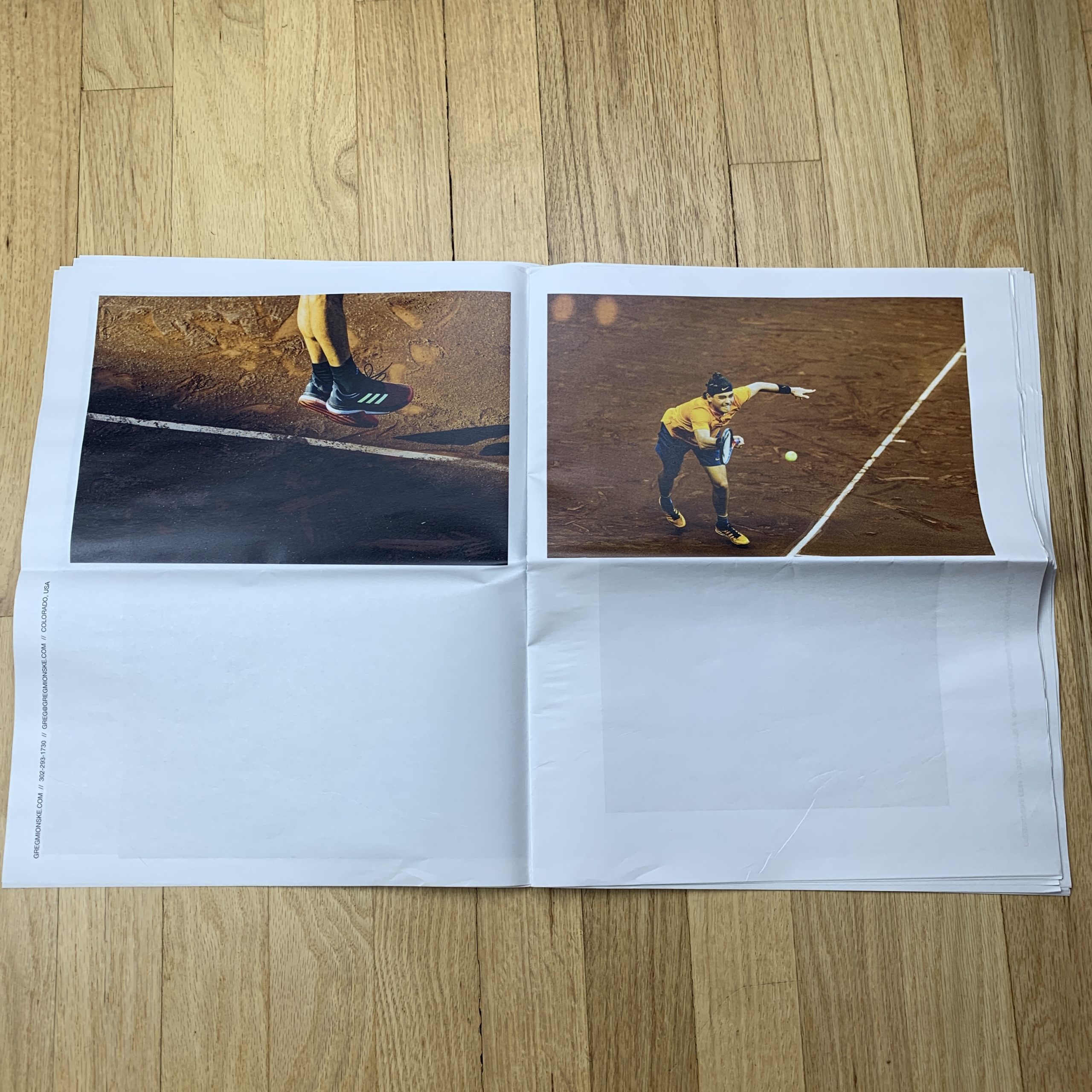
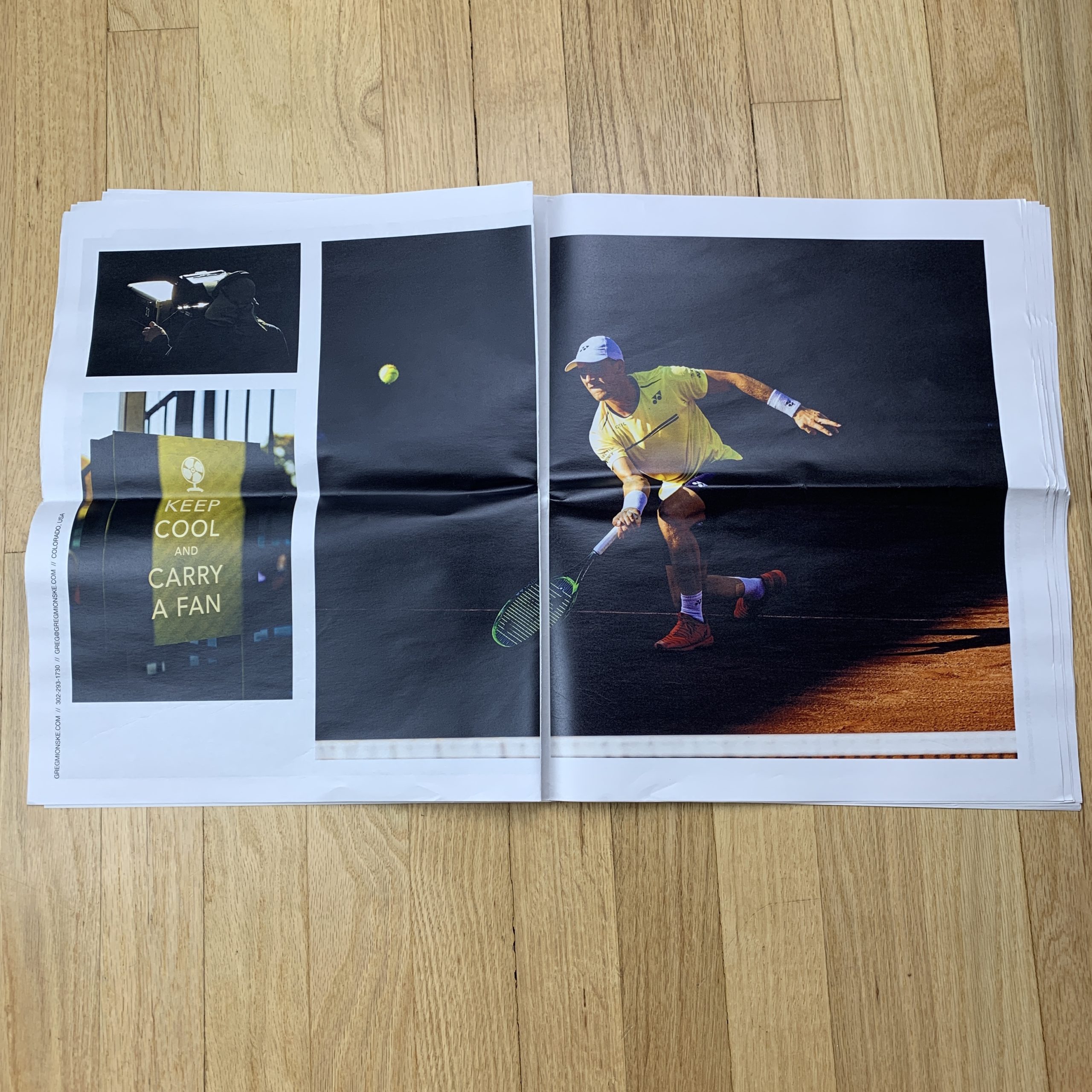
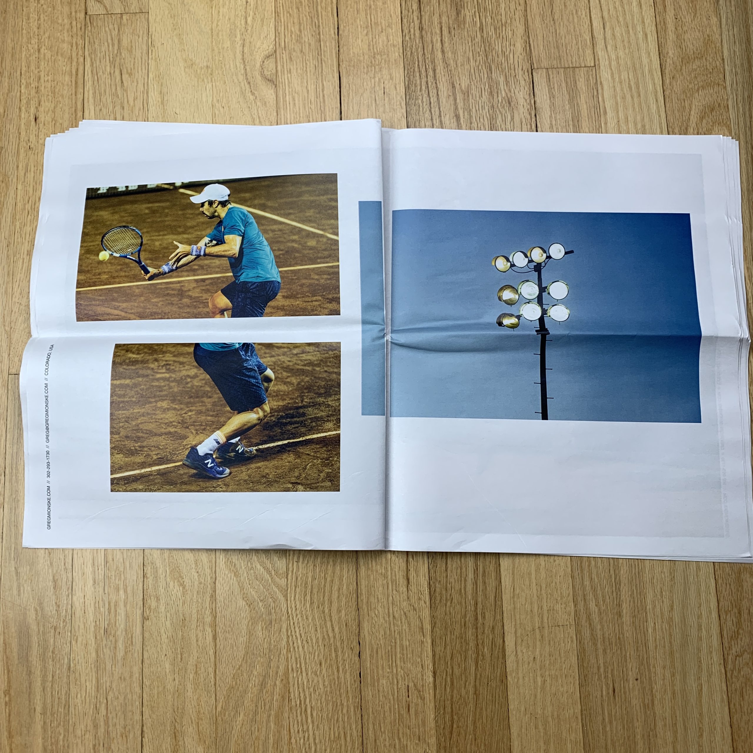
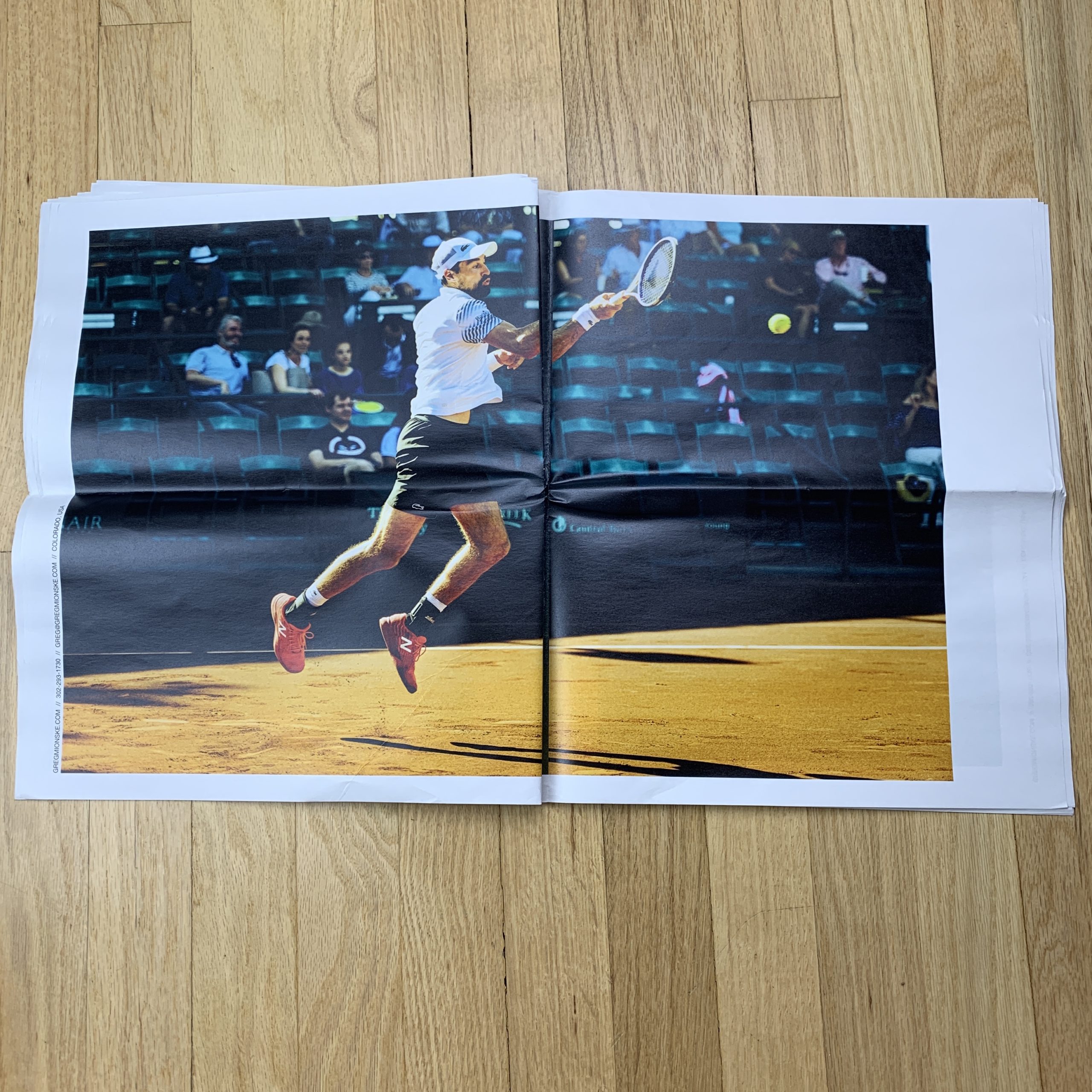
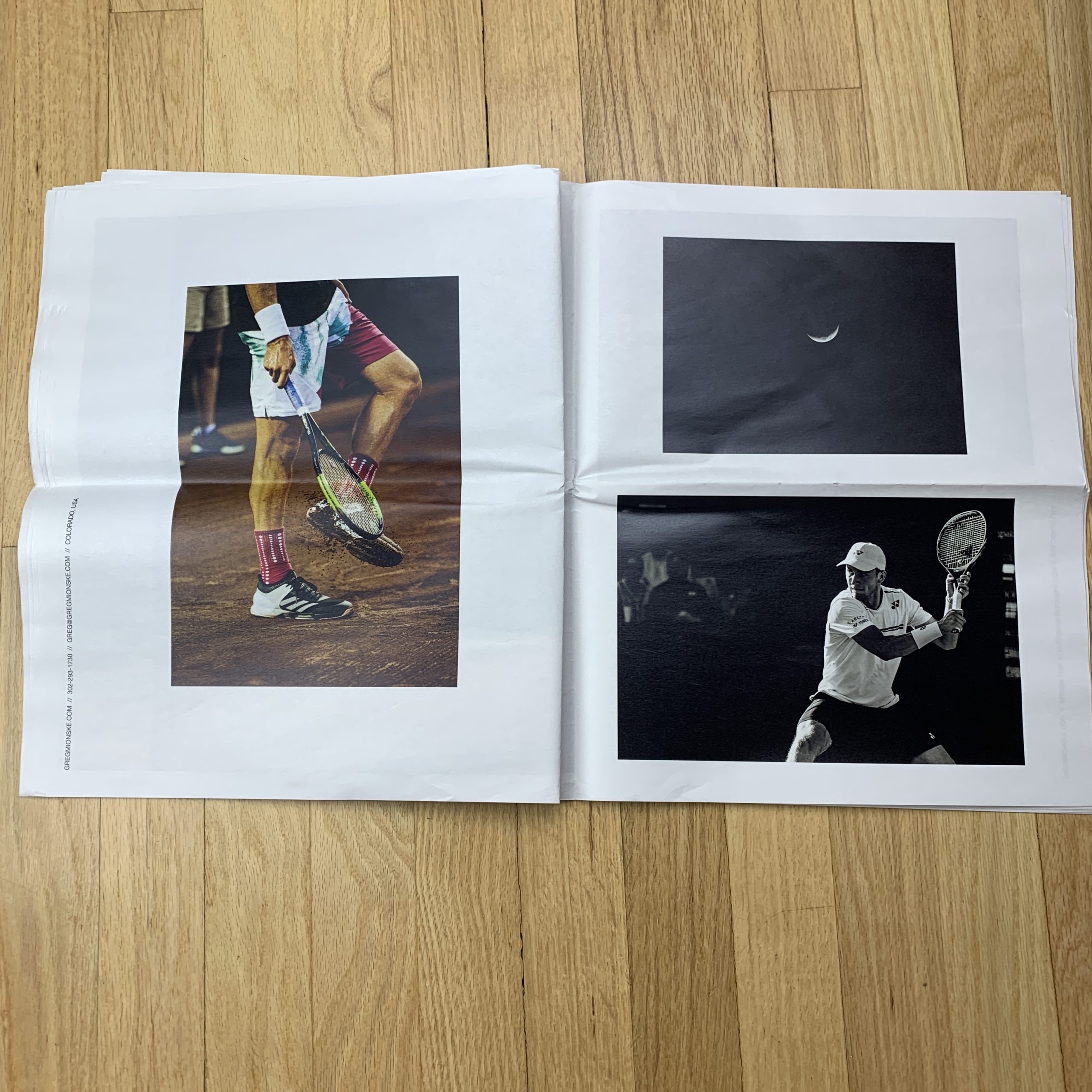
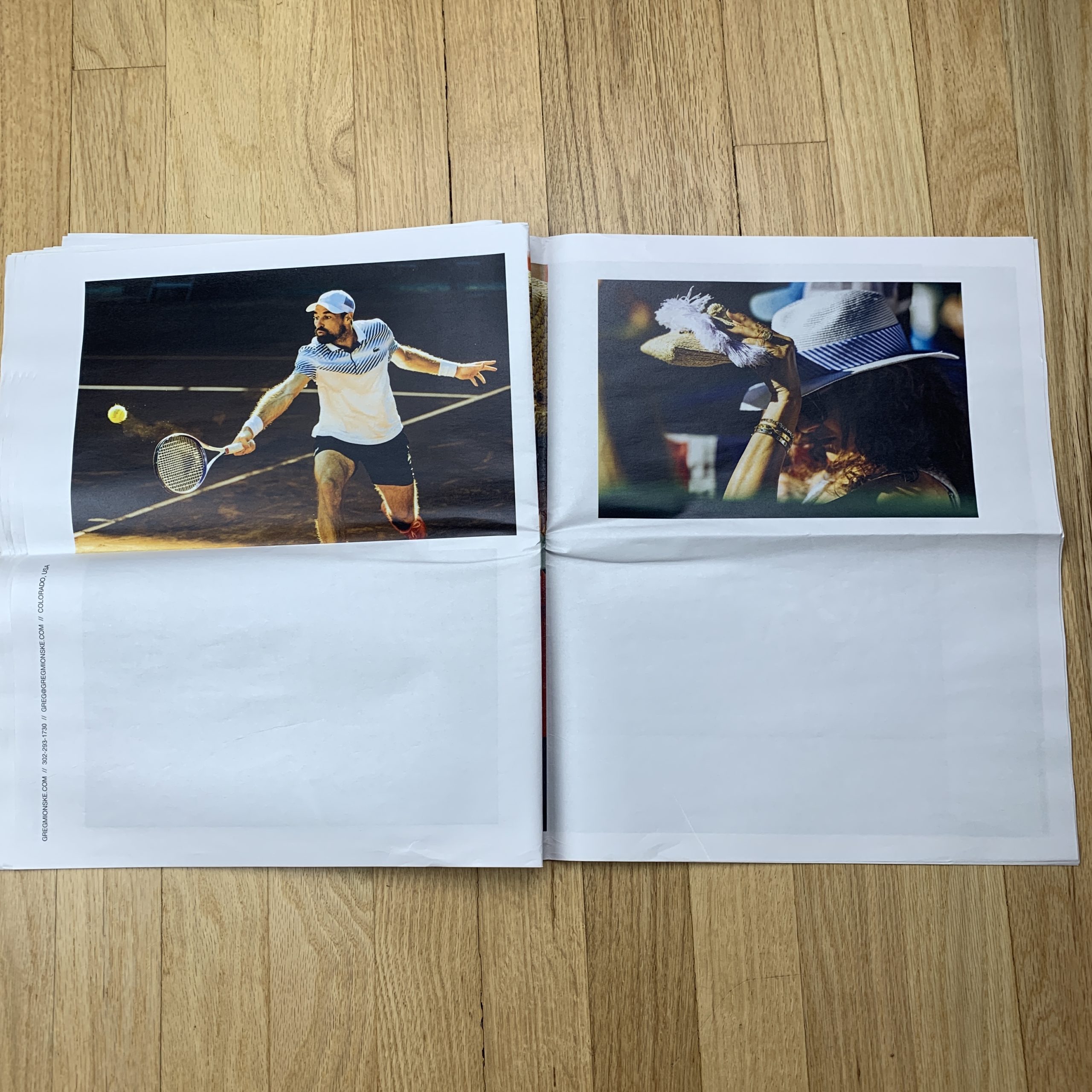
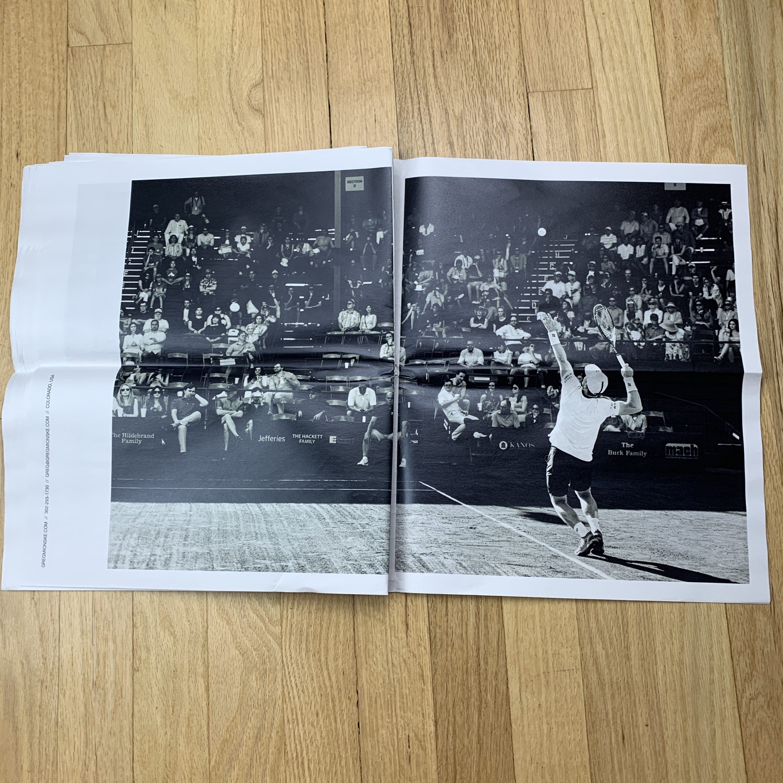
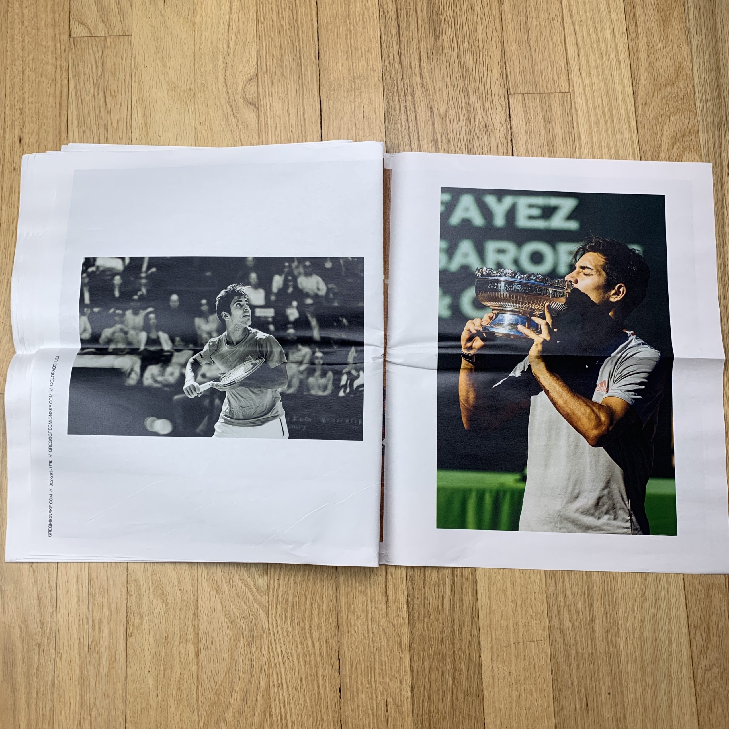
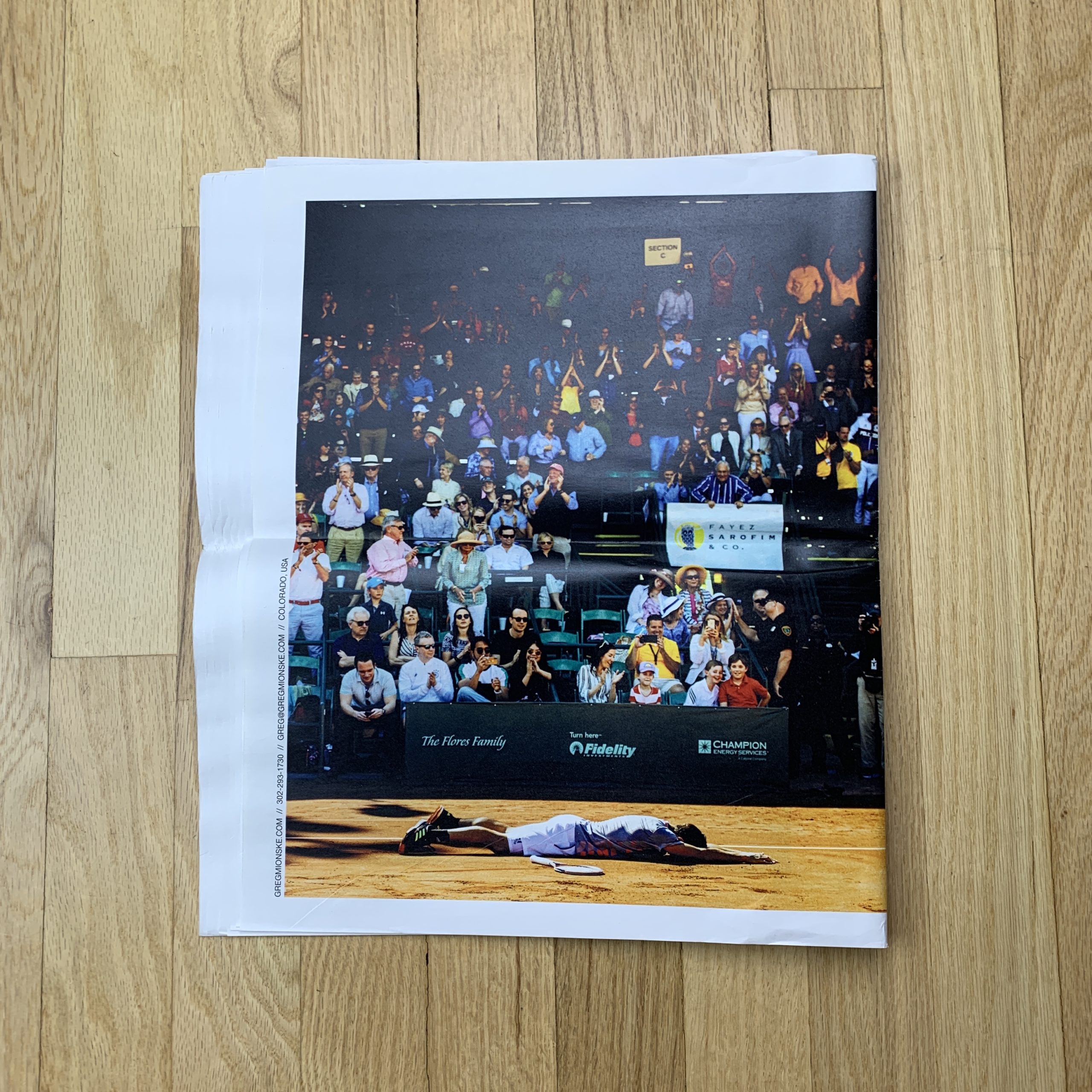
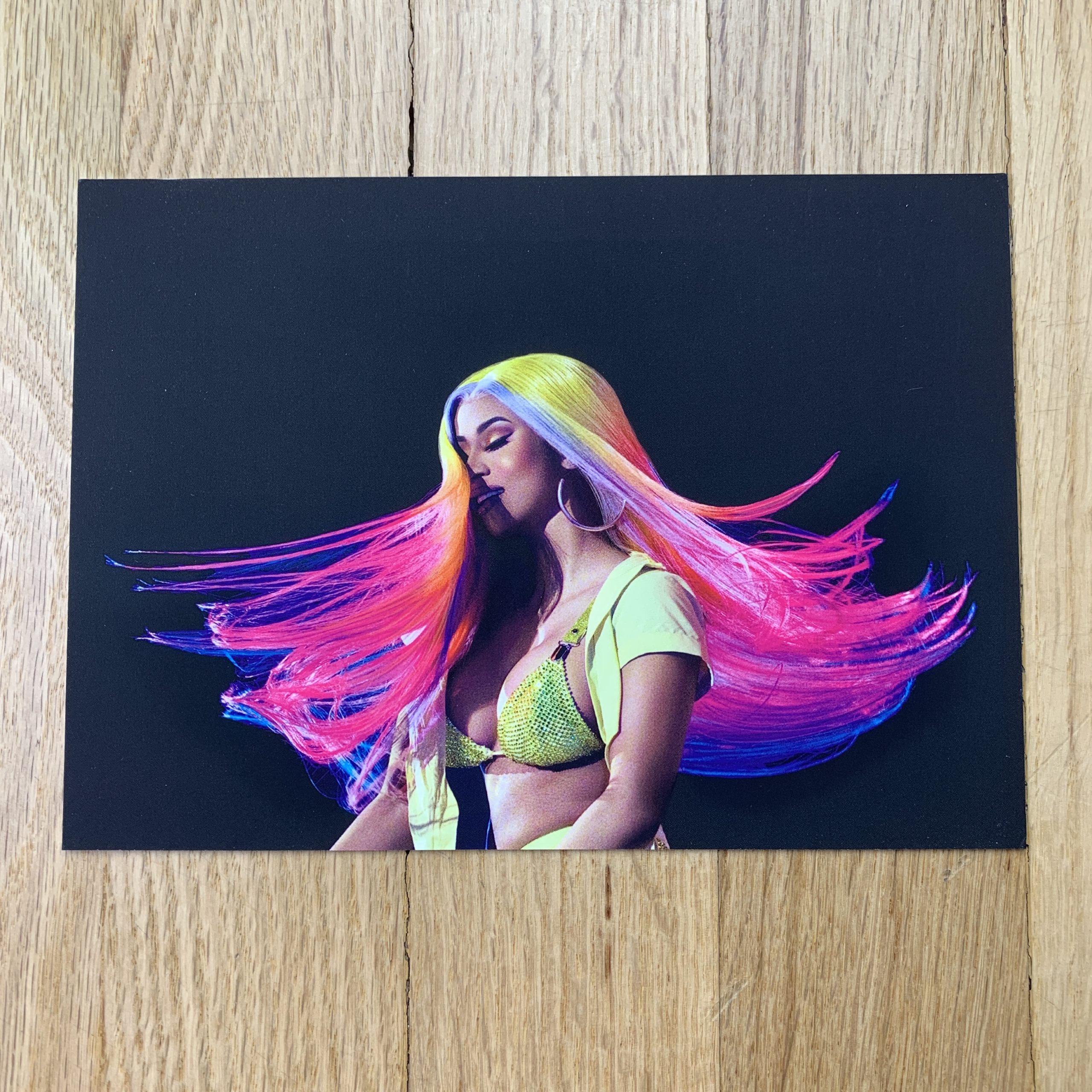
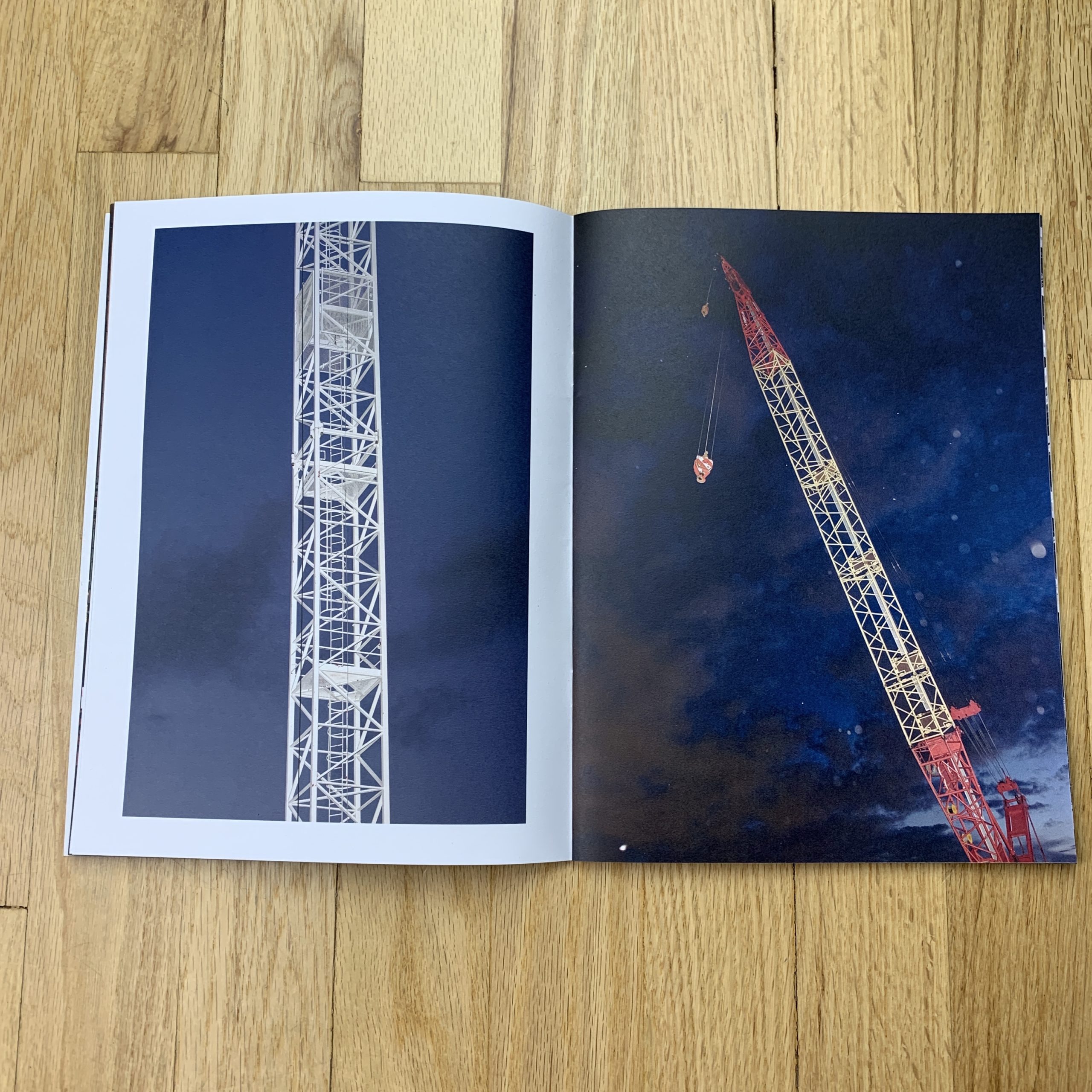
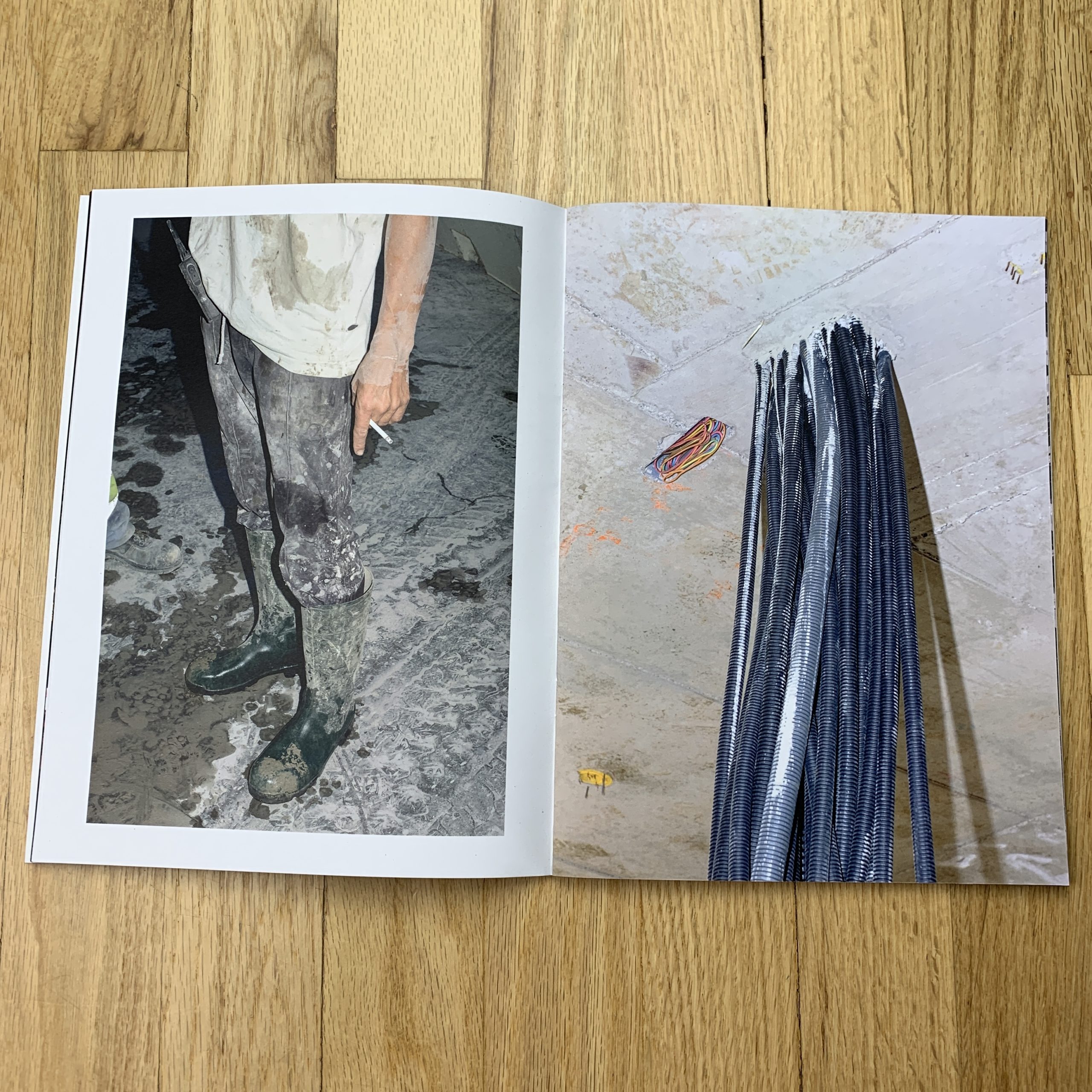
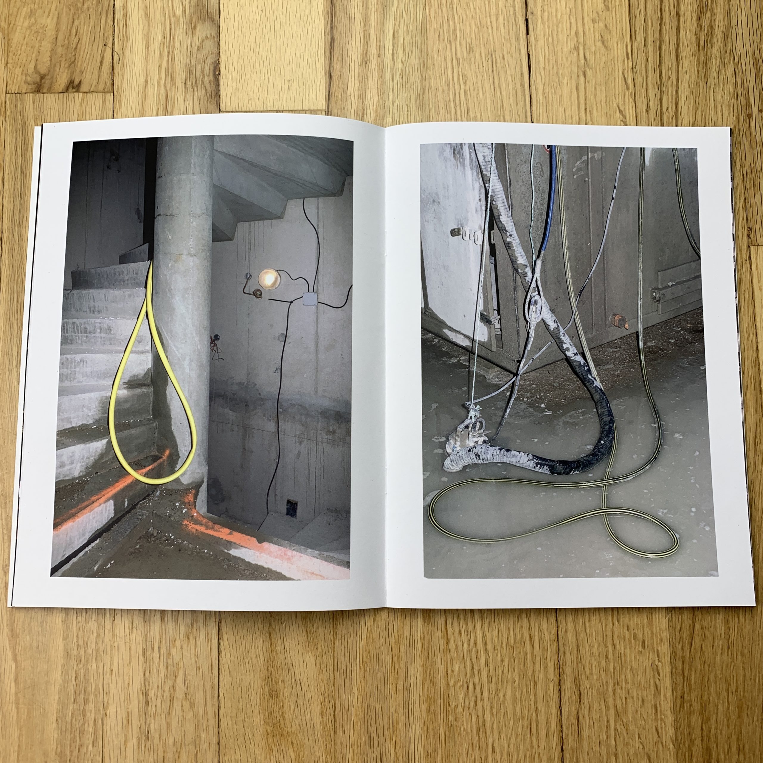
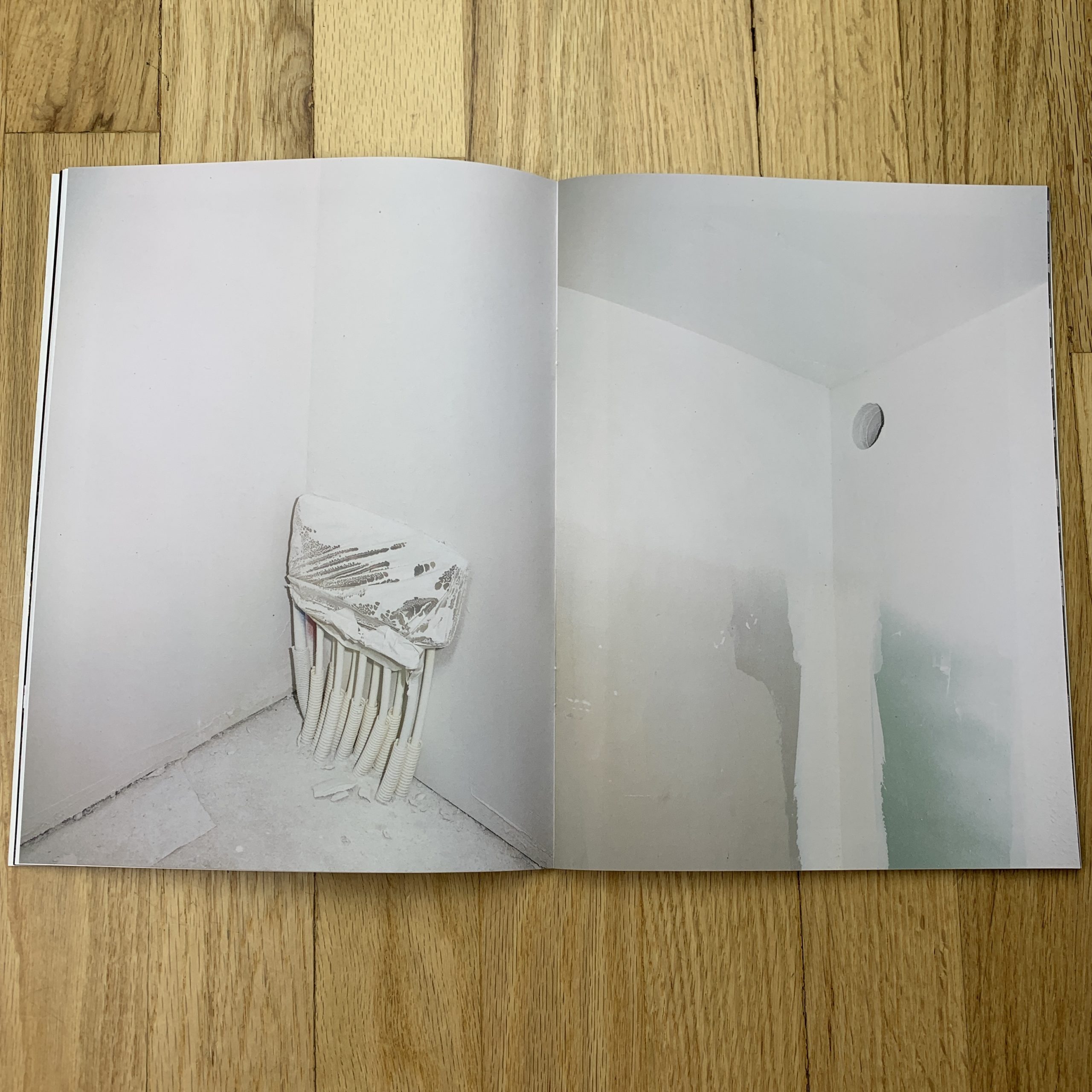
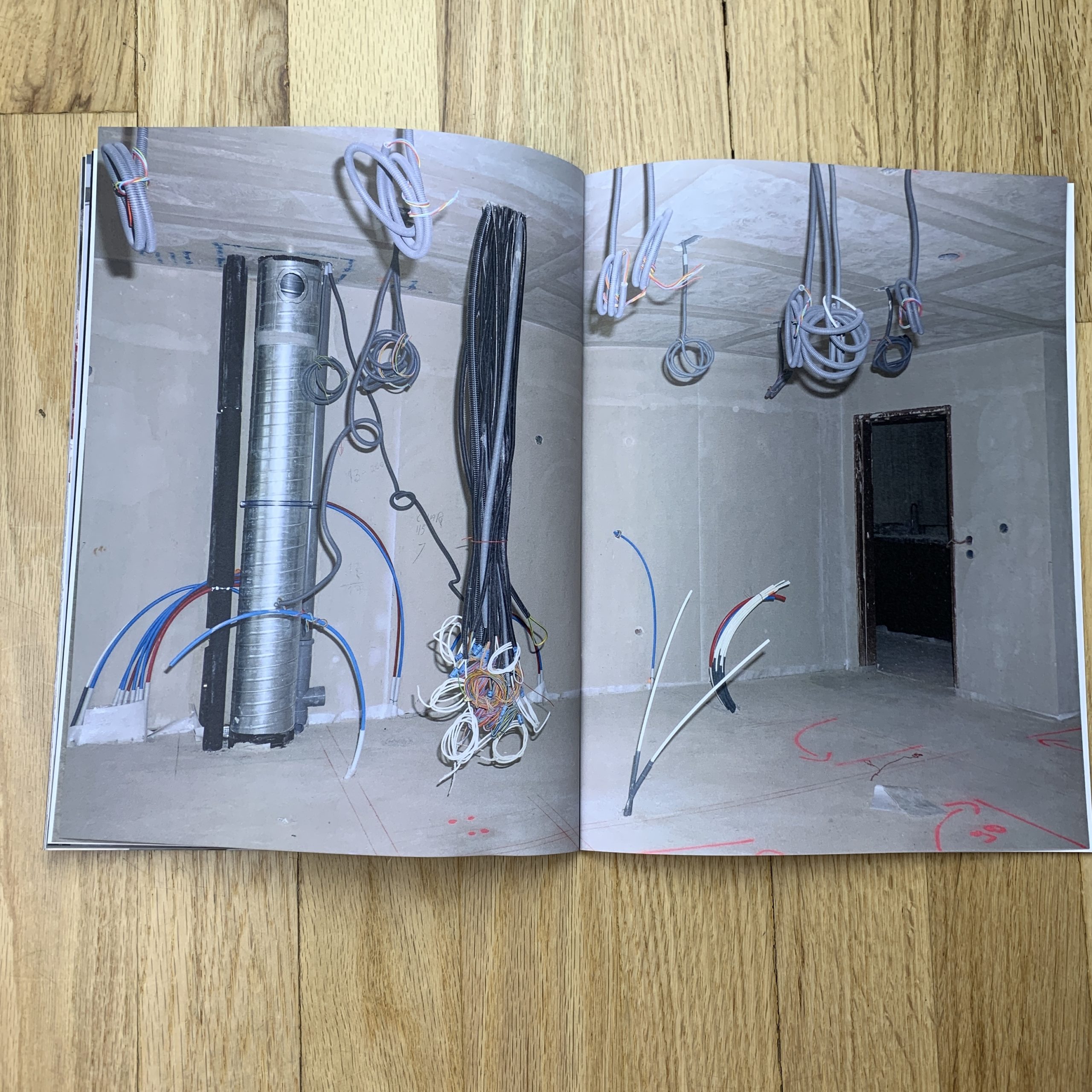
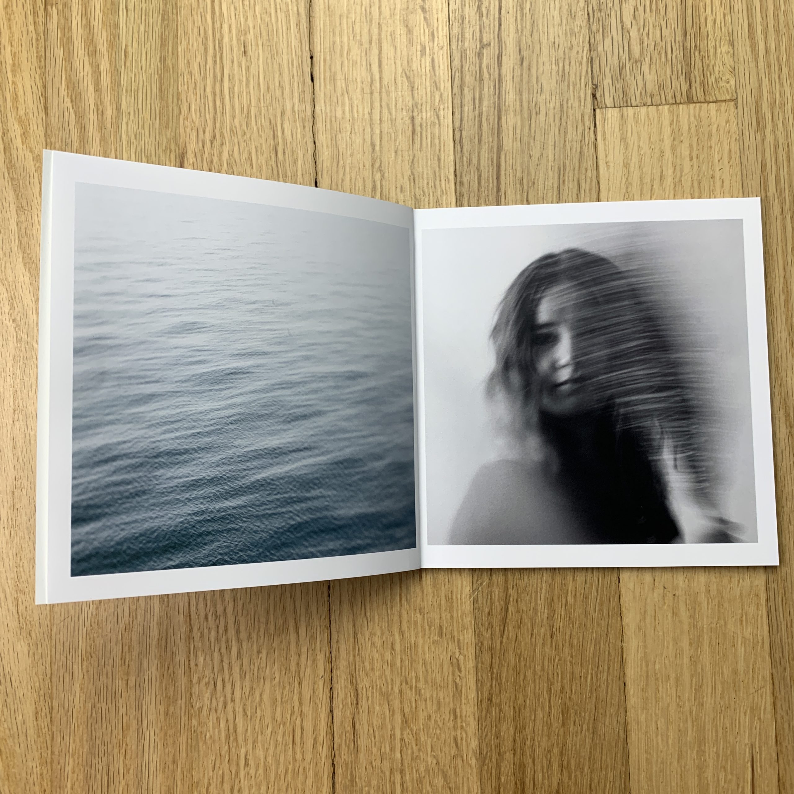
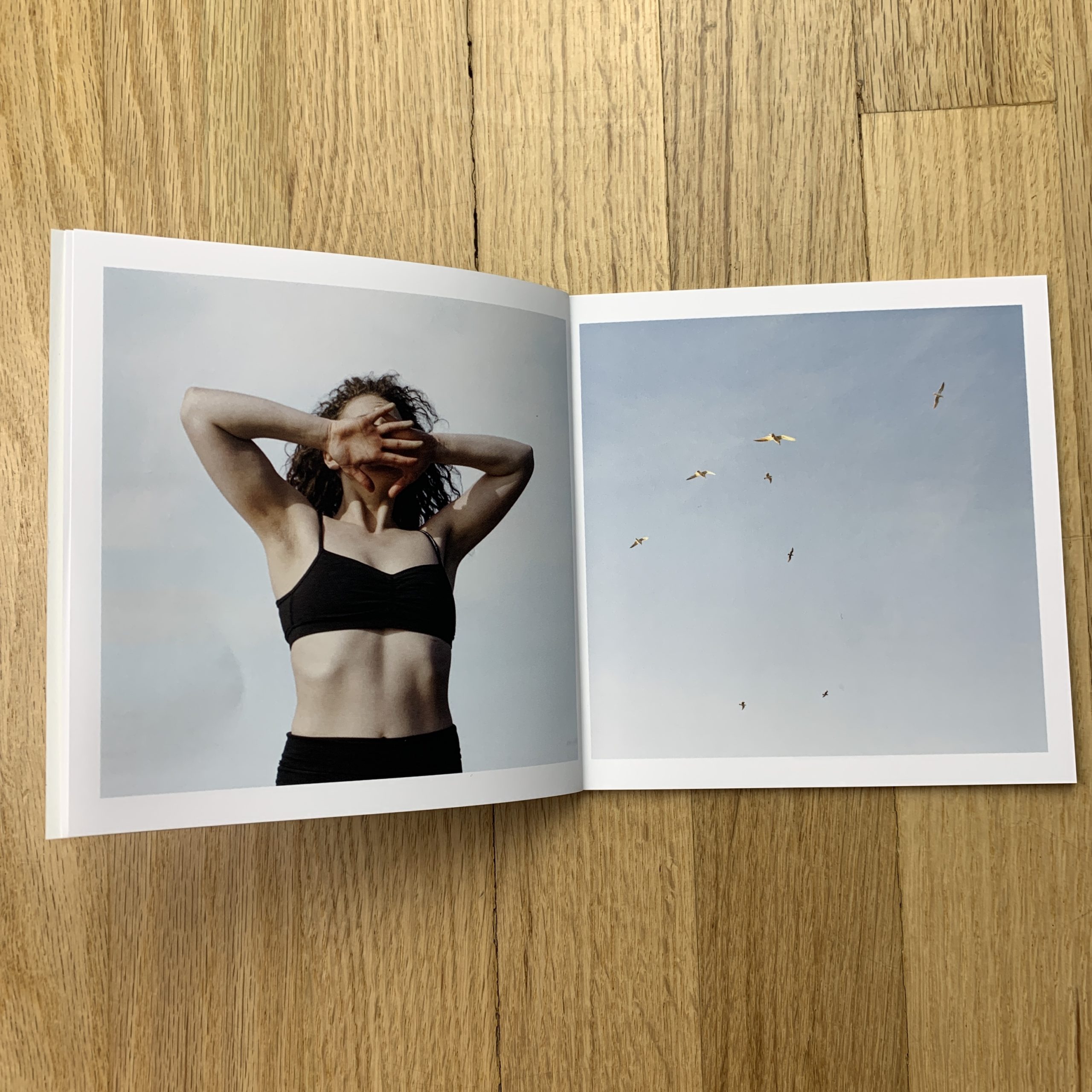
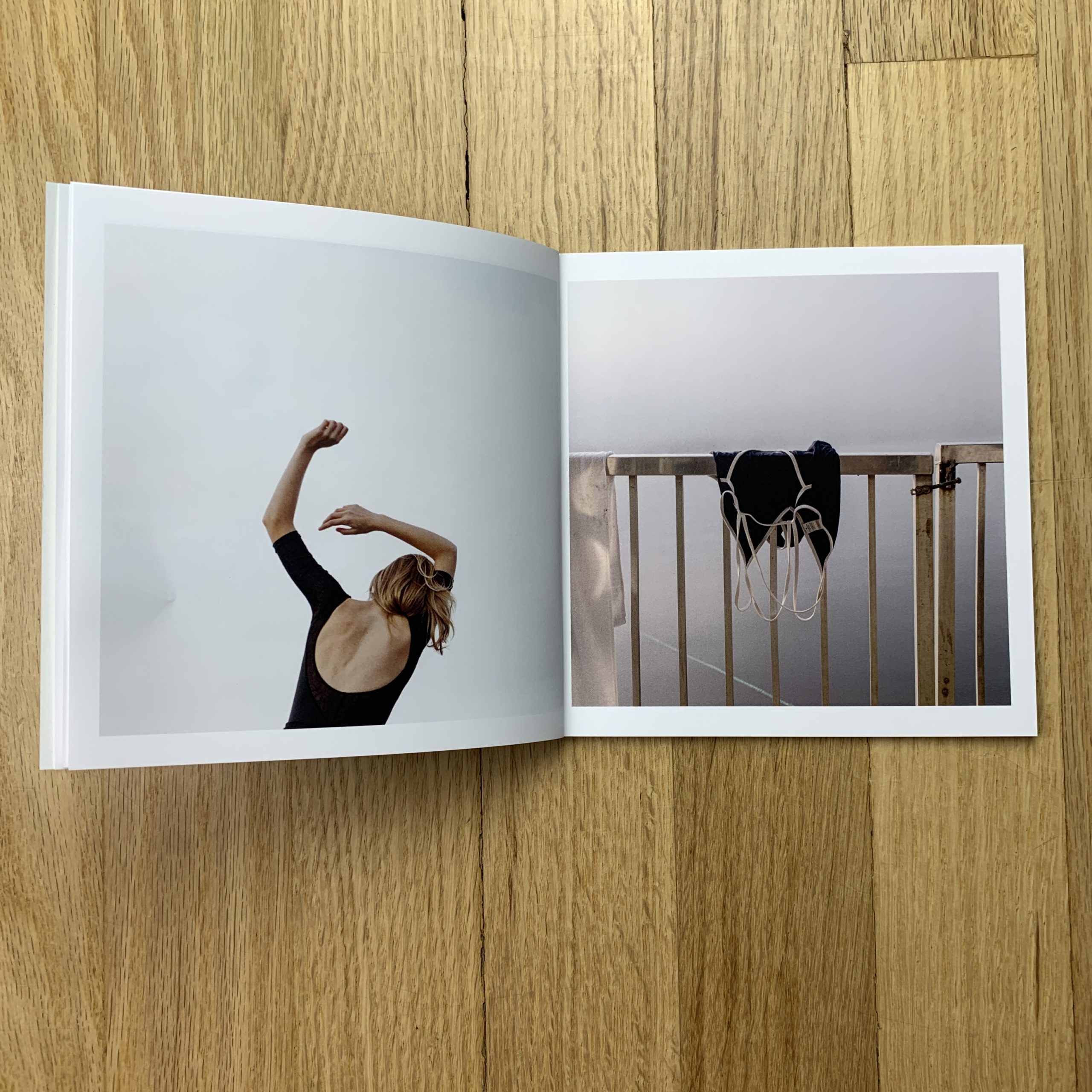
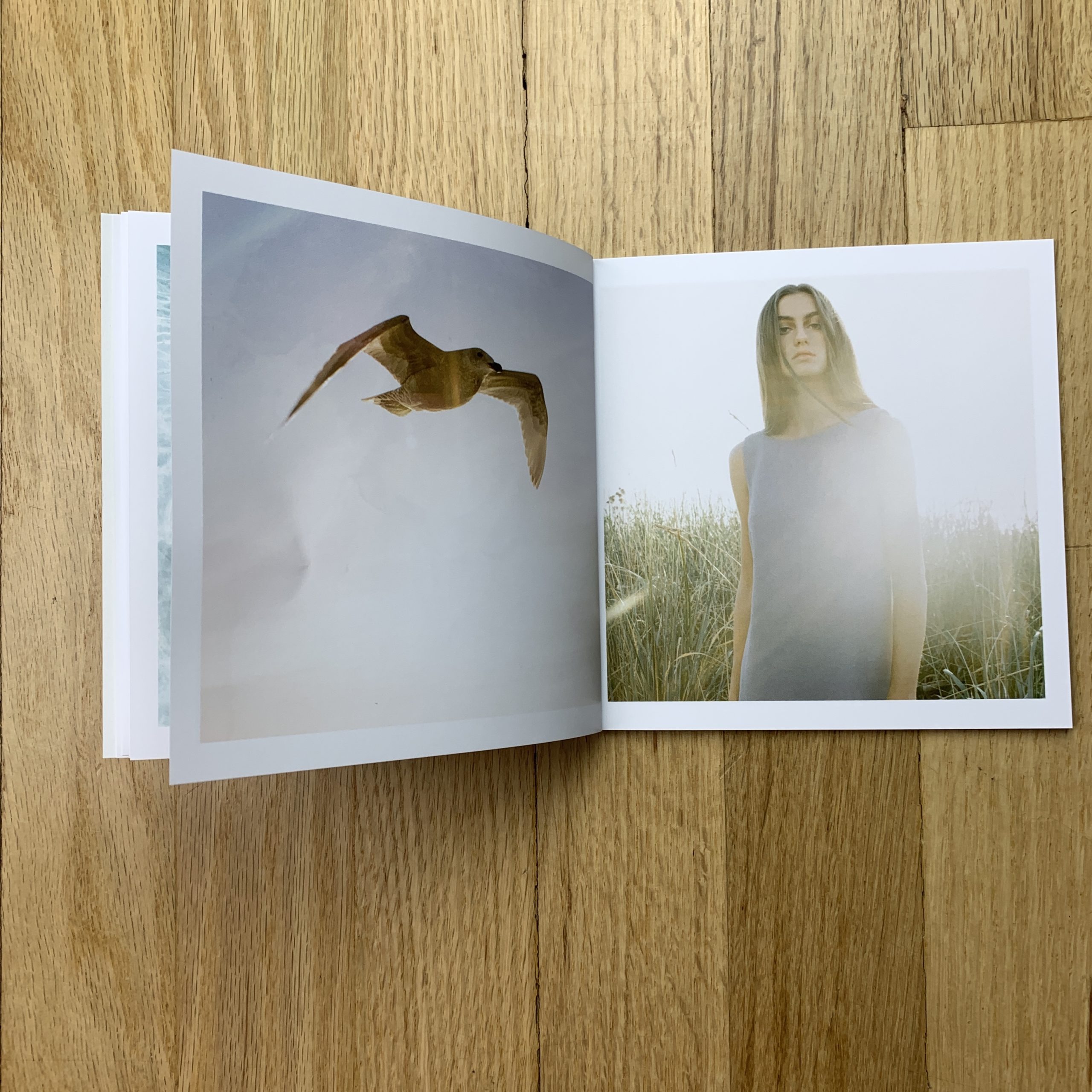
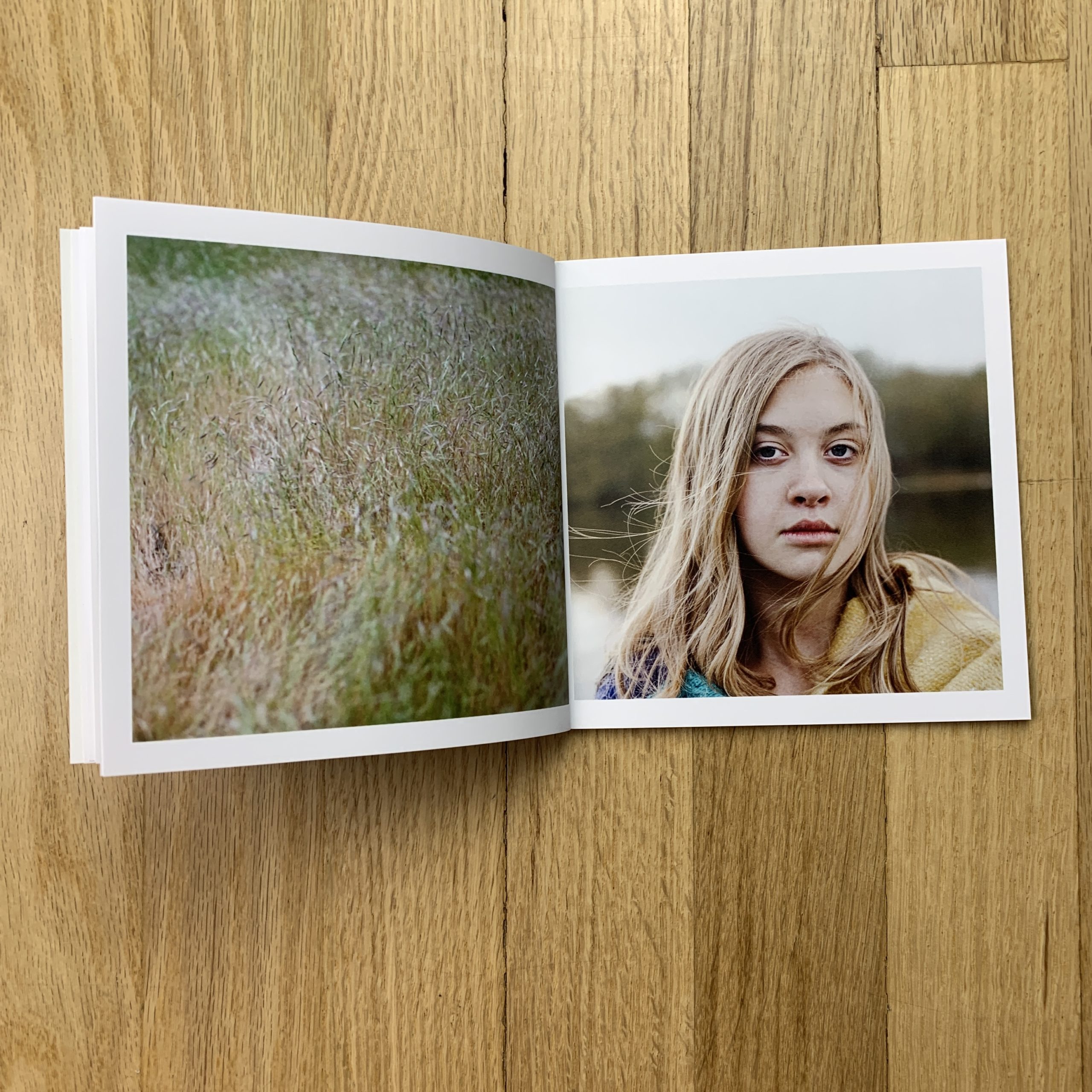
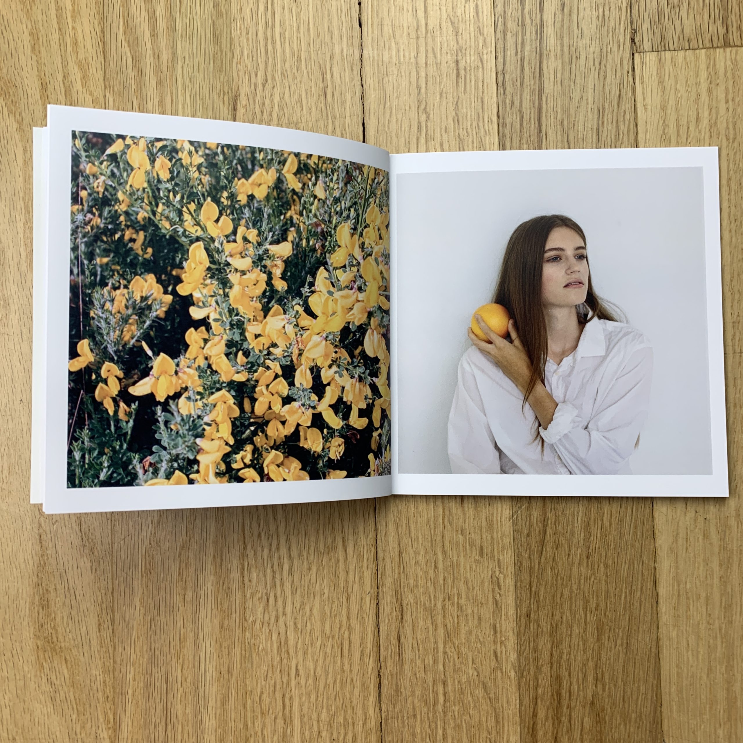
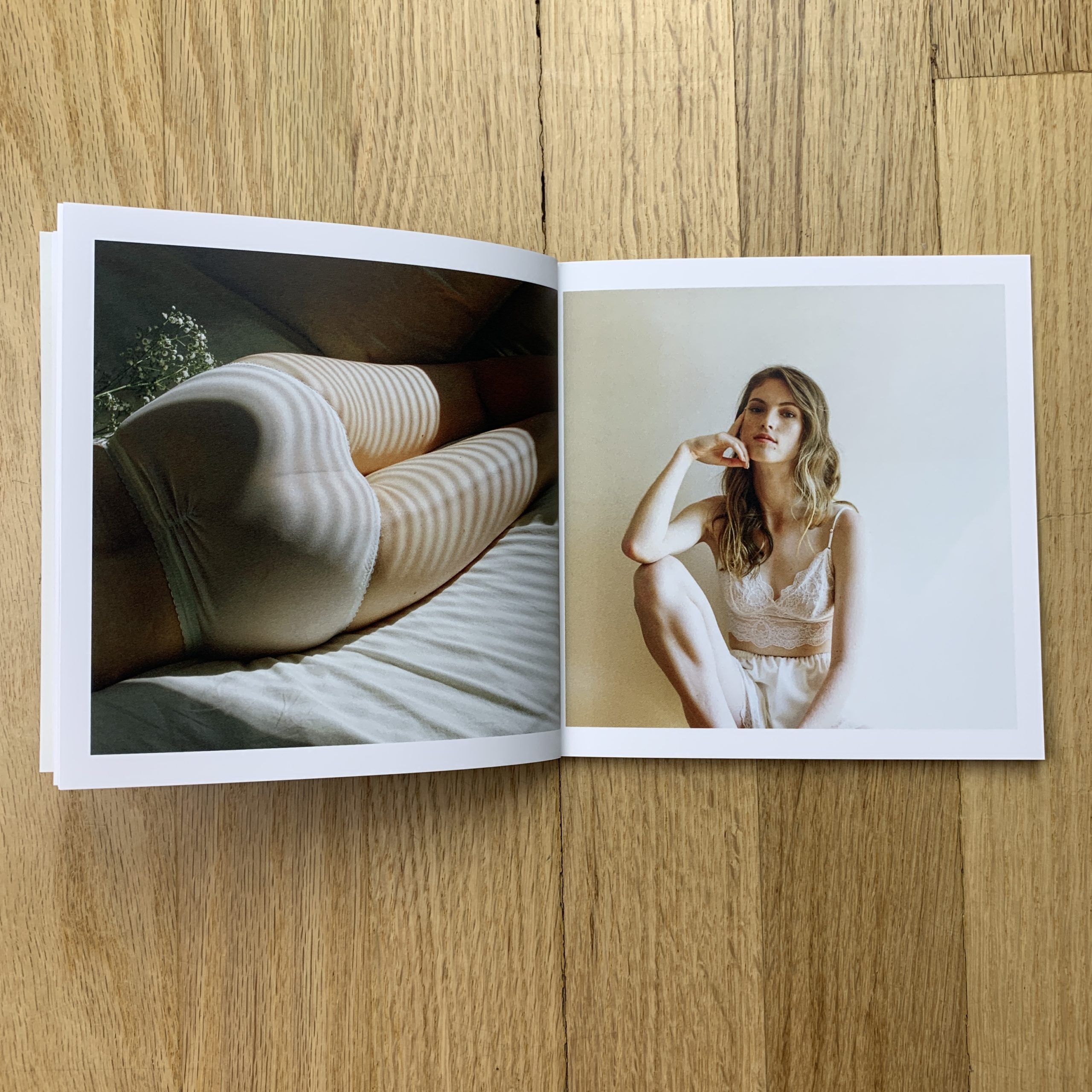
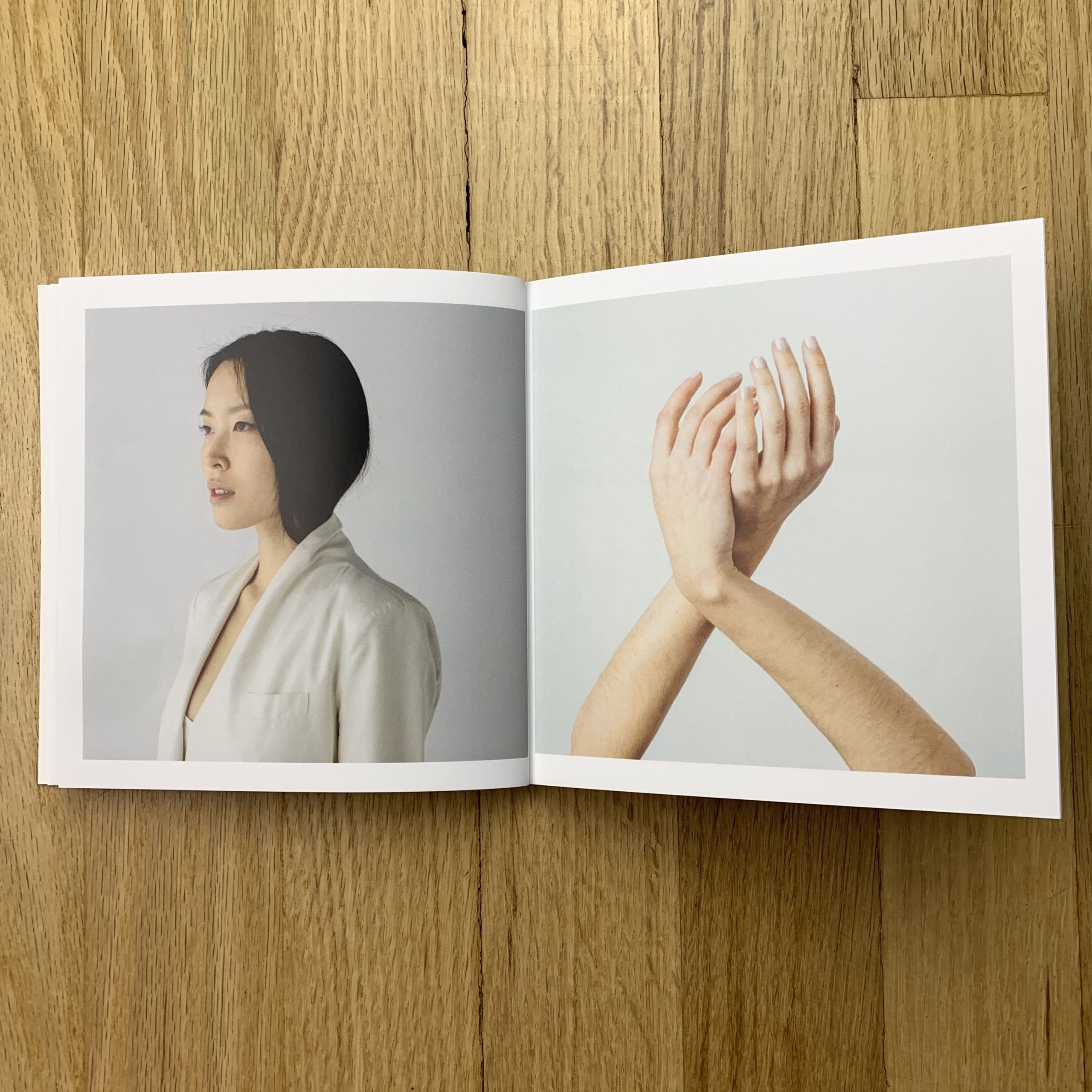
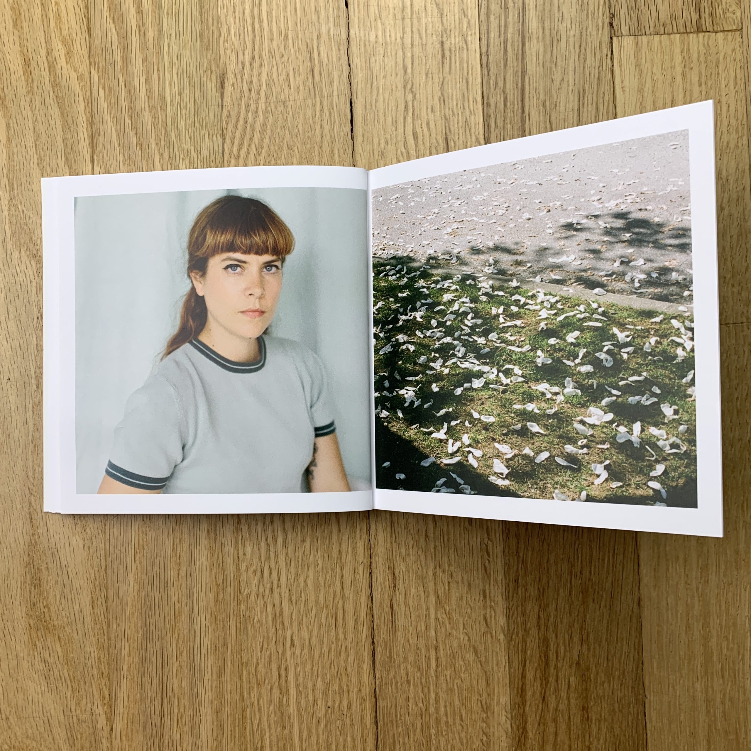
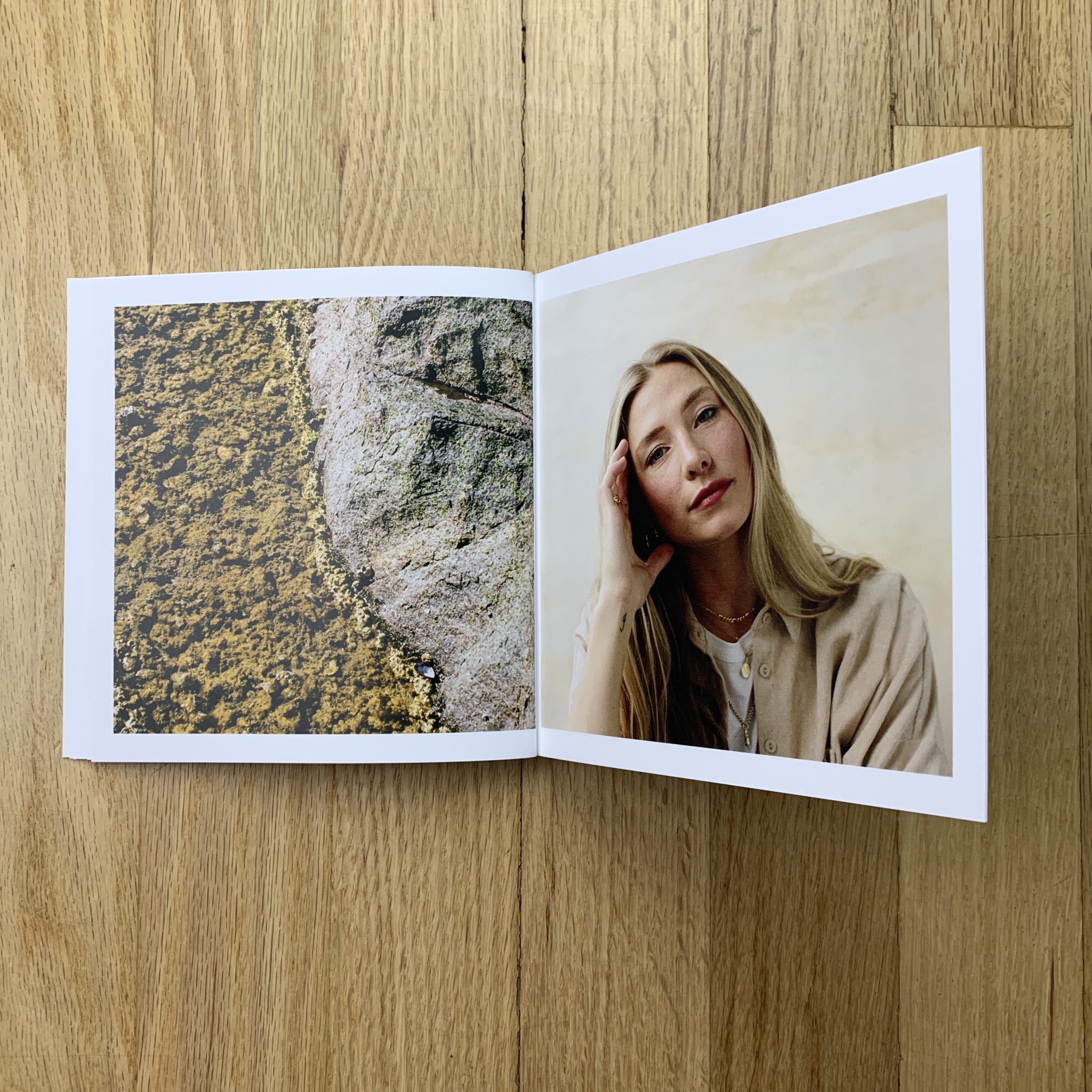
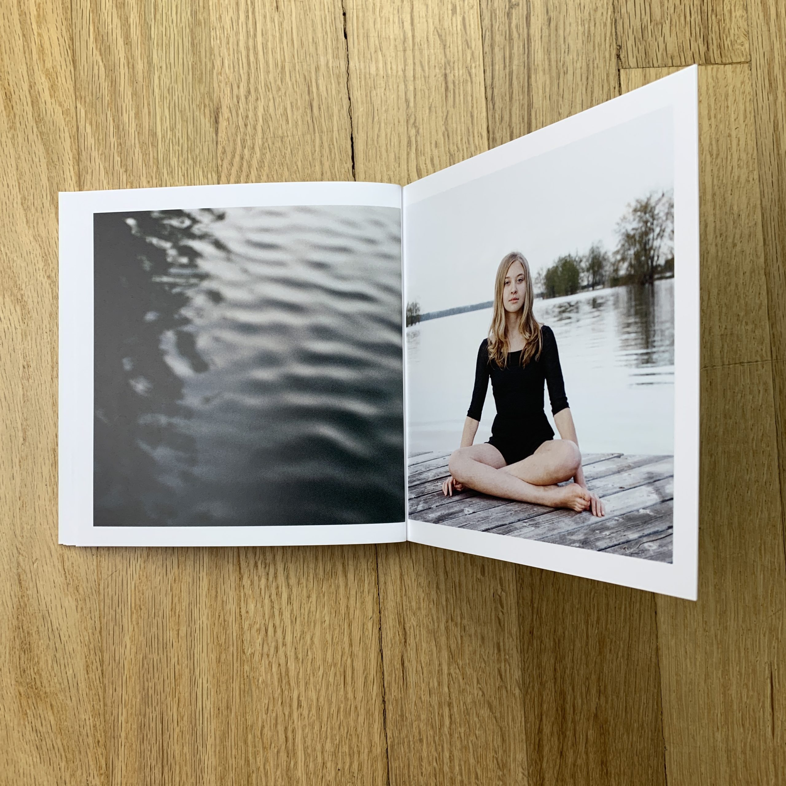
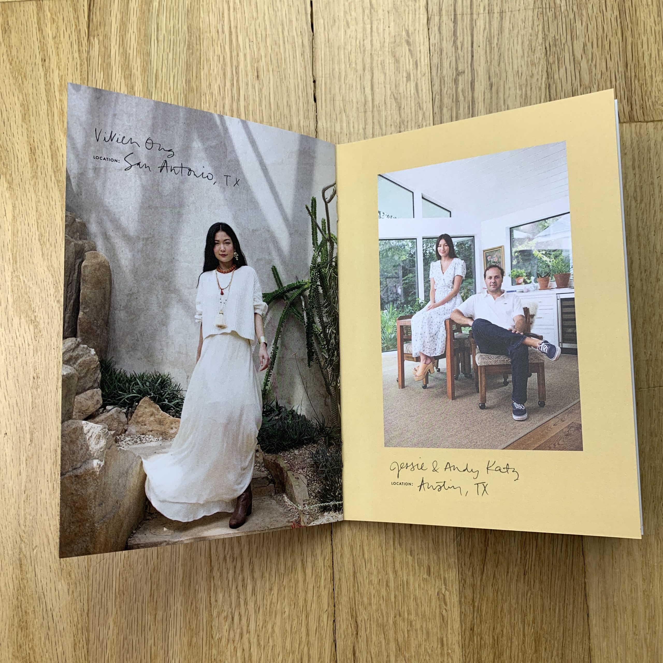
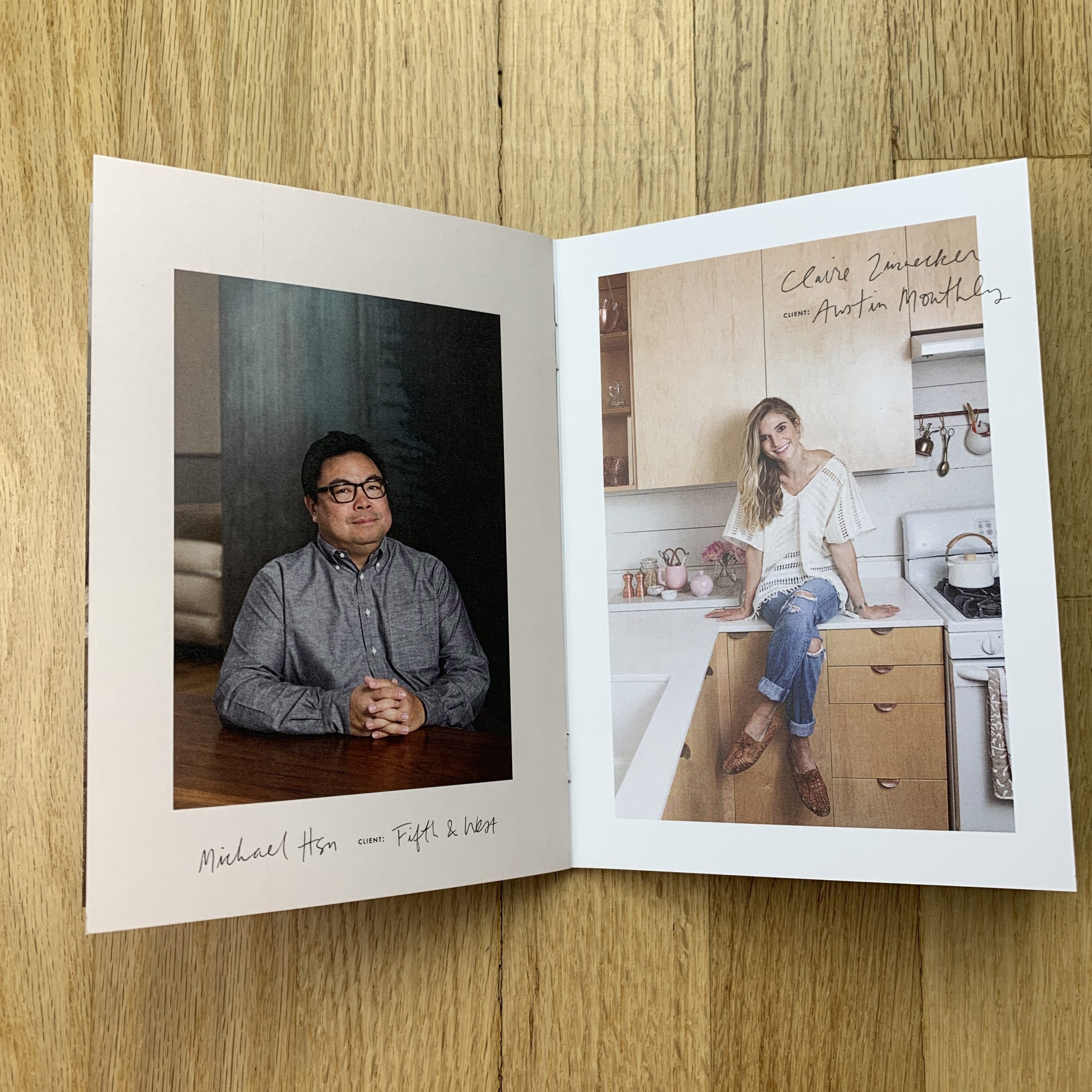
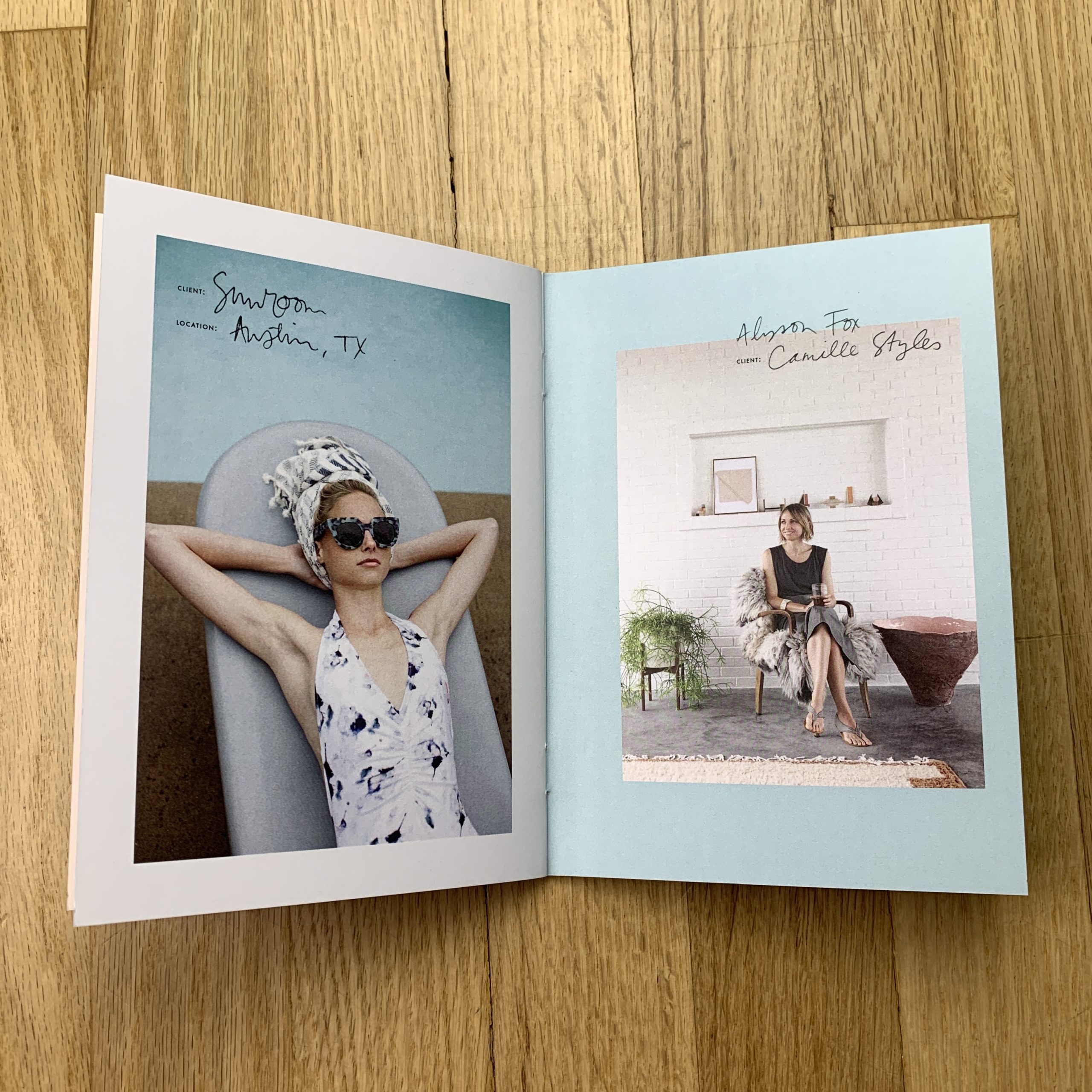
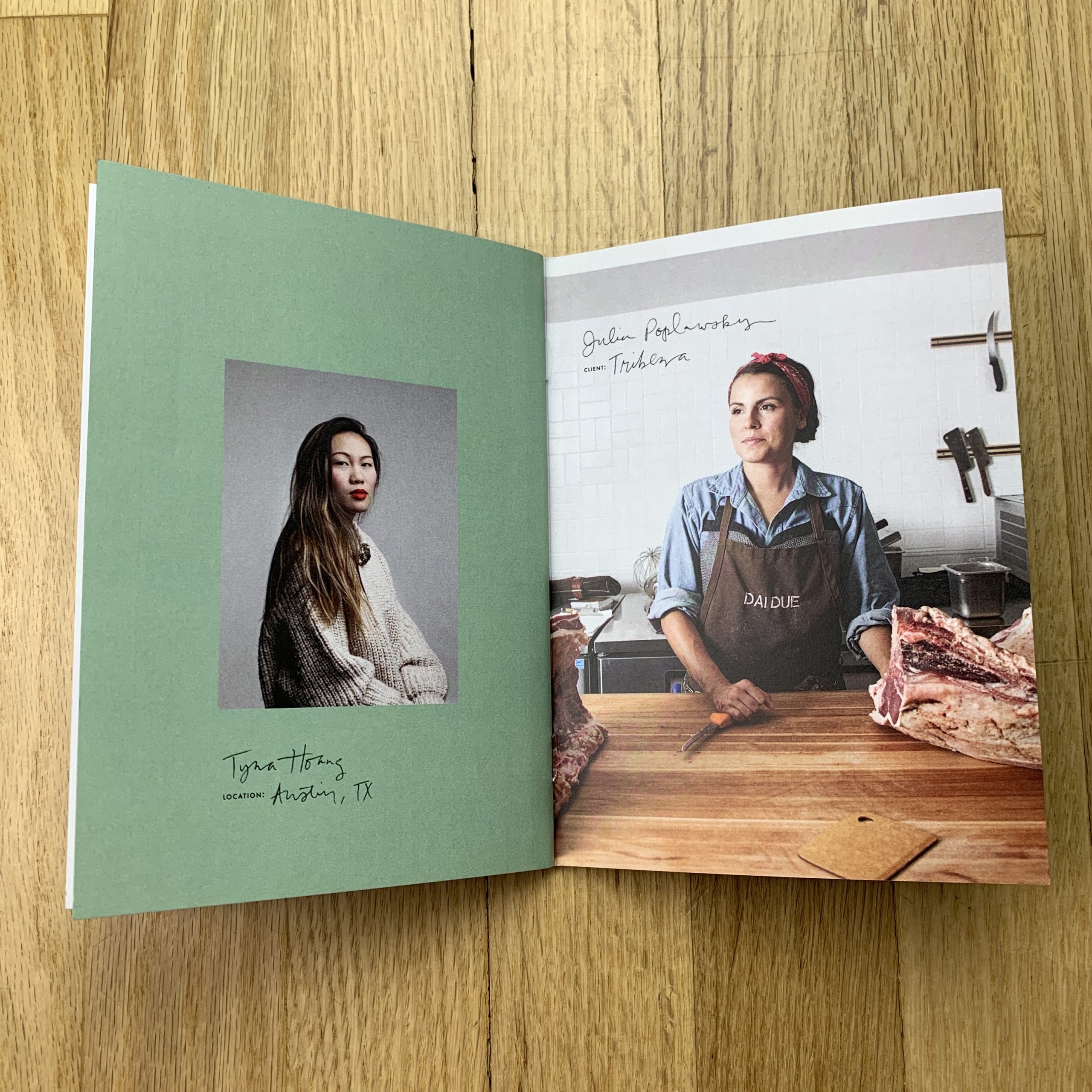
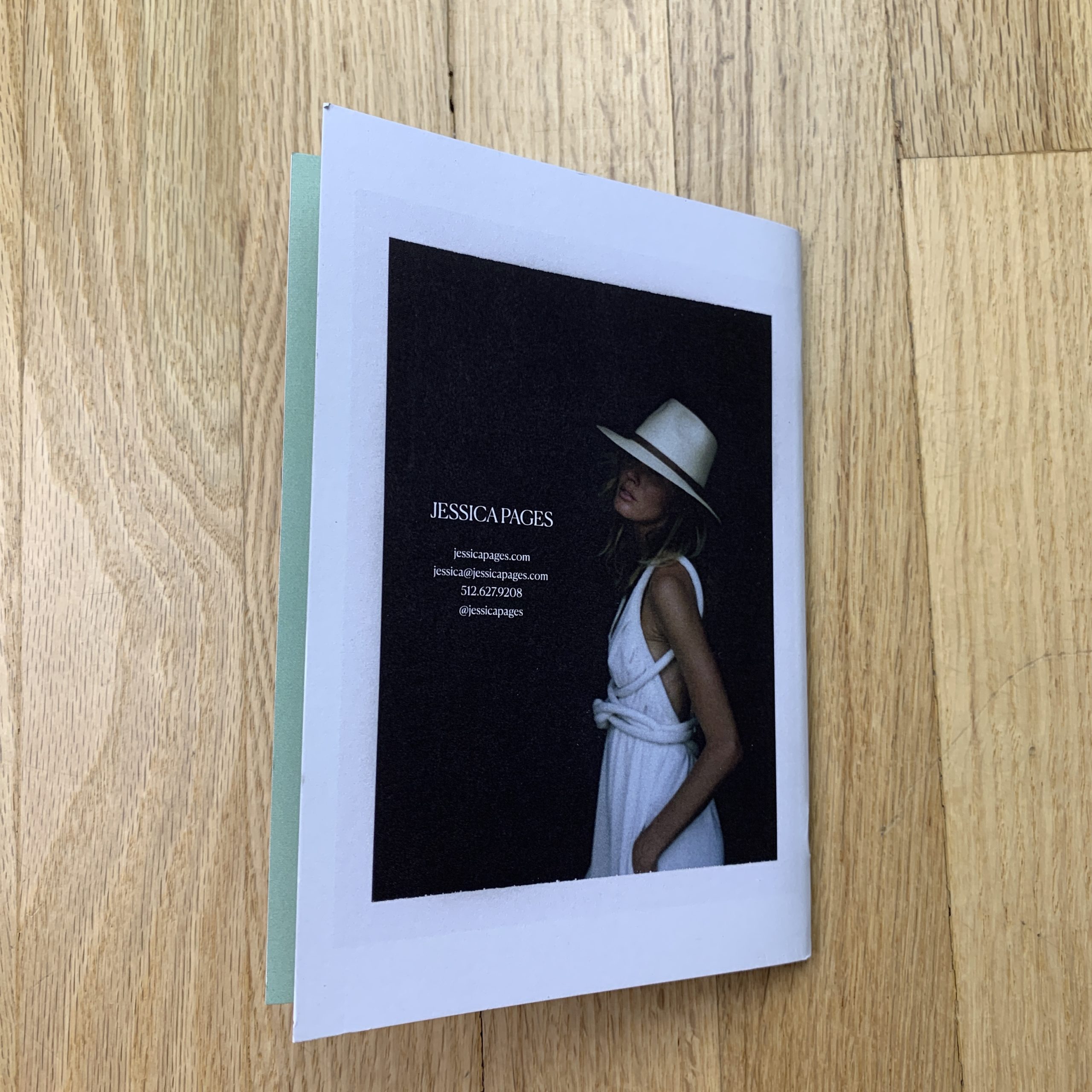
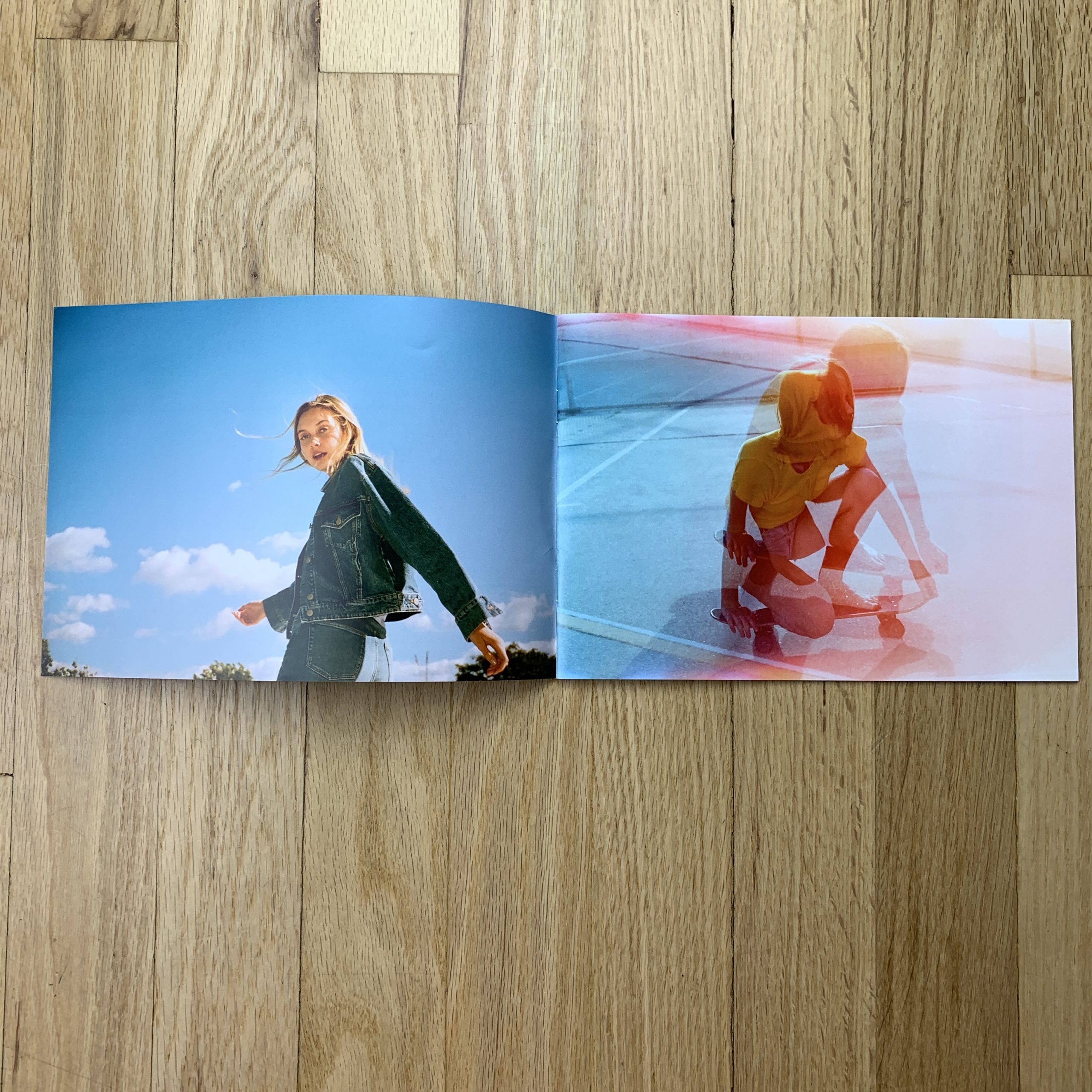
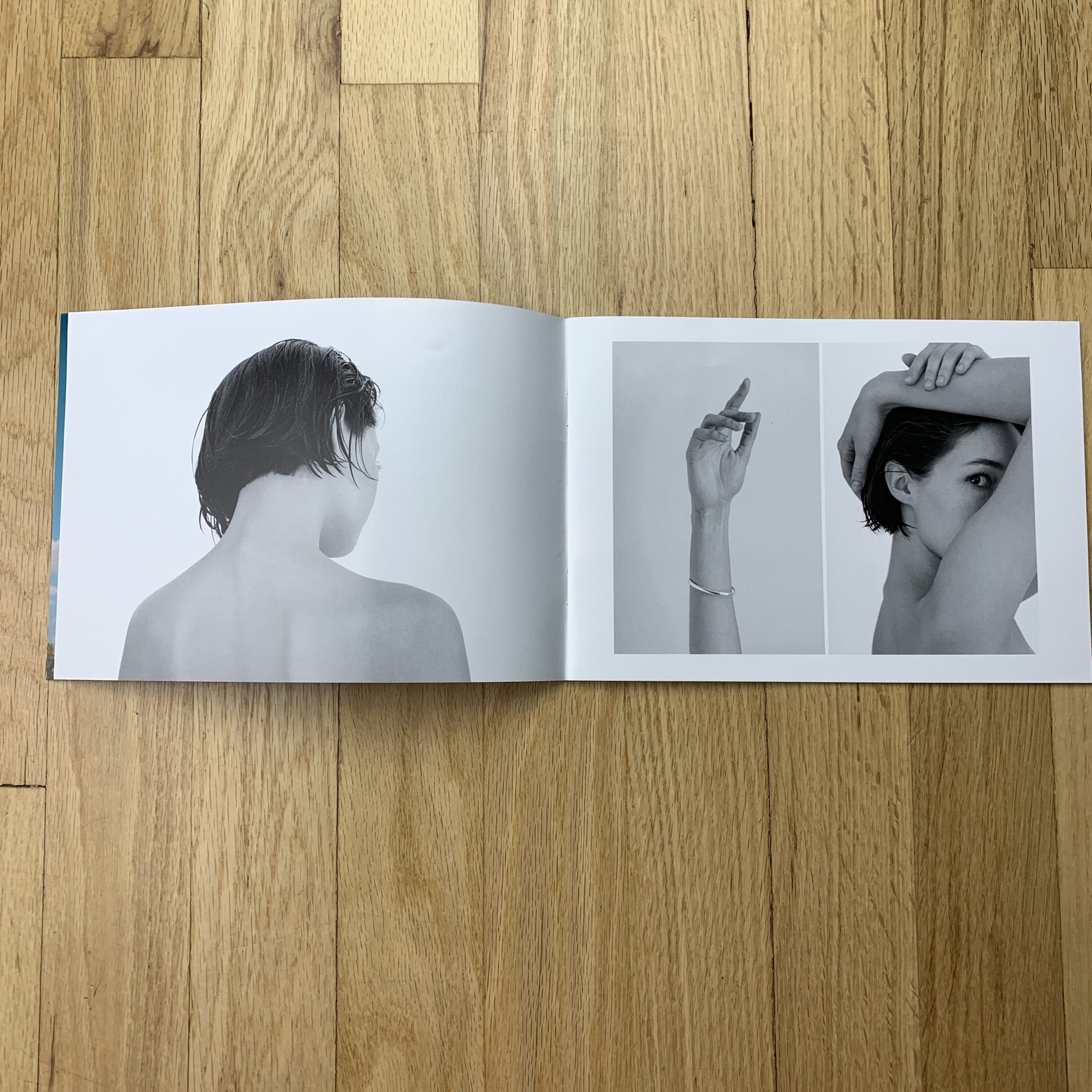
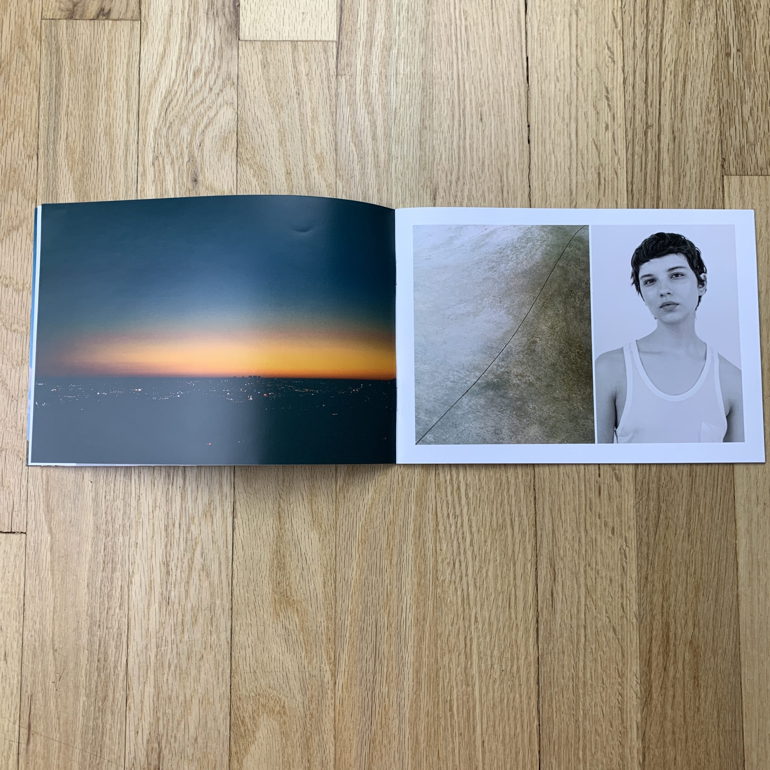
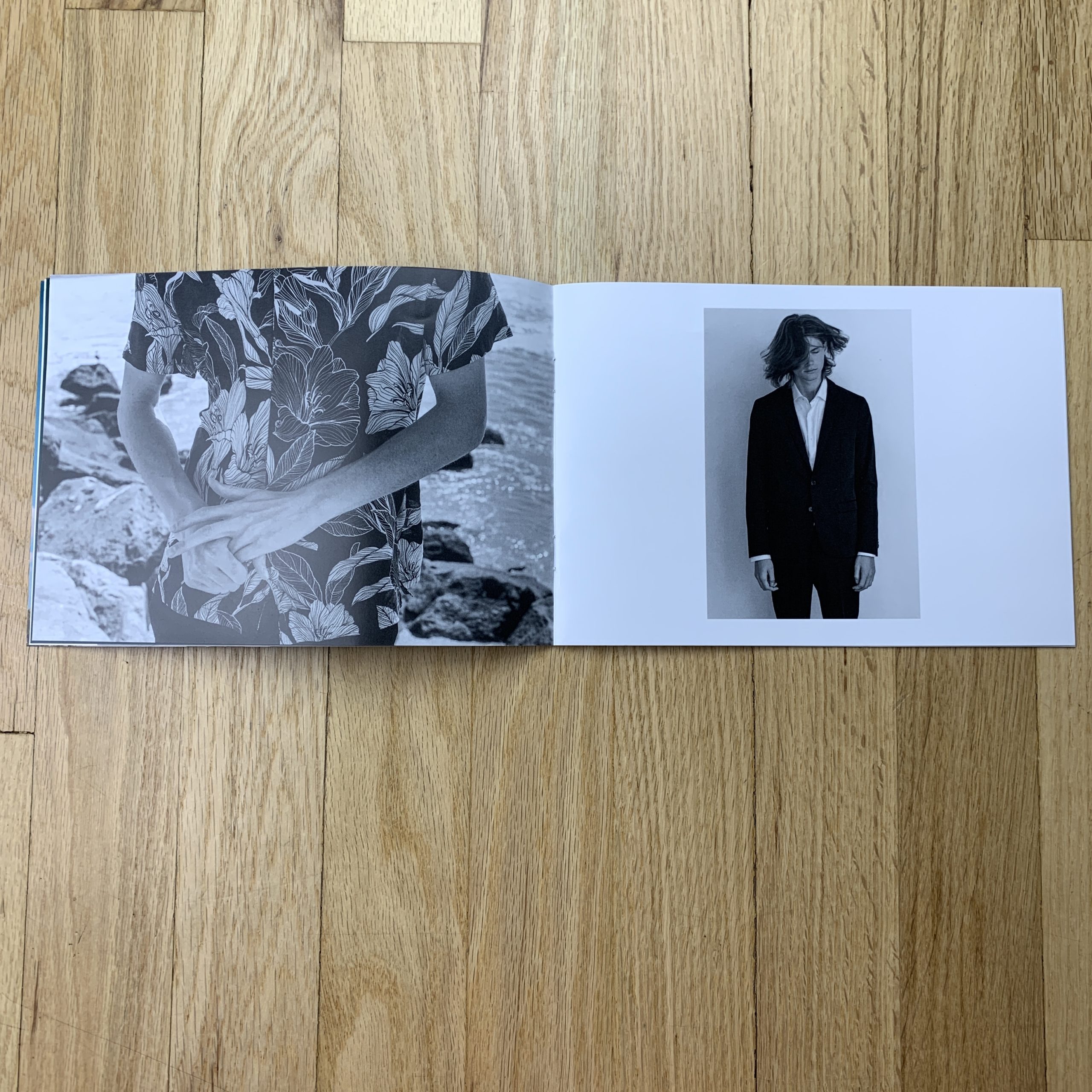
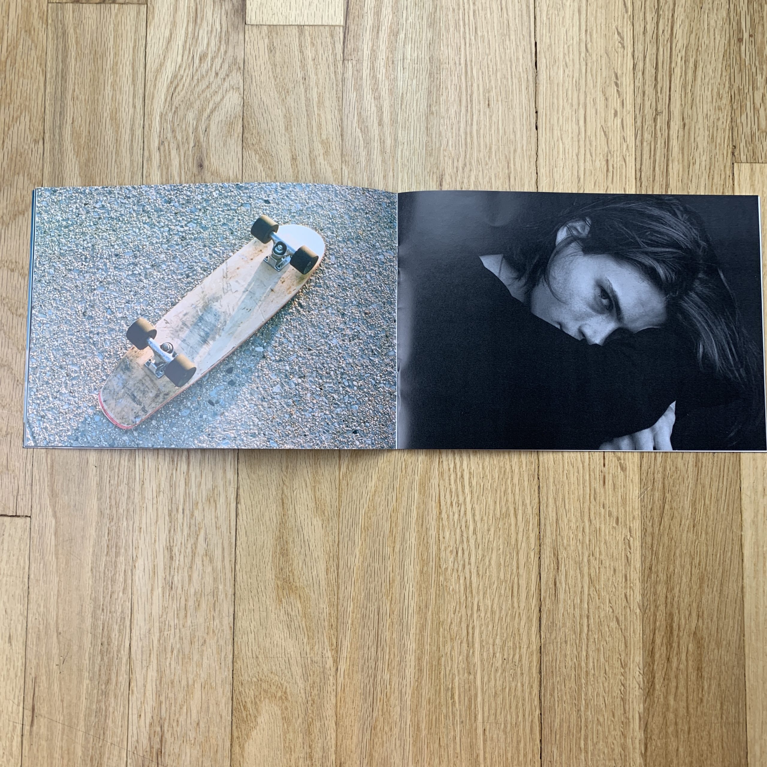
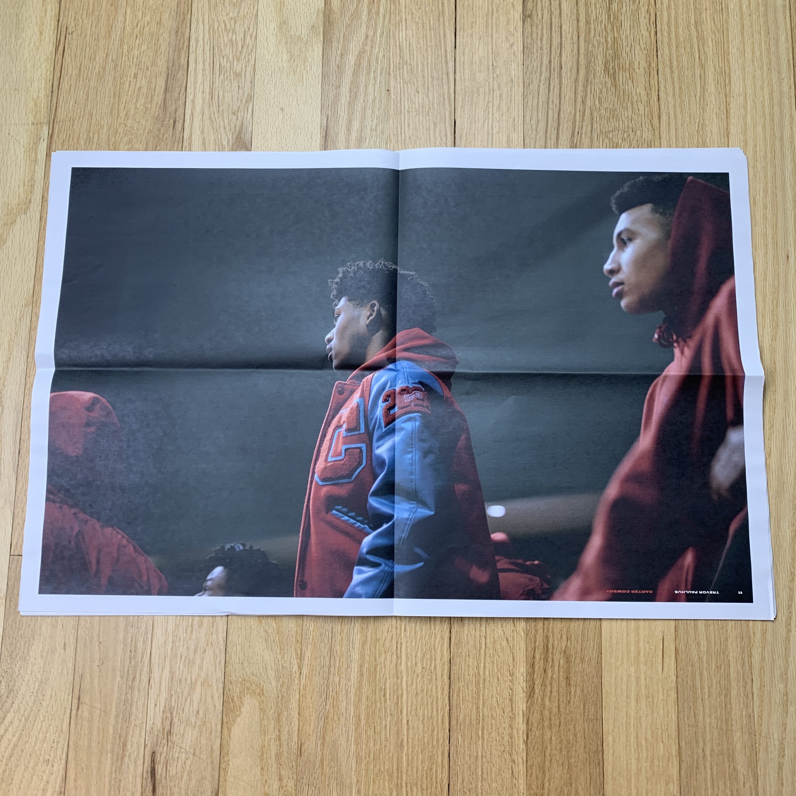
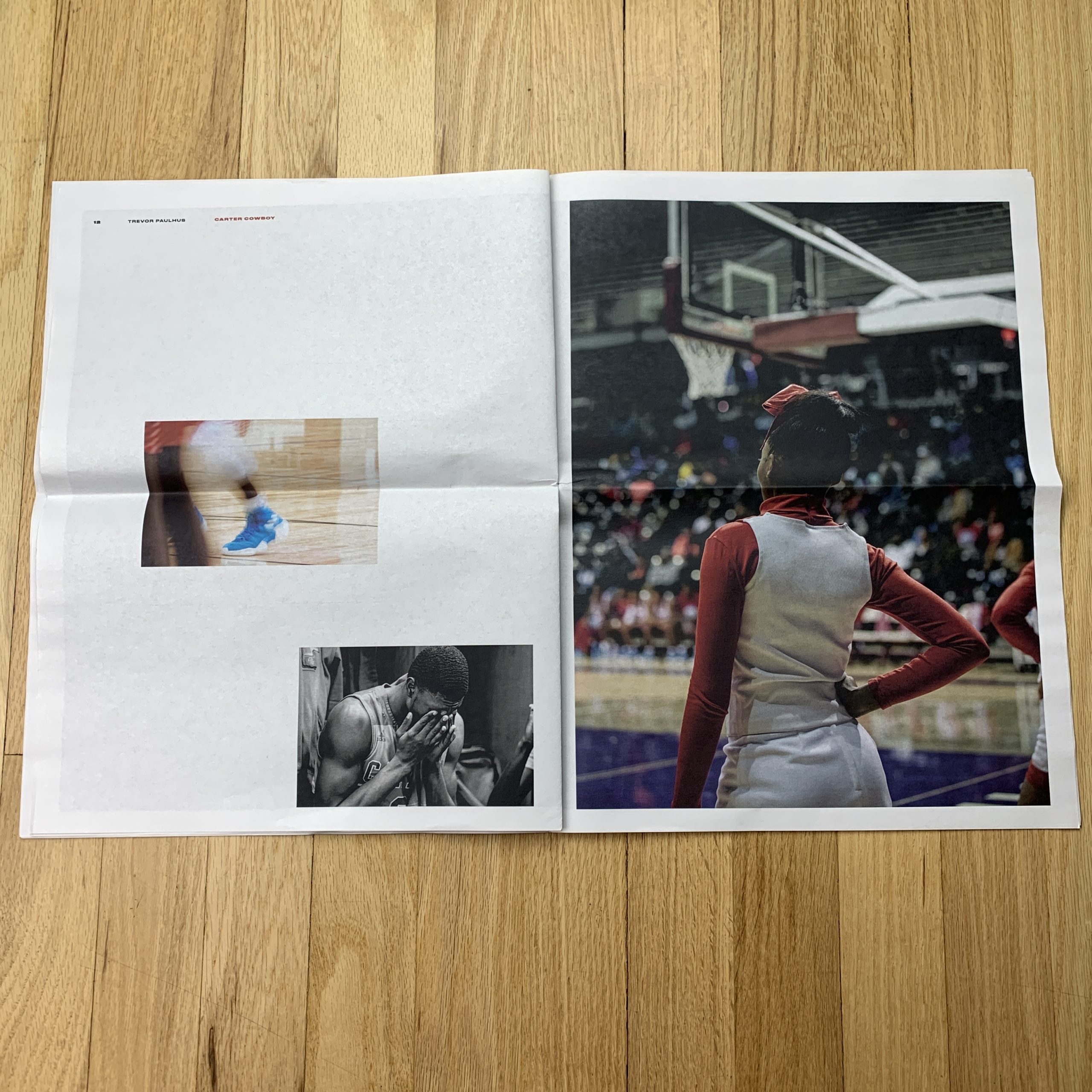
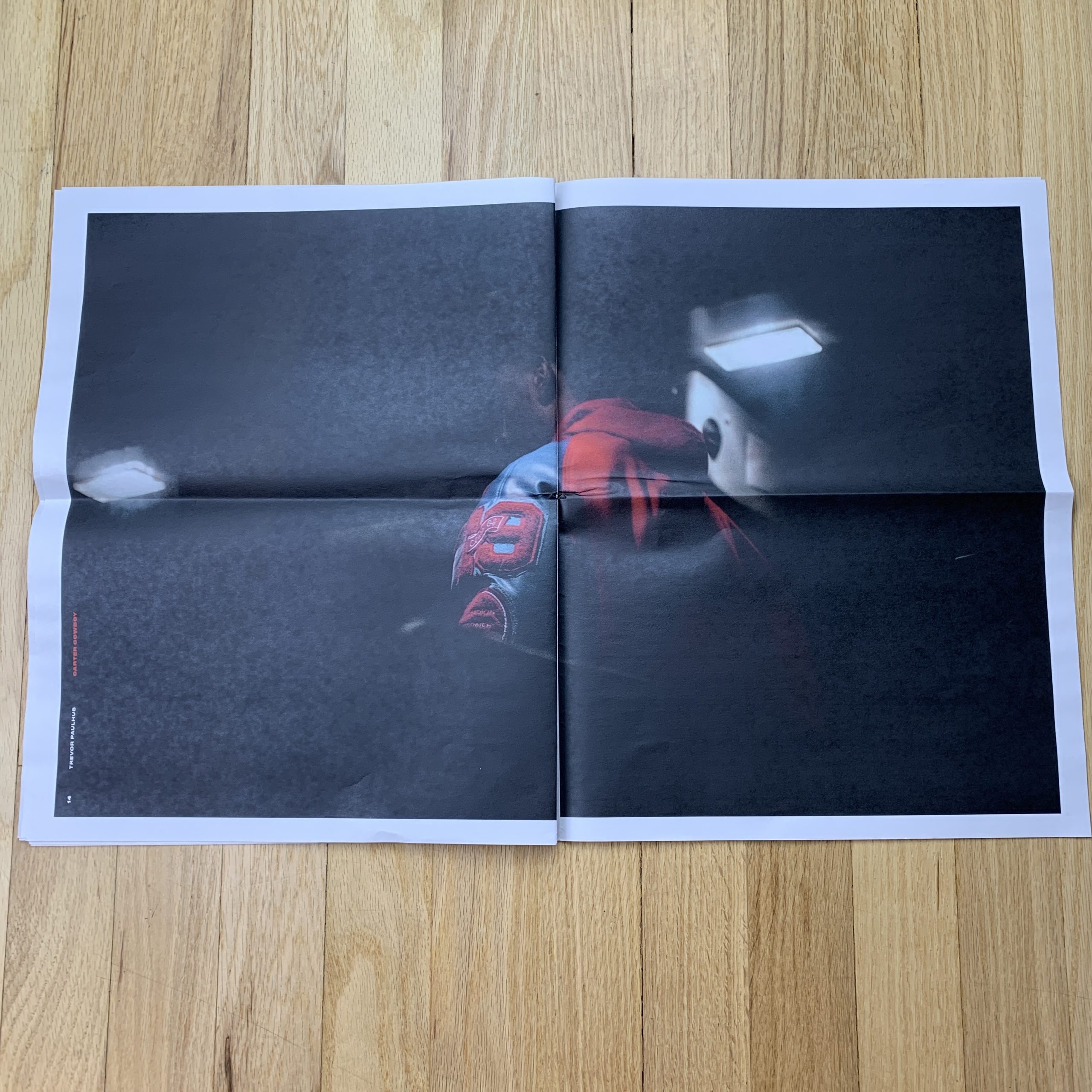
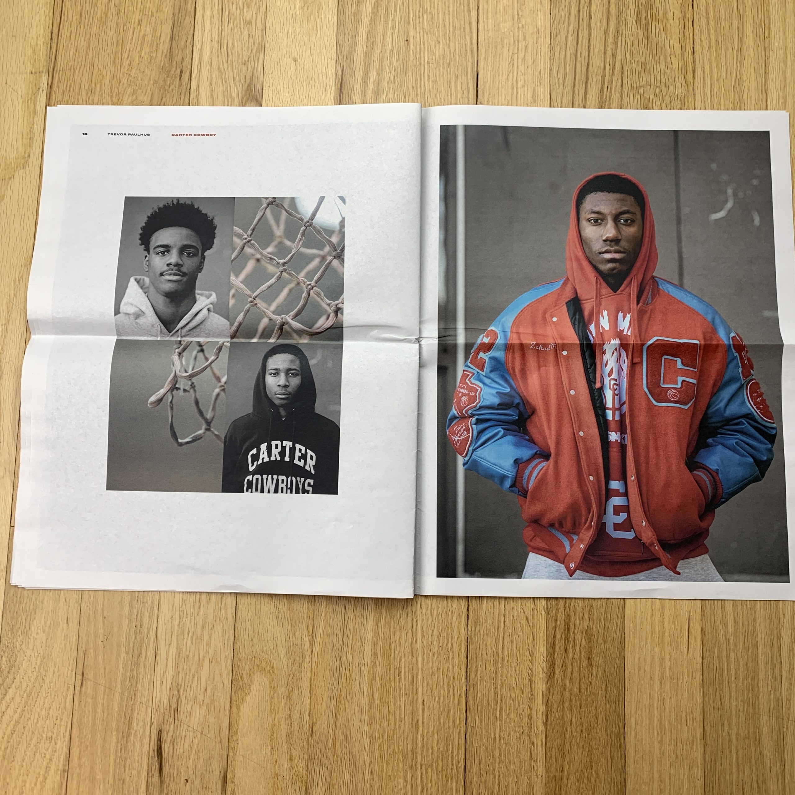
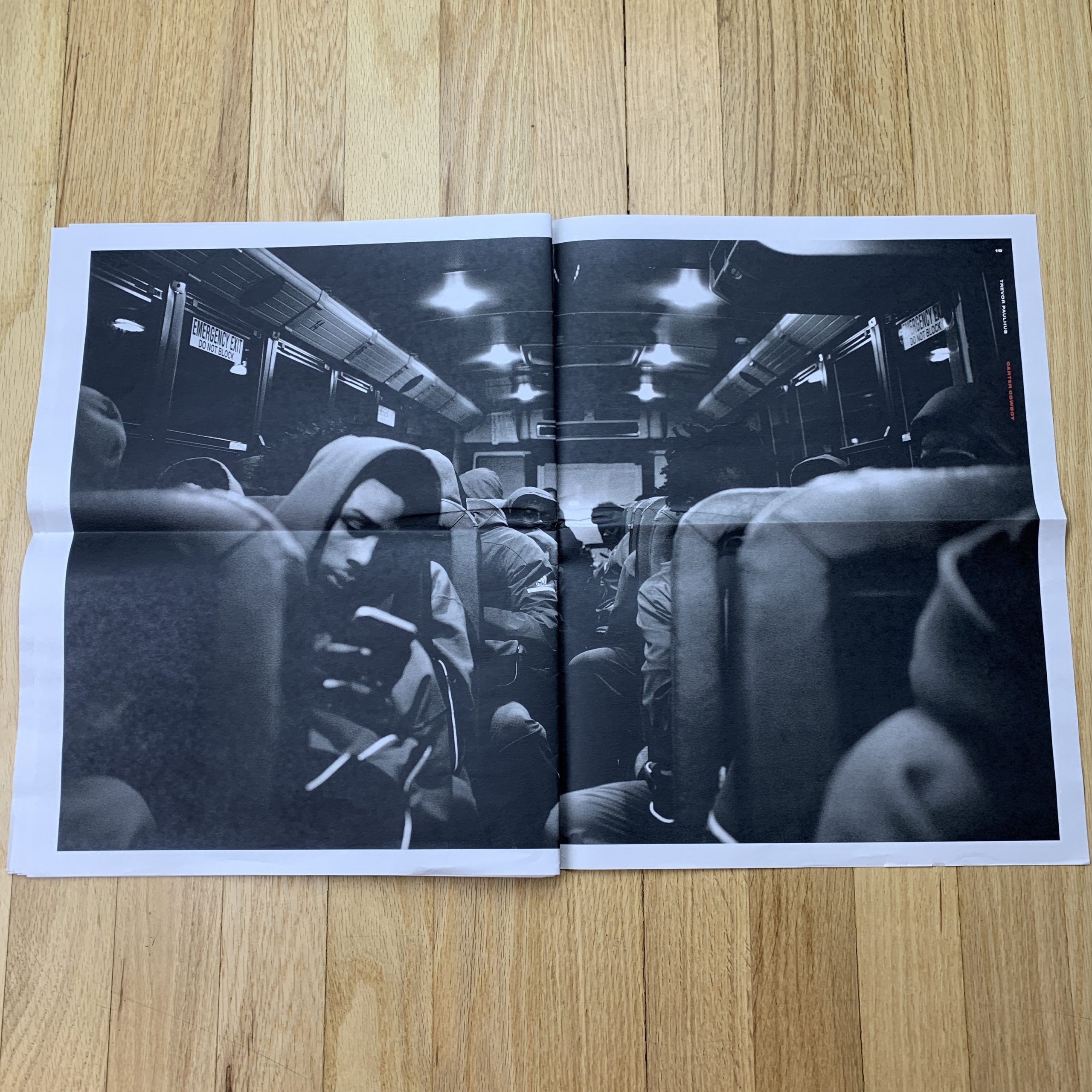
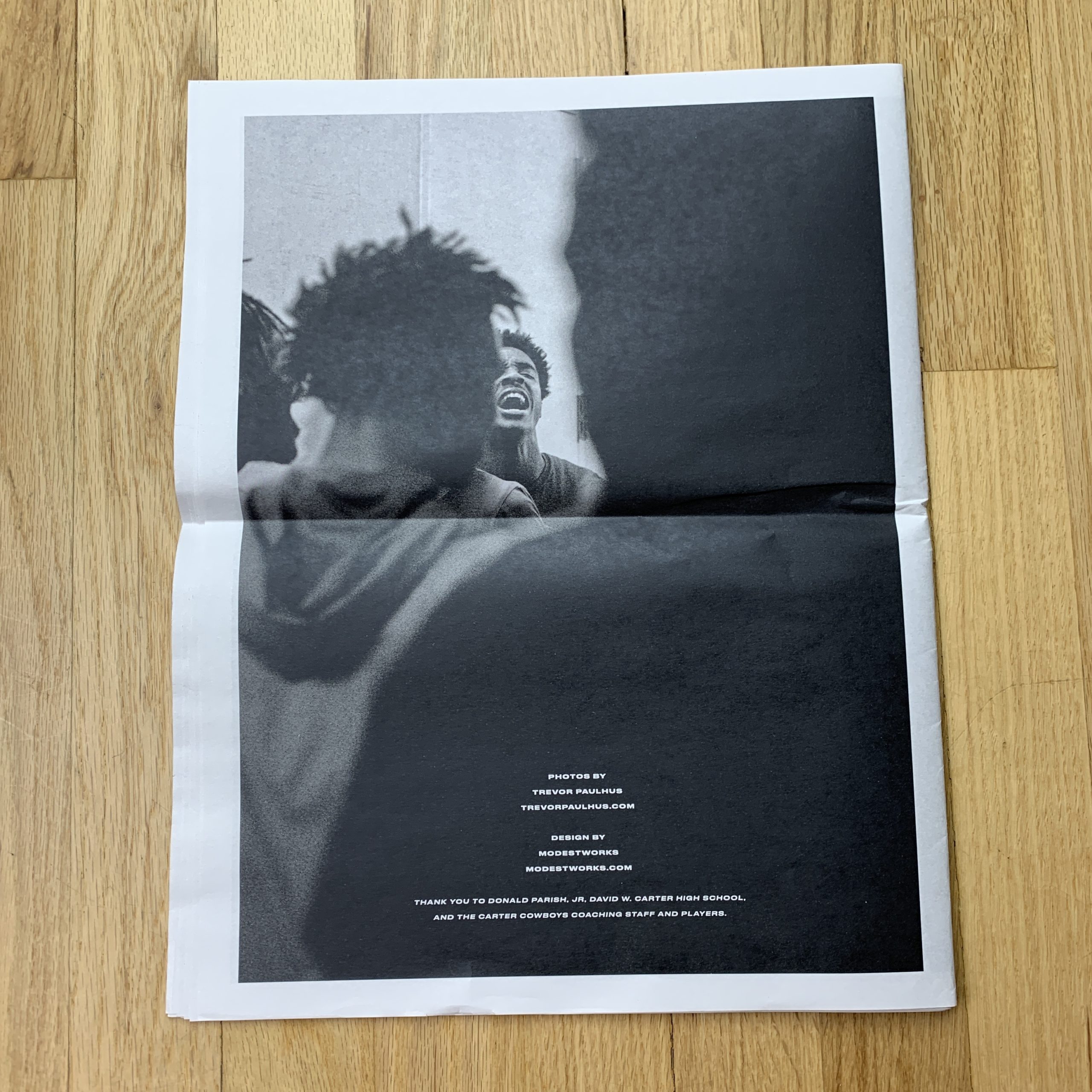
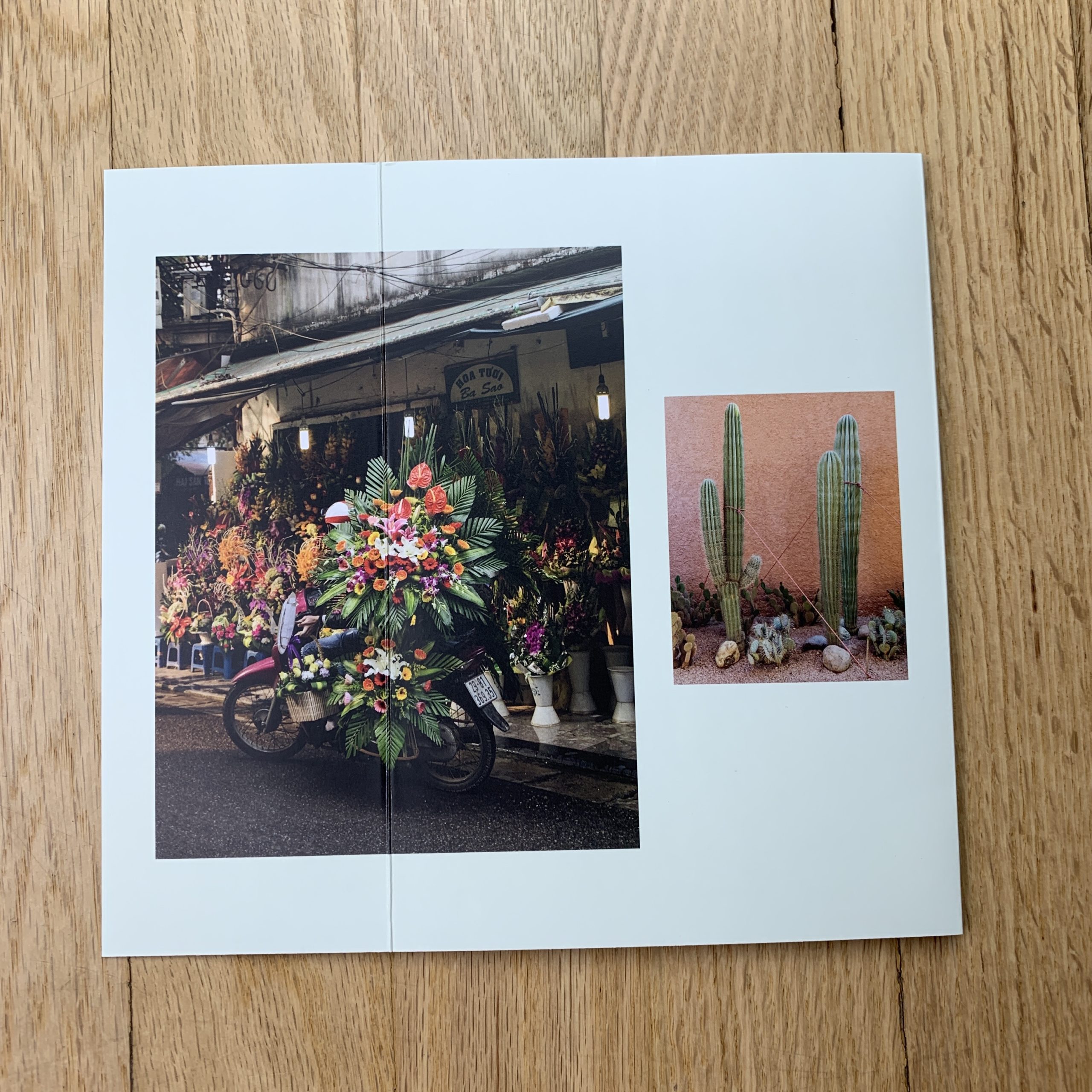
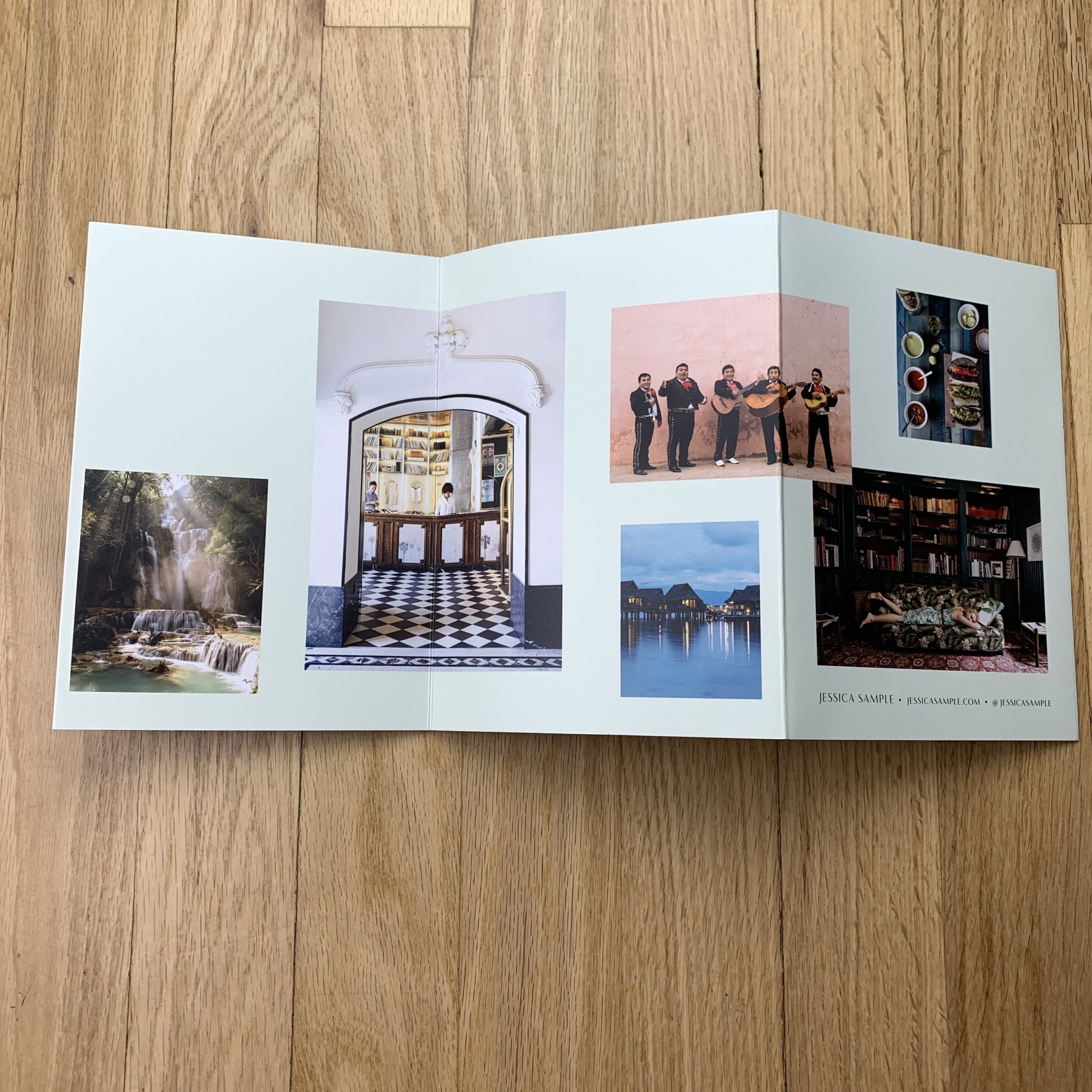
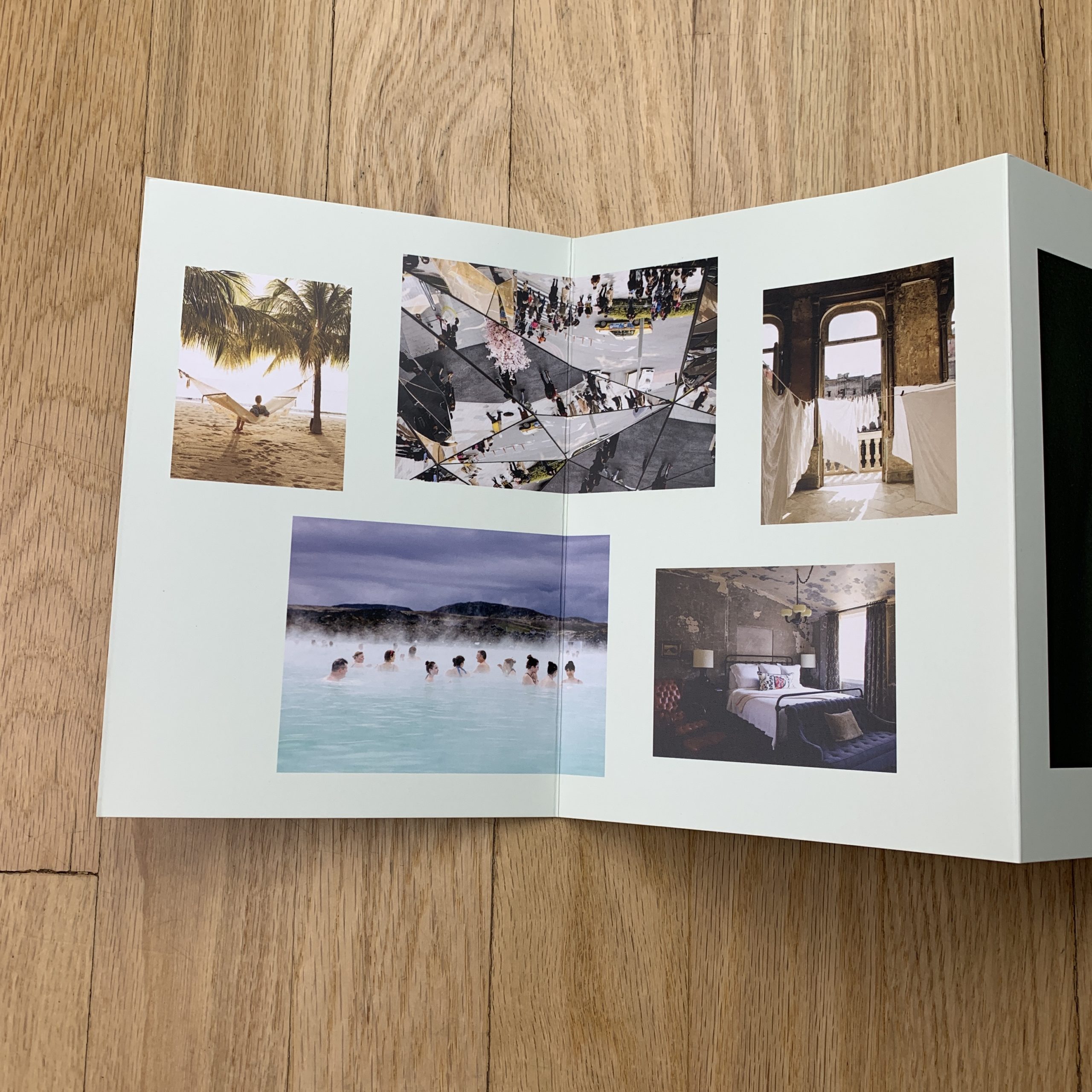
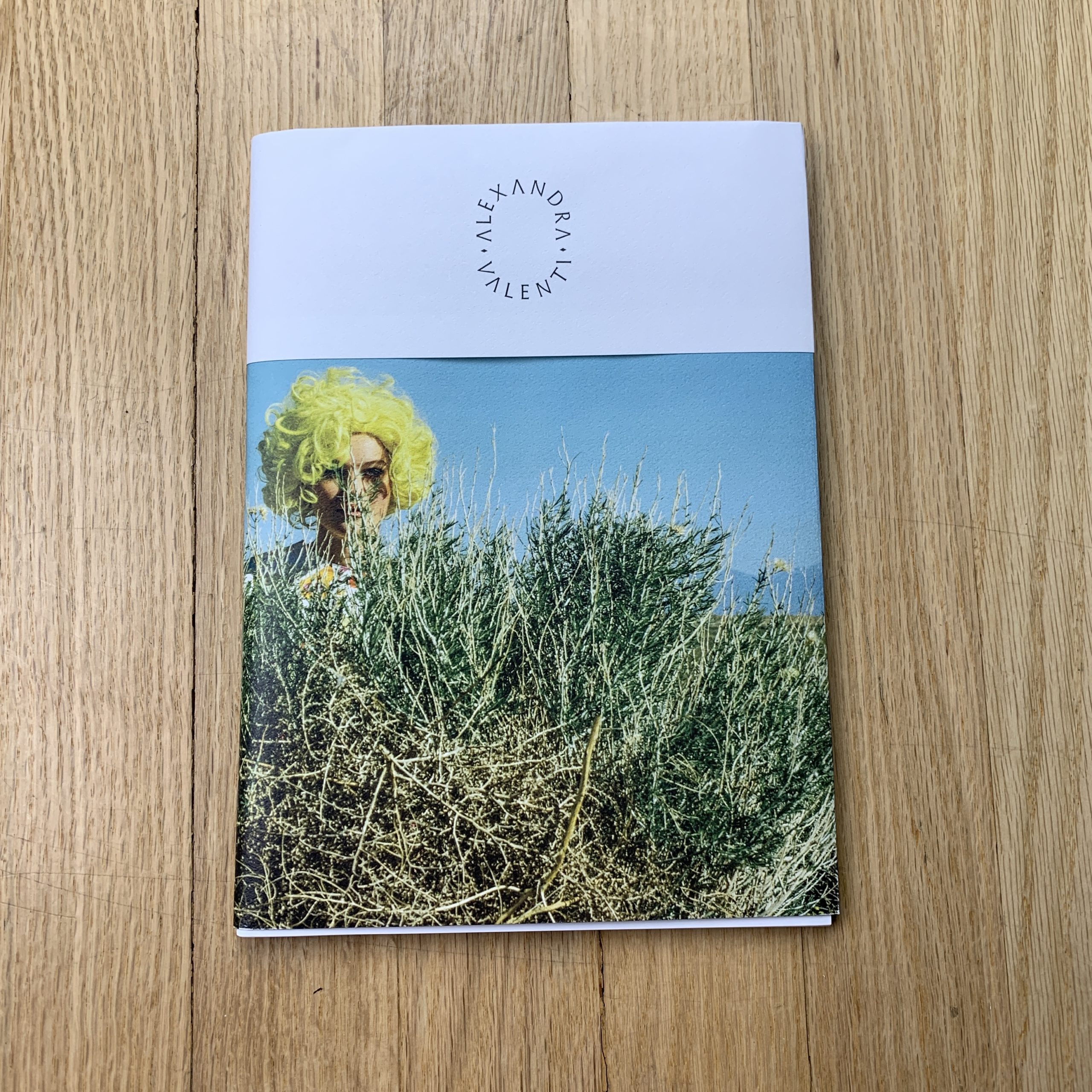
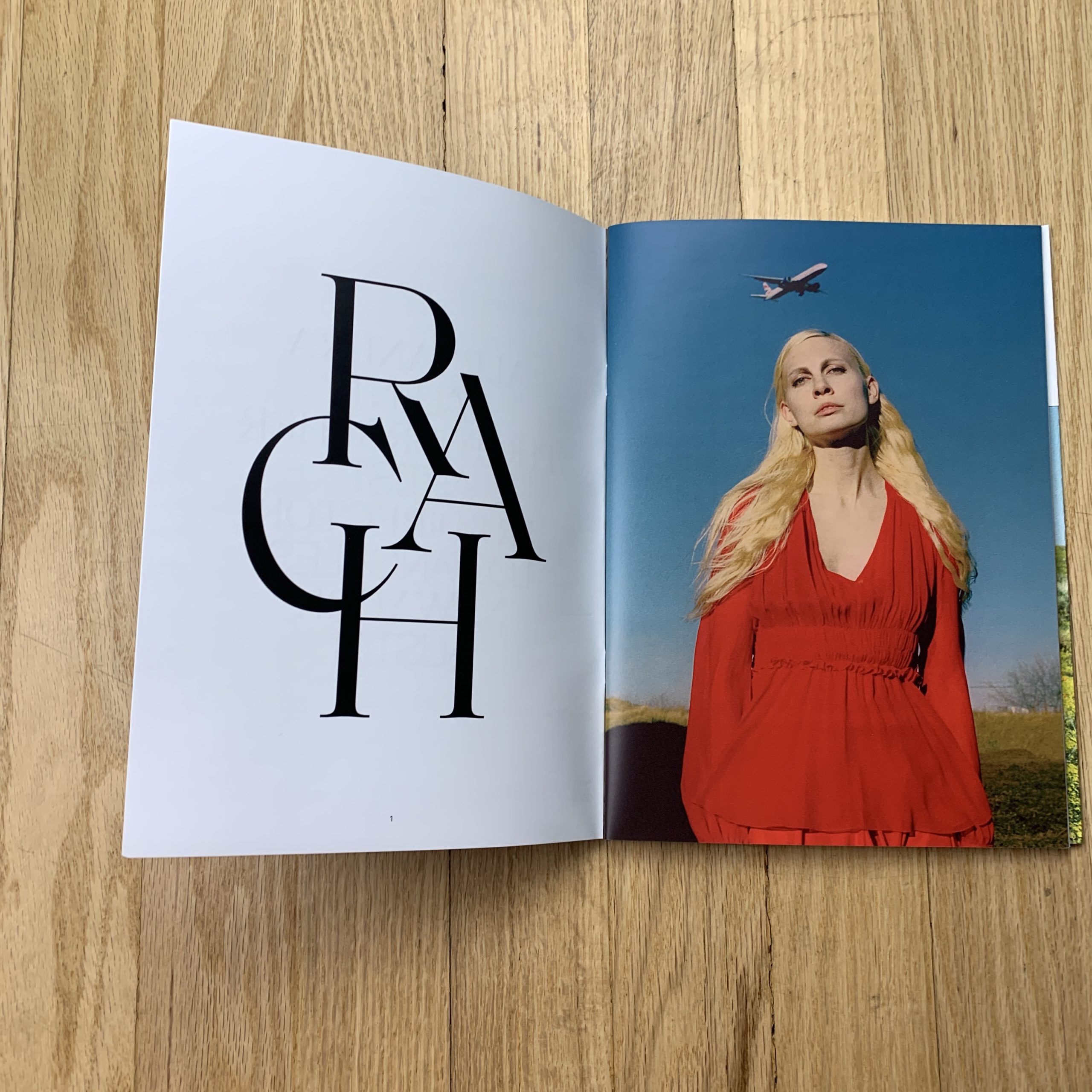
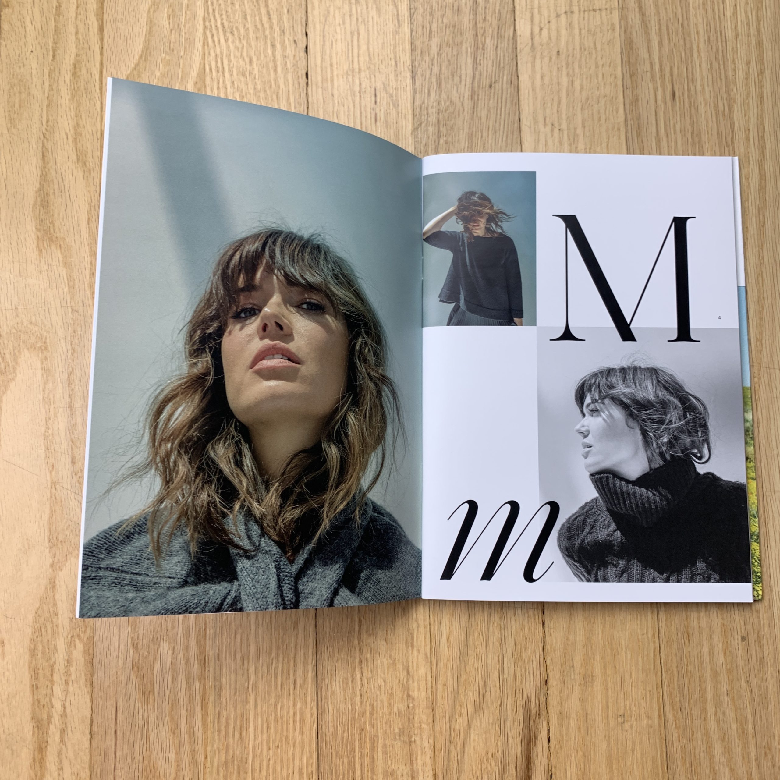
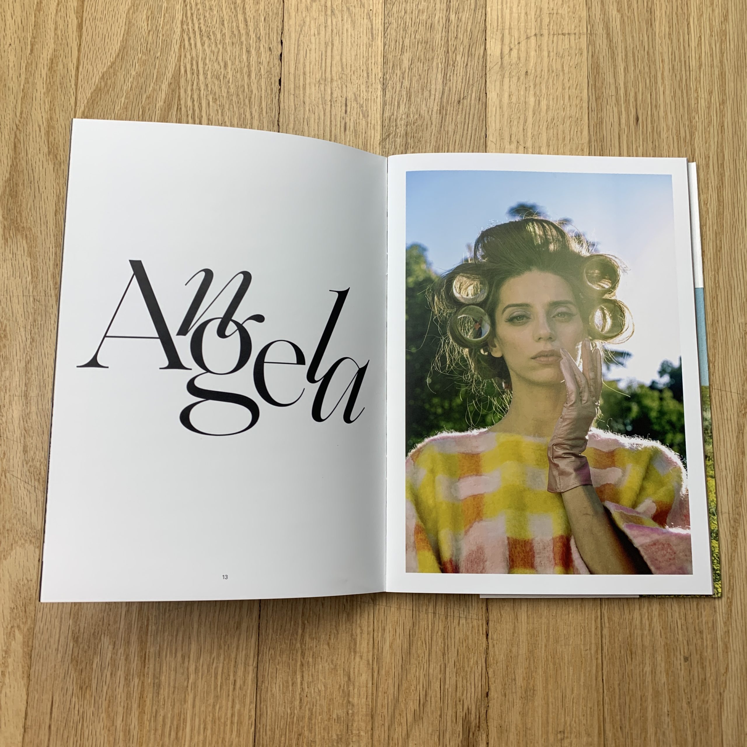
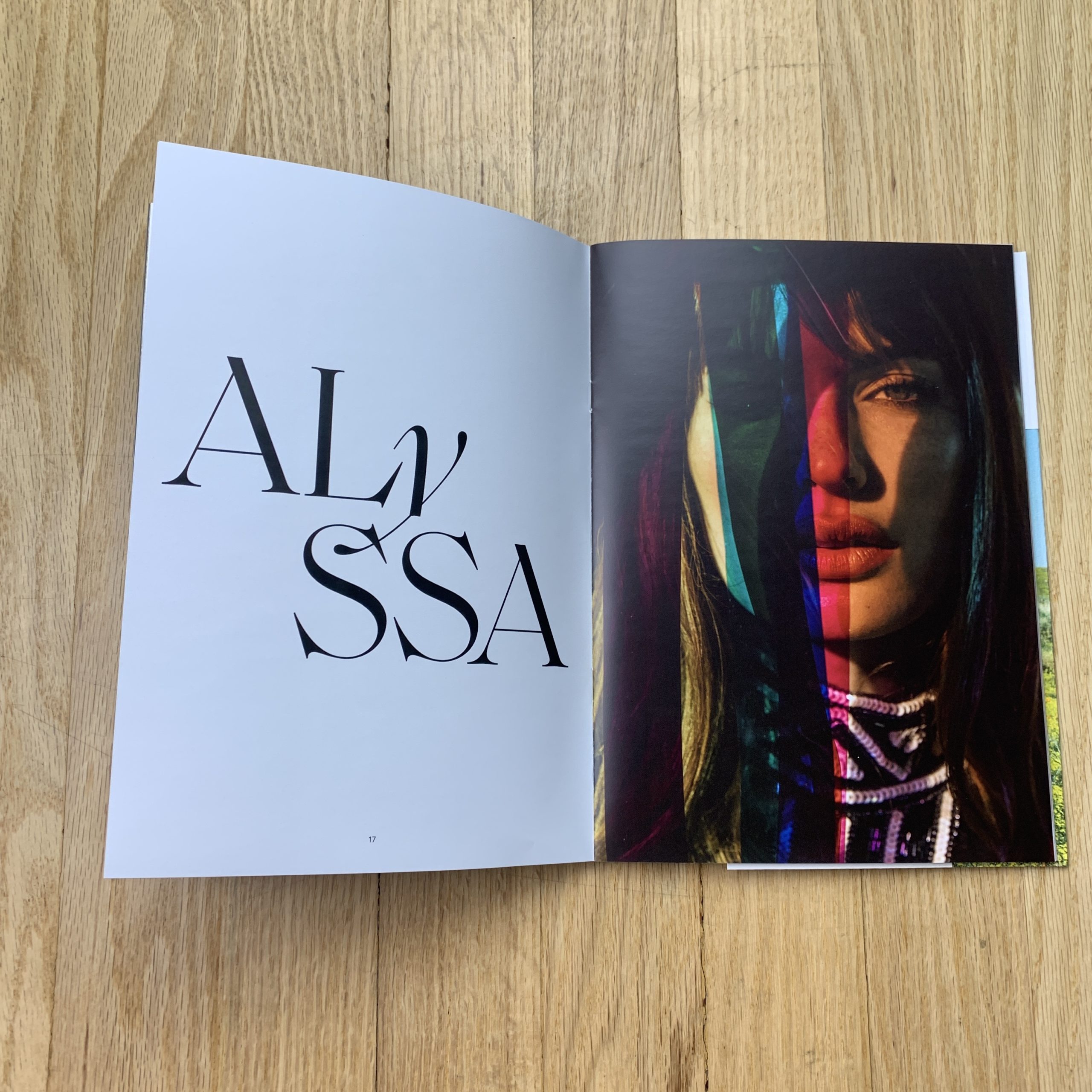
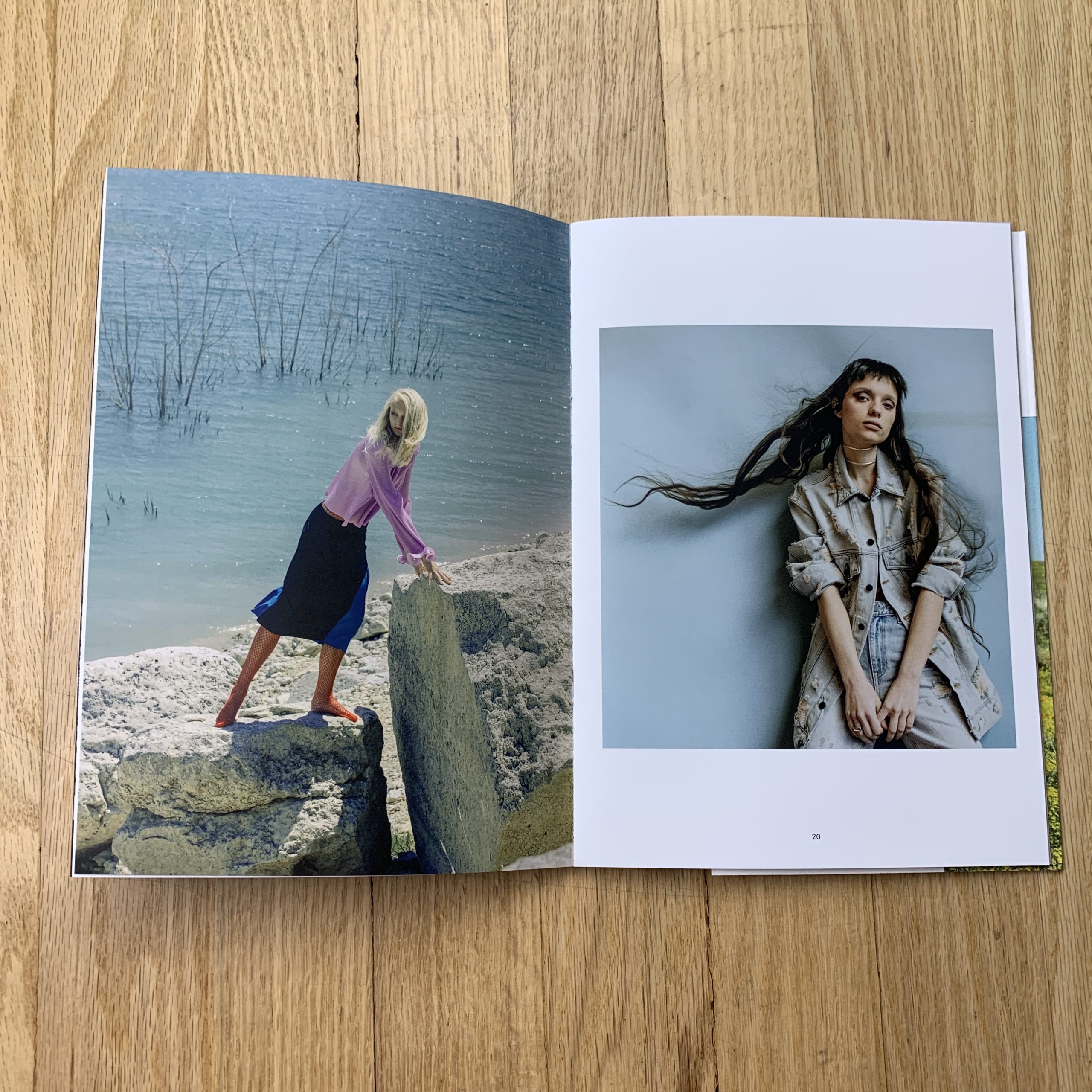
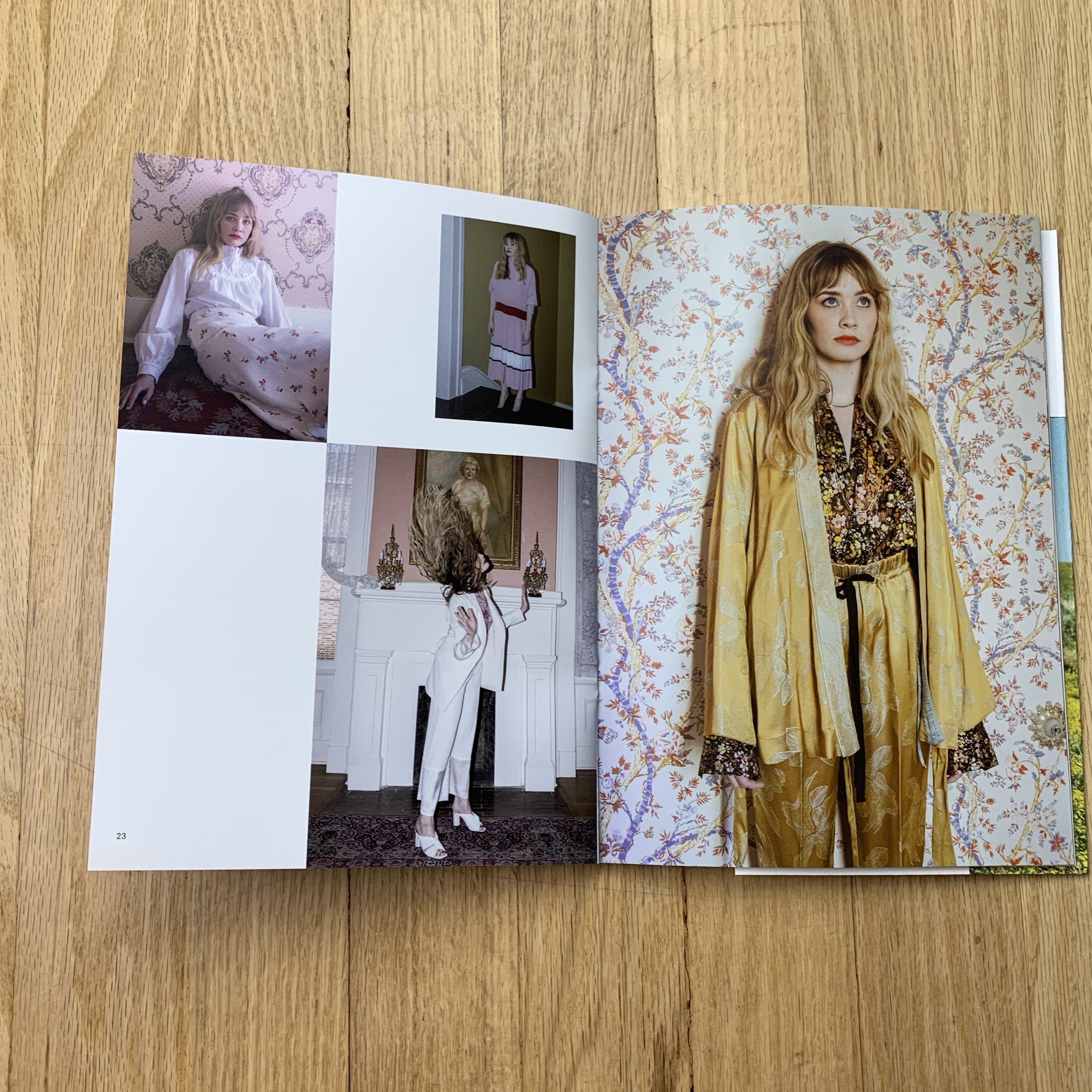
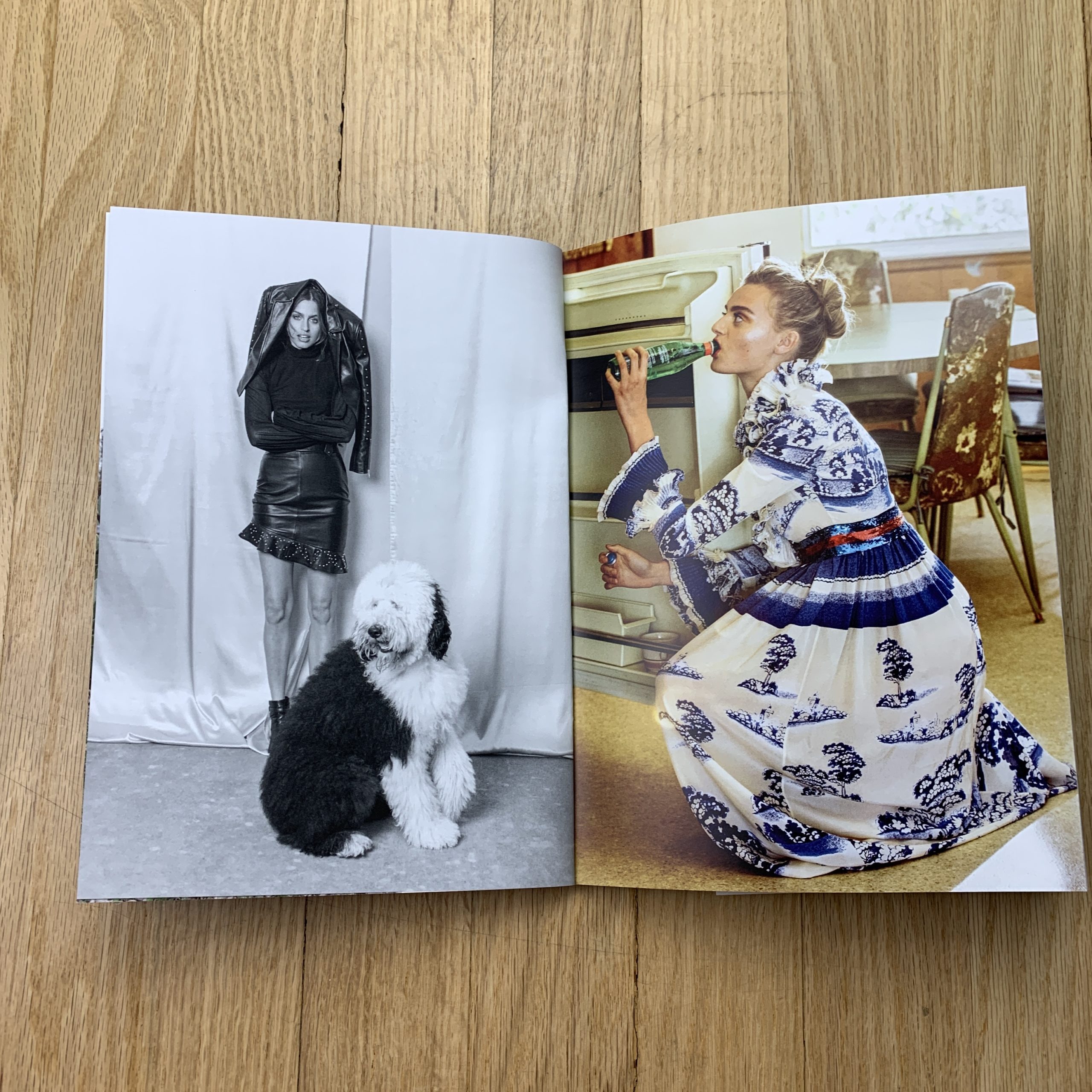
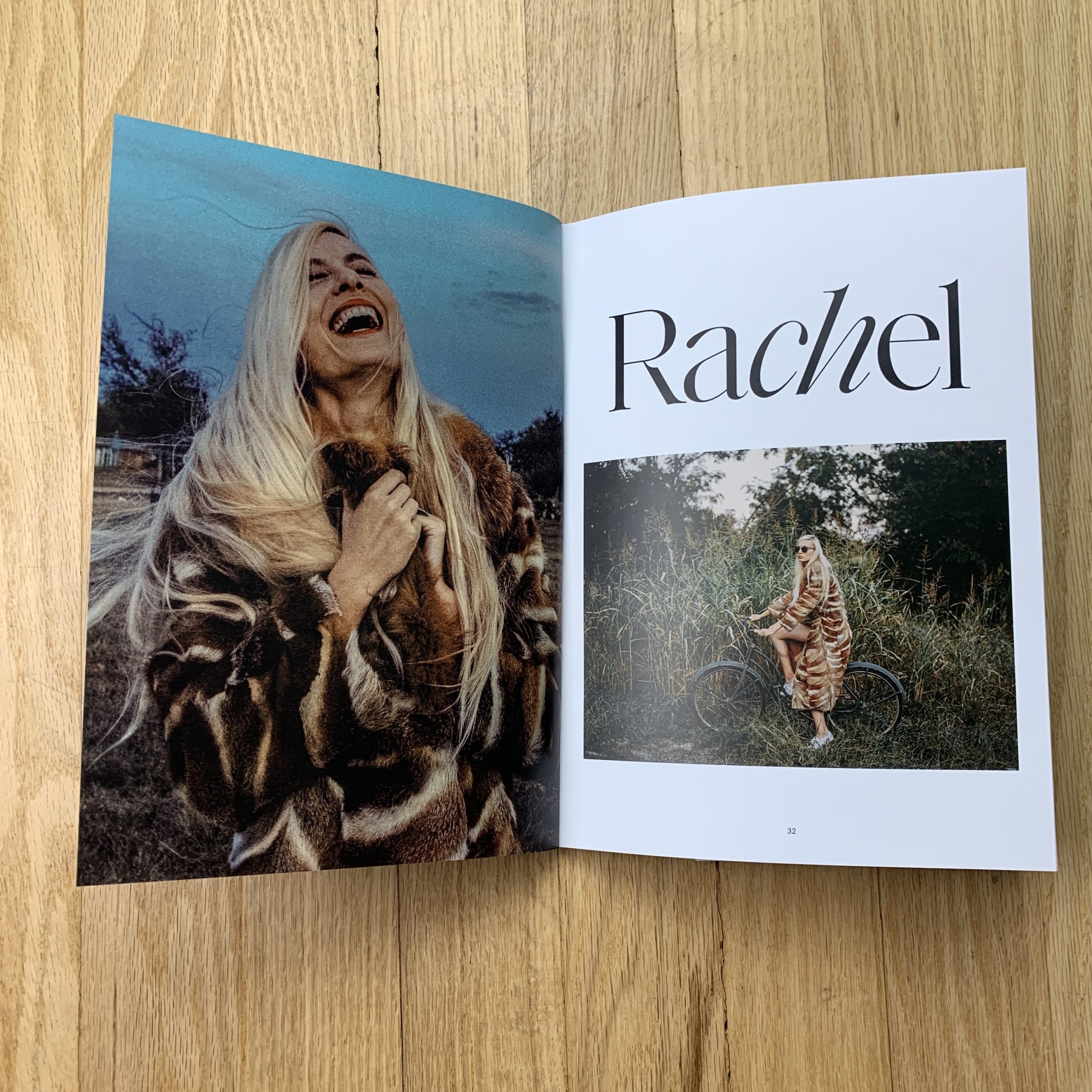
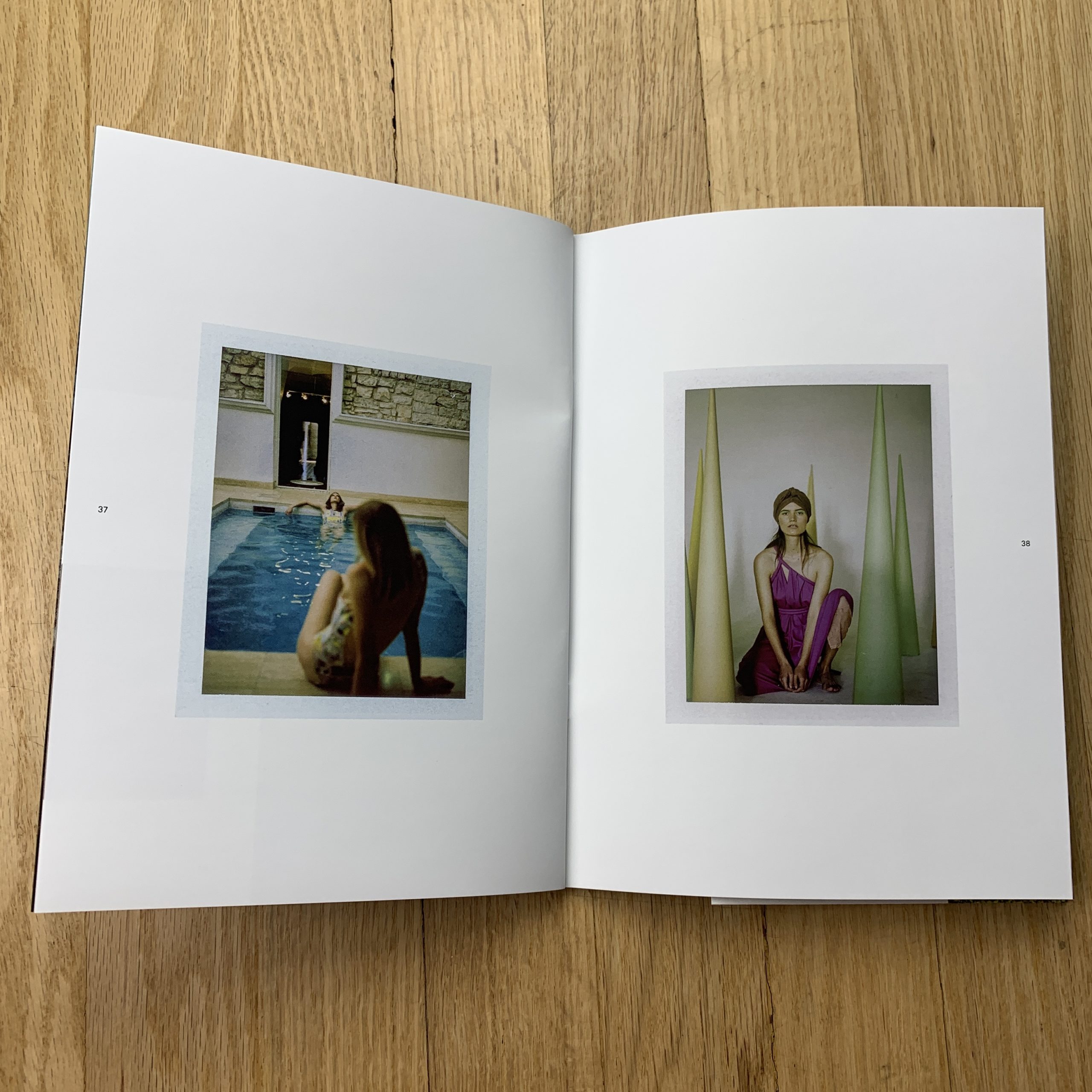
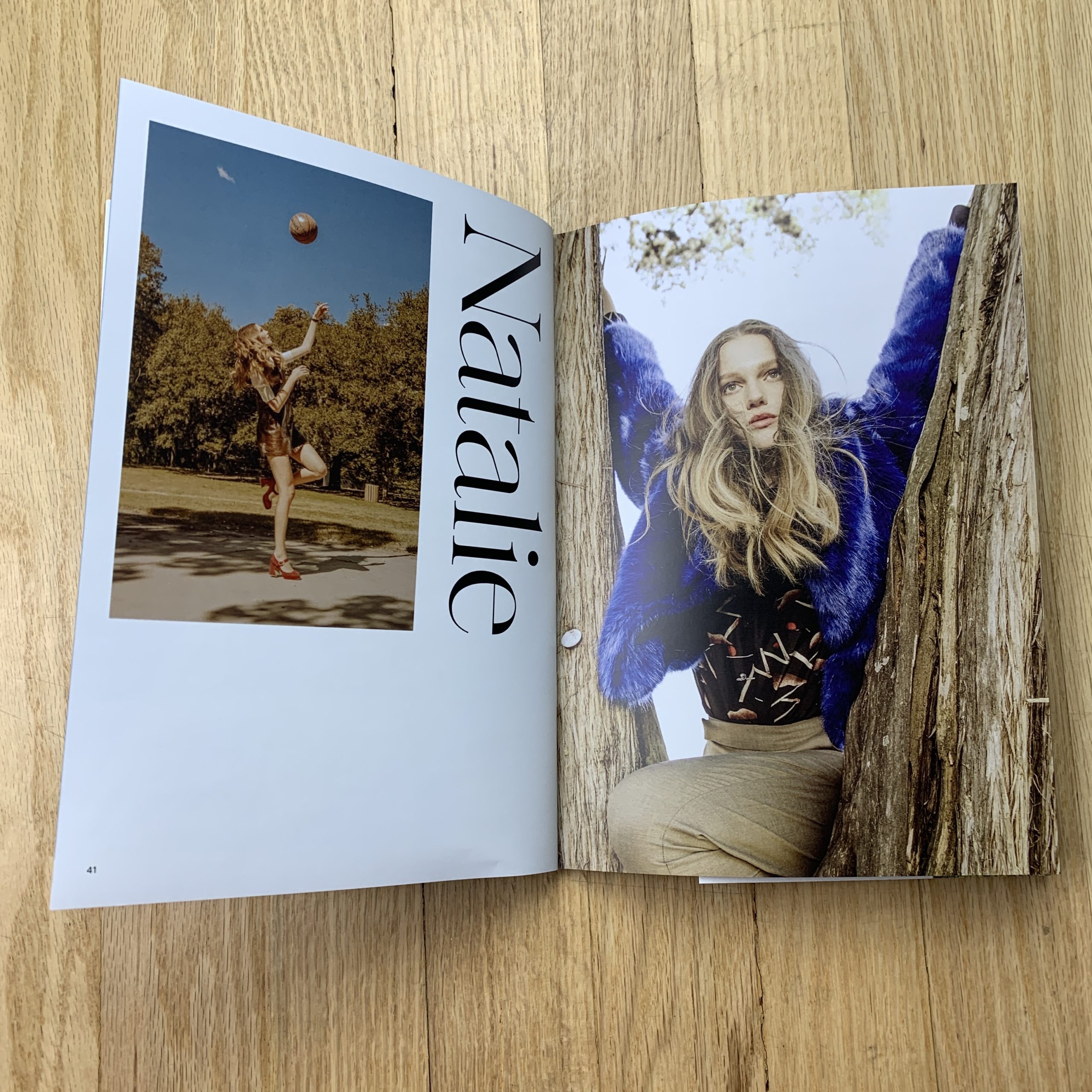
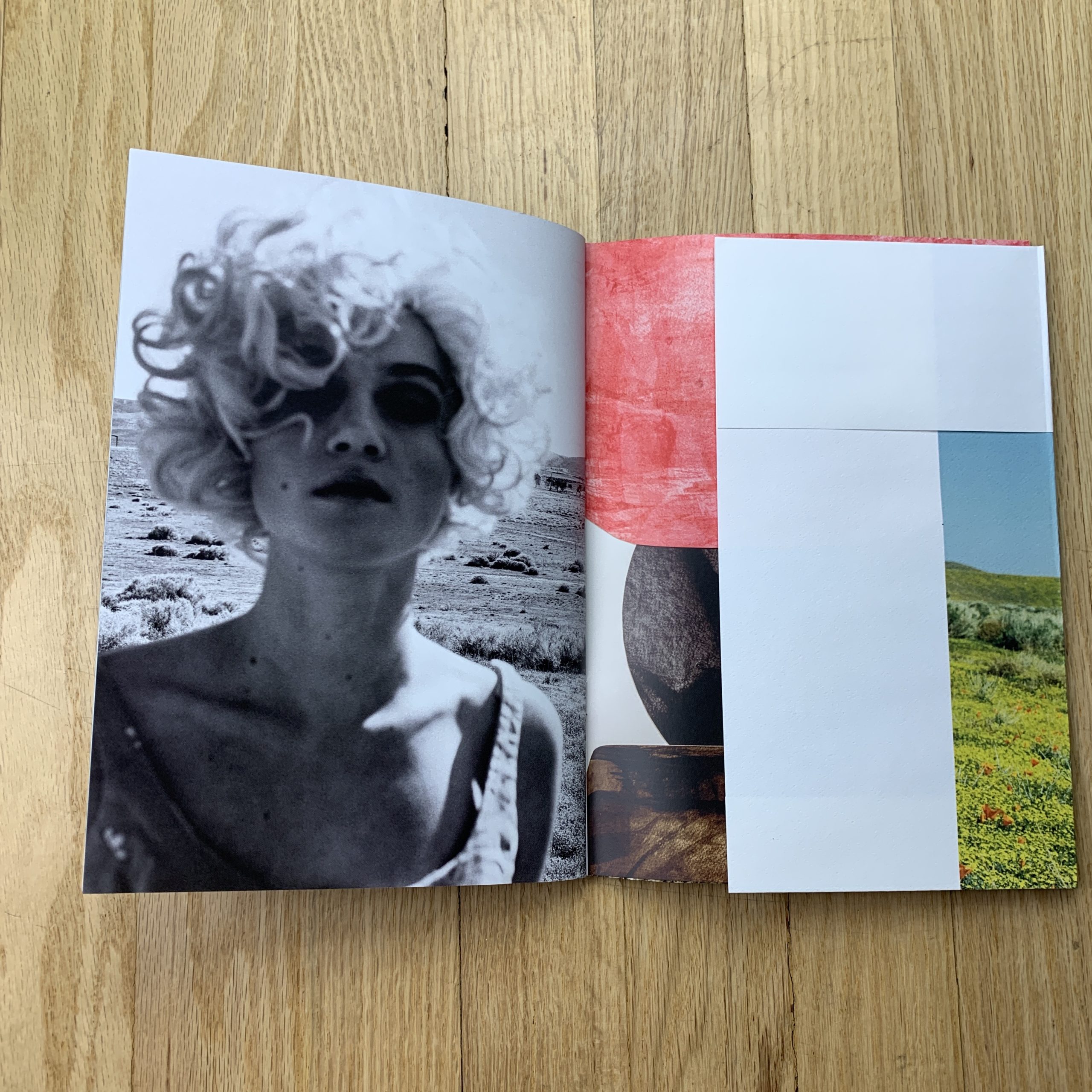
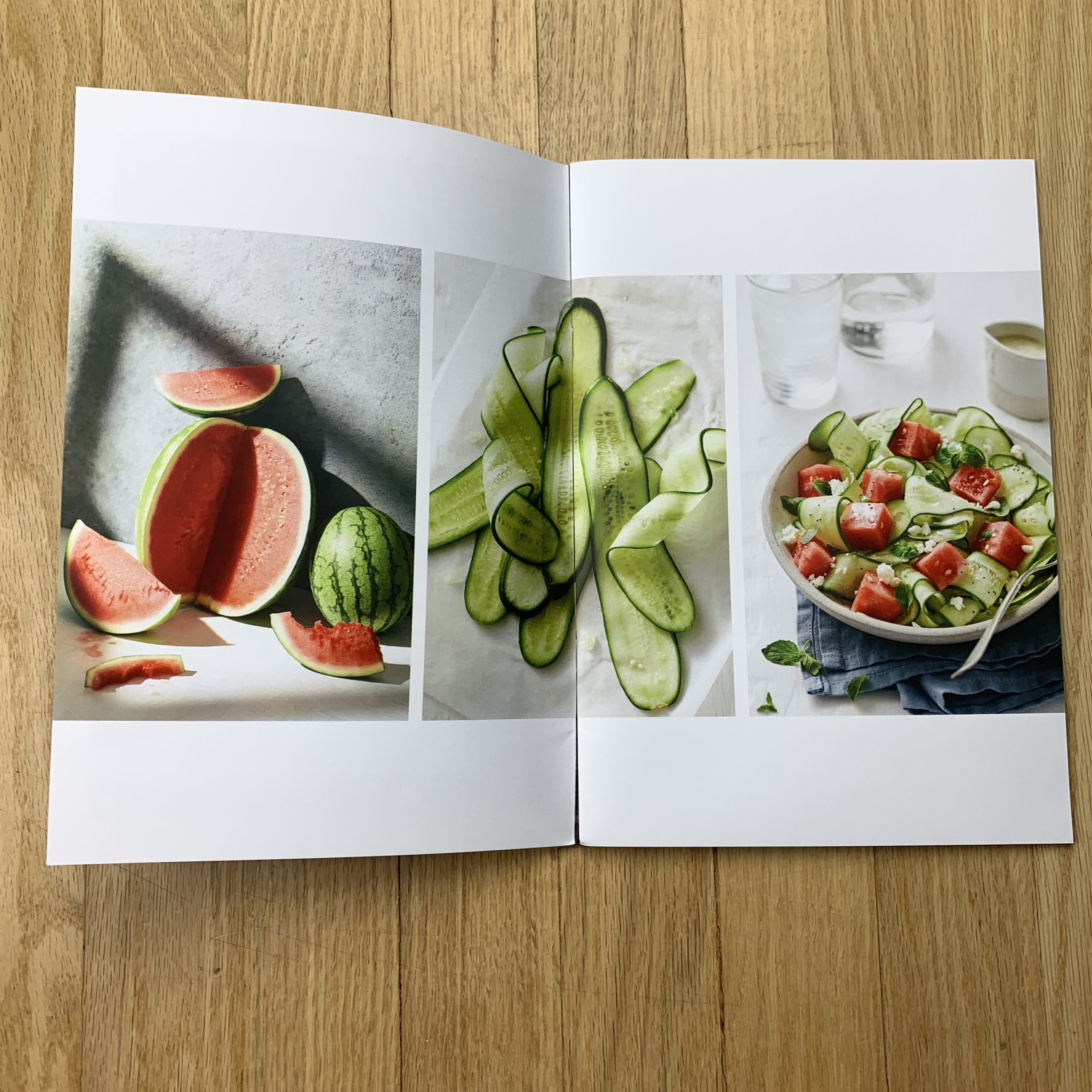
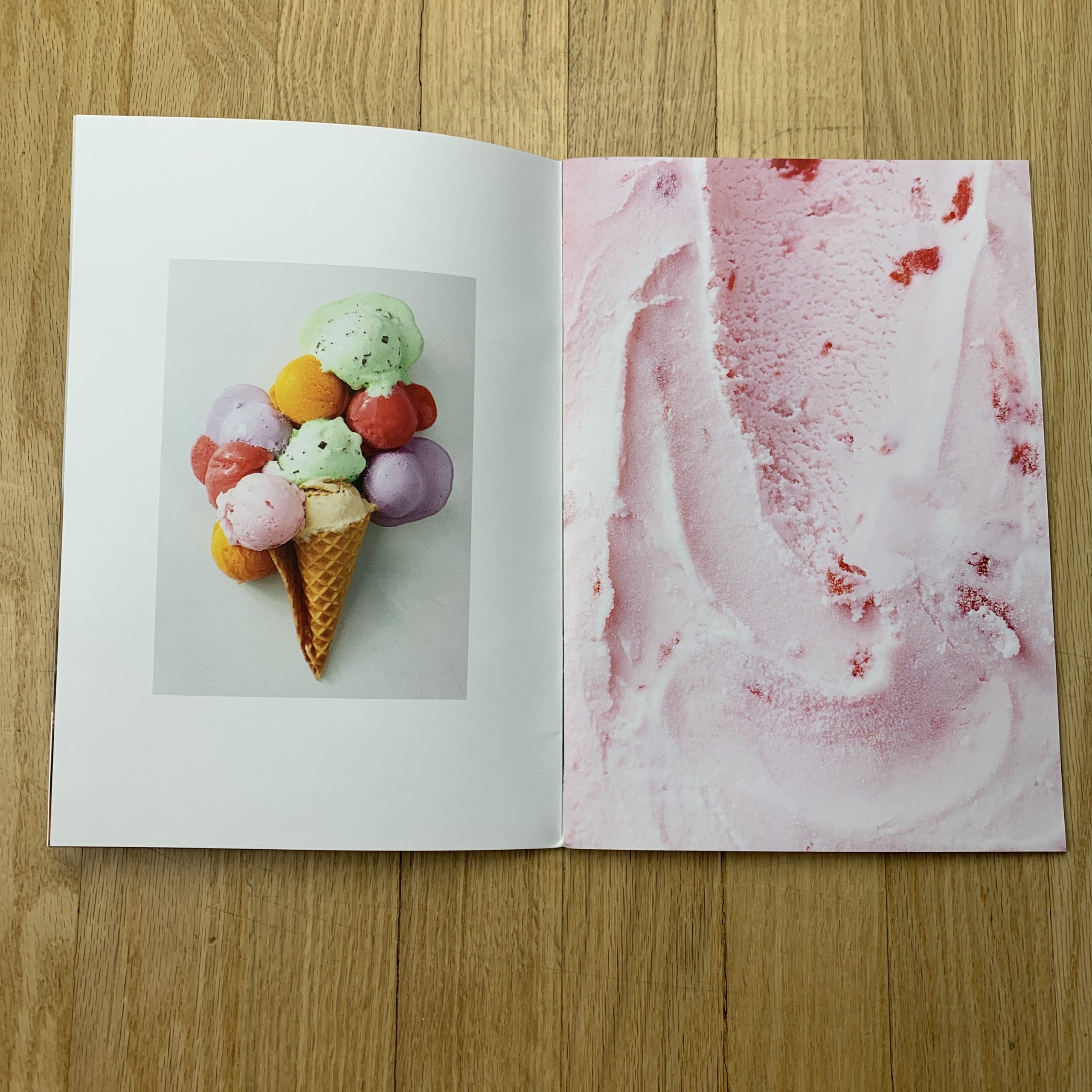
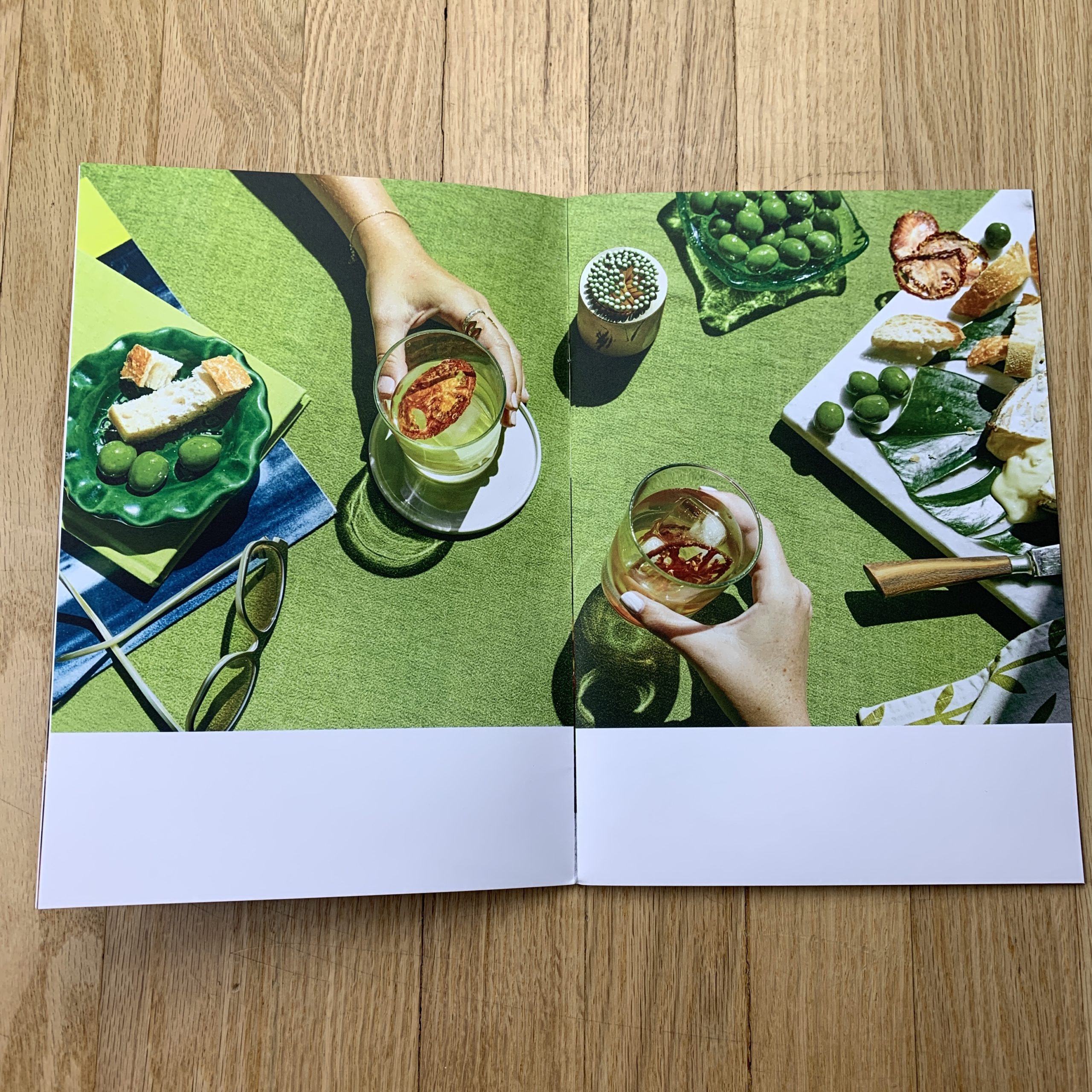
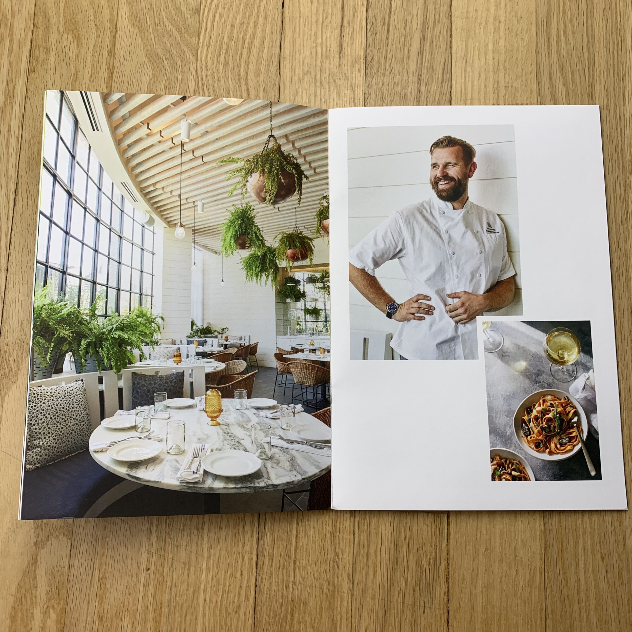
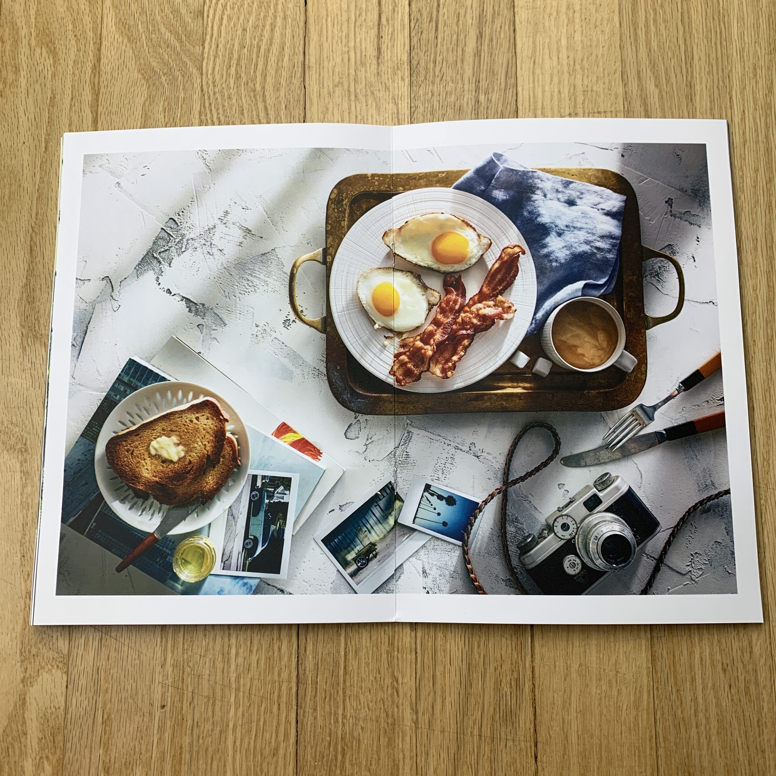
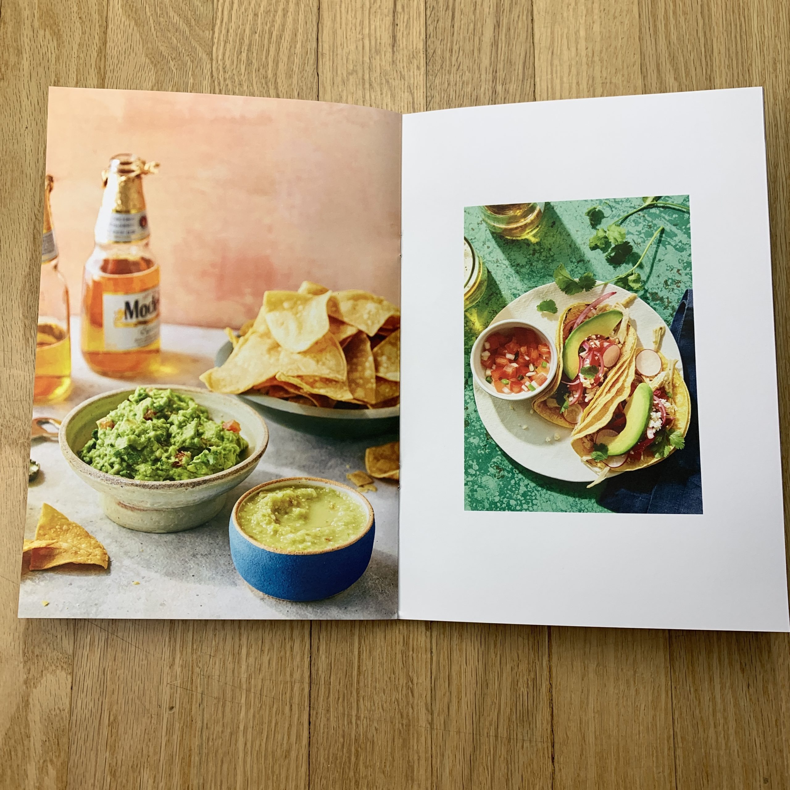
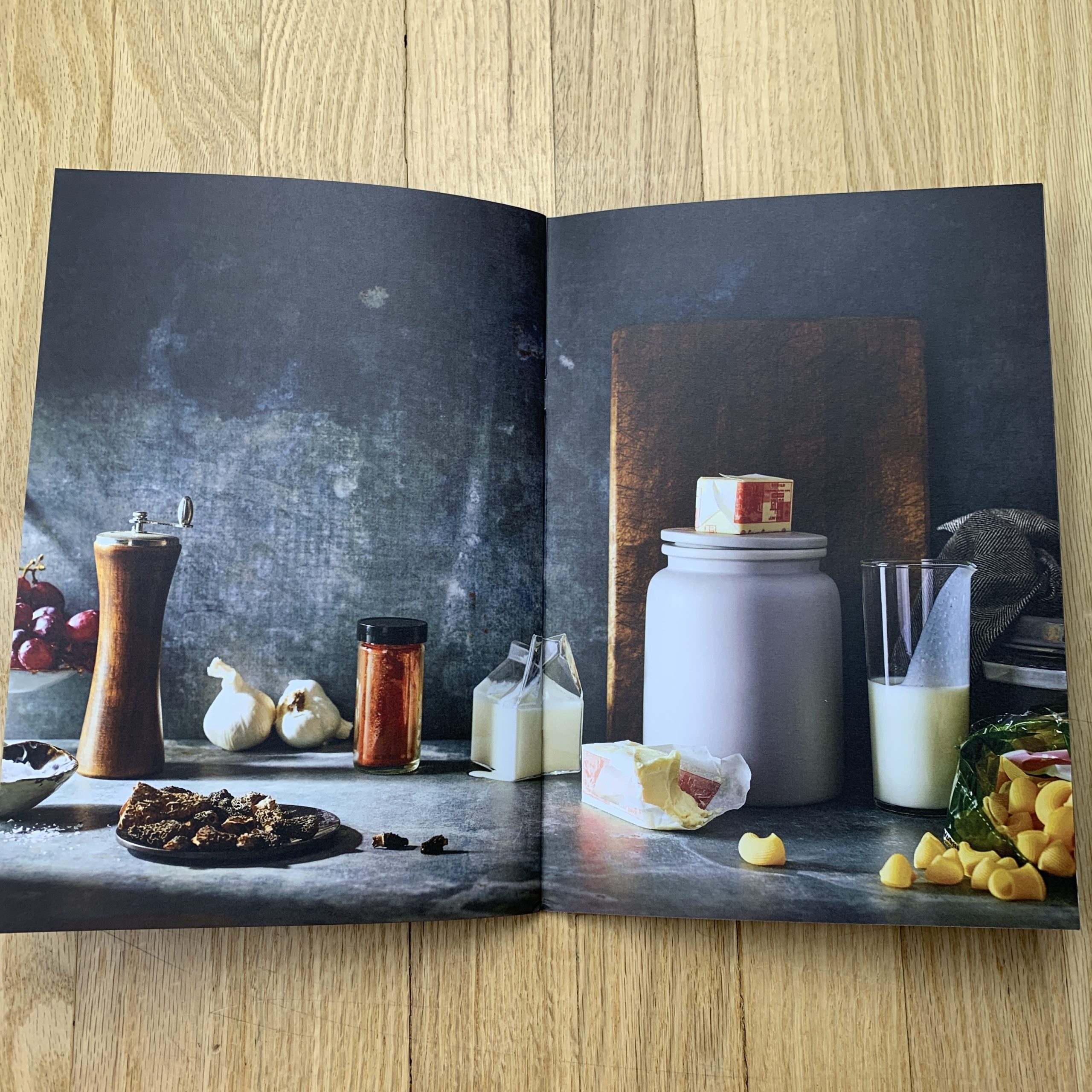
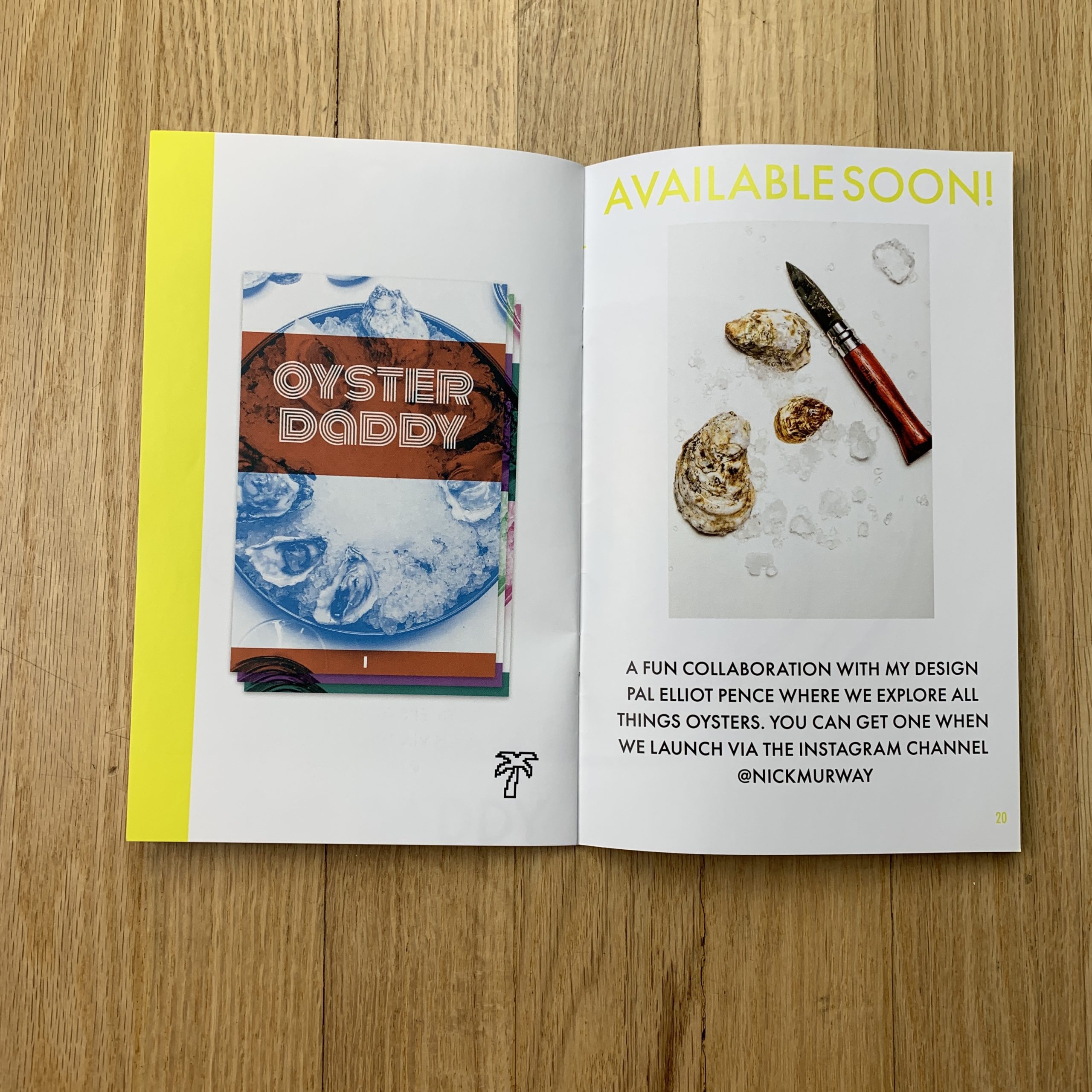
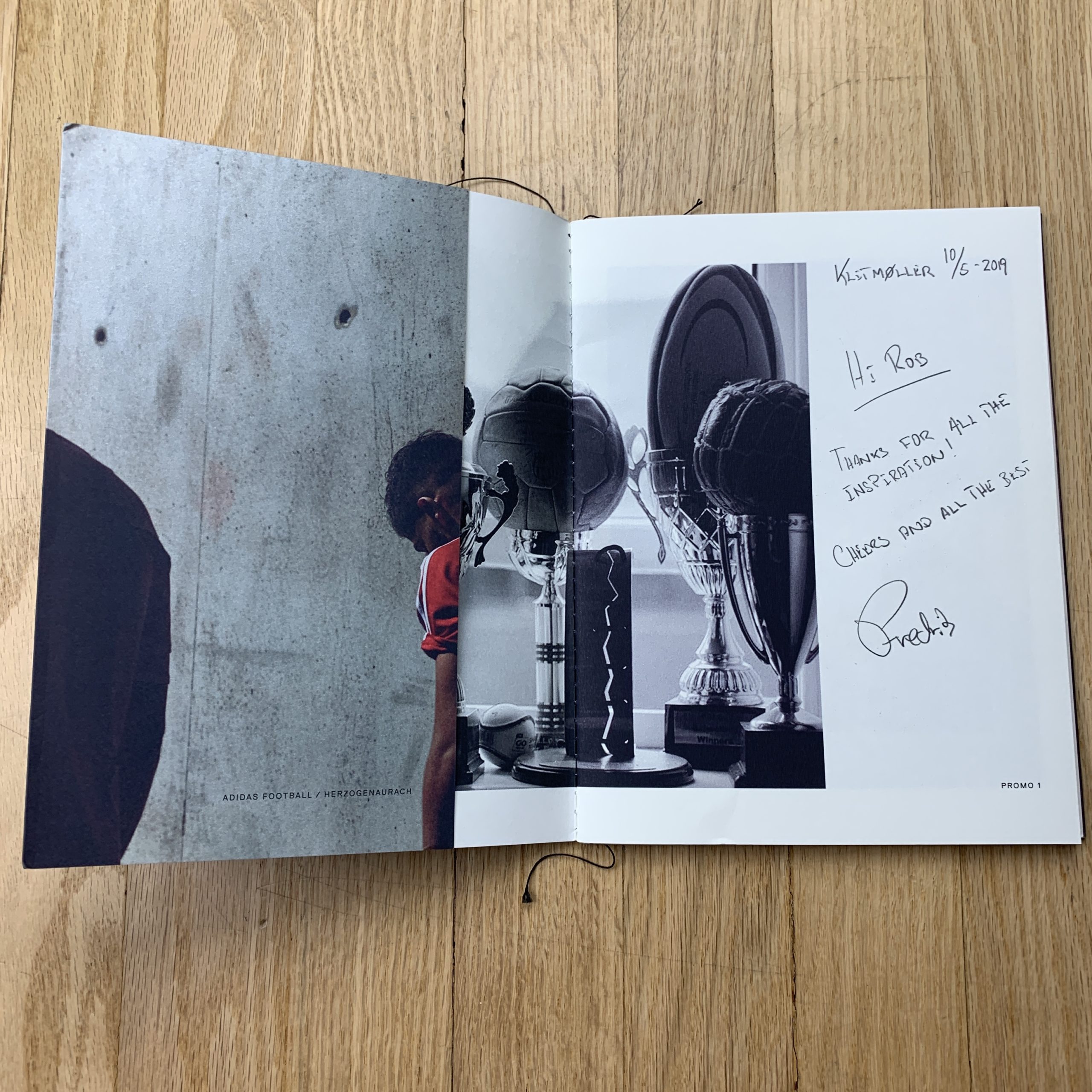
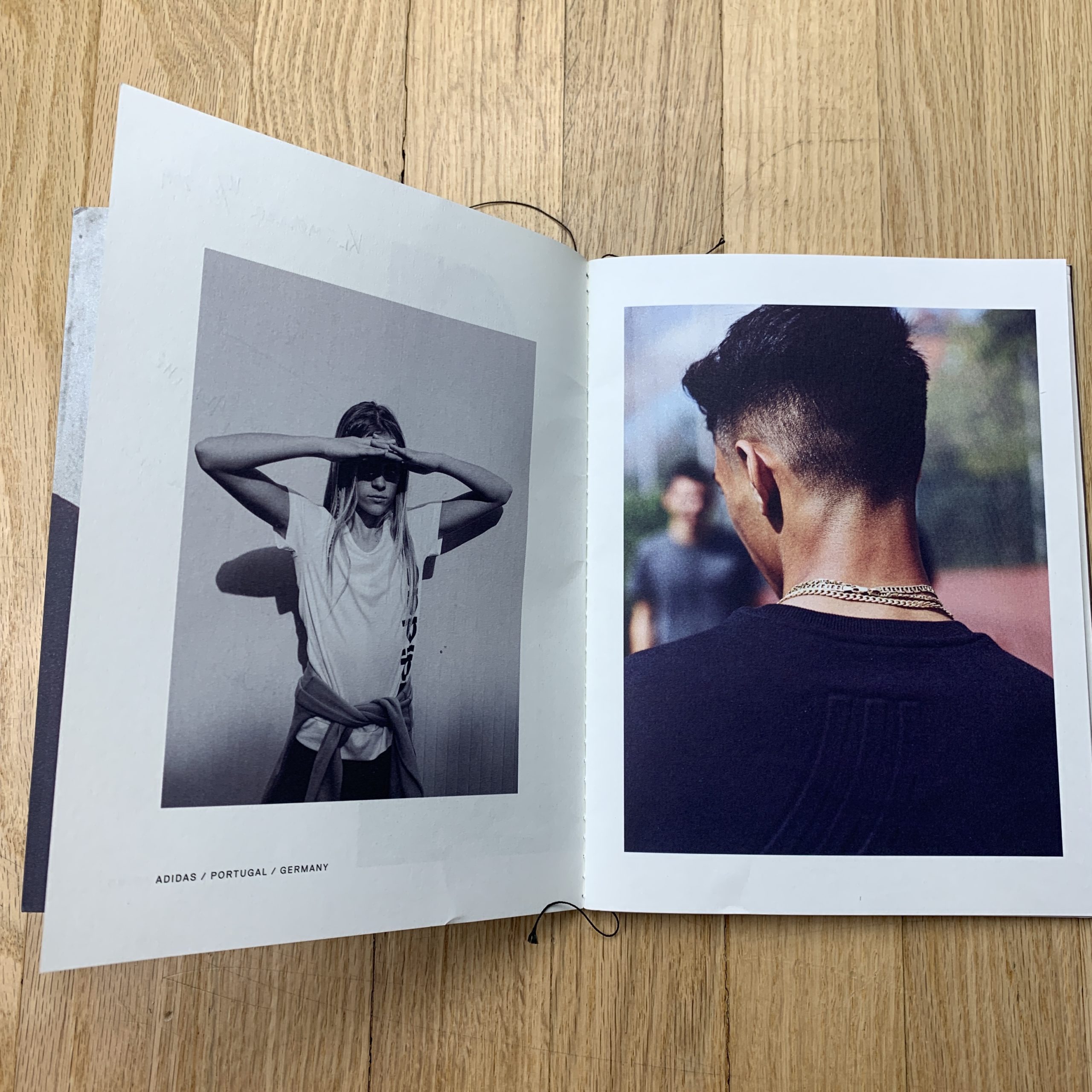
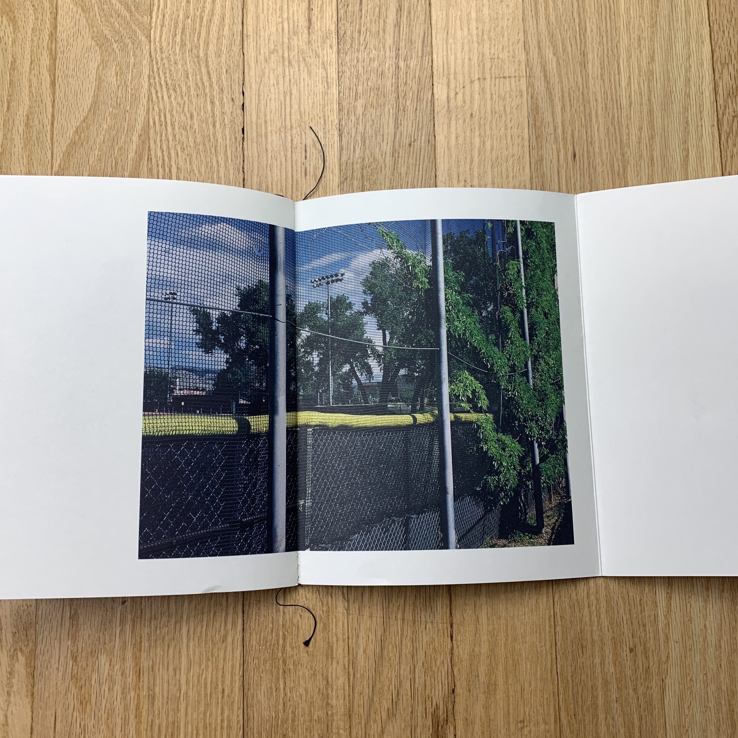
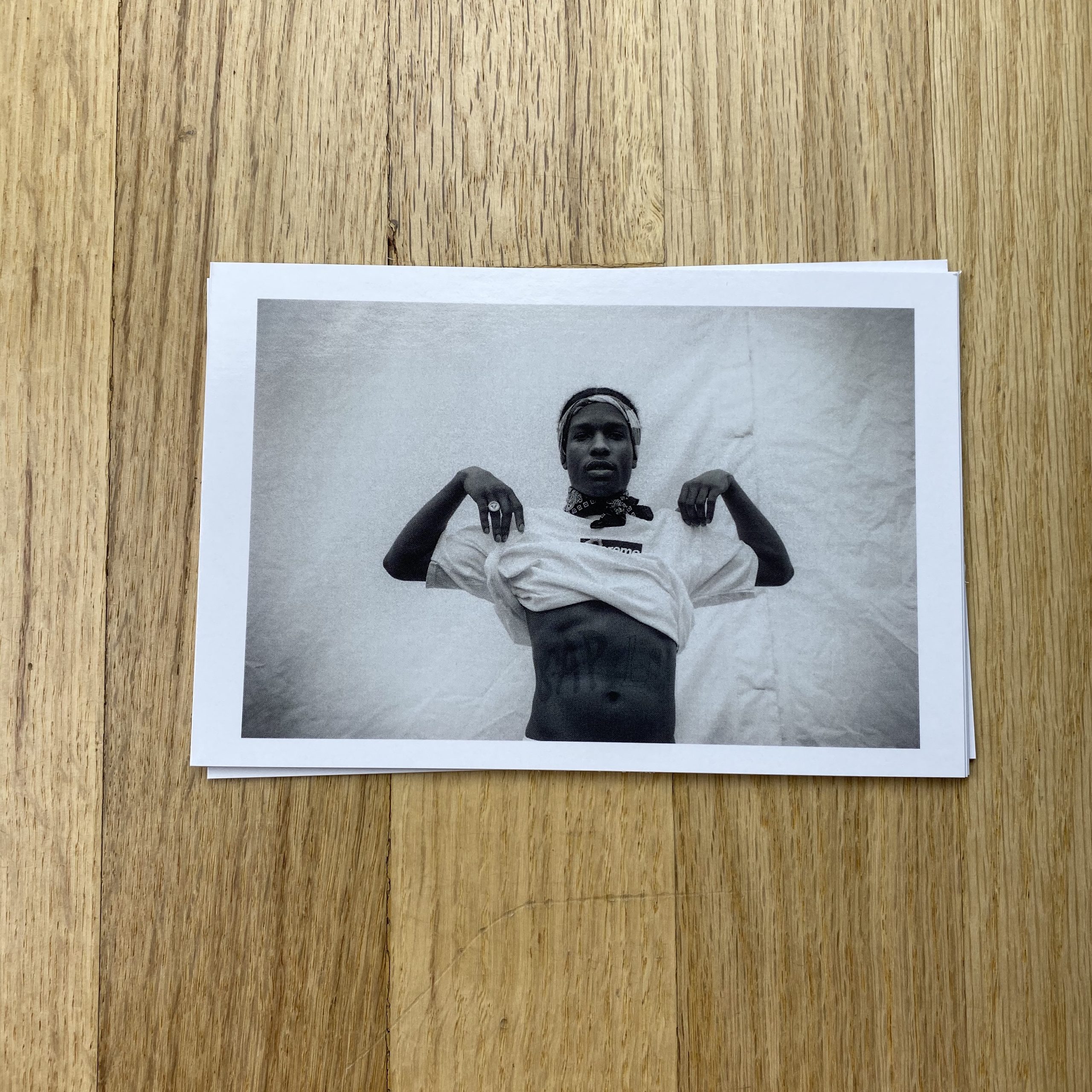
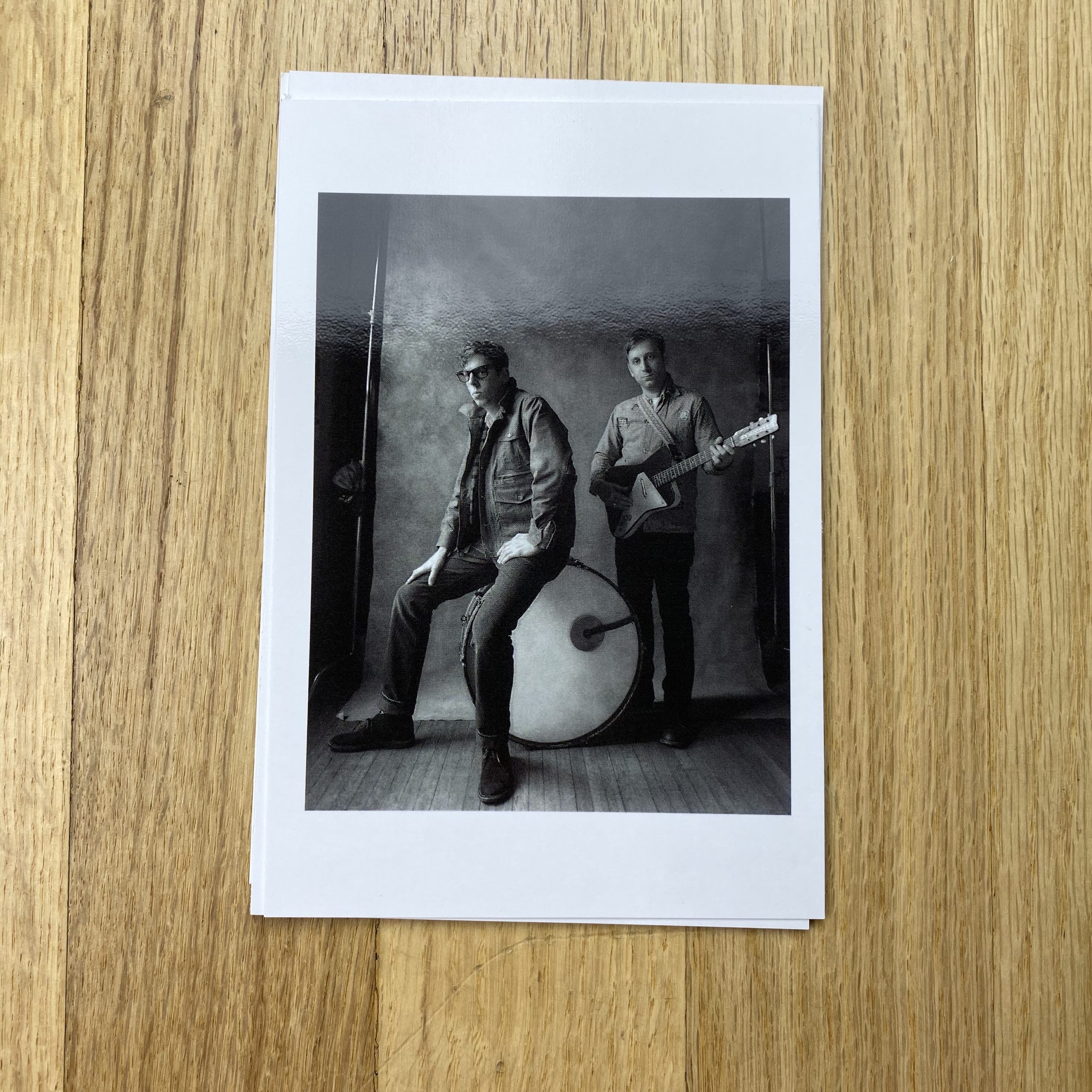
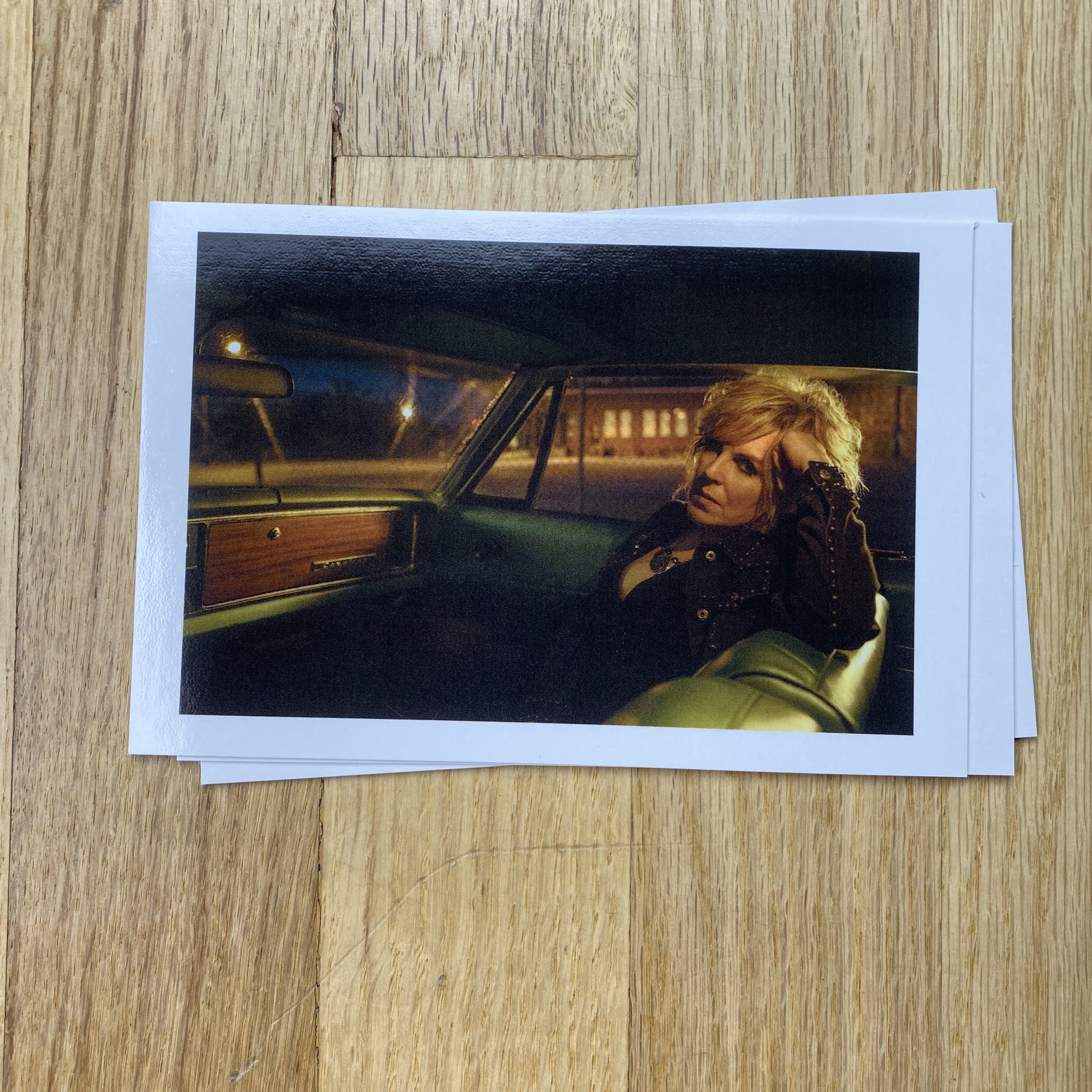
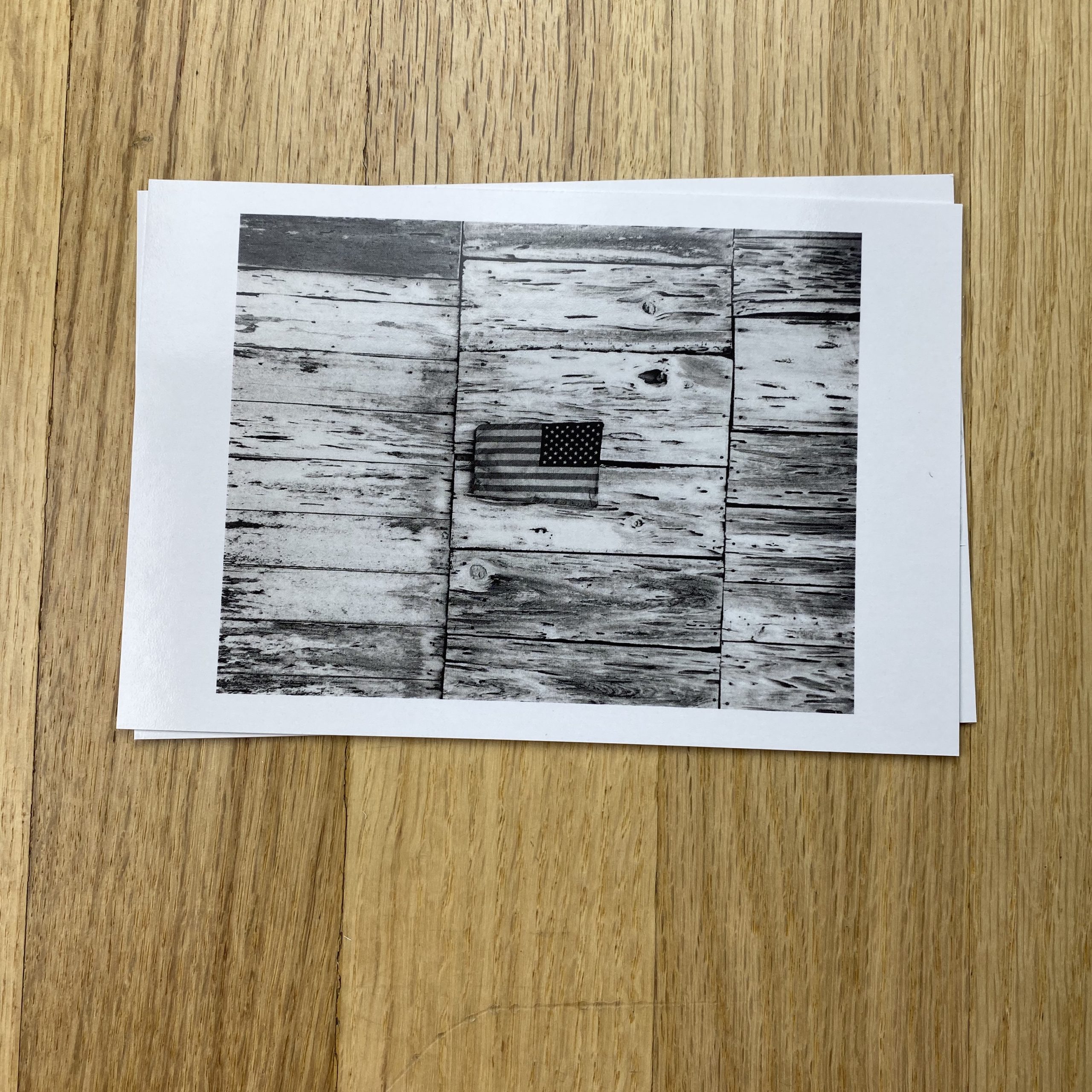
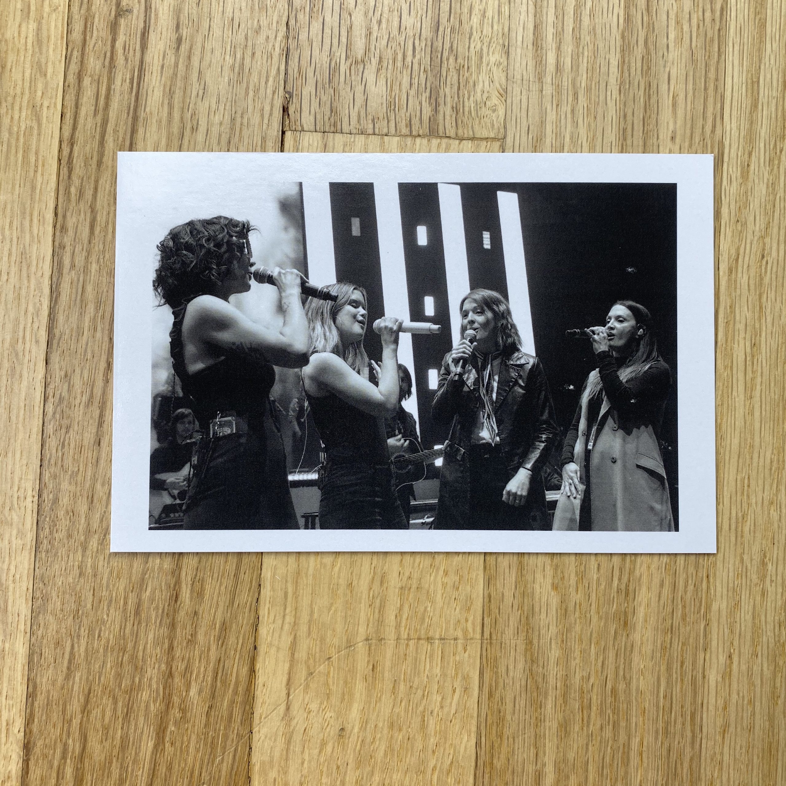
Tell me about the images?
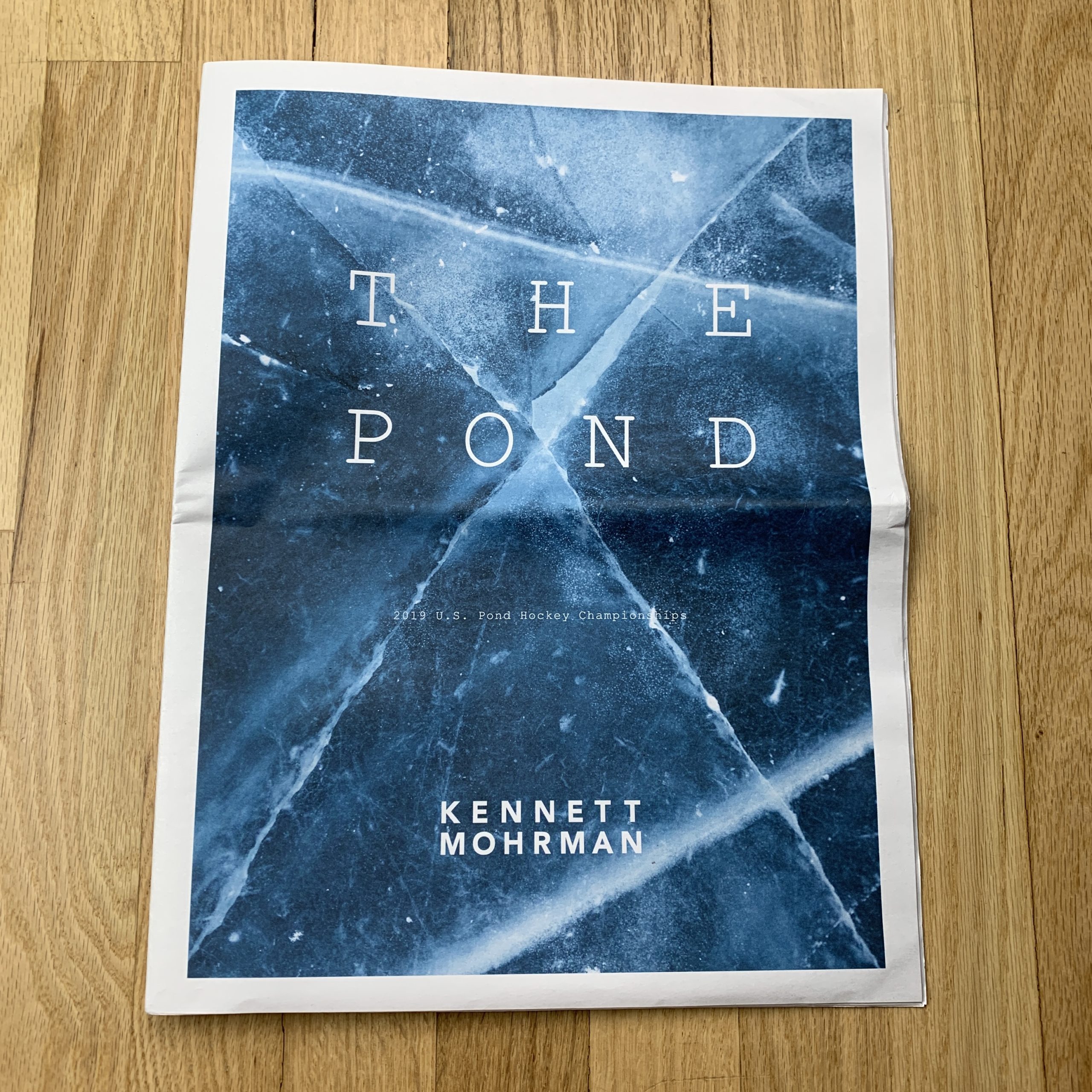
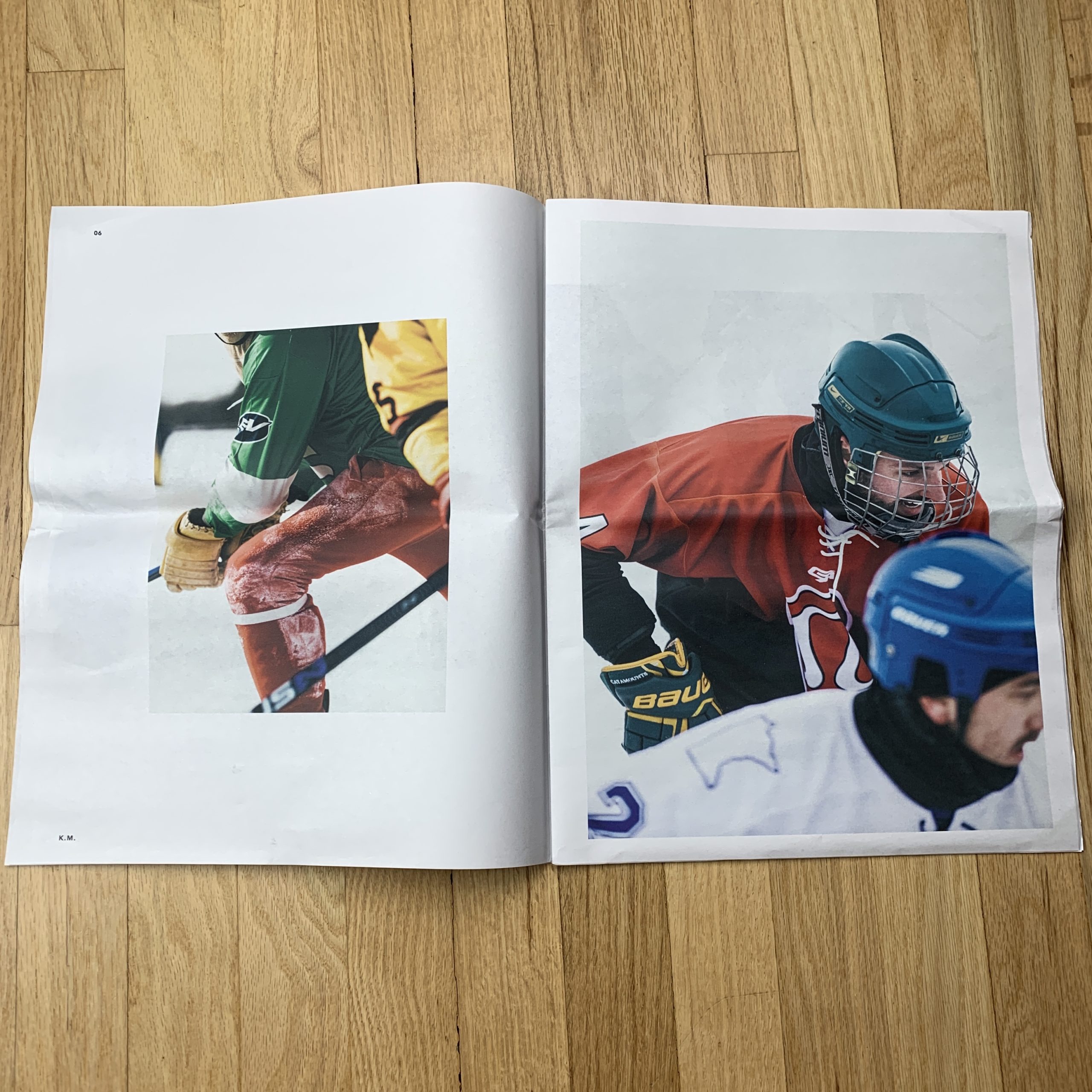
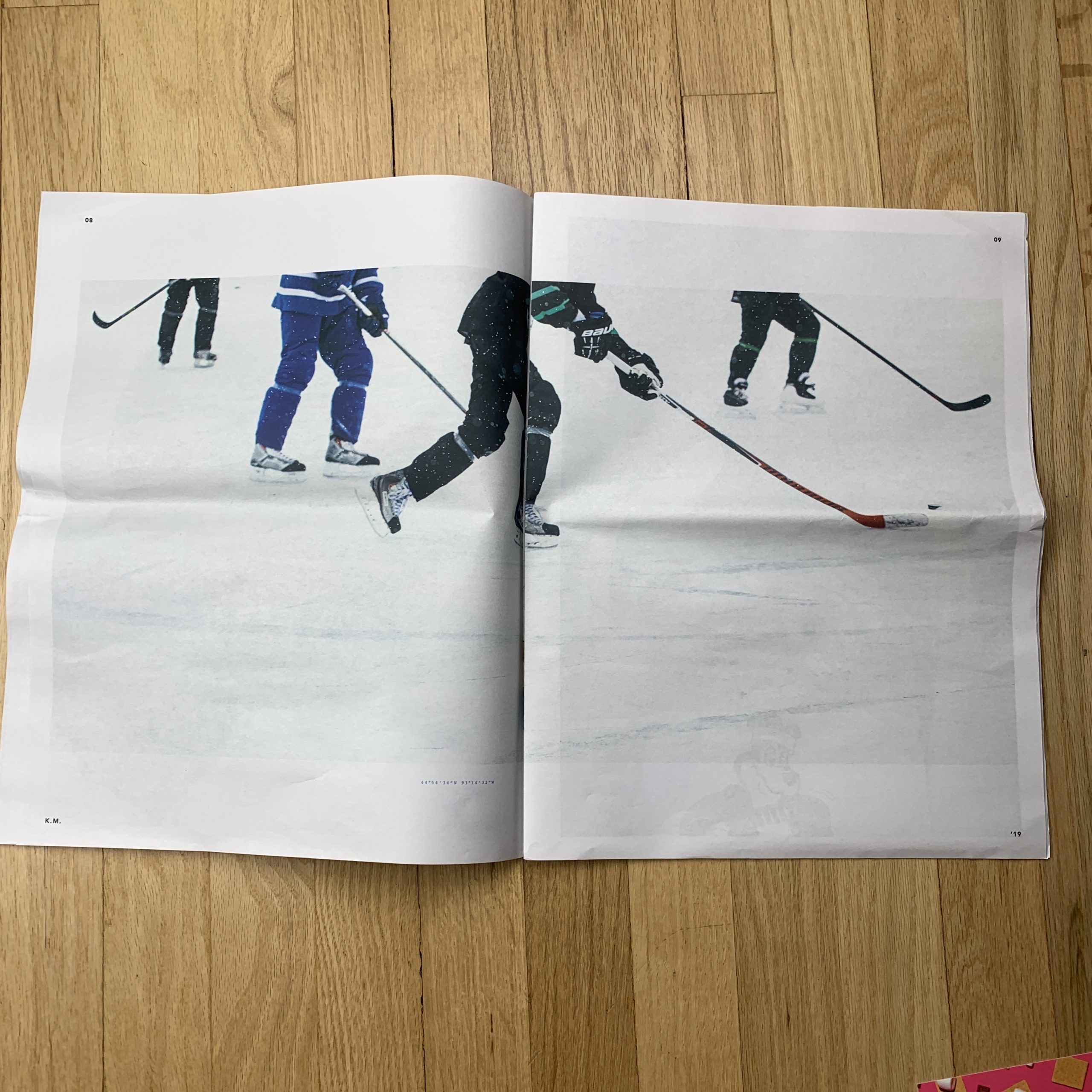
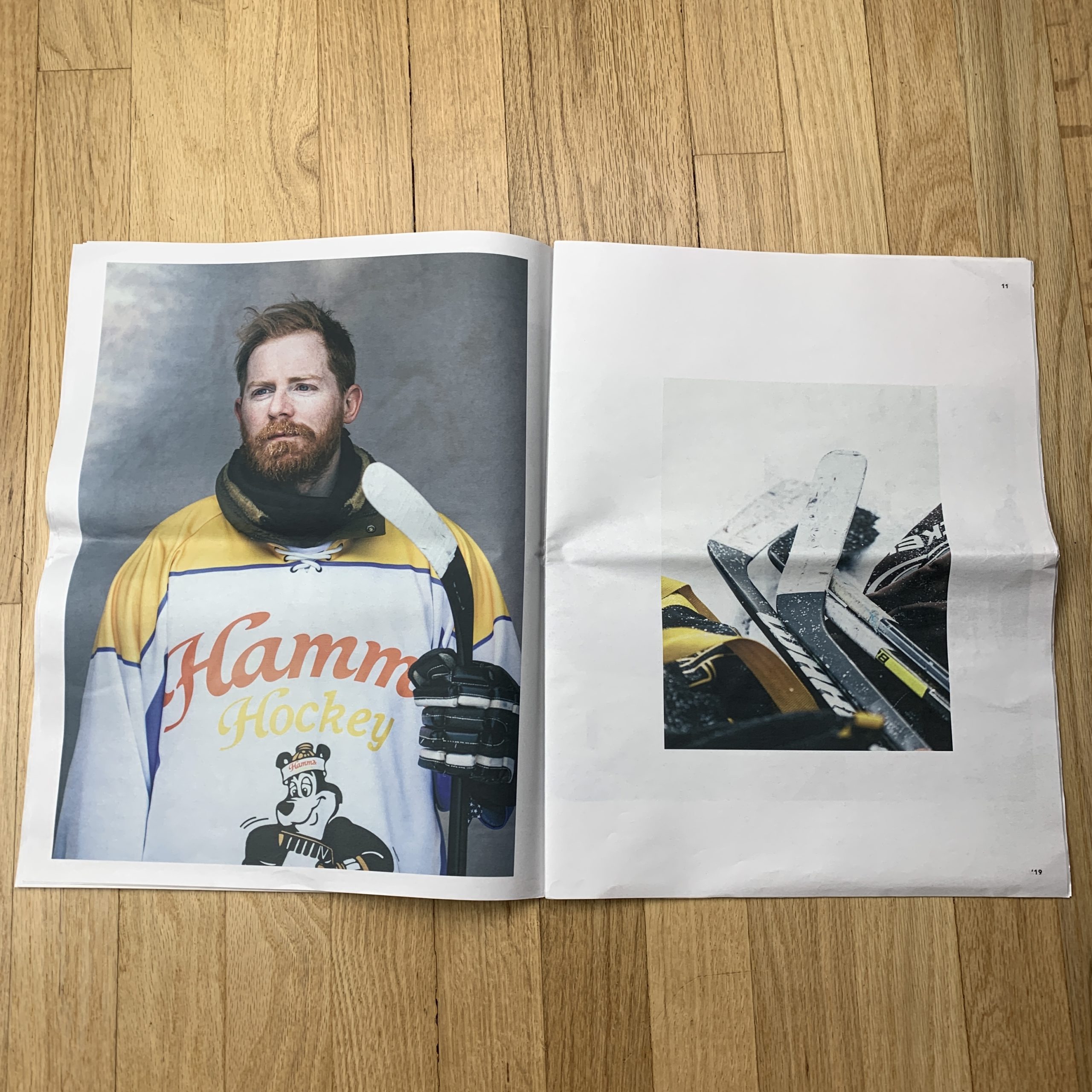
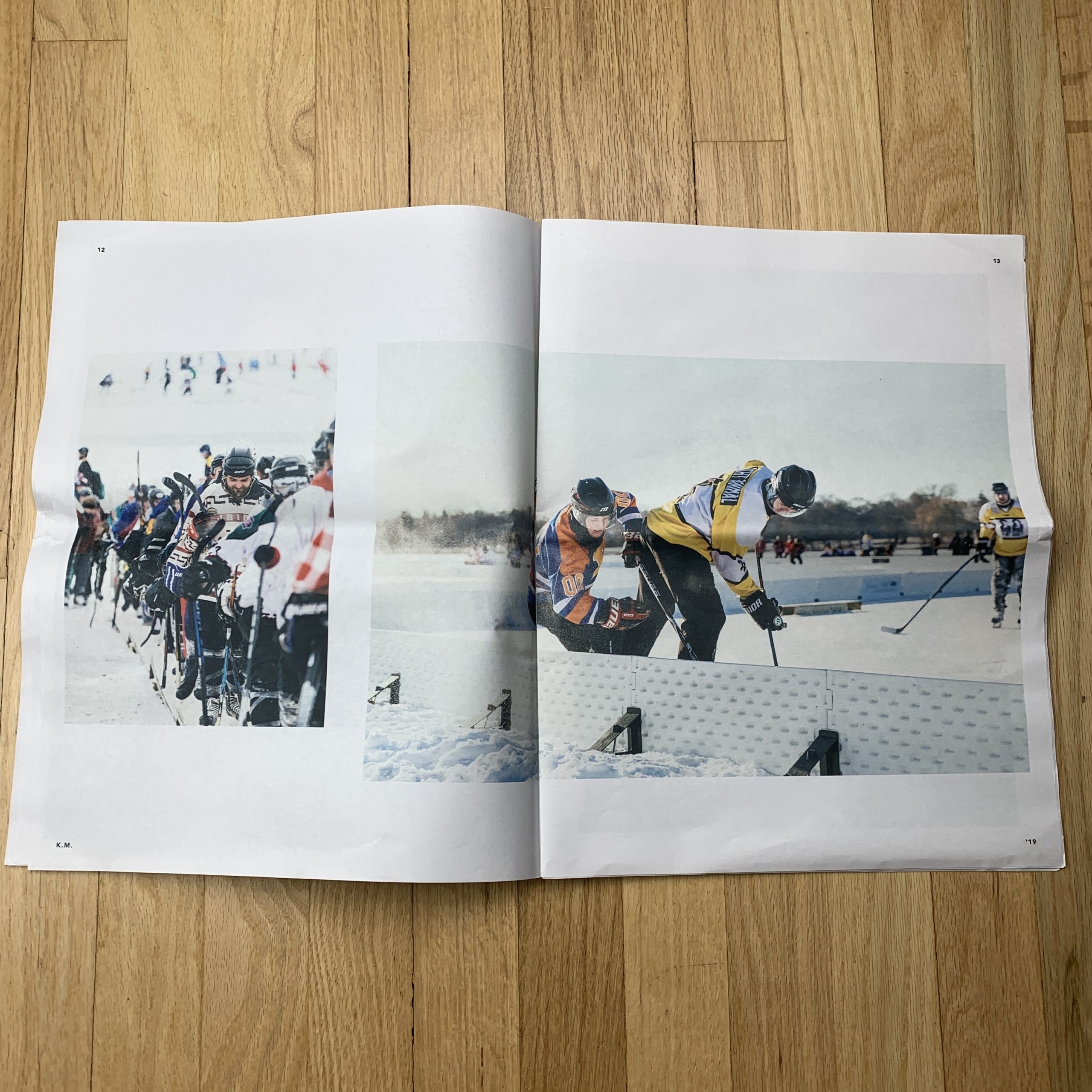
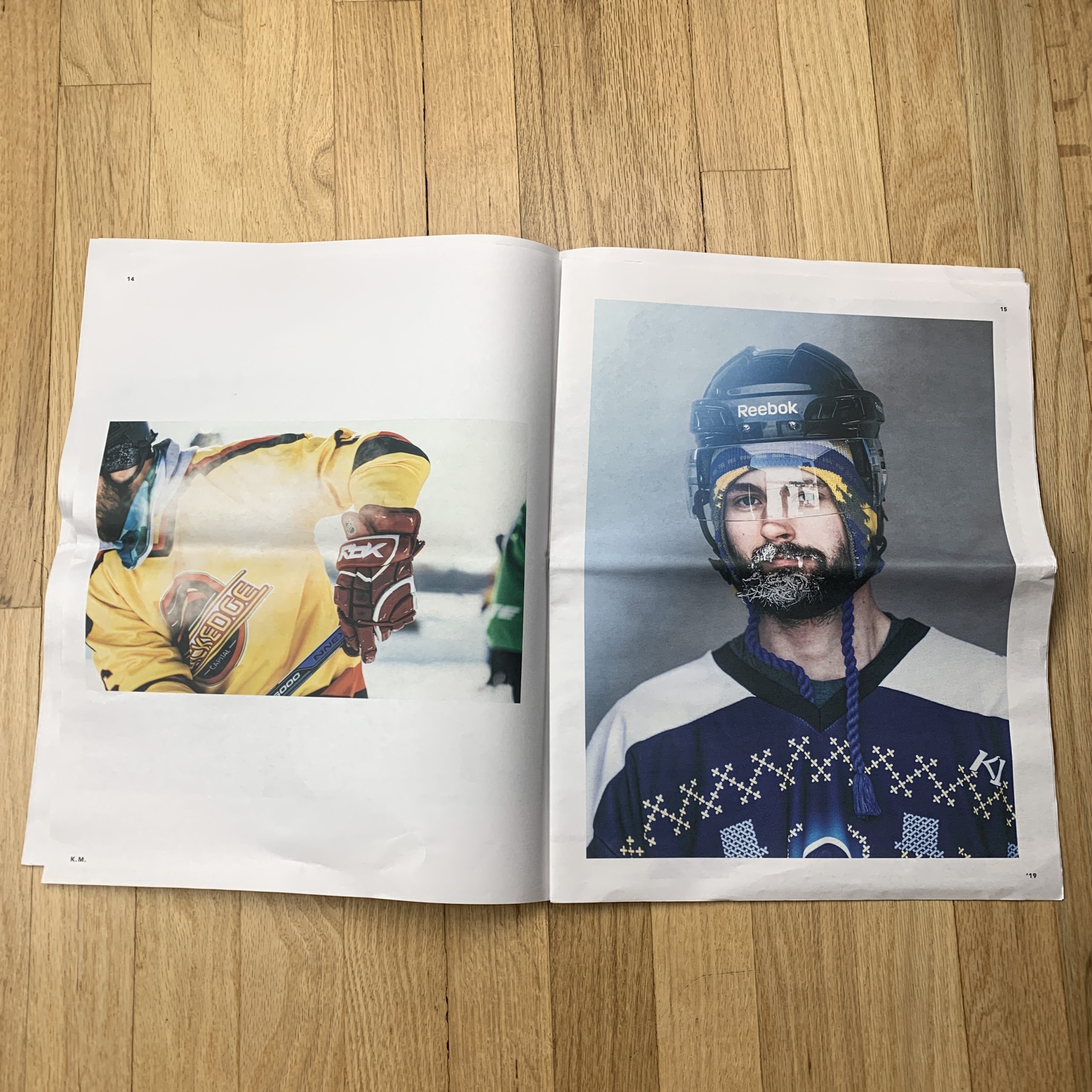
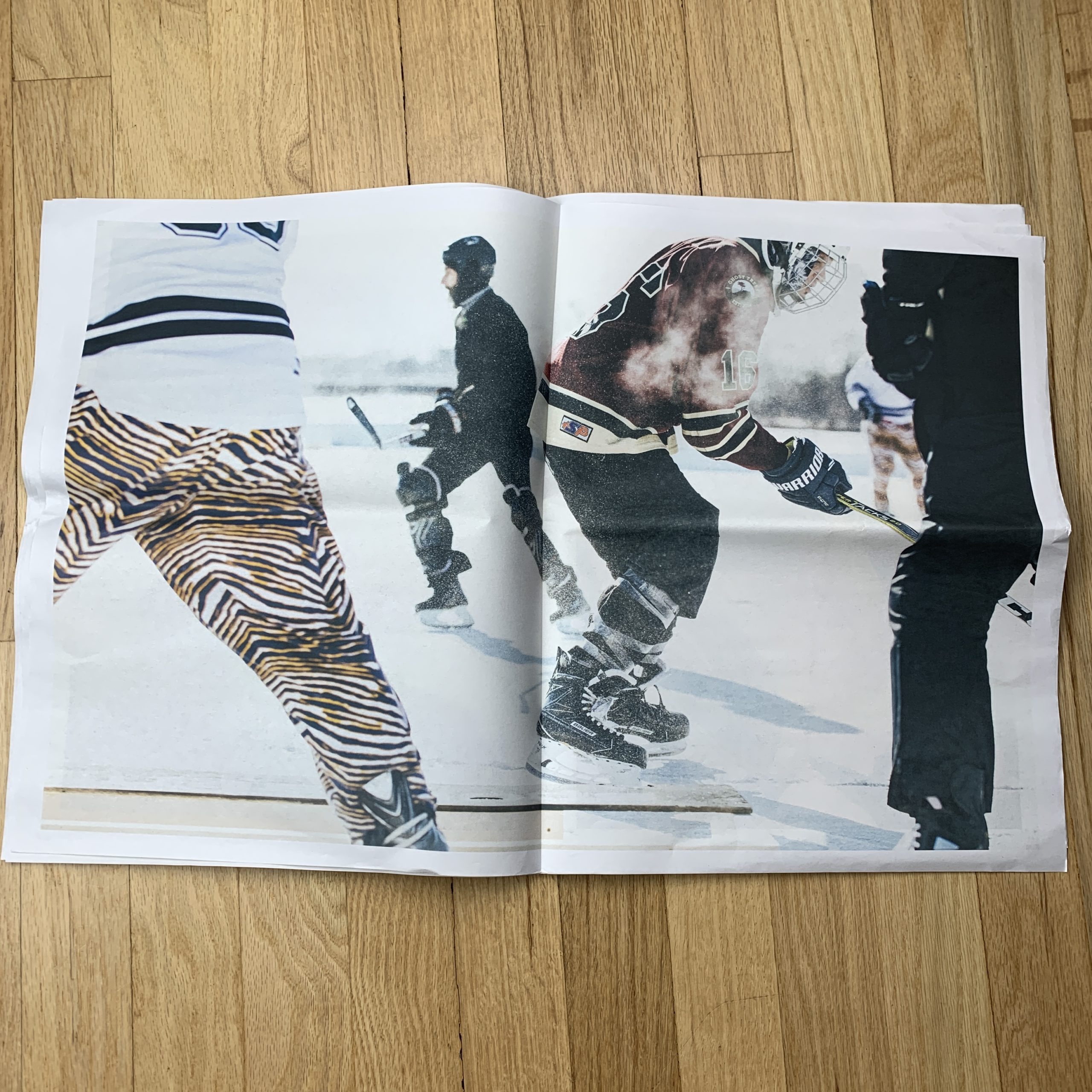
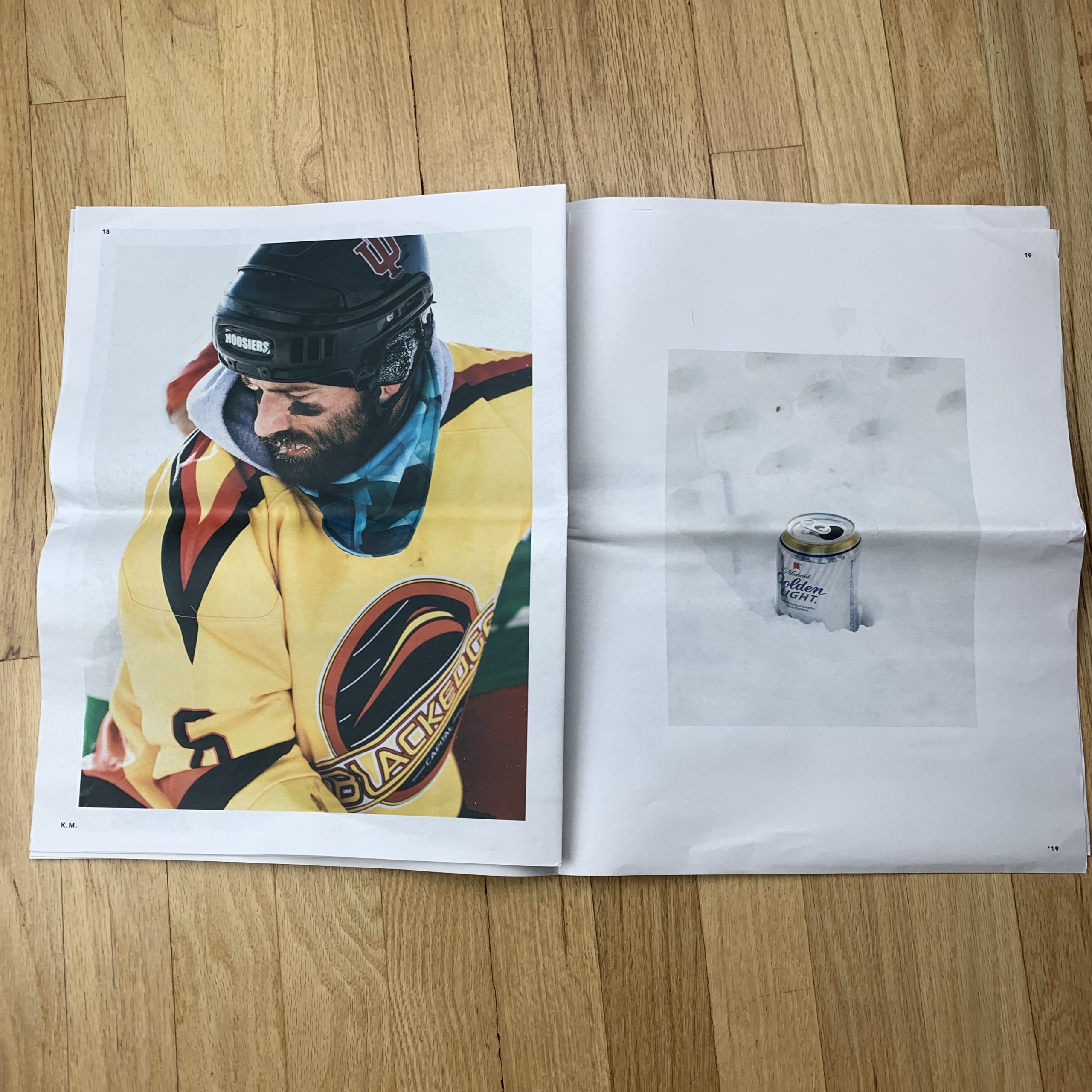
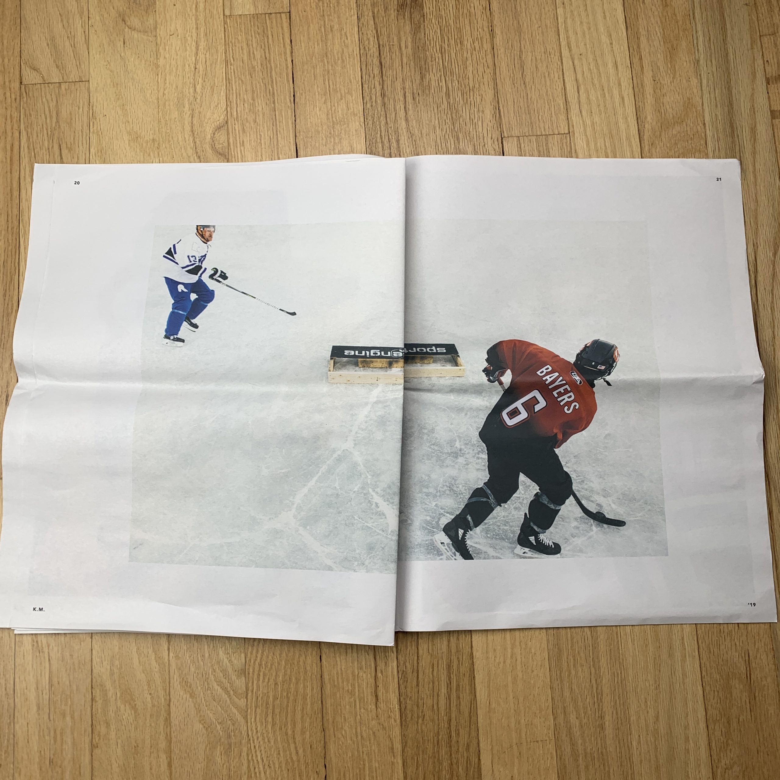
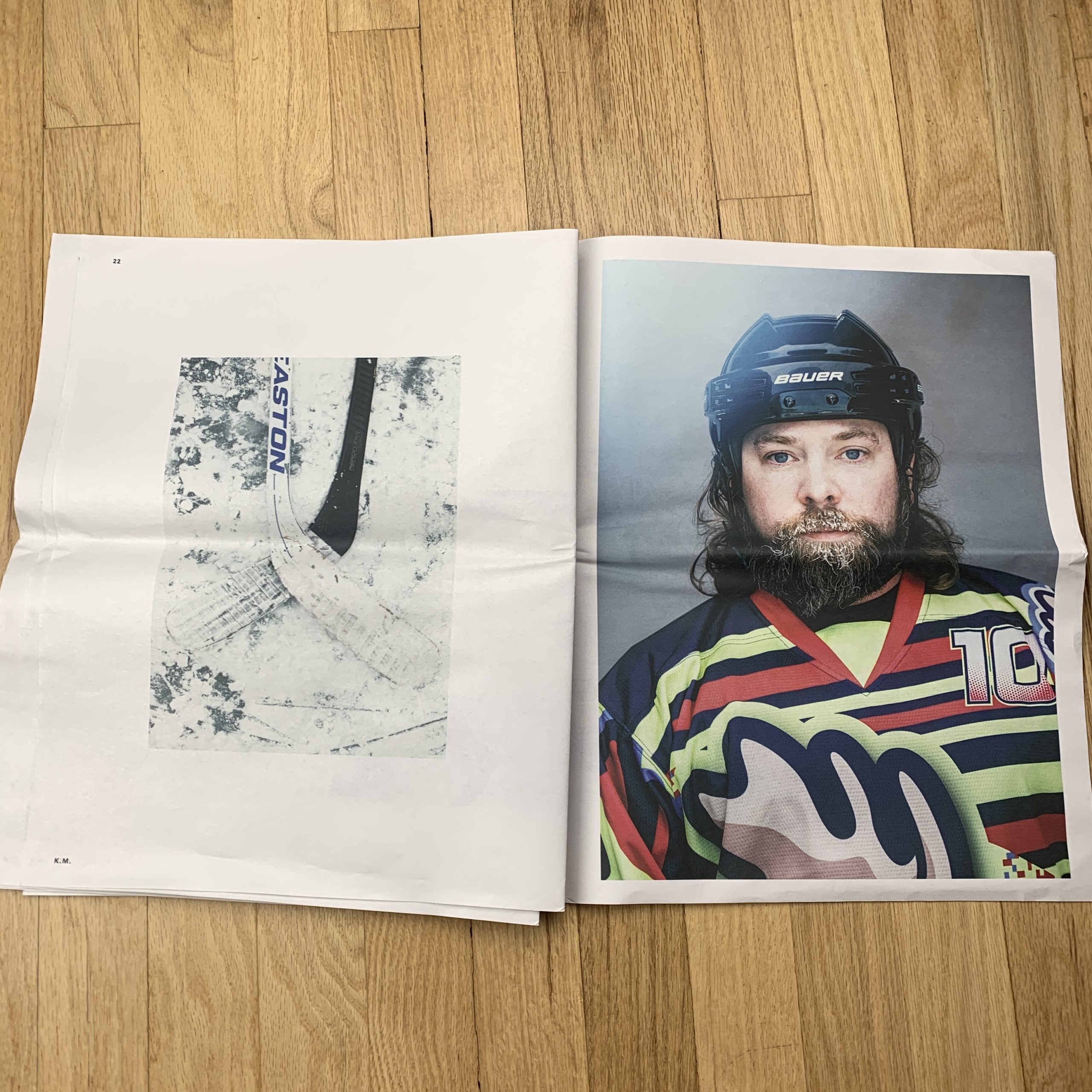
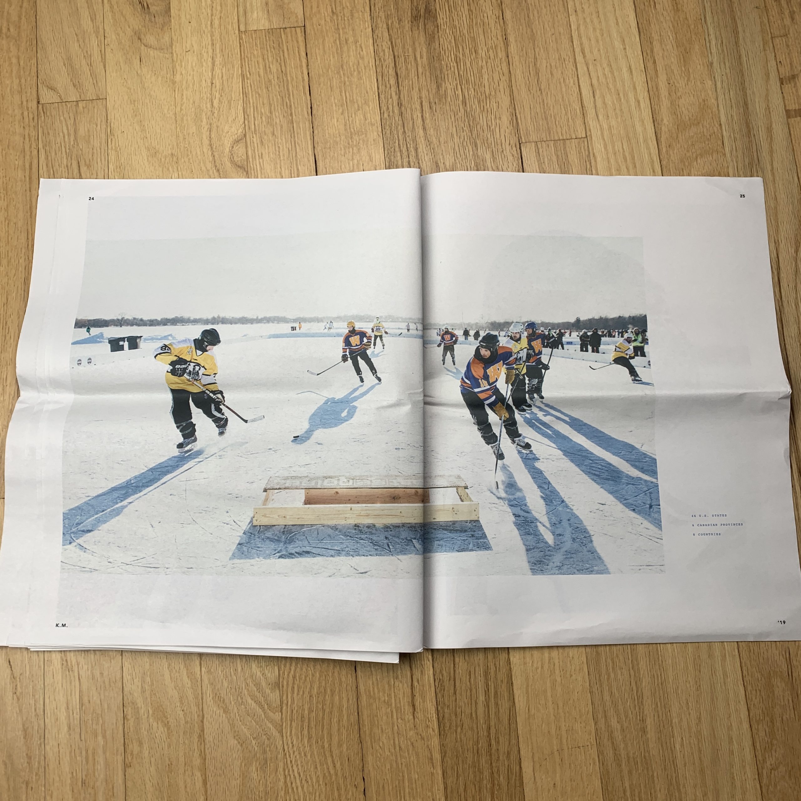
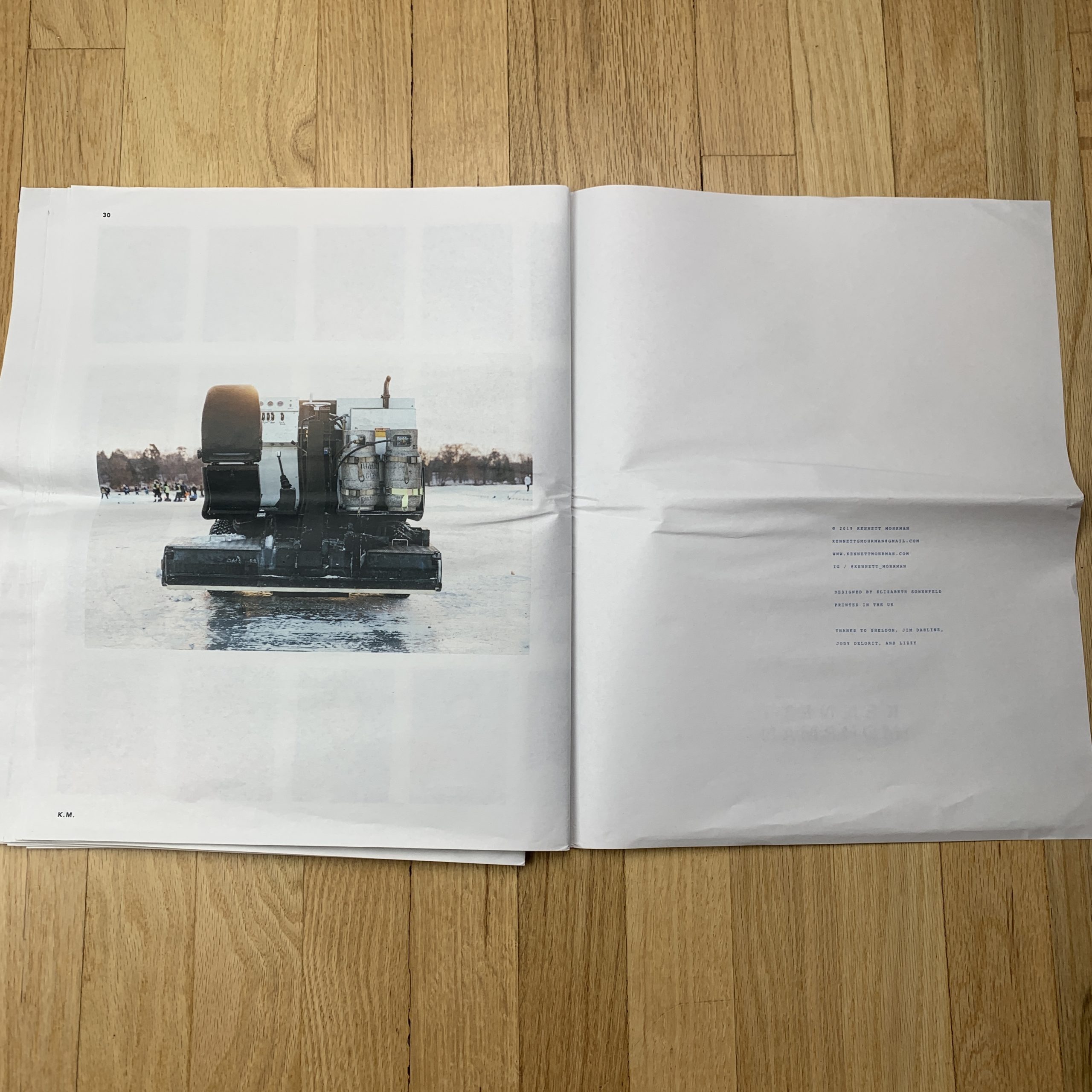
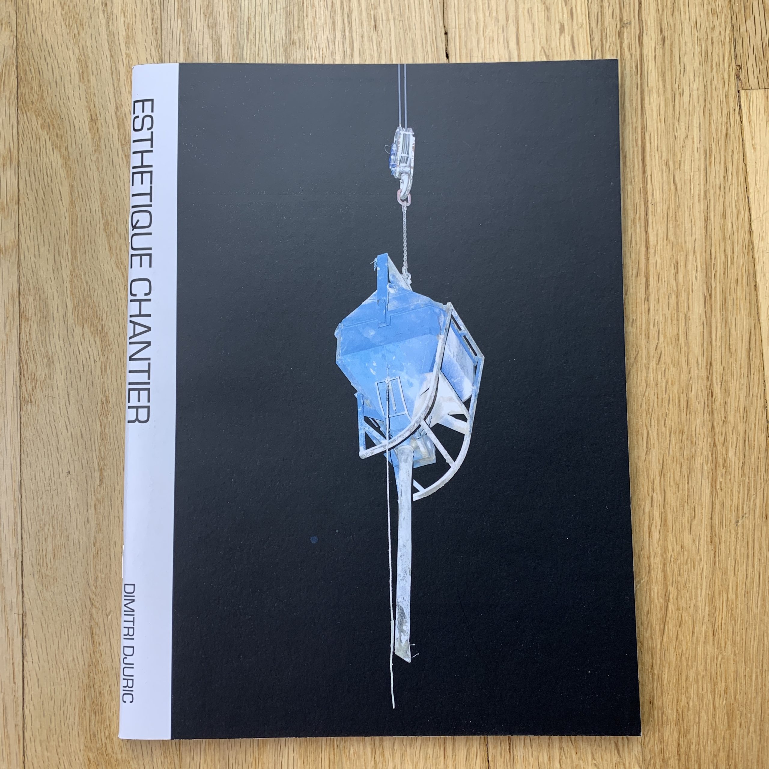
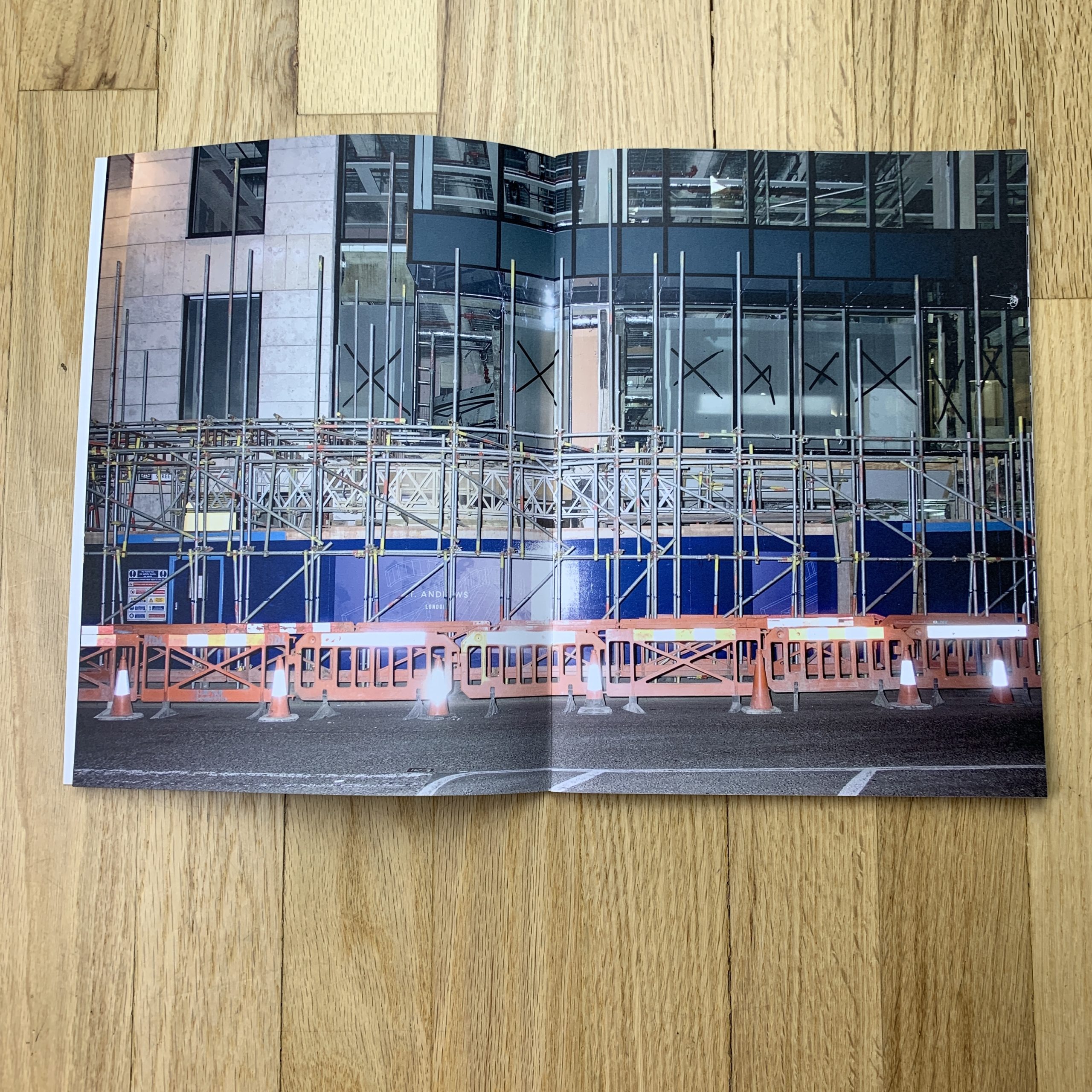
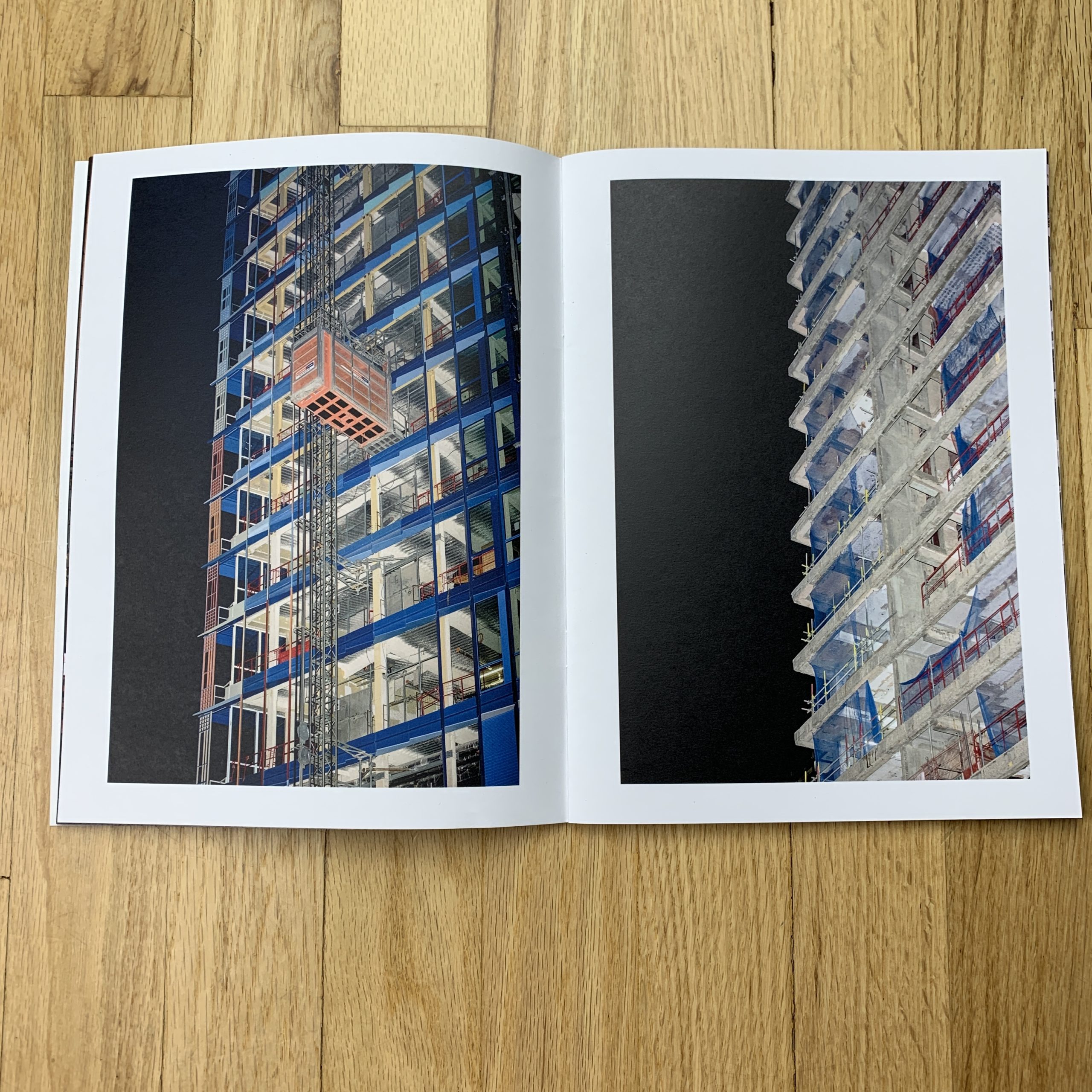
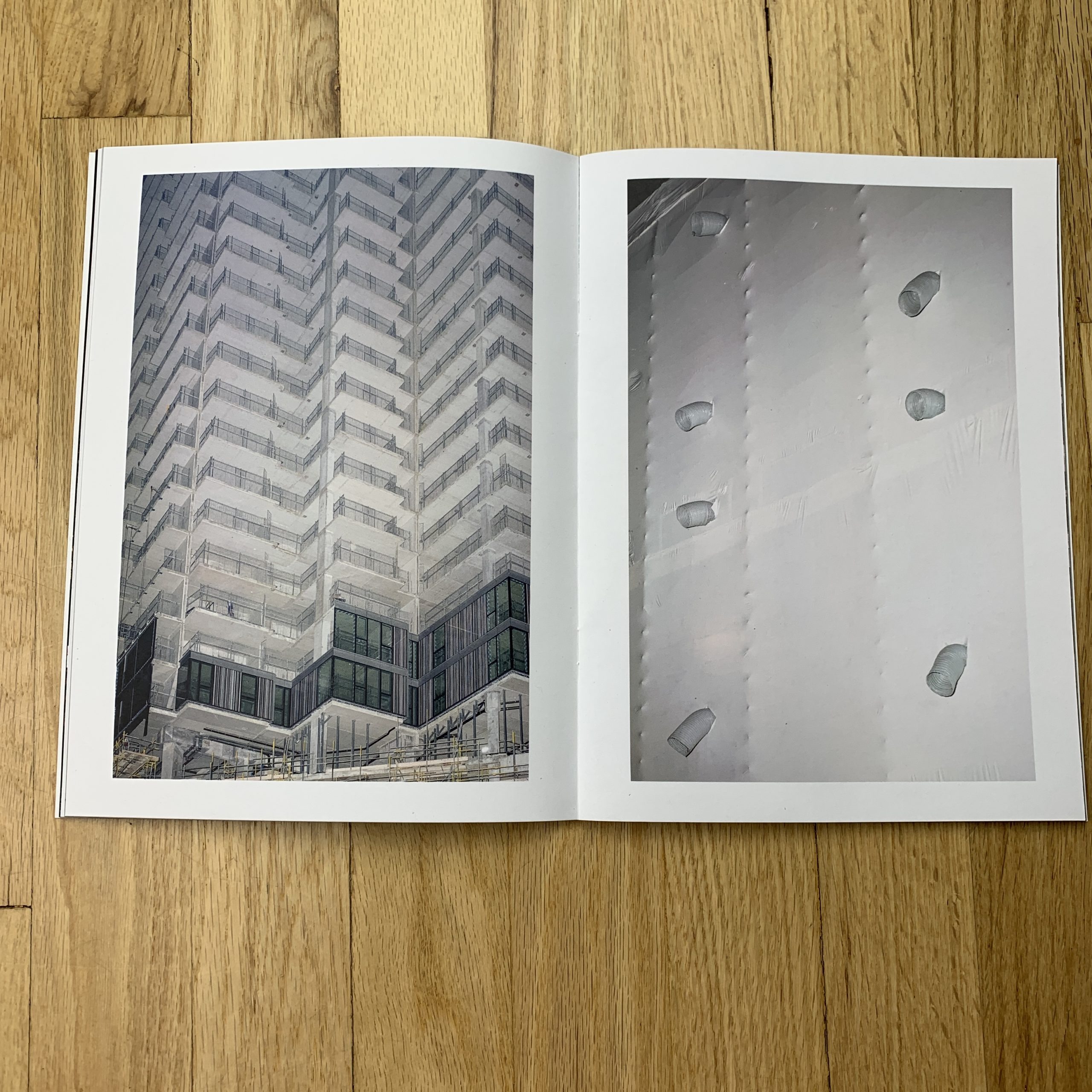
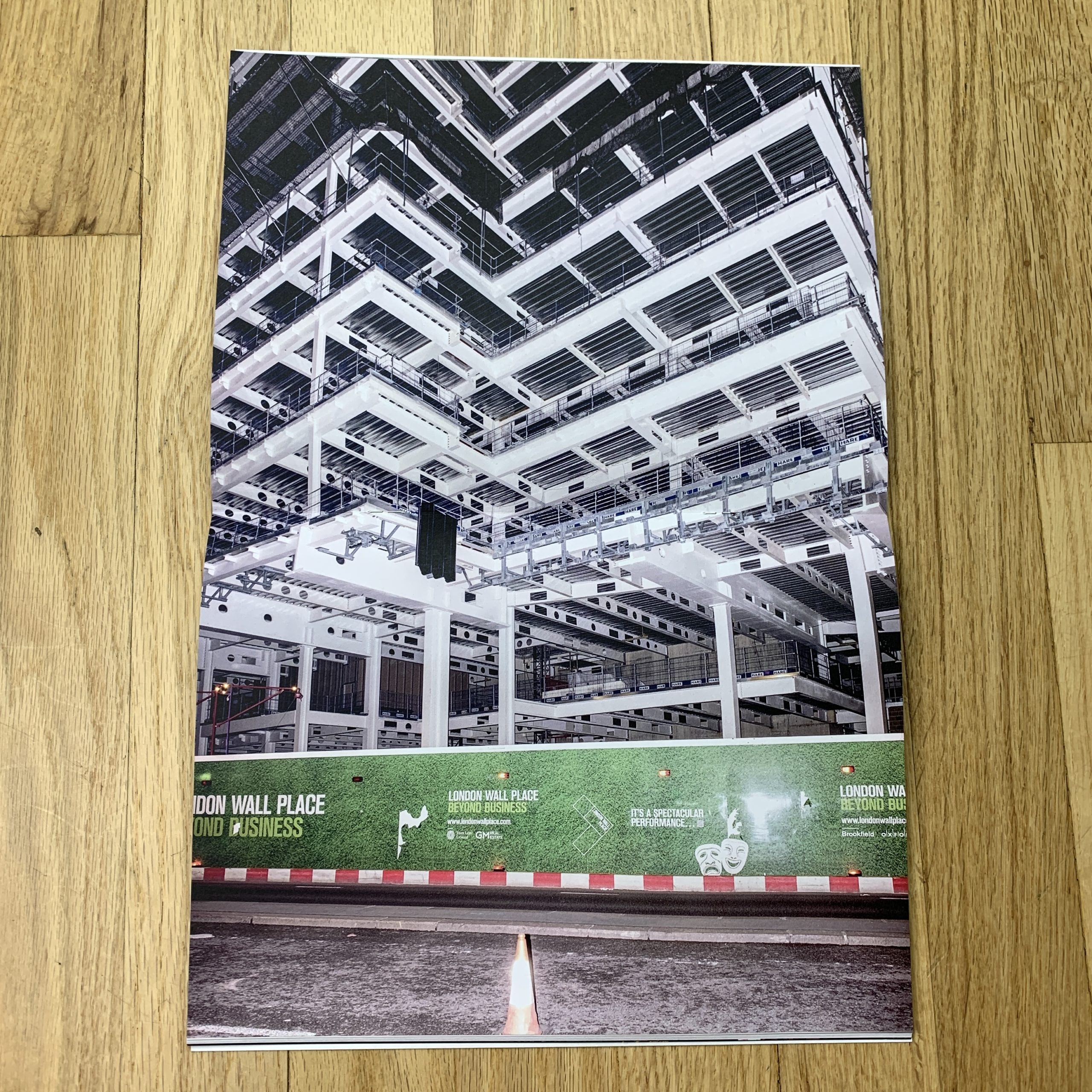
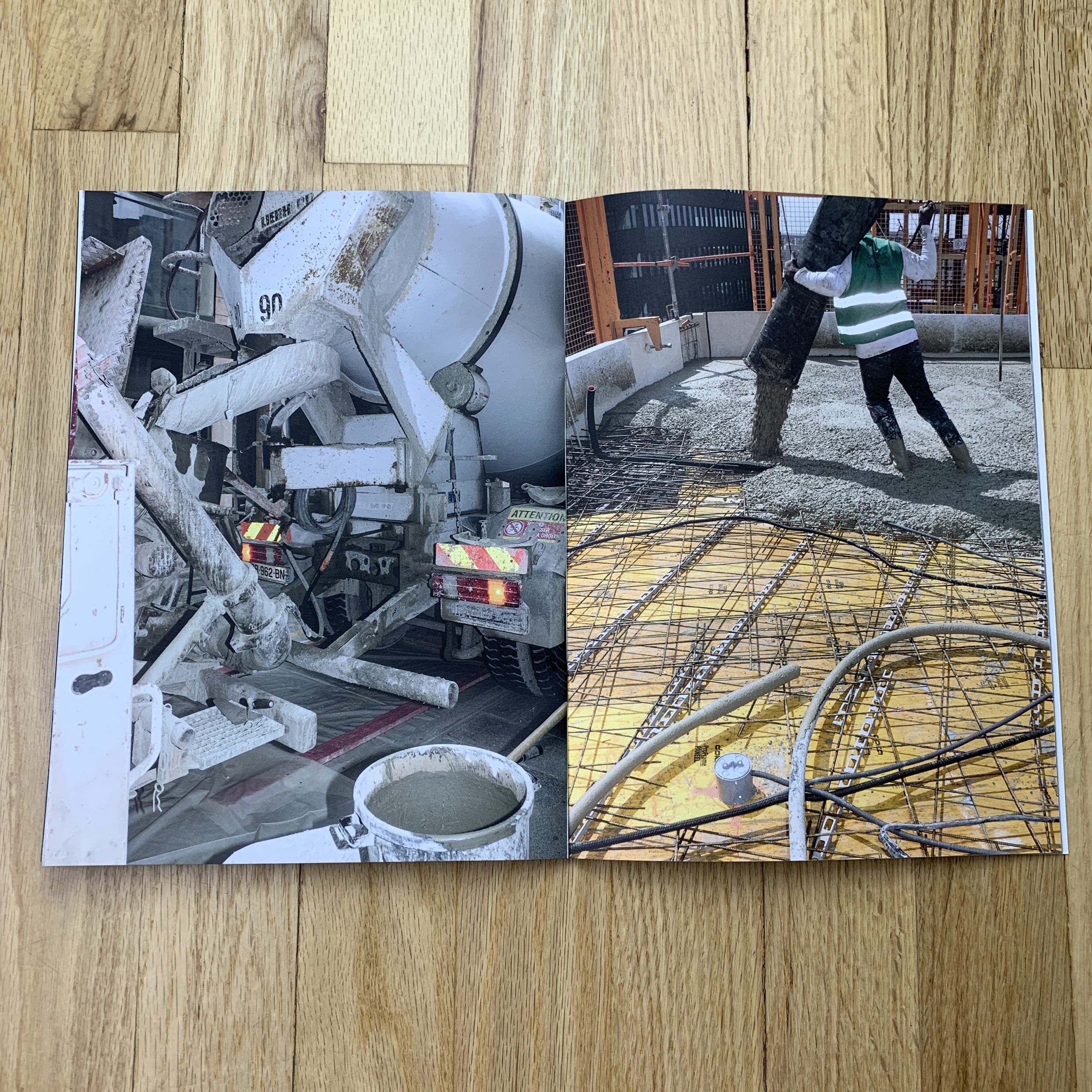
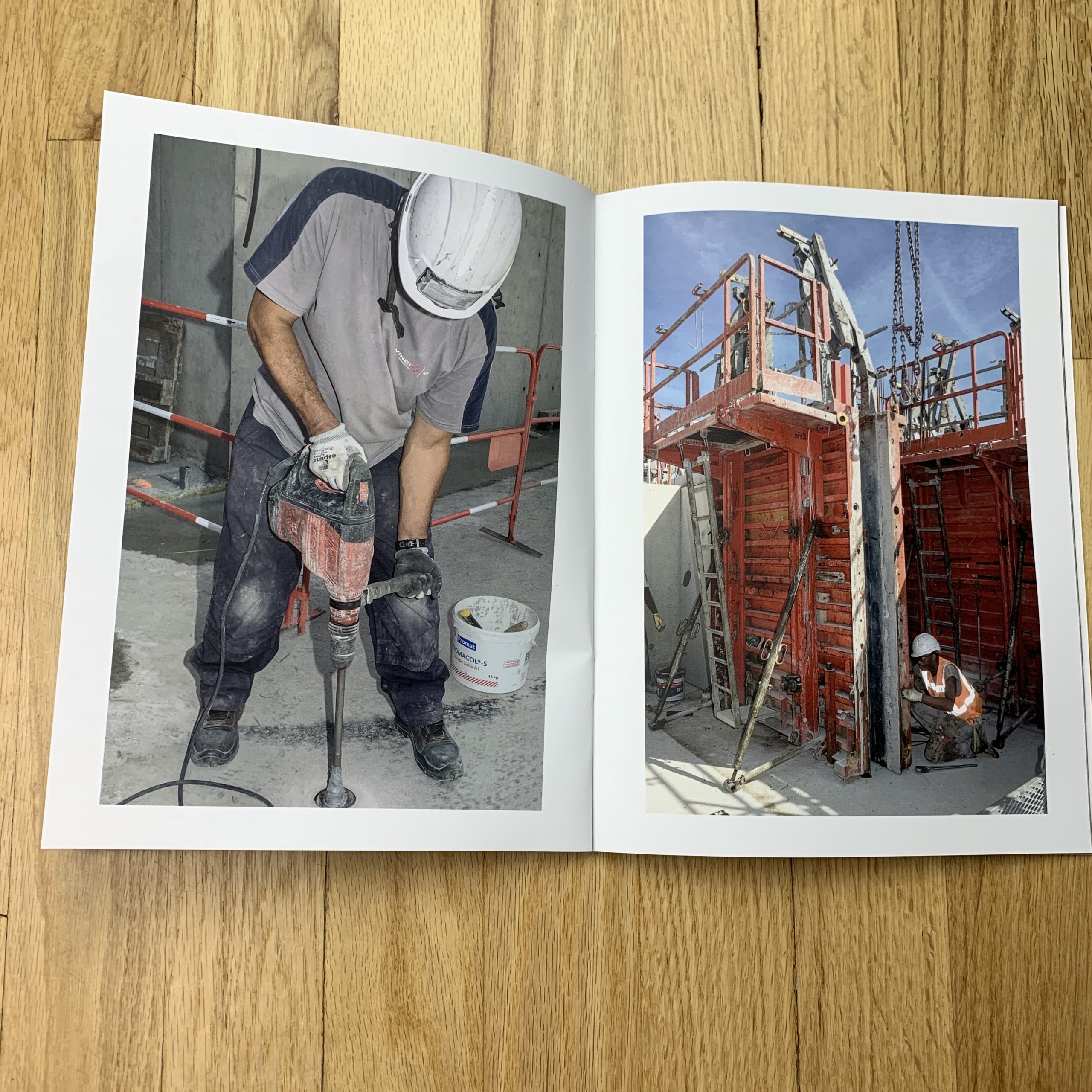
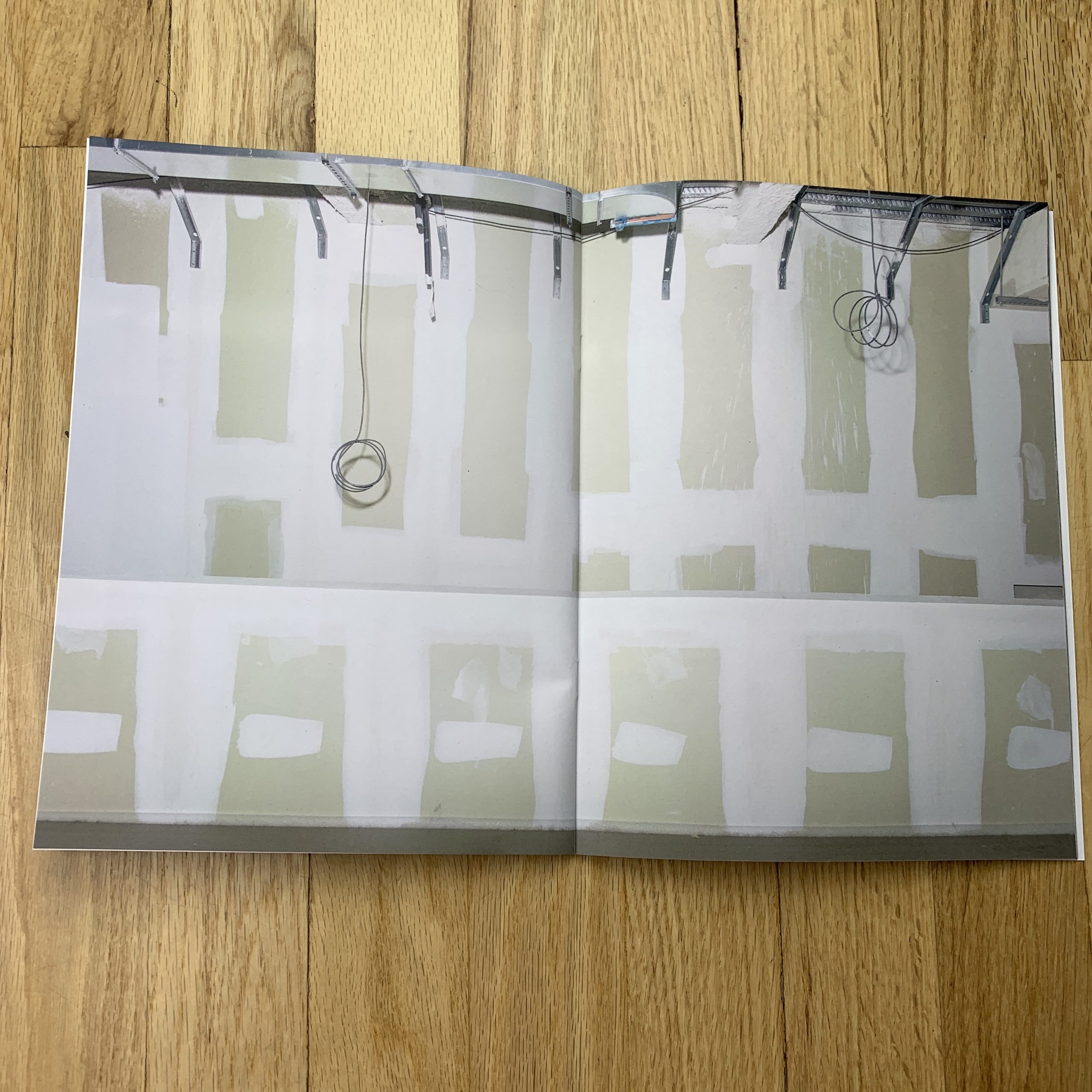
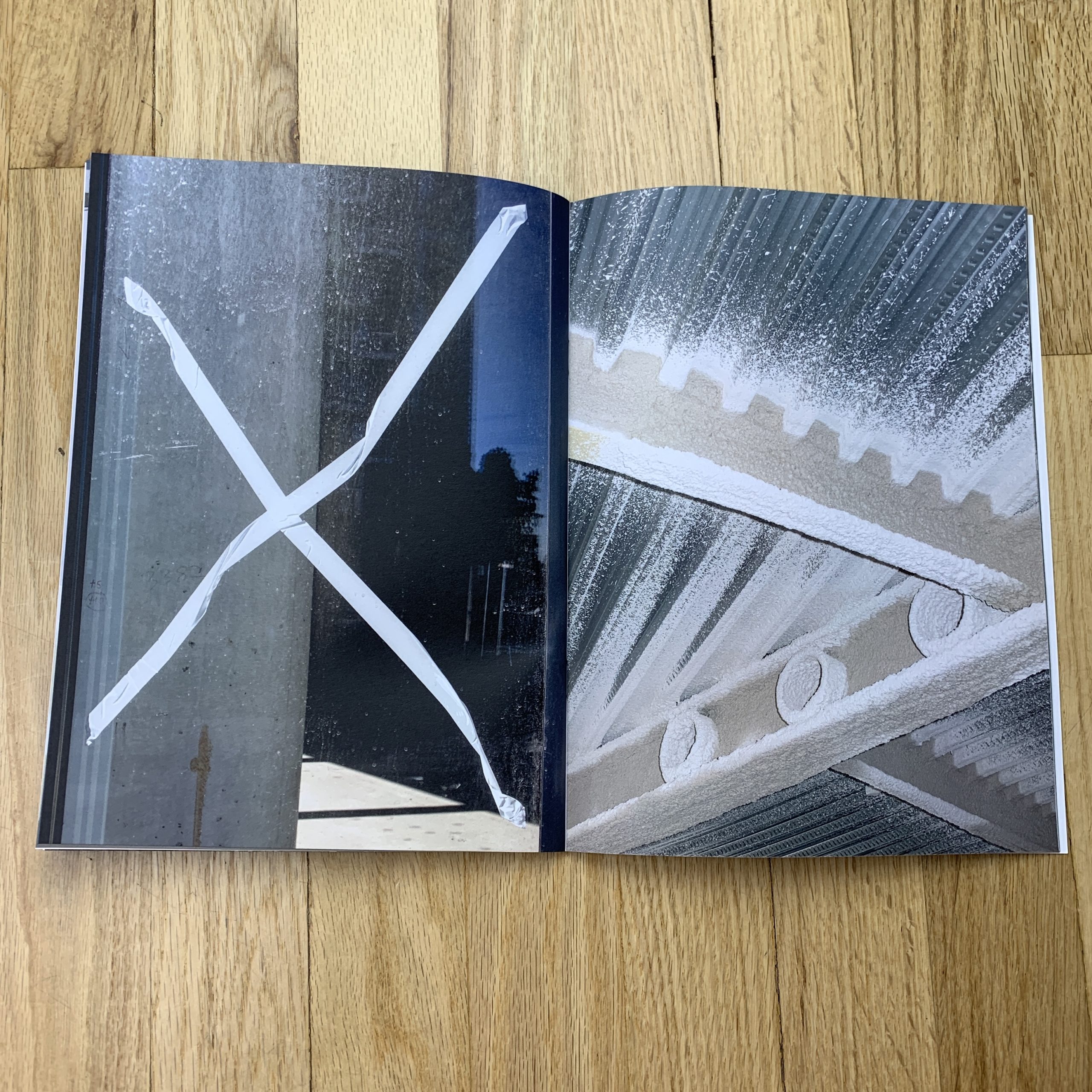
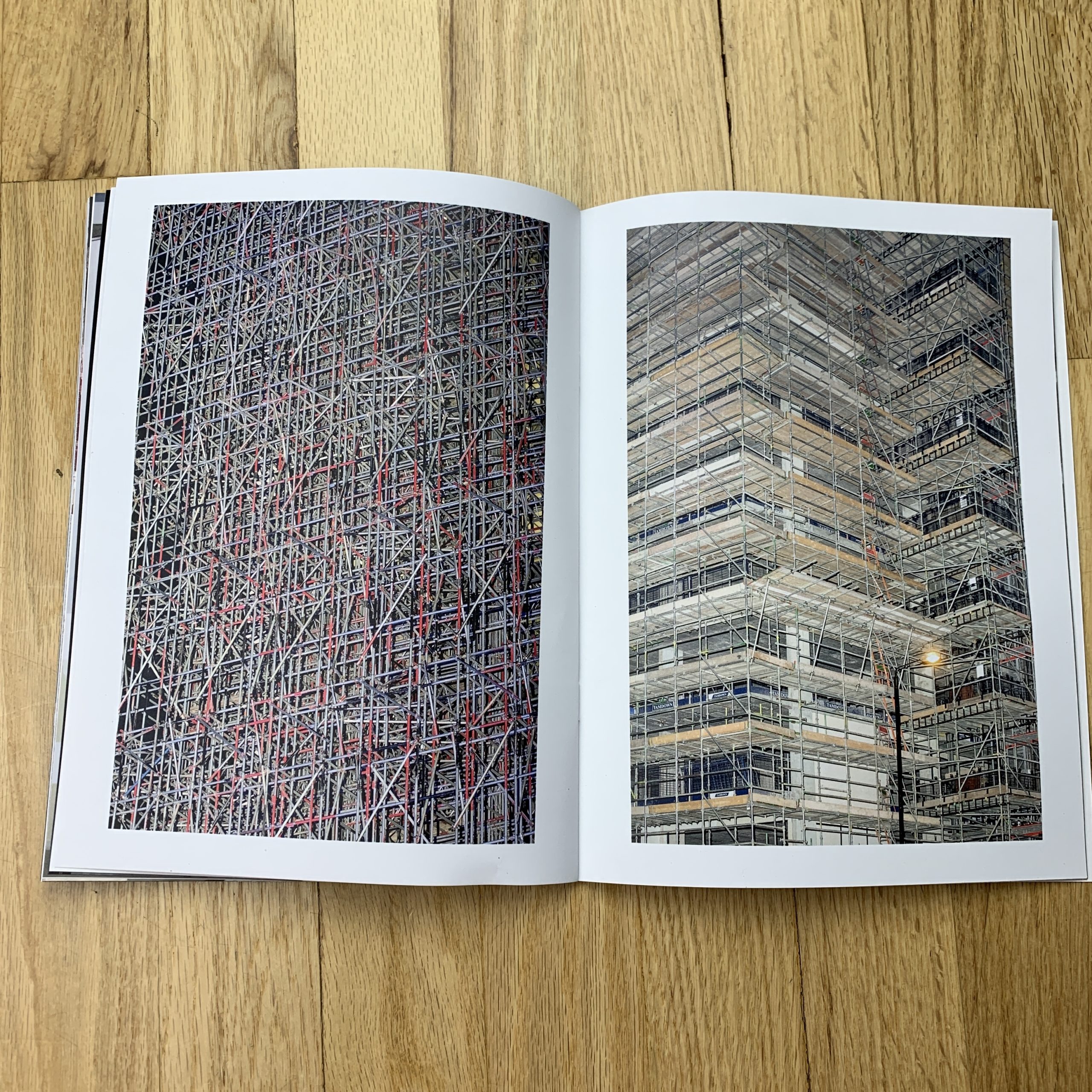
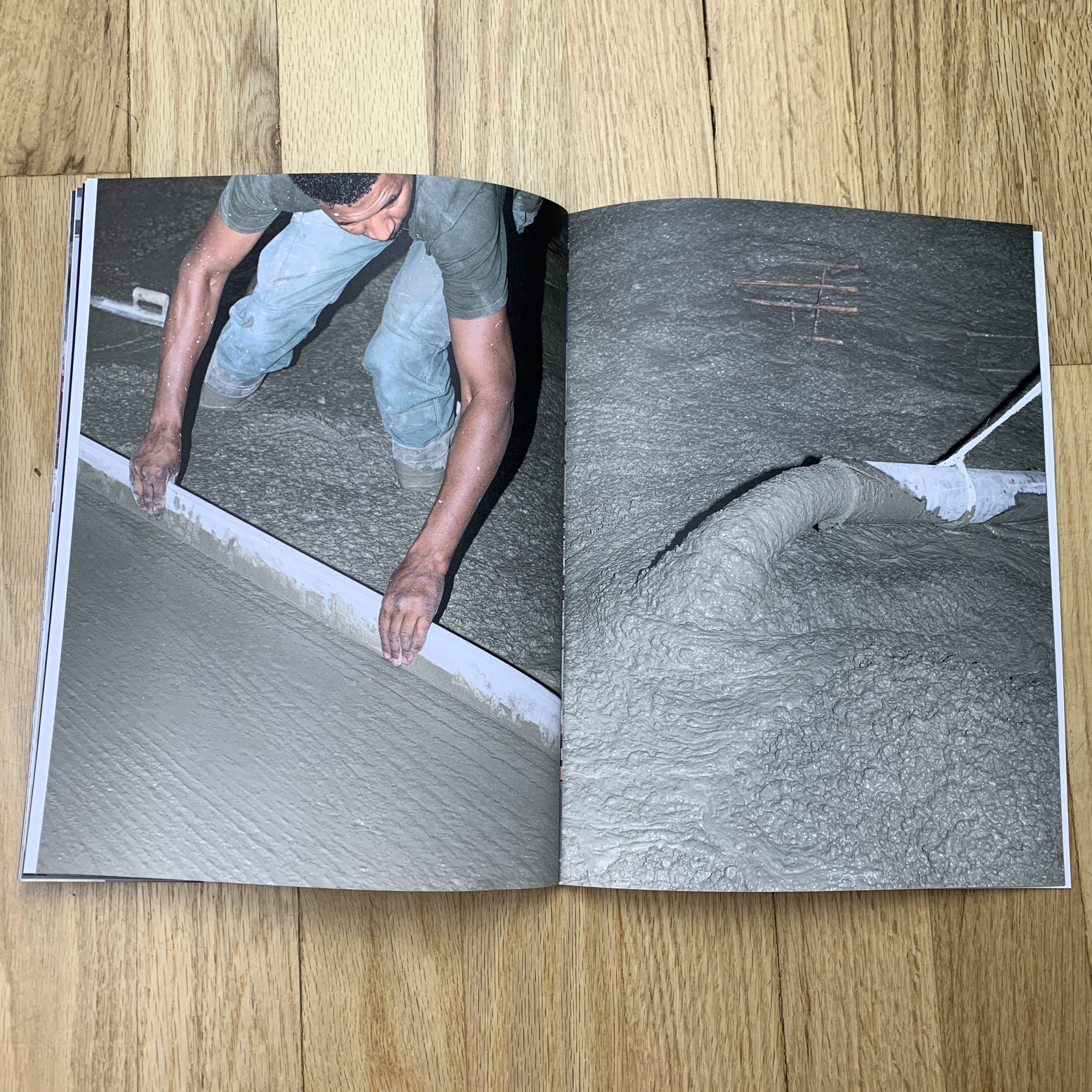
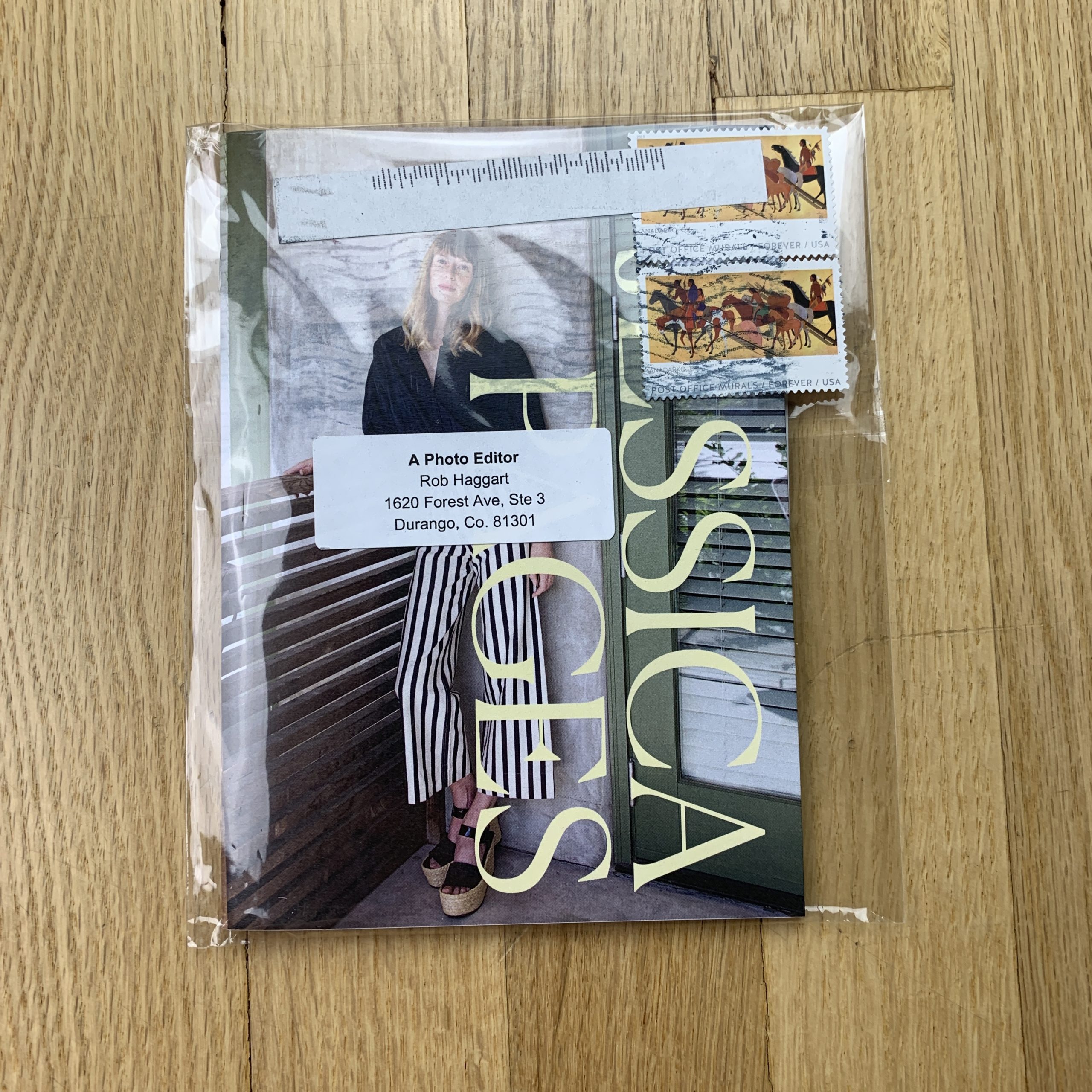
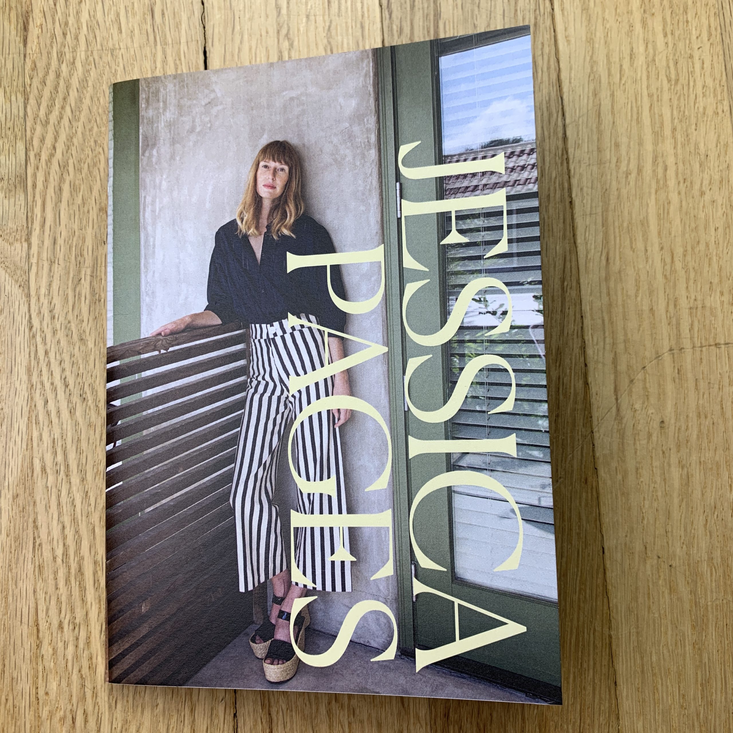
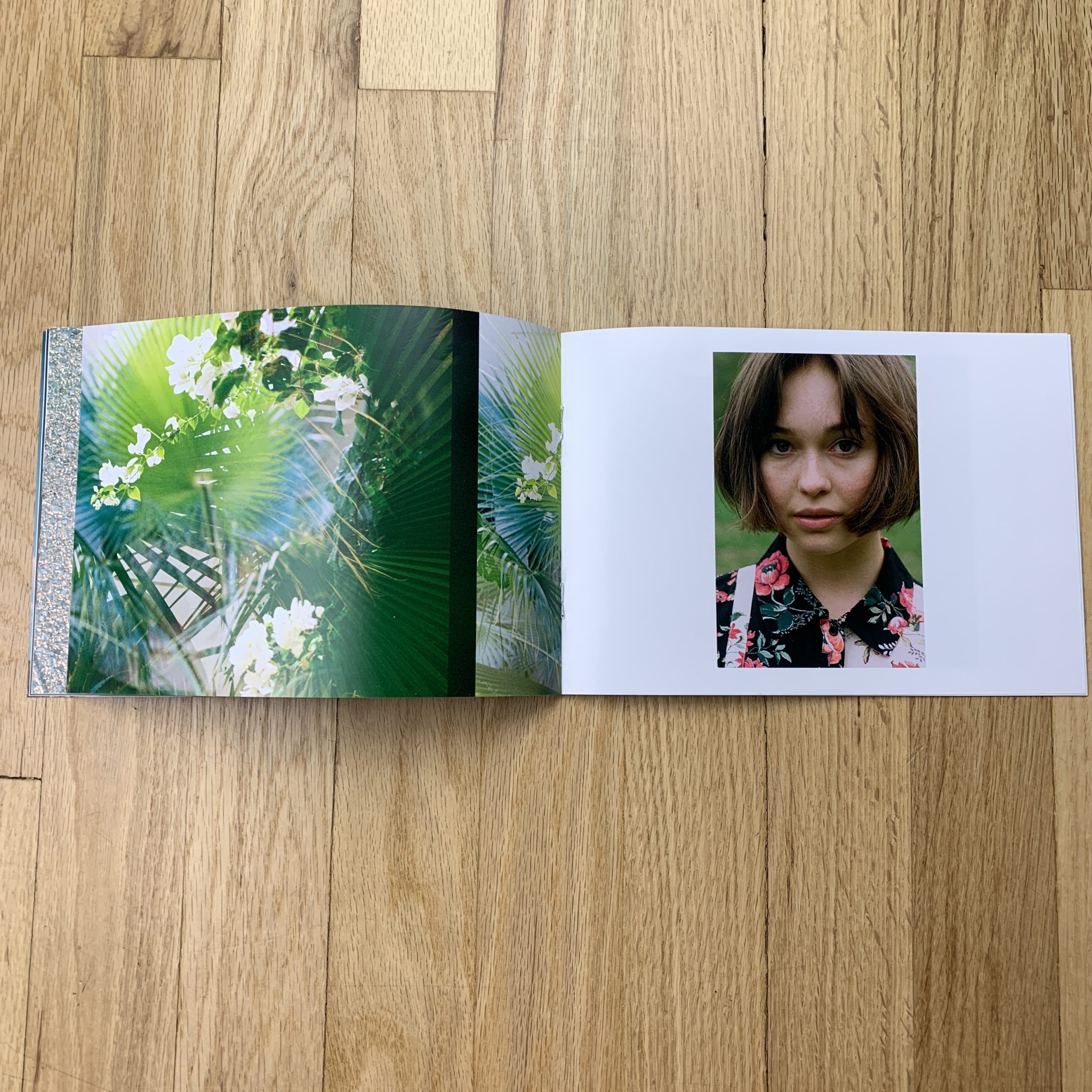
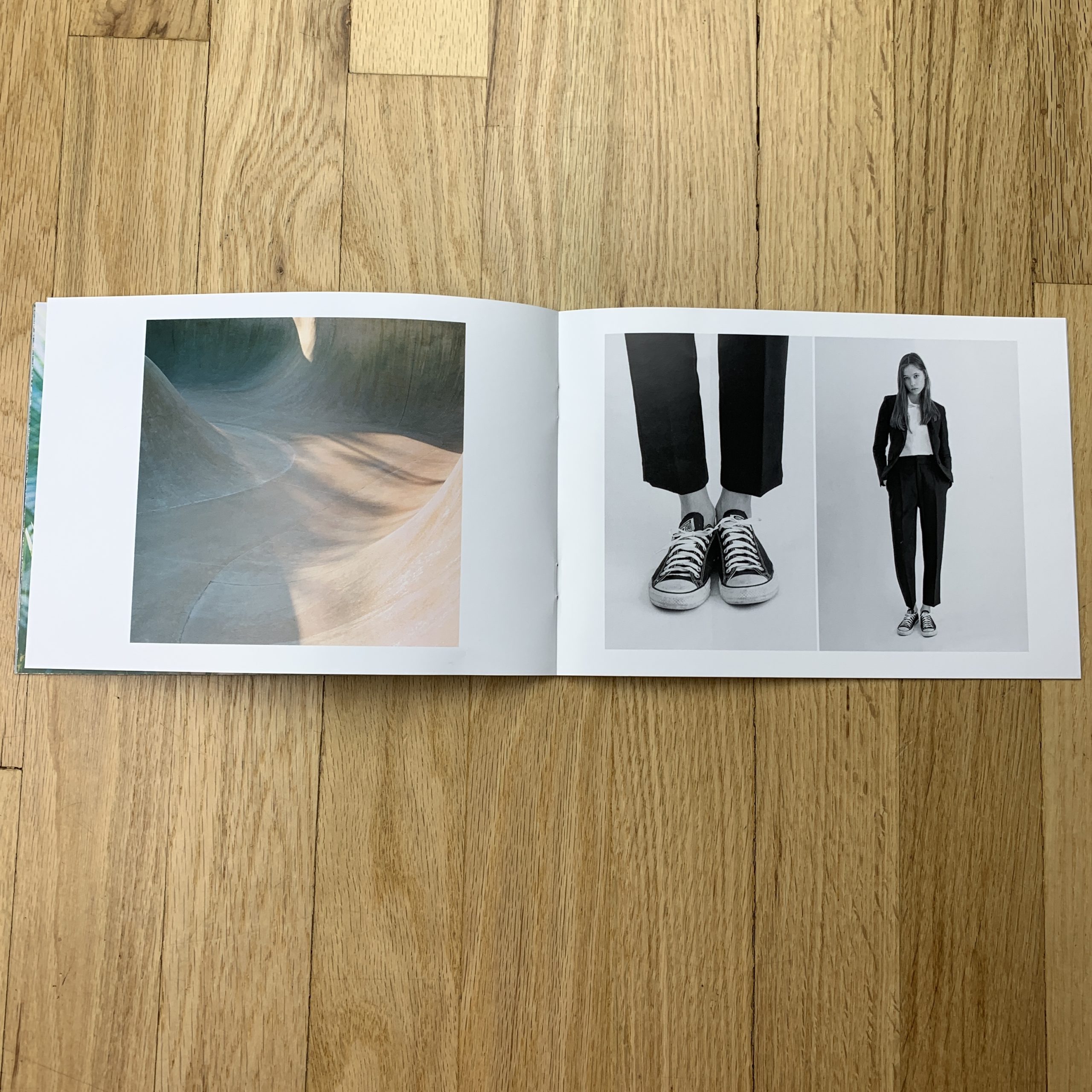
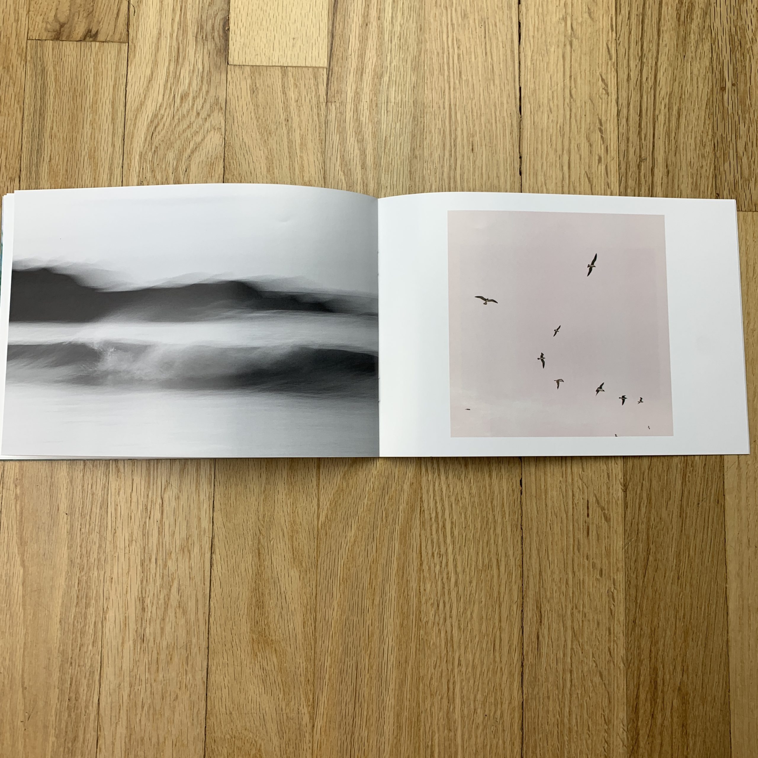
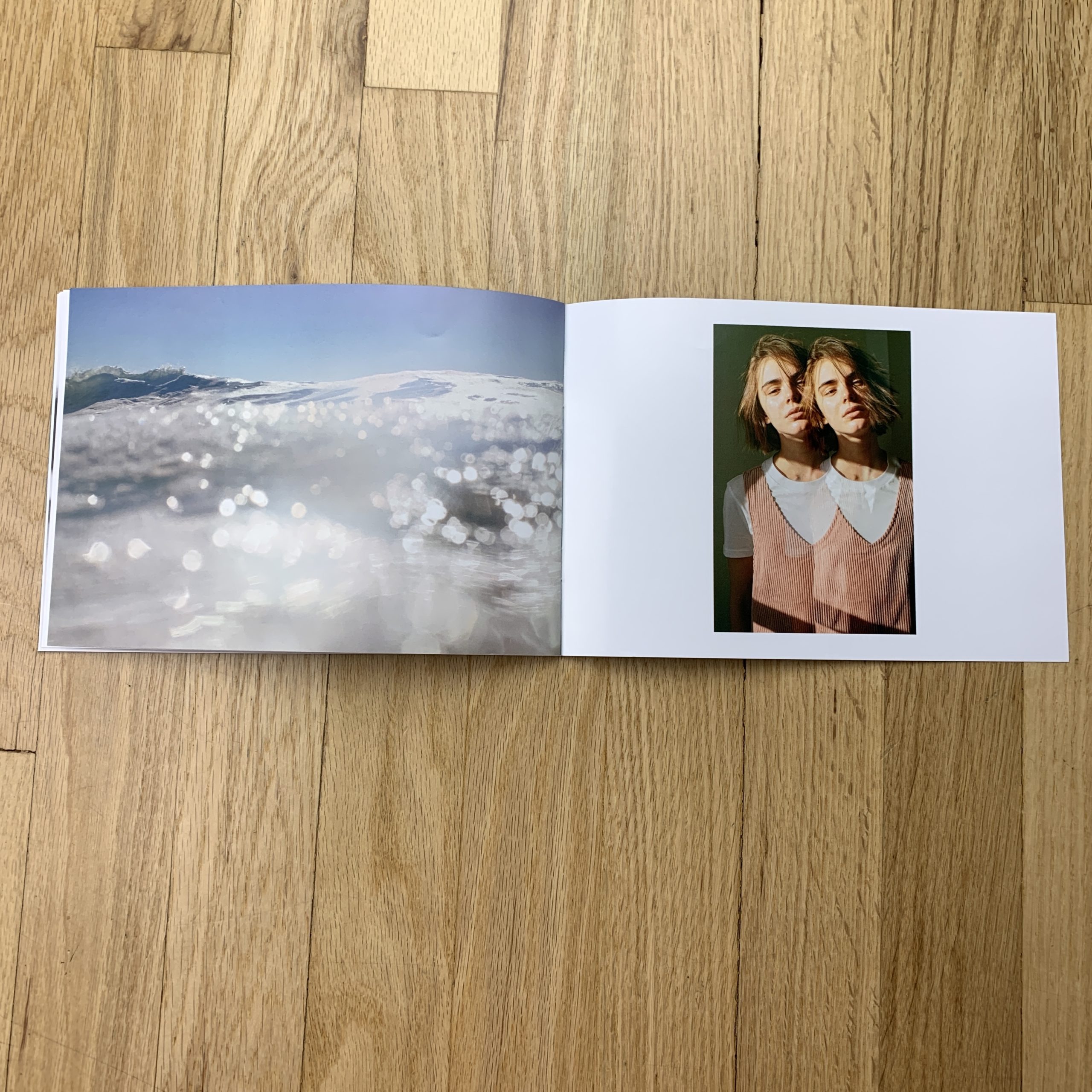
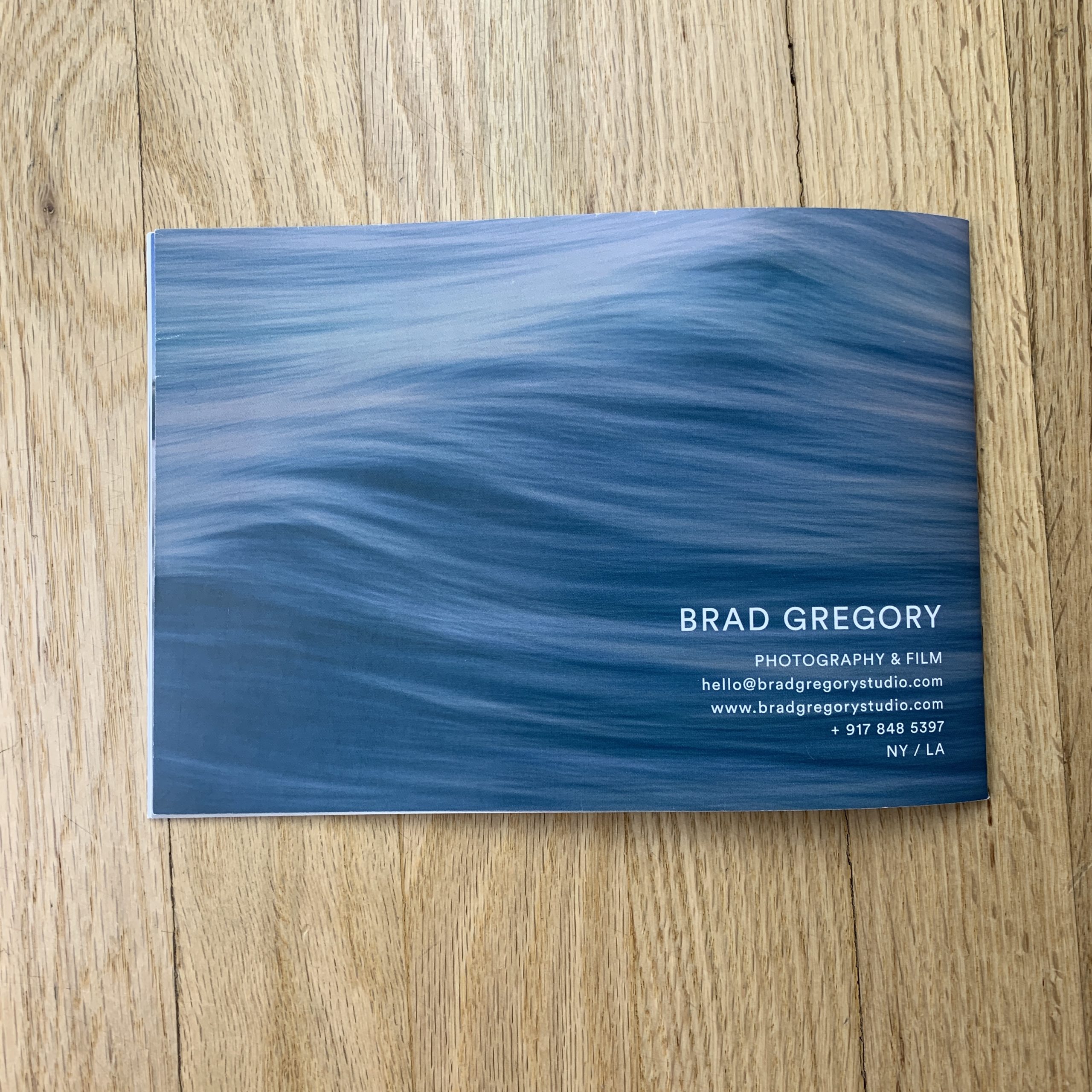
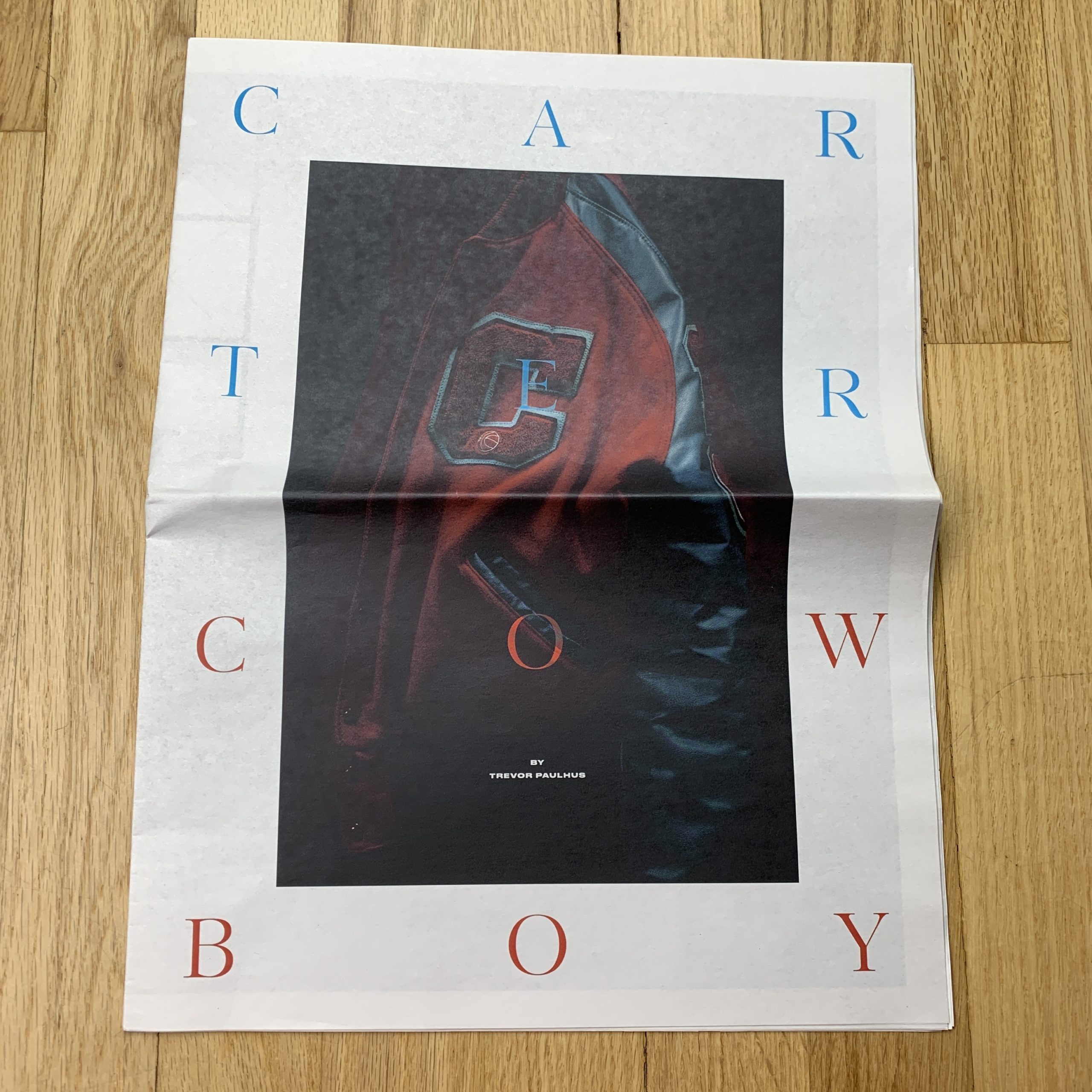
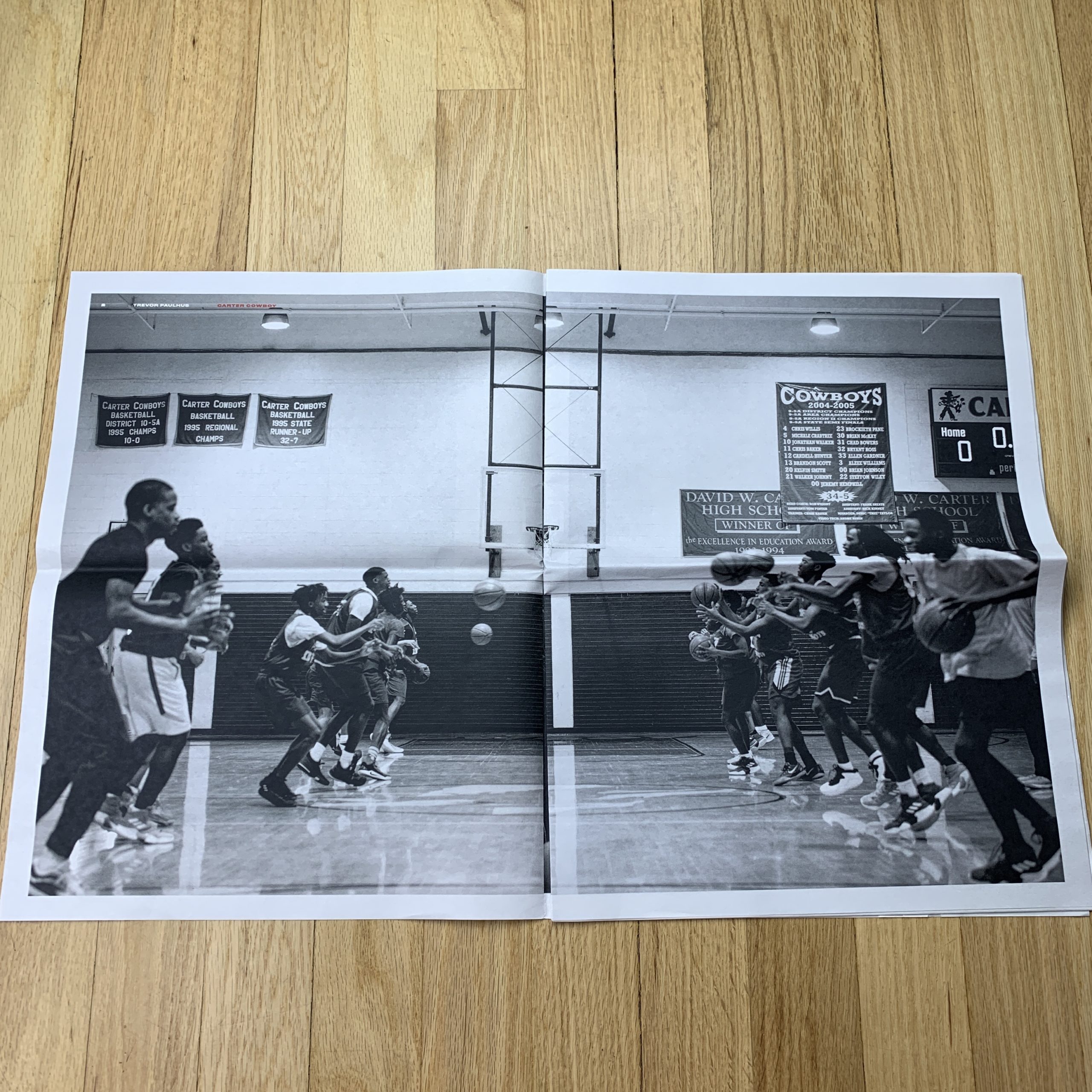
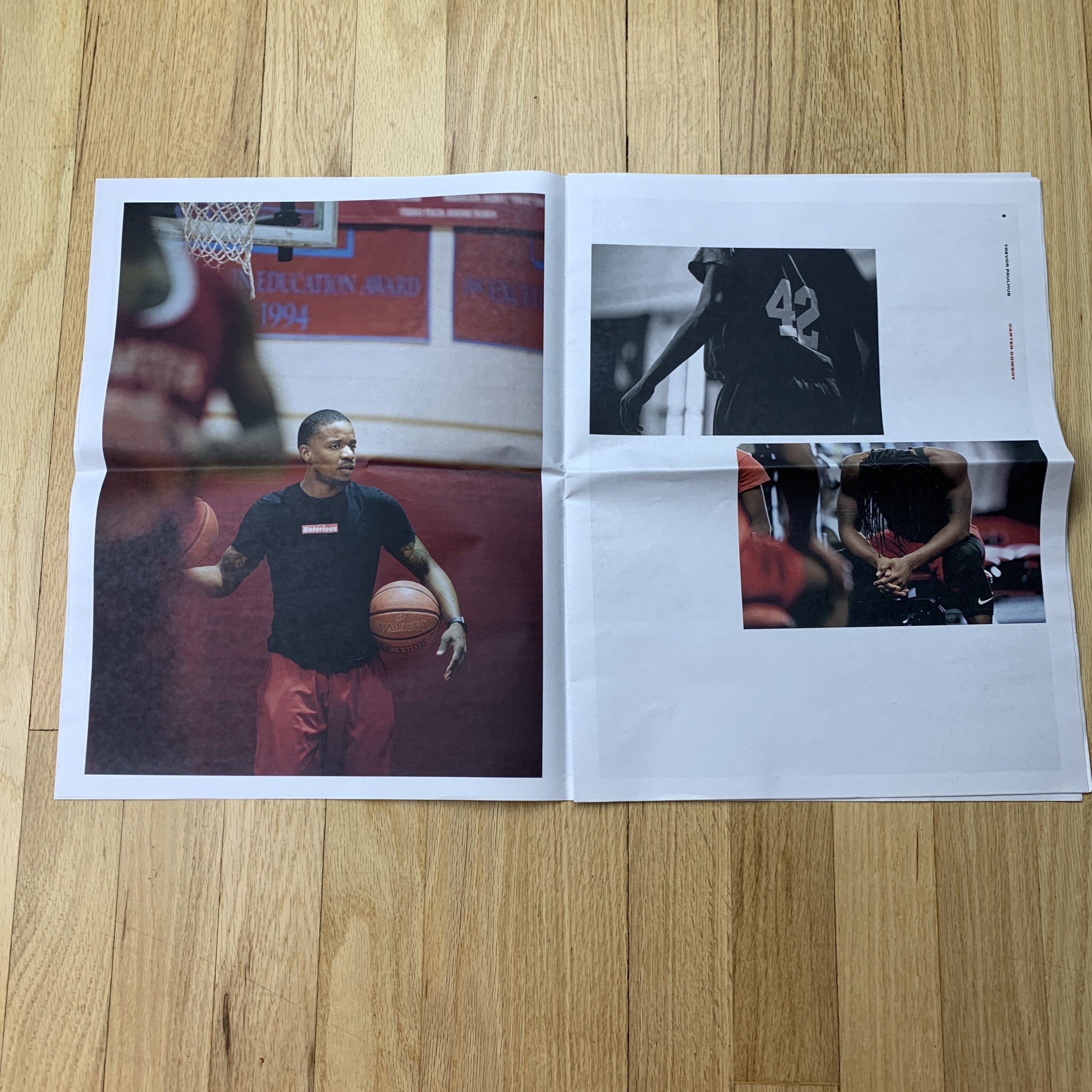
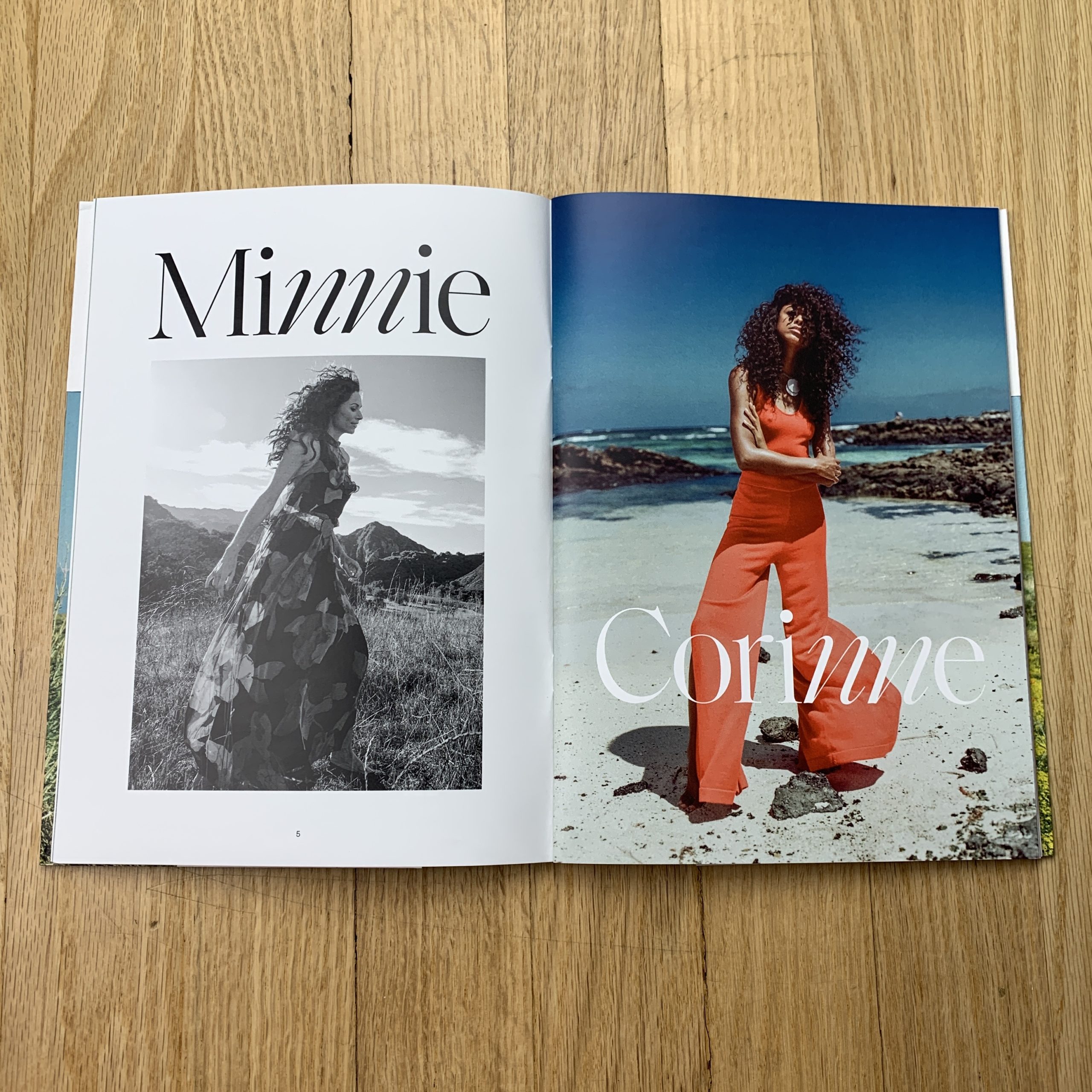
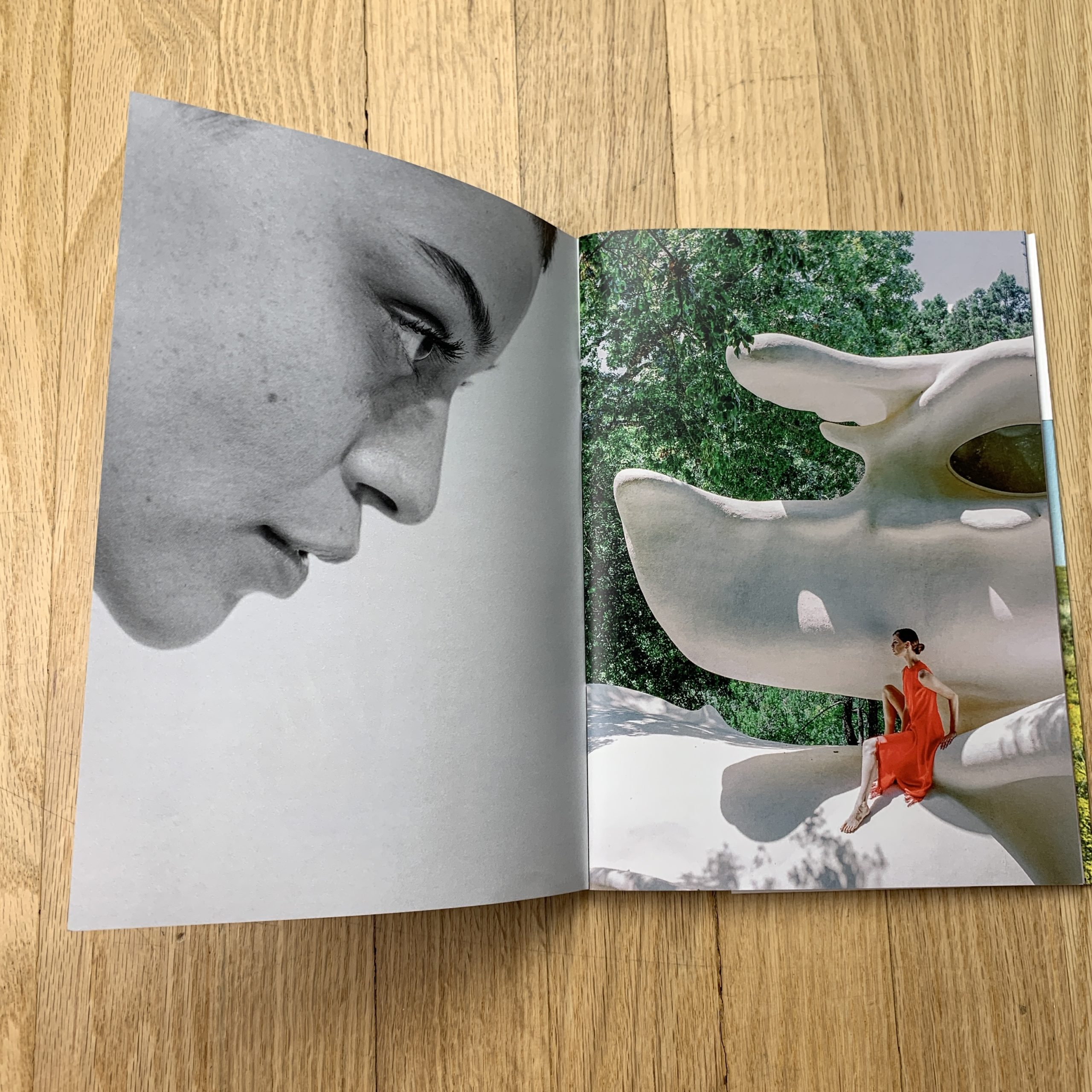
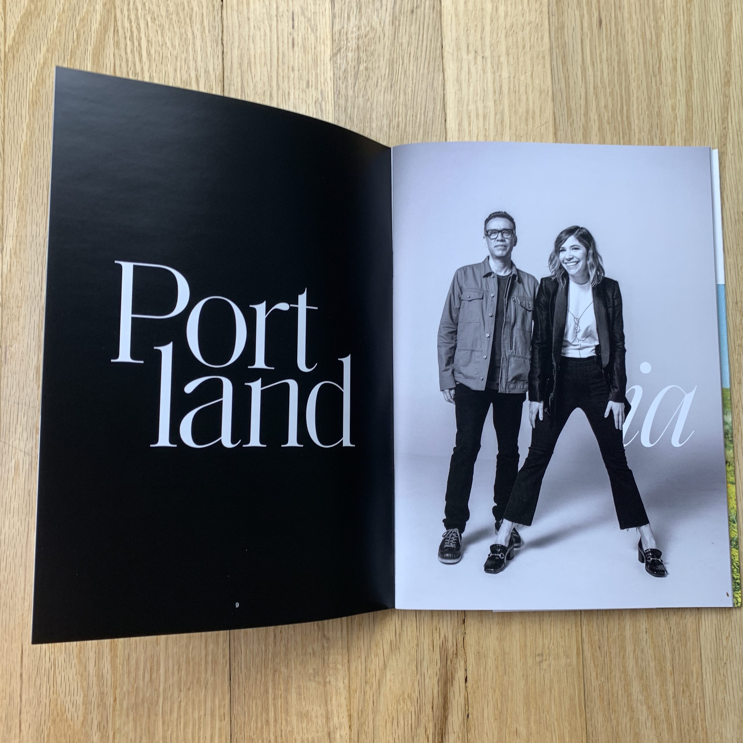
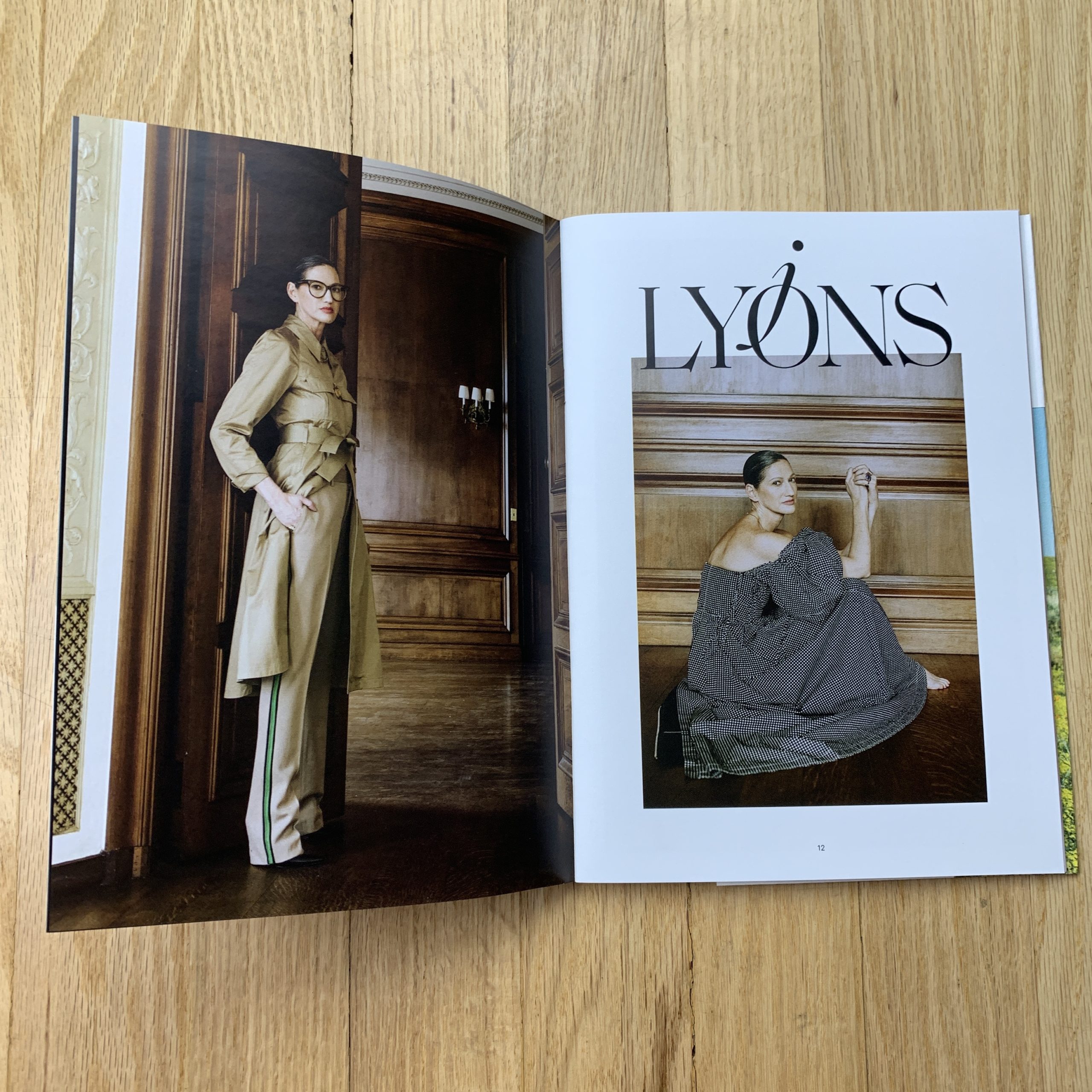
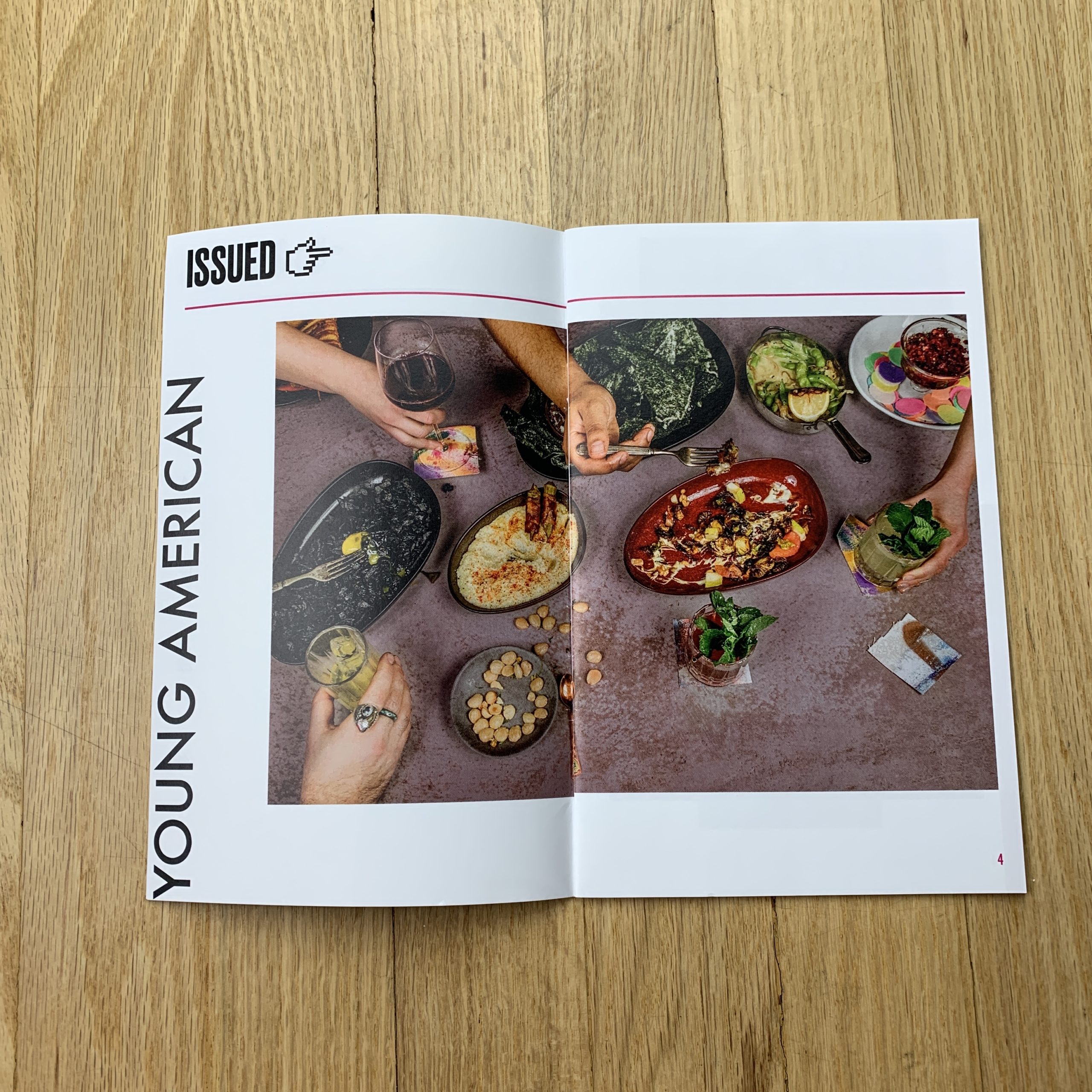
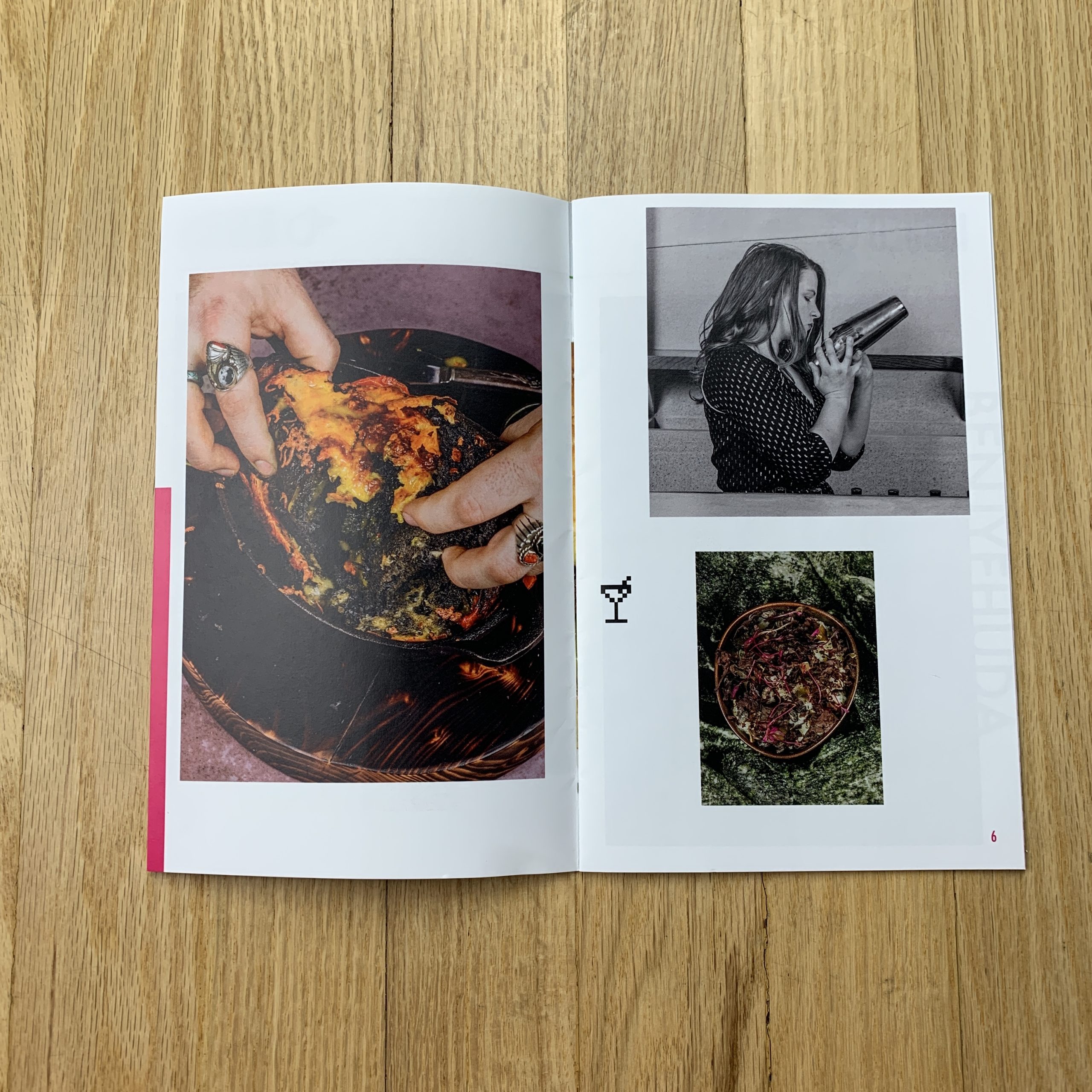
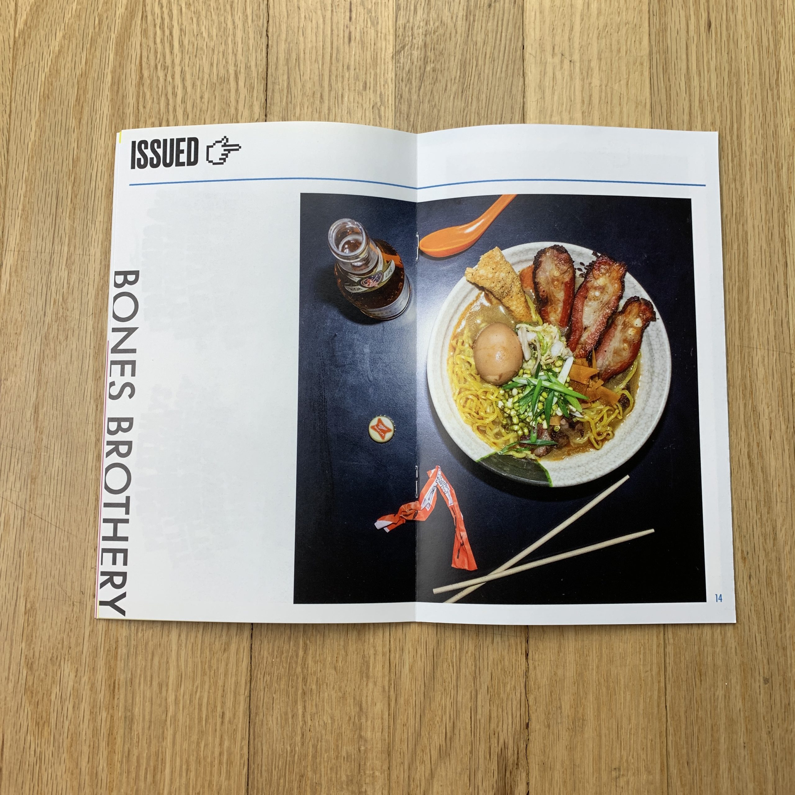
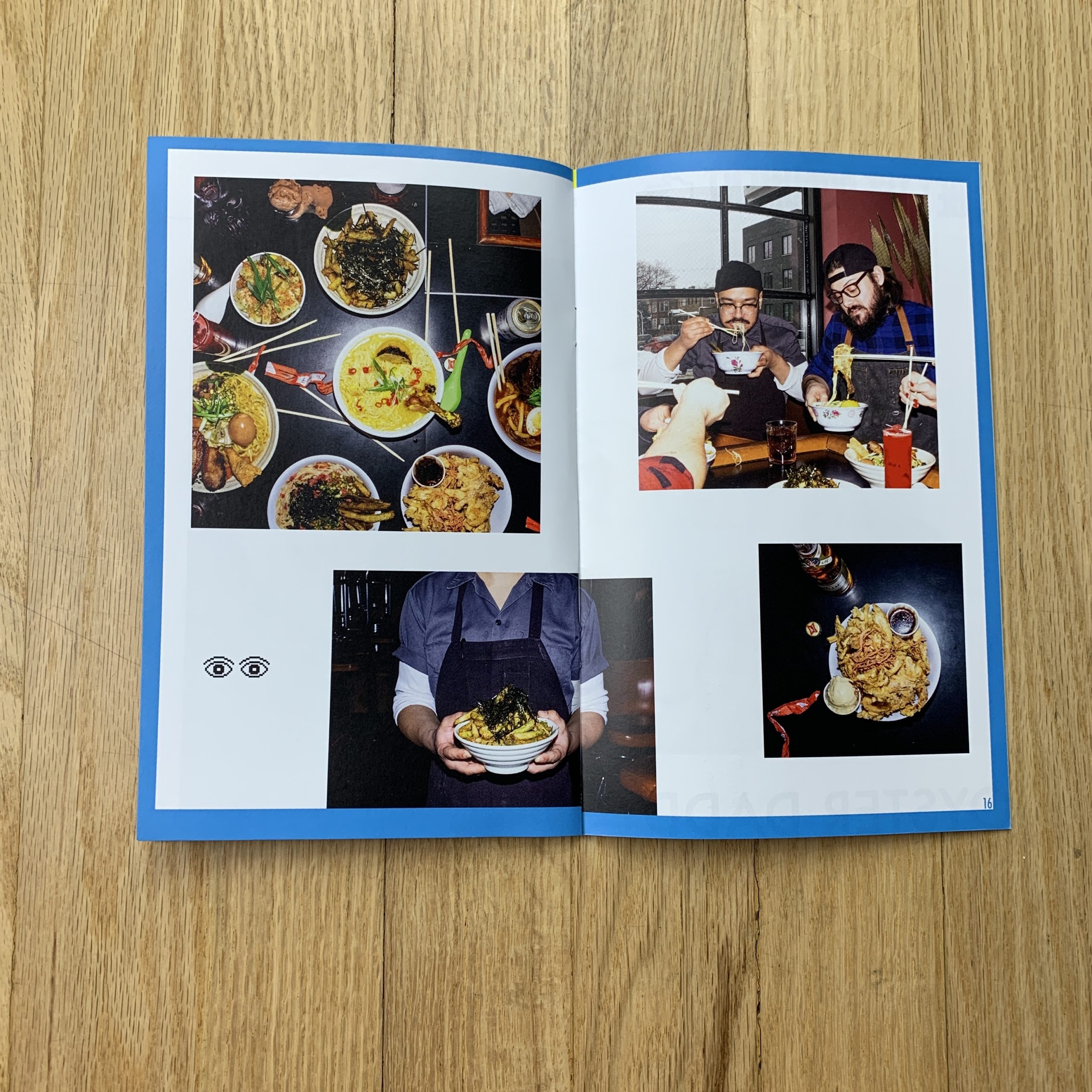
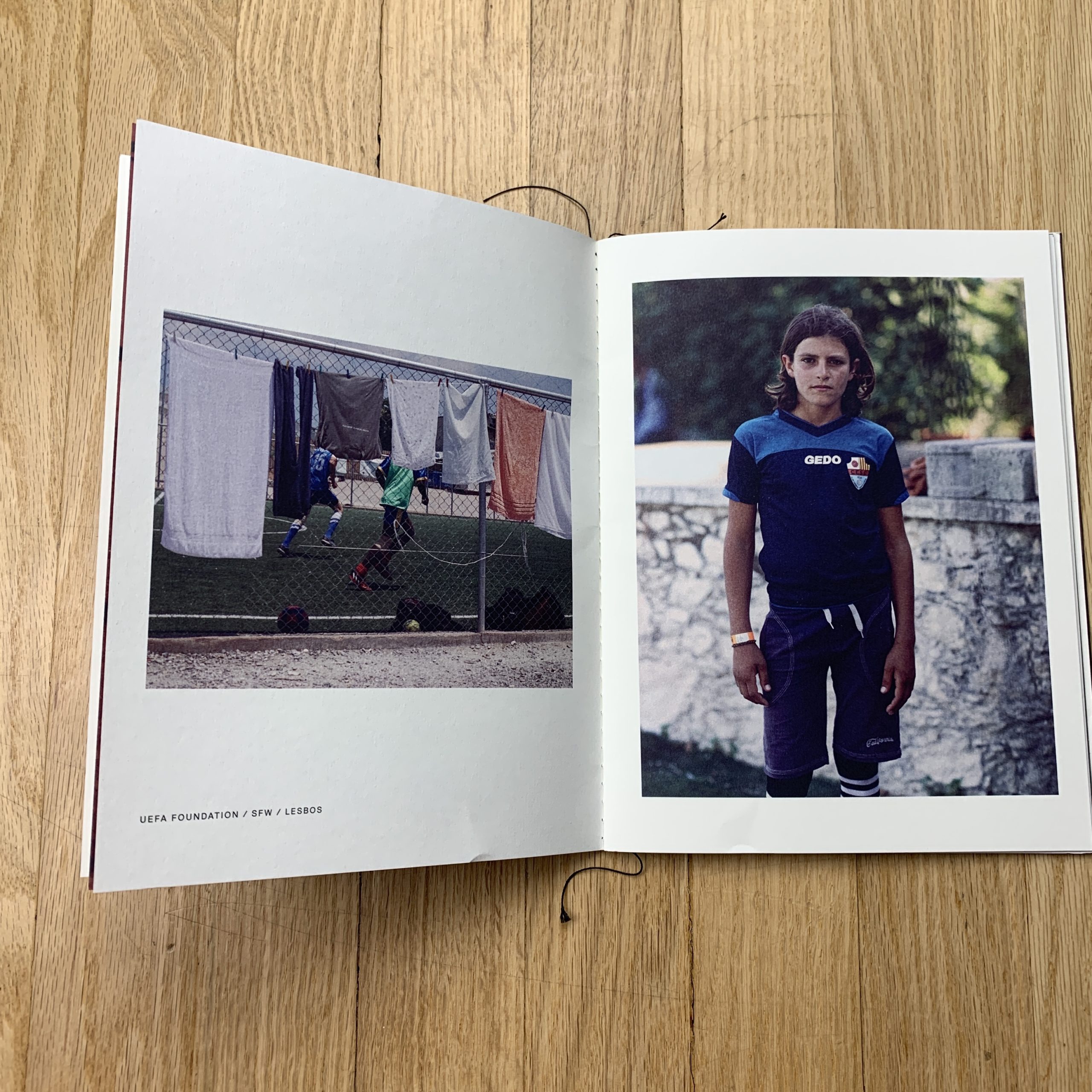
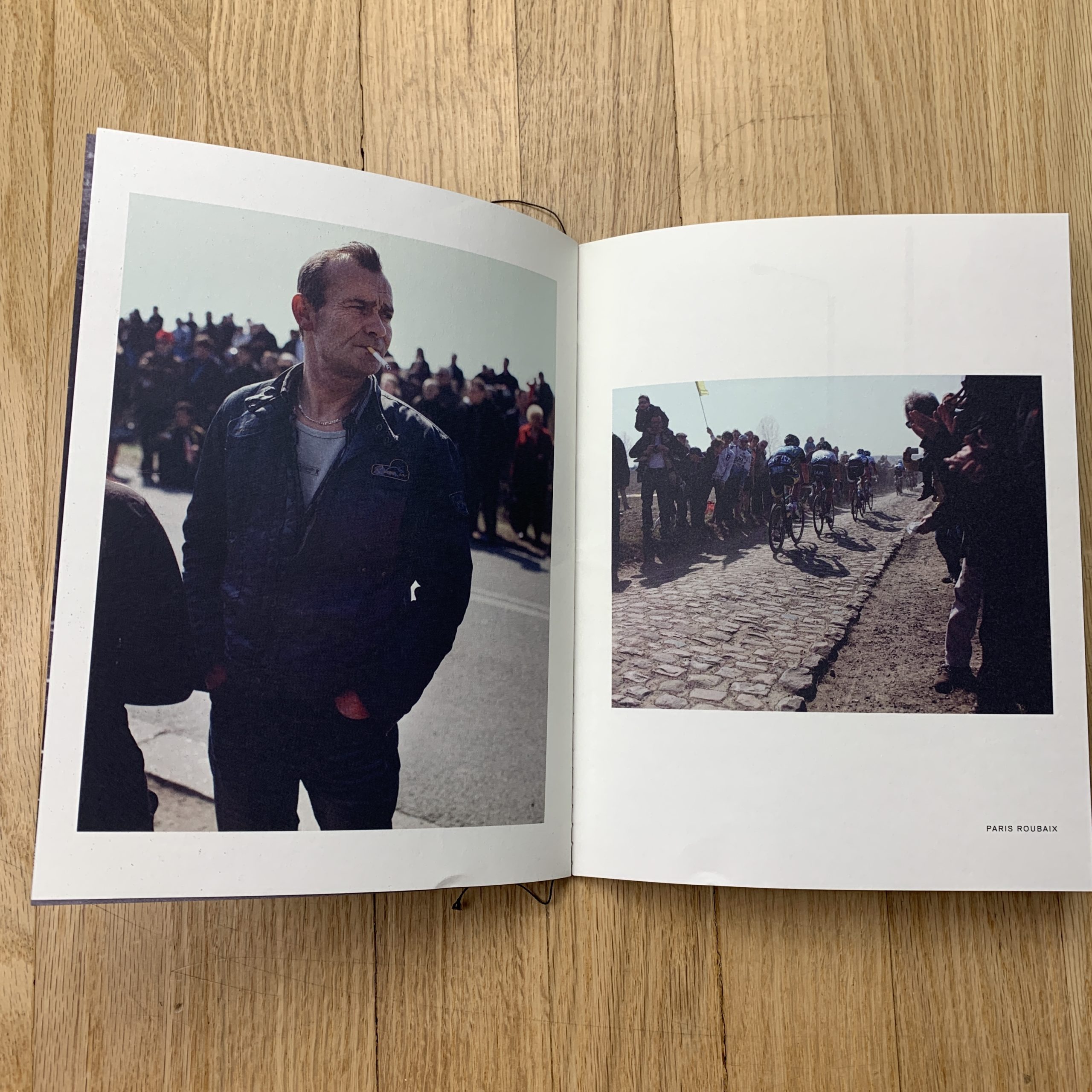
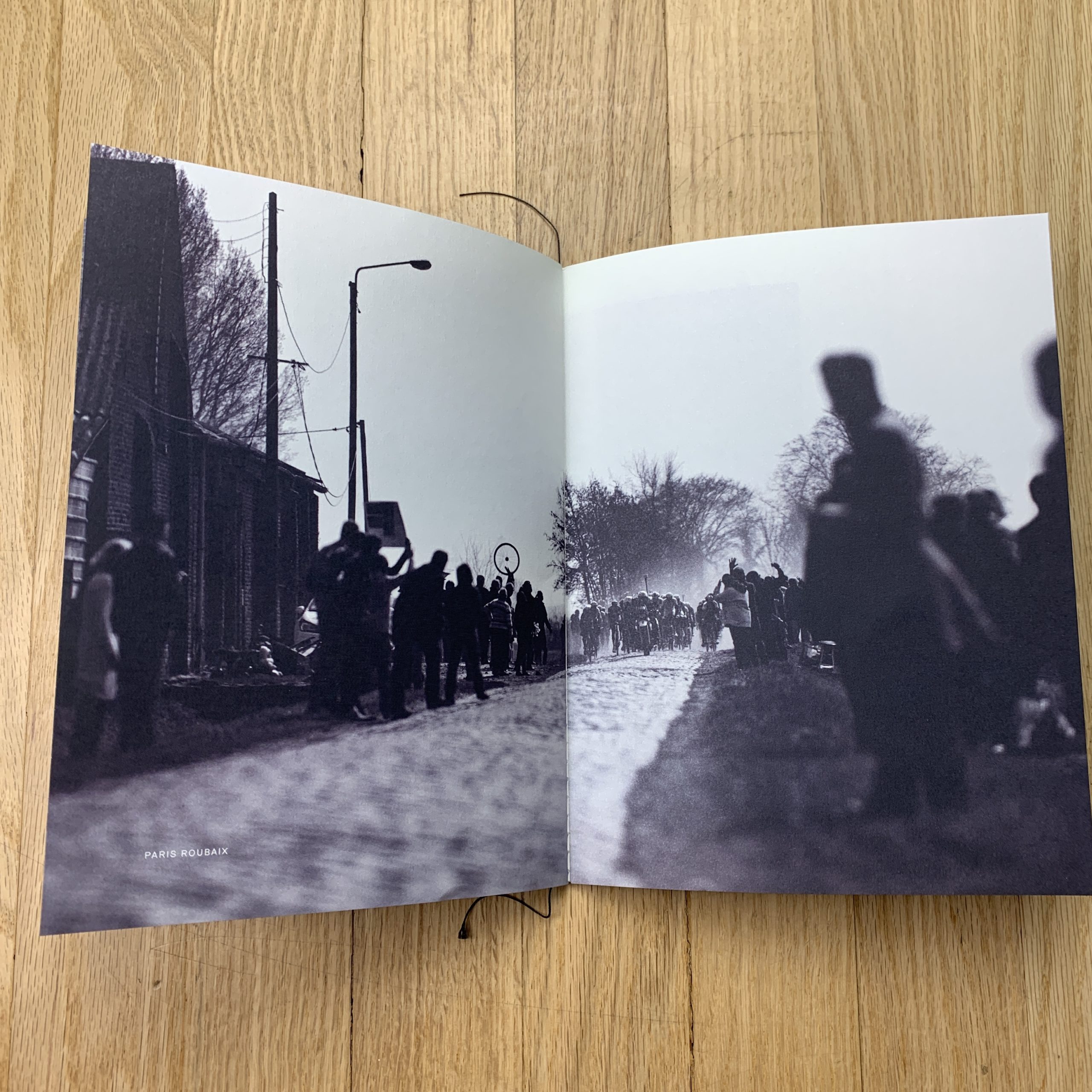
I started this postcard series earlier this year, mixing in current/new work with archival work. Since they are postcards, I try and select images that are strong enough to stand alone; and that someone might want to send/share with a friend (or tack on their wall at work). Photos, like music, are meant to be shared, and I hope these postcards will be used/shared in some form/fashion.
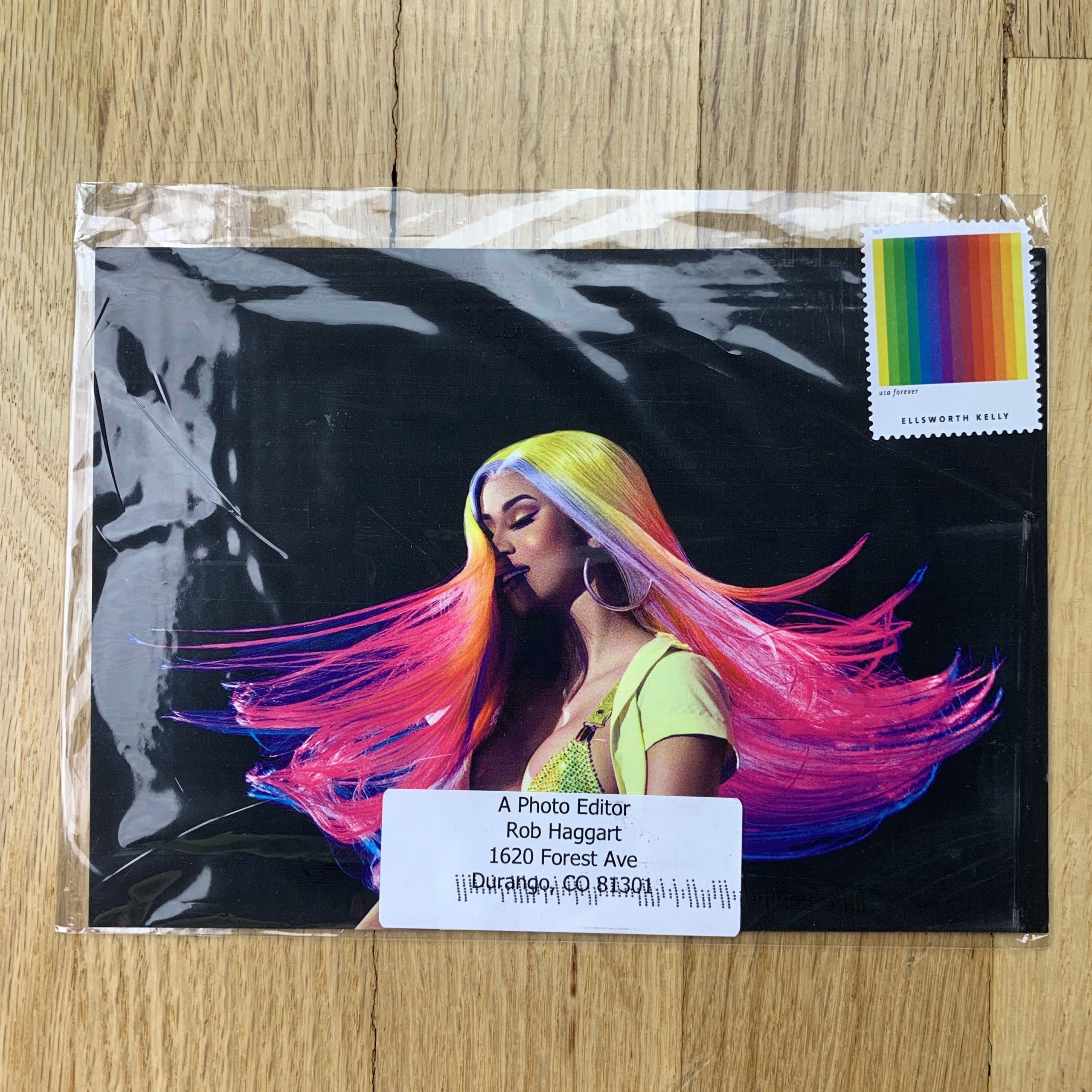
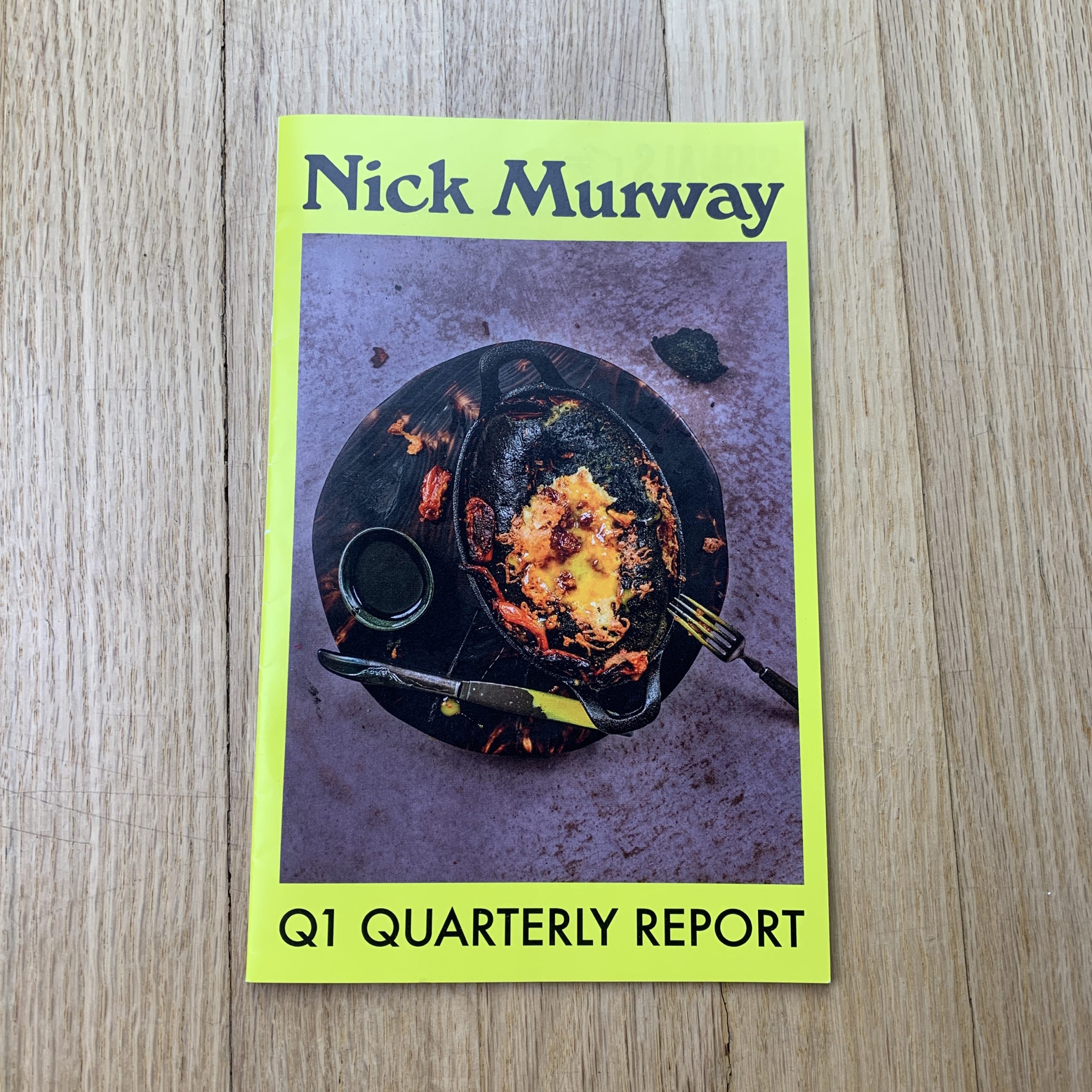
How many did you make?
300 – 500; going mainly to previous clients in the music industry (label, pr, mgmt) and editorial.
How many times a year do you send out promos?
Once a quarter.
Do you think printed promos are effective for marketing your work?
I do absolutely; email blasts are a good way to keep your name in front of clients; but I love the possibilities of printed pieces – there are so many ways you can show your work with a printed piece, tailoring it to a specific personal project, crafting a series, etc. It’s another way to show how you see, how you feel and approach things, etc. I’ll use another music reference, in that promos to me are like releasing a new album of work (or with these postcards – a series of singles that will ultimately make up a collection). And like musicians, we as photographers are continually moving forward, honing our craft, exploring new themes and issues, changing/evolving – our promos and work should reflect this as well.
If you’re not pushing yourself into uncomfortable territory, then you’re stagnant. Shake it up.
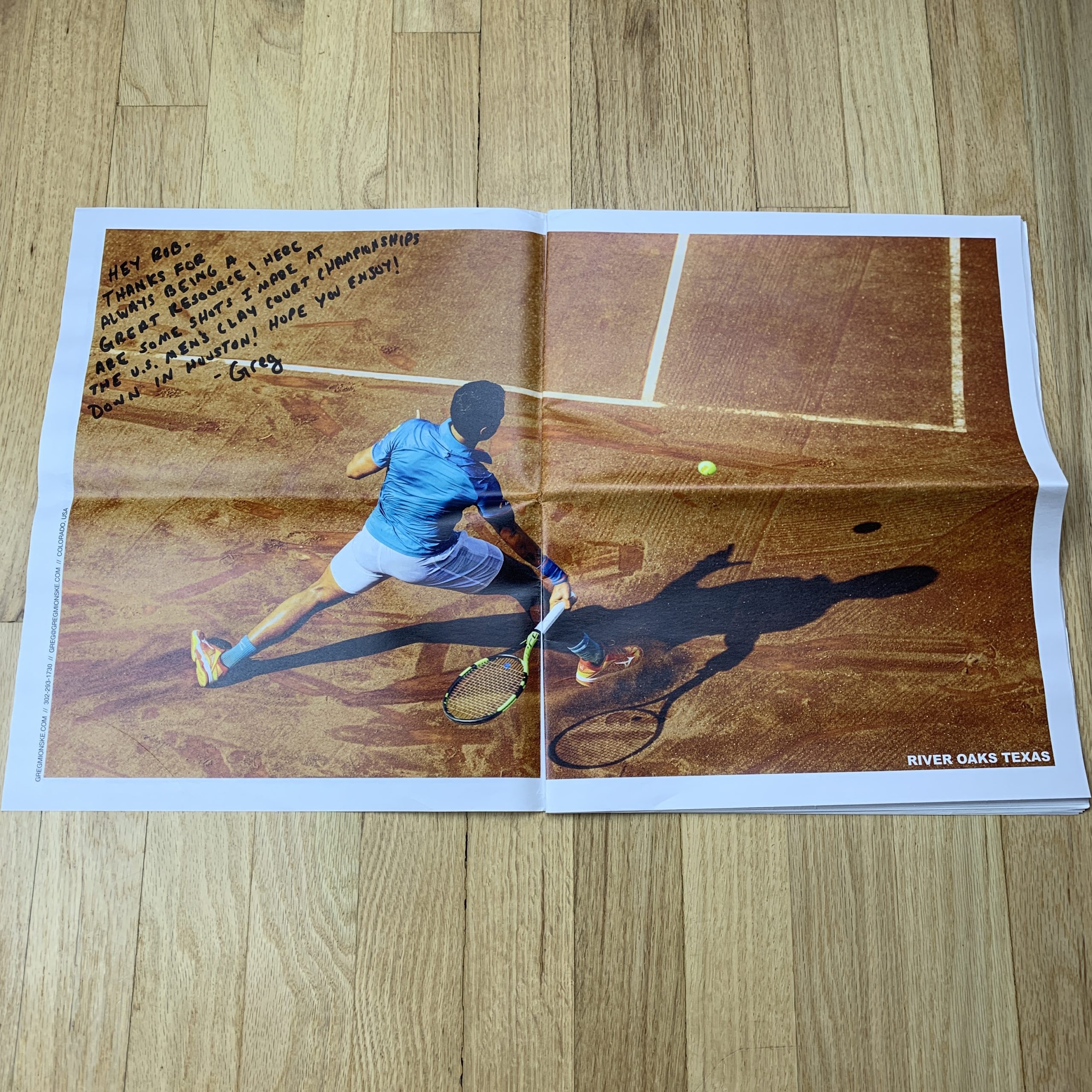
Have you ever gotten a job directly from a printed promo?
I’m often wrong about expectations when I share my work (that’s why I try and have none). When I sent out the promo book earlier this year that I mentioned, I sent several to an ad agency that I had worked with on a commercial spot several years ago. I sent it simply because I liked the team at the agency a lot, and because I knew that they were fans of some of the musicians pictured in the book. Several weeks after they received it, I got a call from them to bid on another commercial spot – and won the job.