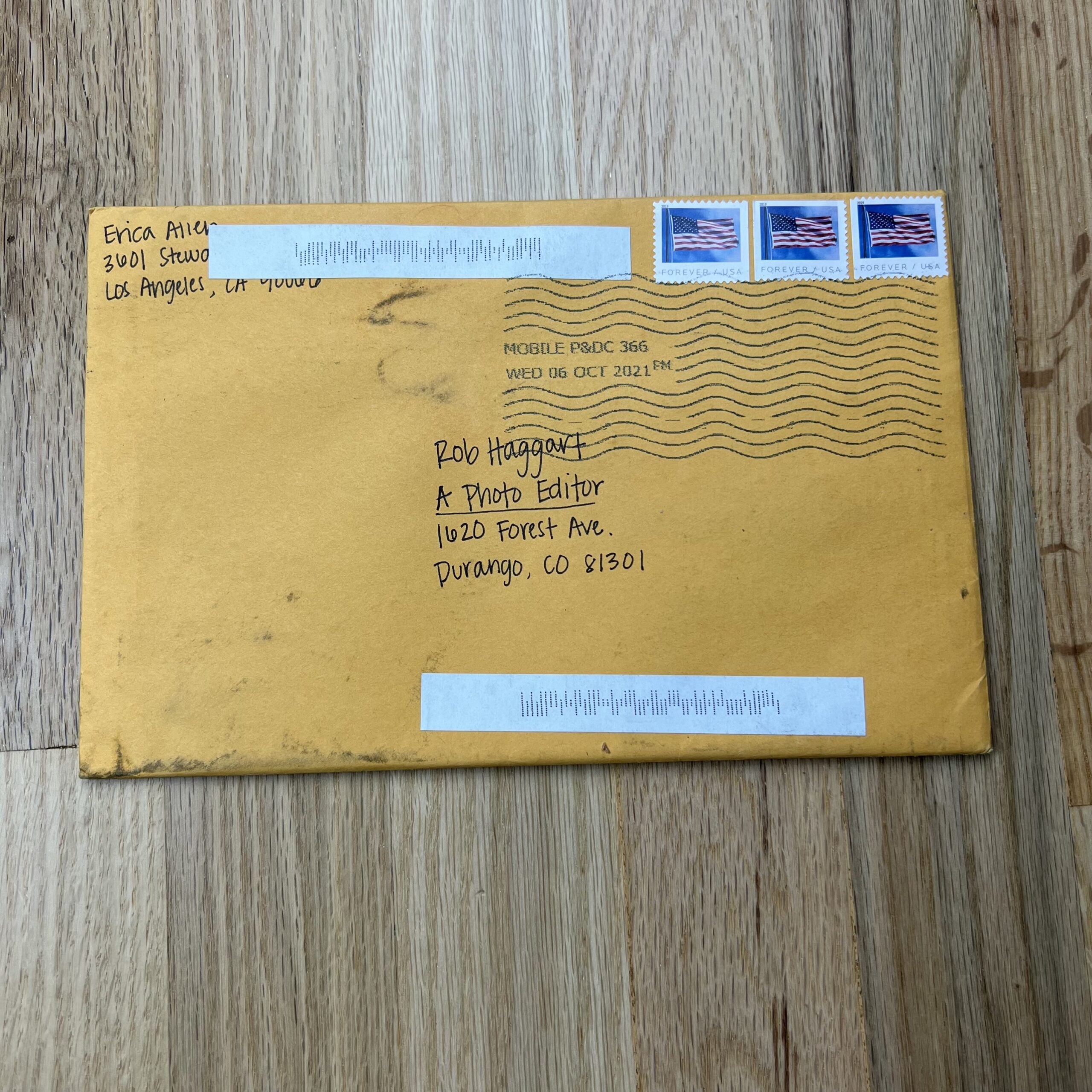
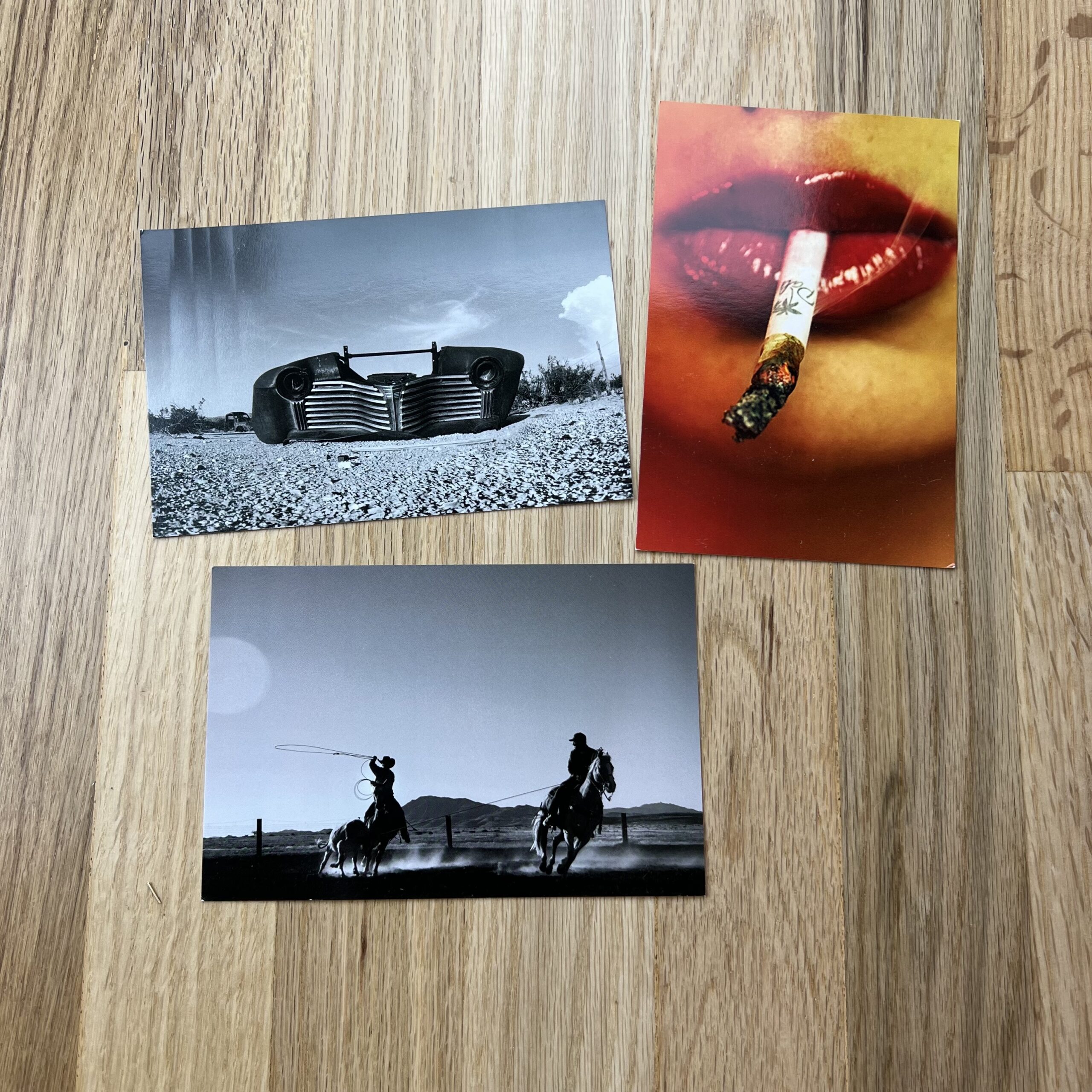
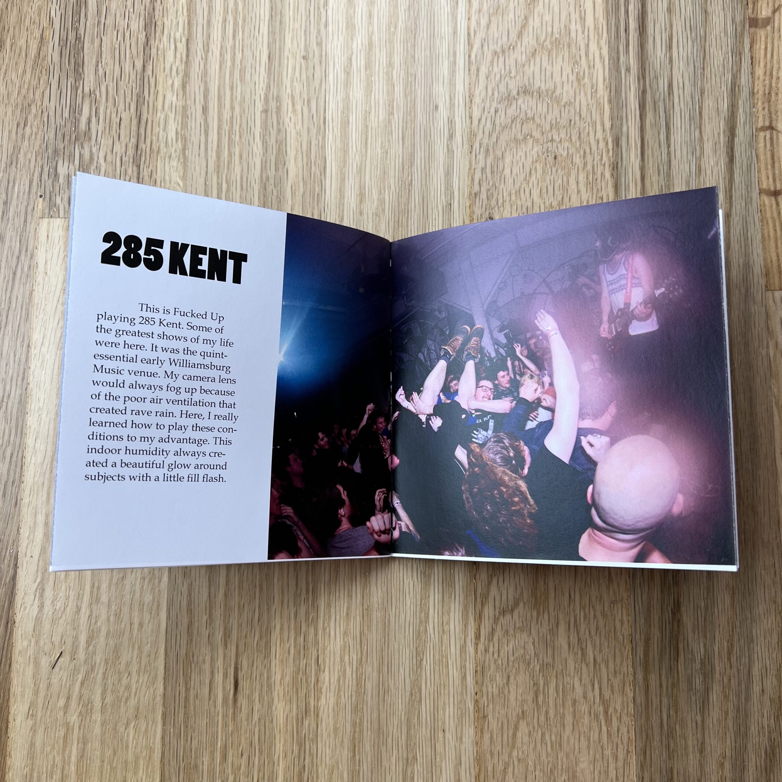
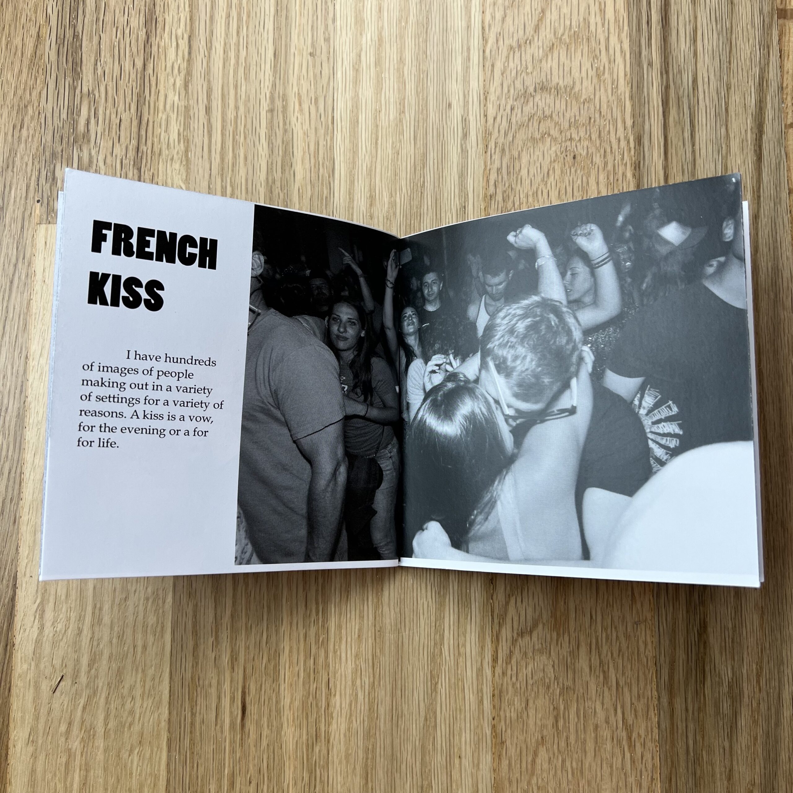
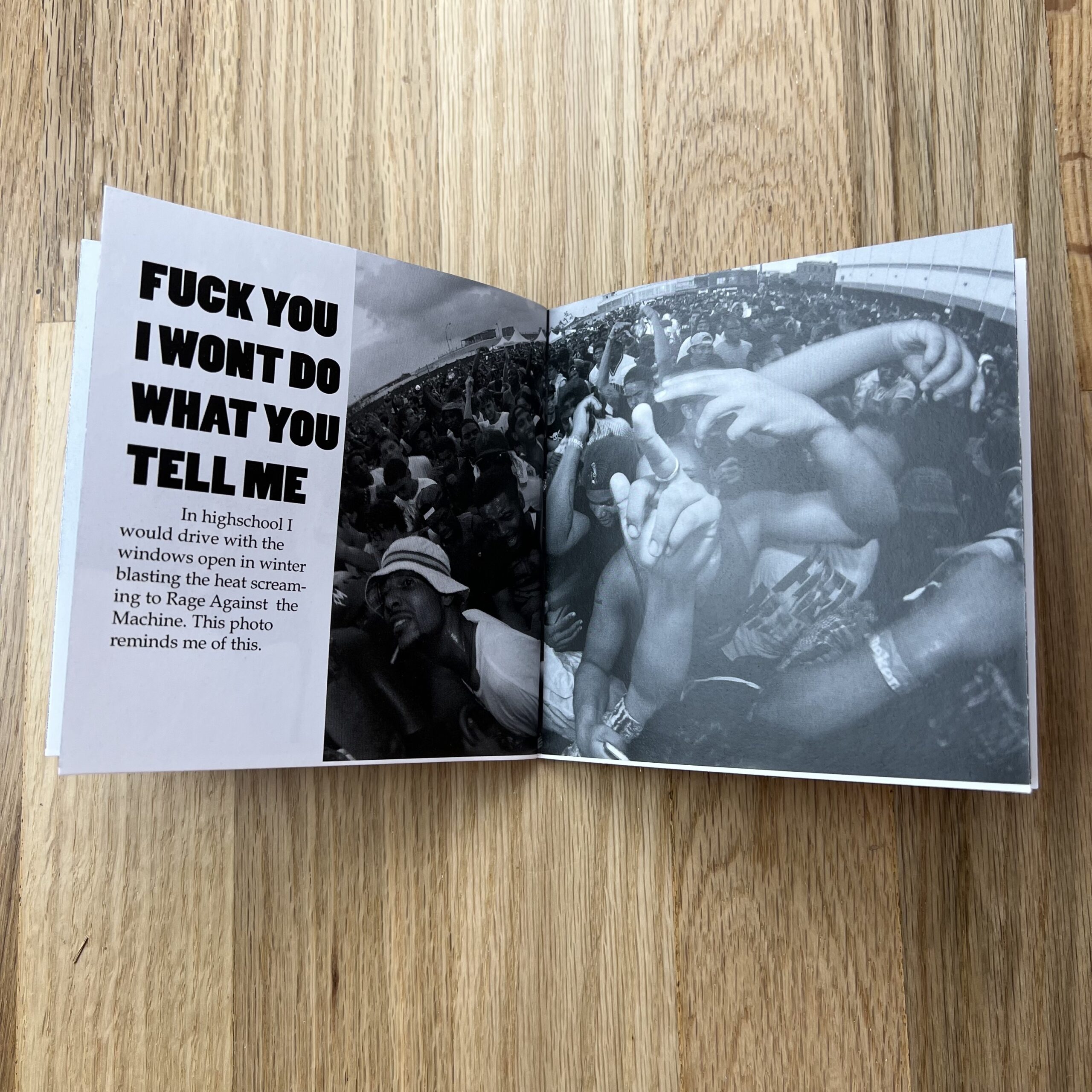
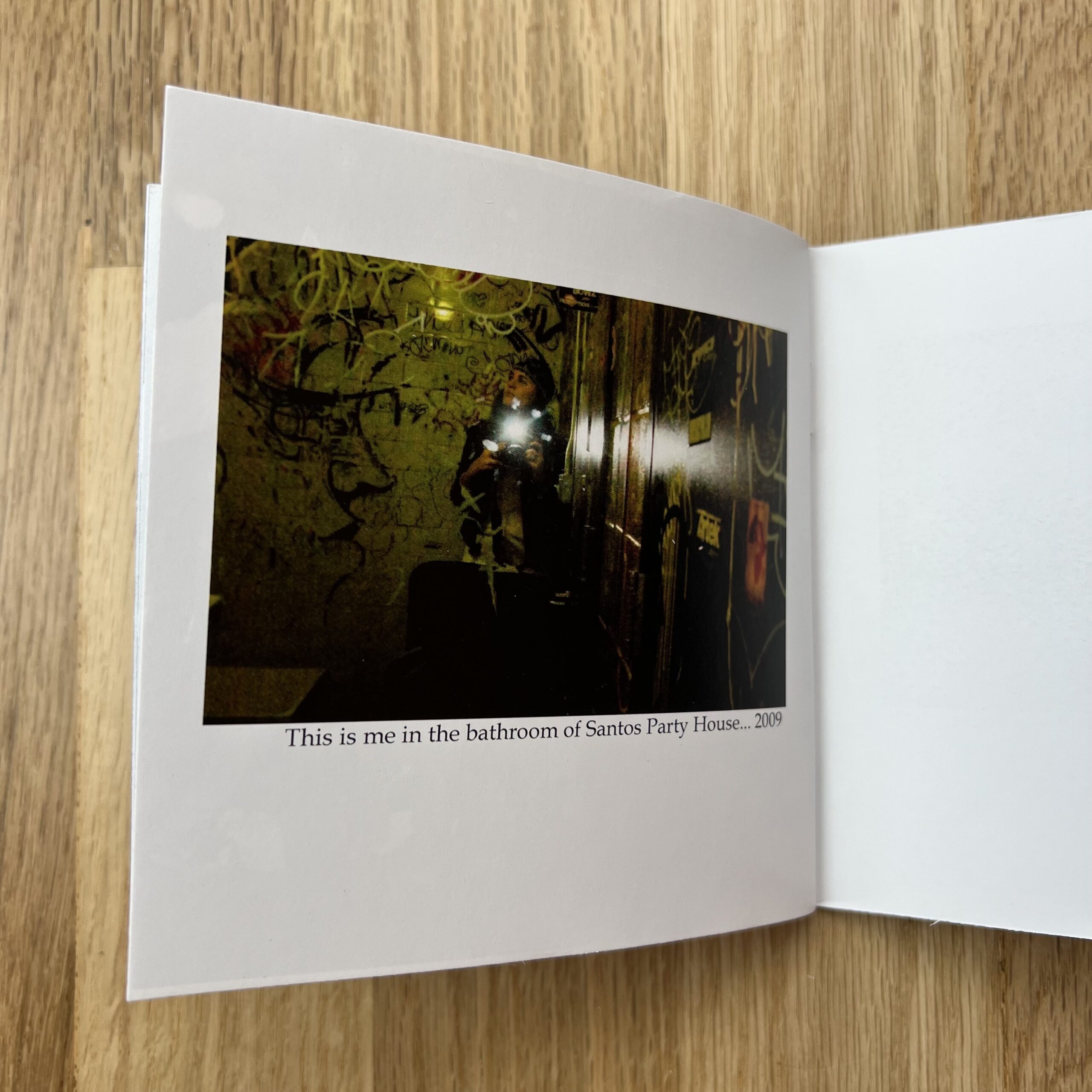
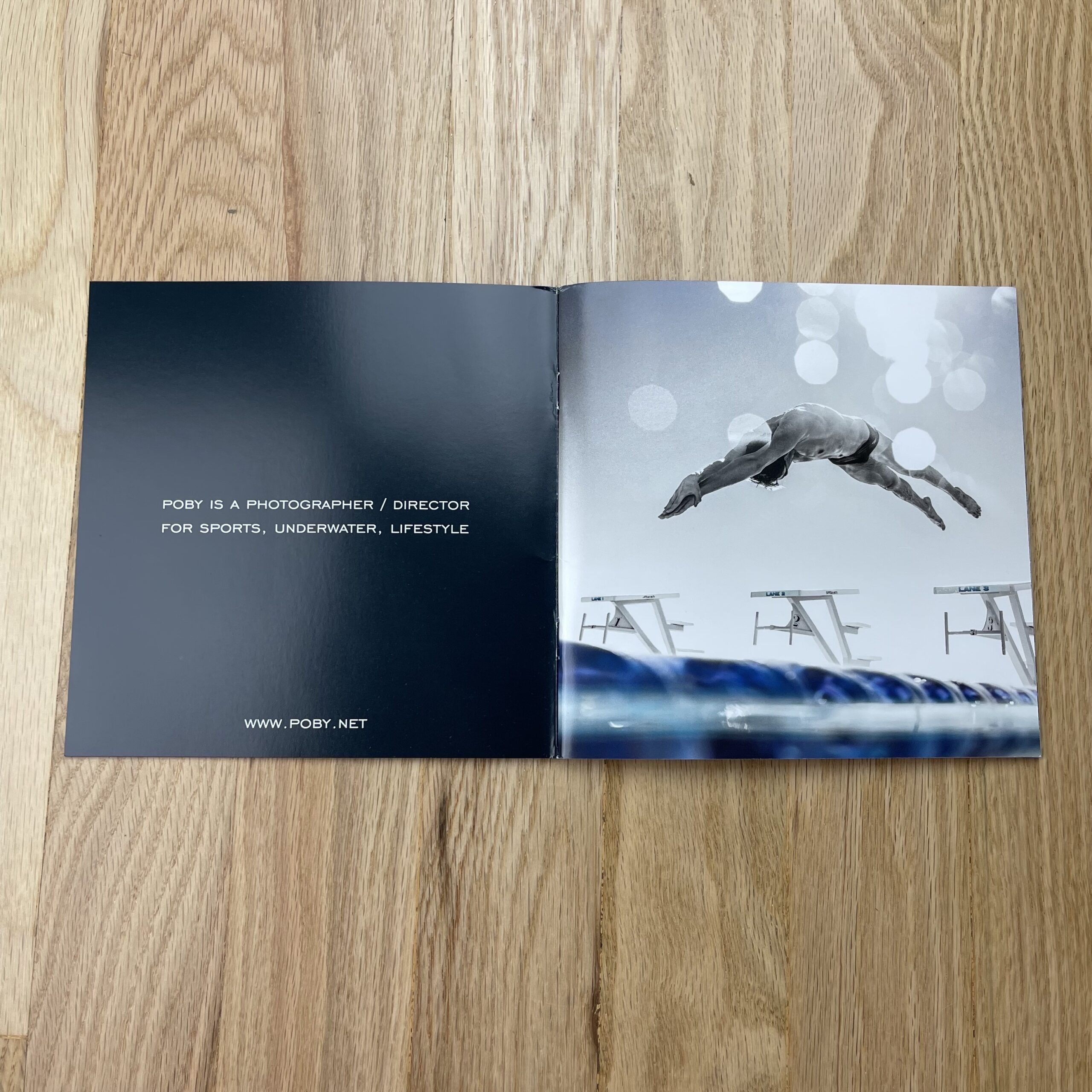
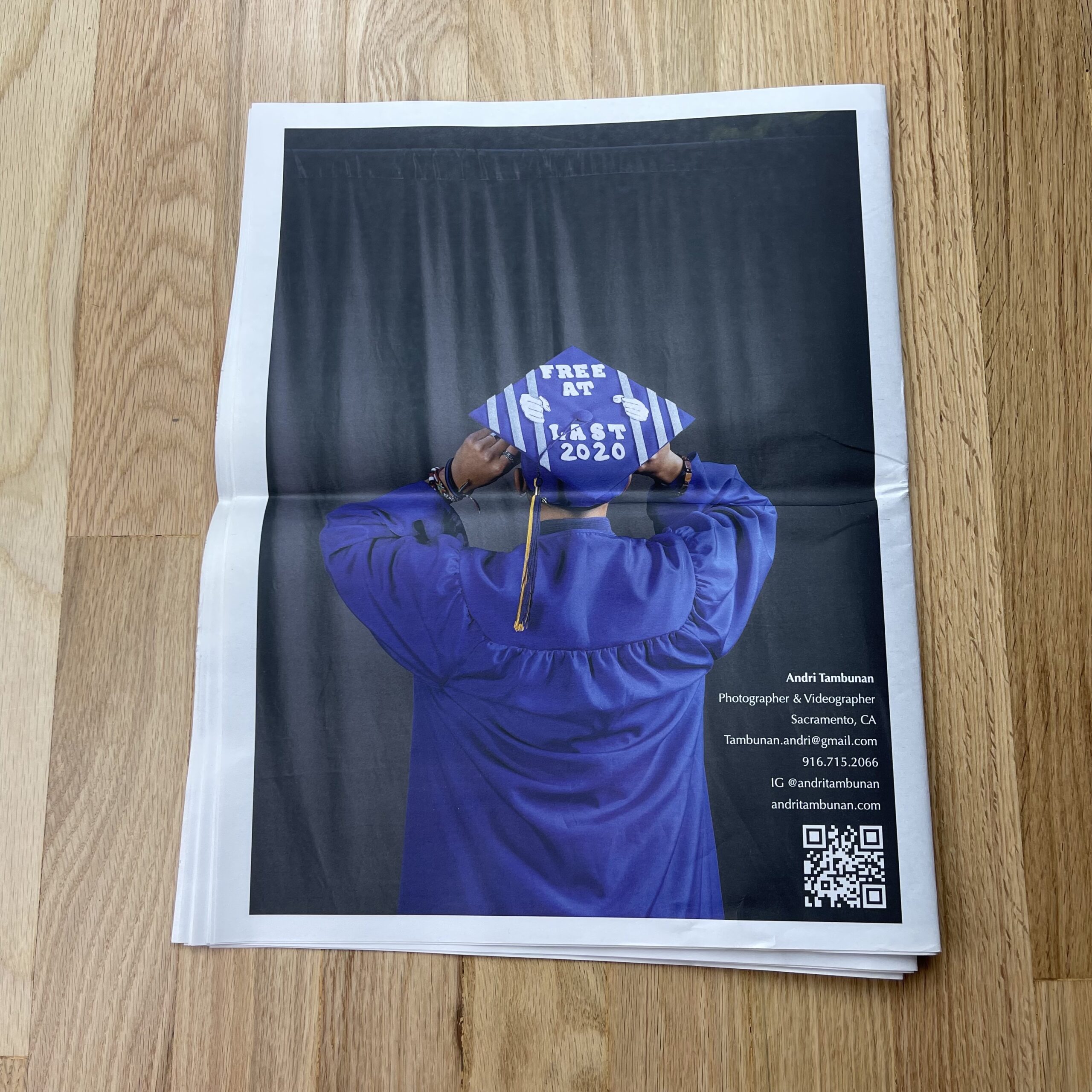
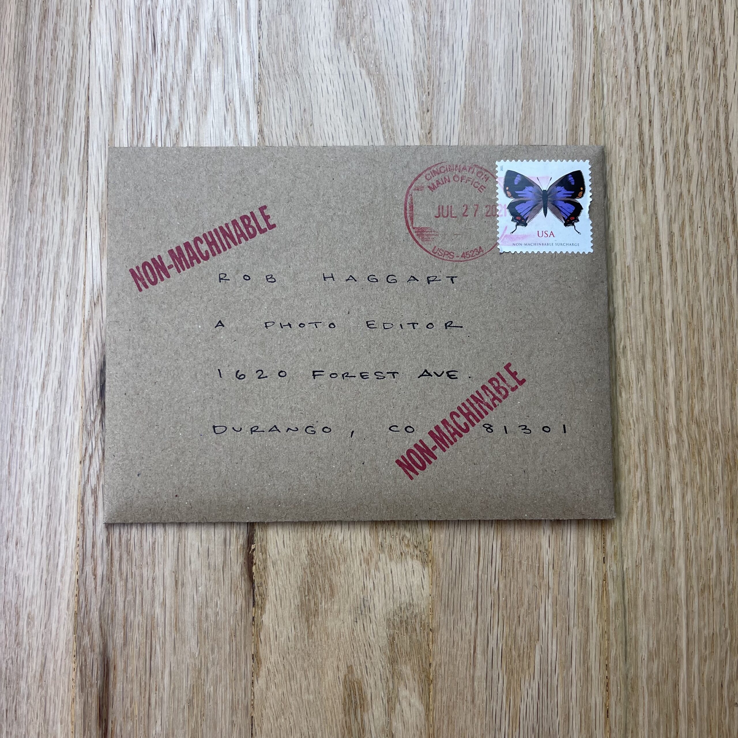
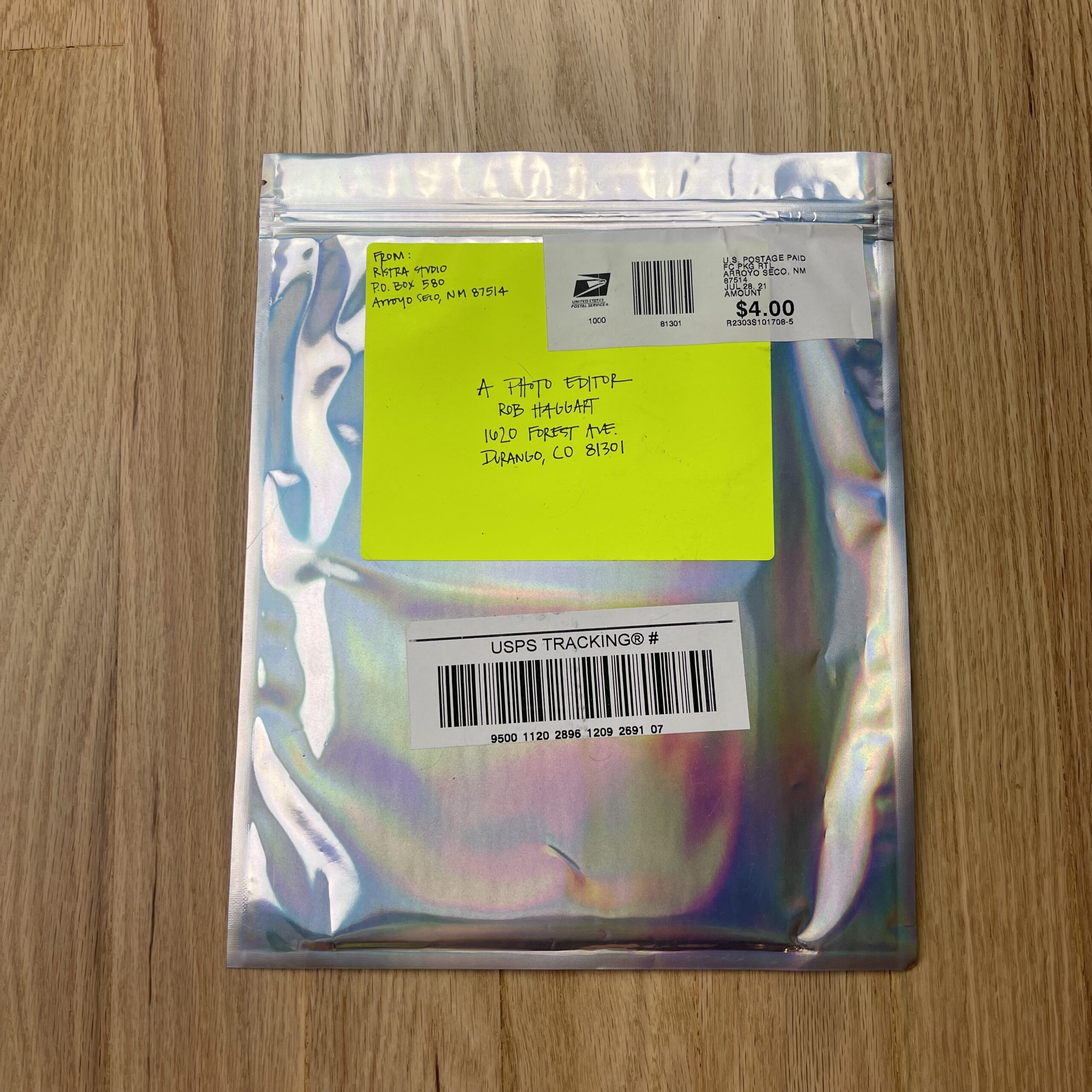
Feature Promo – Ben Girardi

Ben Girardi

Who printed it?
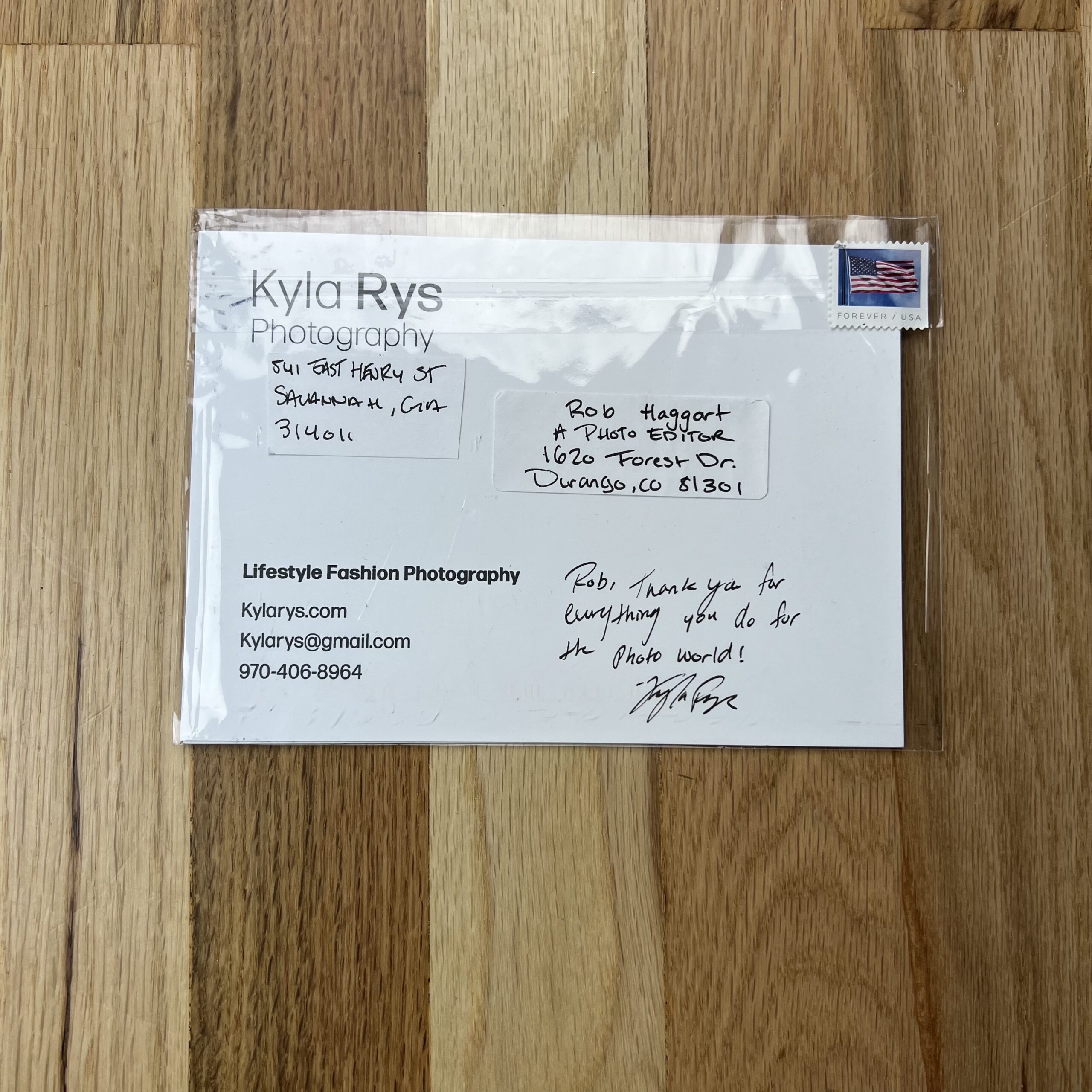
I printed the promo with Moo.com. I’ve tried a few different printers in the past, but I have found that Moo seems to be the highest quality for a reasonable price.

Who designed it?
The layout of the cards was done by myself. However, in the past year I worked with graphic designer Helen Bradford (http://helenbradford.com) to create a new logo and color palette for my brand which I used on the cards.

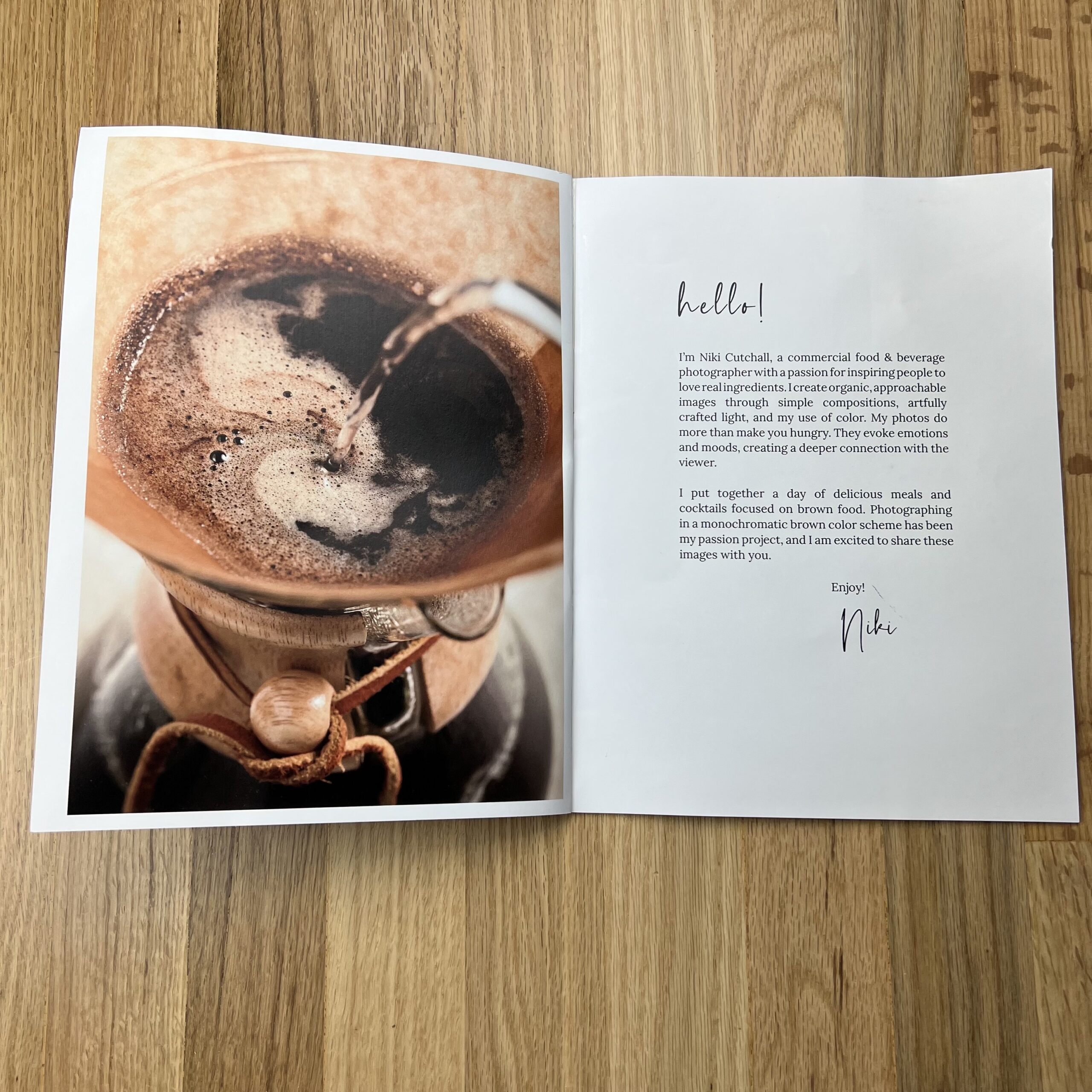
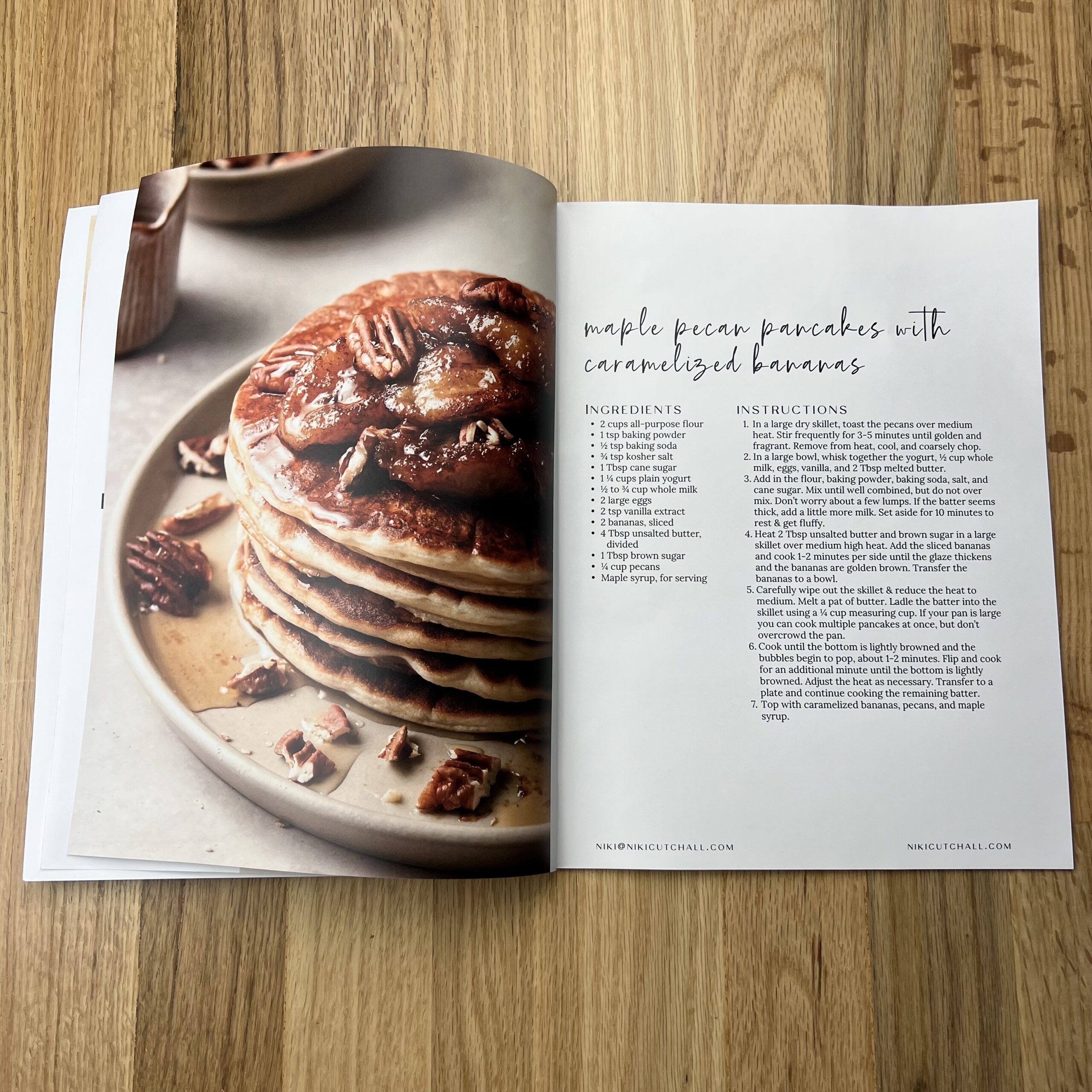
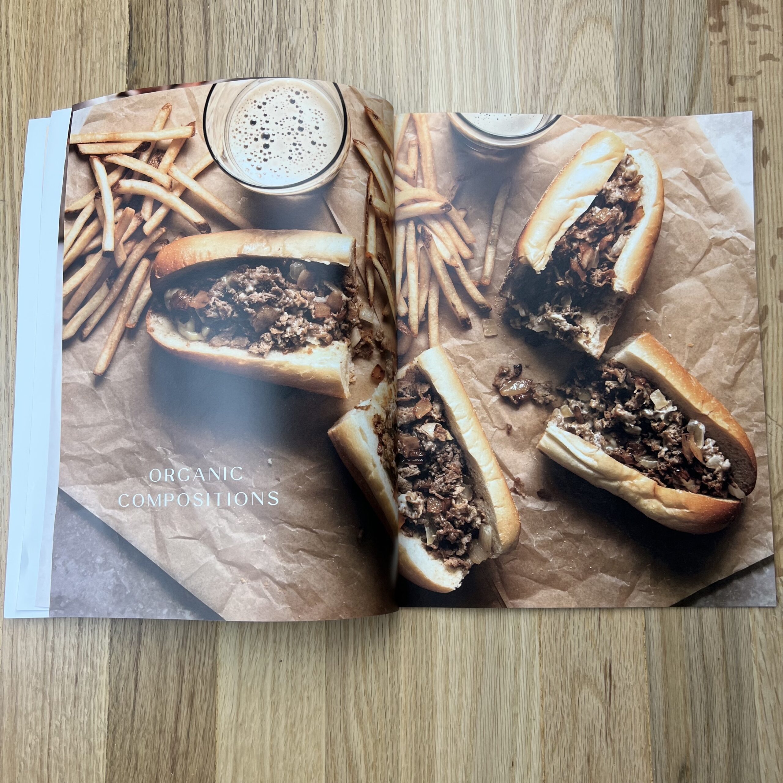
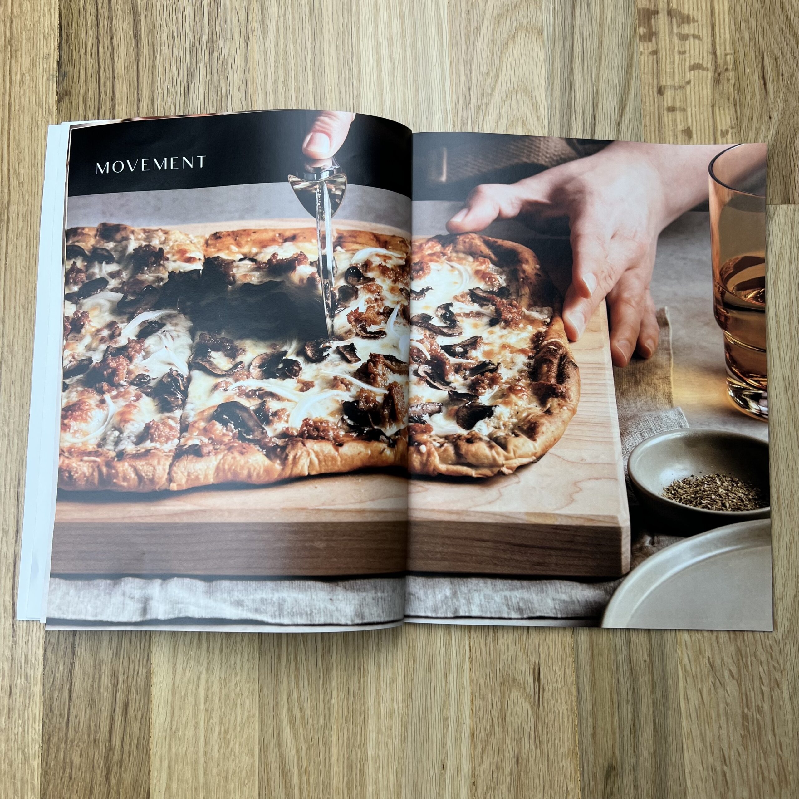
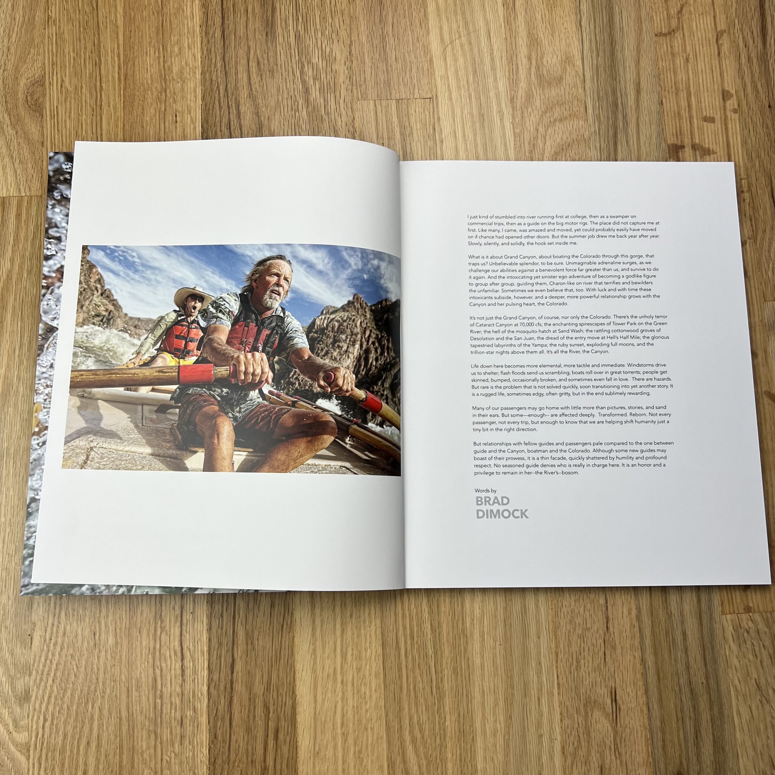
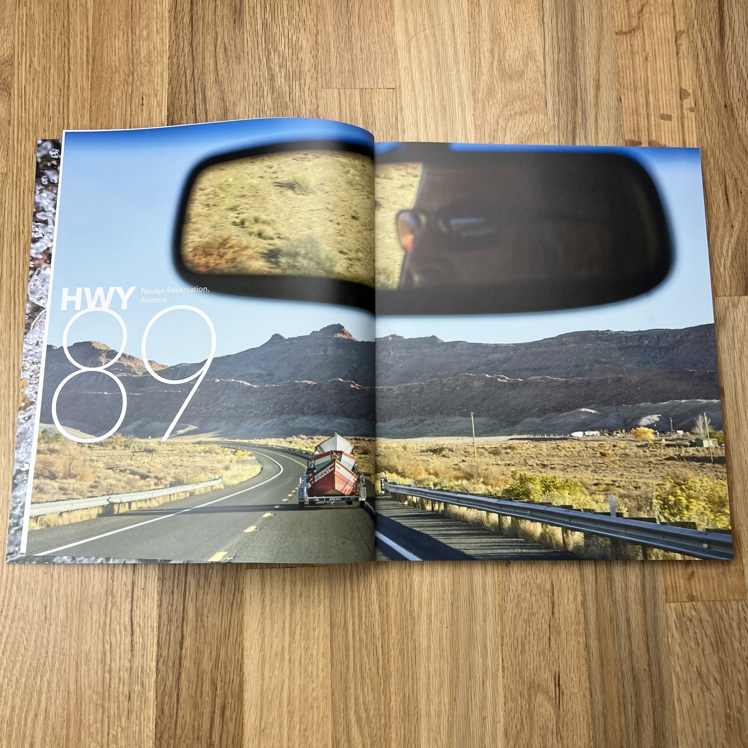
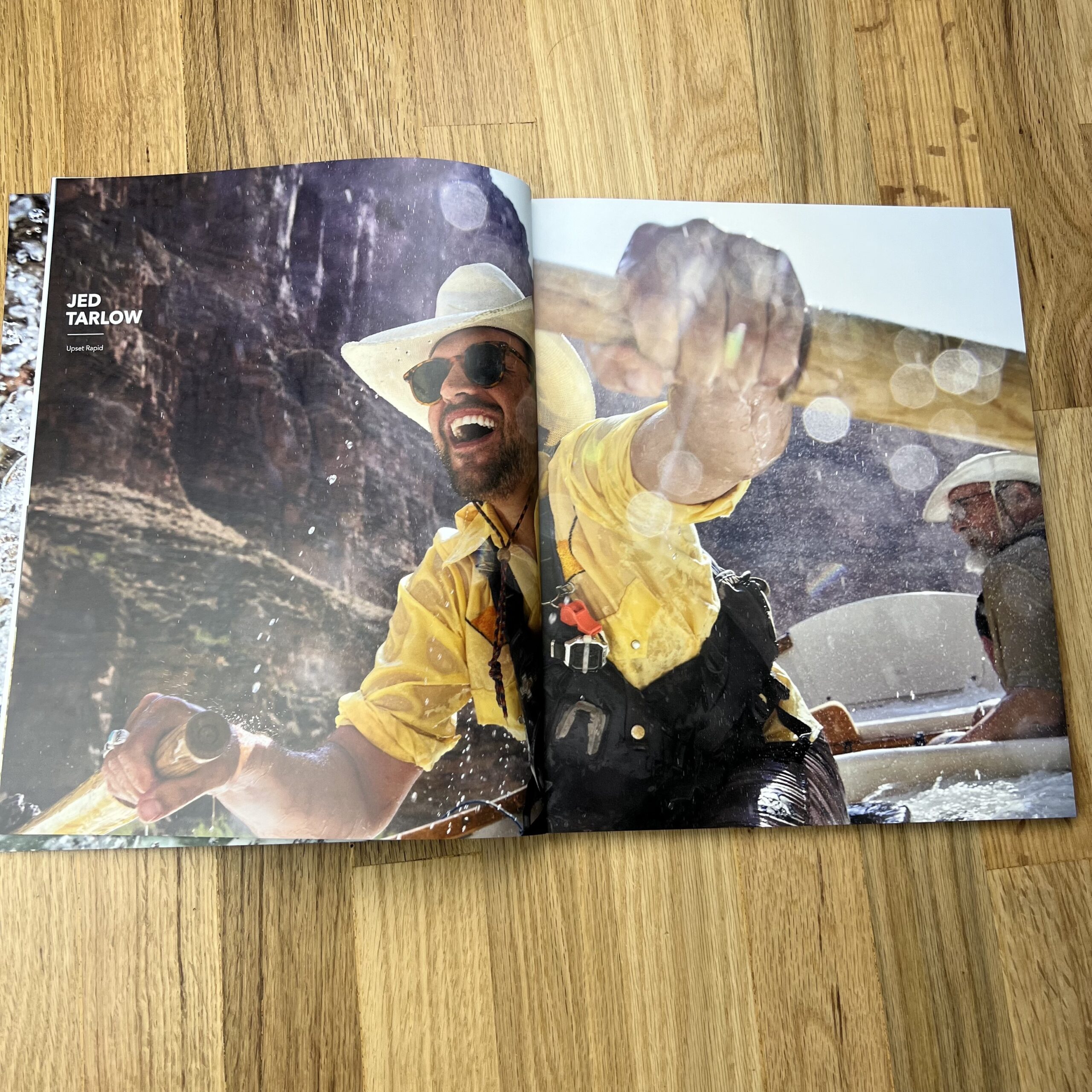
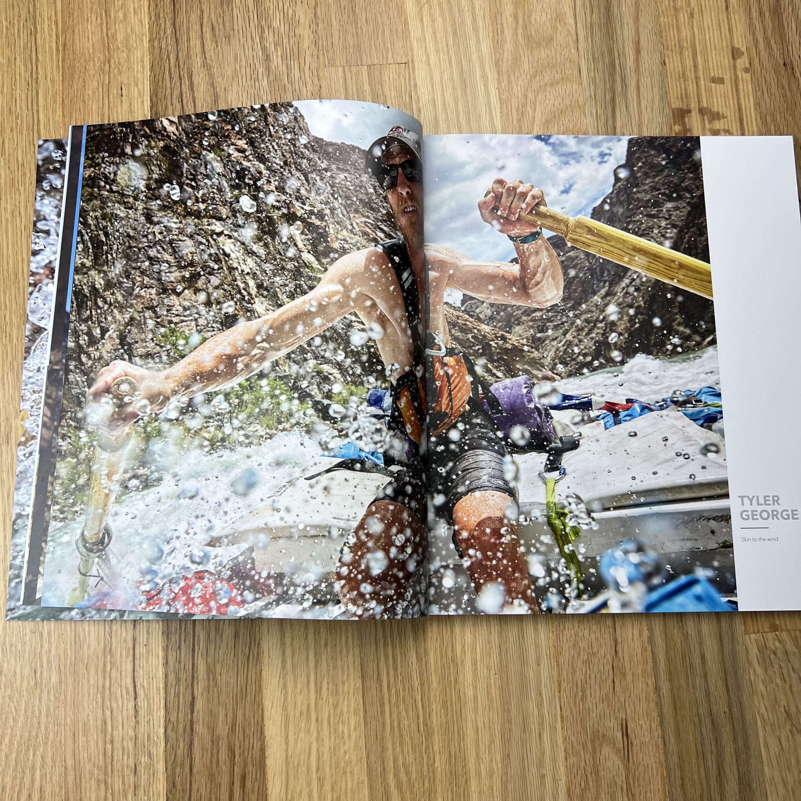
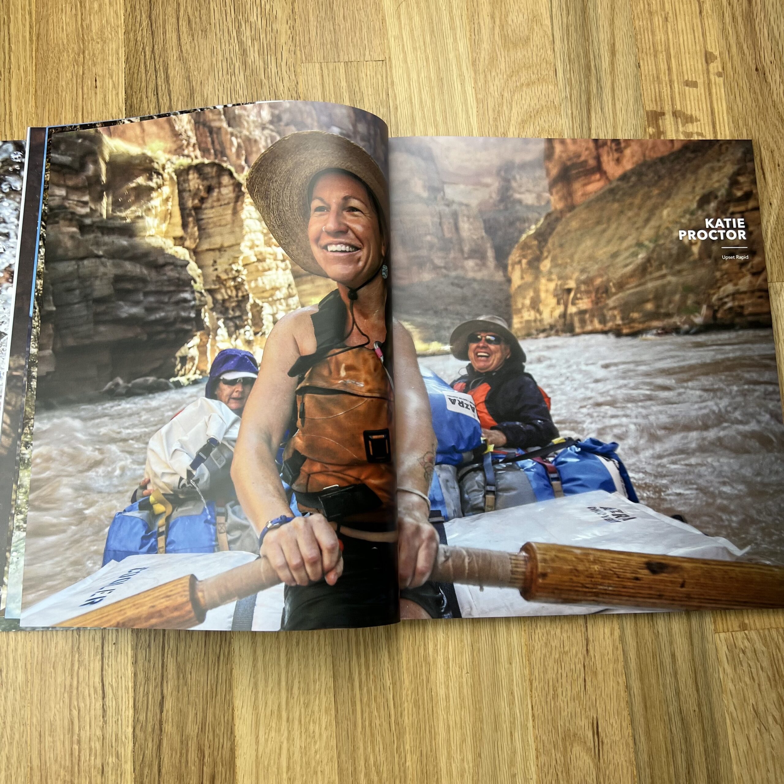
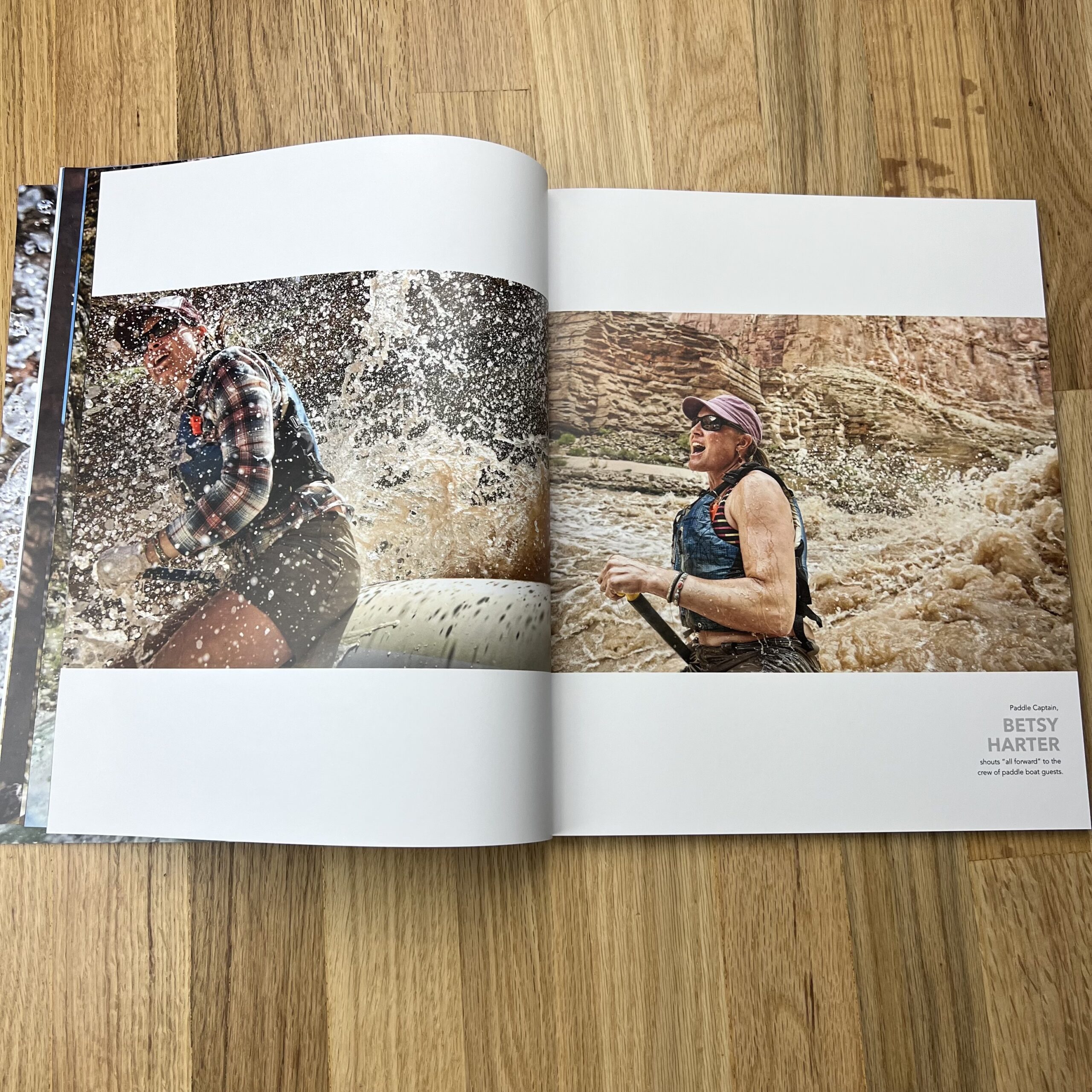
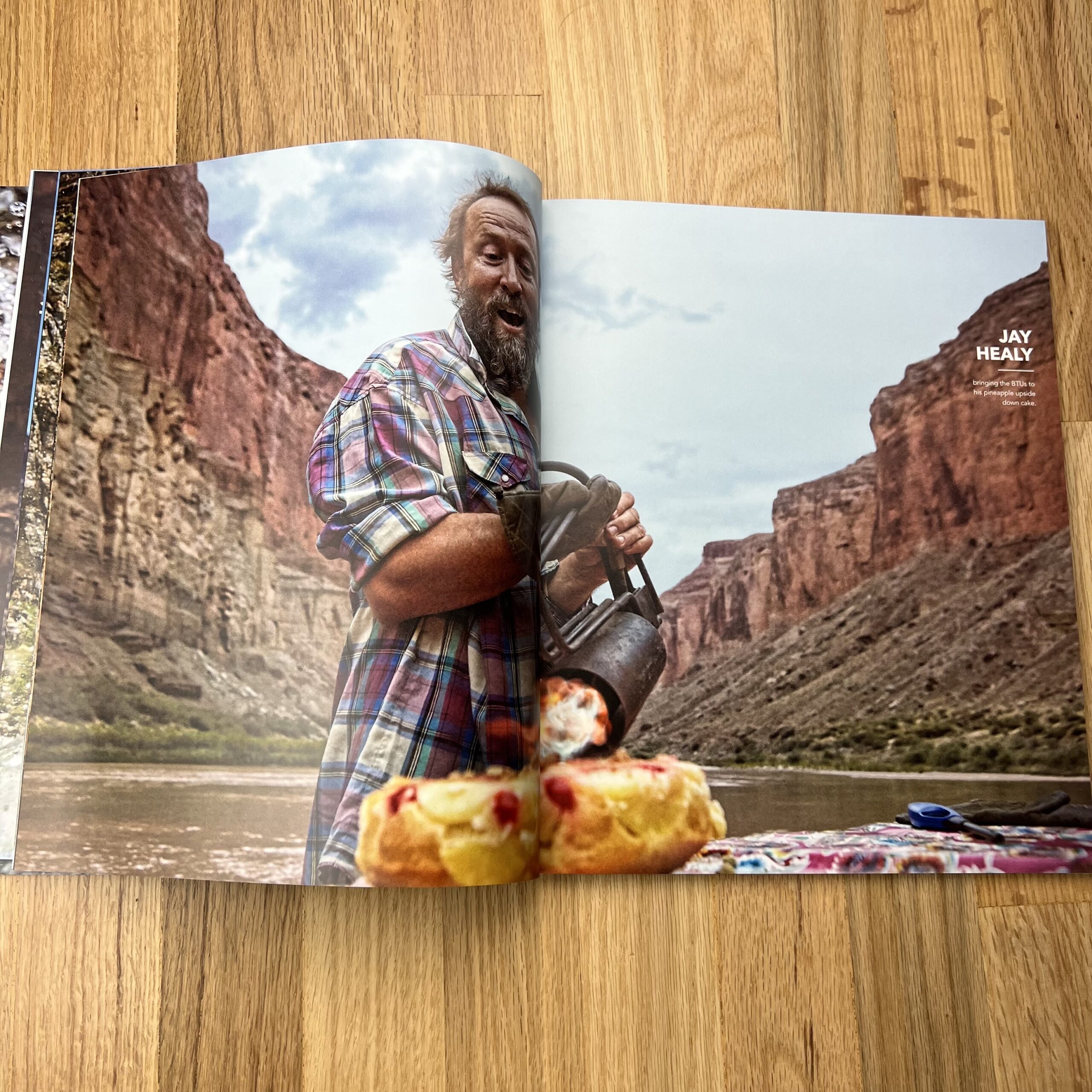
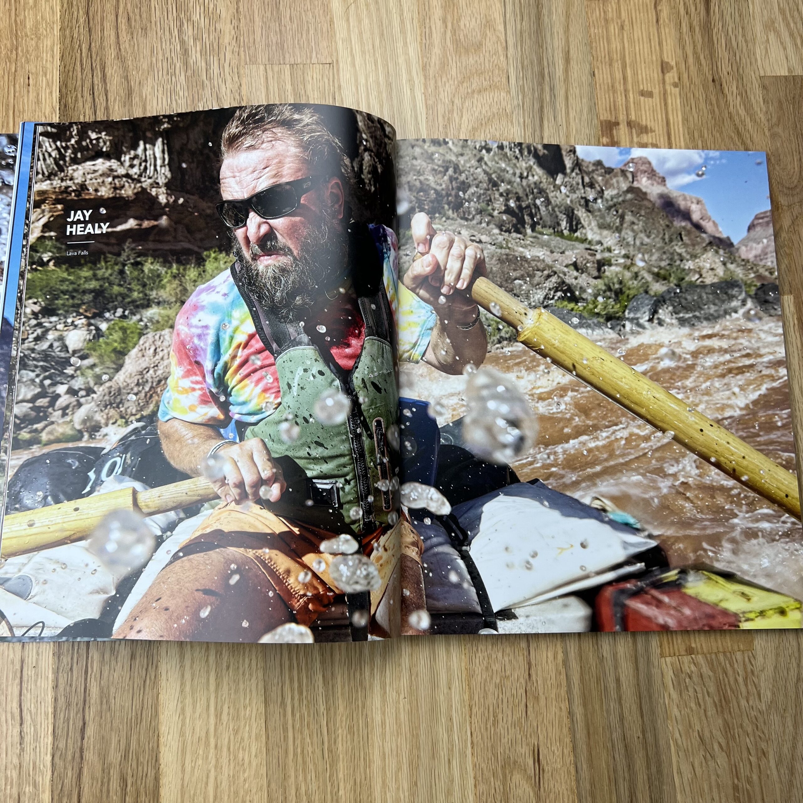
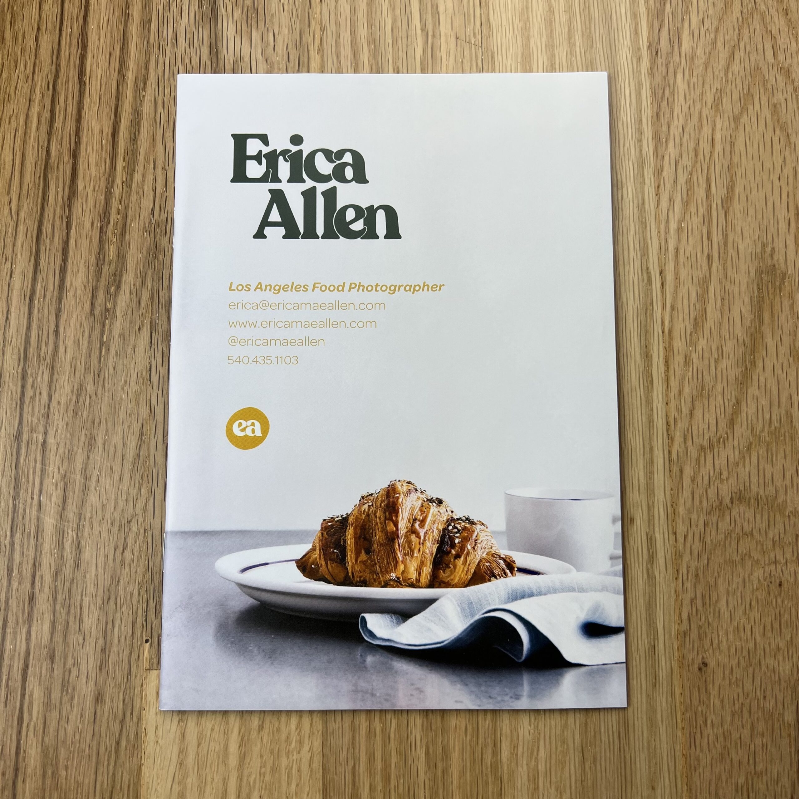
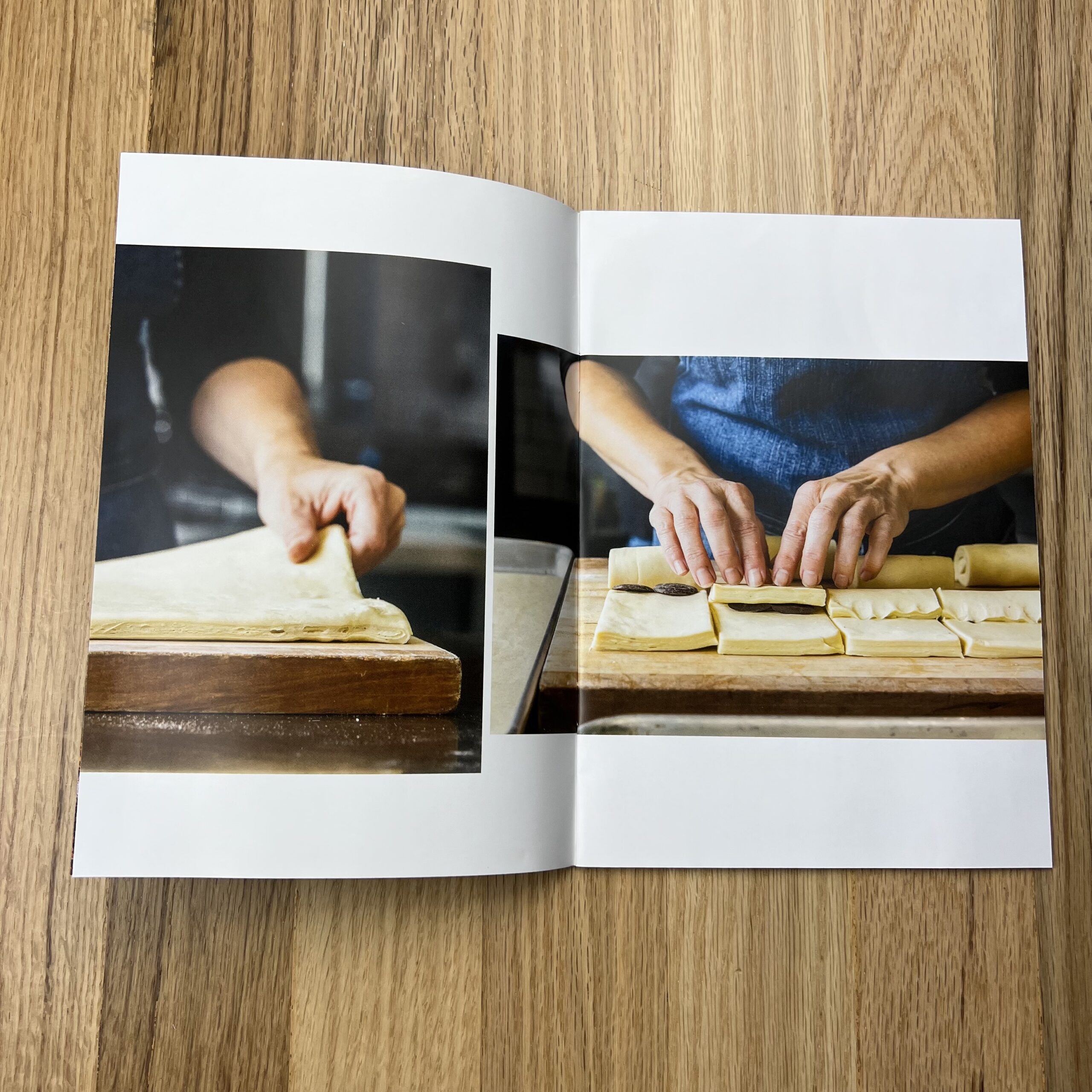
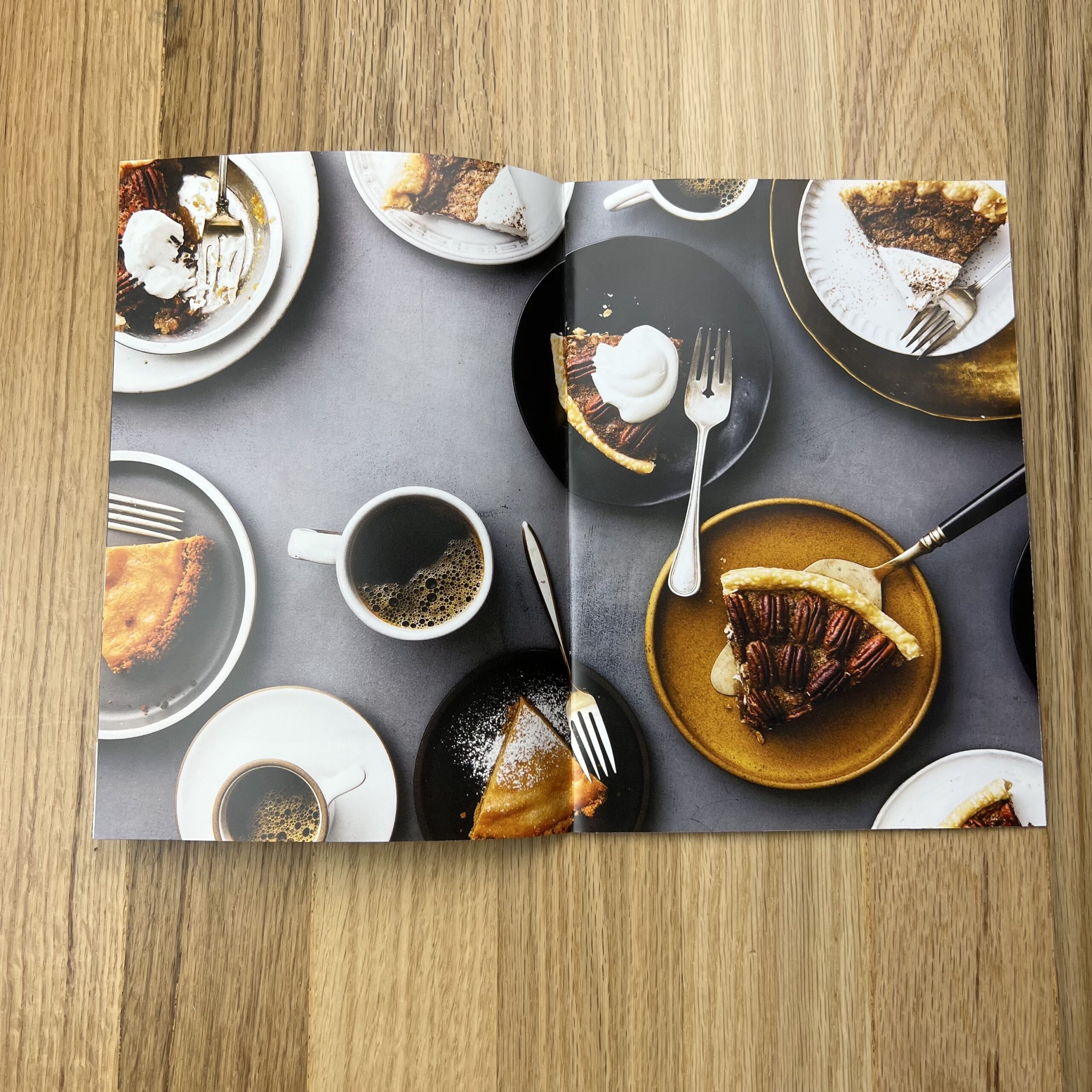
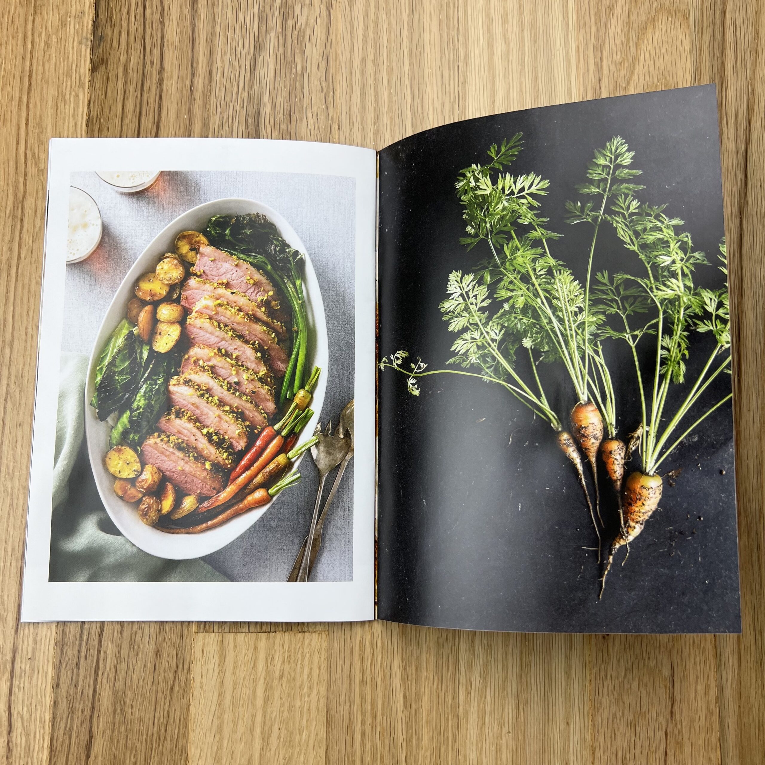
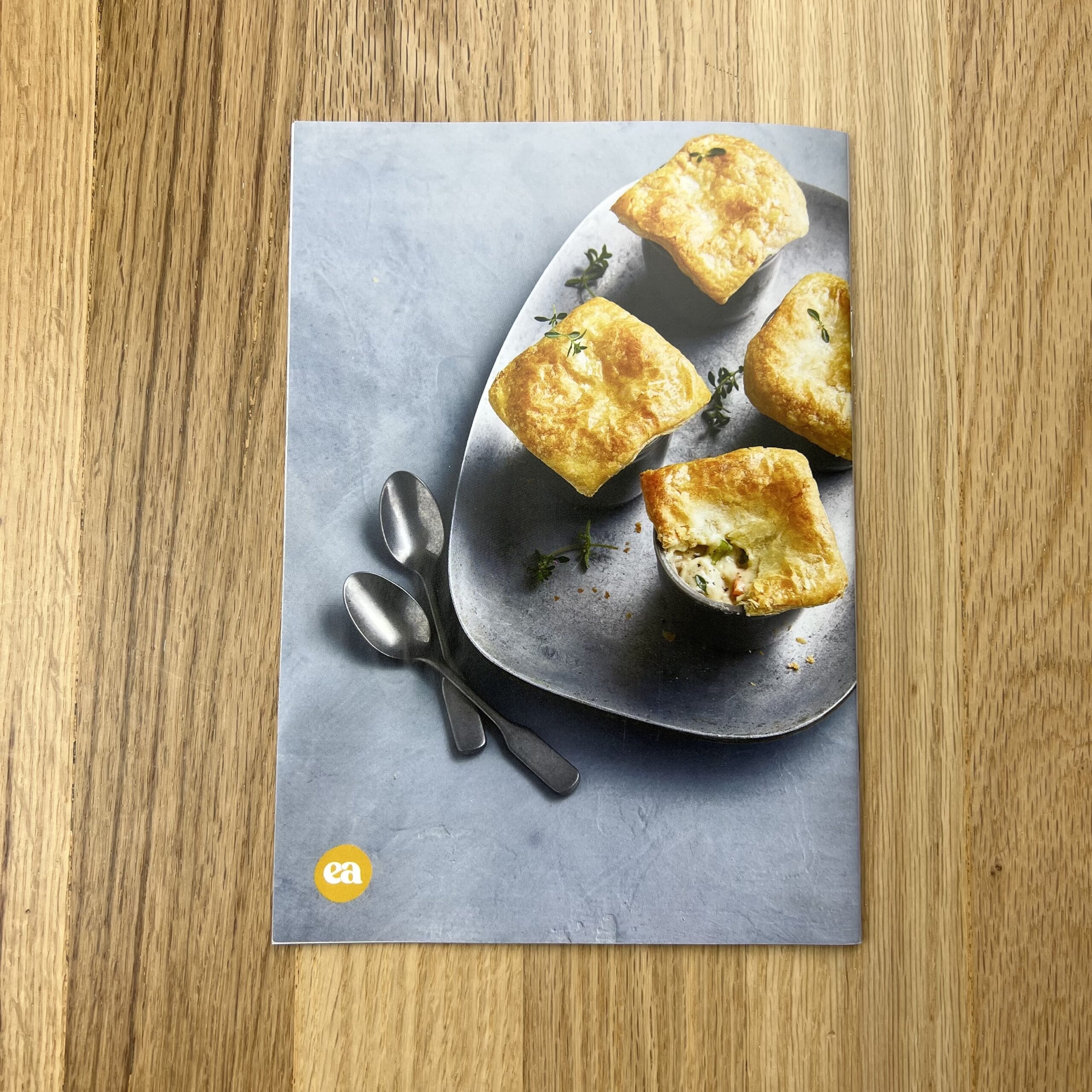
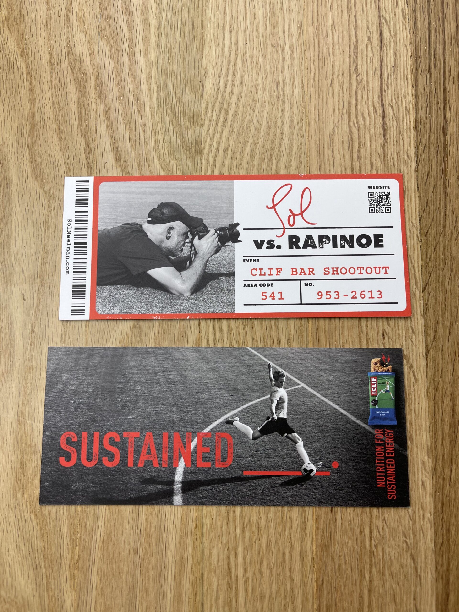
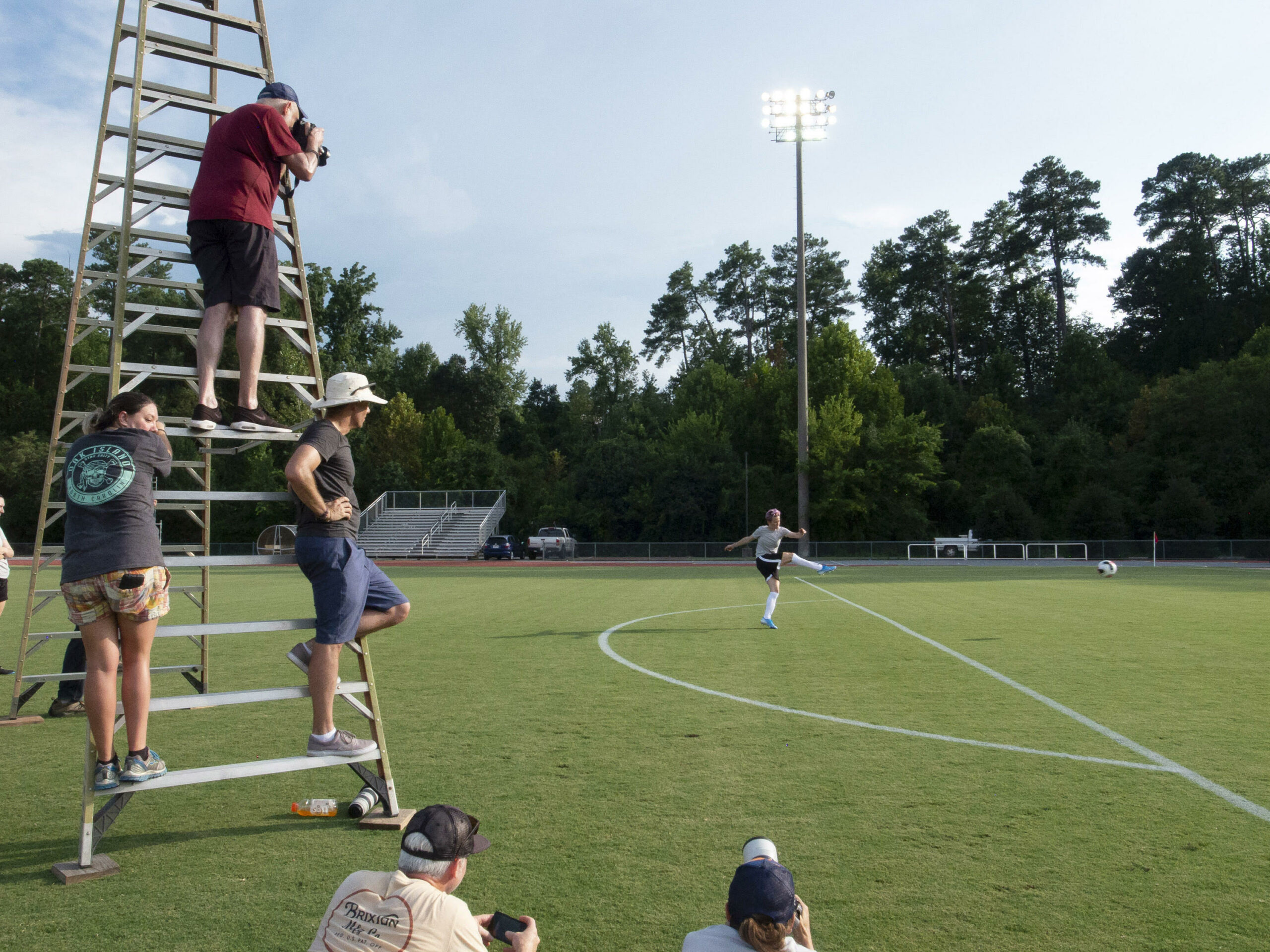
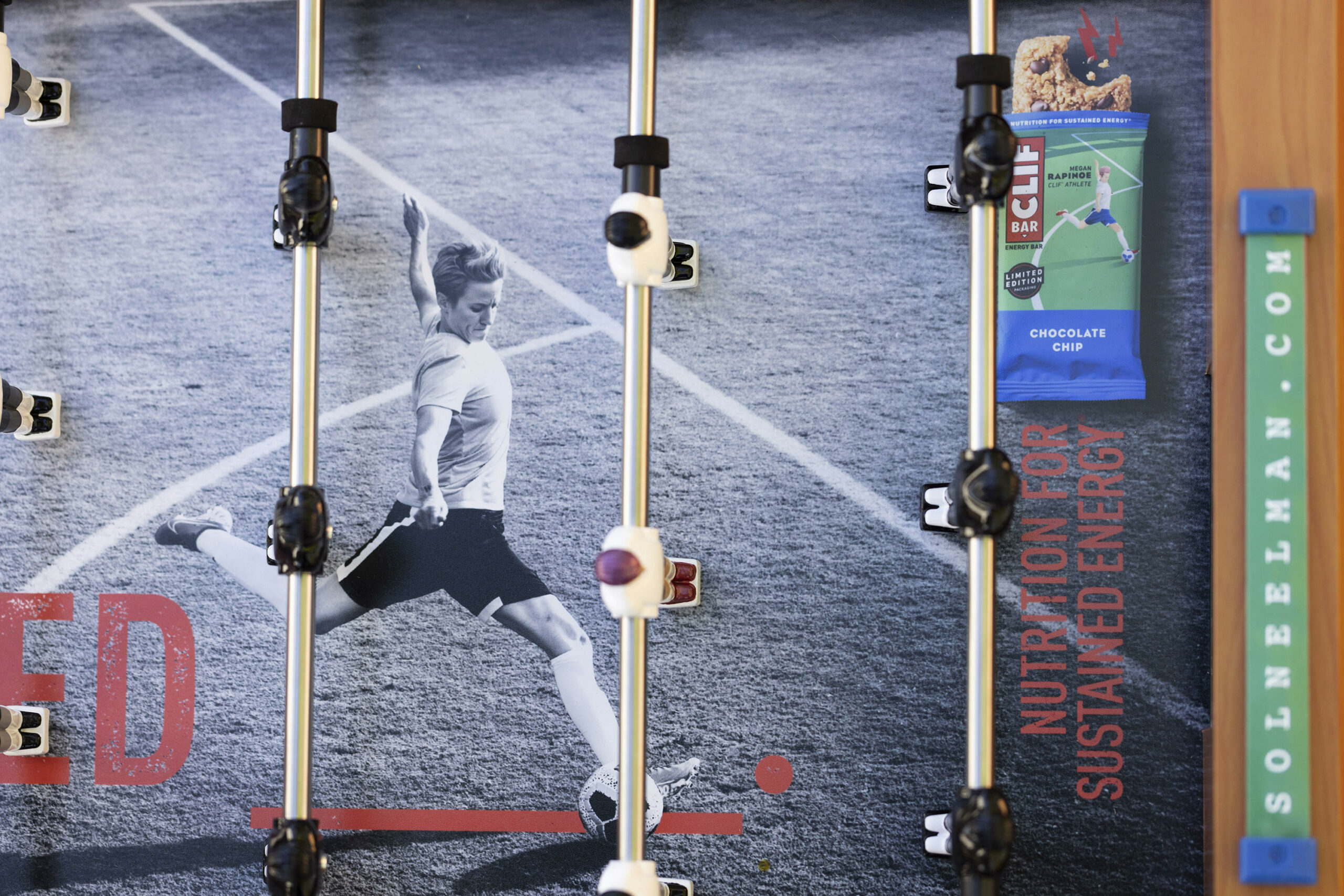
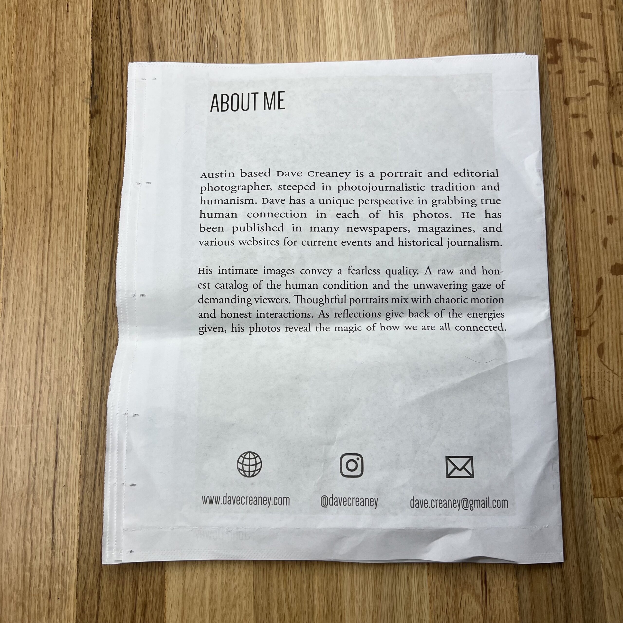
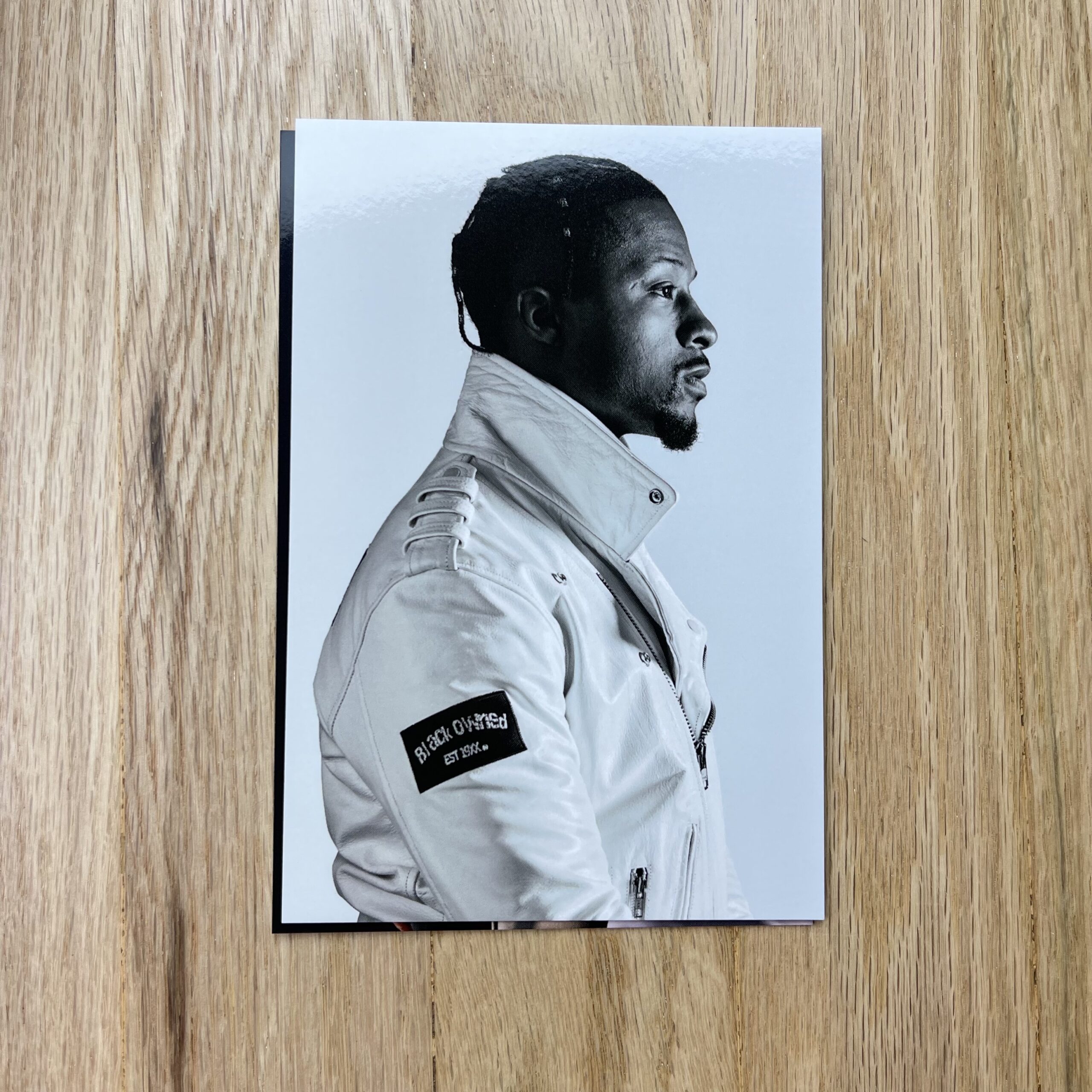
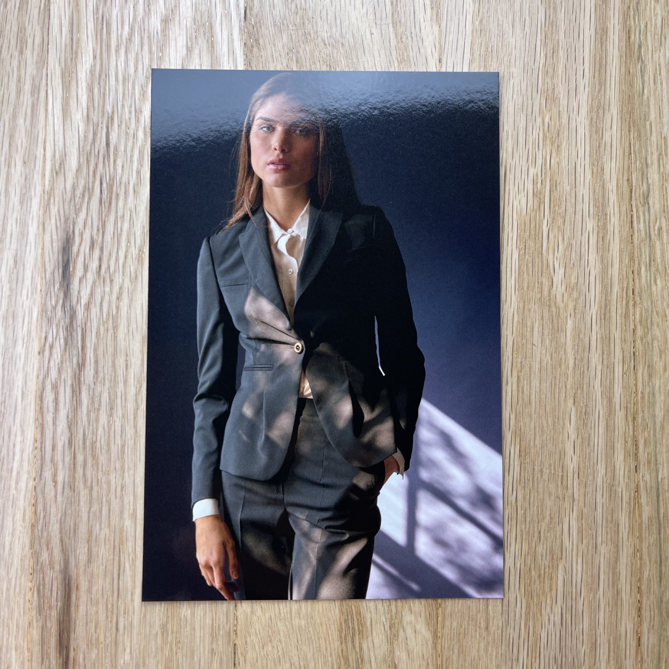
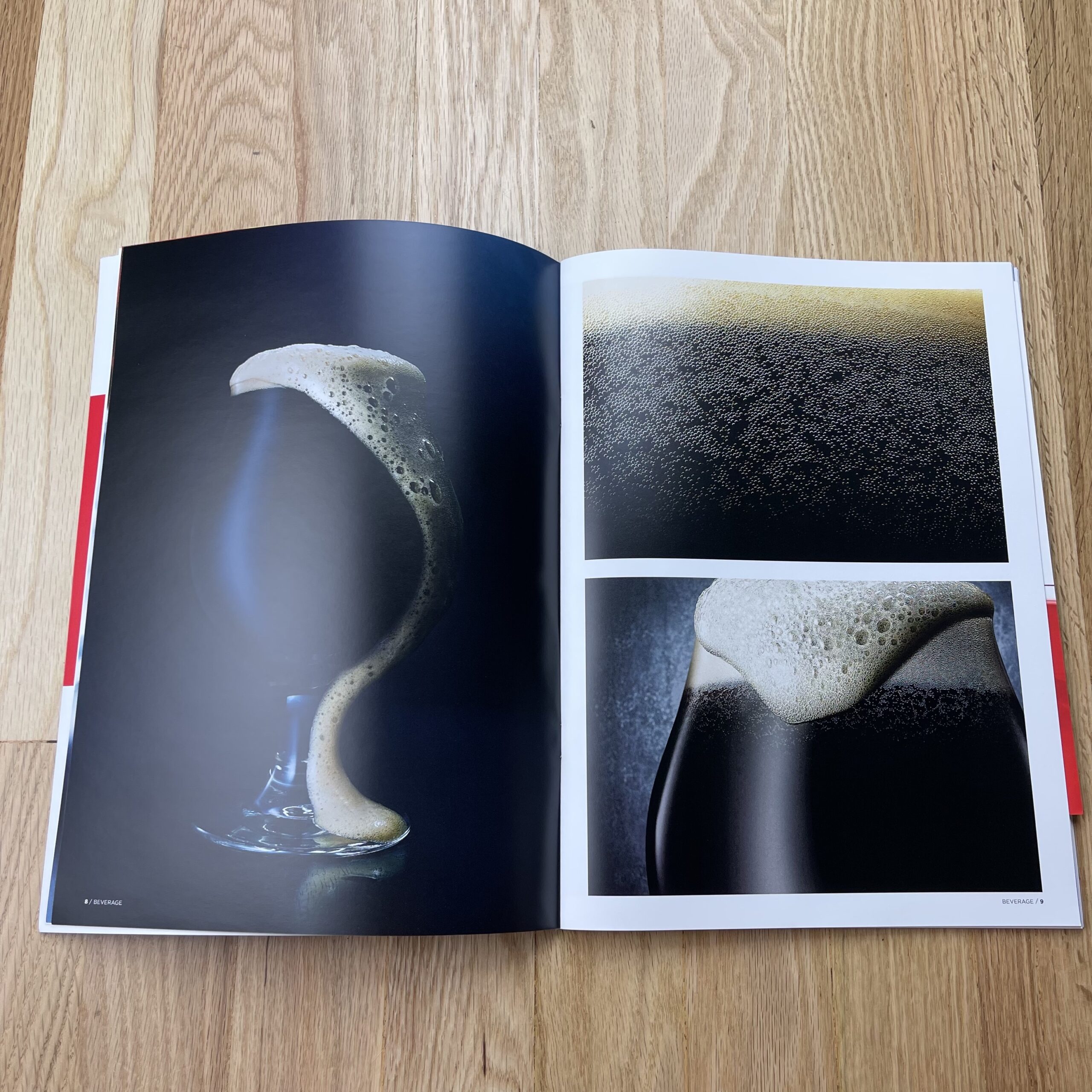
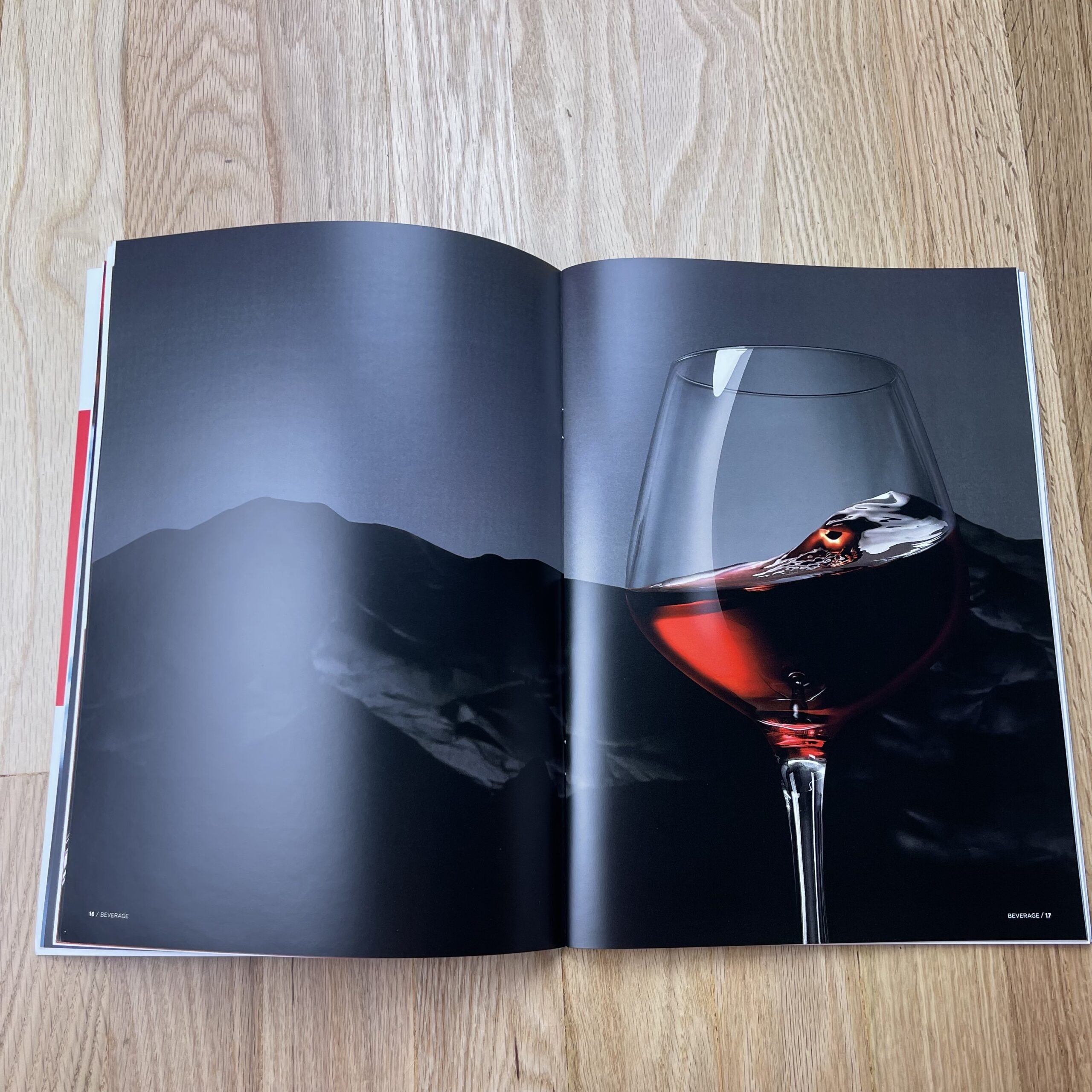
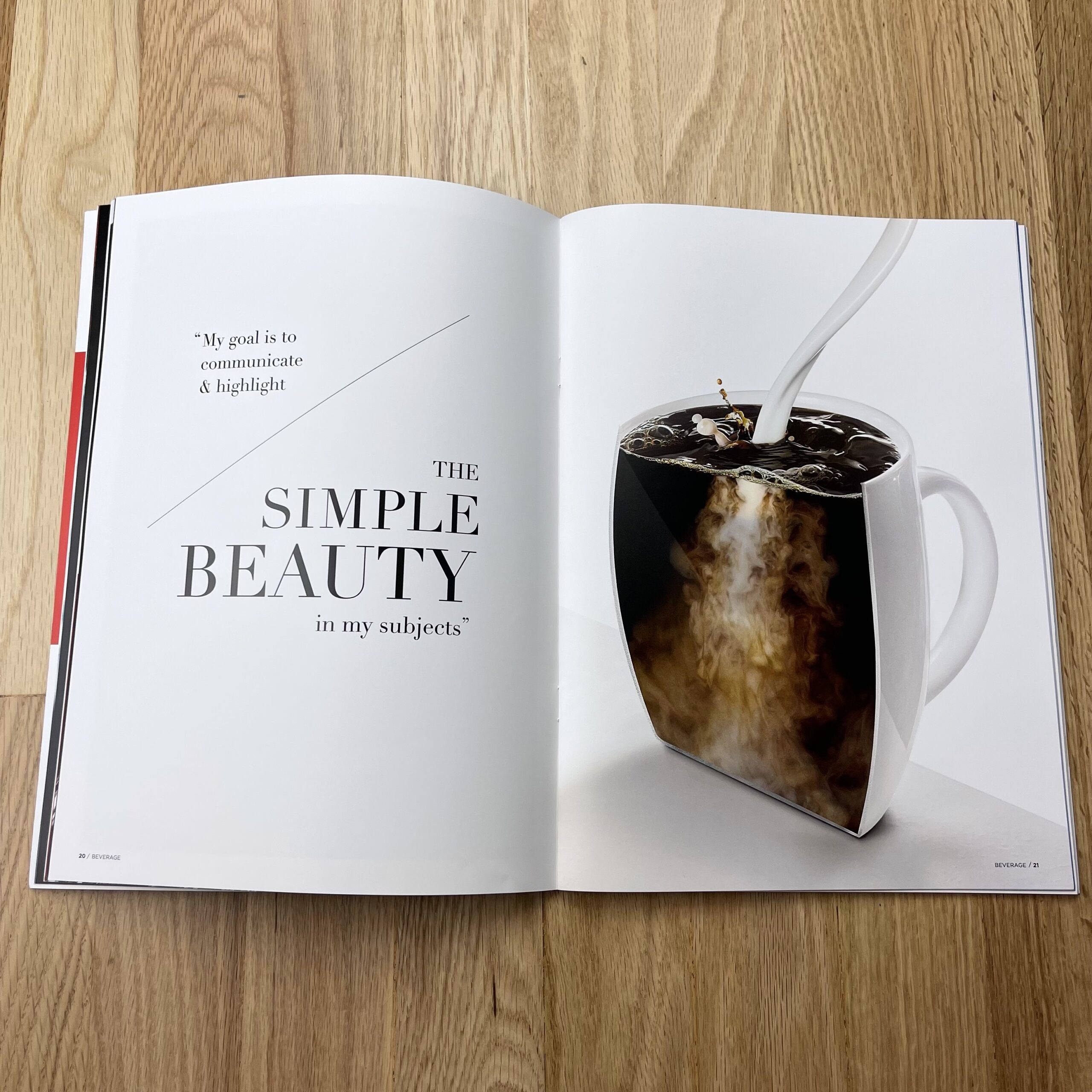
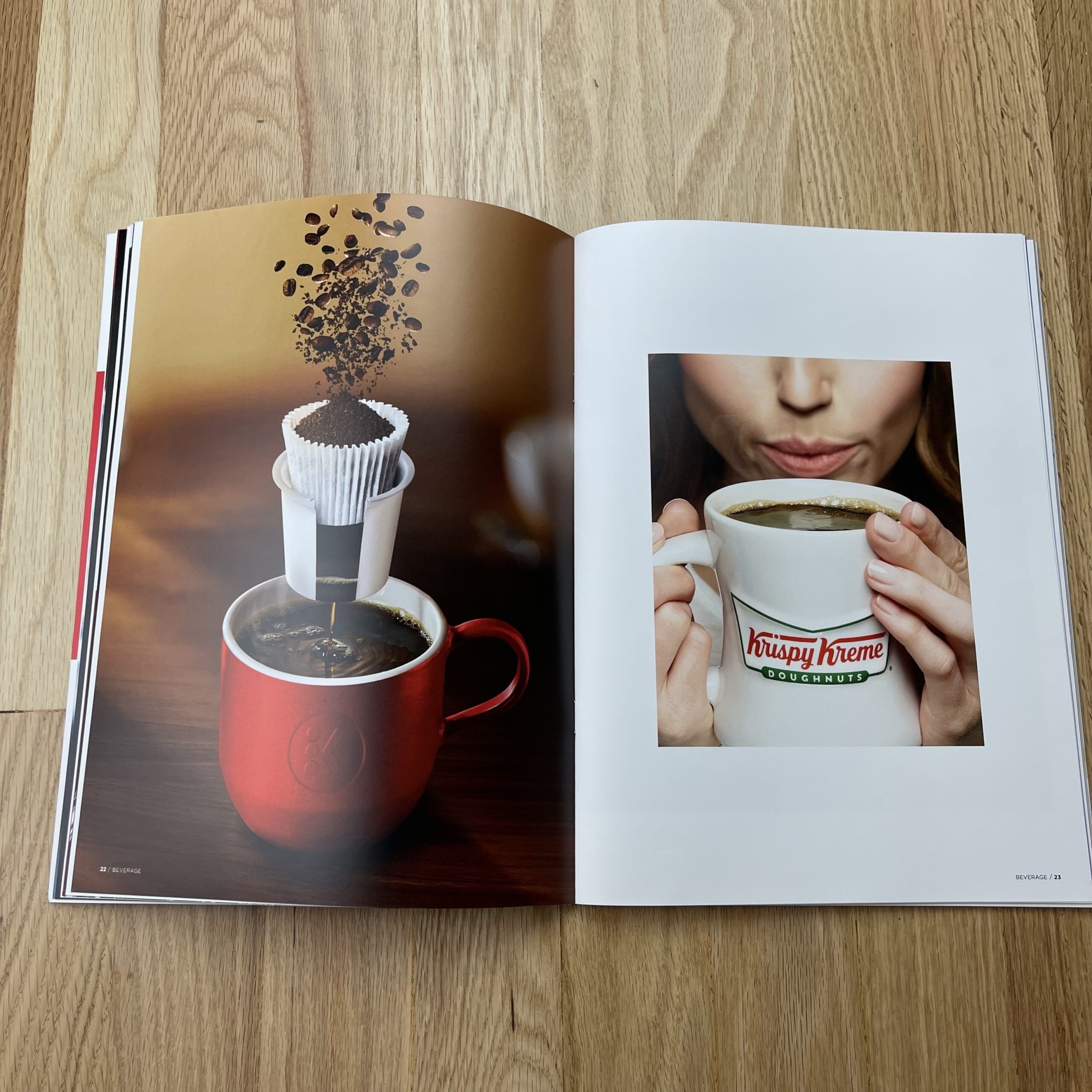
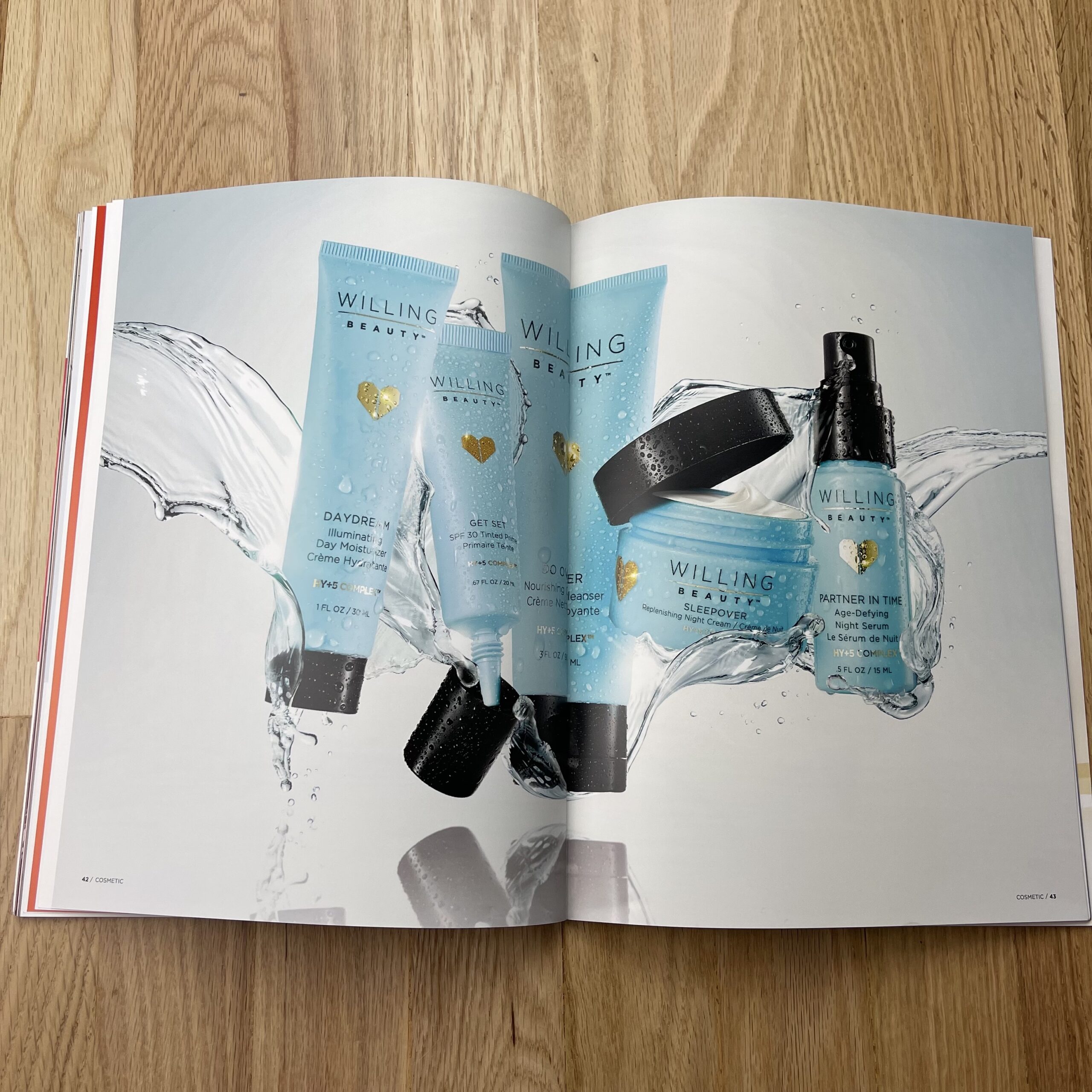
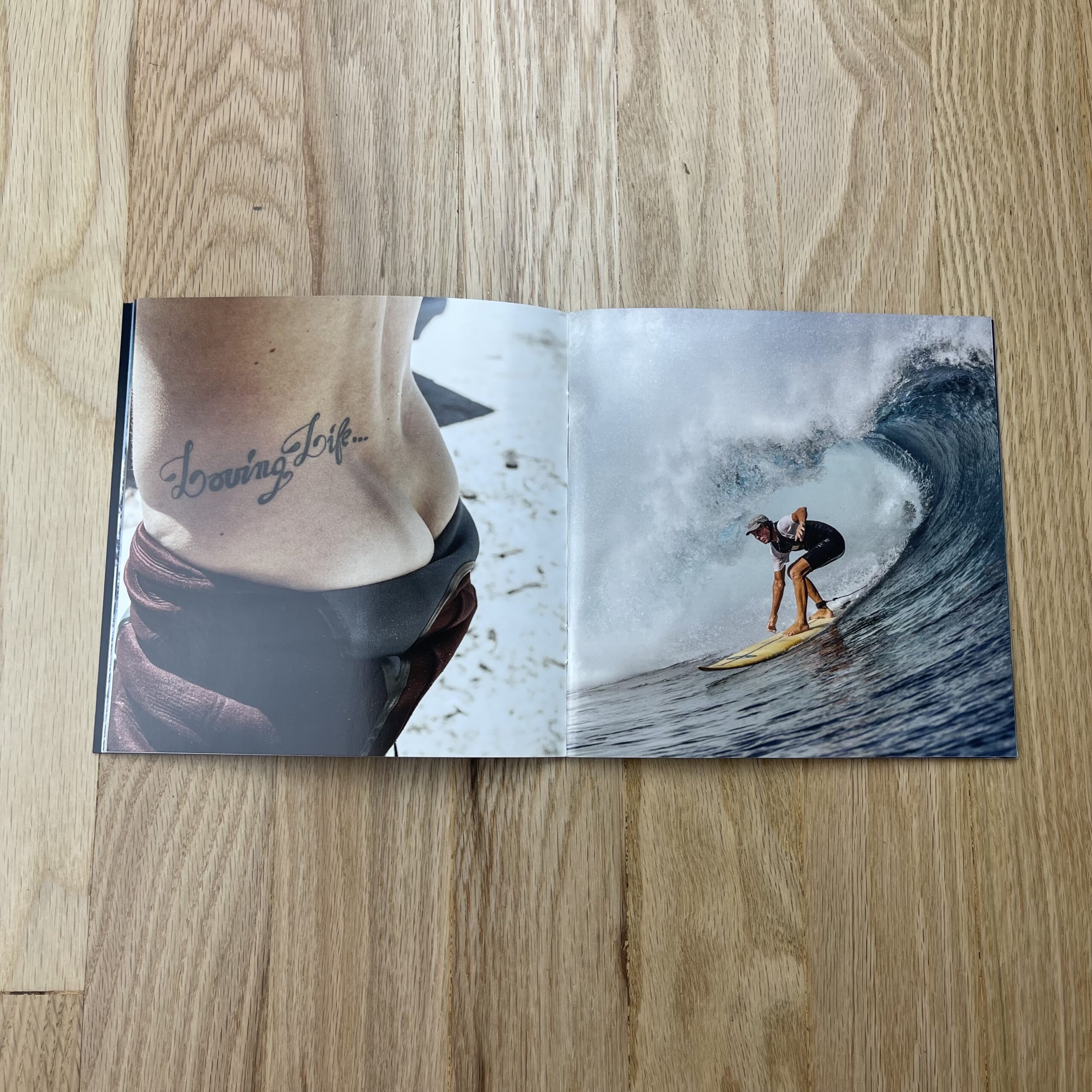
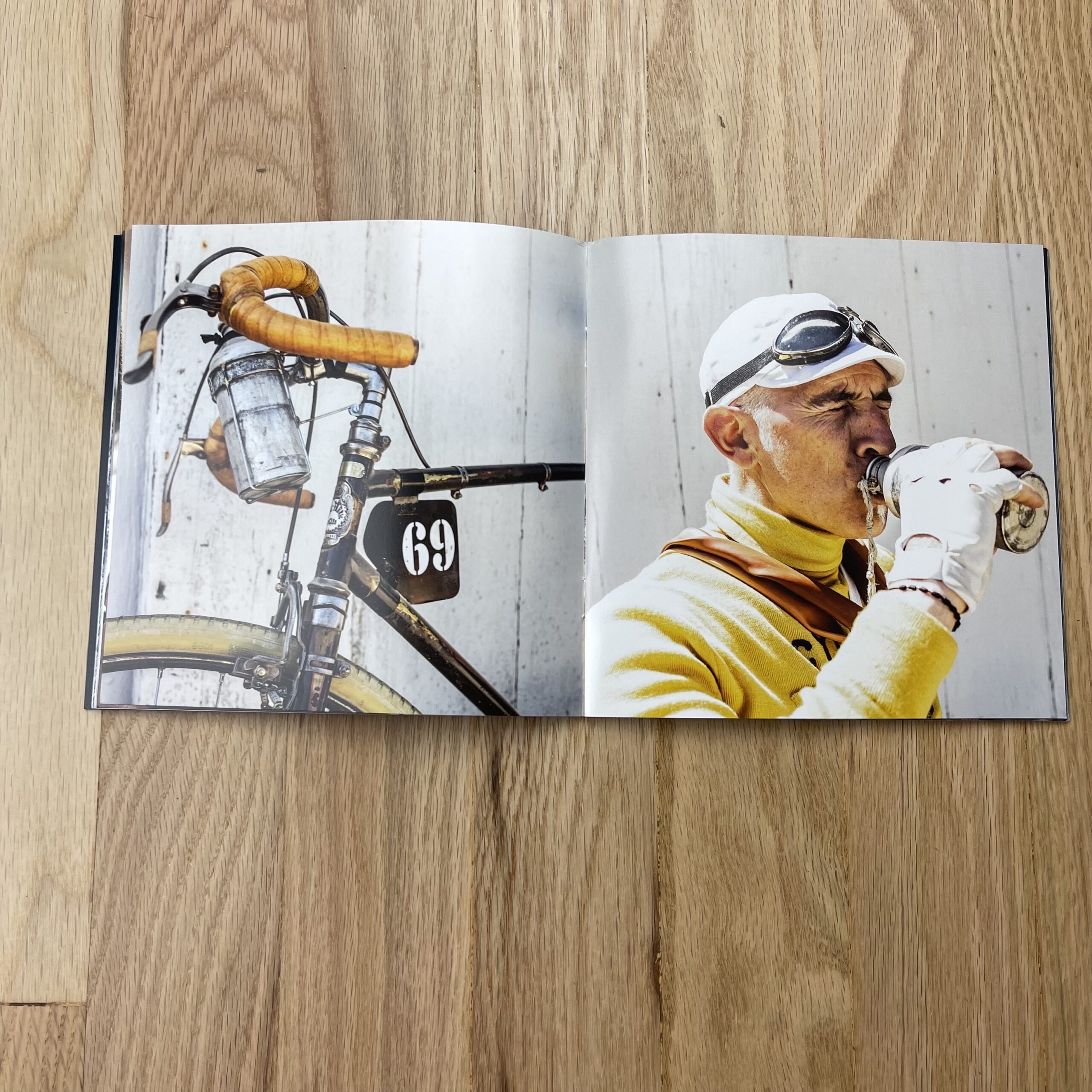
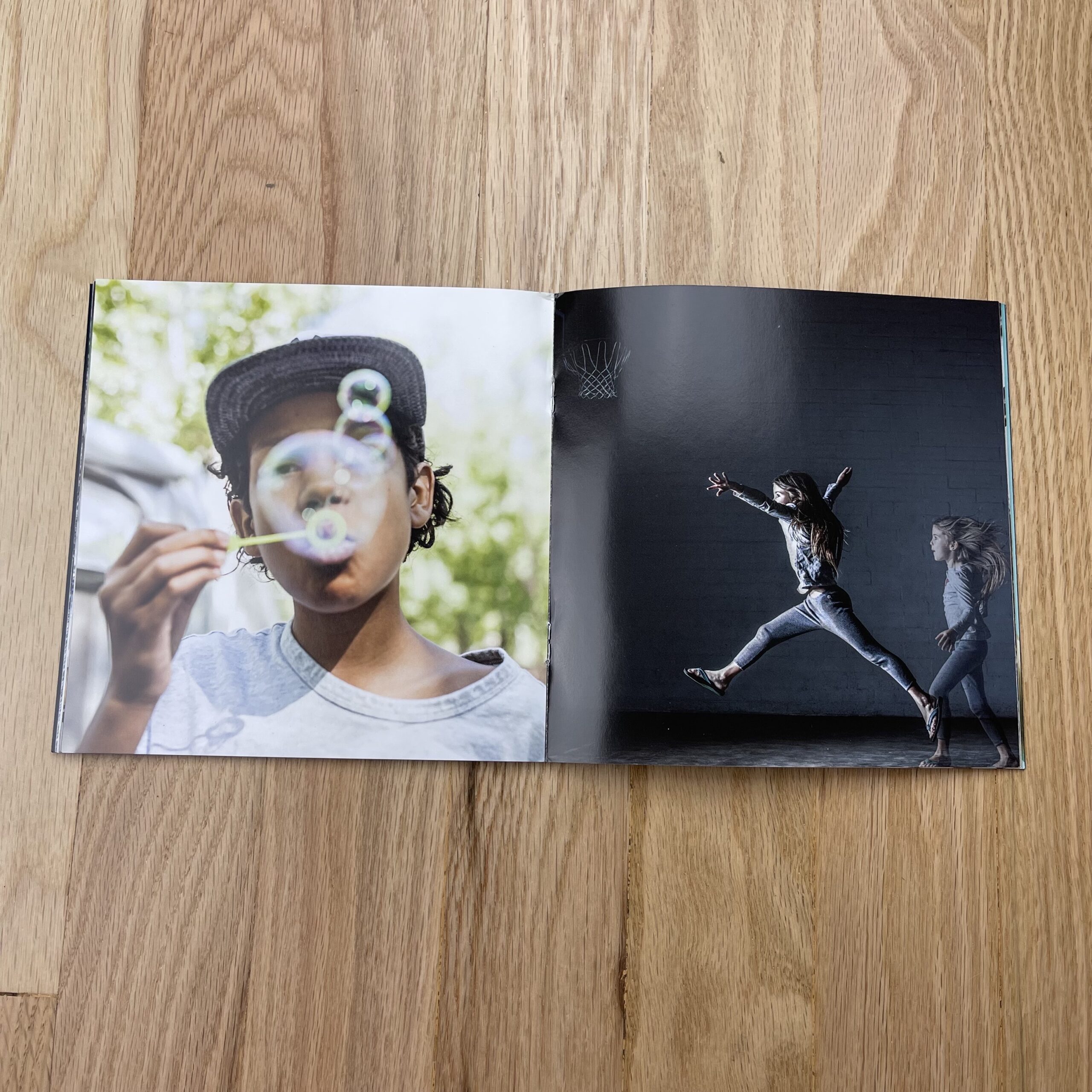
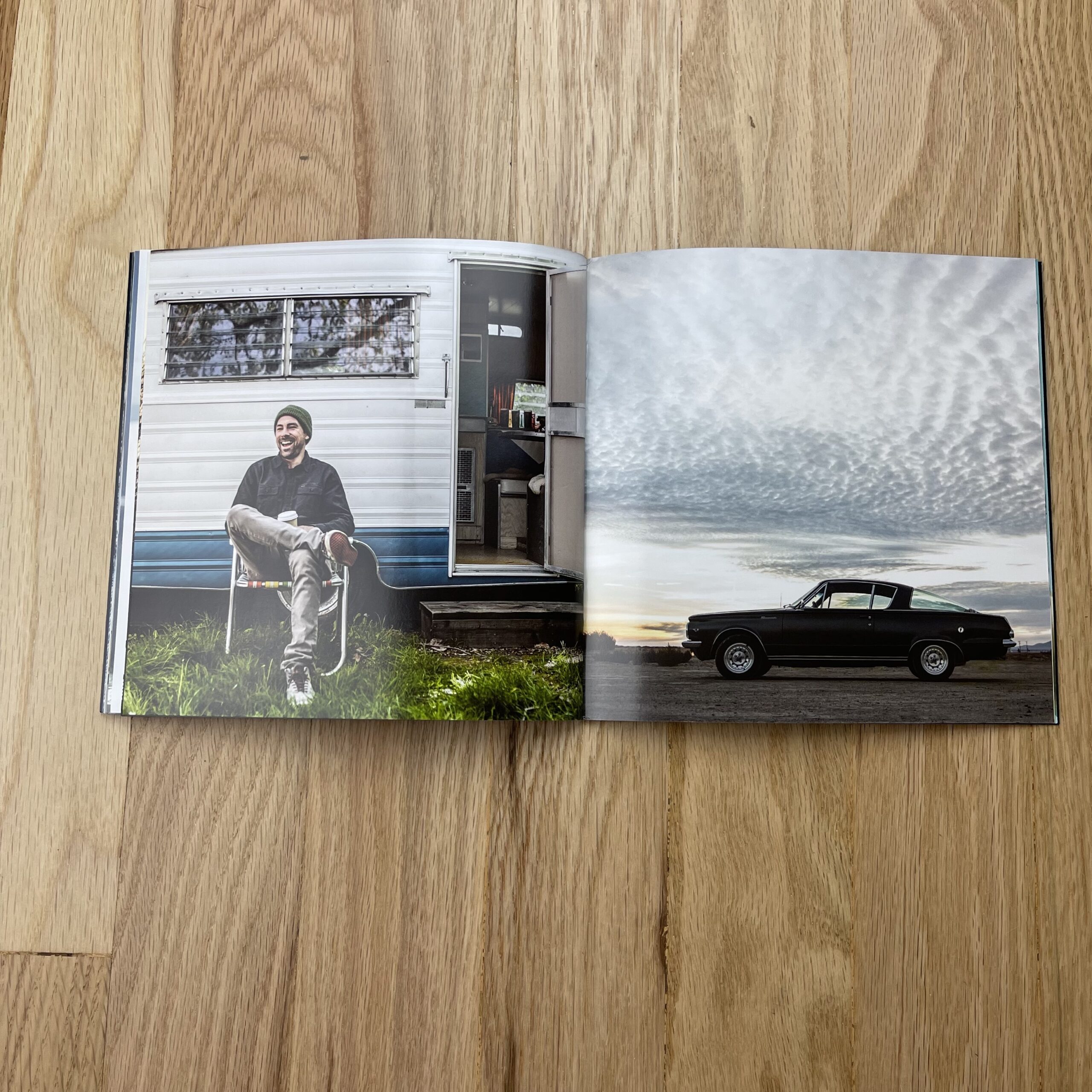
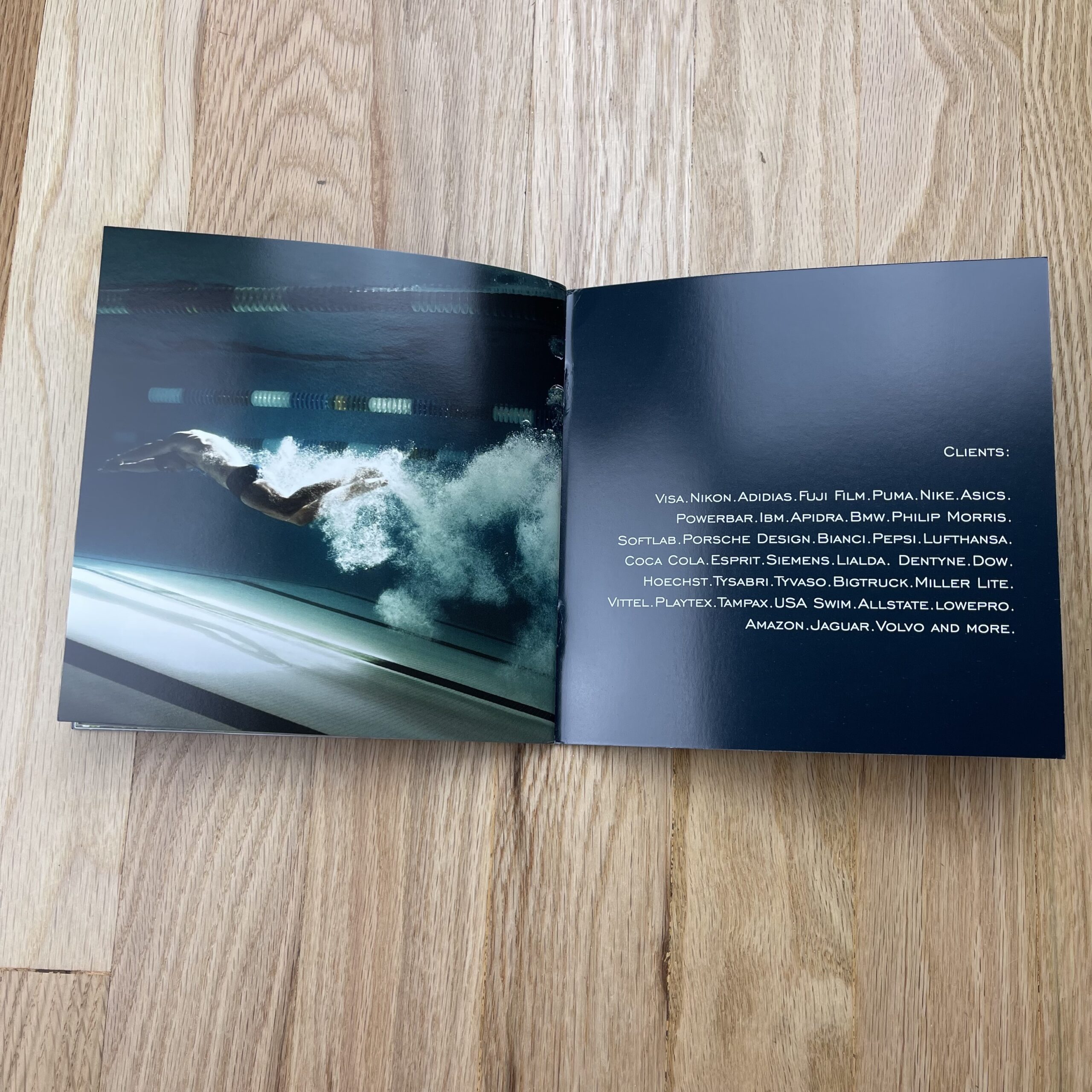
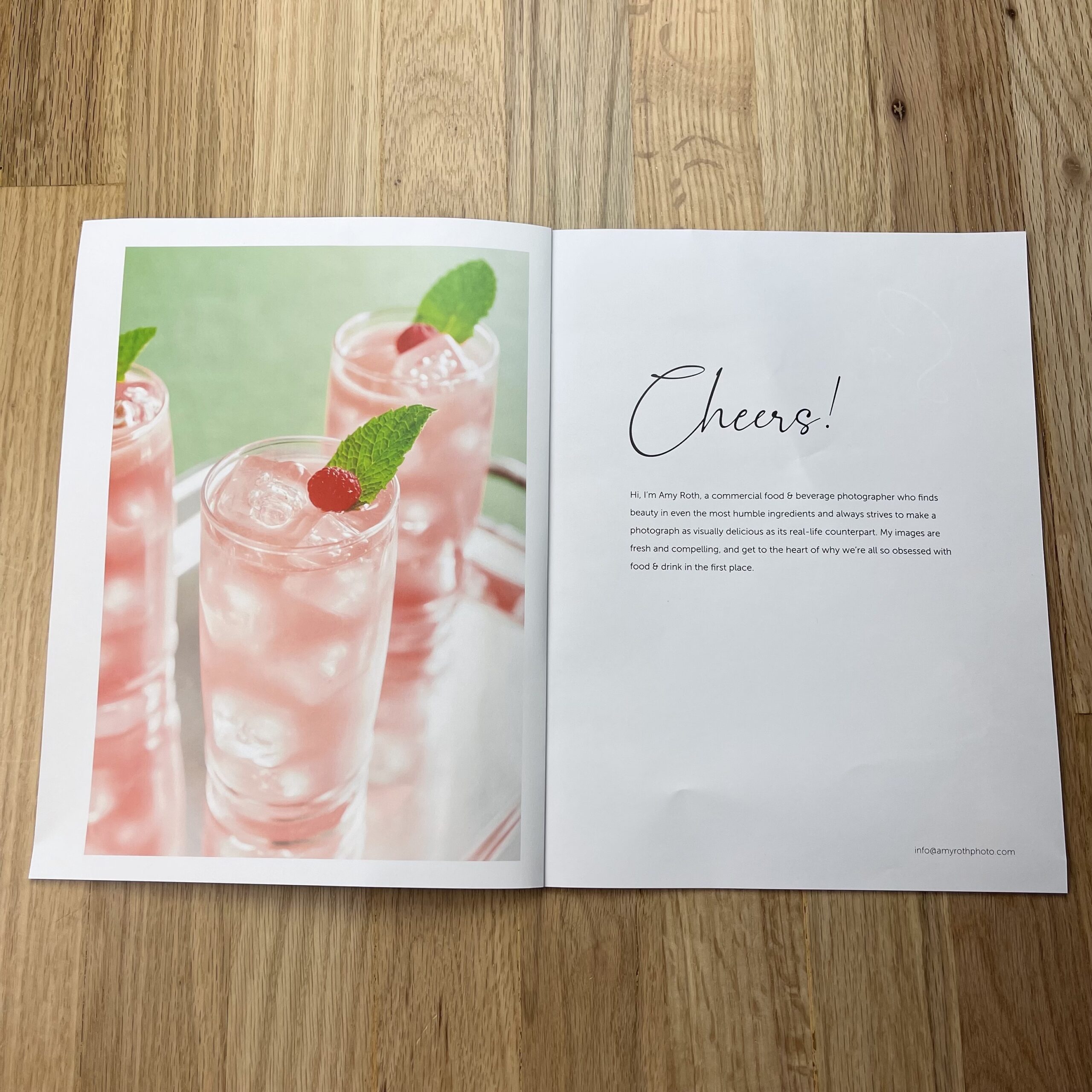
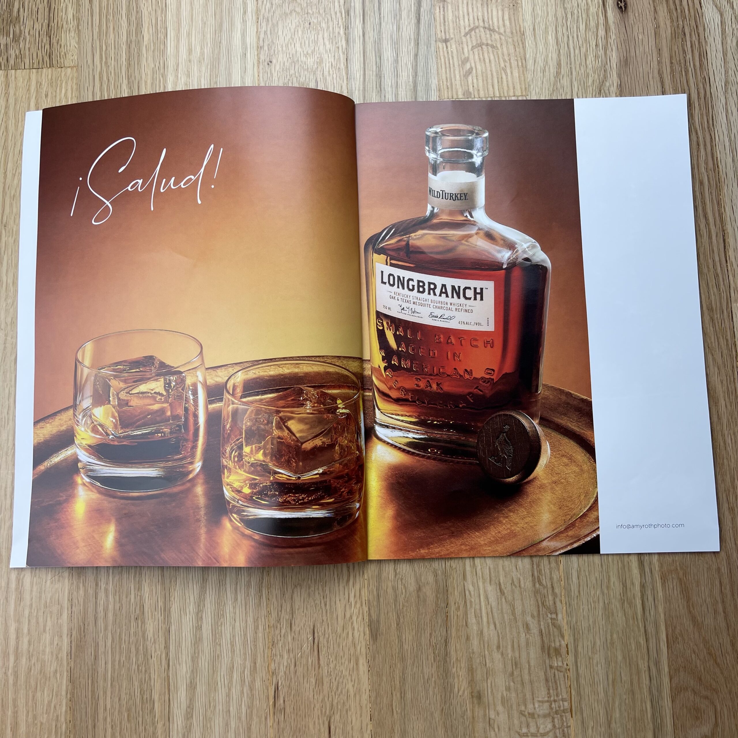
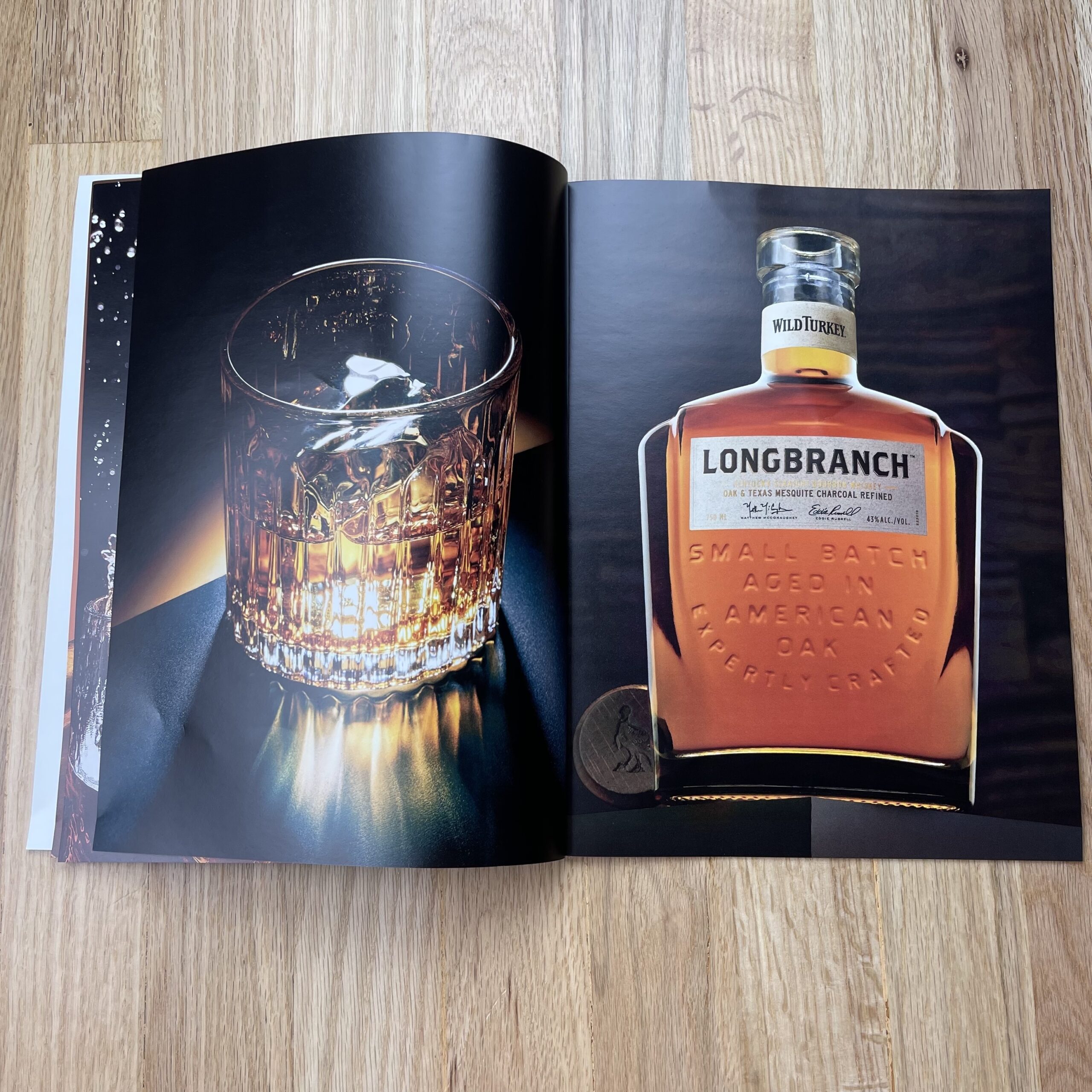
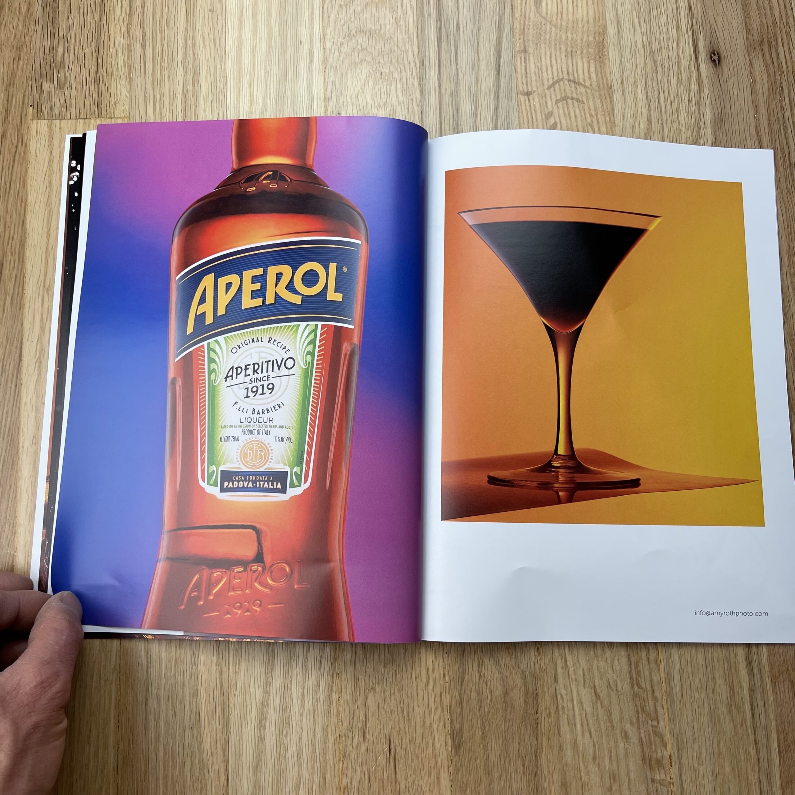
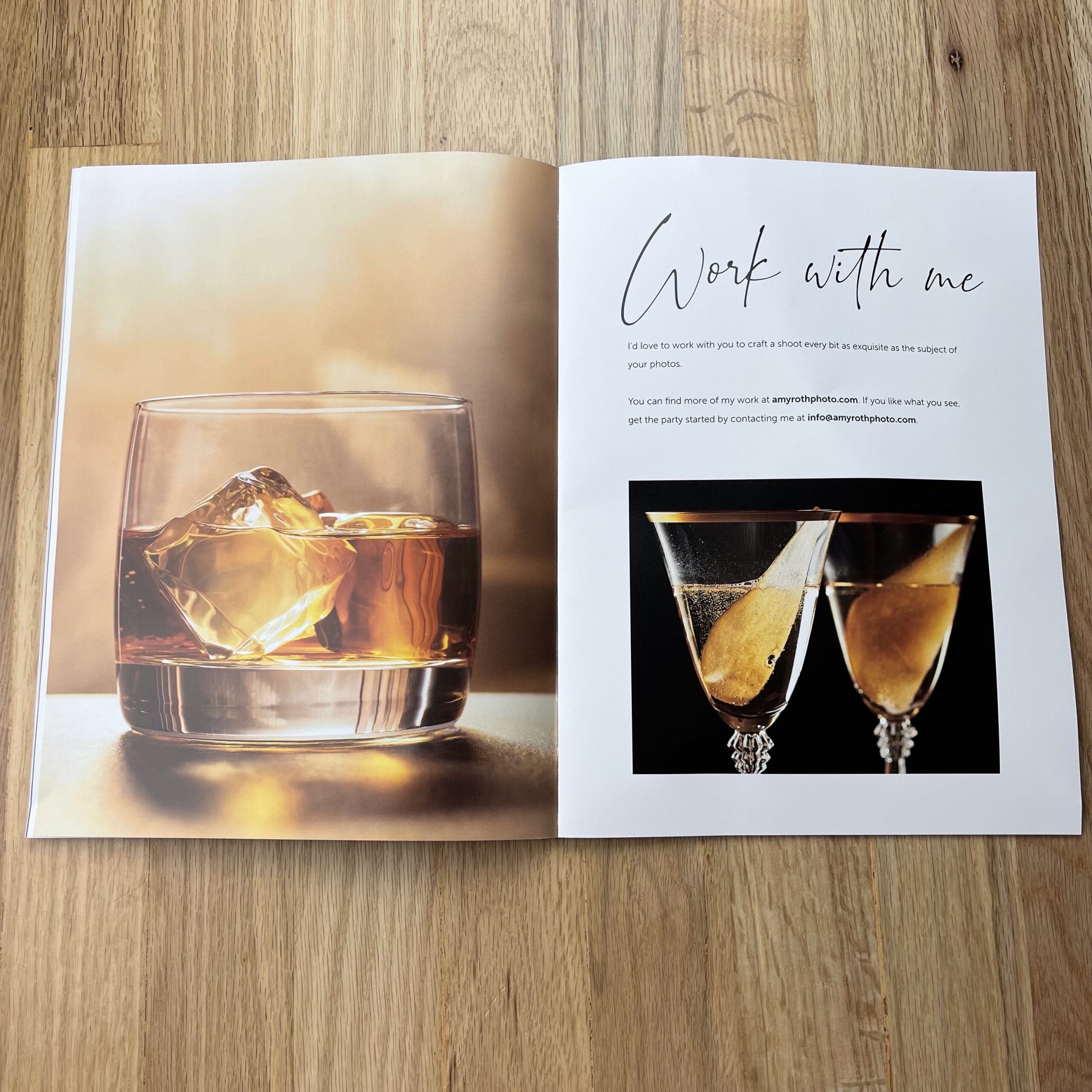
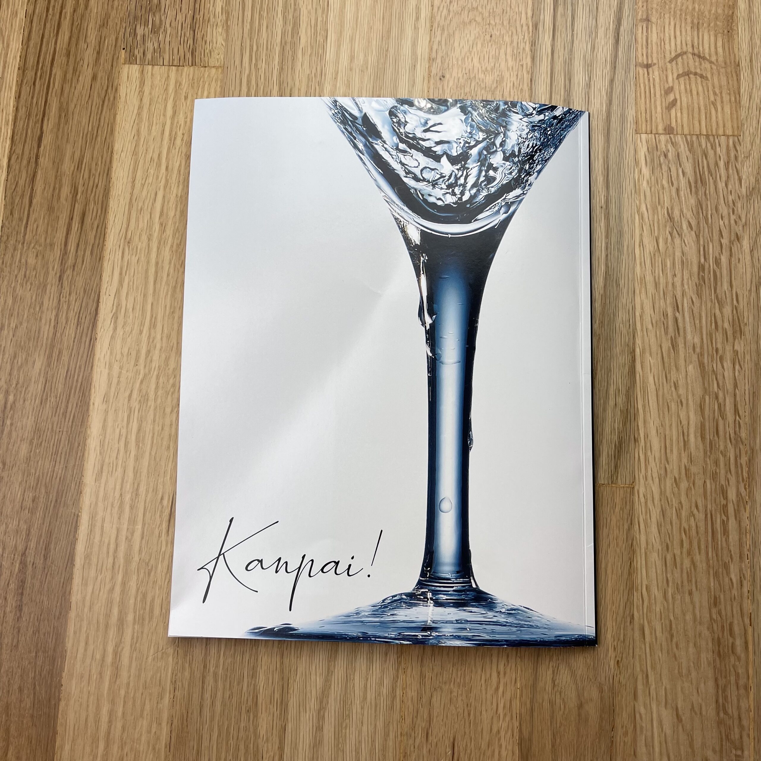
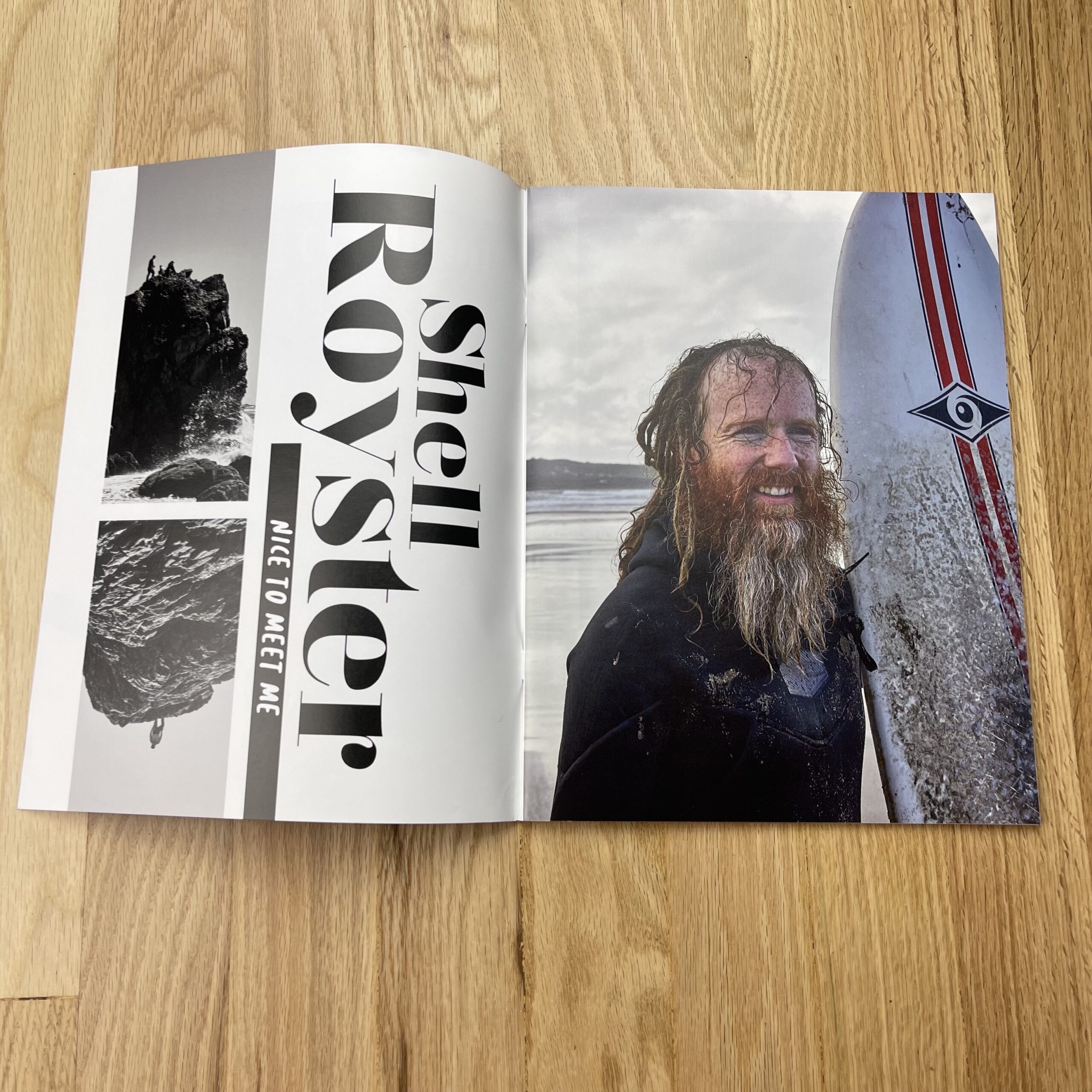
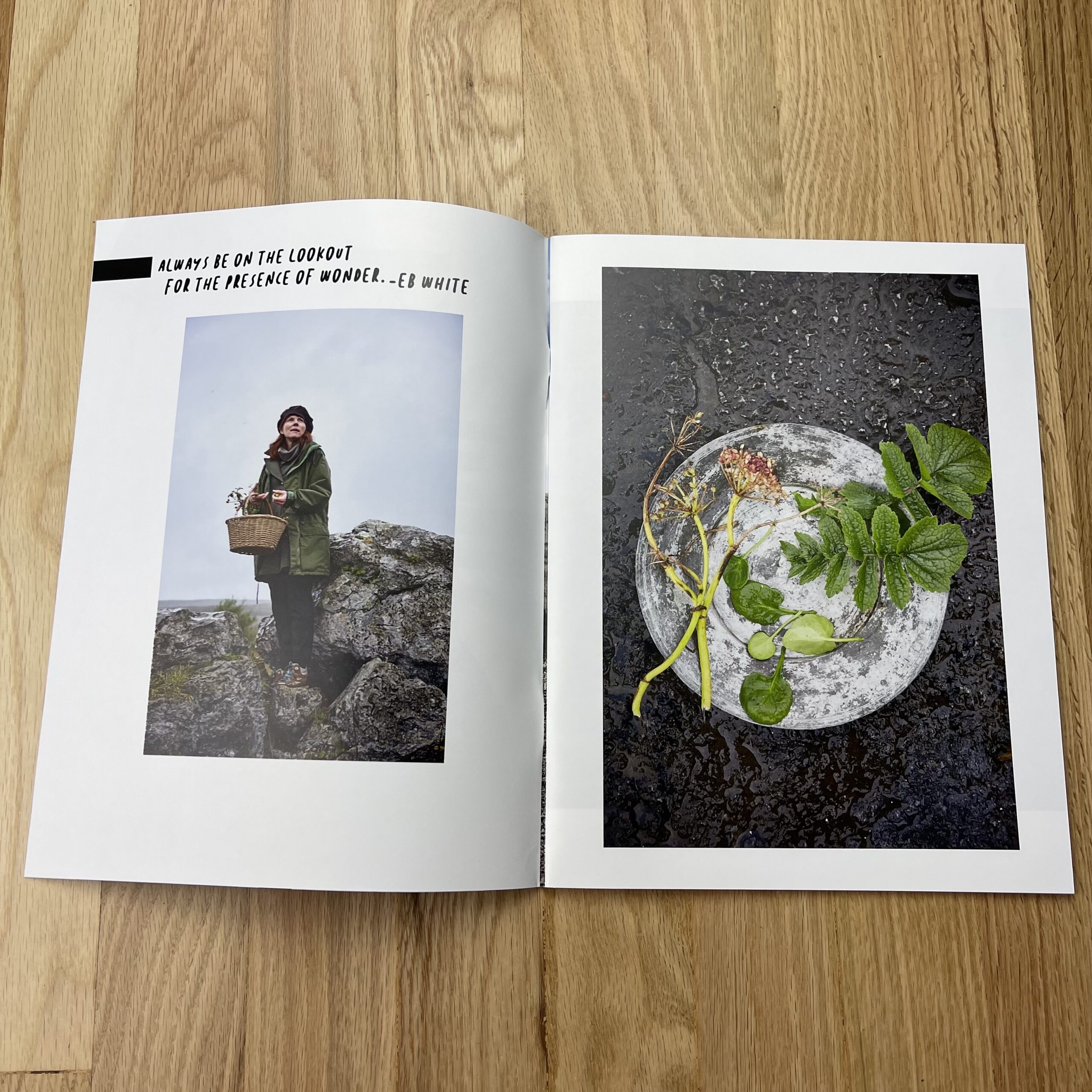
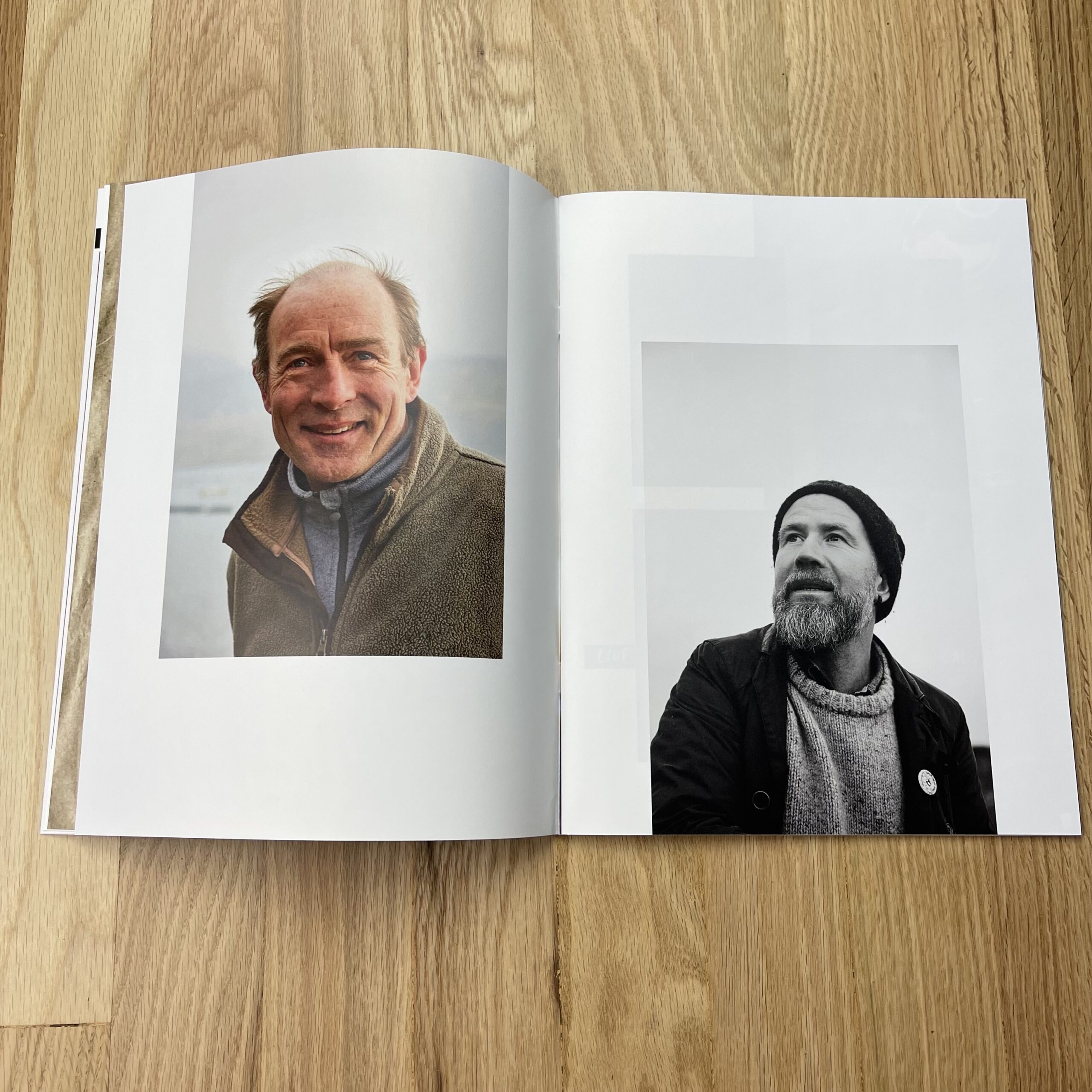
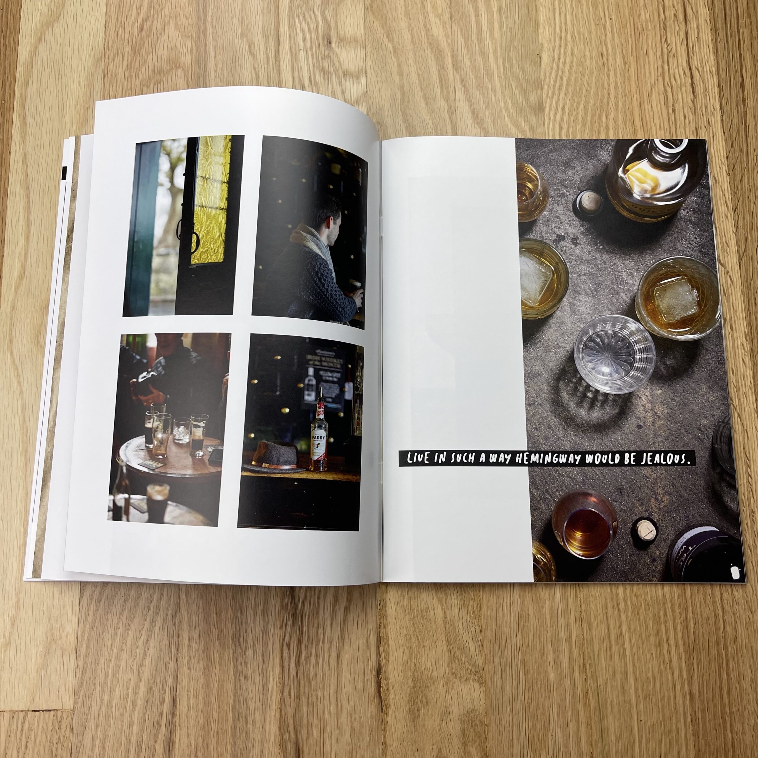
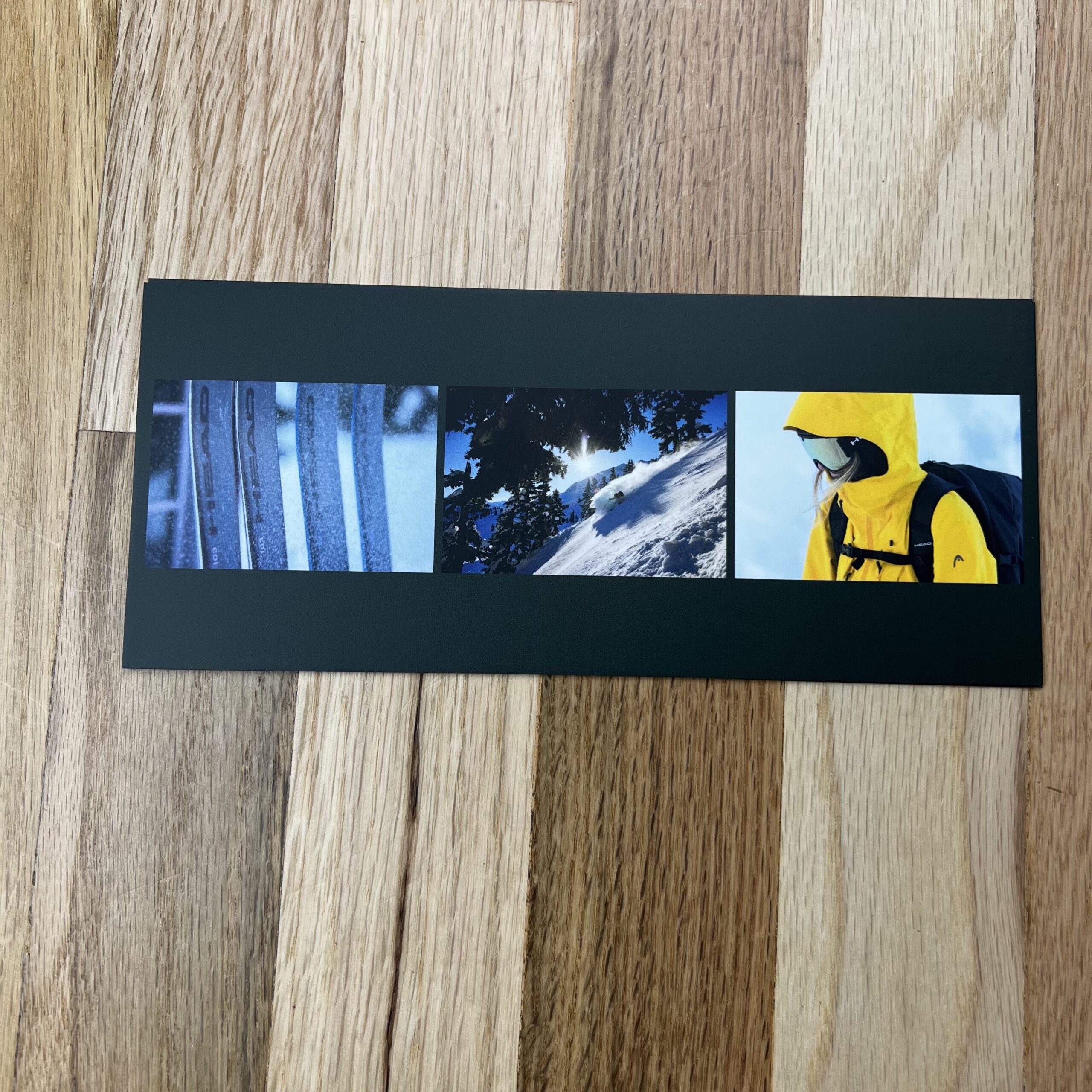
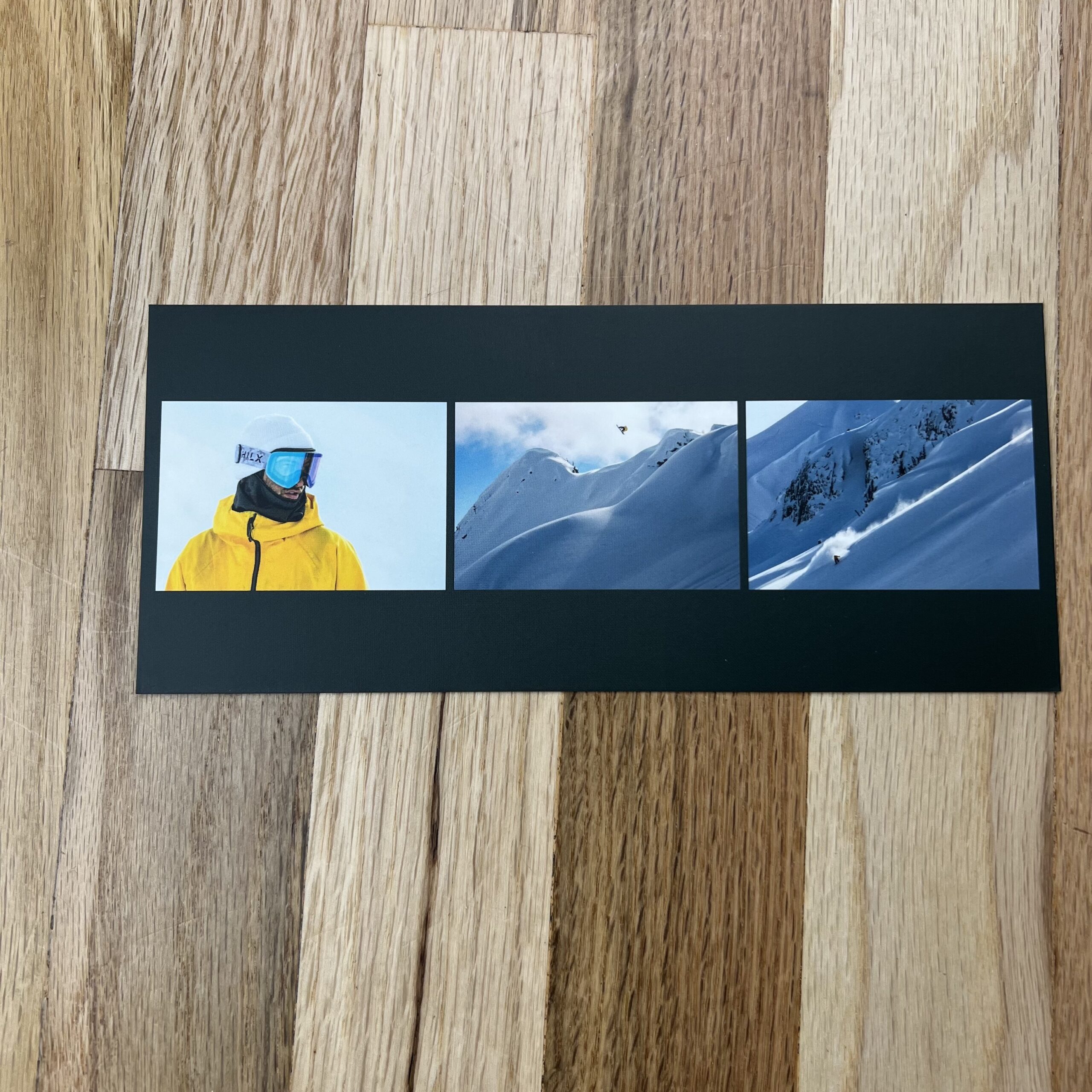
Tell me about the images?
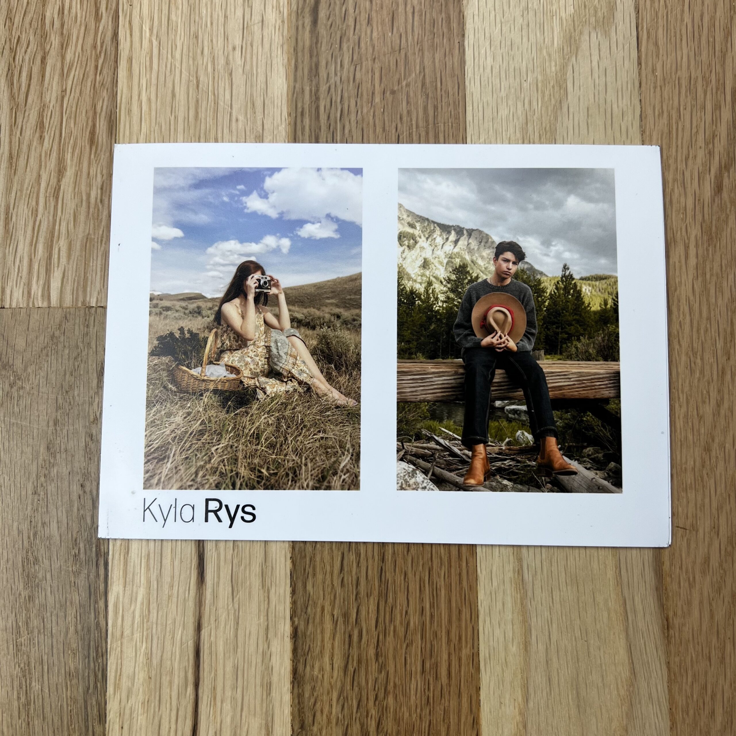
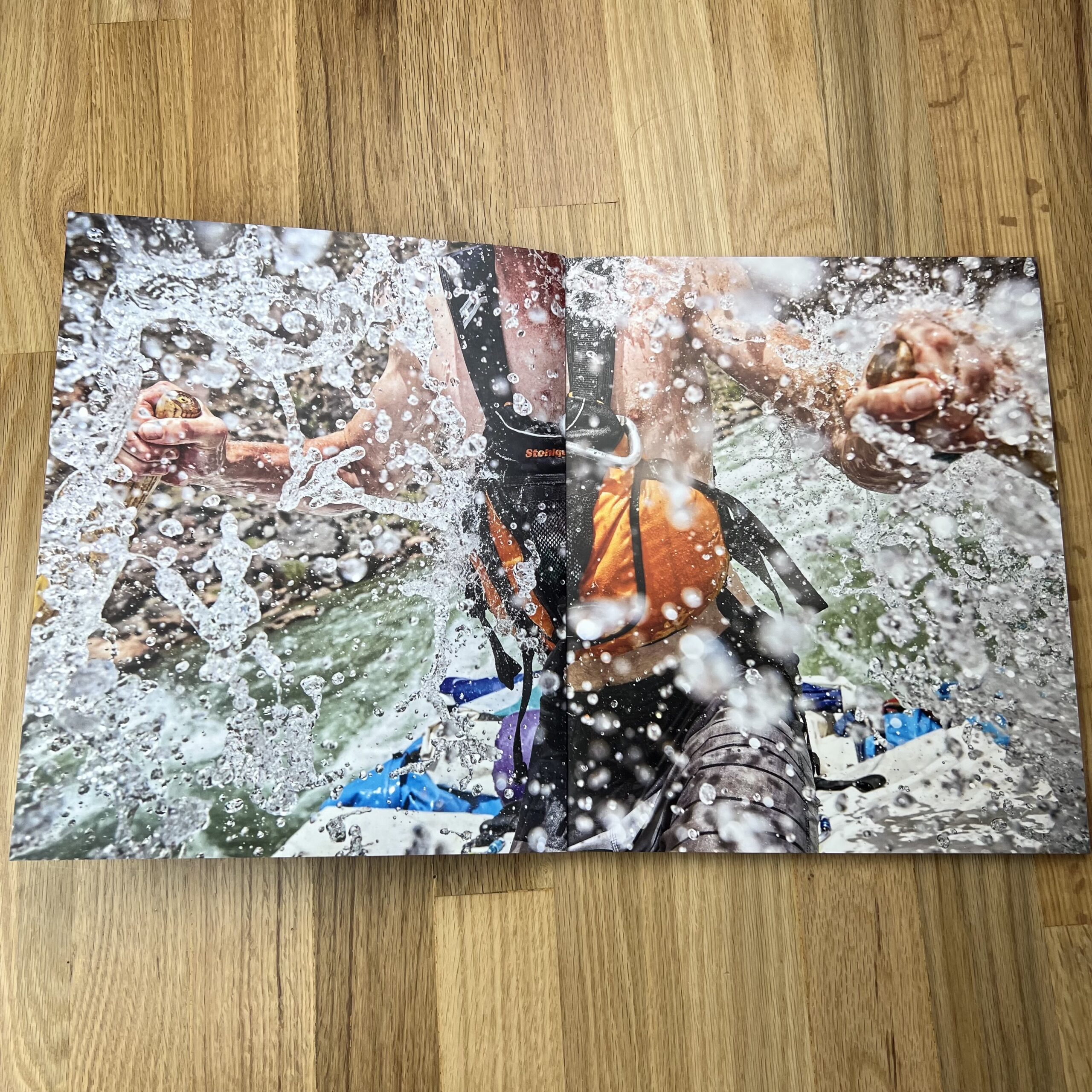
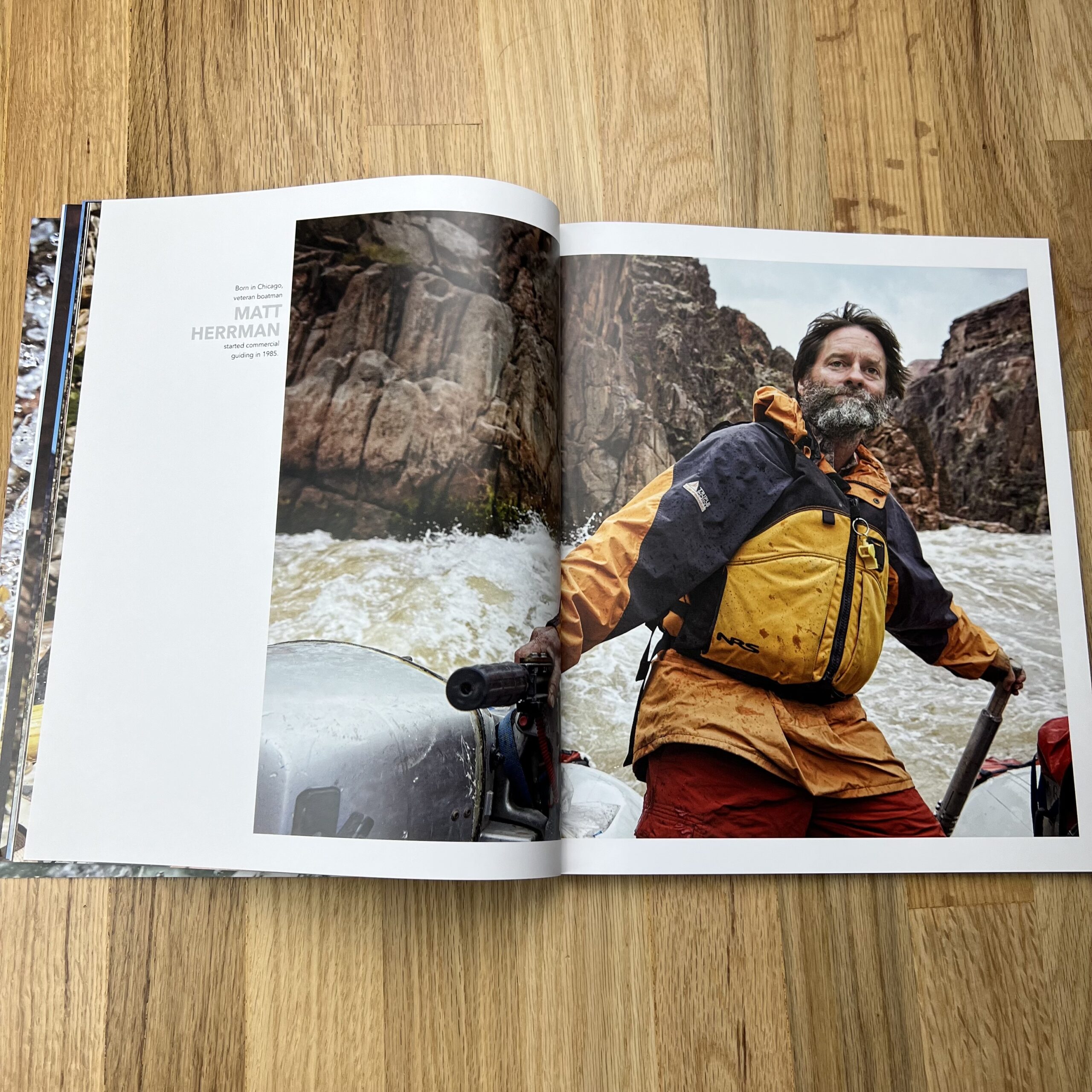
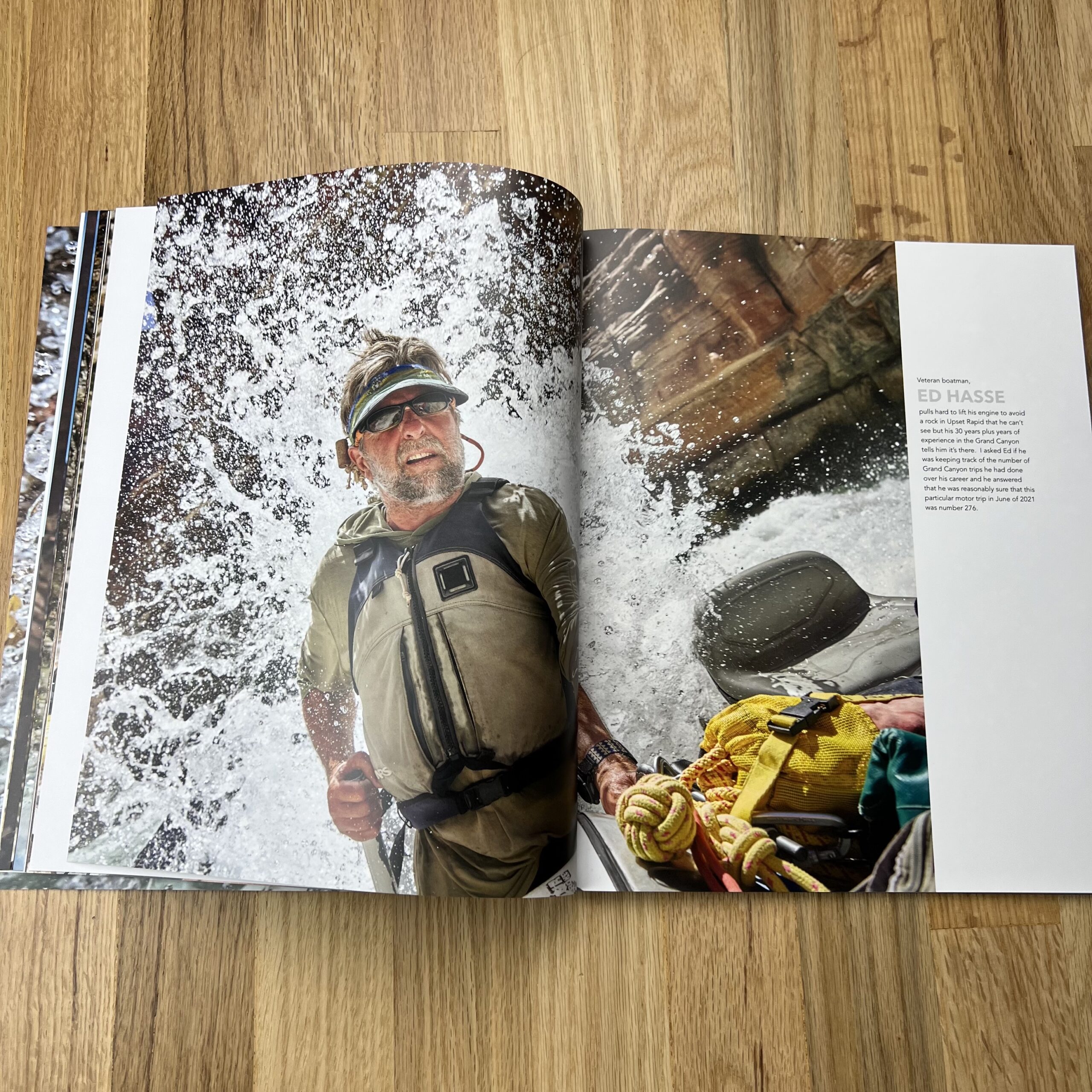
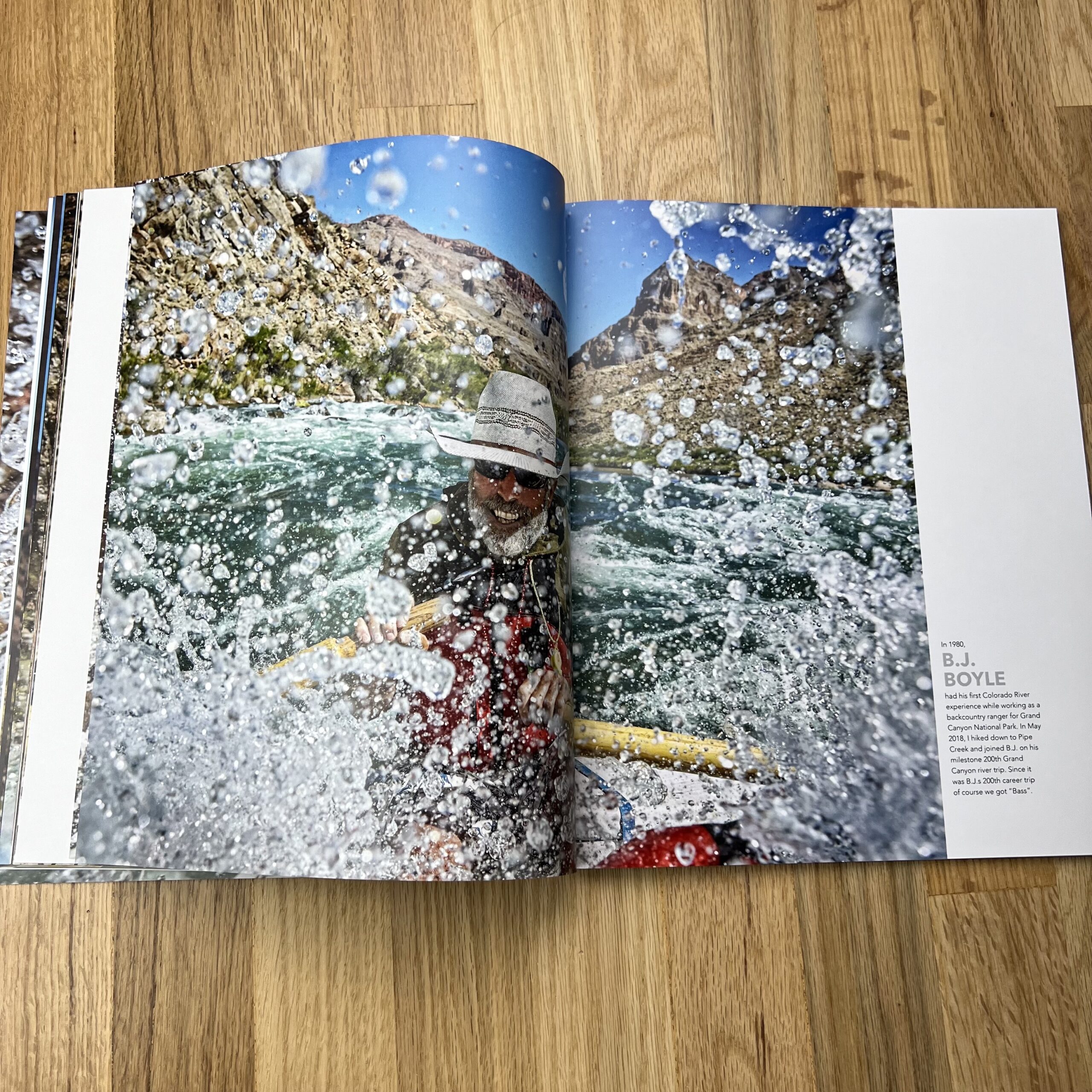
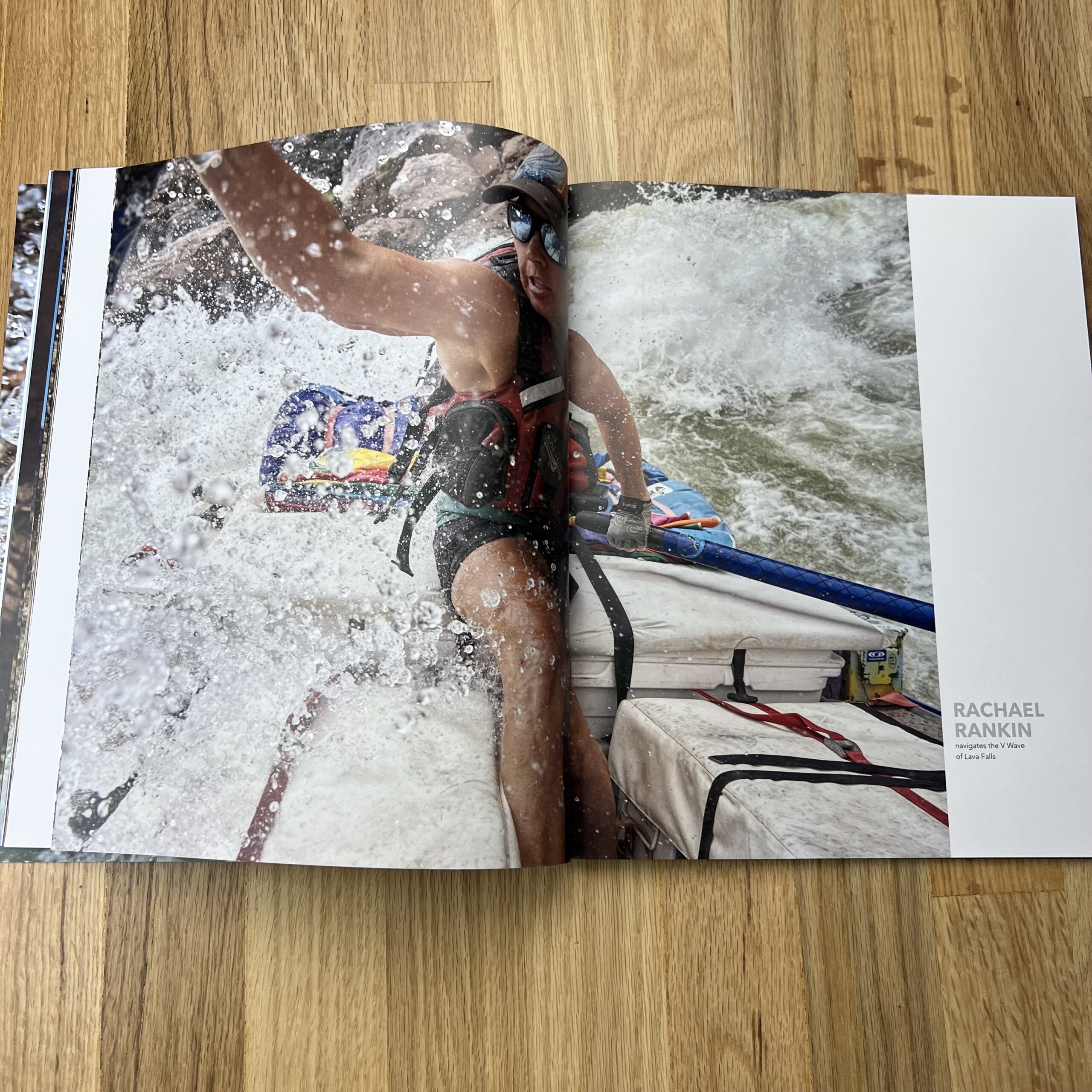
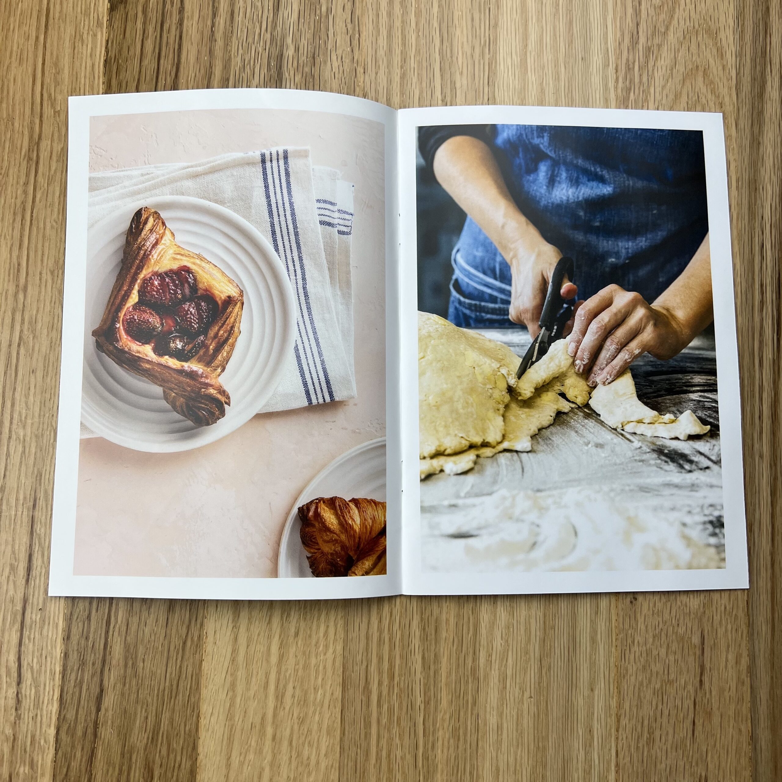
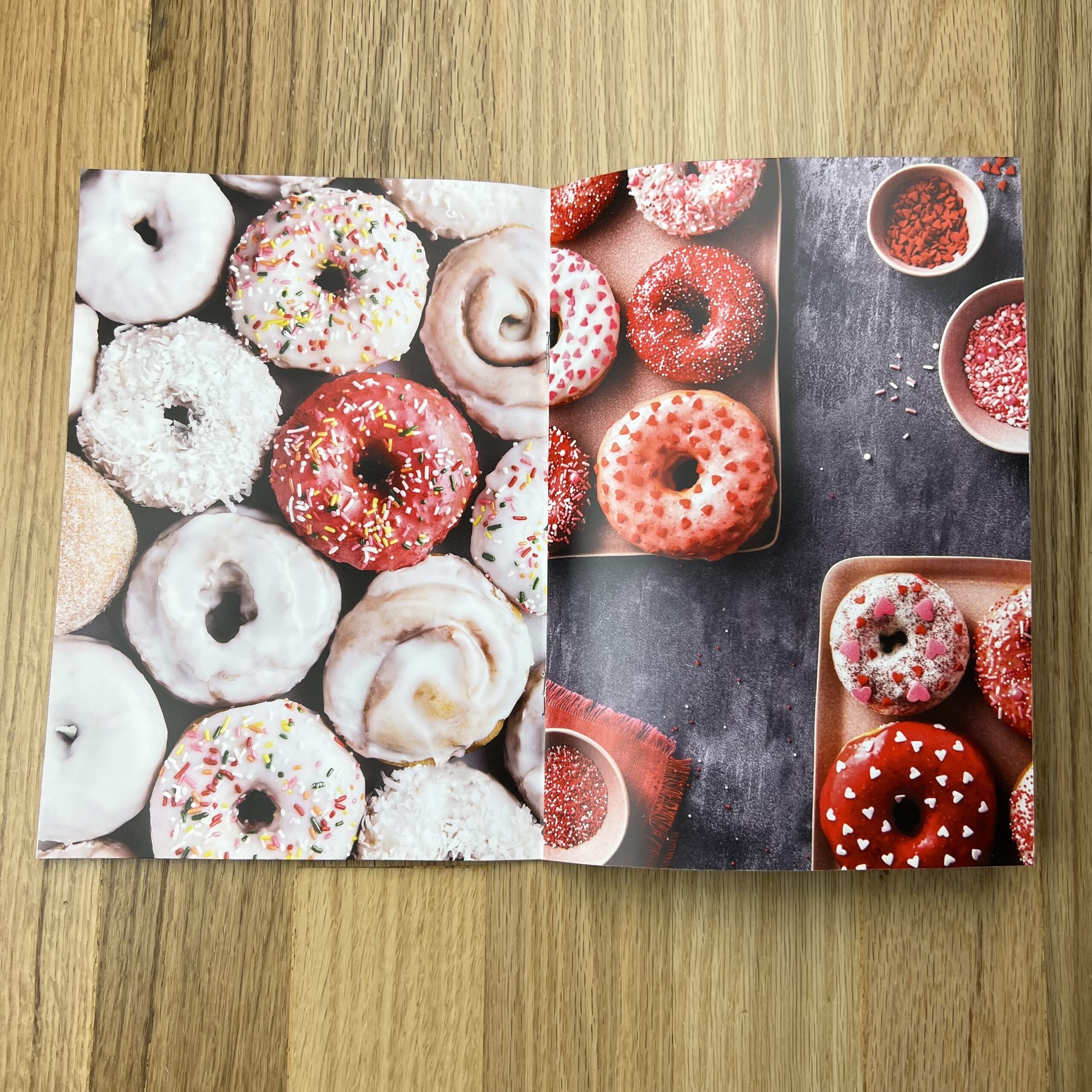
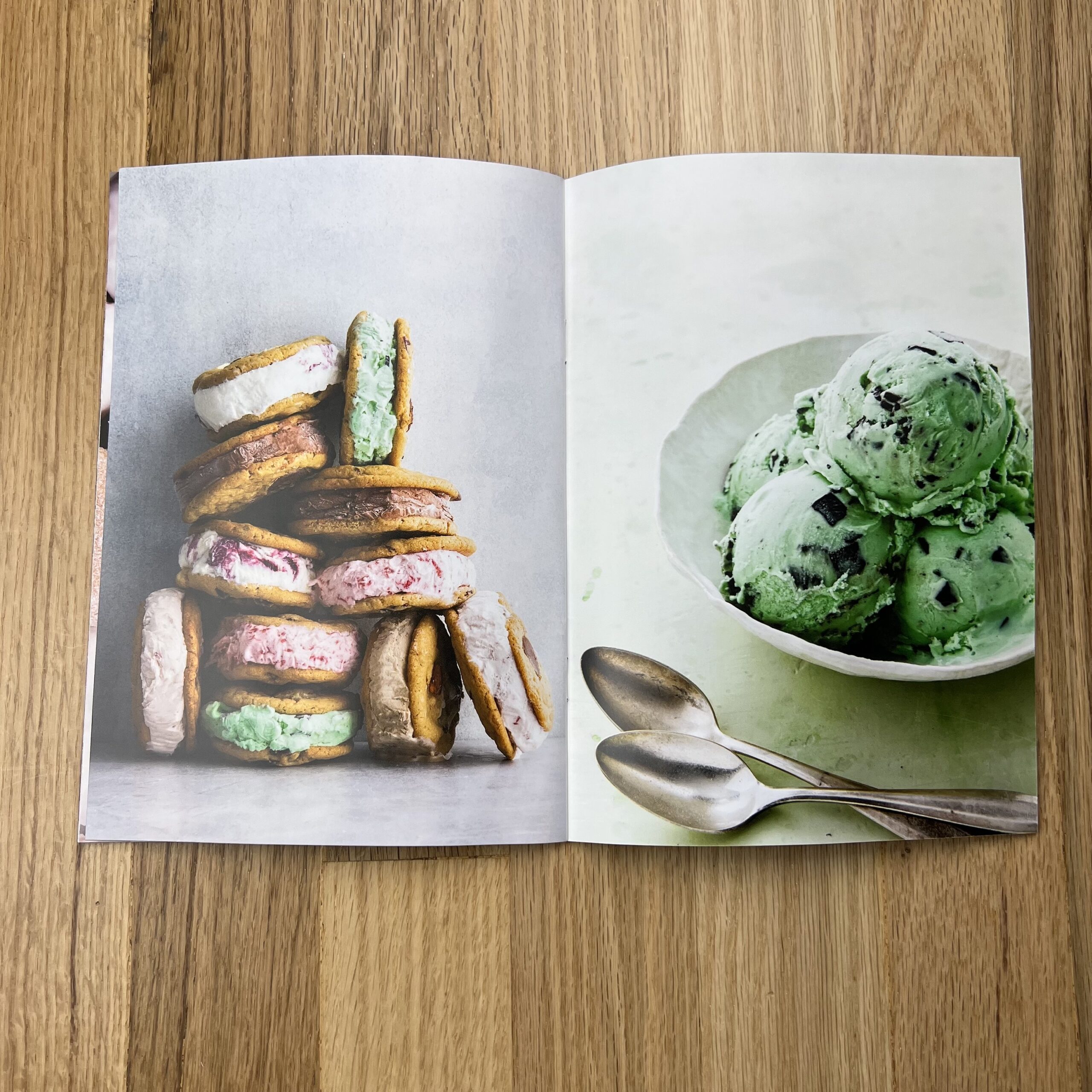
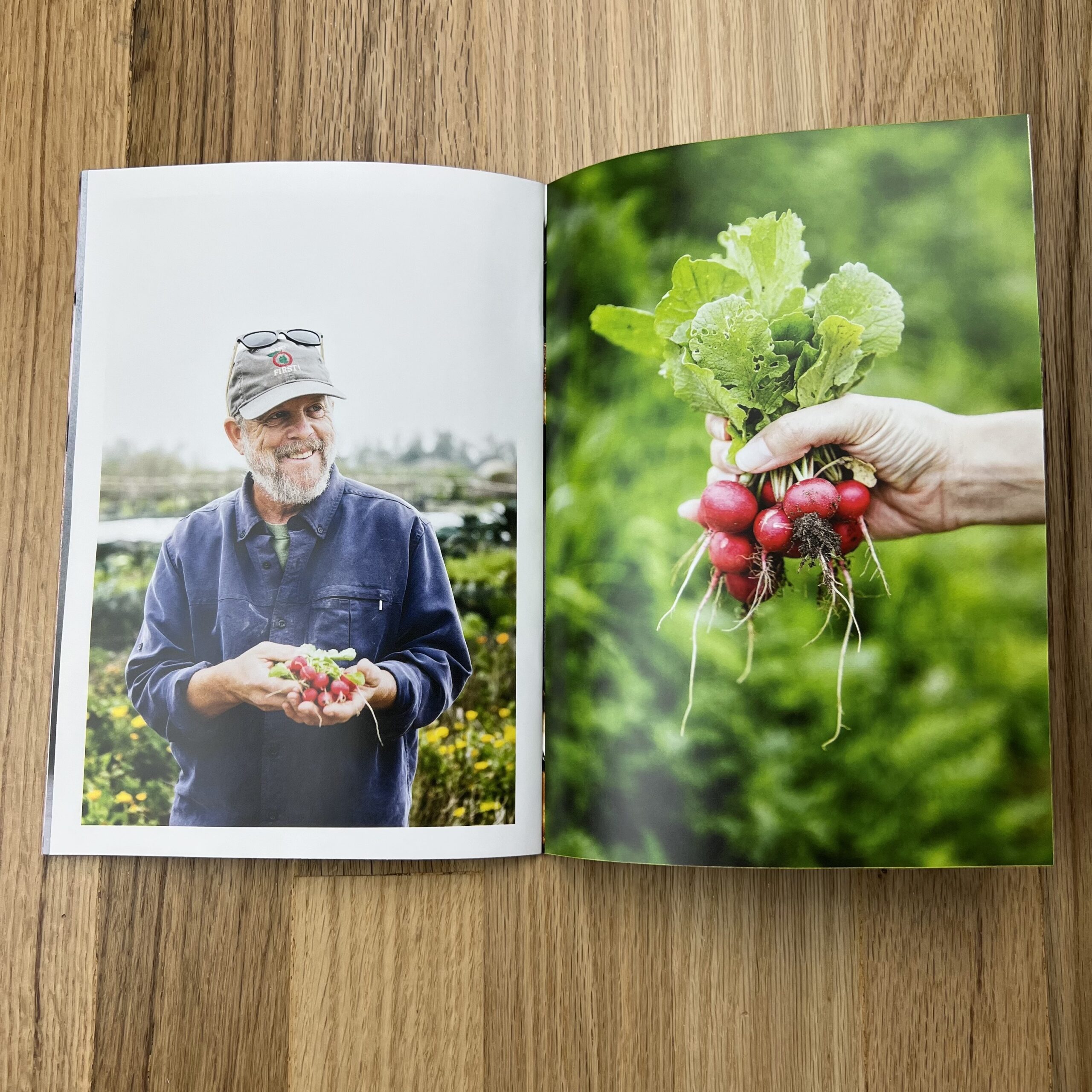
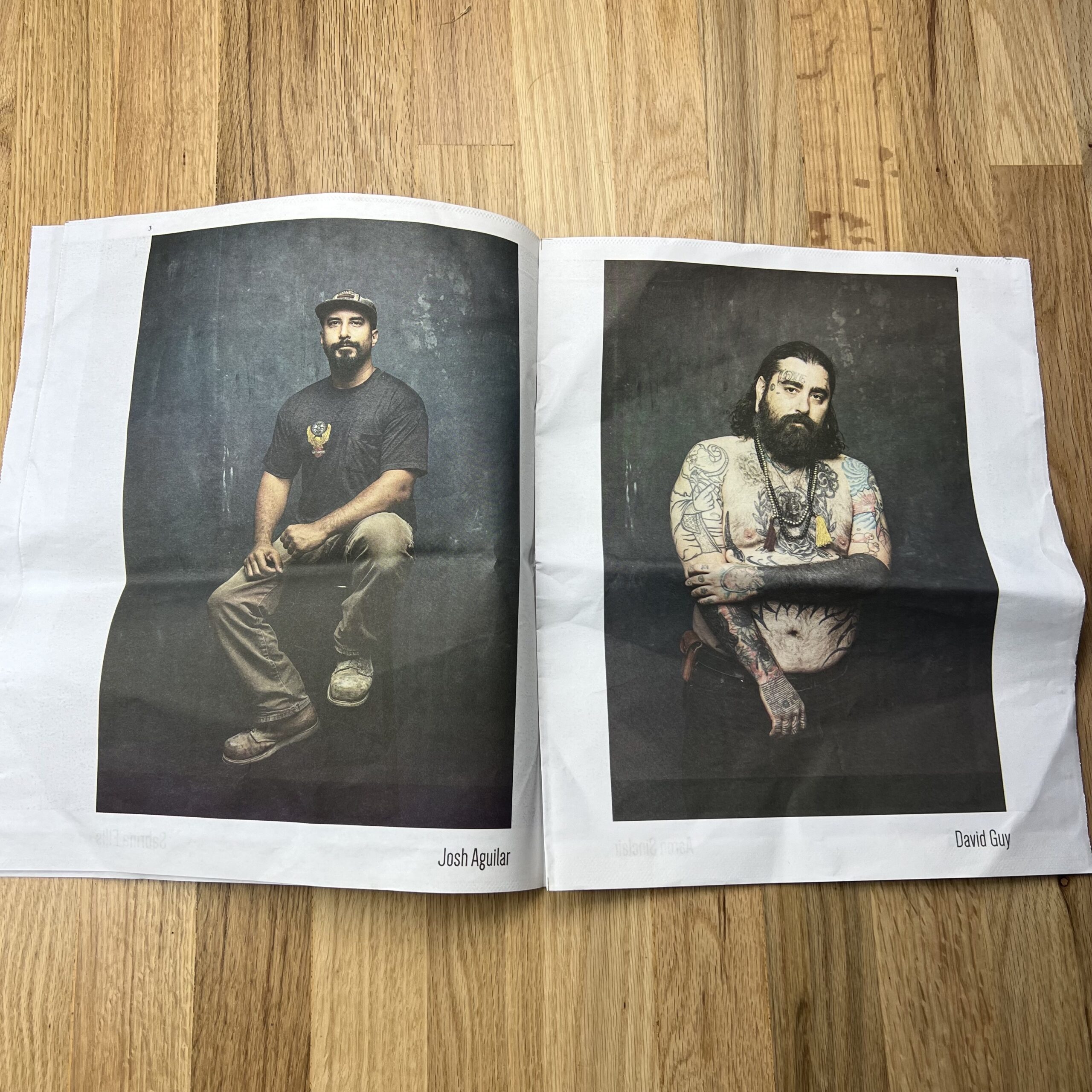
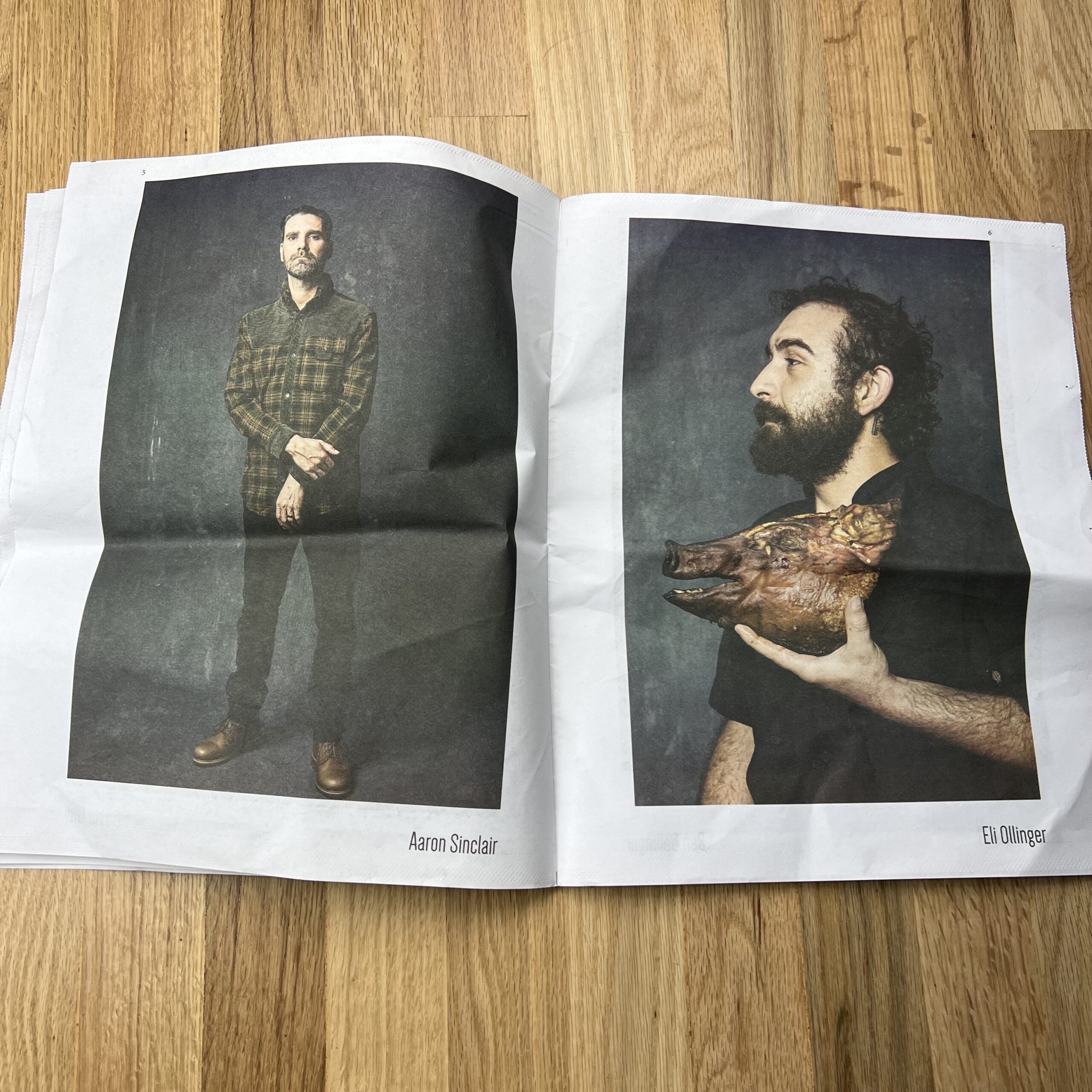
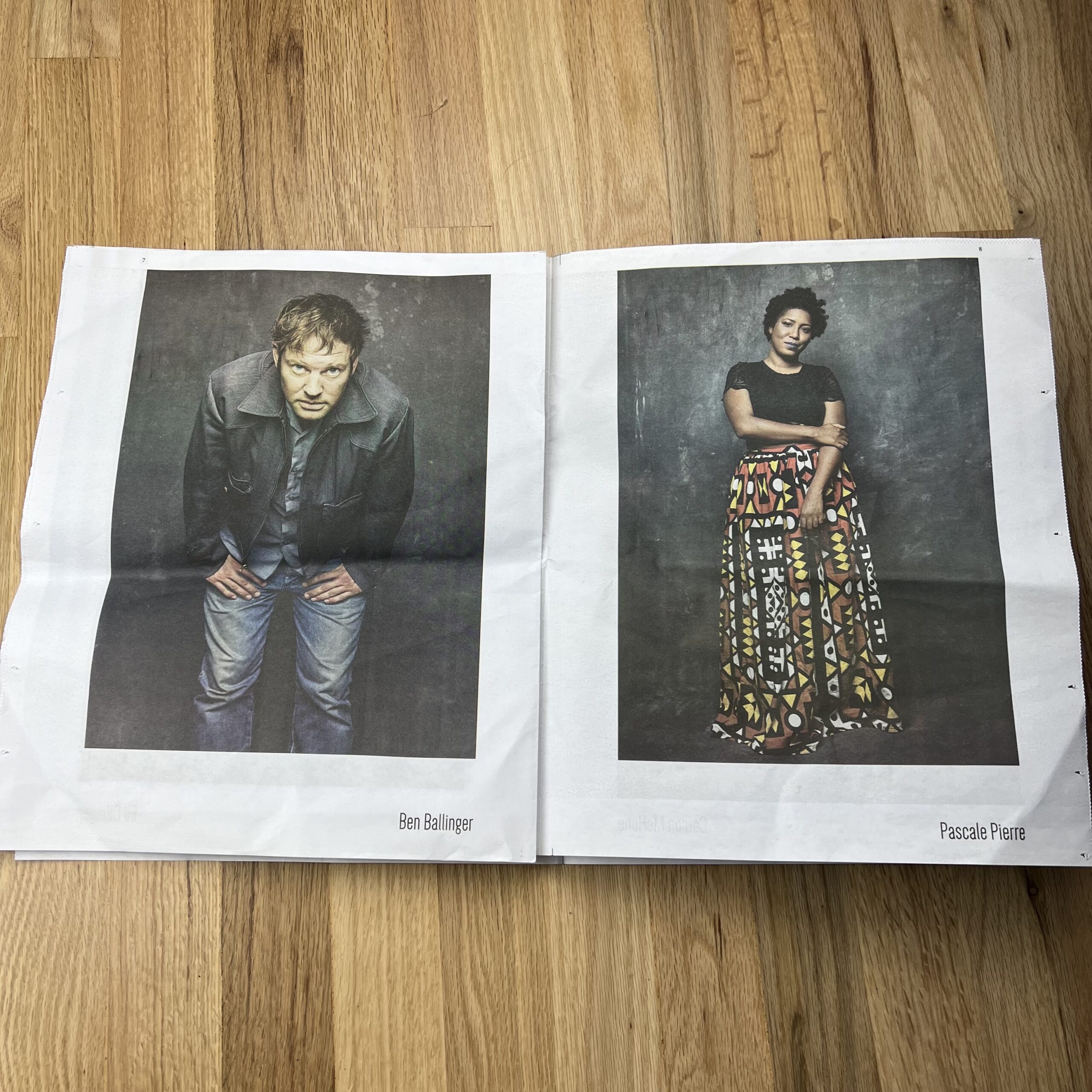
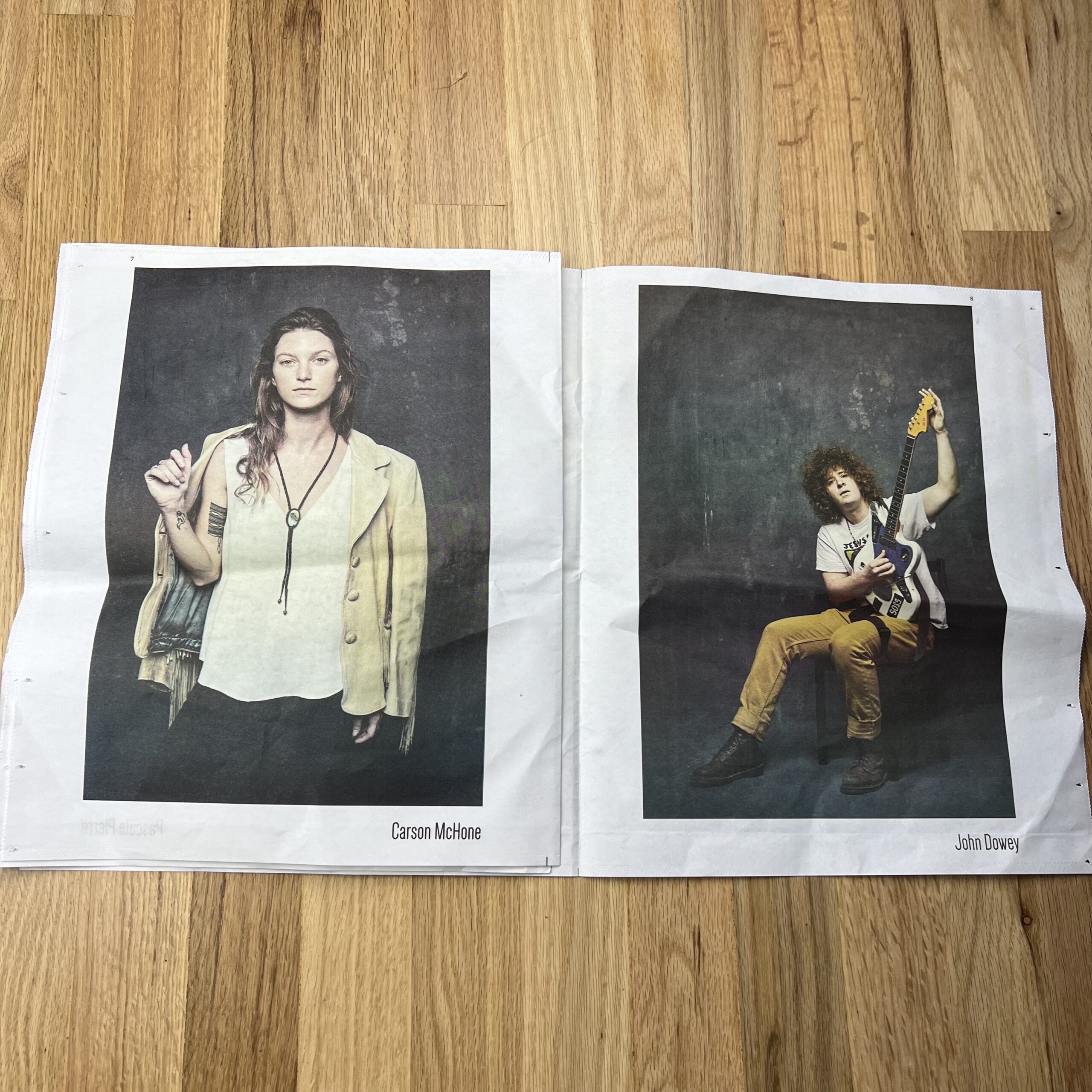
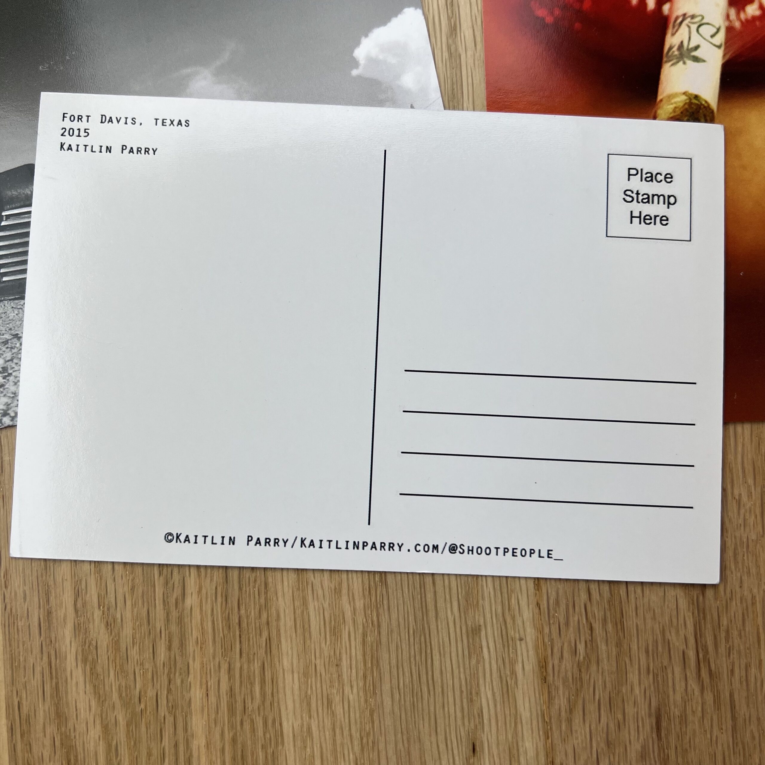
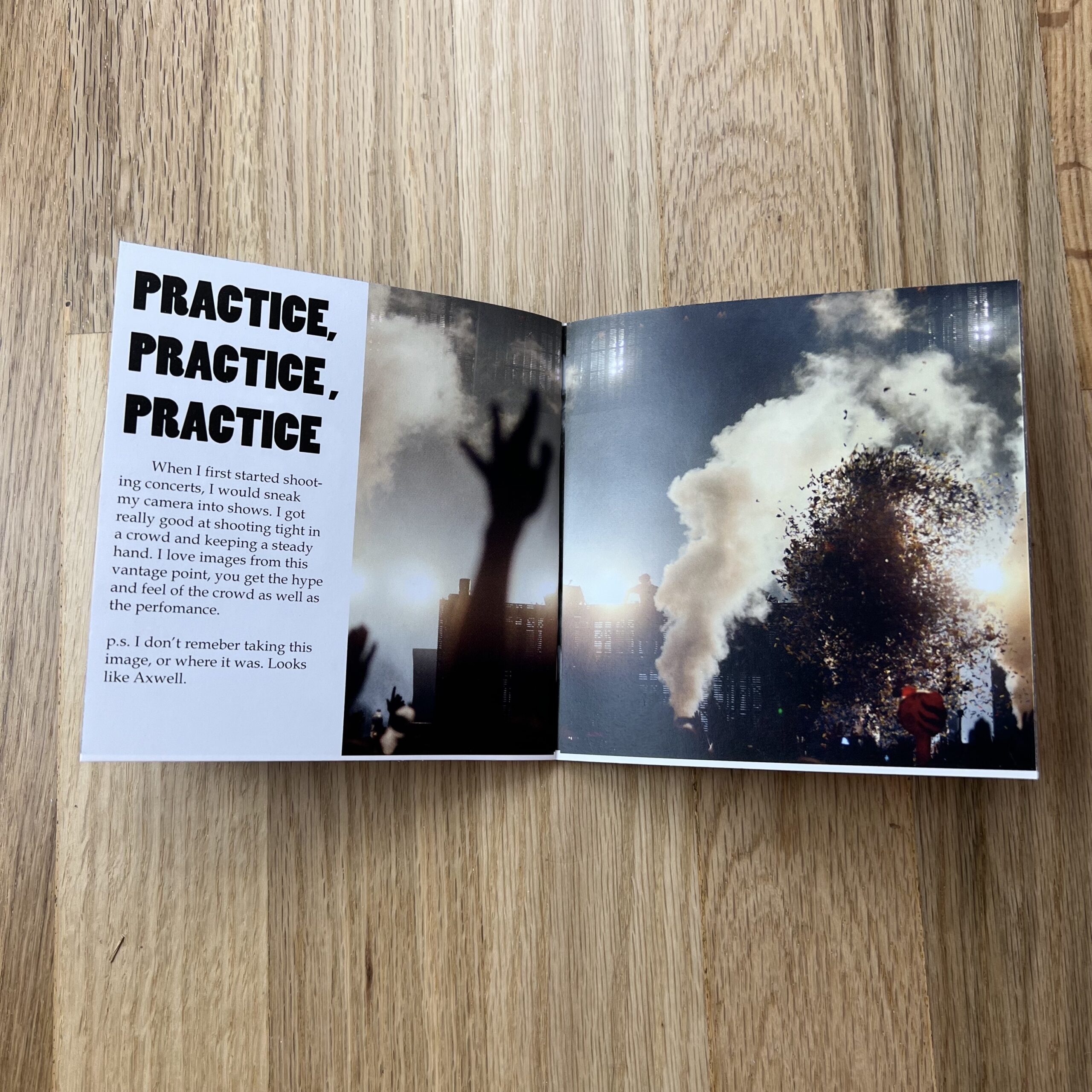
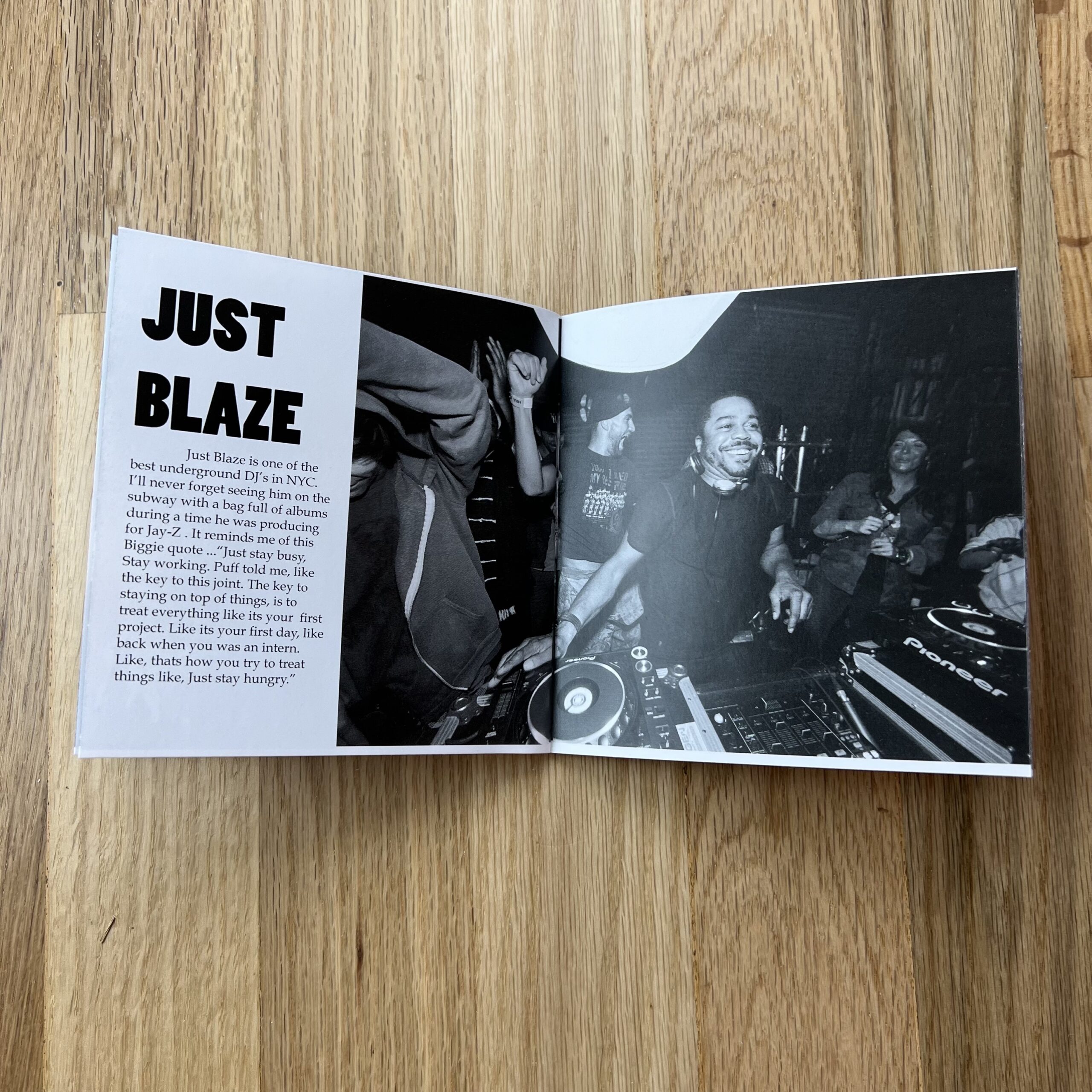
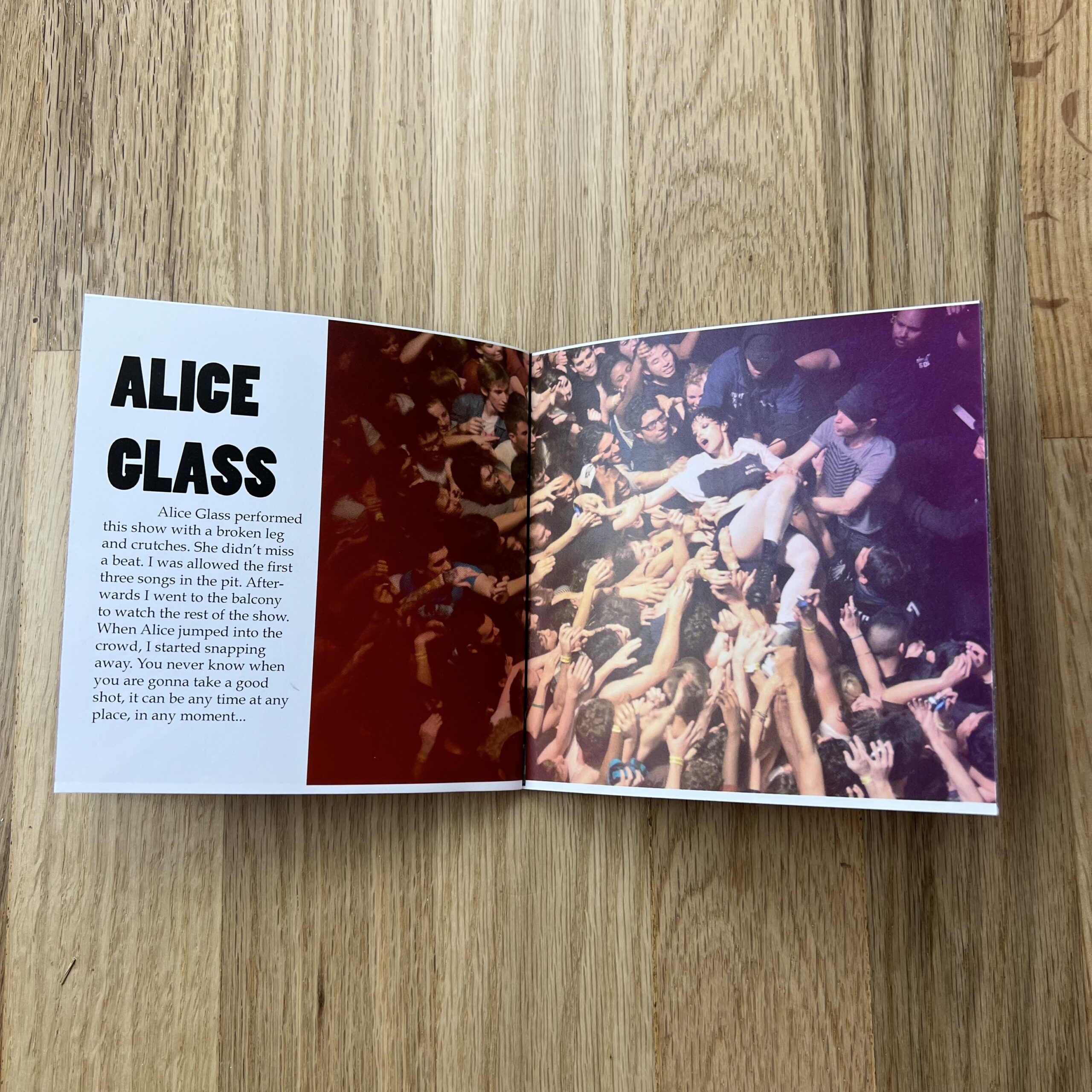
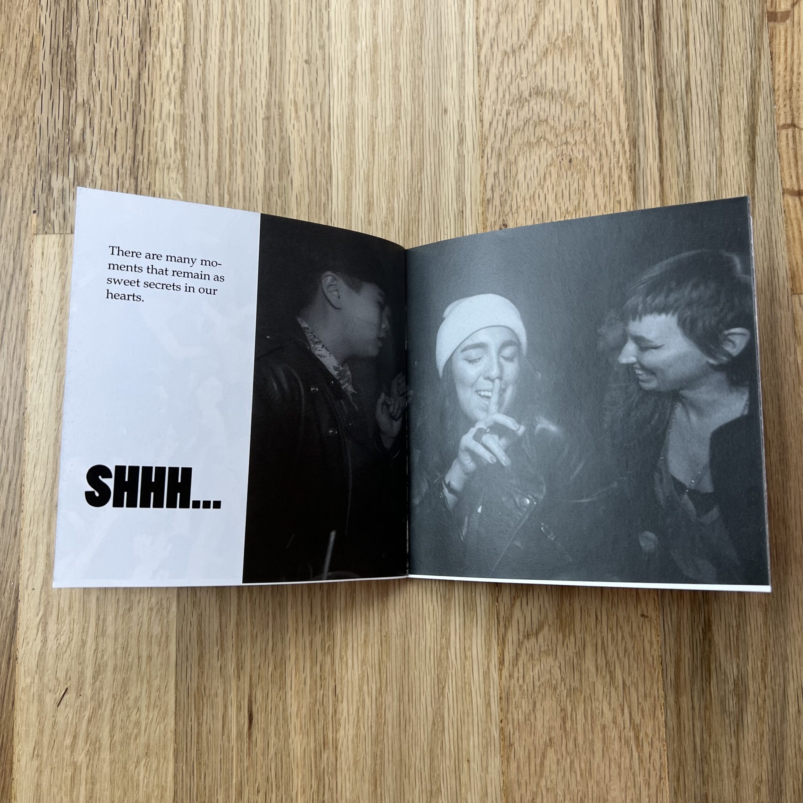
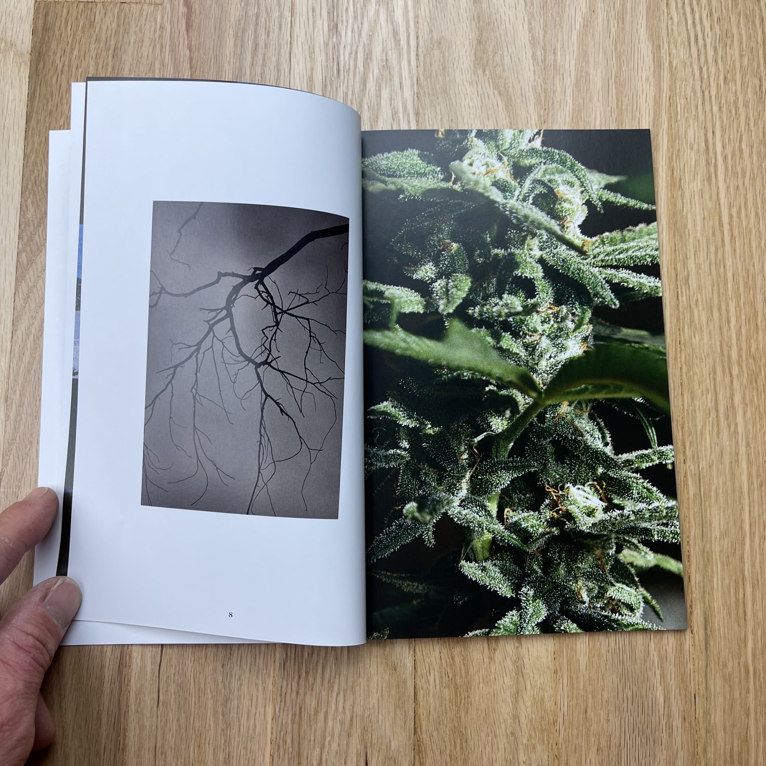
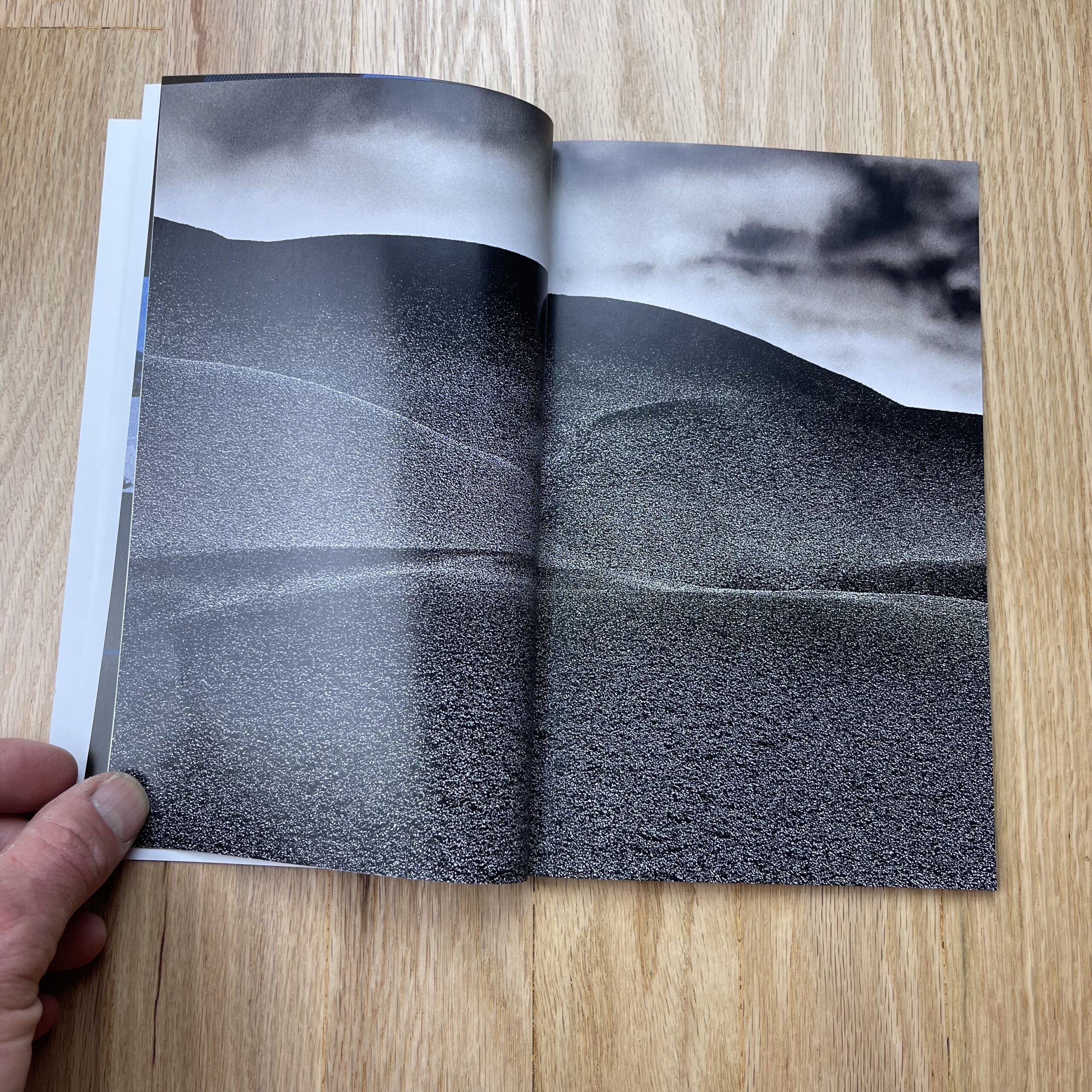
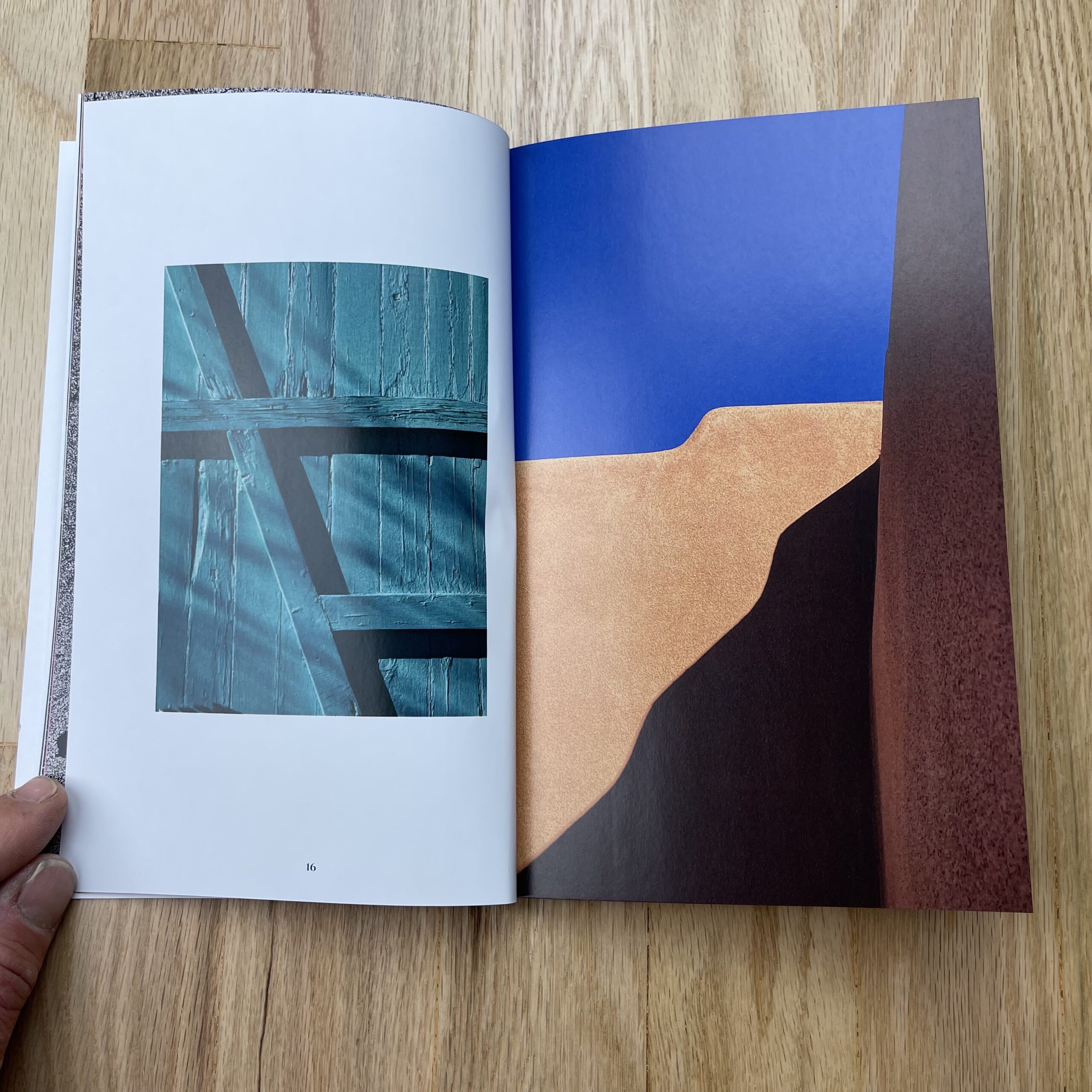
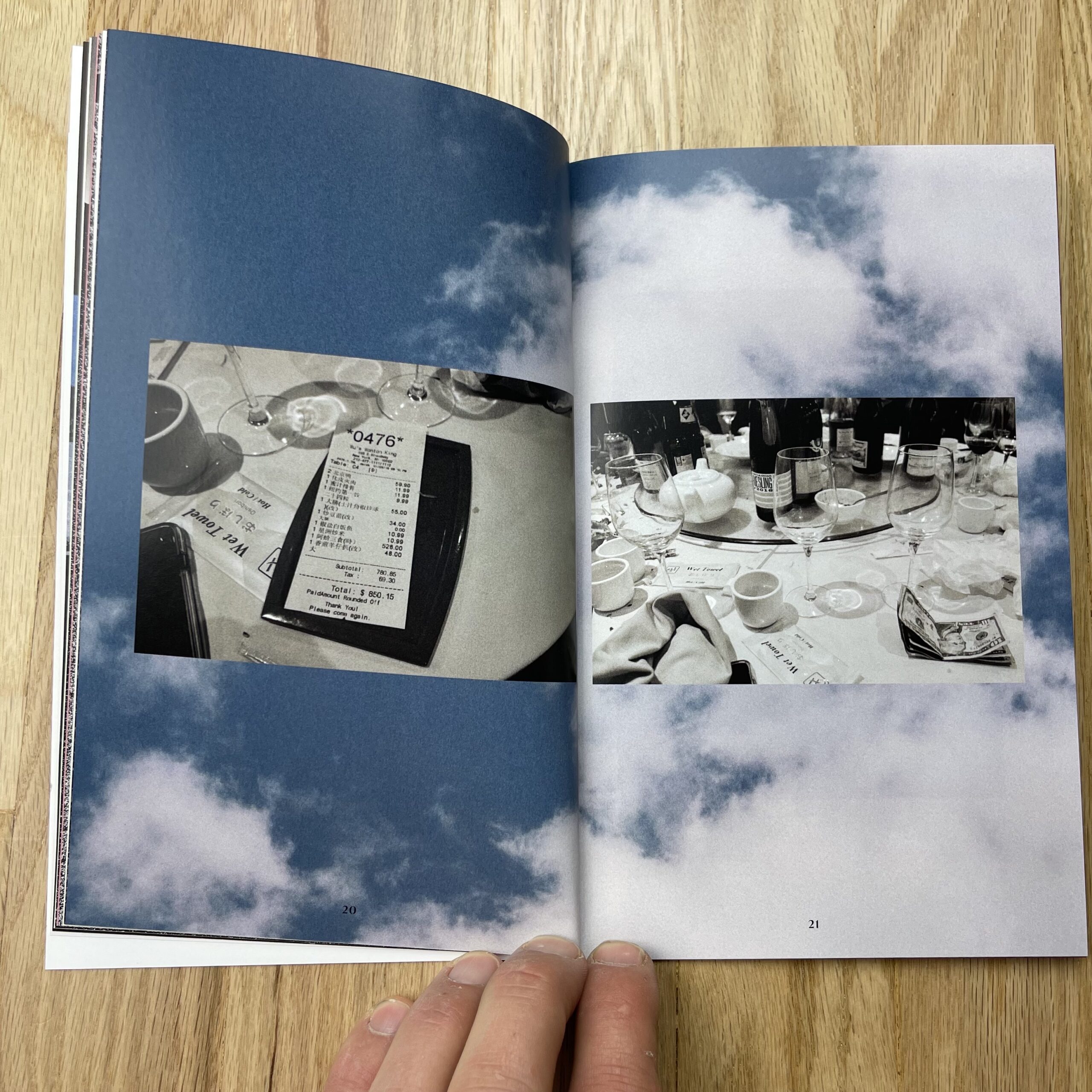
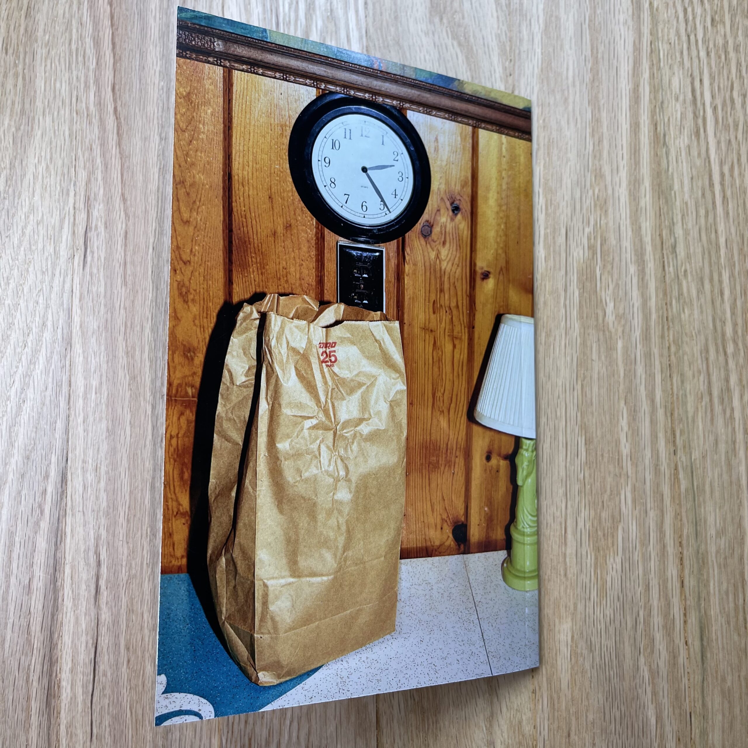
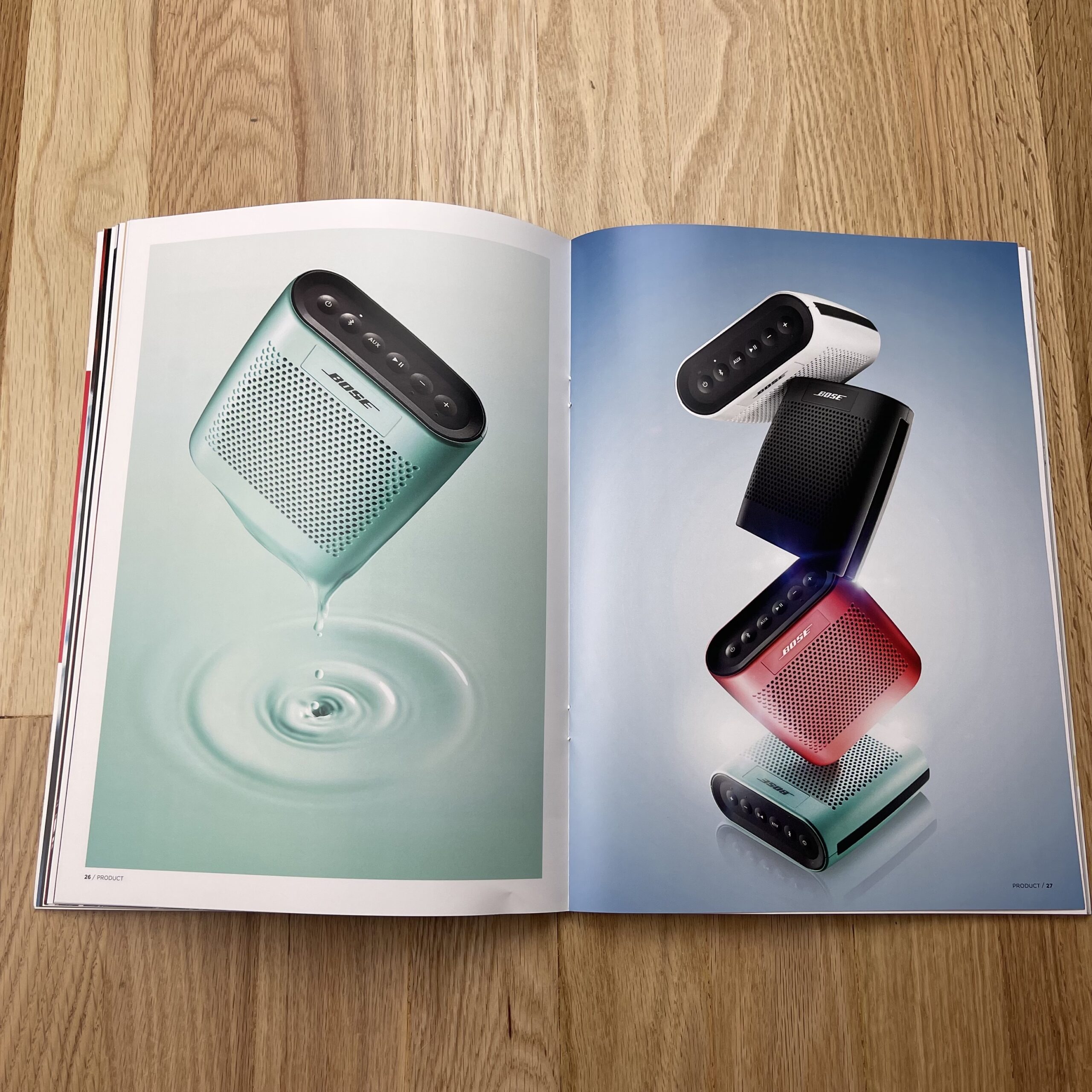
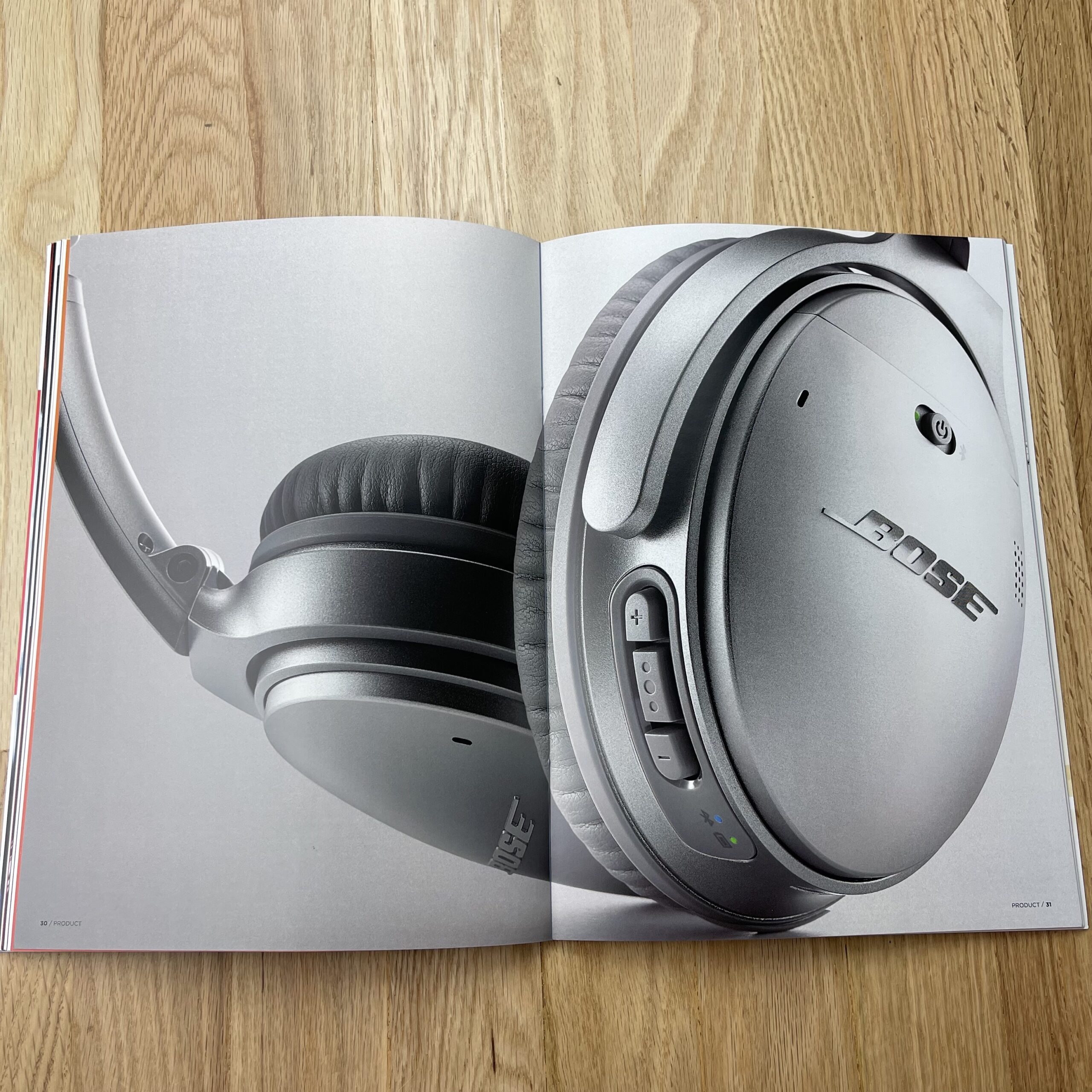
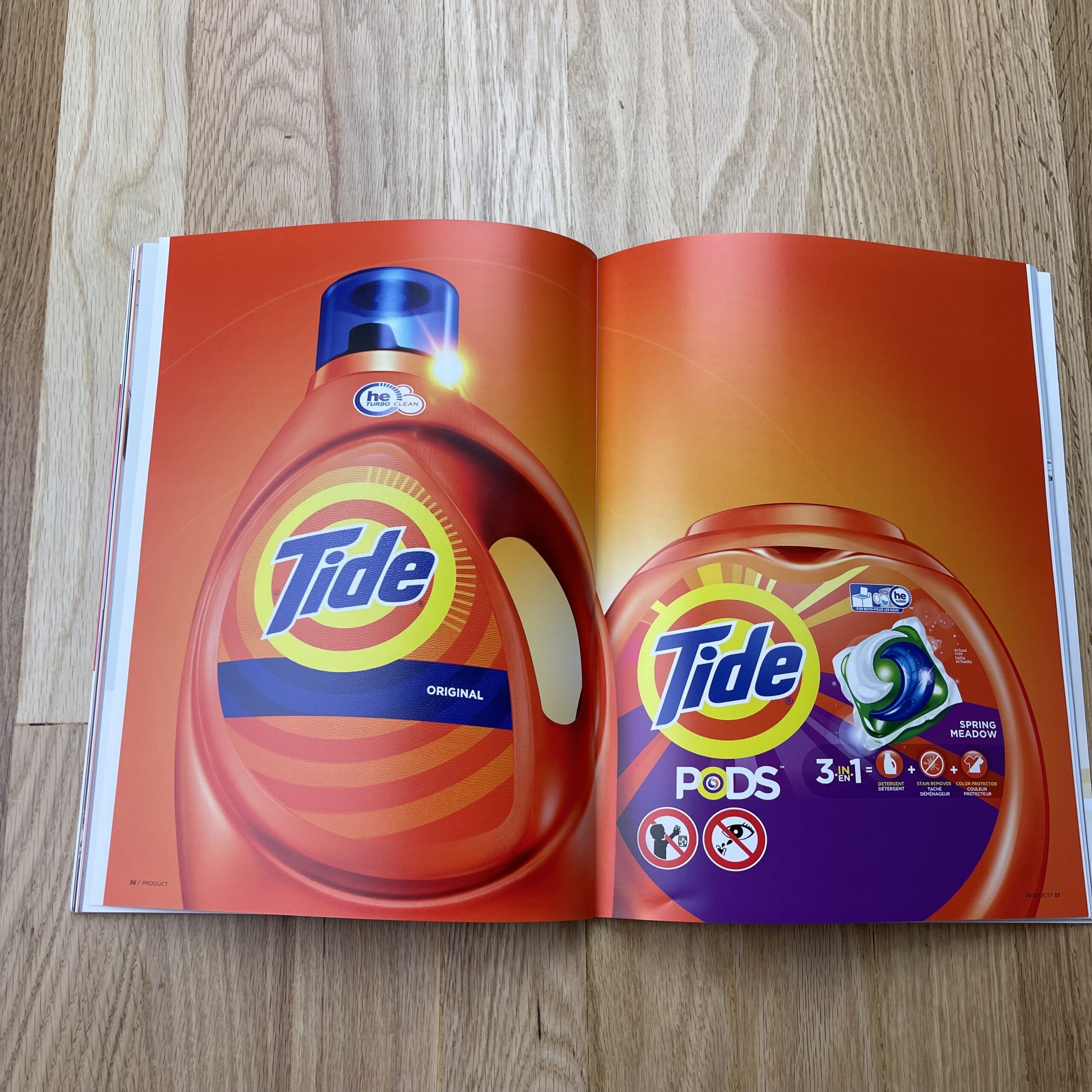
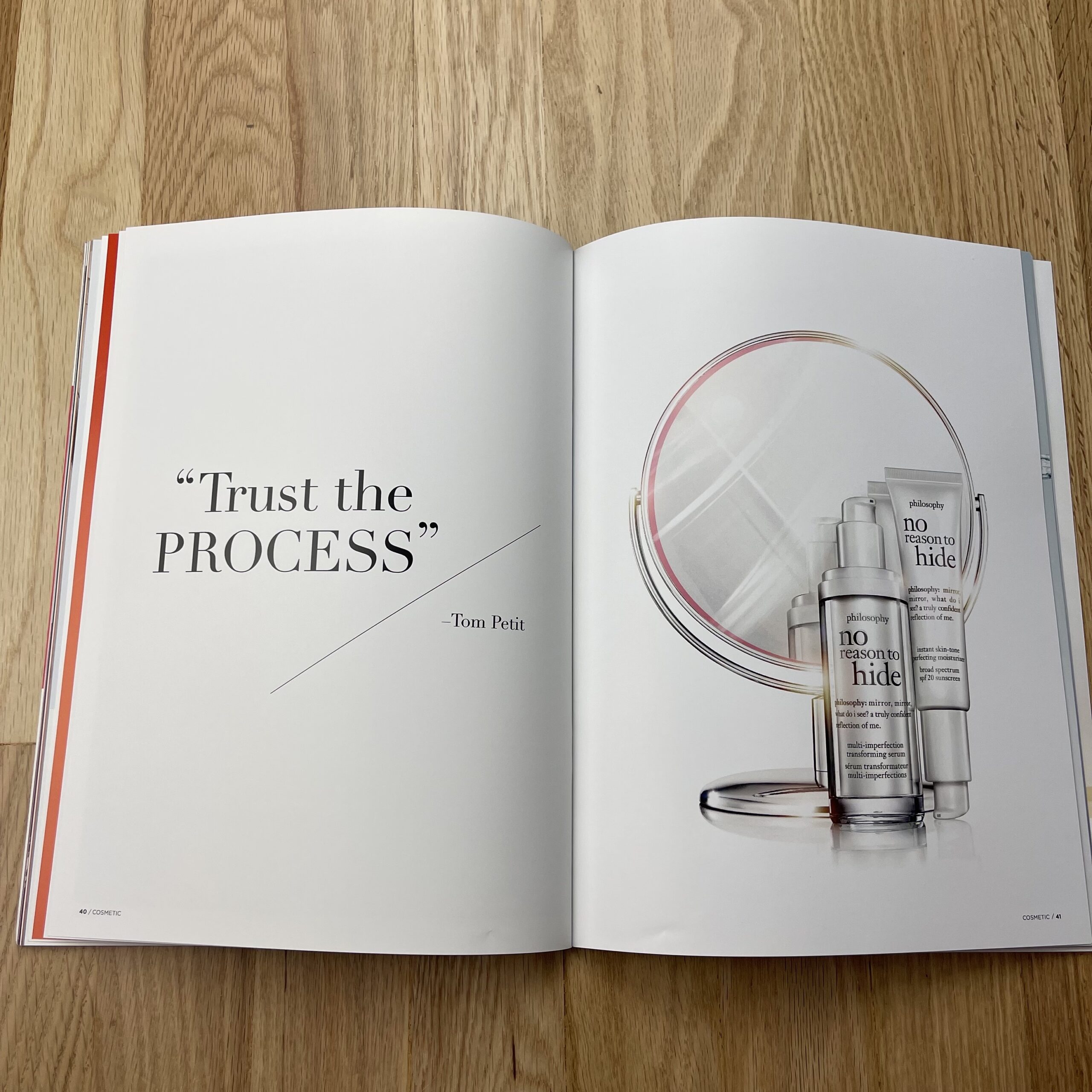
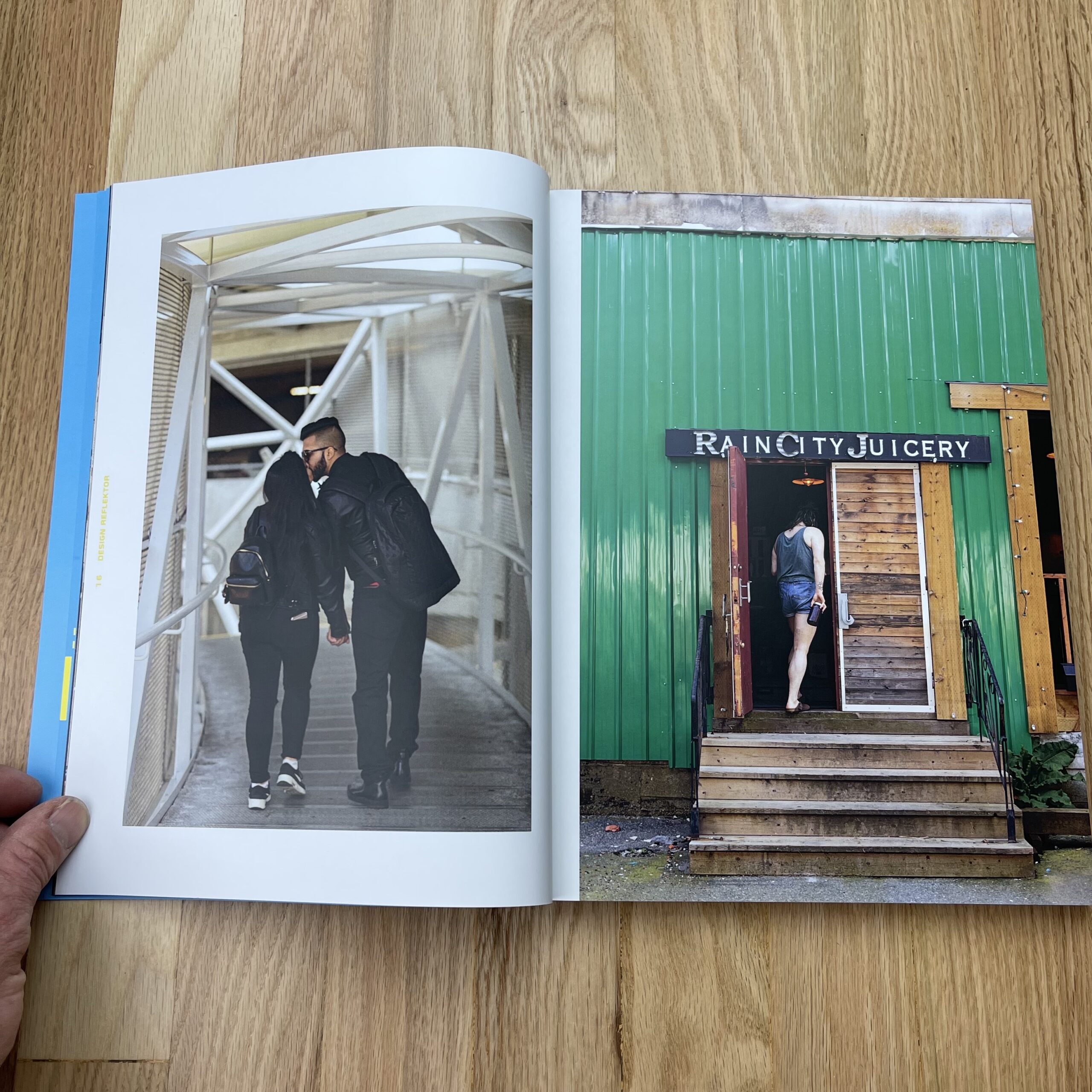
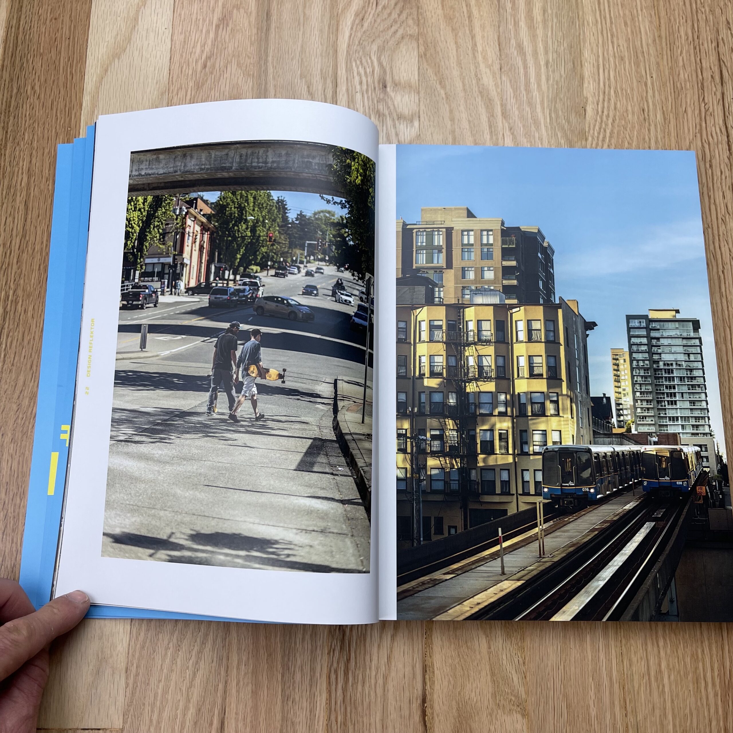
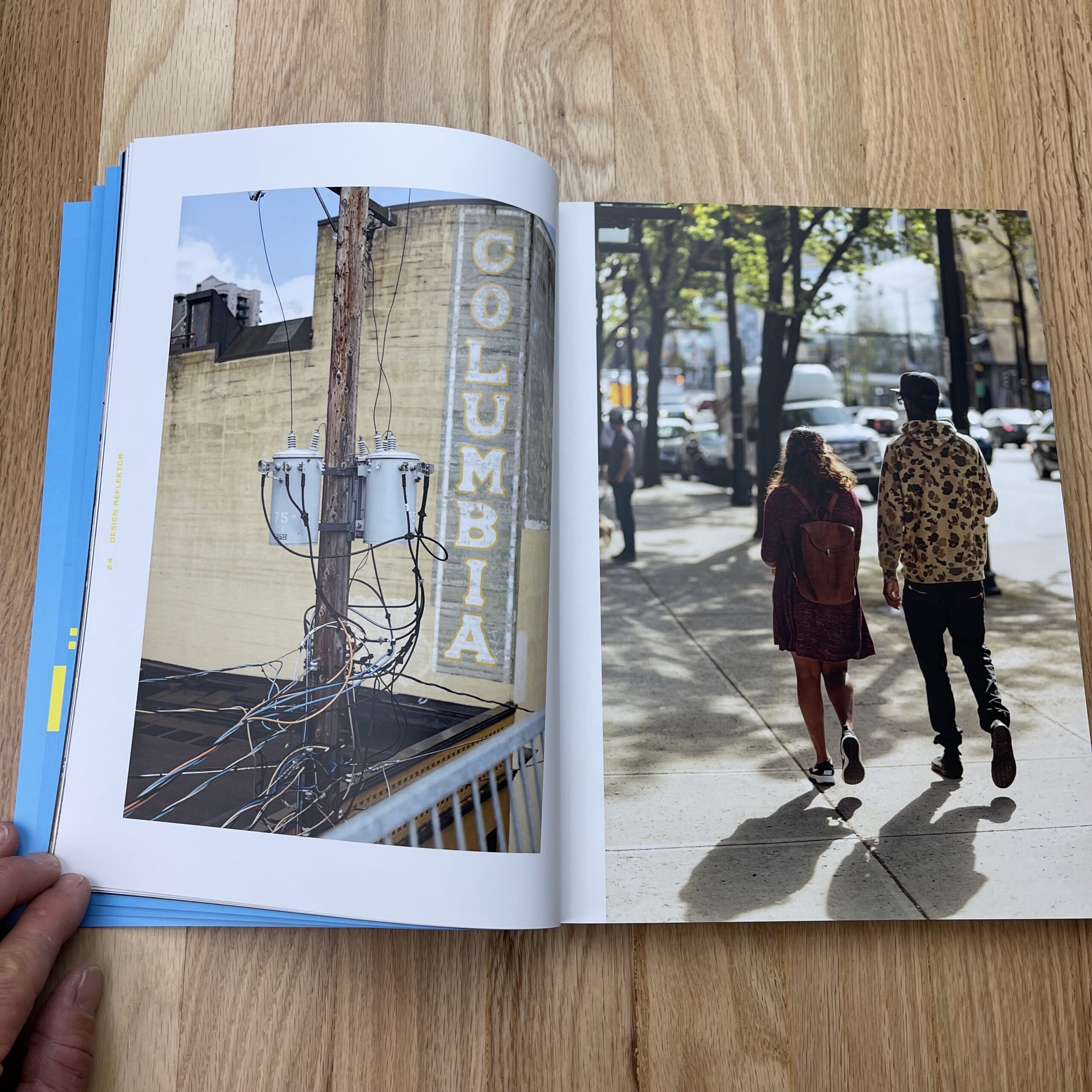
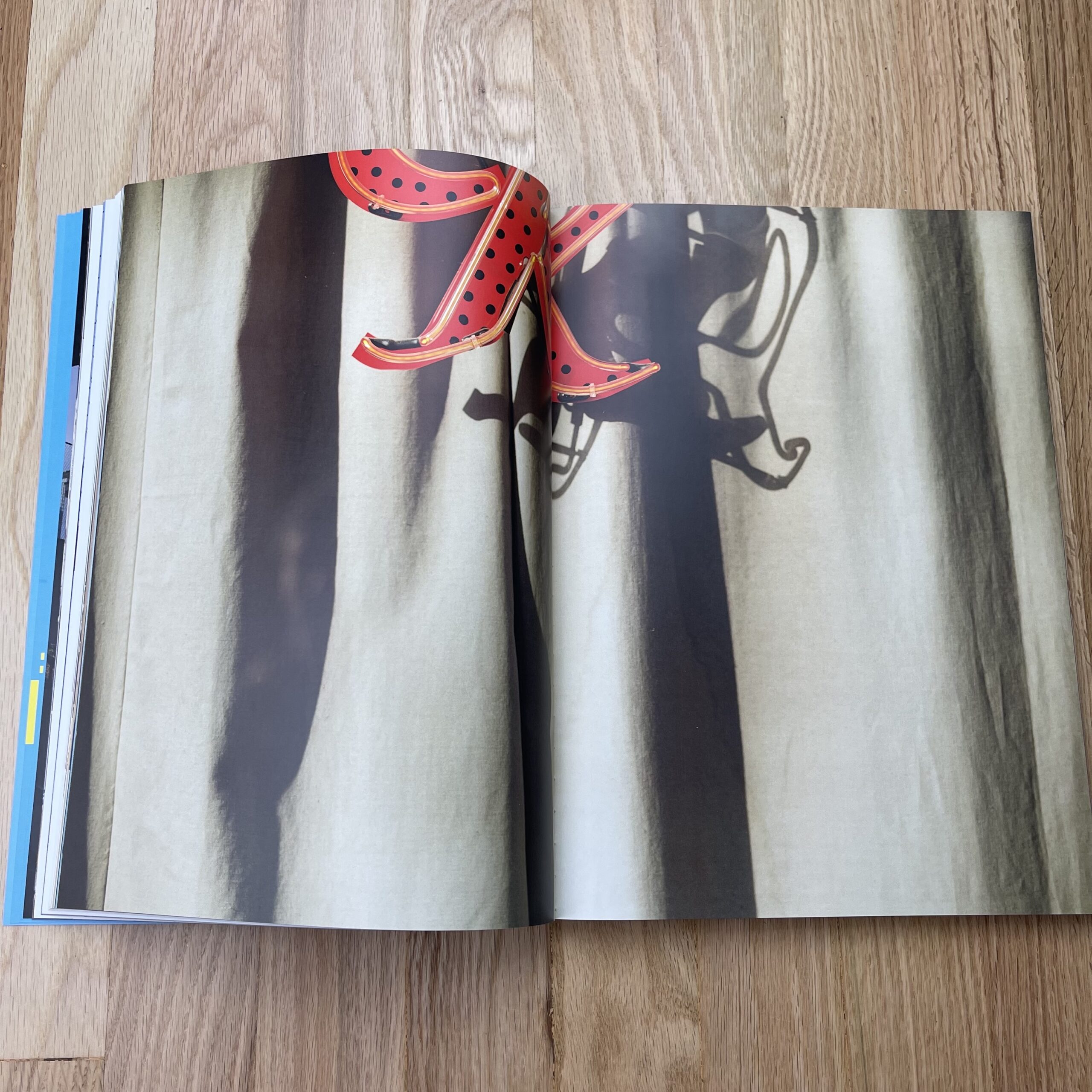
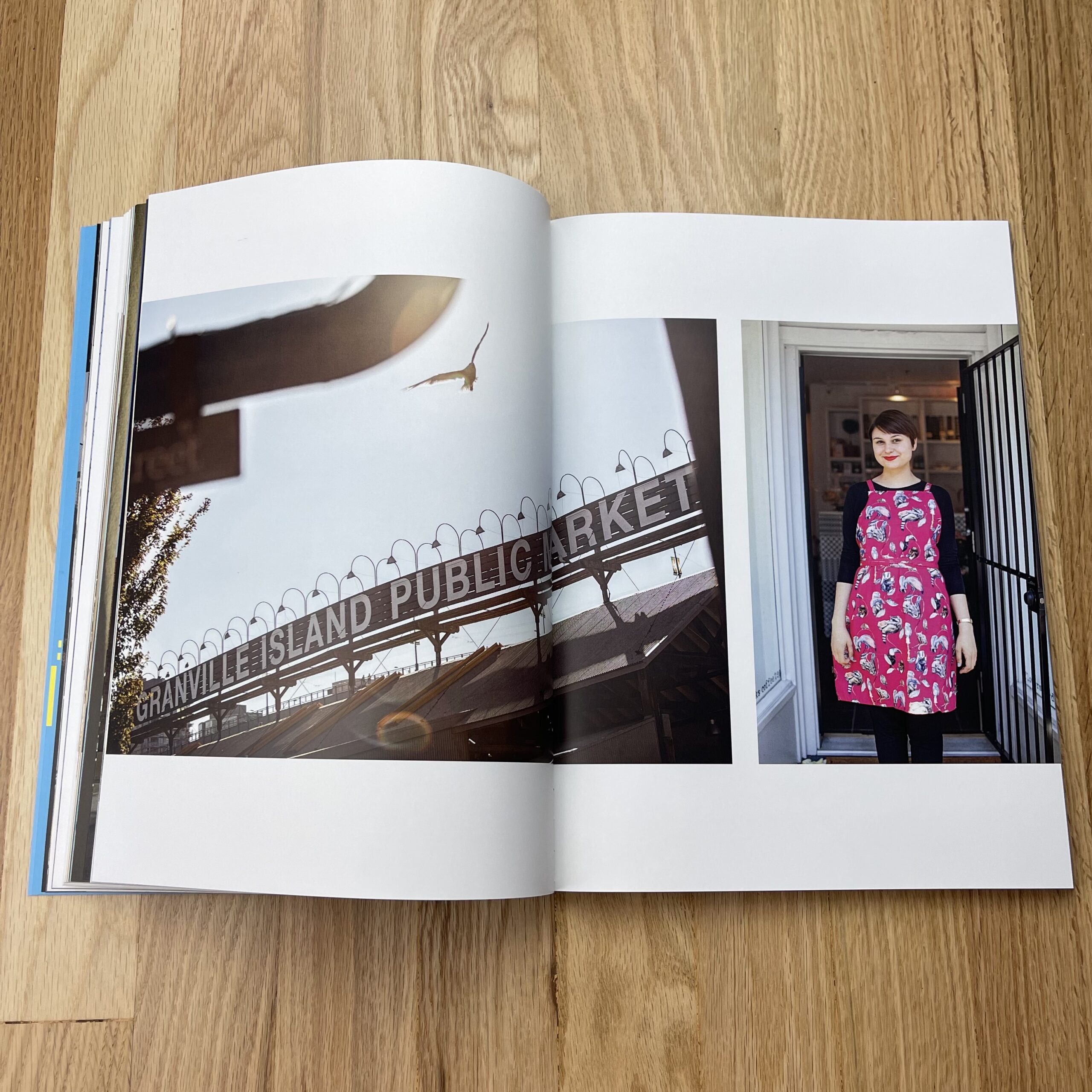
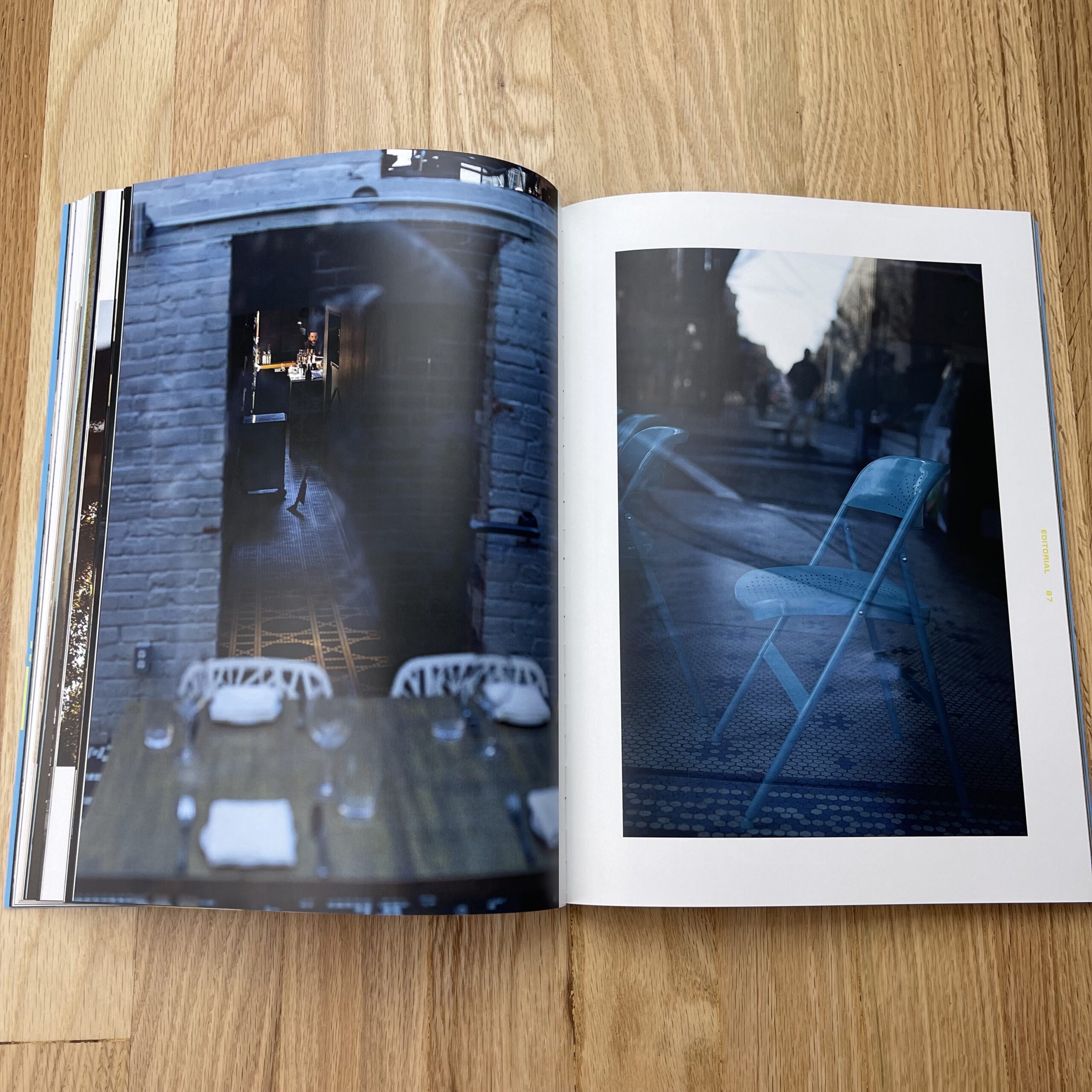
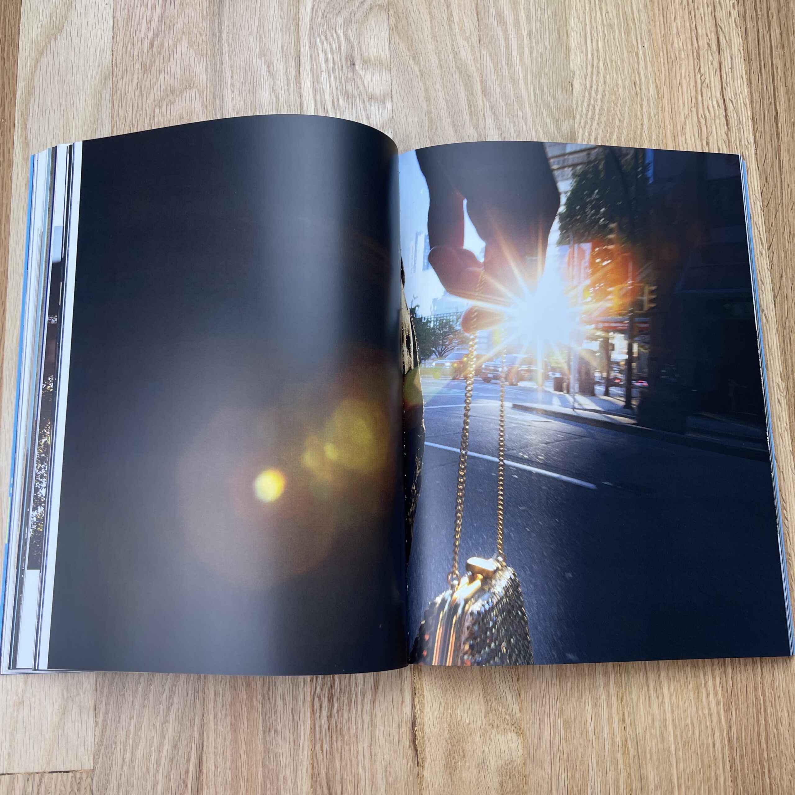
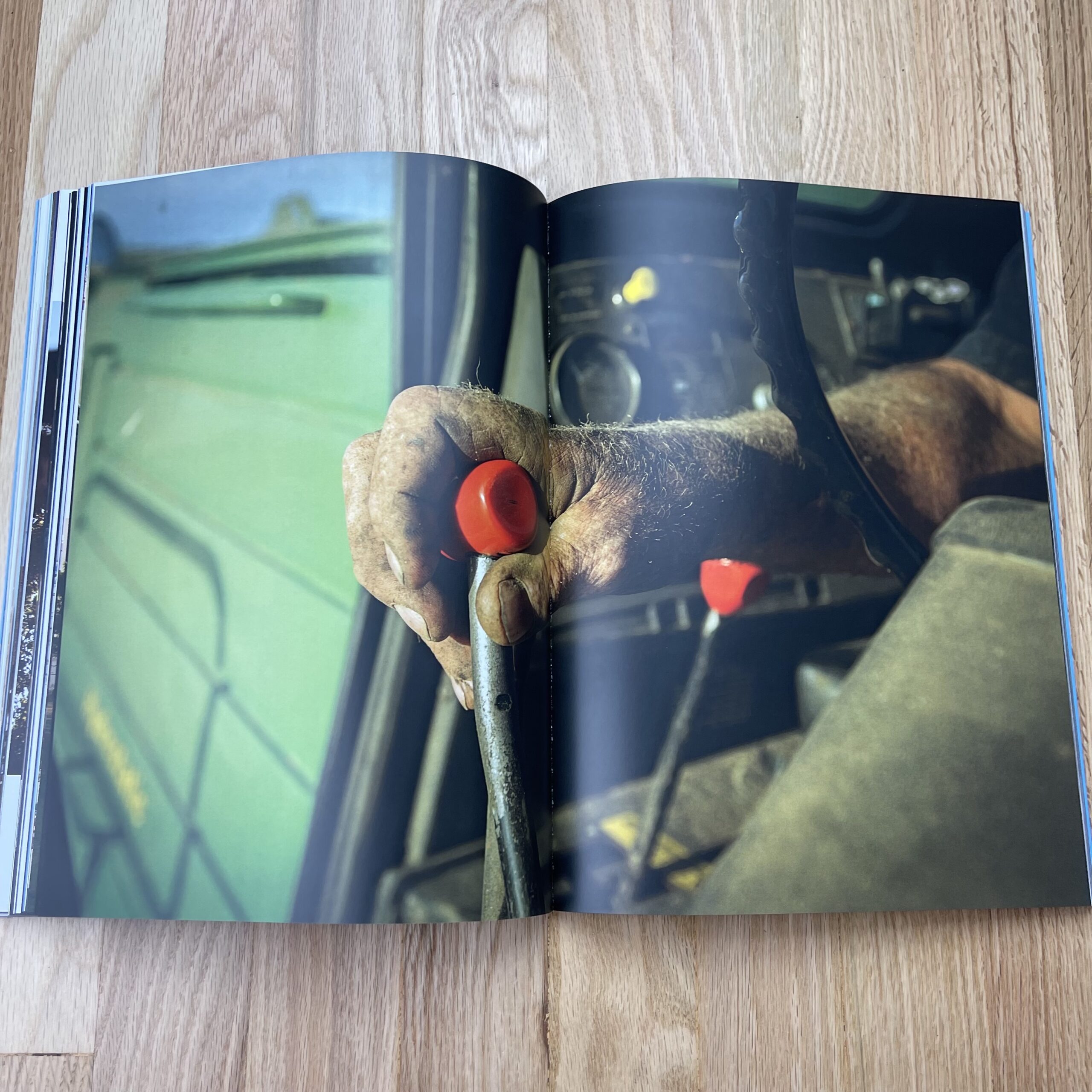
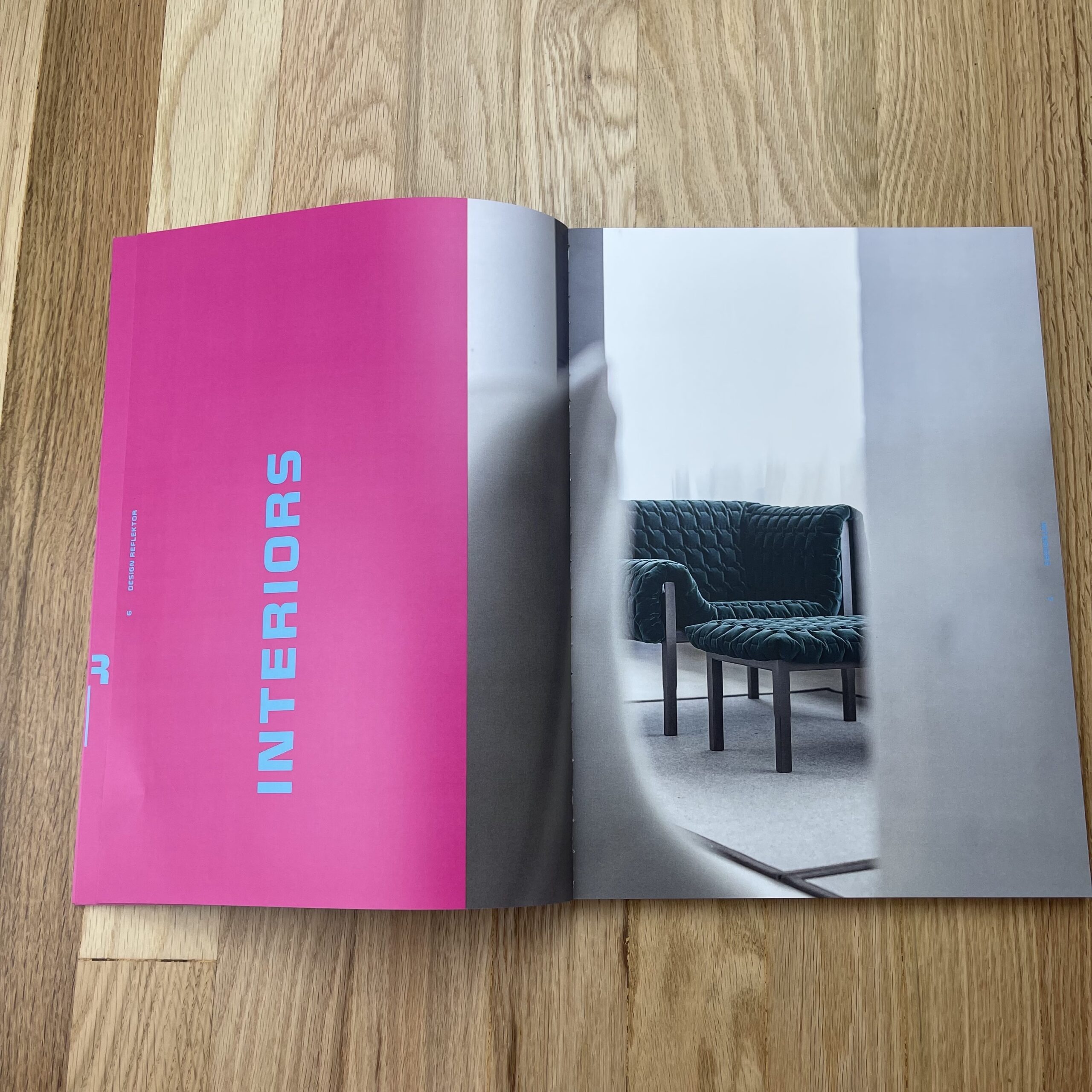
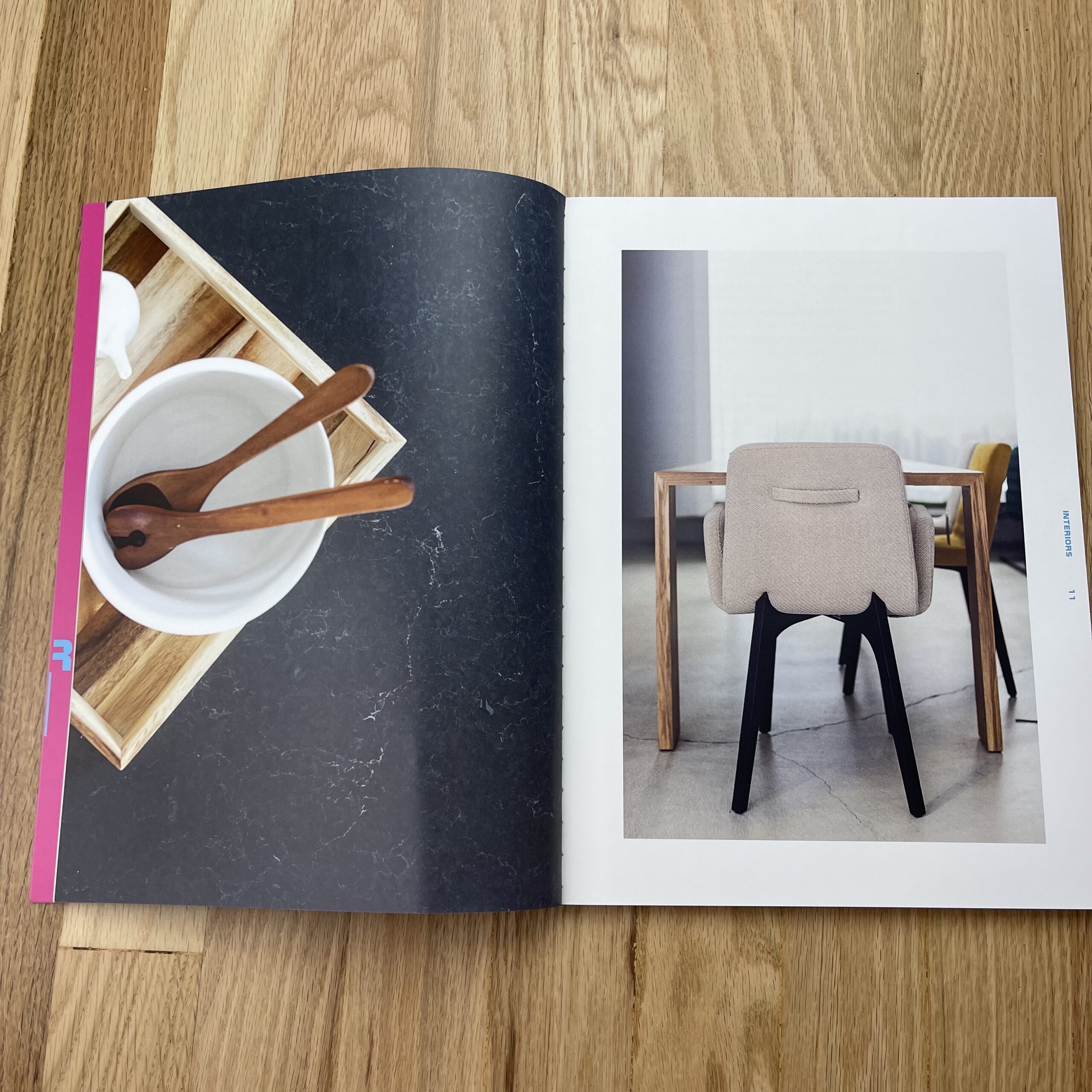
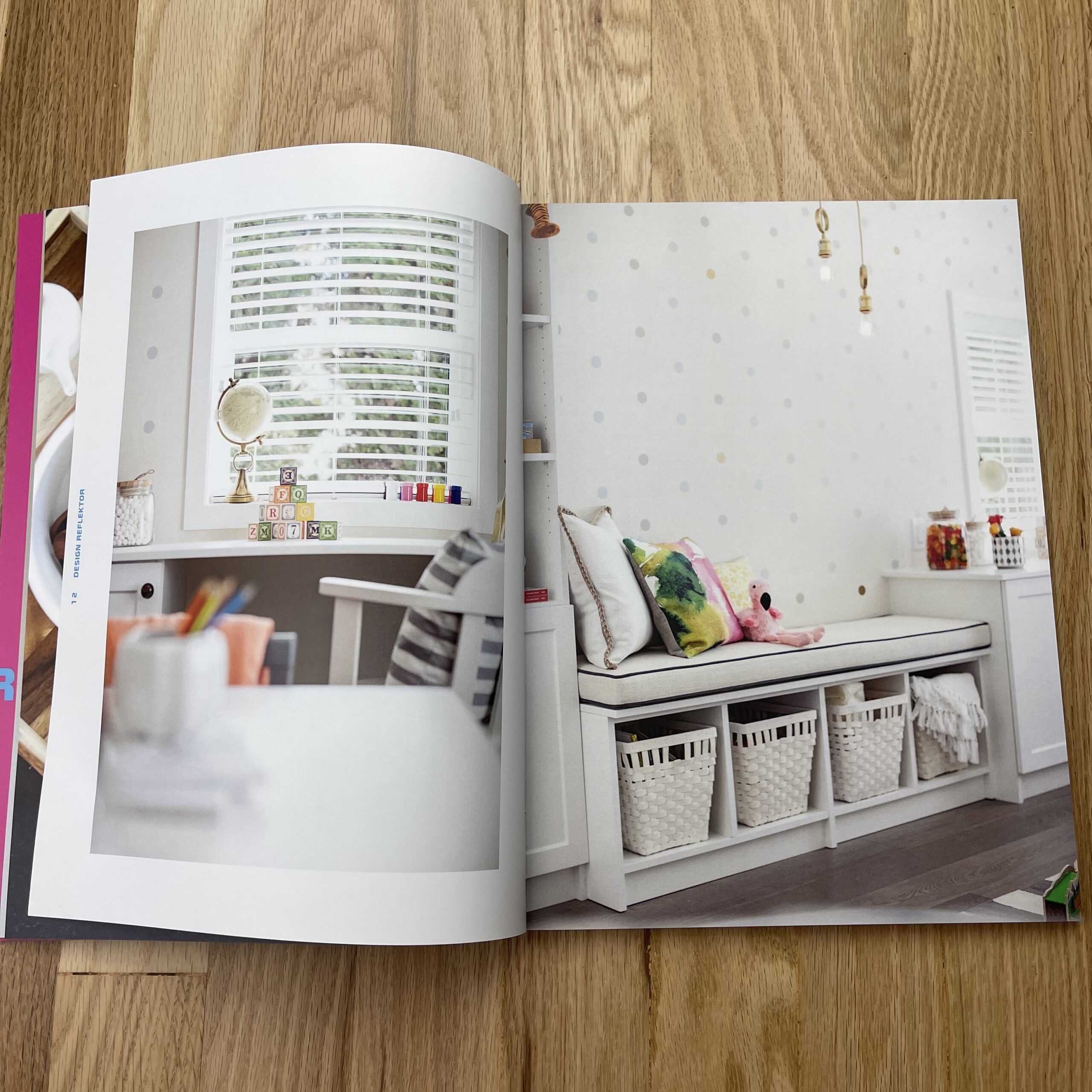
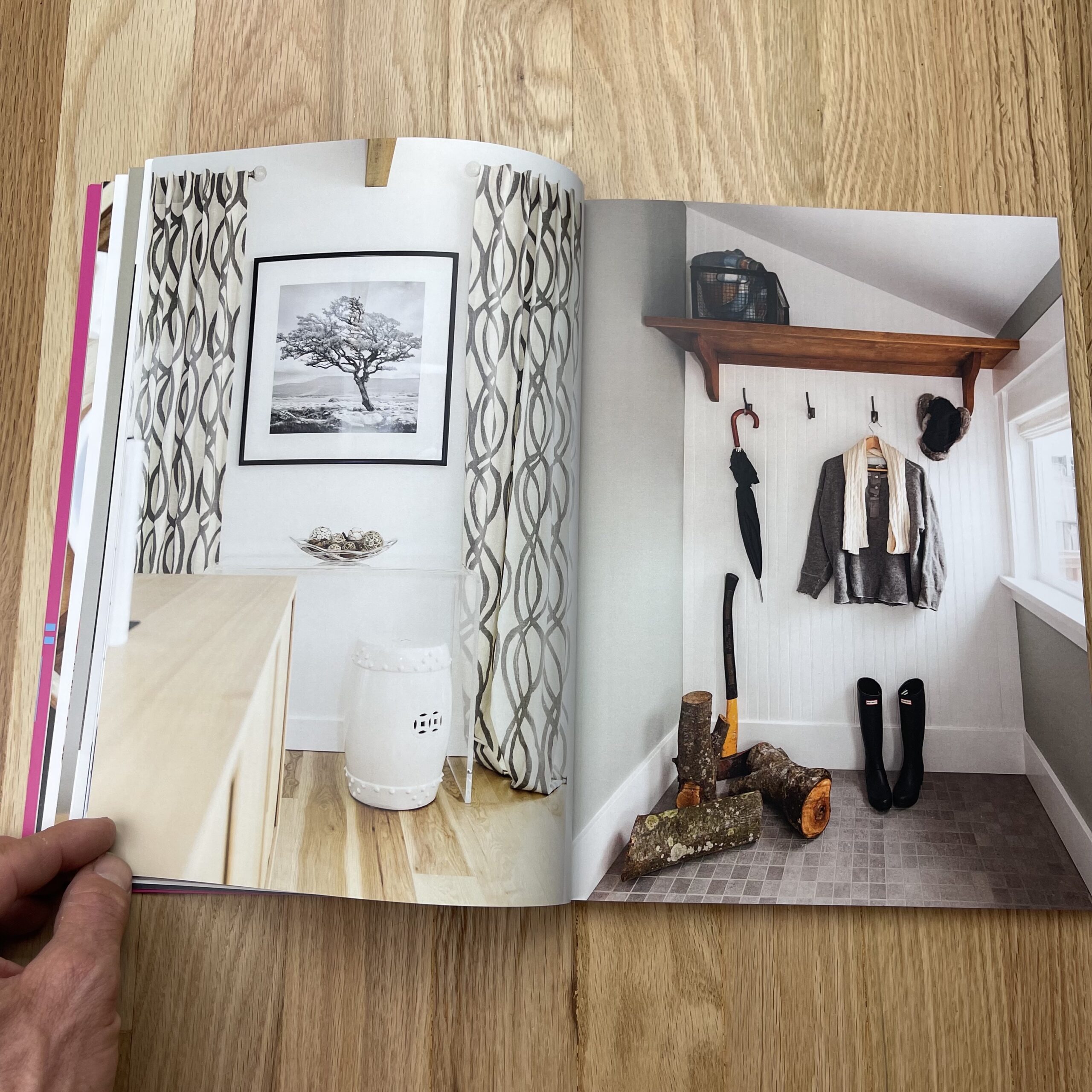
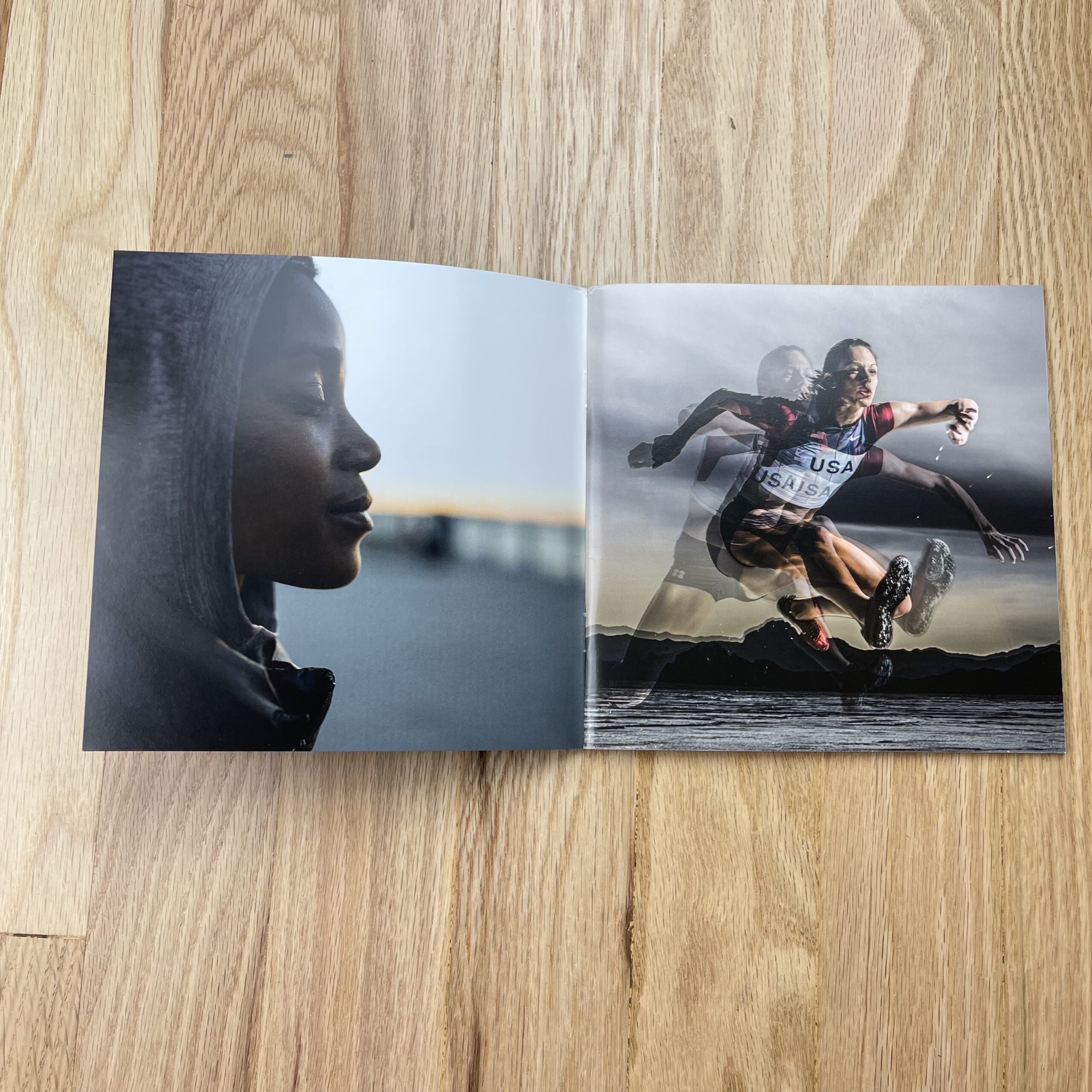
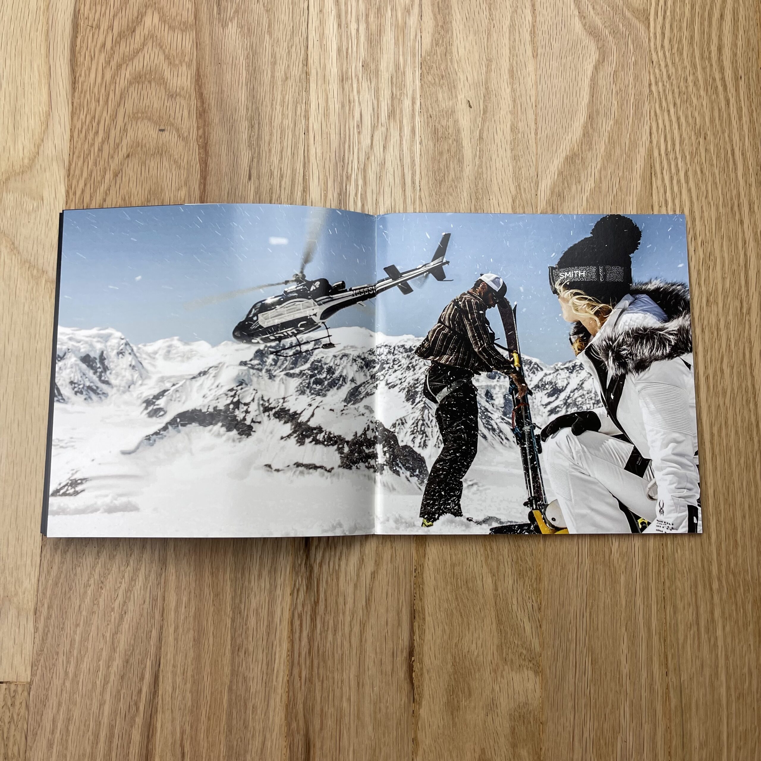
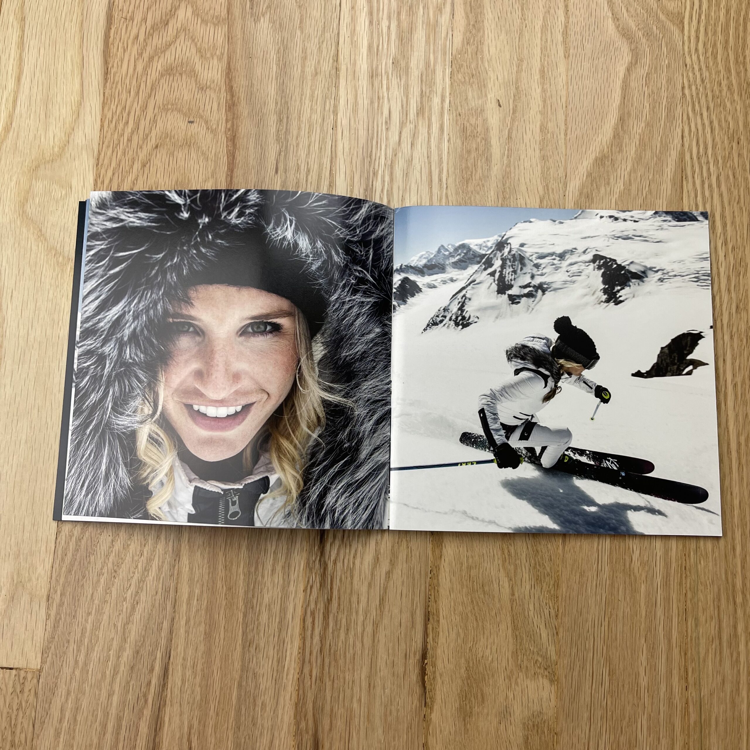
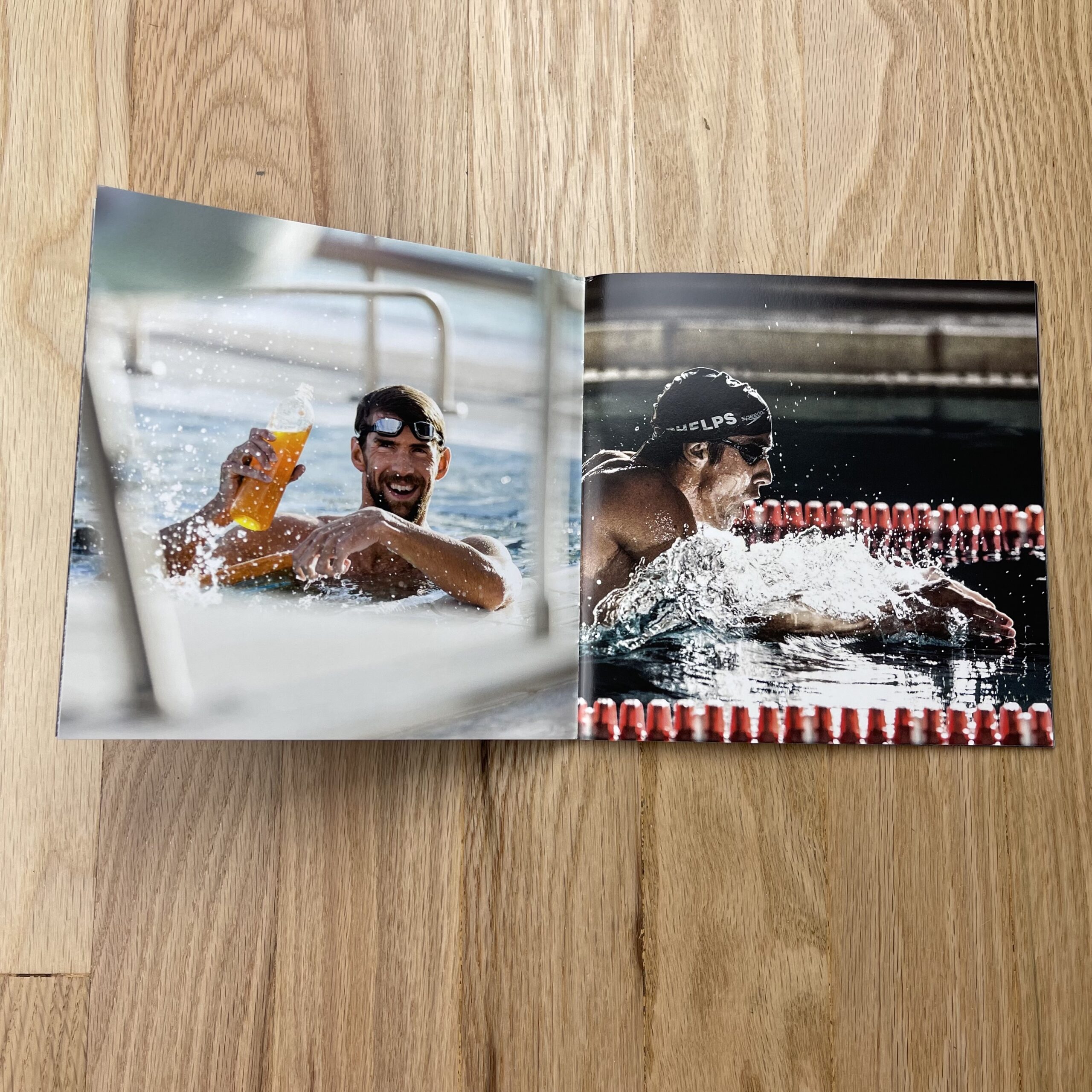
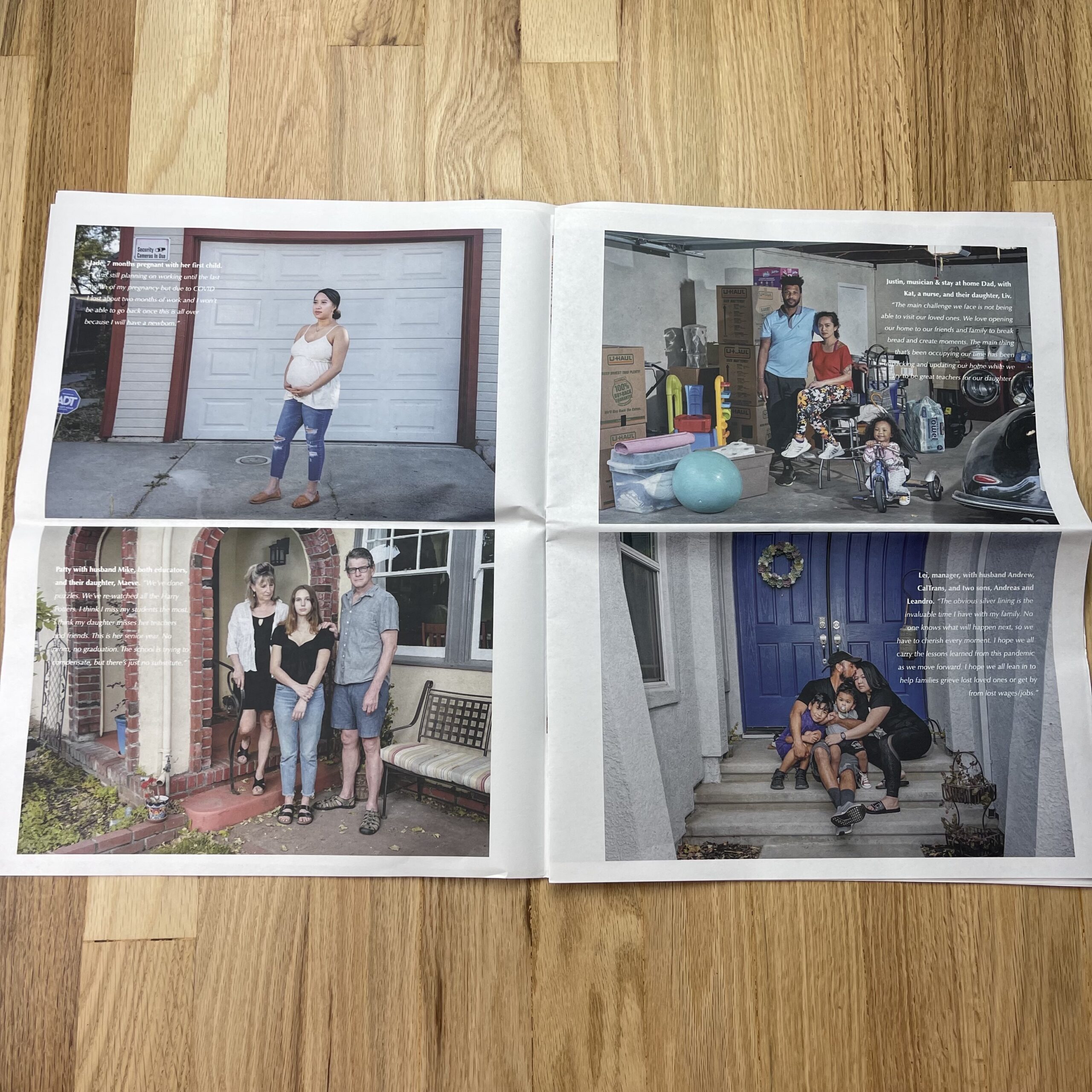
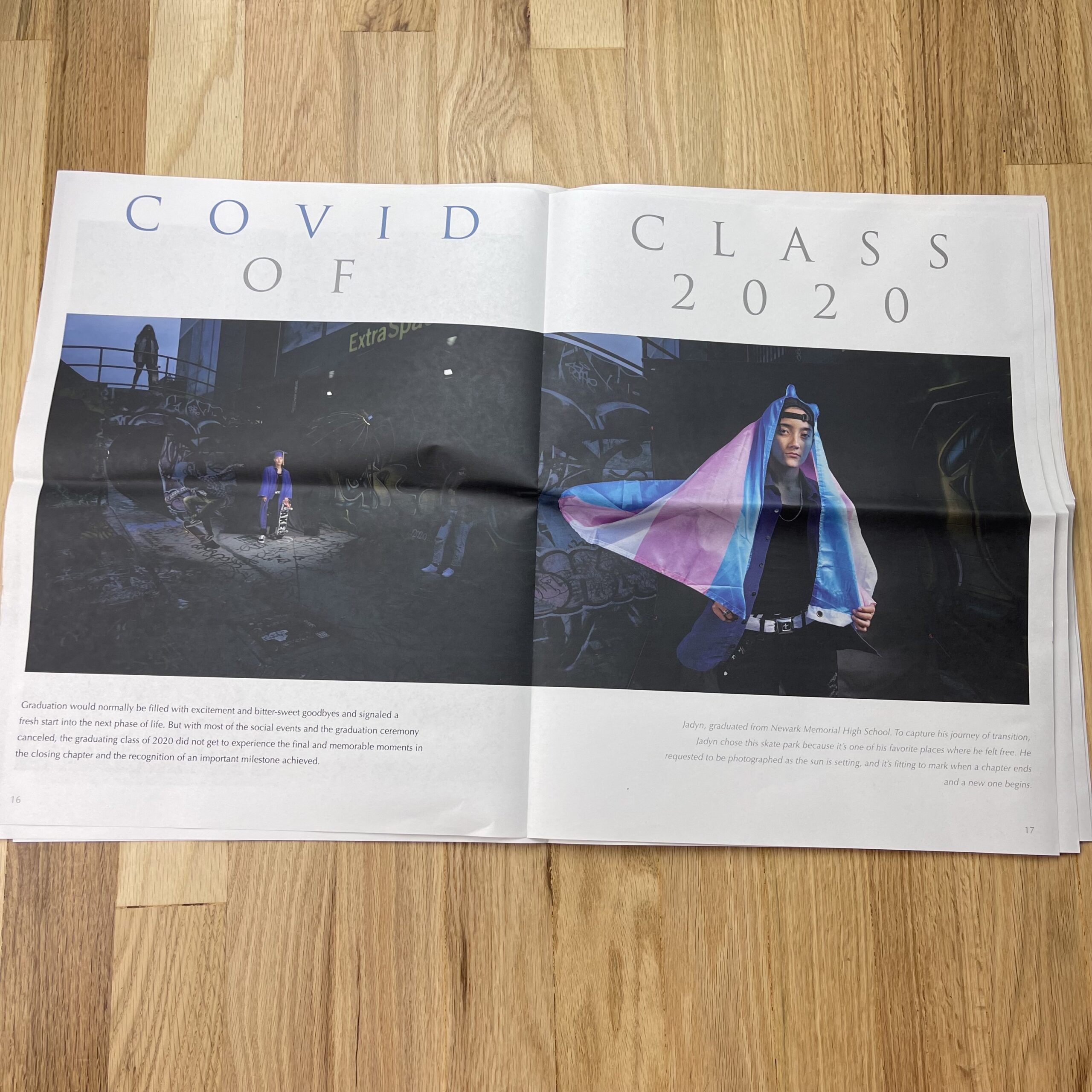
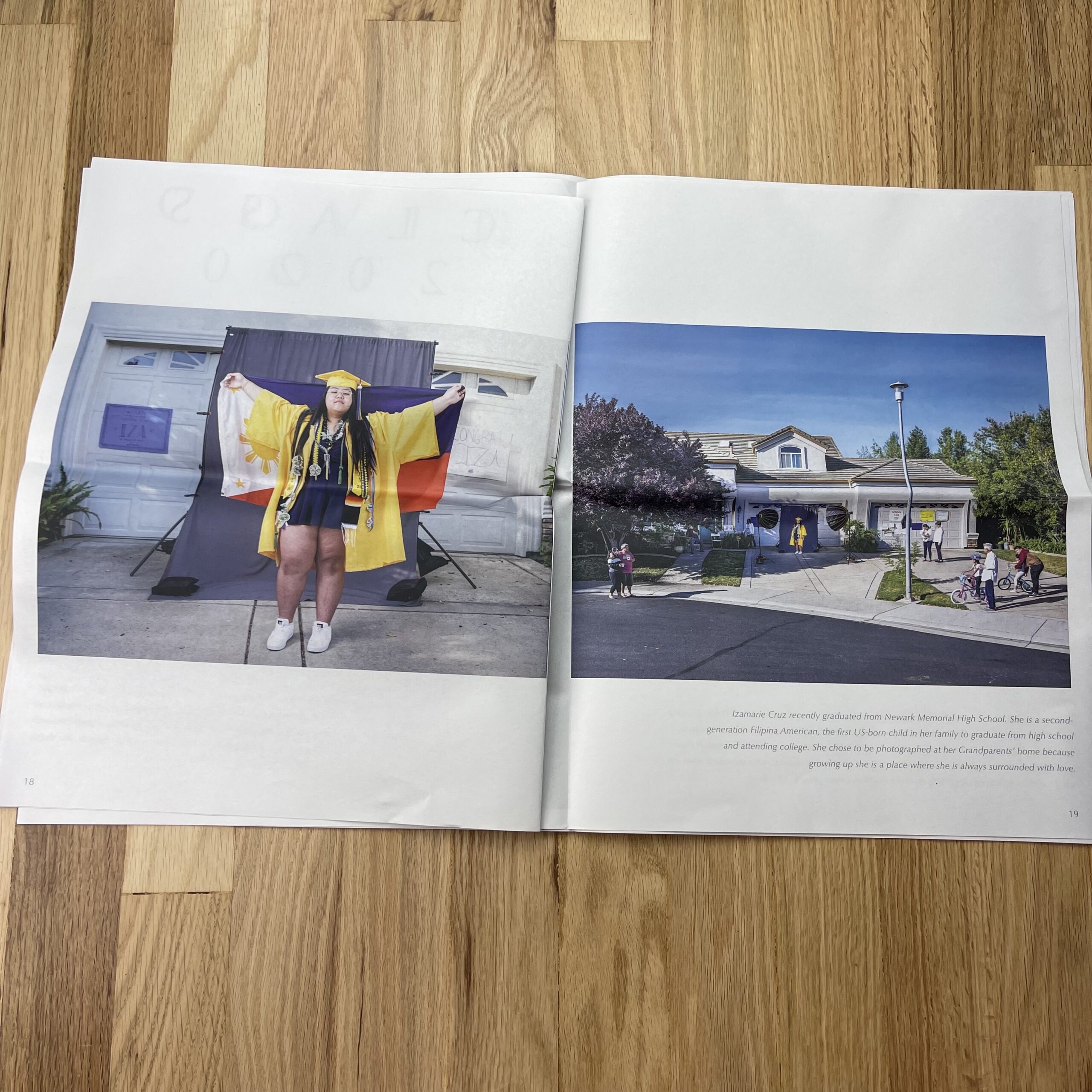
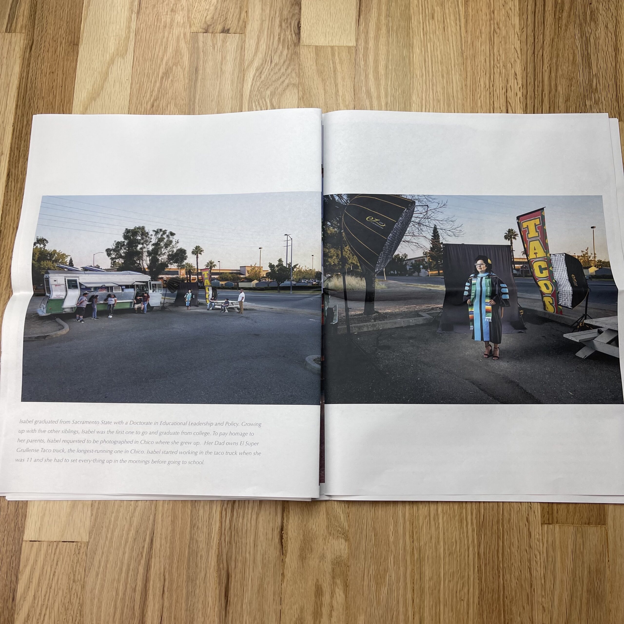
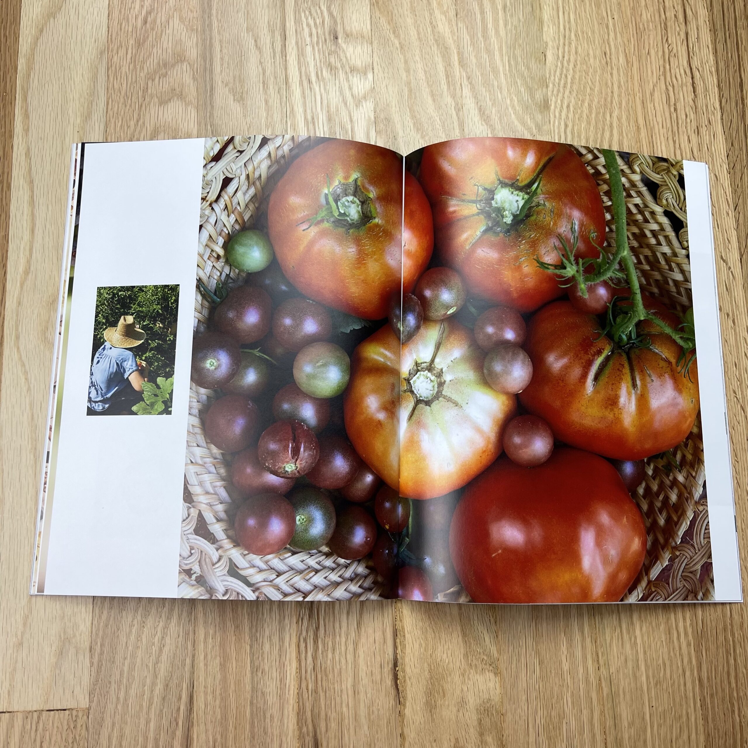
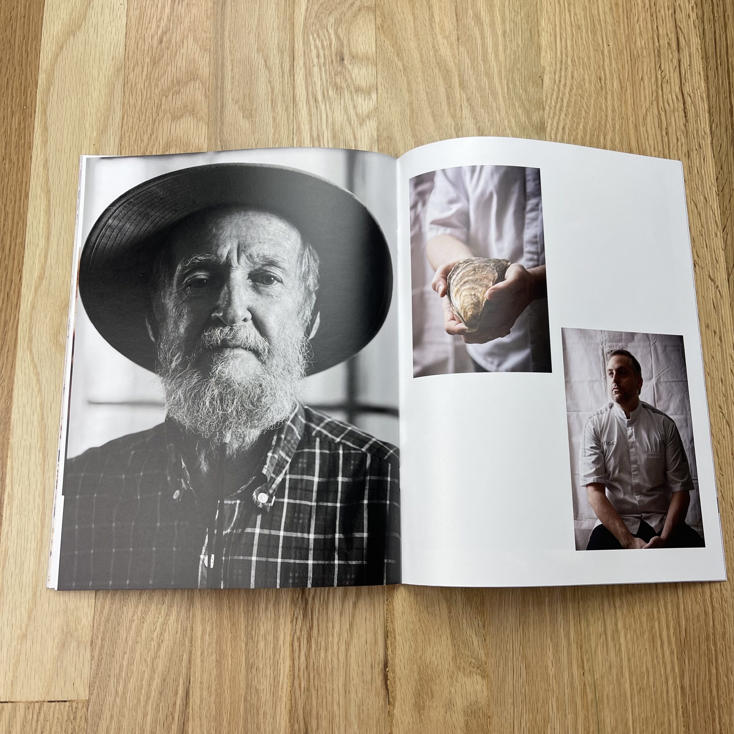
Most of my work is in a niche world of winter action sports. For this promo piece I wanted to choose a group of images that represented this work specifically. Throughout the series of cards I wanted a similar feel, to showcase my style, but also wanted each card to stand alone in case an individual card got passed along.

I tried to make a selection of images to showcase different styles of imagery to appeal to people either on the brand side who are interested in more product specific images, or on the editor side who might be more interested in the action. Some of this imagery was from commercial shoots, and others were shot on spec for editorial all within the previous two winters.

How many did you make?
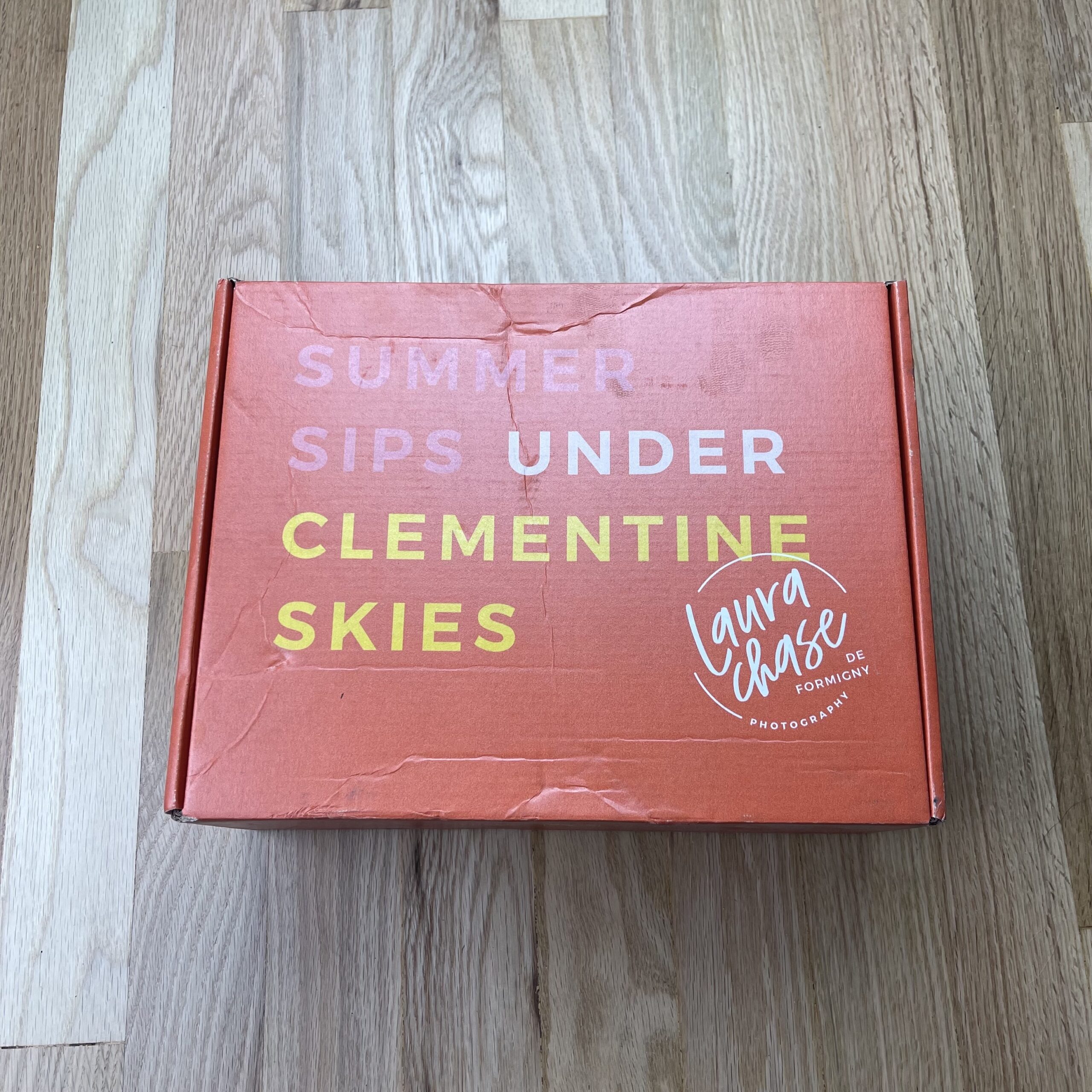
This specific promo piece was very targeted towards the winter action sports industry, so all in all I probably sent out about 50 pieces just prior to the winter. I have a more extensive list, but this includes people who are outside this specific space and I thought a card like this would miss the mark.

How many times a year do you send out promos?
I don’t have a specific schedule. I’ve usually sent them out once a year, but would like to bump it up to twice per year as lots of my work if very season specific so being just ahead of that time is relevant.

Do you think printed promos are effective for marketing your work?
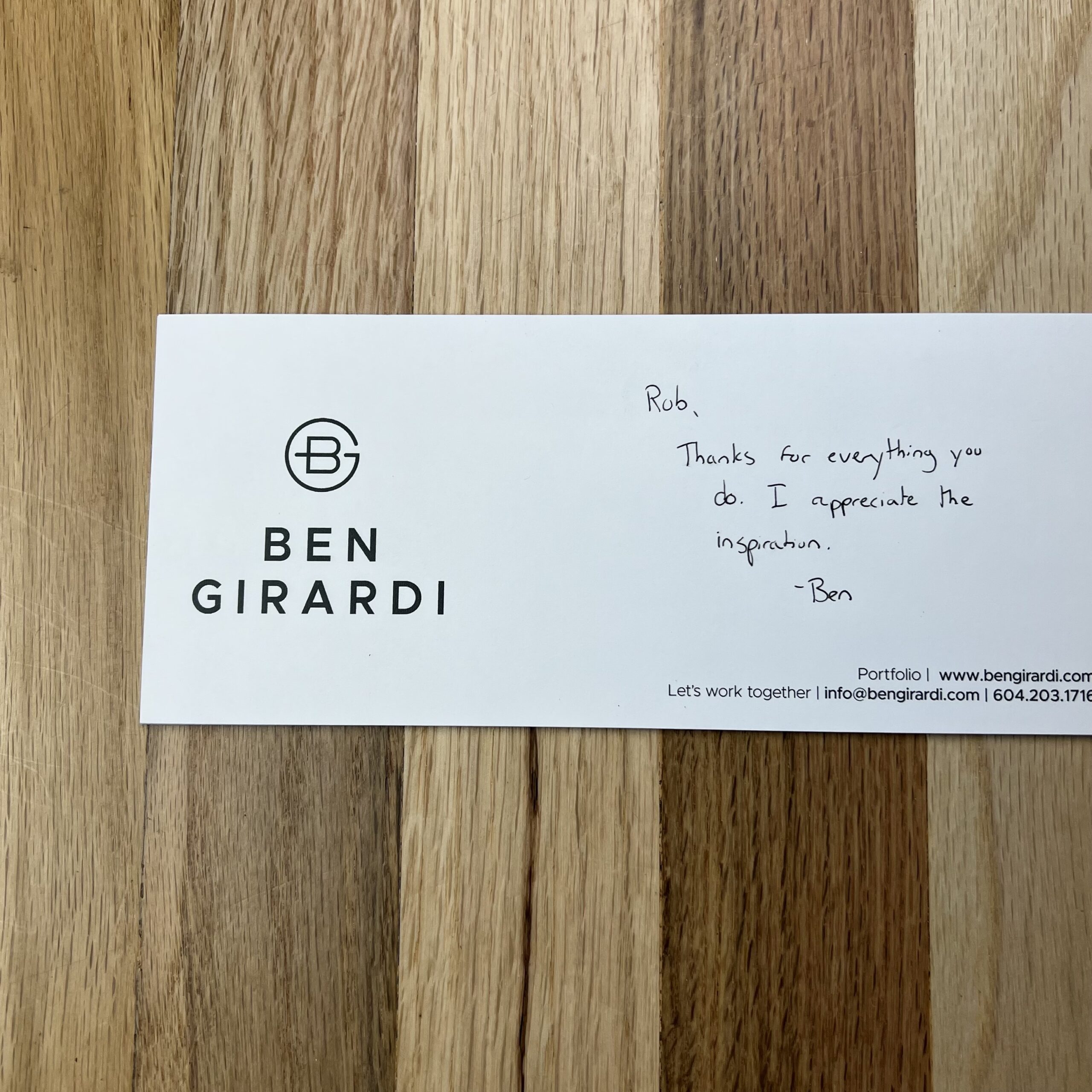
Overall I think the promo piece is an important part of my marketing. While it’s not a major effort in the digital age I think it is a great way to get in front of people that is different than just sending an email, or connecting via Instagram. I believe delivering something tangible is a good way to differentiate my work when many people are purely focused on digital marketing. I always send cards to people I have worked with in the past as I find it is a good way to stay relevant and remind them of your work, without expecting any obligation of a response such as you might get with an email.

With this specific promo piece I had a handful of people I knew reach out directly saying thanks for sending the card. For the effort put in I would call this a success as you know they thought about you, which means your top of mind next time something comes up.

With people I don’t know who I send cards to it’s a good non-invasive introduction to your work and when I do reach out in the future, they’ve ideally already seen my name at least once. That being said since it’s via the mail I didn’t have any confirmation that people actually received them. It’s quite possible that they never even make it to the desk of the intended person.

Featured Promo – Kyla Rys

Kyla Rys

Who printed it?
My promo cards are a little less conventional. I printed these promo cards on 8×10 Canson Inkjet paper and backed them with 5×7 postcard stock at my school computer labs for my Business for Photography course at the Savannah College of Art and Design. I then wrapped them in 5×7 clear envelopes I bought at an art store nearby.

Who designed it?
I created the design for the images in Adobe Indesign. I made three different variations of the promo card with different combinations of the two front photos.

Tell me about the images.
I took these cover images in my hometown of Frisco and Keystone, Colorado. Being surrounded by such vivid environments heavily influenced a lot of the nature and warm colors I include in all of my photo work. I had my friends help me style and model for these images as I wanted to play with fashion and landscapes. They are some of my favorites!

How many did you make?
Since I was hand making the cards, I only sent out ten. I plan to send out more with the rest of my paper as I look for post graduate jobs.

How many times a year do you send out promos?
I aim to send them out twice a year once I get a stronger body of work to send.

Do you think printed promos are effective for marketing your work?
I think promo cards are an effective marketing strategy if the client looks at the card. It is a great way to catch their eye in a space larger than a business card. I think emails and social media messages on instagram and linkedin are cheaper ways to catch some client’s attention however. Promo cards are a great tangible thing to share if you can afford it!

Featured Promo – Niki Cutchall

Niki Cutchall

Who printed it?
I printed the magazine through Blurb. Another photographer recommended them. After comparing their products to a few other companies, Blurb was my best option for the type of promo I created. They made it easy to start with an Adobe InDesign plugin, and I appreciated that I could order a single copy as a hard proof. I went with their magazine and upgraded to premium paper. The postcard was printed through Moo.

Who designed it?
I did! I don’t have a background in graphic design, but I felt confident that I could create something that made me proud. I started it in Adobe InDesign because Blurb had a template and plugin for the tool. My photography trends towards a more minimal, elegant style, and I wanted the magazine’s design to complement that. This was my first print promo, so I wore every hat on this project, from creative director and graphic designer to photographer and stylist. It pushed my creativity as a photographer and made me appreciate all the work that each function puts into a piece of content.

Tell me about the images.
This was my first print promo, and it started as an assignment in a small group fellowship run by Andrew Scrivani. I wanted to create something that felt like me and powerfully debut my work. As I was brainstorming ideas, I kept returning to an image I shot of brownie batter (the image on the postcard) and an idea I had to do a monochromatic series on brown food. It’s a color I love working with, and I knew I could capture it beautifully. Andrew encouraged me to run with the idea, and I took off with it.

I started by brainstorming a list of brown foods. I knew I wanted to include recipes and focus them around a meal. I ended up going with a breakfast, lunch, dinner theme because it gave me a good range of foods to choose from. The challenging part was identifying recipes that are naturally monochrome. I could have included some images of single ingredients to keep with the brown theme, but I wanted the challenge of photographing a final dish that was entirely brown. I decided on four recipes and a cocktail; then, I sketched out my shots. I planned each recipe to have one main hero image and 2-3 supporting photos. I shot and styled all the photos, specifically for the promo. As I was designing the magazine, I had some additional space that I didn’t plan for initially. The Kamikaze was a last-minute addition. It was shot for a different purpose, and it was a happy accident that it worked with the brown color palette.

I live outside of Philly, so I had to include a cheesesteak! Those photos are my favorite in the series. I love the composition, the lighting, and the texture; everything about them. They are an excellent example of bringing the idea in your head to life.

The hero image for each recipe includes a descriptive word or phrase. These are words I use to describe my style. I included them as a way to clearly express my strengths without being too lengthy or adding in additional text. I planned to include them initially, but I did not shoot specific recipes to match a particular description. I matched them up after everything was shot based on the strongest qualities in the photo.

Lastly, I like creating GIFs, and I wanted to include those because it’s part of my services. I planned a GIF for each recipe. Then I made a dedicated page for the series on my portfolio. I included a QR code on the back of the magazine that would take you to that page.

How many did you make?
I printed 85. I thought it was a good number for my first promo. Not so large that I would struggle to mail them out, but not so small that I would have a hard time choosing who gets one.

How many times a year do you send out promos?
This was my first promo, but I plan on sending them out at least twice a year. They won’t always be on this scale. The next one I have planned will be something simple, like a postcard.

Do you think printed promos are effective for marketing your work?
I think it’s too soon to tell. I think it’s a long game and part of a broader marketing strategy. I’m going to keep trying, see if it works, and reassess at a later time.

How can you tell what works and what doesn’t?
Food photography is a second career for me. I was a data analyst for several large corporations for ten years. I specialized in web analytics, looking at how clients are moving and interacting with the companies website. I use a lot of the same techniques in my photography business now. Collecting data can get overlooked, but I think it’s important to understand the health and growth of your business. From the beginning, I intended this promo to live across multiple channels. I knew I could track traffic to my portfolio from social and email, but I was a little disappointed that I couldn’t follow it from the print version. It would be nice to know if the print promo drove traffic to my site. Then I realized the QR code I included on the back serves as that tracker. I created a unique URL called a UTM tracking URL. It’s a URL with additional parameters at the end where I could specify that this link came directly from my printed promo. I embedded the UTM tracking URL into my QR code. Anytime someone with the print promo scans the QR code, I see a marketing channel called “print” come through in my Google Analytics. This only works if the recipients scan the QR code, but regardless, it’s better than not tracking interactions with the promo at all.

Featured Promo – David Zickl

David Zickl

Who printed it?
Rebekah Smithson at My Clear Story
https://myclearstory.com/
rsmithson@myclearstory.com
(858) 526.3600

Who designed it?
Richard Haynie : he’s designed a few books for me over the years.
http://www.hayniedesign.com/
(480) 734-4371

I think it’s important to note that 50 year Grand Canyon veteran guide, author, boat builder and Grand Canyon historian Brad Dimock contributed the opening. He’s story teller and gives great interviews.
https://fretwaterboatworks.com/
(928) 853-2007

Tell me about your promo.
I’ve been working on this project for 8 seasons in the Grand Canyon. I didn’t plan on it. It just sort of evolved once I discovered that I could hold on, stay in the boat and shoot the drama of these veteran rowing in the biggest whitewater in North America. I’ve been perfectIng the equipment and my technique on each trip.

These days I use a Sony A7 R III with an Aquatech Housing.

Most rapids have 8 to 15 seconds of high drama and I typically shoot 50 to 150 frames looking for one moment. Serendipity and making my own luck play a key role in the outcome.

I spend a whole day with one guide going through a number of rapids just trying to get one image of them.

Now many of the guides I’ve photographed have become friends and they support my project by giving me opportunities. I typically do 1 to 3 trips per season. I usually drop everything when someone calls me to be an assistant on a Grand Canyon River trip.

How many times a year do you send out promos?
One promo distributed throughout the year as needed.

Do you think printed promos are effective for marketing your work?
Yes but I can’t tell from this particular promo. It has generated awareness but not any tangible jobs.

Featured Promo – Erica Allen

Erica Allen

Who printed it?
Mixam, a friend of mine printed a mini portfolio with them a couple years ago and I really liked quality.

Who designed it?
A friend and mentor helped me decide the sequential order of photos, and I designed the layout in Adobe InDesign. I have a BFA in photography, but earned a minor in graphic design. I am no expert, but I can design simple things here and there 🙂

Tell me about the images.
The images were from various shoots over the past year or so. Many, but not all, were from test shoots. I love the freedom that testing brings and really enjoy collaborating with other creatives in my field to make our personal visions come to life. I work with prop stylists and food stylists on all of my test shoots and believe the final images are very much part of a team effort. I wanted the images in this booklet to tell a story, not just showcase pretty settings. Story telling through food is so interesting to me. Seeing the farm where it’s grown, to the chef turning into something delicious, to the final product, to the table scene where it’s being enjoyed, to the final crumbs of the last piece of pie is thrilling.

How many did you make?
I printed 100 copies.

How many times a year do you send out promos?
My goal is to send printed promos twice per year and email promos four times per year.

Do you think printed promos are effective for marketing your work?
I do. I acknowledge we are moving faster and faster into a digital world where printed marketing materials and printed works in general are growing obsolete. This saddens me because I appreciate the tangible. I love feeling the coating of the paper, flipping the pages, looking at it in different light, appreciating the way different types of paper accept ink, etc. I believe there are still creatives in the industry who feel the same way, and these are the people I hope receive my promos. Printed cookbooks and printed magazines such as Martha Stewart Living, Better Homes & Gardens, Food & Wine, and Cooking Light are dream clients of mine. I want the promos I send to resemble the type of work I’d like to shoot, in the format that it would be seen.

Featured Promo – Laura Chase de Formigny

Laura Chase de Formigny

Who printed it?
The postcards were printed by Moo and the box was printed by Packlane.

Who designed it?
Nicole A. Yang designed the postcards and the box. She did my logo and branding several years ago, so I knew she’d be able to keep things on-brand for me. She’s fabulous and so professional. I’ve already booked her again for my next promo and I don’t even know what I’m shooting yet! I just know that it won’t shine as bring without Nicole’s keen design sense, so I made sure to get on her calendar early!

I creative directed what I wanted the box to look like. I knew I wanted an orange box so that it would be eye-catching, but also evoke the clementine vibe right off the bat. I picked out products to include in the box that was part of the custom cocktail recipe James Beard Award winning cocktail writer M. Carrie Allan created for the project. It was a no-brainer to include the Clementina San Pellegrino, but I did a lot of research on tea before I settled on Tea Forte to include in the promo. Their packaging is so beautiful and also I appreciated the individual packaging of tea bags during covid times. And of course, the tea is delicious and made the promo box smell wonderful!

Tell me about the photos:
I spent an enormous amount of time researching and conceiving my shot list. I also used this time to really hone in on what kind of lighting I wanted to cast. I’m often lighting things based on what my client’s needs are, but this was a chance to define what I want my photographic voice to look like. I settled on the word “punchy” to evoke the kind of lighting and mood I wanted the photos to give off. To me, punchy photos have crisp shadows, vibrant colors, and plenty of fill. The light is contrasty, but not necessarily high key. It also means that every little detail matters because sometimes it’s the littlest thing that makes a photo pop.

I wanted to show clients that I can produce food lifestyle work and produce it at a high level. I felt like my portfolio had been missing the lifestyle side of food work, so I wanted to send out a promo with images showing I can do the lifestyle side of cookbooks, in addition to just food and beverage. Readers connect to cookbook authors through lifestyle imagery in their cookbooks and on social media. These lifestyle moments are critical to set the tone of an author’s book and overall brand. I couldn’t be more proud of how these images turned out.

We photographed 10 sets and Photo Editor Stacy Swiderski chose 8 images for the final edit. Every set was photographed with the cocktail in both an elegant cocktail glass and in the custom Laura Chase de Formigny Photography Tervis Tumbler I had made and included in the promo box. It definitely took extra time to shoot everything twice, but I’m glad we did! I ended up not publishing any of the images with the tumbler because the edit looks so much more elevated shot with the beautiful glassware prop stylist Giulietta Pinna selected.

I ordered 65 boxes and 60 Tervis Tumblers. I wanted room for error if boxes got returned, which is why I ordered a few extra. I ended up mailing 50 promos in total. It was a difficult undertaking because of covid. Since most of the country was working from home at the time, I had to pre-email everyone on my list and ask if they felt comfortable sharing a personal address that I could mail the promo to. This is my first promo ever, so very few of these people knew who I was! I did end up sending several boxes to office addresses with the hope that one day the recipient will return to their desk and find a lovely surprise. This also happens to be the biggest reason I did not include perishable items, like a clementine, in the promo box. That would be a very unhappy package to come back to after months or even years away from the office!

As I mentioned, this was my first promo. Go big or go home, right?! I’m planning to continue doing print promos biannually. Definitely nothing to the scale of Clementine Skies, just a postcard a couple of times a year. I just thought I’d kick off my marketing with a bang!

I’m honestly not sure if print promos are effective marketing anymore. What I do know is that most creatives have a bulletin board of inspiration and I want my photo to be on it, so all I can do is try, right?

This project was conceived while I was pregnant with my daughter, Frances Clémentine. I executed the project only a few months after her birth because I want creatives to know that there are badass female commercial photographers out there producing exceptional work while balancing a family. I want my kids to watch me chase my dreams so that someday they do the same. More on this in the behind-the-scenes video on my website.

I was very clear with the recipe writer that I wanted the recipe to be non-alcoholic. I wanted the drink to be family-friendly and accessible to all recipients. You never know what someone else is going through, so I didn’t want to send somebody an alcoholic recipe if that could be potentially triggering for them. Also, since the inspiration for this project was a baby, it just seemed more appropriate to keep it kid-friendly.

I was very, very detail-oriented while sourcing for this promo. I color matched the model’s nail polish and lipstick to my business card. I also bought a real, live clementine tree to have on set to cast shadows in the background of one of the images. I wanted everything to feel super authentic so I didn’t cut any corners and I’m glad I didn’t! Food stylist Nichole Bryant ended up using some of the leaves from the clementine tree by gluing them to actual clementines on set! Chance favors the prepared, indeed.

Credits
Photographer, Director, Creative Director⁠⁠: Laura Chase de Formigny
First Assistant: Matthew Dandy
First Camera Assistant: Alex Papalitskas
Prop Stylist and Art Director⁠⁠: Giulietta Pinna, Limonata Creative
Food Stylist: Nichole Bryantt
Videographer: Jimell Greene
Hair and Makeup: Kim Reyes
Wardrobe Stylist: Alyssa Sadler
Recipe Development: Carrie Allan
Photo Editing: Stacy Swiderski

Featured Promo – Sol Neelman

Sol Neelman

Tell me about the promo you sent me. I had assumed it was something CLIF Bar made as a promo of their own.

The last big print campaign I worked on before the pandemic featured soccer superstar Megan Rapinoe for CLIF Bar. Fresh off the Women’s World Cup title, Megan was to be one of a handful of CLIF-sponsored athletes promoted internationally ahead of the 2020 Summer Olympics.

While the last-second logistics was a little nuts, my art direction was pretty straight forward: take photos of Megan kicking a soccer ball. Megan was great to work with, client was really happy with selects and we wrapped up early. It was a good day. To me, the best part of the entire experience was collaborating with fun and talented creative directors and photographers I also consider close friends.

I don’t know who remembers REGGIE! candy bars, but I was stoked to learn my photo of Megan would be inspiration for a limited edition CLIF wrapper. Pretty surreal and fun. When the bars launched in early March 2020, I was excited to share what I had been a part of. Then the pandemic hit, and the print spots were held back with the Olympics on hold.

With the Summer Games officially back on, now for 2021, I was finally able to share the entire ad campaign. I had been noodling on soccer-themed promos, something that an art buyer would use/keep/share. I like producing fun promos that are unique and hard to toss. I kept coming back to customizing a miniature foosball table.

The problem, of course, was that no one was working in an office, let alone having in-person meetings. No point in spending a ton of money on a full promo campaign. But you, Rob, have a very large social media presence (44k followers on Instagram and 133k on Twitter). Many of the clients and photo agents I was hoping to reach follow you. So I decided to invest in a single, one-off foosball table and send it your way.

Despite what some might think, the entire promo wasn’t really that expensive – or that large. The 27” travel-size table was about $40 on Amazon, plus a few bucks for modeling paint, adhesive spray and a print of the ad. The s/h was the most expensive part, but again, I only had to ship one. I tossed in a couple double-sided tickets with my contact info and a fresh box of Megan’s CLIF bars.

For the record, I don’t think promos need to be expensive. Almost all of mine involve plenty of cheap DIY crafting. I do think promos need to be worth the time and effort of producing and delivering them. And I think they need to properly represent your work and personality. My brand is literally fun and games, so a kid-sized foosball table totally worked for me. This is really a continuation of what I’ve created in the past, like with my custom Weird Sports trading cards.

I’m not going to lie: I wasn’t sure whether to warn you or not about a massive box landing on your front doorstep, Rob. But I also wanted it to be a surprise. Love that you originally thought it was a CLIF-produced promotional gift, instead of something hand-painted and assembled on a dining room table in Portland. Pretty flattering. Thanks, Rob. I appreciate you for sharing my work.

Featured Promo – Dave Creaney

Dave Creaney

Who printed it?
It was printed at a small web press operation in Marble Falls, Texas. (about an hour outside of Austin) Their website and contact seem to be gone, I fear they didn’t make it through the pandemic.

Who designed it?
I designed it in photoshop myself but had a friend give me a hand getting it properly laid out in InDesign and press-ready.

Tell me about the images.
The subjects are all types of folks from in and around Austin. The cover shot is actually a judge out in Bastrop county, the Honorable Charles Carver. He and I worked in kitchens together years ago; one time he chipped my tooth with a microphone during a duet version of ‘My Way’ at karaoke. There are musicians, chefs, tattoo artists: weirdos, and friends of mine. I hand-painted the backdrop in my friend’s driveway and tried to light them all more or less the same.

How many did you make?
Since they were done on a web press, most of the cost was in setup fees. When the owner of the print shop called to quote me for 500 copies, he said the cost for 1000 would be practically the same. So naturally, I went with 1000. I still have a lot to give out though!

How many times a year do you send out promos?
I’m still pretty new to the marketing game. I’ve sent out a handful of postcard-type mailers with different designs before these newsprint ones.

Do you think printed promos are effective for marketing your work?
People are usually very responsive to these if I put one into their hands. It’s hard to judge the mailed versions though. I love printed materials regardless. That’s what’s especially great about these in my opinion – I really don’t have to be precious with them. I leave them in bars and coffee shops and put them into anyone’s hand that will stop long enough to let me.

Featured Promo – Emily Brooke Sandor

Emily Brooke Sandor

Who printed it?
I chose Mixam.com to print the Saffron cookbook. I first learned about Mixam from reading aphotoeditor.com, so here we are, full circle! Mixam has great customer service and I’ve been very happy with their print quality.

Who designed it?
My boyfriend an illustrator/graphic designer, Daniel Peacock, and I designed the Saffron cookbook together using InDesign. I knew that I wanted the Saffron cookbook to be a blend of my travel and food photography and designing the layout flowed easily – starting with a brief written intro, a short history of saffron, tips on how to use and store it, followed by twelve recipes featuring saffron, and finishing with a photo story of the annual saffron harvest in Krokos, Kozani, in northern Greece. I also collaborated with Greek-American chef, Christina Xenos, who co-authored this project and developed the recipes for the cookbook.

Saffron crocus flowers bloom for three weeks, only once a year. Every aspect of the saffron harvest is done by hand – picking and gathering thousands of flowers each day, separating the red saffron stigmas from the rest of the flower, and skillfully drying and packaging the spice. I wanted the Saffron cookbook to reflect this level of care, too. So, I wrap each book, add a handmade stamp of a crocus flower on the front, tie the book with red twine in a way that’s meant to mimic the red saffron stigmas, and include a handwritten note.

Tell me about the images.
There are a few categories of photos:

A photo of the saffron that I grew at home and a bowl of saffron corms were taken with my iPhone.

The recipe photos were shot over three days with prop stylist, Robin Turk. I used natural light, a diffusion panel, and several reflectors. I shot everything on the Canon 5D Mark II with the 100mm lens.

Daniel and I traveled to Krokos, in the town of Kozani, to document the annual harvest over ten days. I shot stills and Daniel shot video. We met many wonderful people we are still in touch with via social media. As a thank you, I sent 20 Saffron cookbooks to Greece to the folks who allowed us to photograph them. The majority of our shooting time was photographing outside, in the saffron fields – mostly of the saffron flowers being picked, and shooting various portraits of the harvesters. We spent one morning photographing the dried saffron as it was being weighed and packaged at the Kozani Saffron Producers Cooperative. That evening, we documented the saffron sorting process. At one point, it was good to put the cameras down and join the women sorting the saffron.

While out shooting in the saffron fields one day, it occurred to me that I would really like to get a shot of a single saffron crocus flower on a black background. It was windy and hot outside, so I sat inside the rental car and photographed a single flower on my lap (I was wearing black pants). When we returned home, Daniel retouched the shot and it became the cover of the cookbook.

How many did you make?
I’ve printed 350 Saffron cookbooks so far. I’ve been sending them out to clients, family, and friends. I’m also selling the cookbook, along with a few prints from the saffron project, in my Etsy shop, Xploria. www.etsy.com/shop/xploria

How many times a year do you send out promos?
I usually send out promos twice a year – but with a big project like Saffron, I think it’s going to be my only promo for a little while.

Do you think printed promos are effective for marketing your work?
Yes, definitely. There’s something wonderful about sharing a printed promo/book with someone who understands and resonates with the work.

Where did you get the idea for the project?
It’s amazing to me that a big project can start from such a small question: what is saffron?

Before this project, I didn’t know much about how to use saffron beyond a few recipes, so my little jar of saffron sat mostly on the shelf, unused. I knew saffron was pricey but wasn’t exactly sure why. I was cautious about using the precious red threads in a casual way and unsure of what to make with them. This spice held a lot of mystery.

My journey with saffron started because I was looking for something new and interesting to grow in my Los Angeles home garden. Then I got a job opportunity to photograph in Bulgaria and Crete and decided to extend the trip to photograph the saffron harvest in Greece. The only catch was that I had to wait a month for the saffron harvest to begin!

One of the best pieces of advice that I ever got from art school came from the late photographer, James Fee. I had asked him how he mentally/innerly prepared himself for a photoshoot. He responded, “Don’t be afraid to shoot on the way to the shoot.”

So, in preparation for the saffron harvest shoot, and because we had plenty of time to explore, Daniel and I did some photo/video mini-stories together: an organic olive mill on Crete, the cultivation of citron on Naxos, and the production of Kitron (a special liqueur made only on Naxos), and a family farm growing Greek mountain tea.

I want the Saffron cookbook to inspire others not only to understand and appreciate what saffron is but also to give some practical, easy ways to enjoy this beautiful spice – to demystify it a bit. Simply put a few saffron threads in warm water, add some honey, and, ta-da! saffron tea. Full of health benefits and tasty, too.

Chef Christina, Daniel, and I put together a video presentation of the saffron cookbook: https://www.youtube.com/watch?v=p9ToGVUkKcM Christina demonstrates how to make a few recipes and there’s a video of the saffron harvest that Daniel and I created.

Featured Promo – Kaitlin Parry

Kaitlin Parry

Who printed it?
mixam.com

Who designed it?
I designed the poster, book, and postcards. I wanted the poster and the book to have a very early 90’s NYC art feel when you would get posters in the Voice, and artists would hand out their work in cards and books. I am from New York, and its artistic history has really influenced me.

Tell me about the images.
The book and poster represent the spark that made me want to be a fully professional photographer. Two of the cards are images from West Texas, I really enjoy traveling and these images never really have a place to live. The third image is a product shoot I did for the Company Palms.

How many did you make?
I made 100 books, I have friends asking me for more so I am thinking of printing more! I made 100 posters and 100 of each postcard. When I run through them, I make more as I use them as a business card.

How many times a year do you send out promos?
I am continually making digital promos. Some of my first internships for photographers involved running around New York handing out their promos to various clients and editors. I am continuously making promos, but sending them out to a client list becomes less frequent. Quarantine afforded me a lot of time.

Do you think printed promos are effective for marketing your work?
I am not sure. I have had clients reach out to me years after I had sent them a promo. I would say for every 25 promos I send I hear from one person. The book was a bit different as I sent it more to work friends as opposed to a traditional marketing campaign. I find that handing out cards to people has a greater impact than a standard business card. I find it is a good way to continuously foster relationships with various clients.

Featured Promo – Jeff Kobberdahl

Jeff Kobberdahl

Who printed it?
After considering Modern Postcard, I ended up going with Moo because I had printed my business cards with them and was curious about their offset print quality. The images turned out well with the exception of some subtle color banding on one of the black and white images. Moo provides specific file output instructions to ensure color accuracy and use an online previsualization tool that’s helpful for the bleed/crop.

Who designed it?
Initially I asked a couple of graphic designer friends for help, but I was going to have to wait for their schedules to clear and so decided to do the simple type design myself. I picked a couple of fonts I thought would work well and simply laid it out in PS. Next time I’d like to do more with design.

Tell me about the images.
I chose a mix of editorial and commercial portraiture and decided on five images:

The first image in the set is from a shoot with LA actress/model Chelsea Debo. (Otto, Eris Talent) She was amazing to work with – very relaxed and generous with her time. The vintage wardrobe for the shoot was sourced from Casablanca Vintage by co-owner Mx. Ashley Baeufille Cook, and Chelsea styled one look with her own clothes. Actually, I think it was her brother’s Motorhead t-shirt. I gave Chelsea the wardrobe after the shoot and we finished by eating pancakes at a Waffle House. Chelsea recently landed her first leading role in a feature film!

The second image of good friend Courtney Dozier (formerly Next MIA, New View) was from a shoot at my former loft studio space. Courtney had brought a pair of white, knitted beach pants by Andi Bagus, and she was so tan at the time that they were a great, contrasty look on her.

The third image was from an editorial shoot for YogaOutlet featuring Erica Miramontes (Wilhelmina) at the Cincinnati Ballet, styled by Jessica Rathbun and assisted by Robert White and Aly Schneider. When I asked Erica’s agent how experienced she was with yoga from 1-10 she unhesitatingly answered “a 10”. She was a joy to work with for the entire team.

The forth image was shot for a story about entrepreneur and owner of Black Owned Clothing and Black Coffee, Means Cameron, for Polly Magazine. Polly Magazine’s Editor and Creative Director Deogracias Lerma assisted with styling by Camille Bacon. An image by talented Brooklyn-based photographer Billy Kidd served as lighting inspiration for this shot.

The fifth image in the set features model Emma Karle (The Rock Agency, New View) who I immediately wanted to put in menswear. Luckily for us Philipe Haas Bespoke Tailoring provided us with a beautiful suit that fit her perfectly.

How many did you make?
I printed 50 sets of 5 for a total of 250 cards. I sent the full sets out to Art Directors and Creative Directors, and to creative agencies who represent photographers. I was reluctant at first to send this set to the photo agencies because they’re not the most produced images in terms of editorial, but then went ahead anyway with the thought that it would help to build name/brand recognition. Some of these agencies included LundLund (Stockholm), Artsphere (Paris) and East (NYC).

How many times a year do you send out promos?
Biannually.

Do you think printed promos are effective for marketing your work?
I have always loved printed work and postcards especially. There’s a physicality and a ‘boots-on-the-ground’ quality to printed media that I think is still appealing. You have to have your brand represented digitally on multiple platforms, but there’s definitely still a place for print.

Featured Promo – Diggy Lloyd

Diggy Lloyd

Who printed it?
I worked with Mary at Printing Center USA – super fast, responsive, and I like to print in the US when possible.

Who designed it?
Along with my commercial photography business, I also have a branding and design company called Ristra Studio, and /Ristra Studio I have designed most of my promos and printed matter, which I love!

Tell me about the images.
Free Association is a zine series I started producing in 2012. This series of images is influenced by a course I took from Charles Harbutt, an incredible documentary photographer. The course was called “Instinct and Metaphor”. He asked us to allow the camera to become an extension of ourselves, and to speak through its lens. Through his teachings I was able to understand my instinctive reflex, a millisecond decision to shoot an image. Then the next question came – well, why would I want to take that picture? We had to make the connection as to why instinctually we shot that image, and what metaphor we believed appeared in that image. We had to do this for every image we hung in critique. Ten years later, this is still an exercise I do regularly. Free Association, and each of its volumes are a direct result of this exercise. The story I compose through Free Association will be different from the story you compose. The metaphors I see will be different from what you see, and that is the magic of photography. The images in Volume IV were mostly shot in and around Taos, New Mexico and showcase my love for this sacred land. Juxtaposed next to these images are self-portraits, family portraits, and musings from everyday life.

How many did you make?
With Free Association each volume prints around 100 copies, which I leave as open editions. For my commercial photography promos – they run around 1500-2000 copies.

How many times a year do you send out promos?
Now, I do at least one volume of Free Association every year, and around 12-18 months I do a commercial photography promo.

Do you think printed promos are effective for marketing your work?
Absolutely! I think as a photographer, it is so important to create printed matter. Oftentimes we are working so much in the digital space, we forgot how impactful and powerful print can be. I enjoy sending this out to previous/potential clients and I also sell them in my print shop – ristrastudio.com/shop

Featured Promo – David Butler

David Butler

In the past, I’ve rarely sent print promos (tho I always wanted to create a nice one), and I mostly relied on online marketing, sourcebooks (At-Edge, Archive Magazine, Workbook, etc), and face to face portfolios showings for sharing my work. However, as soon as 2020 hit and everything began to lock down I figured it was a great opportunity to channel my energy into a nicely designed promo… something I have always wanted to do, but never made it a priority.

Last spring, I connected with an Art Director & Graphic Designer friend of mine named Ryan Frease that I had previously worked with on some campaigns (some actually in the fold out case study), and learned he was in between gigs and had some extra time on his schedule. The timing lined up for both of us, and we were off and running. I threw out a bunch of ideas, and he heard them all and really helped channel them all into one cohesive and branded message.

My main goals with this promo were to:

  • Communicate quickly the type of work that I specialize in, and leave an impression.
  • Create multi-tiered items; something you can keep and perhaps pin on your office wall (fold-out case study promo or postcard), something designer related and practical that you can use on a daily basis (wine key, or pencil + notebook), and something of good print quality that shows an overview of my portfolio. I realize Agency folks get a lot of promos, so I wanted to create something that would at least get passed around, as opposed to tossed.
  • As a product photographer, I work with a lot of designers. So, I wanted the packaging to be note-worthy, and something that would demonstrate my appreciation and passion for good well thought out design. Ryan really brought a deeper layer of design to this promo in a few areas. Particularly in the way, he designed the folding case study to line up perfectly with the portfolio book cover as the copy reads “Make Visible” while revealing the splash image from monochrome to color. These details go a long way with me.
  • I really wanted to show the human connection element, especially in a time where we are over-saturated with content and DMs… As of now, I only printed 250 promos. I am only sending out a few at a time, so I can track who they are going to, and I can follow up. I am intentionally and personally sending each promo to creatives I would love to work with. Each box contains a personalized handwritten note, and my hope is that it shows that I am at least aware of who I am sending these to, and it contains that human element that I feel is missing in other forms of digital marketing.

The images in the fold-out case study represent almost 3 years of work created for the brand Drinkworks They are a pod-based at-home cocktail brand, created by Keurig and Anheuser-Busch. Prior to Drinkwork’s launch up until now, I have been collaborating with a Boston-based design agency Motiv Design on bringing to life an entire portfolio of cocktail images that are designed to be used on their packaging designs as well online and print marketing. I felt this was a great case study since we captured such a brand range of beverage photography, from conceptual to just beautifully simple and graphic.

After designing and printing everything, the next hurdle was acquiring addresses for folks I was trying to reach… given that everyone was working from home, the agency address wasn’t going to work. So, for the better half of a year, I sat on these promos, and have just been sending them out over the past few months. The feedback has been mostly quiet, however, there are some cases where I have gotten some great responses as well as some creatives that have passed my work along to colleges along with some incredibly kind words, so that is very encouraging!

As far as who printed these, I actually went through a few vendors recommended to me by Ryan, and I am really pleased with each piece.

Branded Box: https://packlane.com/products/mailer-box
Portfolio Booklet: www.Mixam.com
Fold out case study: https://fireballprinting.com
Branded note card: https://www.jakprints.com/postcards.html
Branded notebook: https://www.jakprints.com/notebooks.html
5”x7” double sided post card: https://www.modernpostcard.com/printing/flat-cards/postcards/deluxe-postcard
Shipping Labels: https://www.jakprints.com/roll-stickers.html

Featured Promo – David Strongman


http://www.davidstrongman.com

http://designreflektor.com

Tell me about your promo.

This was my first real promo piece having been a working photographer since 2001 – crazy I know. But as a photographer living in Vancouver we’re a small community, and work is word of mouth in this provincial town. That being said I think the practice of mailing out promos is under appreciated and is another asset that the right editor will appreciate. It’s really your opportunity to put together work in a meaningful way, on chosen print stock, with design intent, that provides an editor the sensorial cues about the person they’re about to hire … without having ever met them before. It invites a mutual relationship of trust. This is the blessing and curse of our industry these days. You just don’t get that kind of connection with the disposable Instagram-one-hit-wonder post that is so prevalent in our swipe right culture these days. So this is why I sent you my 2lb mailer. Here’s how it all began ….

I knew it was time to do something with the images I’d been commissioned to create over the last few years. Do I send out a mailer with a selection of images to tell an editor a story? Ok what images do I send? What do they mean? How do I present them? How many should I deliver? Am I over thinking this whole process. Well… yes and No.

I called Jaden Critchlow – @jac_illustration and the two of us got to work on creating a visual brand package. Jaden was a third year student at the design program at Capilano University in Vancouver (he’s now in Berlin … good move). He’s also my cousin so I was able to hold him hostage while we took 3 months to get these books completed. It was great to have a designer at the desk beside you who was skilled at the technical details of layout and design. Great for me, but I suspect an exercise in futility for Jaden because I was wielding executive control over the image selection and layout. I eventually stepped down from my lofty perch realizing he was full of great ideas and that we worked better as collaborators.

We ended up printing a few thousand 4×6 prints for the initial edit covering the main floor of my house, and we began laying out the shots according to whatever arcane and esoteric principles we could BS each other with. It’s amazing what you see when your floor is completely covered in photographs. Colours, shapes, themes, stories, light. The limitations of a computer monitor were quickly realized when we made visual / narrative connections with a room full of photographs that never would have been made on a tiny screen. This is really where the magic happened. When we had our final edit we realized that we were sitting on over 450 images. I stubbornly said let’s print them all. He agreed because again … he was family and couldn’t say no.

After the wide edit we then started the layout for two separate books. One focused on Editorial images – people and places. And the other on Interior images – something looser than pure architecture. I kept the two separate because it’s pretty rare that the interiors guys are also people shooters. One job is total silence, the other requires people skills. And people hiring for one often don’t consider you for the other. It made sense to kept the two brands separated.

After month of back and forth we had agreed on a layout for both books. I had a few ideas for a cover that Jaden worked up and we then dove into the print world. I initially went to an offset press house and was quoted about $15,000 for a print run of 100 of the books. Kinda out of budget but damn did the printing look amazing. Can’t beat it really. So I settled with digital output for about a third the cost. We ended up spending about $5000 for 50 copies of the the 178 page Editorial book and 100 copies of the 106 page Interiors book.

My Art Director in Vancouver Tanner Wilson (tannerwilson.com) always went to the same print broker – Russel White at Nine Yards Print (nineyardsprint.com). Russel deals with printers who are not public facing and handle large commercial jobs. They often sneak in the smaller guys a the end of a print run for a better price. It was great to have Russel stick handle the print brokering as his job is to connect you with the best print houses in the city, matching your budget and print requirements. It took the guesswork out of printing and one day we met in a back alley where he delivered a trunk full of printed books. Magic.

These images are a departure point in my photogrpahy, the culmination of 7 years of commissioned work in Vancouver. A personal retrospective. They’re largely street imagery and portraiture created during a great run of work for local real-estate developers who would hire me to go out on the street, create whatever images I wanted to, and come back to them with a look and feel for a specific neighbourhood that they were launching a tower in. What a gift. Because we are without an editorial scene in Vancouver, the opportunity to roam the streets to create images and get paid for it was a total blessing. The trade off was you’d get paid better than editorial rates, almost great for feeding a family of four in the overpriced city of Vancouver, but no one who mattered ever saw your work because it was locked away in a brochure for a development that sold out in a day. The challenge then was to get these images into the hands of editors and agencies around the world for their consideration. Do I ramp up the website? Blast social media? And then make cold calls?

I already spend way too much time in front of a screen and I’ve lived through watching old clients suddenly disappear to hire photogs based on their one-hit-wonder Insta image – who by the way have returned because it turns out you need to know something about something to re-create the magic of a lucky single image. So I thought that the best way for me to engage a photo editor was not with a few good images, but with a book. Two books actually that are 100 and 175 pages each. Something that when you drop them off on an editor’s desk you let loose from three feet and the reverberation is felt throughout the office. Something that that they could really engage with.

These books are a way for me to entice editors and creatives into digging deeper into my work, give them something to sit with for more than 15 seconds. Each and every page has been laid out with intent and purpose. Nothing is by accident. Images play off each other though light, texture, content, narrative. There’s easter eggs everywhere. The real joy for me is in watching someone sit with the book. Do they flip through it rapidly or do they spend time with each image. Most people these days unfortunately flip through so fast that they barely remember a single image. Oh well, I tried.

The challenge I face now is in how best to get these to the agencies/editors who really matter to me, and have them hire me for jobs that will push my creative boundaries? I recently sent the books to the UK and it cost me $80. But it felt great when that editor responded immediately to my phone call because they had received the work and loved the production of it. Will it get me work? Maybe. Maybe not. I think what will get me work is consistency. I gambled putting all my eggs in one basket. But I did it for myself because who would be crazy enough to delver 275 pages of printed content to a random editor? It’s now up to me to keep up with these new relationships by calling/sending more work.

Living out on the west coast, without an international agent to put you forward for work is a big challenge. The goal now is to identify the finest editors/agencies worldwide and target them specifically with this work. And I’ll eventually upload all of the books to Instagram and revamp the websites. And start another body of work that makes my happy.

Featured Promo – Poby

Personal project to show different views of under/above water photography
Personal project of high end athletes in New York and in the Saltflats
This was a story for SNOW magazine. Photographing Heli skiing in Alaska at the exclusive Tordrillo lodge. What a blast!
photoshoot for a personal trainer and IG influencer with 2 million followers
Michale Phelps for VISA

A classic bicycle race called EROICA . This one took place in Northern California.
For several years I went to Ecuador, photographing for the foundation of native Indians in Ecuador to raise money. Each time I lived with the tribes in the rain forrest for around 3-4 weeks.
A little project with my kids.
Kids soccer in LA : AYSO

I photographed this one for Asphalt Green NYC a non profit community Sports club

POBY

Who printed it?
I print with www.uprinting.com
They are pretty precise and are also based in LA, so I can actually pick everything up.

Who designed it?
I designed it.

Tell me about the images.
The poby booklet you published are my best of images of the last 2-3 years.
I always mix some images of actual jobs, with mostly projects I photograph so i can show my vision.

How many did you make?
Usually I print every 3 years around 5000

Some of them are sent out to selected creatives and art buyers and others I just use as leave behind when I see agencies/brands in person.

How many times a year do you send out promos?
Not more than every two years.

Do you think printed promos are effective for marketing your work?
I still believe that printed pieces make a huge impact. Yet I also know many art producers who simply do not want anything printed anymore and save space (also many work remotely and dont have any space).

Featured Promo – Amy Roth

Amy Roth

Who printed it?
I printed my promo with Blurb. Even though I’d heard great things about their magazines, I was still blown away by the quality.

Who designed it?
I started with a template from Creative Market, then updated the fonts and adjusted the layout a bit to work better with my images.

Tell me about the images.
Like I say in the promo, cocktails are a mood and an experience to be savored. So many of us have been missing our regular social interactions for the past year-plus, whether it’s a big night out, a party at home, or just getting together with a friend or two over a tasty beverage. I guess this was my way of lifting my spirits (heh) and reminding myself that the world will become a place we recognize again.

From a practical standpoint, I’ve been a food and beverage photographer for several years, so I had quite a few drinks in my portfolio already. When northern New Jersey was locked down early last year, it made sense to lean into beverage photography because I could handle the styling on my own much more easily than I could with a full food set.

How many did you make?
I printed a single copy to check for errors, tweaked a couple of images, then printed 75.

How many times a year do you send out promos?
With so many people still working from home, I haven’t worked from a strict marketing plan for printed pieces. Ideally, I’d like to send out quarterly promos.

Do you think printed promos are effective for marketing your work?
I believe in the power of the printed photograph and a well-executed printed promo. So much of our photography exists solely in a digital space now; it’s an ephemeral, yet oddly static way of experiencing photos. Printed pieces are undeniable and demand attention — flipping through a printed magazine creates an experience you just can’t get scrolling through social media feeds. And, of course, I think there’s something magical about having a big, beautiful cocktail staring you in the face. Maybe these pieces will end up in the recycling bin, but I hope some of them have a life outside of that and leave the recipients looking forward to post-pandemic cocktail hours.

Featured Promo – Andri Tambunan

Andri Tambunan

Who printed it?
The Newspaper Club printed it. I ordered their free sample pack and decided to go with the digital tabloid size.

Who designed it?
Initially, I worked on designing the layout myself using the Book Module Lightroom. I often use this tool to create custom PDFs for moodboards and pitches. The process was familiar, starting with image selections, pairing and grouping photographs, trying out different layouts, adding and positioning text. I shared the rough draft with a couple of friends for feedback and made necessary refinements. Once the sequencing and the rhythm of the layout felt solid, my talented designer friend Cat Oshiro (catoshiro.com) added finishing touches, and she ensured that the file followed the artwork guidelines for printing.

Tell me about the images.
After spending a decade based in Indonesia and covering the South East Asia region, I moved back to my hometown Sacramento, CA in December 2019. A month before moving back, I spoke to my friend who was based in Shenzhen, China. Due to the COVID-19 outbreak, he was evacuating his family before the government closes the borders. I was keeping up with the spread of the virus. However, I didn’t expect it was going to arrive at our front door so quickly. I was still adjusting to living back in the States when the Shelter in Place order took place in March of 2020. Prior, I was on track re-establishing my career meeting with editors in LA and San Francisco, connecting with colleagues and collaborators, and networking with potential clients, and looking for a new home base in California. When the pandemic hit, all my plans and progress got put on pause, and upcoming projects and assignments got cancelled or postponed indefinitely. Almost all the available assignments were related to covering the COVID-19 pandemic. In my field of work, I’ve covered armed conflicts, violent protests, and humanitarian disasters. However, because I was staying with my mom and other family members I didn’t accept or pursue any assignment that carried a high risk of infecting my household. I had saved enough money to cover my expenses for the rest of the year and I opted to hold off from working until the pandemic was under control. However, it was necessary to record the impact of this pandemic on individuals, families, and communities around me and I found personal projects to pursue that were safe for me and the people I photographed.

The first one that I photographed was the deserted playgrounds in the Sacramento suburbs. I was walking my Mom’s dogs to a park nearby when I saw the yellow tape reminding me of a crime scene. While still adhering to the shelter in place protocol, I ended up visiting over 60 playgrounds near my home. I photographed them at times that families and children in the community would normally come to gather and play.

The pandemic had forced us to alter many aspects of how we live, work, learn, and interact with one another. My family had to cope with new sets of challenges and adapt to the norms. My biggest scare during the lockdown was when I had to take my mom to the Emergency Room. She was sleeping and woke up around 1:30 am because her blood pressure shot up to 200. My mom is healthy and she has no history of high blood pressure. The first thought that came to my mind was that it could be related to COVID-19. When I reached the ER, I wasn’t even allowed to enter inside. The nurse took her in and I waited several hours while the doctor ran multiple tests. Luckily, it wasn’t COVID. The doctor said that her test results were normal and that the high blood pressure might have been caused by stress and exhaustion. My mom is still very active and independent and she told me that she was experiencing stress from being confined inside. This experience inspired my next series “6 Feet Apart” where I photographed and interviewed individuals and families a month into the Shelter in Place mandate.

I had a personal connection to each photo series in this project. For the last 10 years, I was mainly taking photos in places that weren’t my own. At the same time, after being away for so long, my hometown felt unfamiliar because I was still a stranger and an outsider. This project had helped me in ways that I never expected. It has given me a new sense of belonging.

How many did you make?
I made 70 copies total. I sent out 50 copies to selected editors and publications in a clear vellum envelope and a handwritten note. I gave out the rest to some of the people I photographed.

How many times a year do you send out promos?
Since I relocated from Bali, Indonesia to Sacramento, CA, it was a great opportunity to create and share a new body of work. I try to send a promo out at least once a year. Nowadays we have to actively promote our work since it’s such a competitive field. I started allocating a budget and time for self-promotion a few years ago.

Do you think printed promos are effective for marketing your work?
I believe making printed promos give you an incentive to share and promote your work with current and new potential clients. I can imagine that editors are bombarded with emails daily so this approach separates you from the rest since it is more personal and thoughtful. In this digital age, it’s not often that I get to see my photos in physical form. I enjoy the process of making printed promos, especially for my personal projects because it gives me ample time and creative freedom to digest and reflect on the overall experience before moving on to the next one giving me the stamp of closure.

Featured Promo – Shell Royster

Shell Royster

Who printed it?
Magcloud

Who designed it?
Kat Slade, an AD I worked with on the Moe’s Southwest Grill account.

Tell me about the images.
The images were a selection of travel and food experiences blended with food shots from studio work, to tell a larger story as a whole about my style and skill set.

How many did you make?
It’s a weird story, but this was just pre-pandemic, I had this prescient feeling that something bad was going to happen. I got a proof and printed 12 copies to target travel and food editors. And of course, due to the circumstances it was bad timing. So I only sent out 6 to a selected audience.

How many times a year do you send out promos?
Generally, I print 1-2 promos a year, as I strongly believe in the printed promo, especially if it tells a story or is simply a stunning photo. I’ve been on the other side of the aisle and I always kept the work that stood out, and pinned them on a cork board for future reference. And I actually hired a few of those individuals.

Do you think printed promos are effective for marketing your work?
Yes, I do, for the reasons above, and emails are so ubiquitous-that I feel they are often times relegated to spam, or ignored. But if you receive a beautifully crafted, printed promo, who doesn’t enjoy that? It’s like a small gift. It also creates an awareness for editors who are not familiar with my work.

How did you intimate your personality aside from the images and the story they told?
I love humor, it comes in handy on set and puts people at ease (I’ve also performed stand up comedy in NYC, but I digress) so we brainstormed and came up with the idea of these pithy quotes from famous authors (most notably Dorothy Parker, a huge fave) and inserted those as breaks. The quotes were carefully chosen as they had to speak to my life philosophies.

Literature and visual arts go hand in hand, and I love the marriage of the two, so I sought to achieve that marriage, as opposed to visuals alone.

The back page with the quirky ads was another collaborative effort. How did we end with a bang? I wanted to take a slight risk, because, why not? We looked at graphics and decided on these retro images, with a snarky element to them. They channeled the spirit of the quotes, and that sense of sardonic humor.