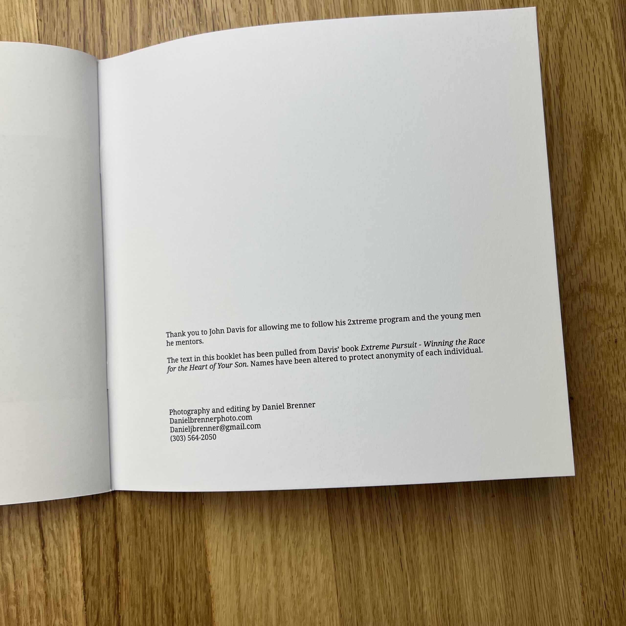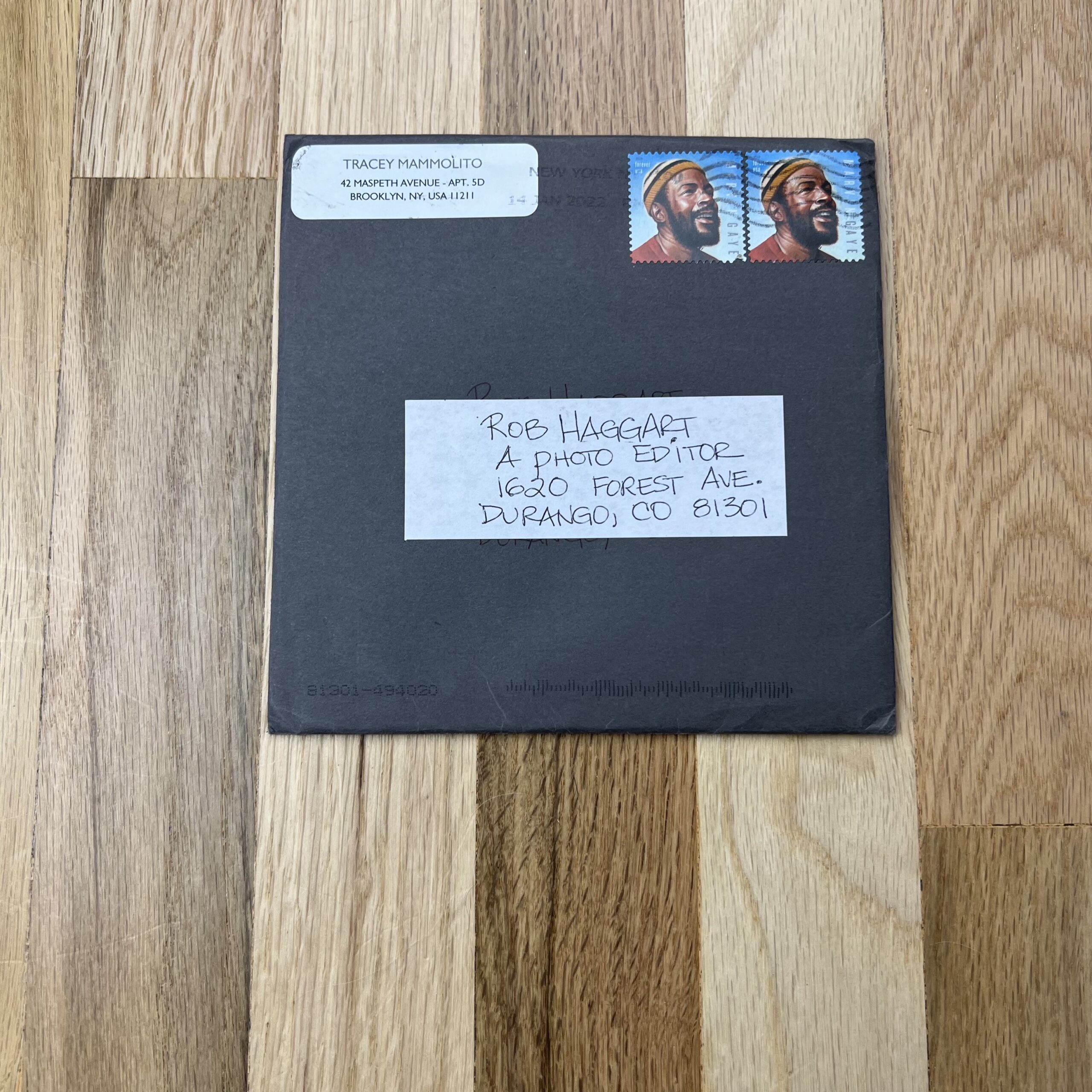


Who printed it?
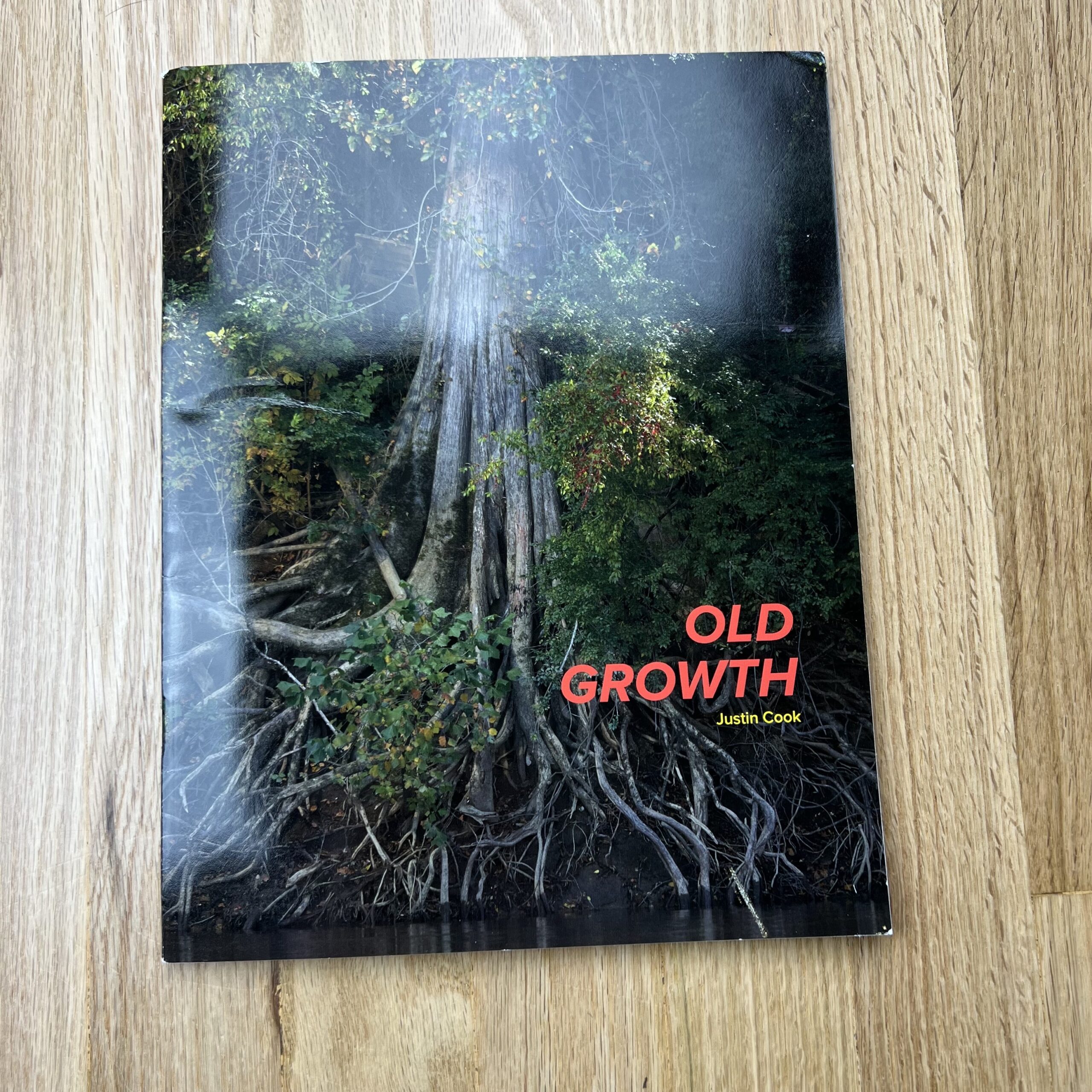
Agency Access, sometime in 2021. Due to a massive mailing hiccup and “a series of unfortunate events”, the booklets weren’t actually sent out until this spring, around six months after their first mailing (thankfully I had extras and could mail out a second batch). Full disclosure: to my knowledge, Agency Access is no longer designing and mailing print promos, but I could be mistaken.
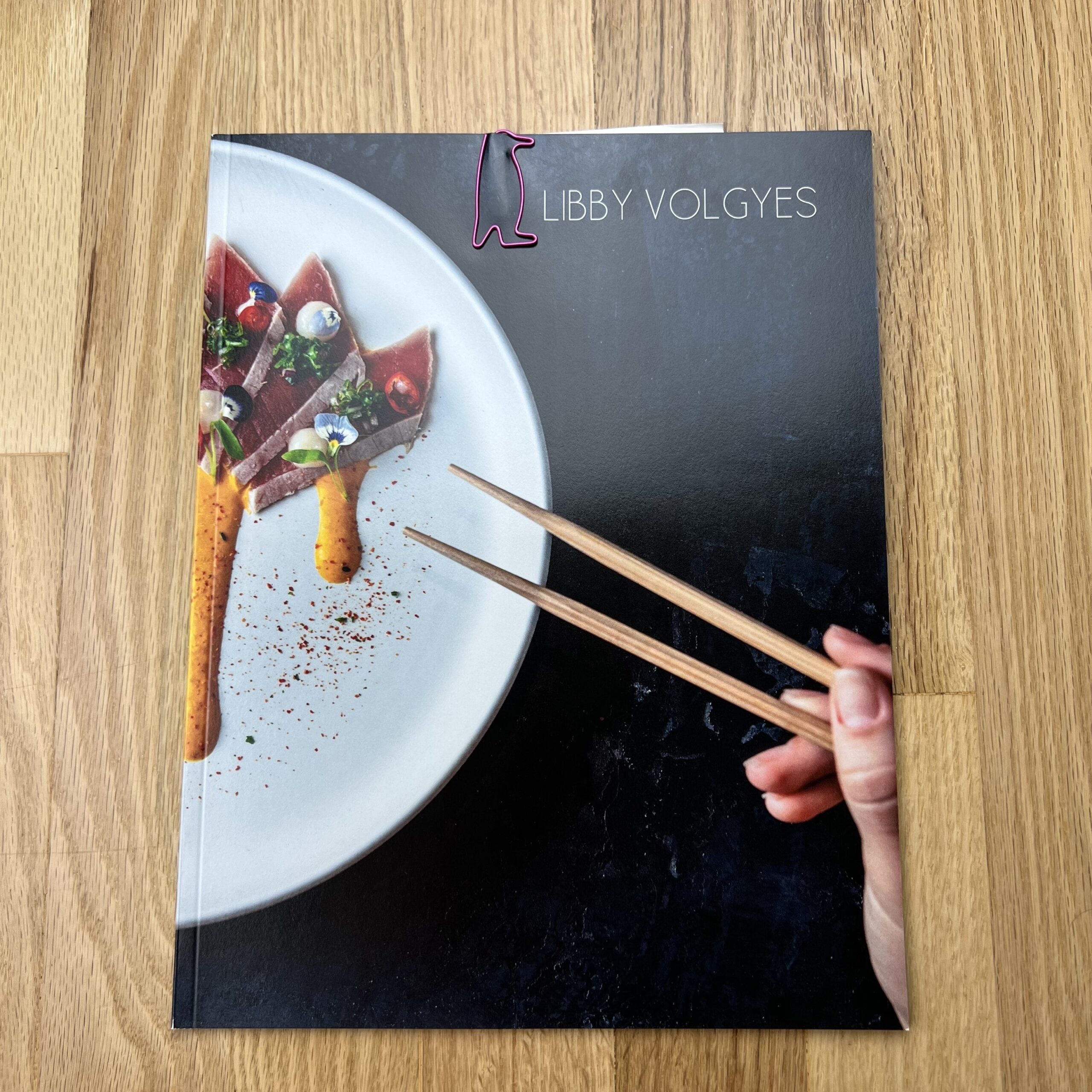
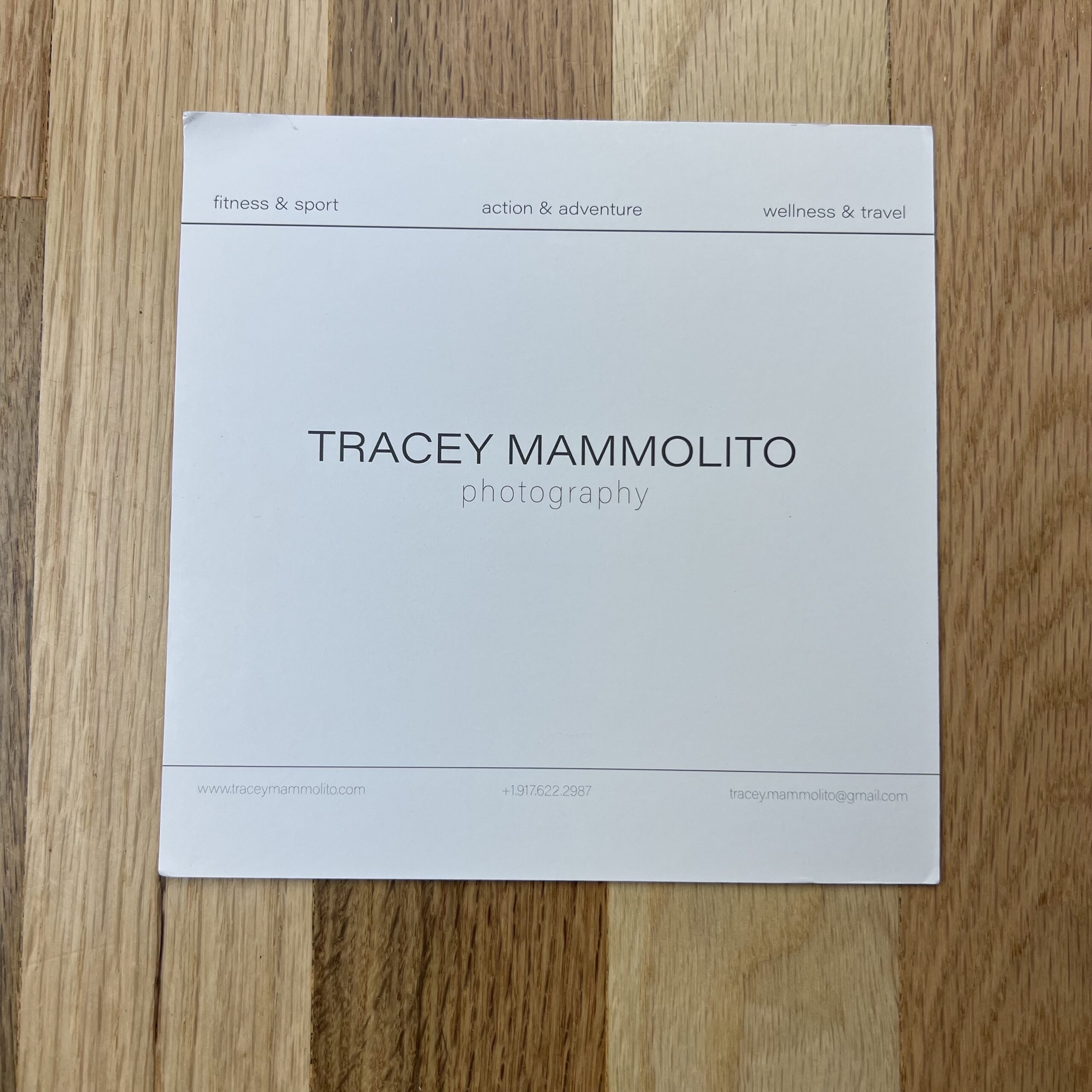
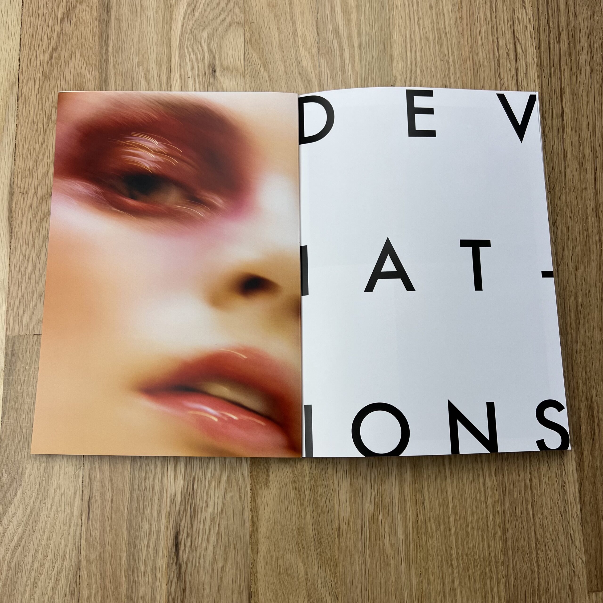
Who designed it?
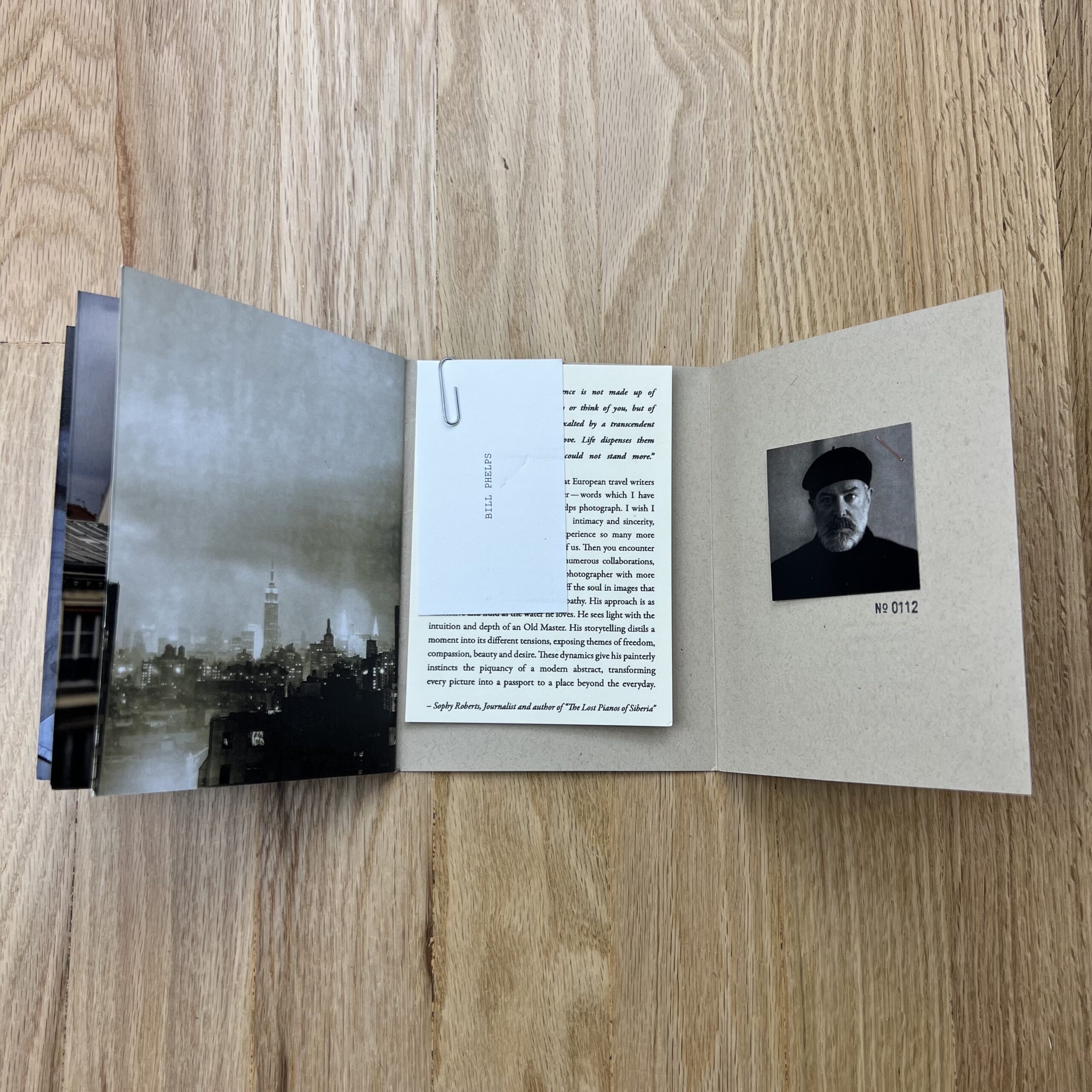
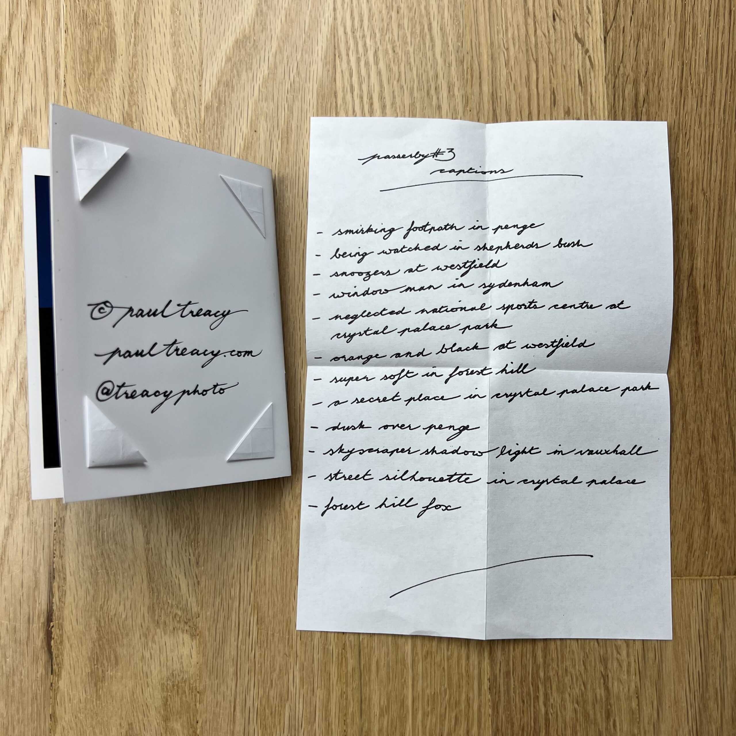
I can’t actually remember specifics (design and production started in Spring 2021), but this was also with Agency Access. My website is organized by Standards and Deviations—more traditional, classic styling vs. more left-of-center—and the booklet was designed to reflect that division. I know their sister site, Found, produces booklets a few times a year, and I had asked if they could make one specifically for me. When I approached them, I explained I was hoping the booklet would be my “Alan Rickman moment”: before Die Hard, Rickman was working, but not as often as he liked, and only in smaller projects, but was consistently receiving positive reviews and feedback from that work. Then he shot Die Hard, and the rest is history. I see a lot of overlap between my career trajectory and his earlier experiences: under-employed, but fantastic response. I’m just looking for my Die Hard.
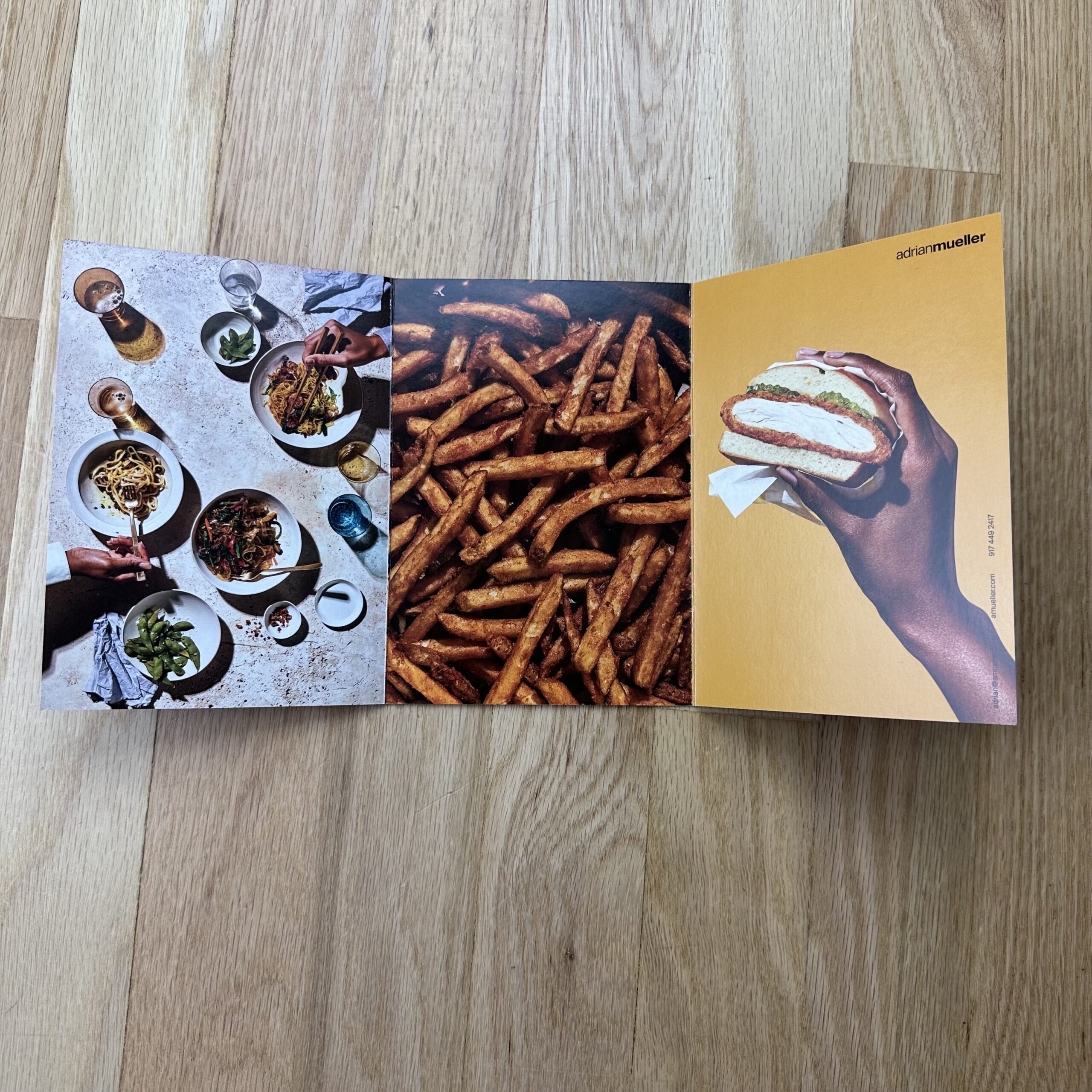
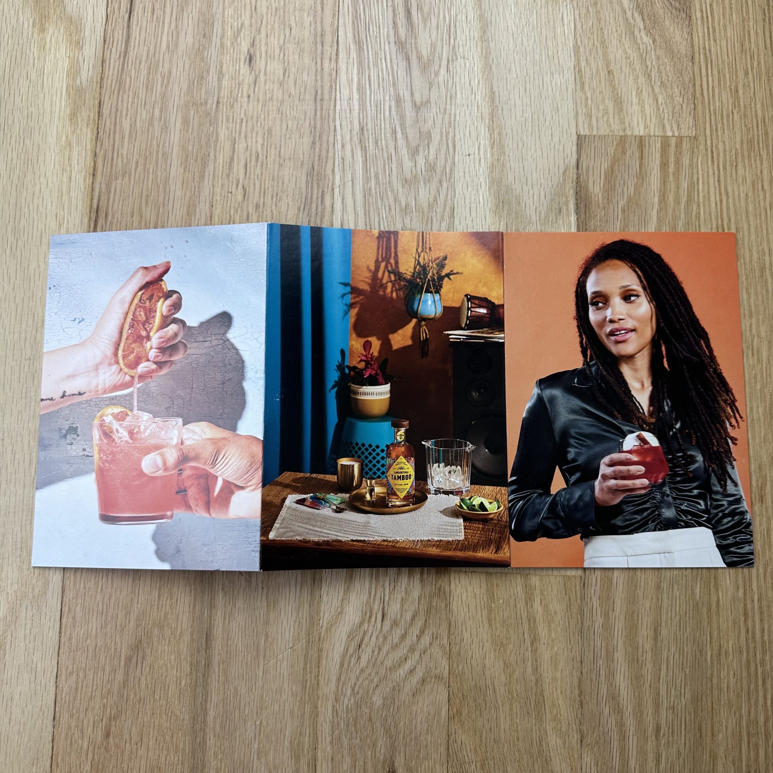
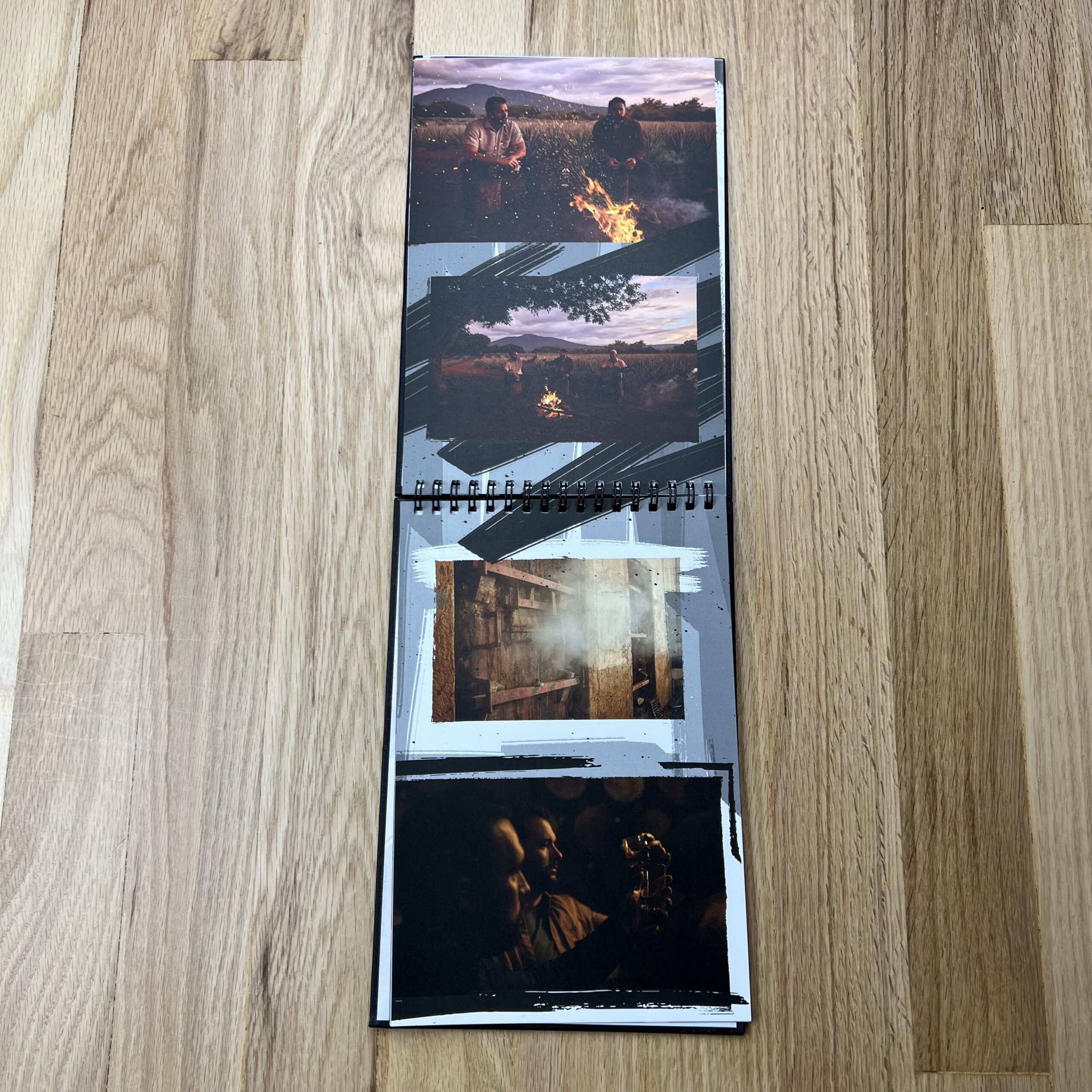
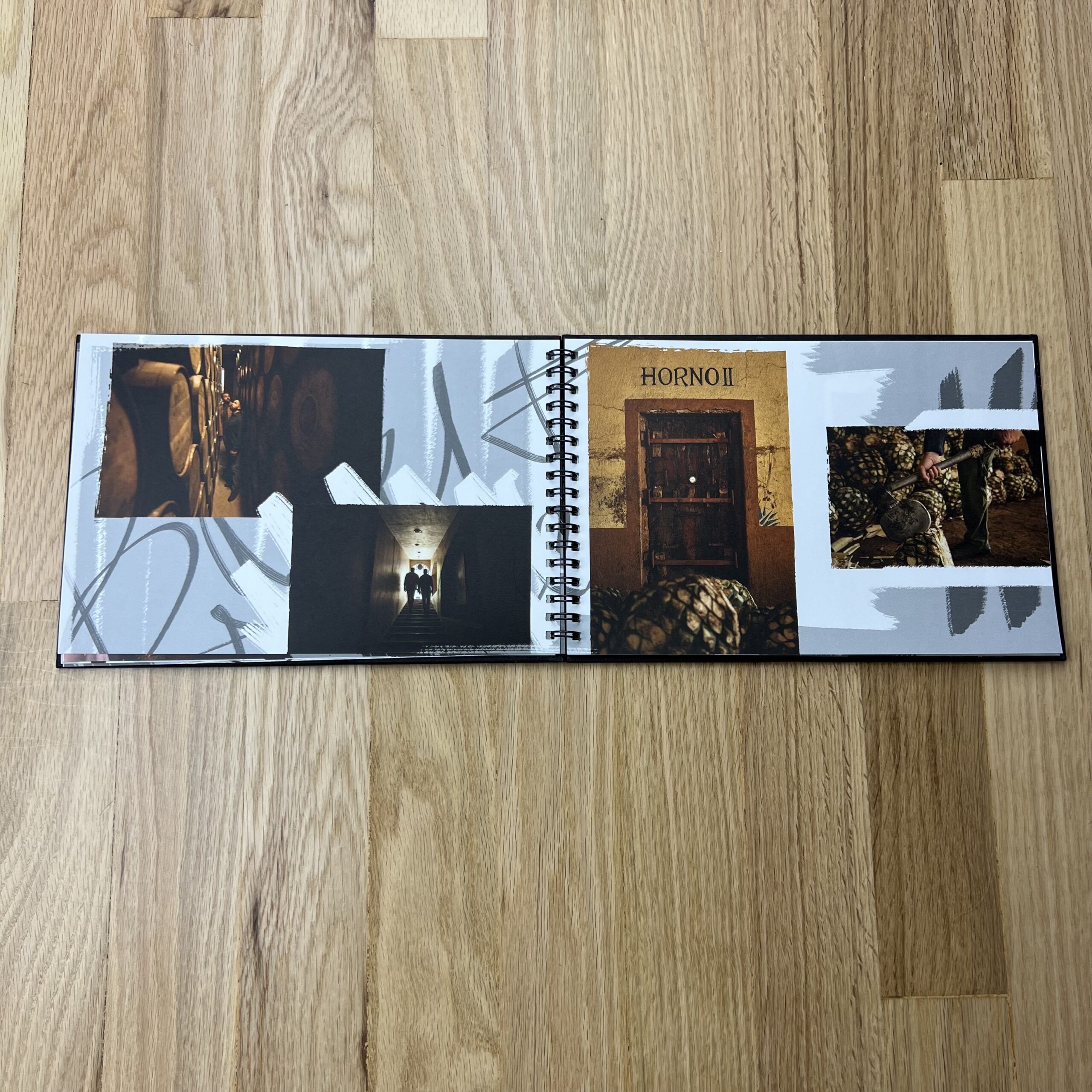
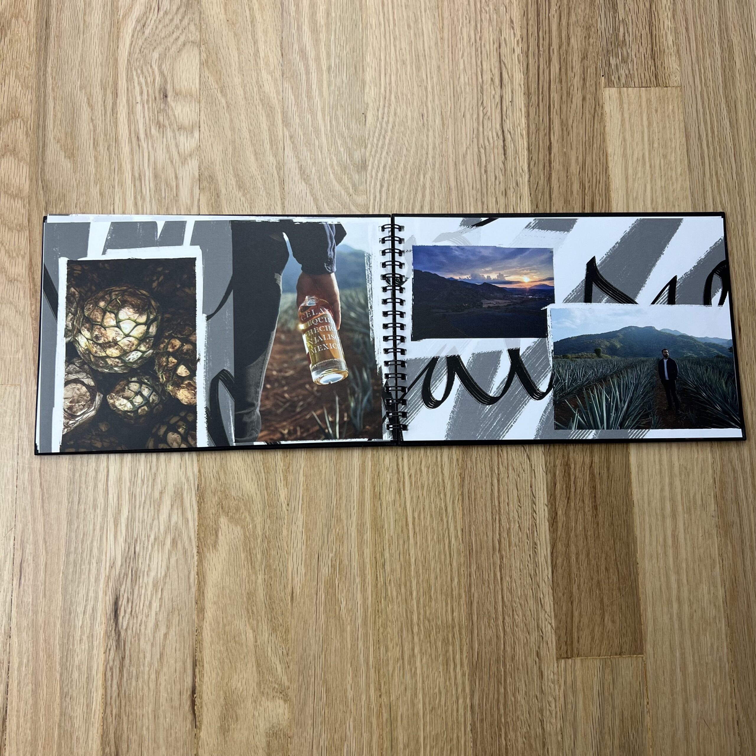
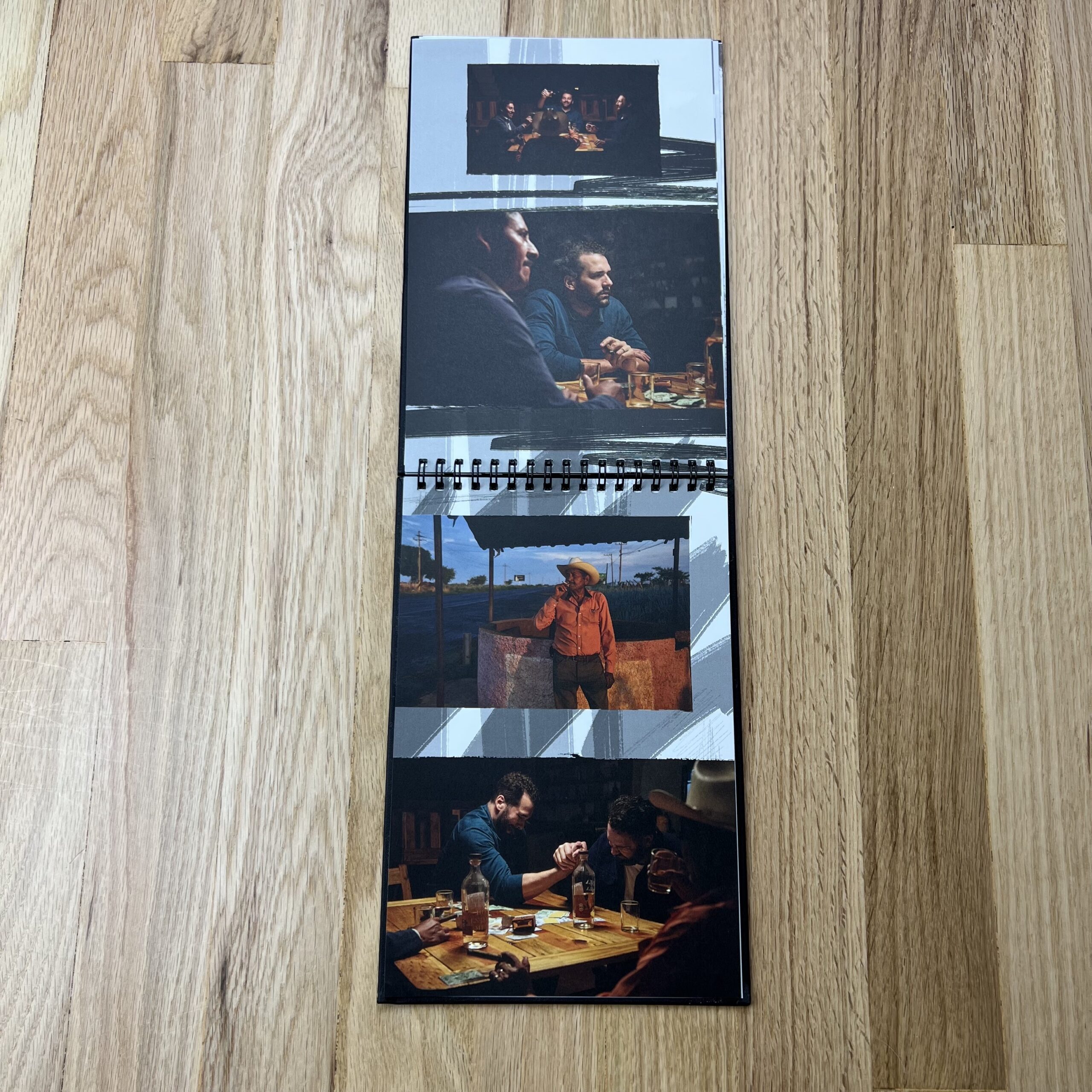
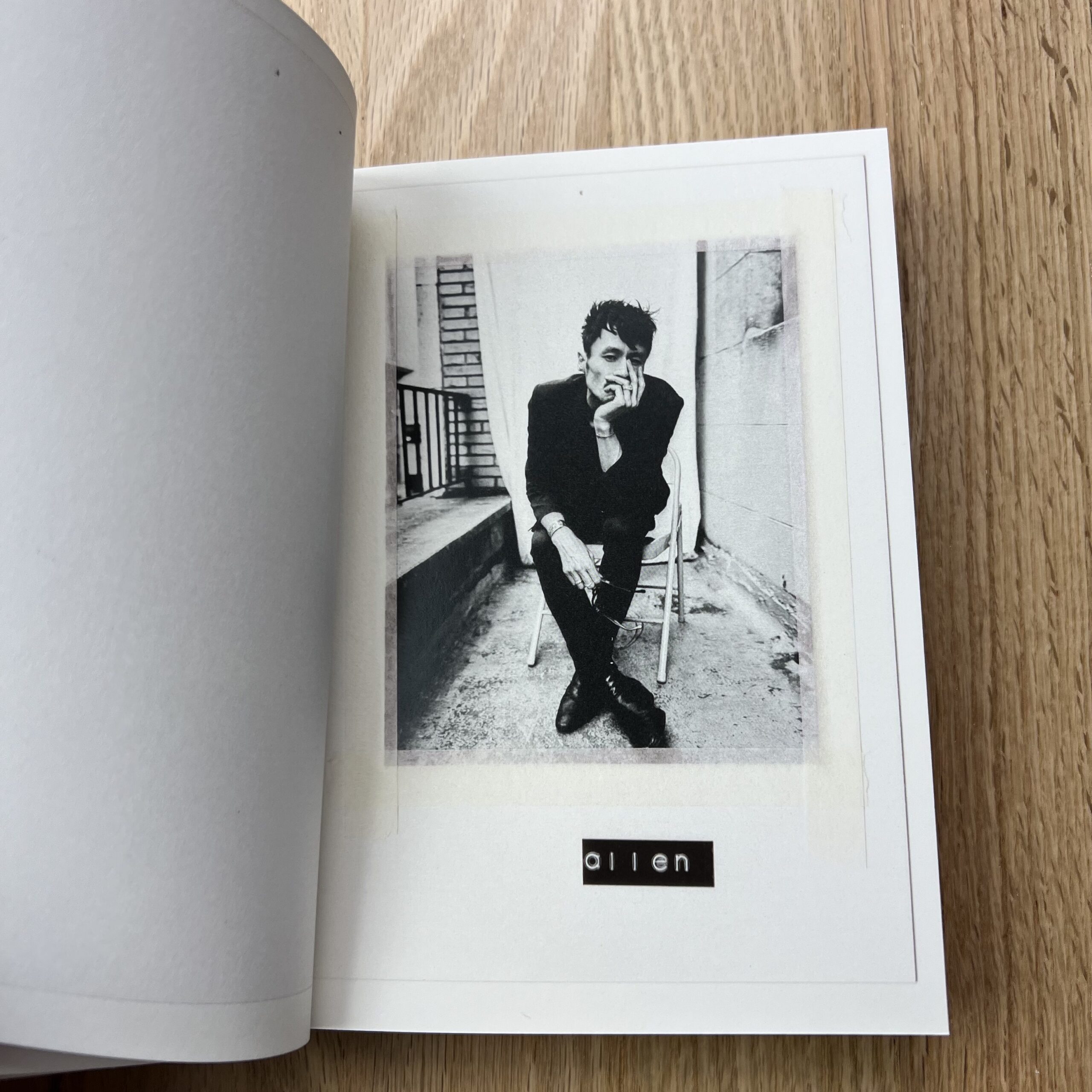
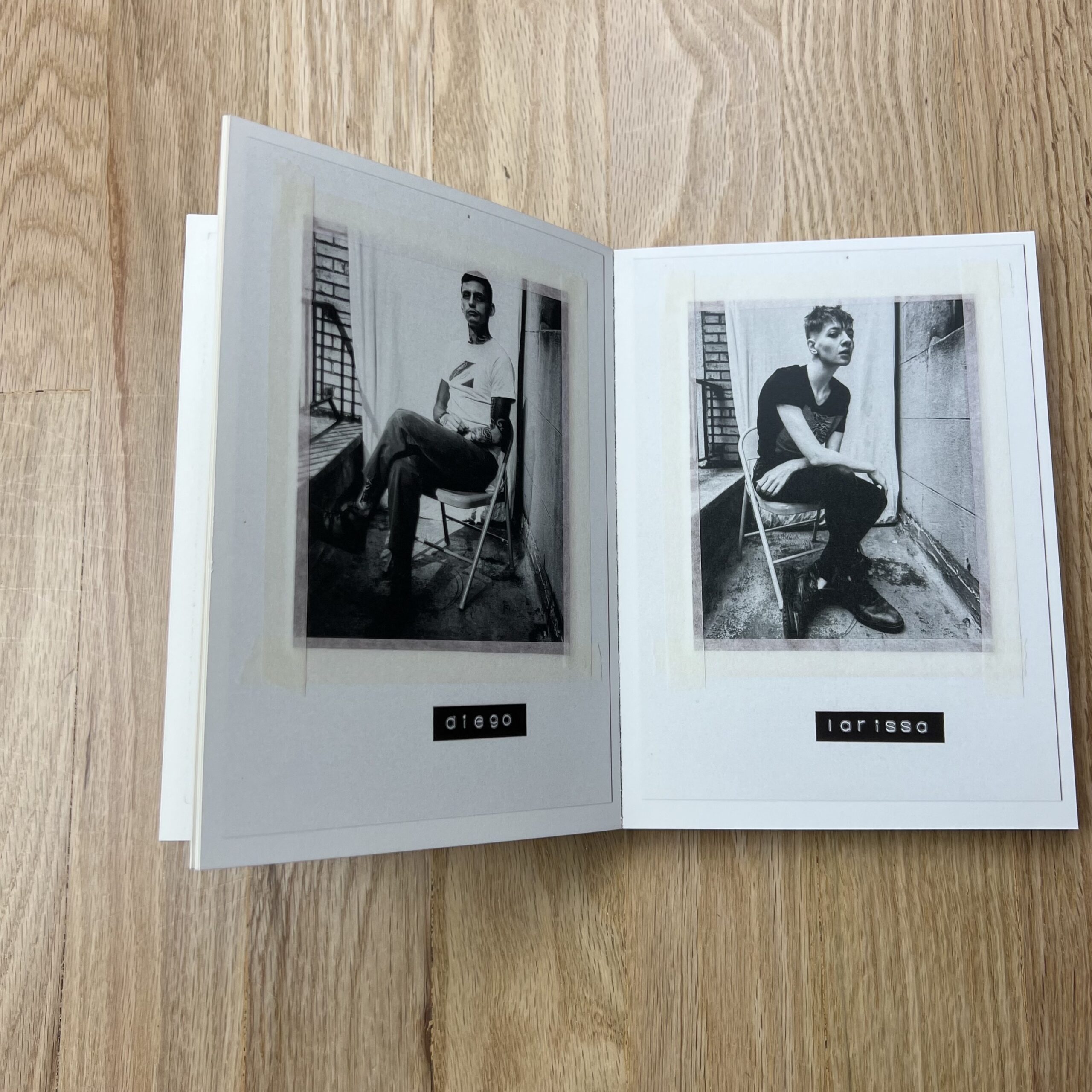
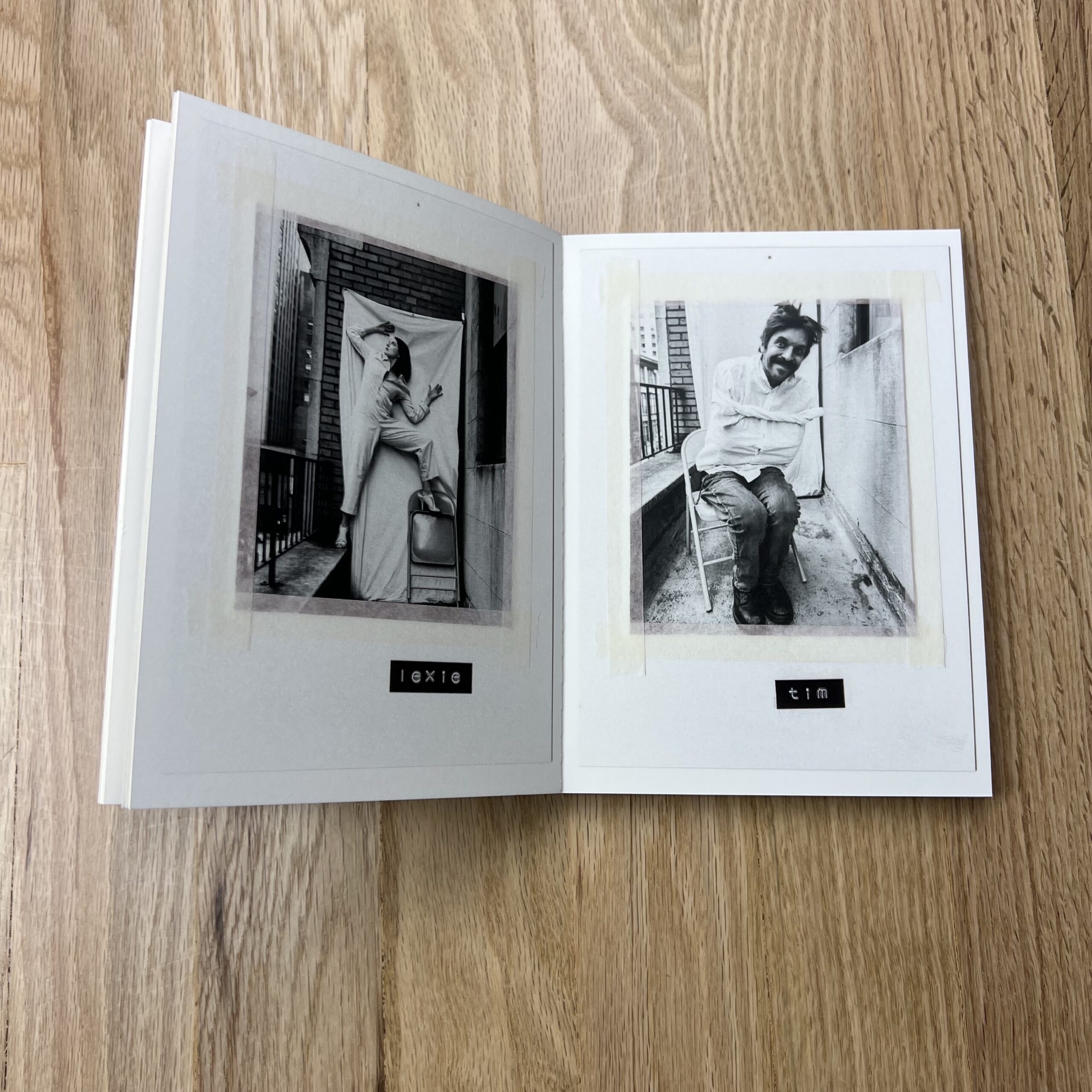
Tell me about the images.
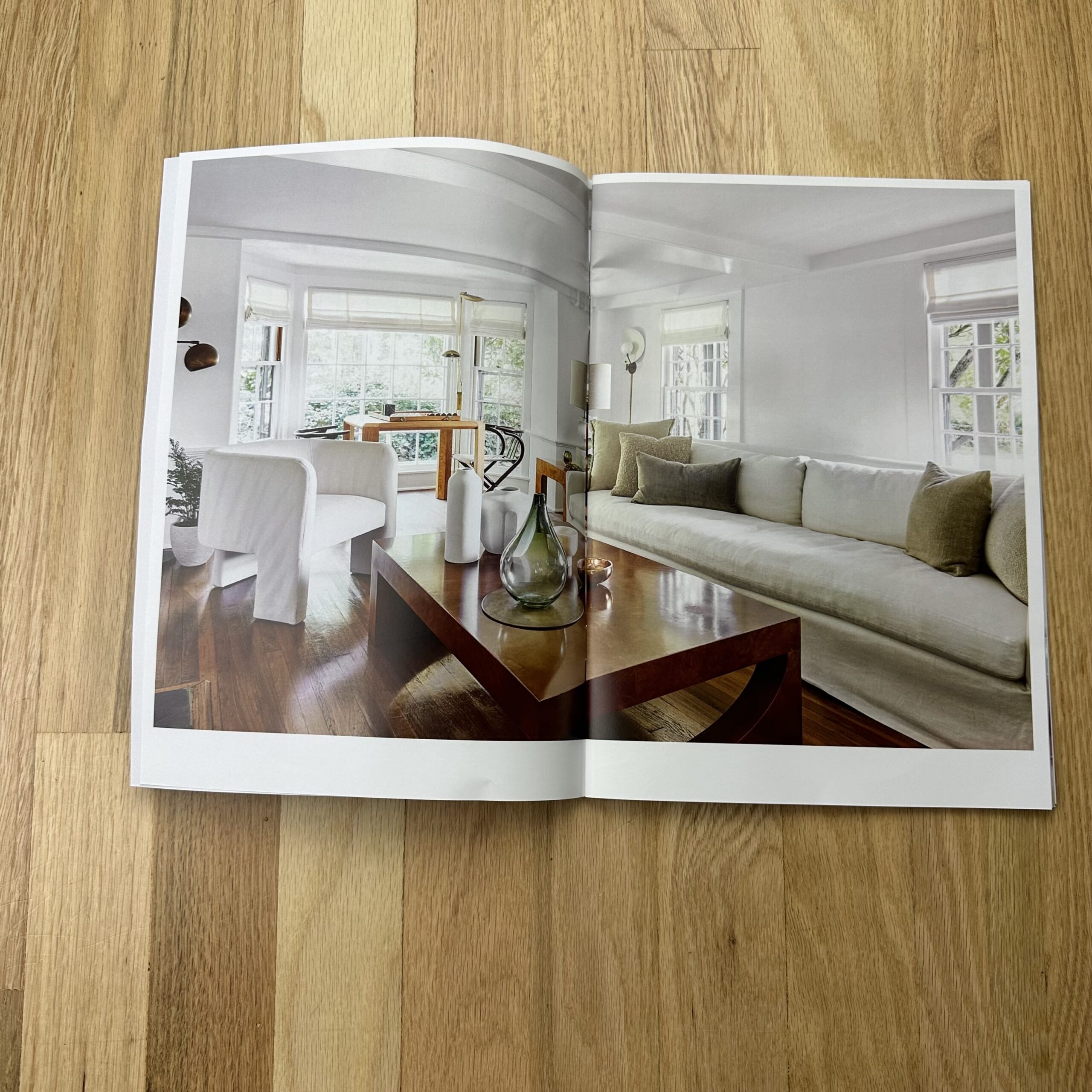
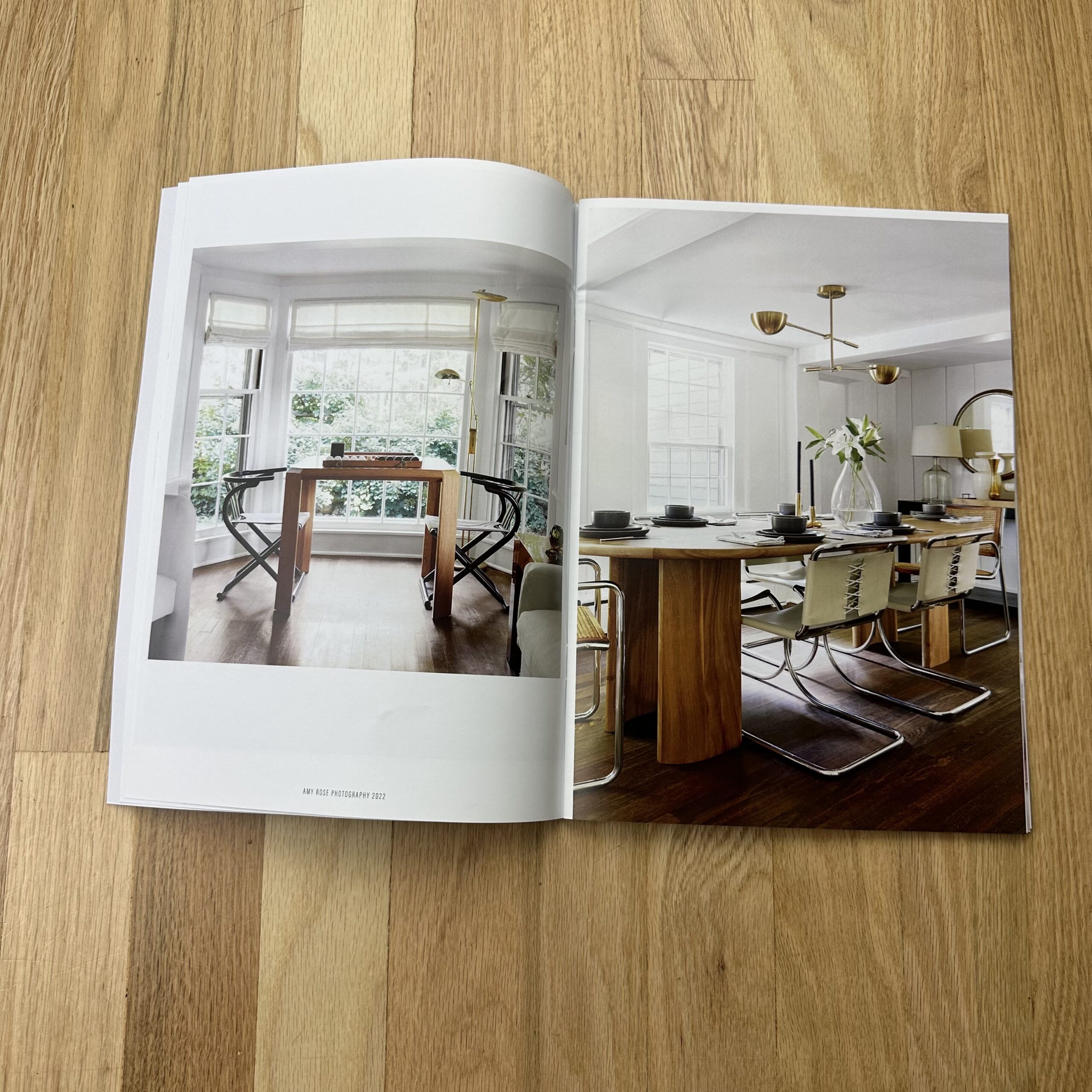
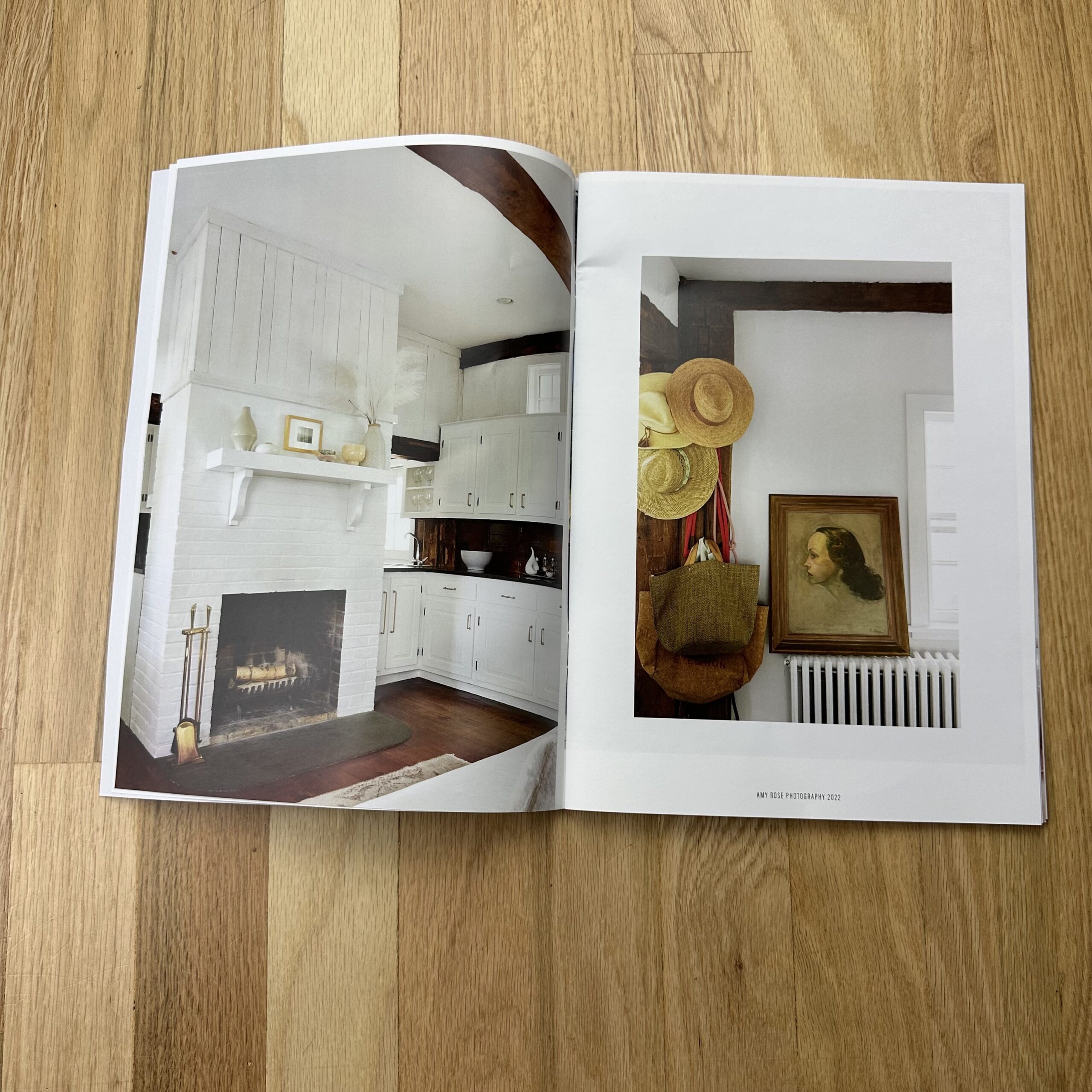
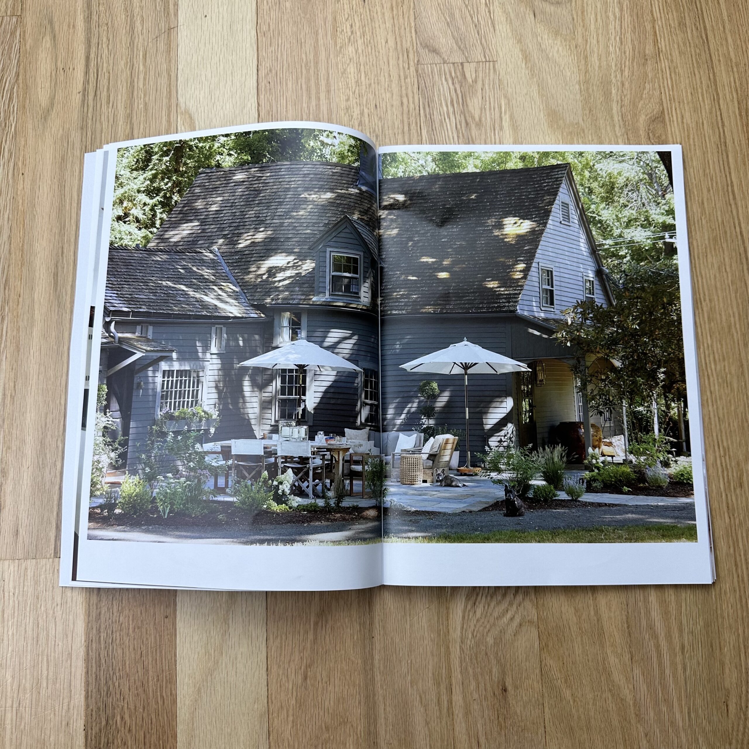
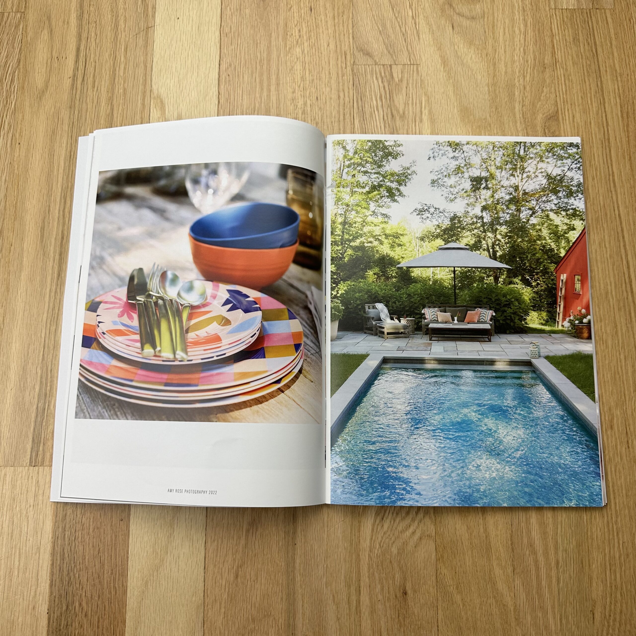
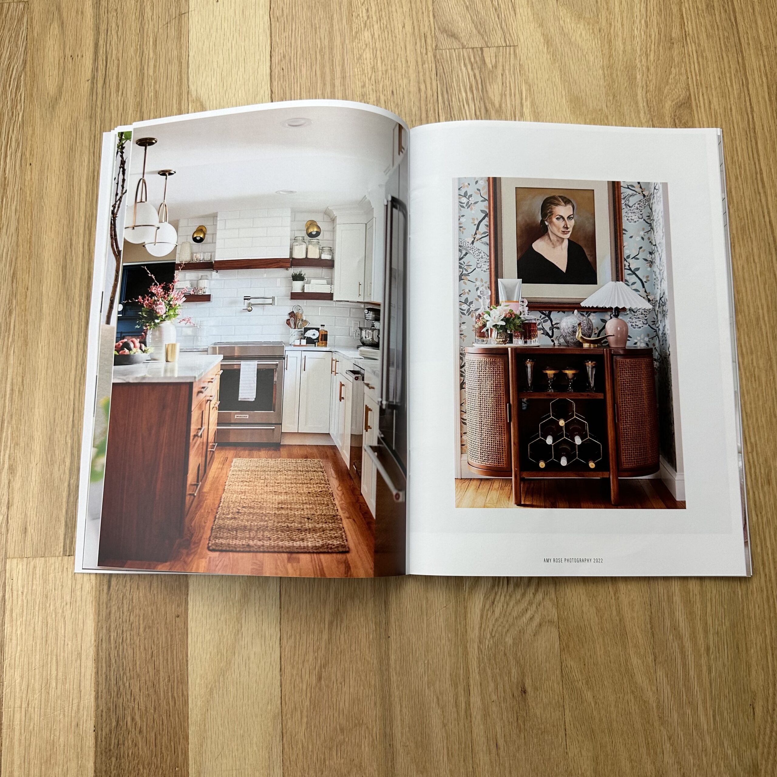
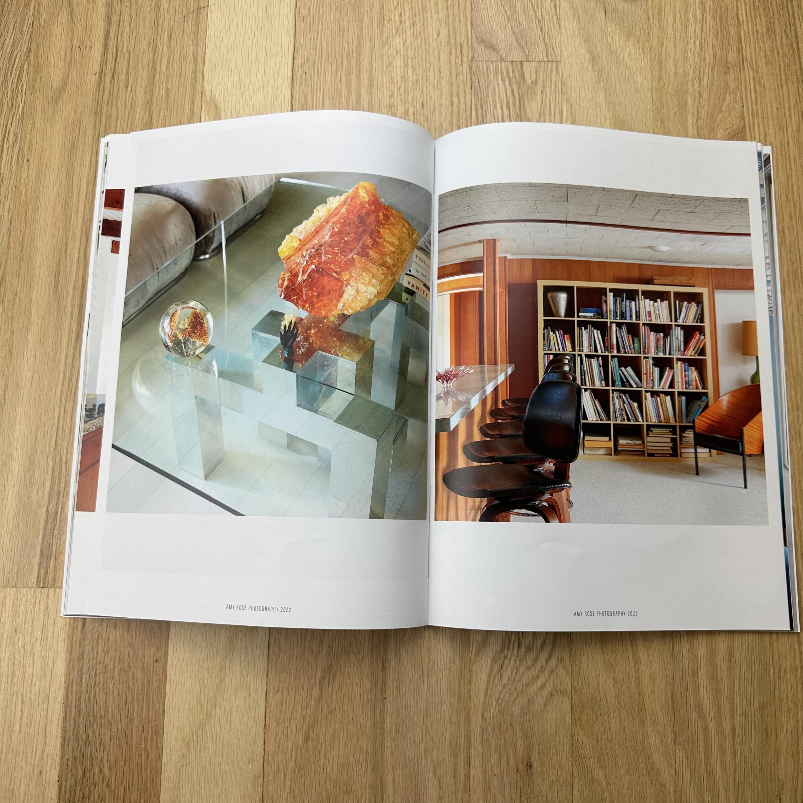
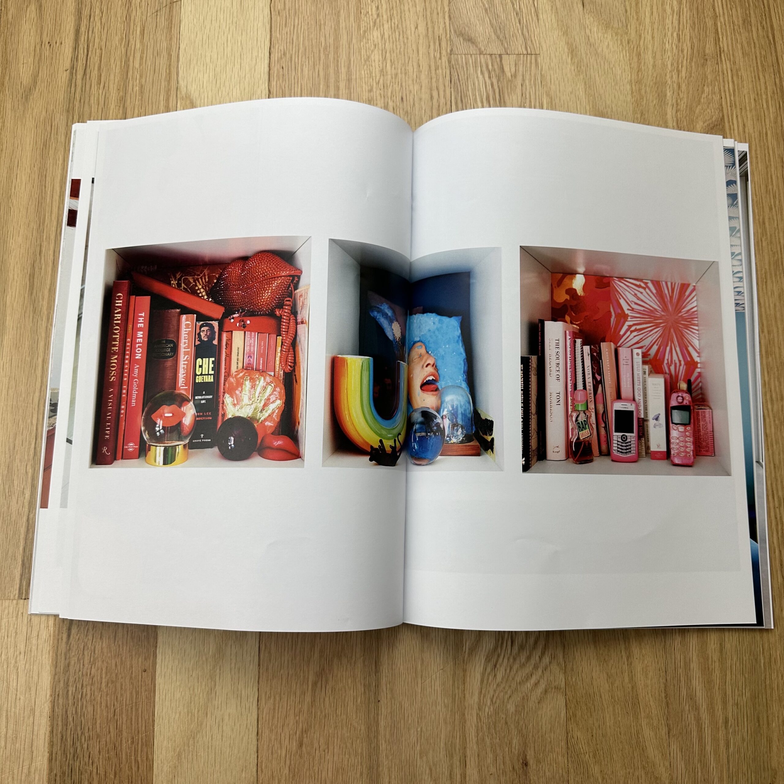
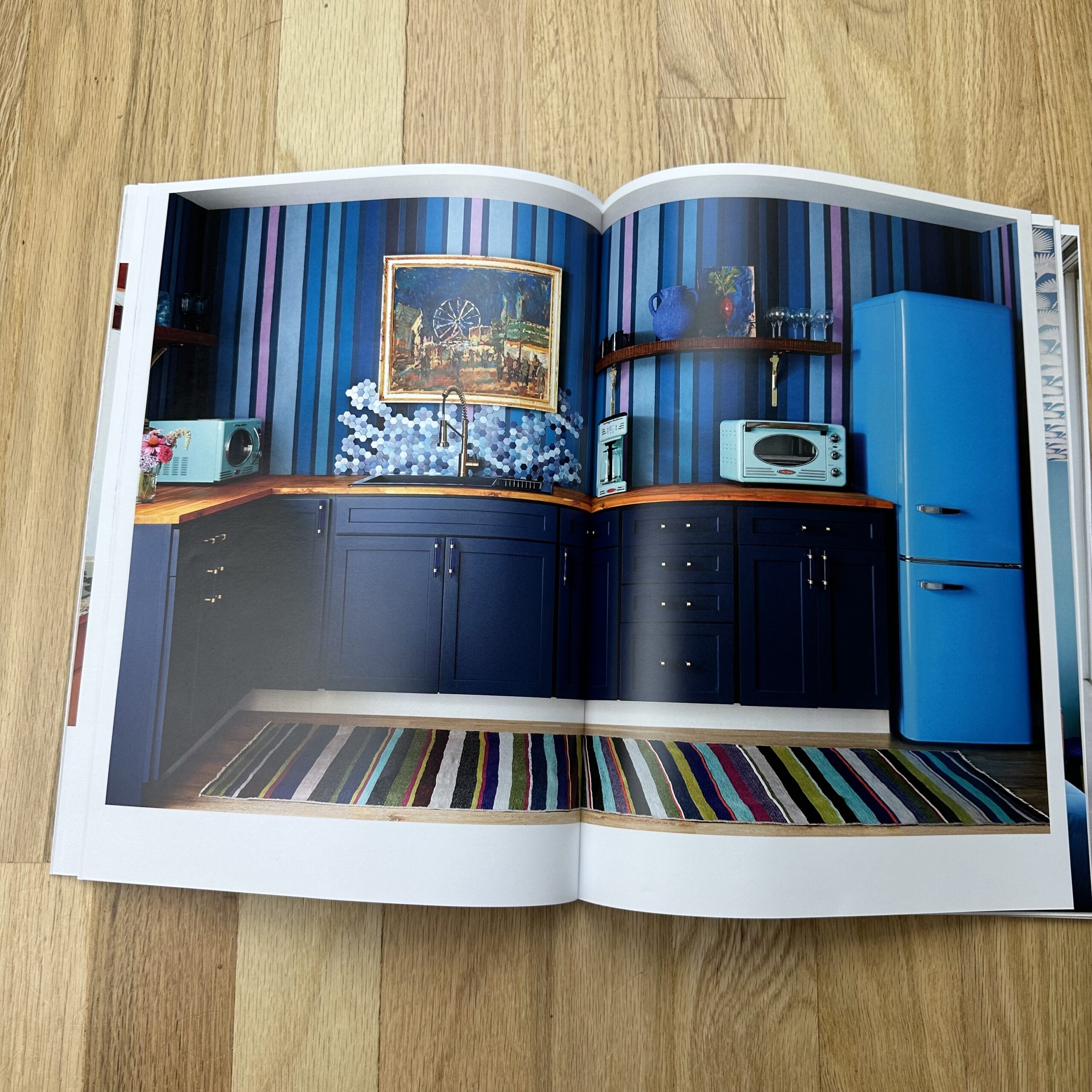
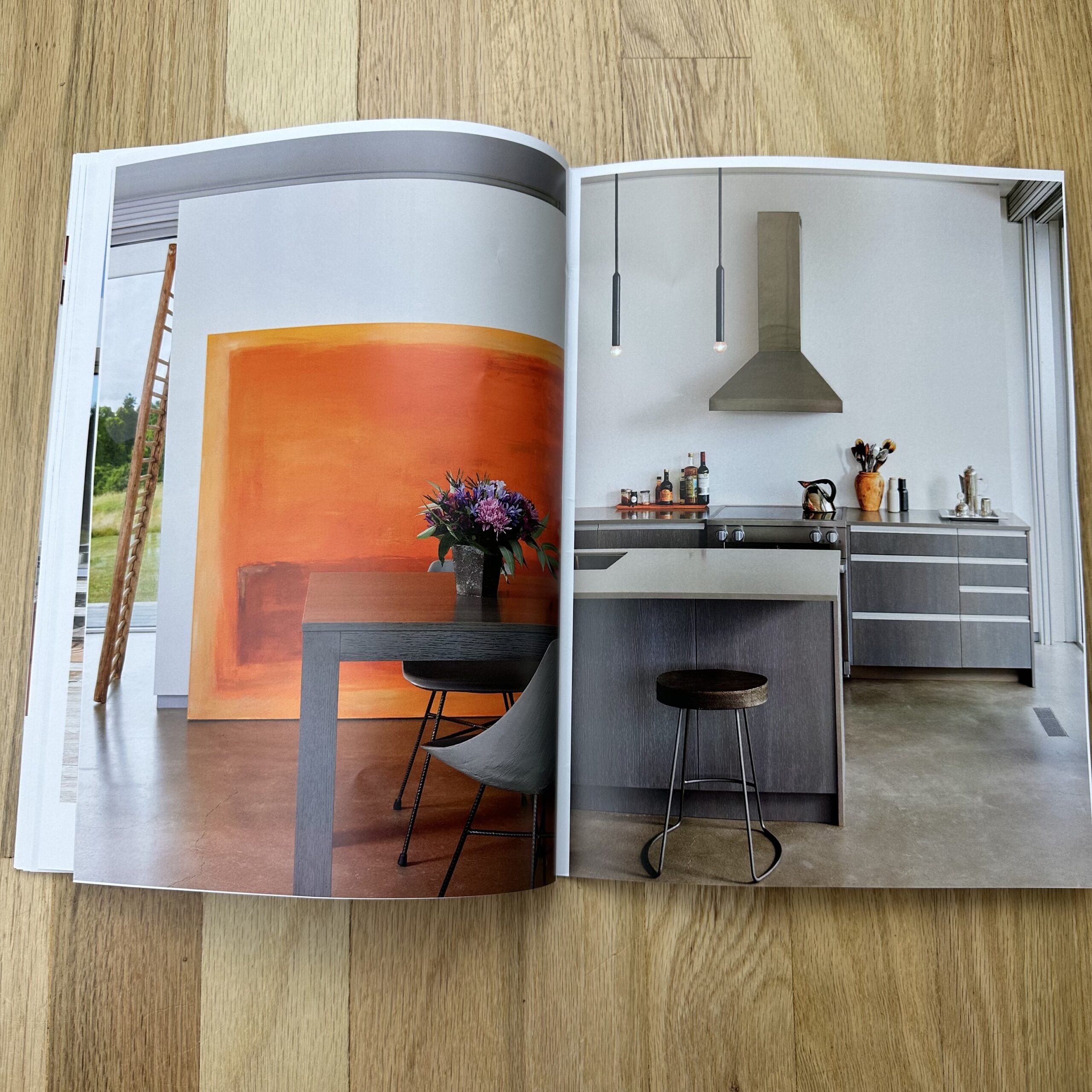
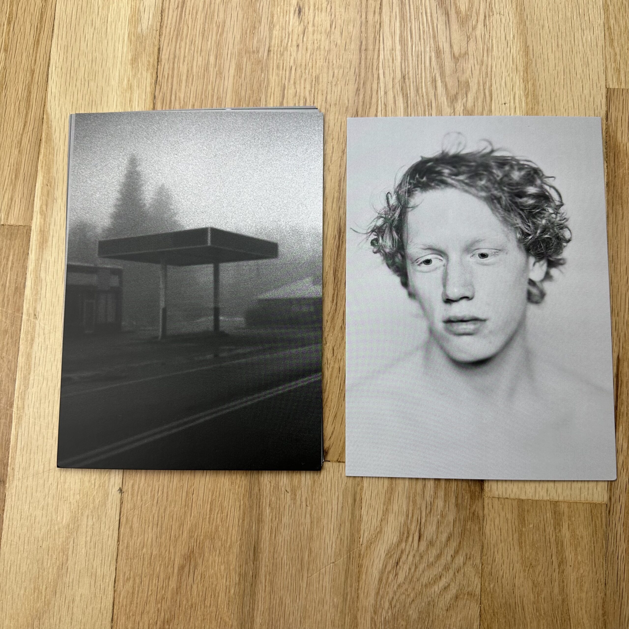
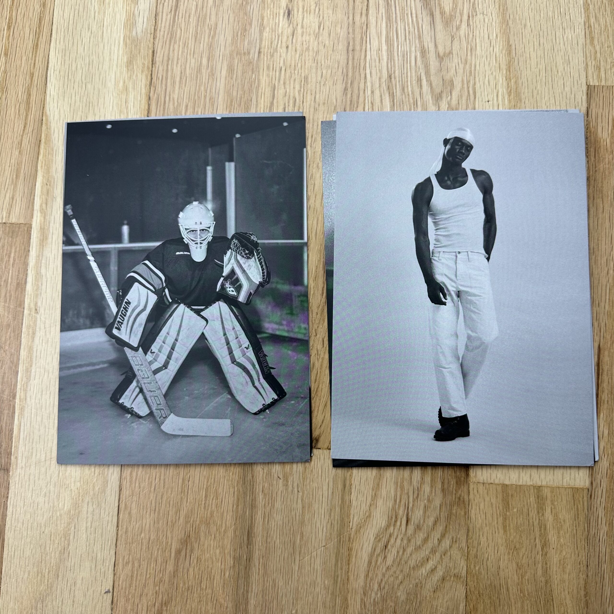
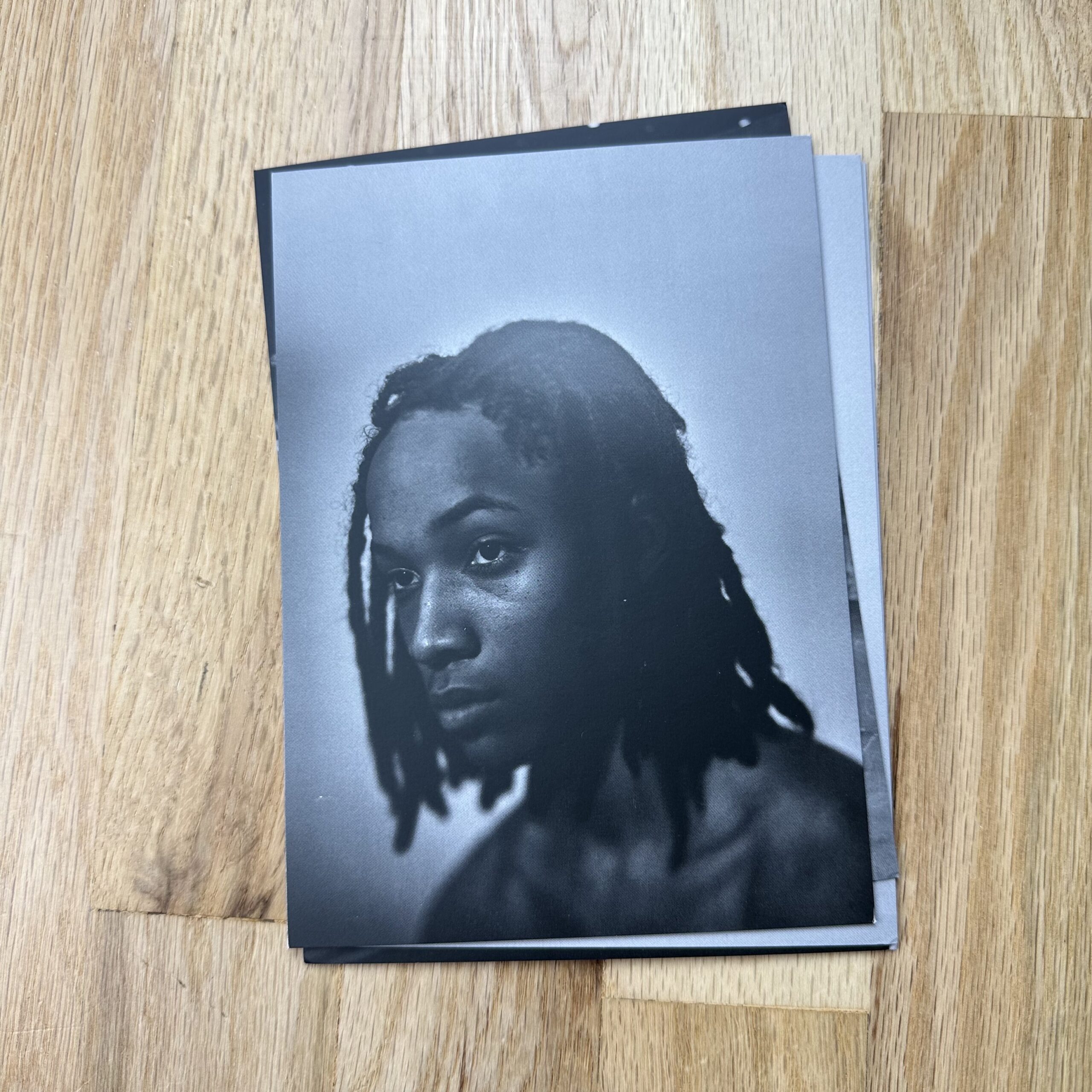
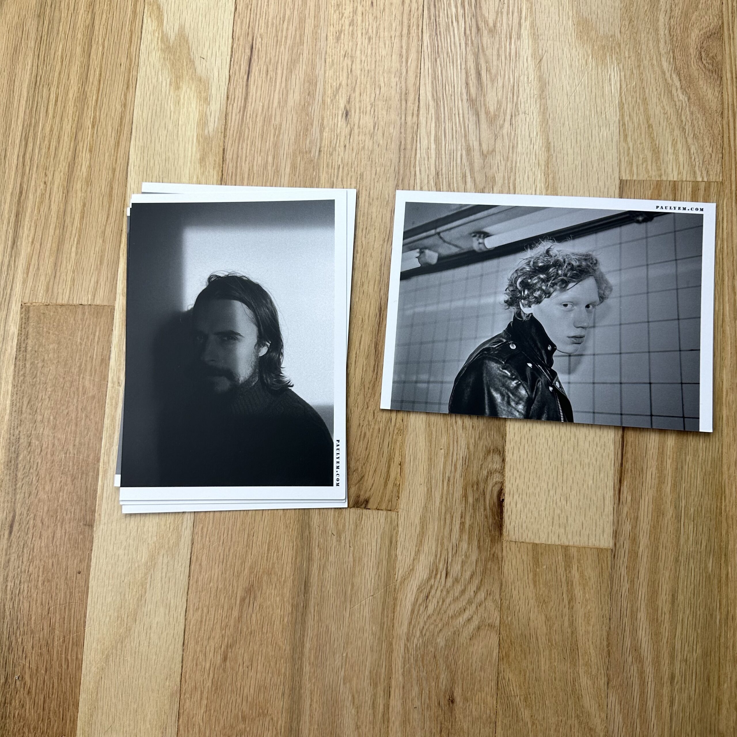
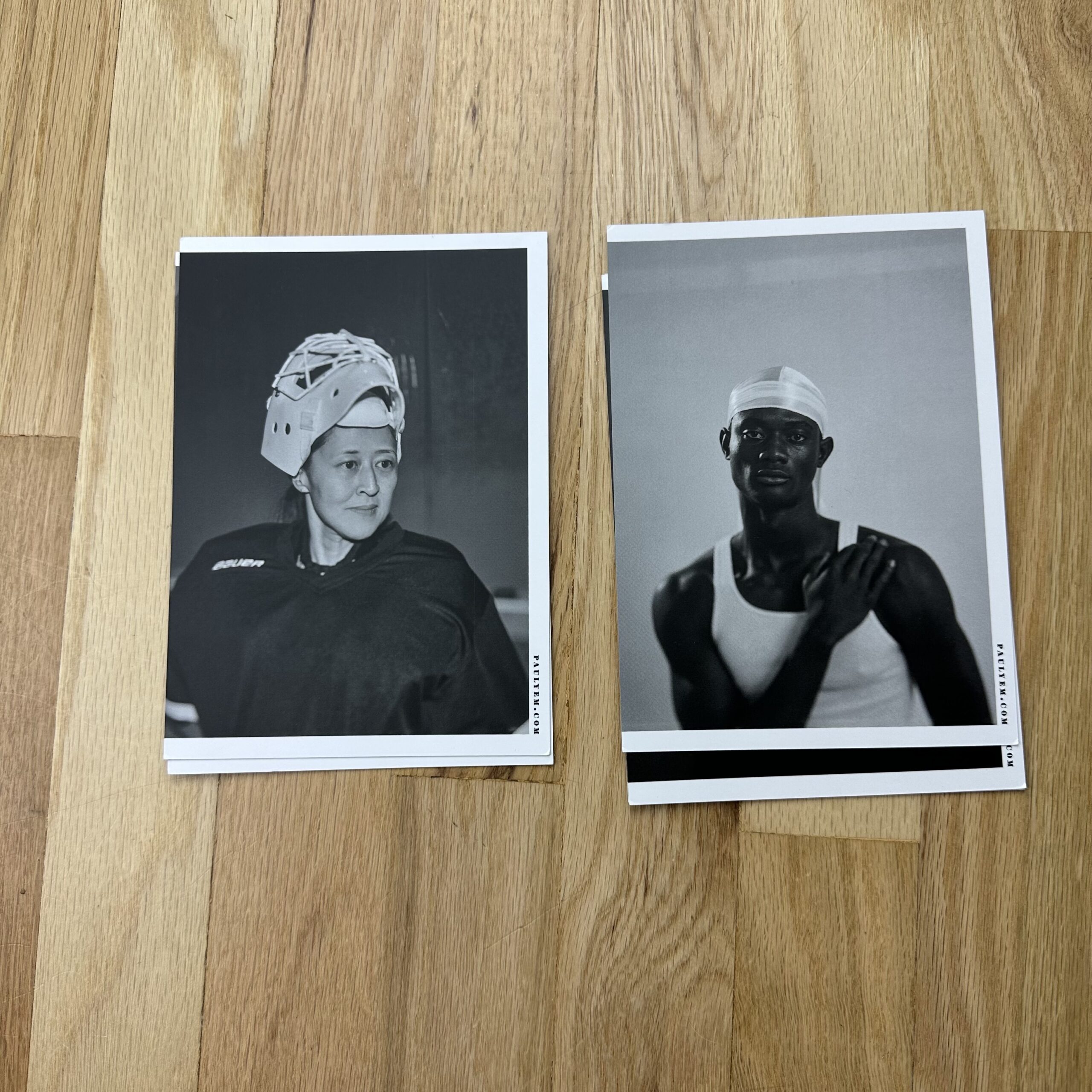
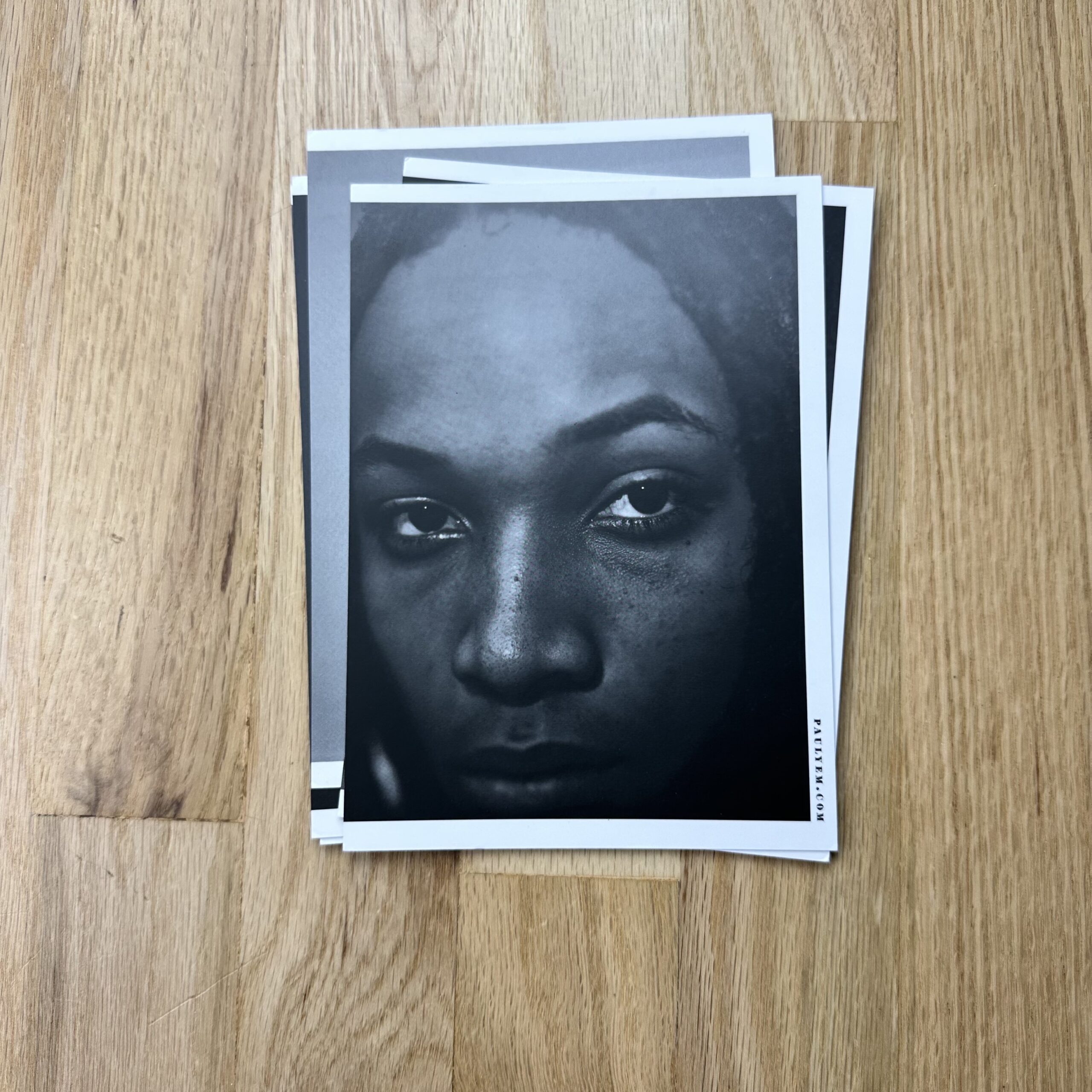
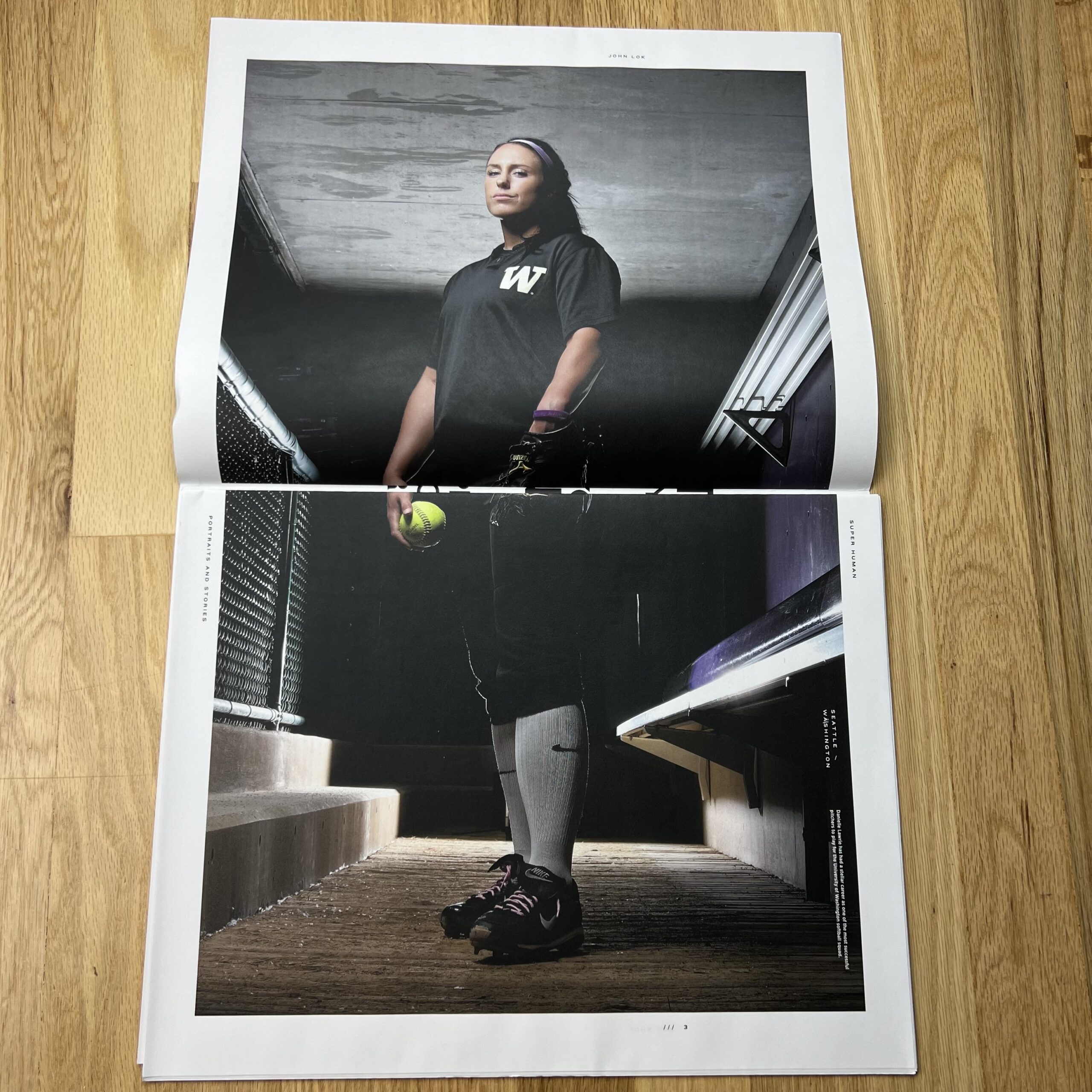
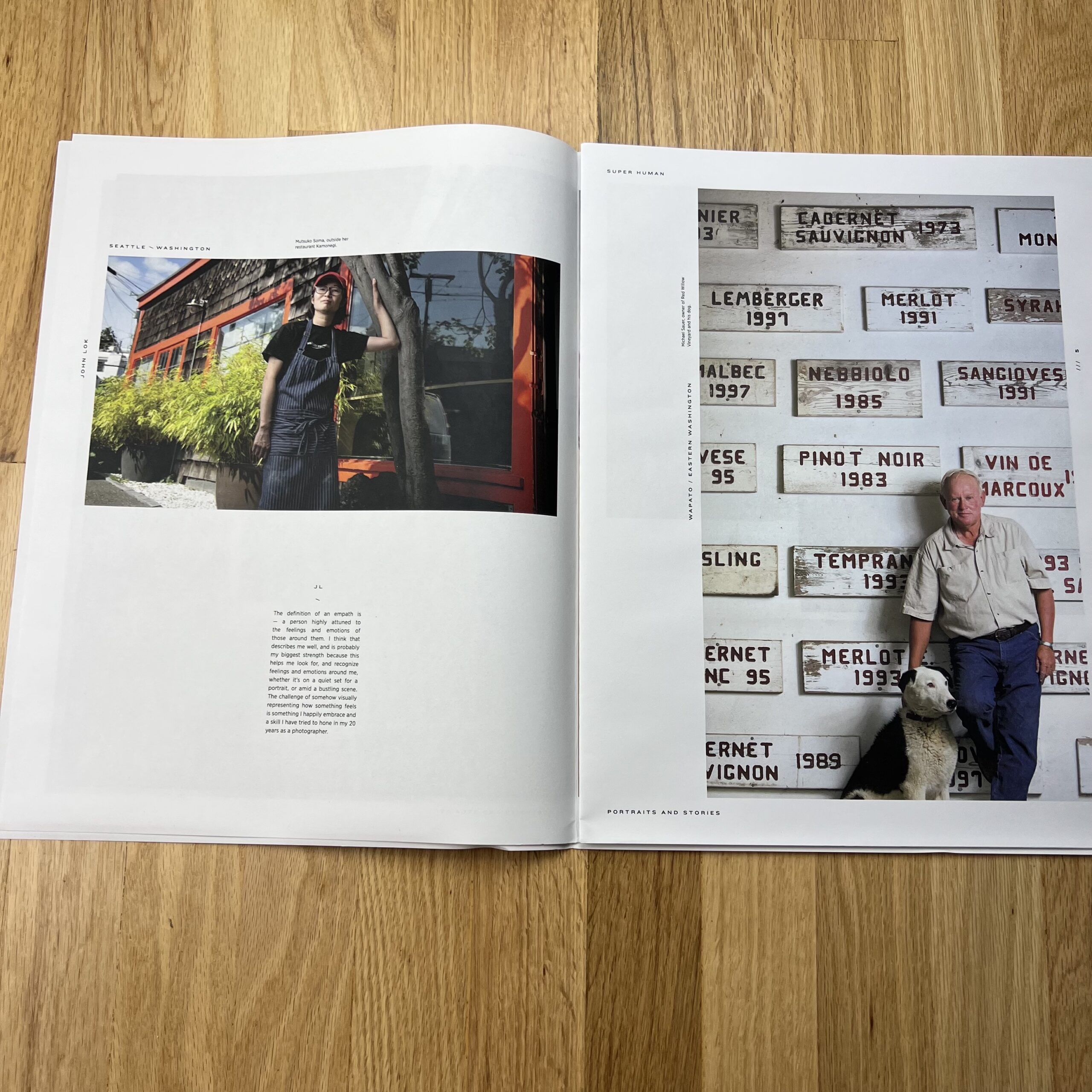
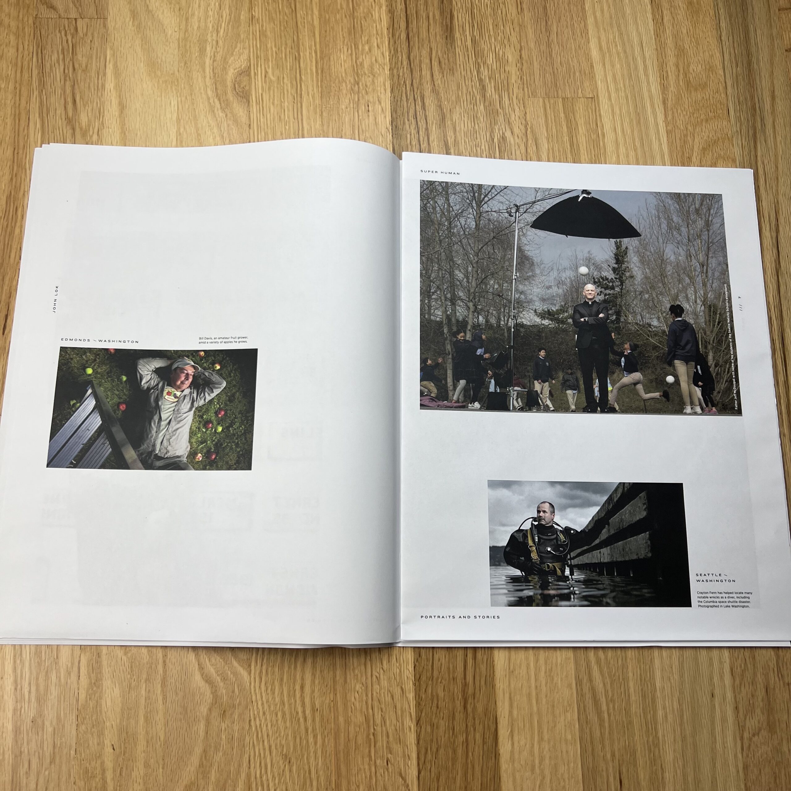
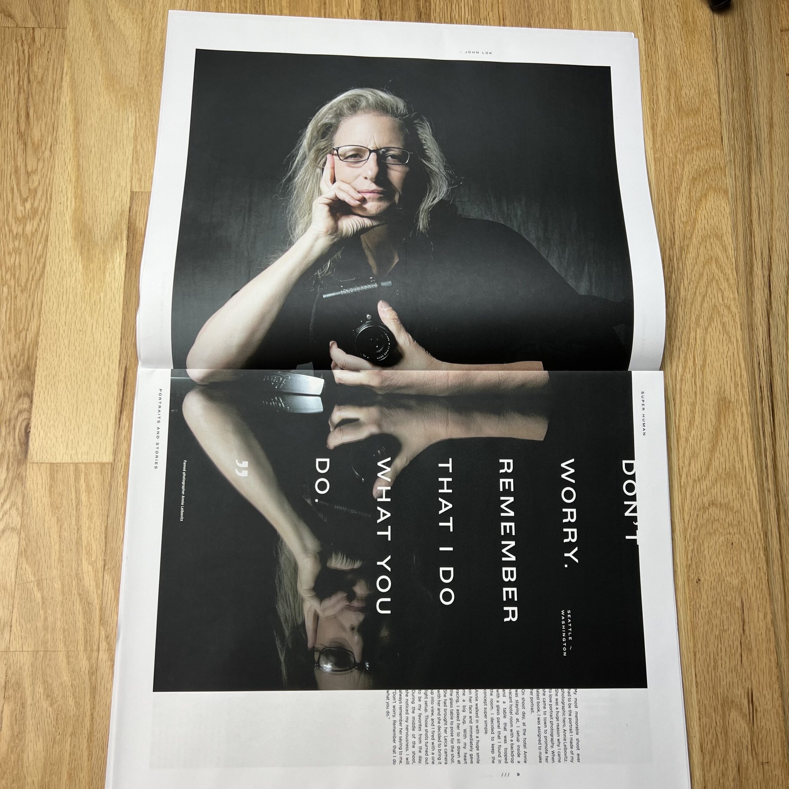
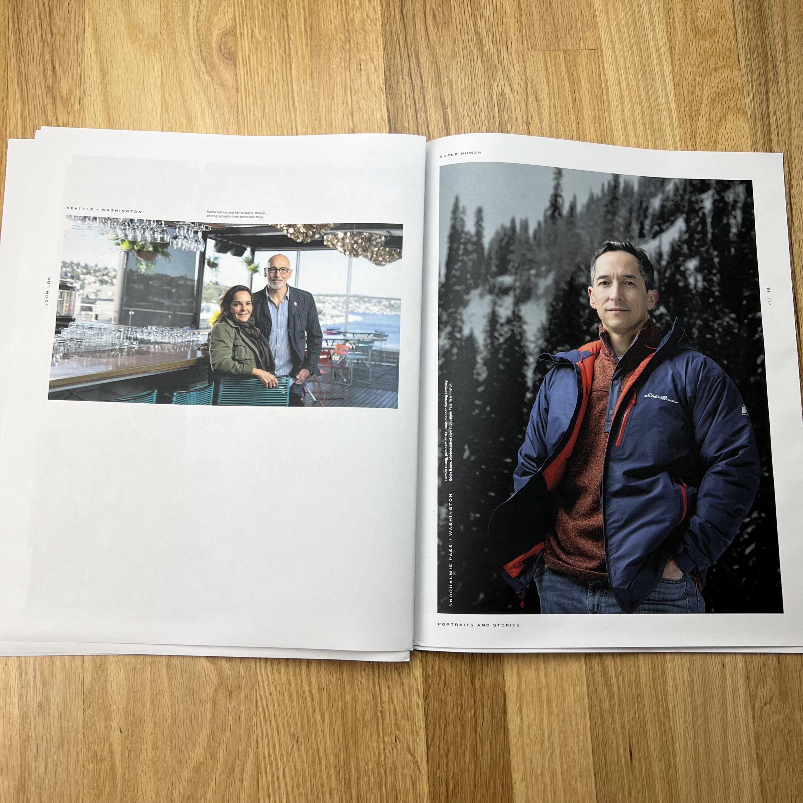
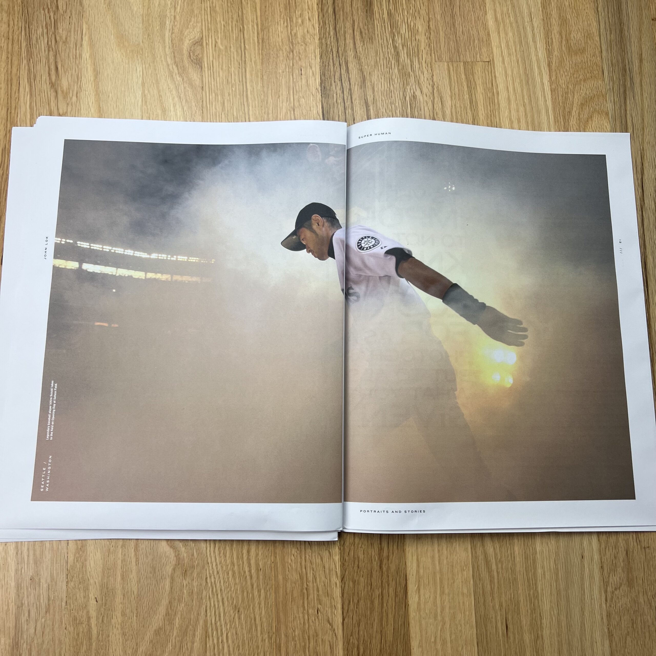
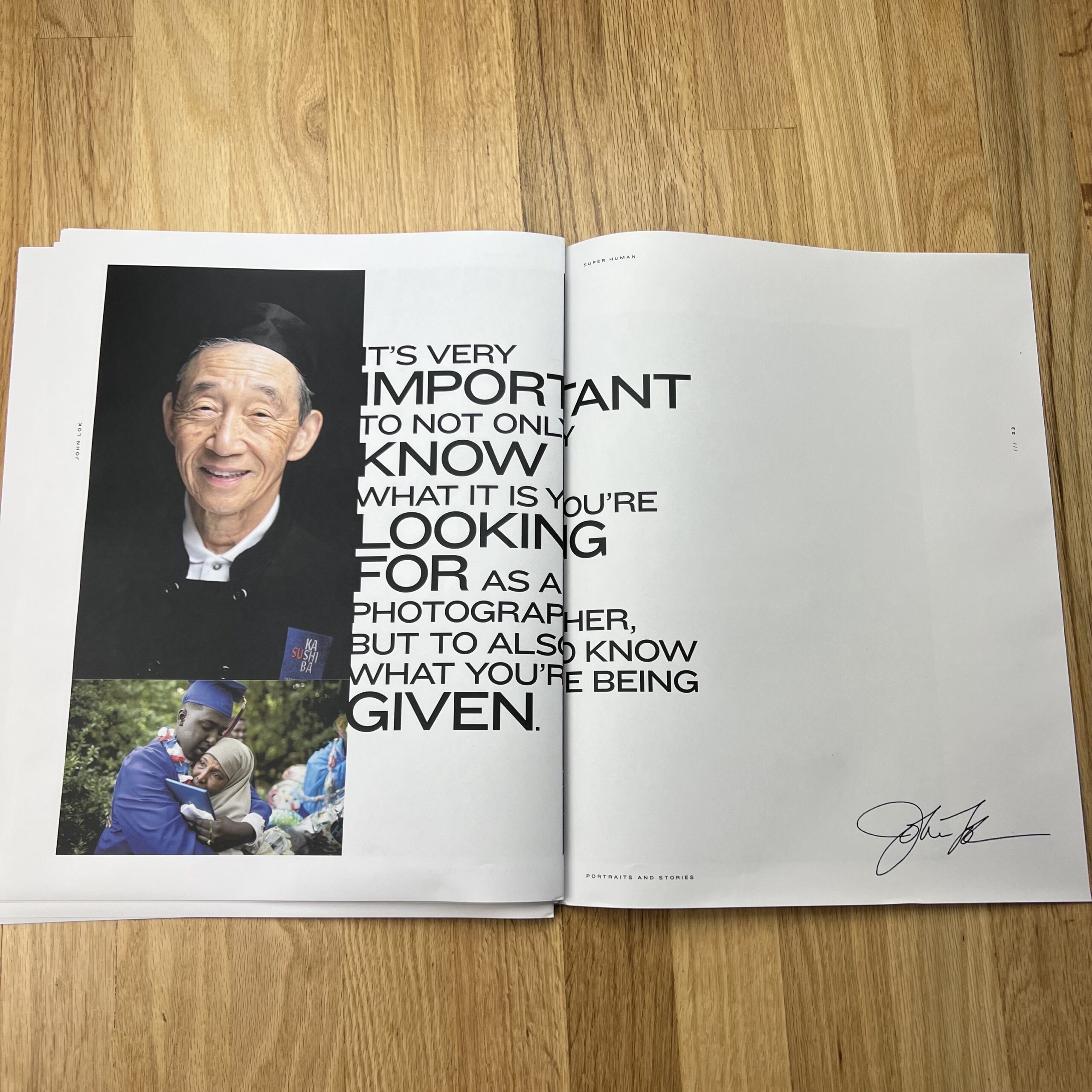
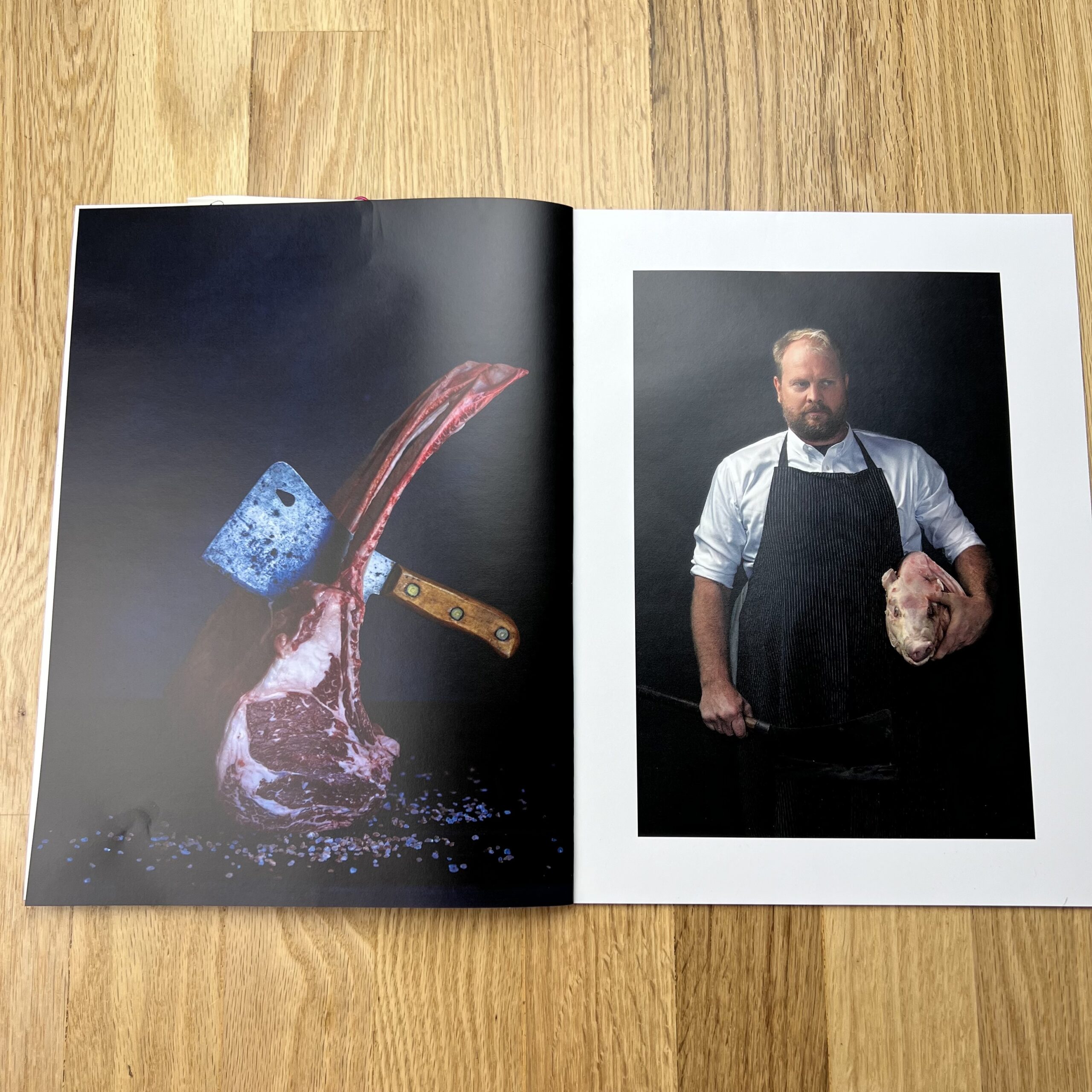
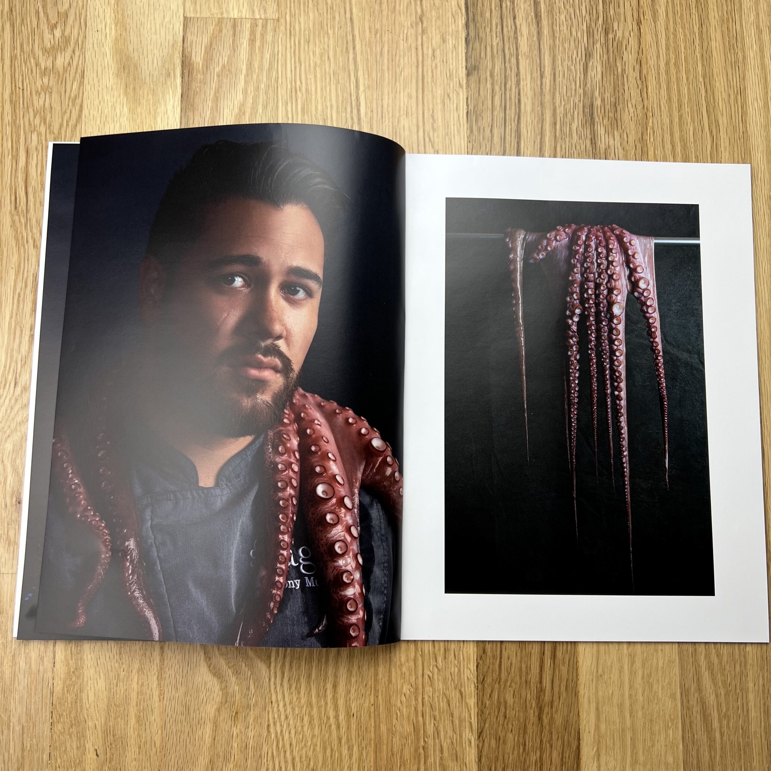
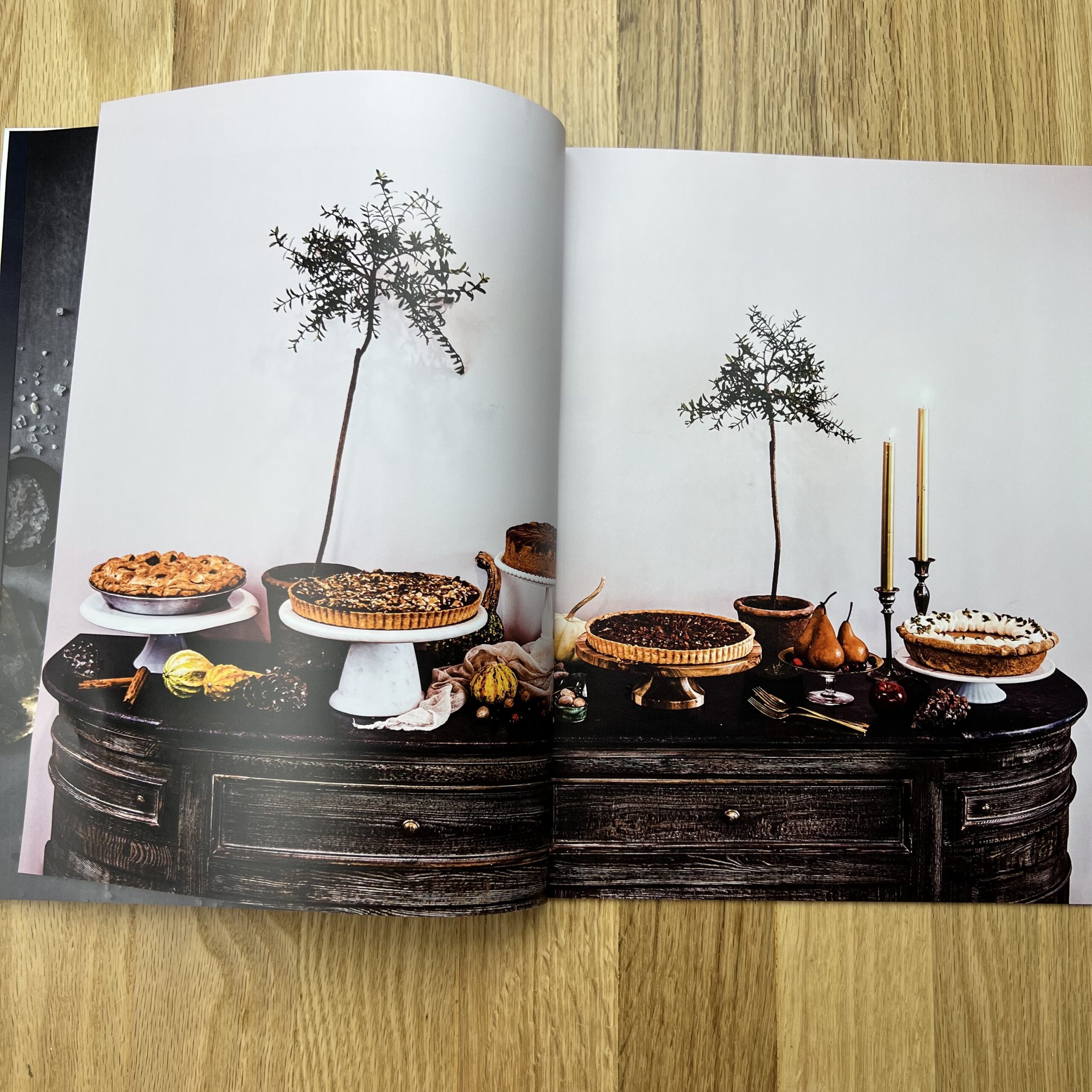
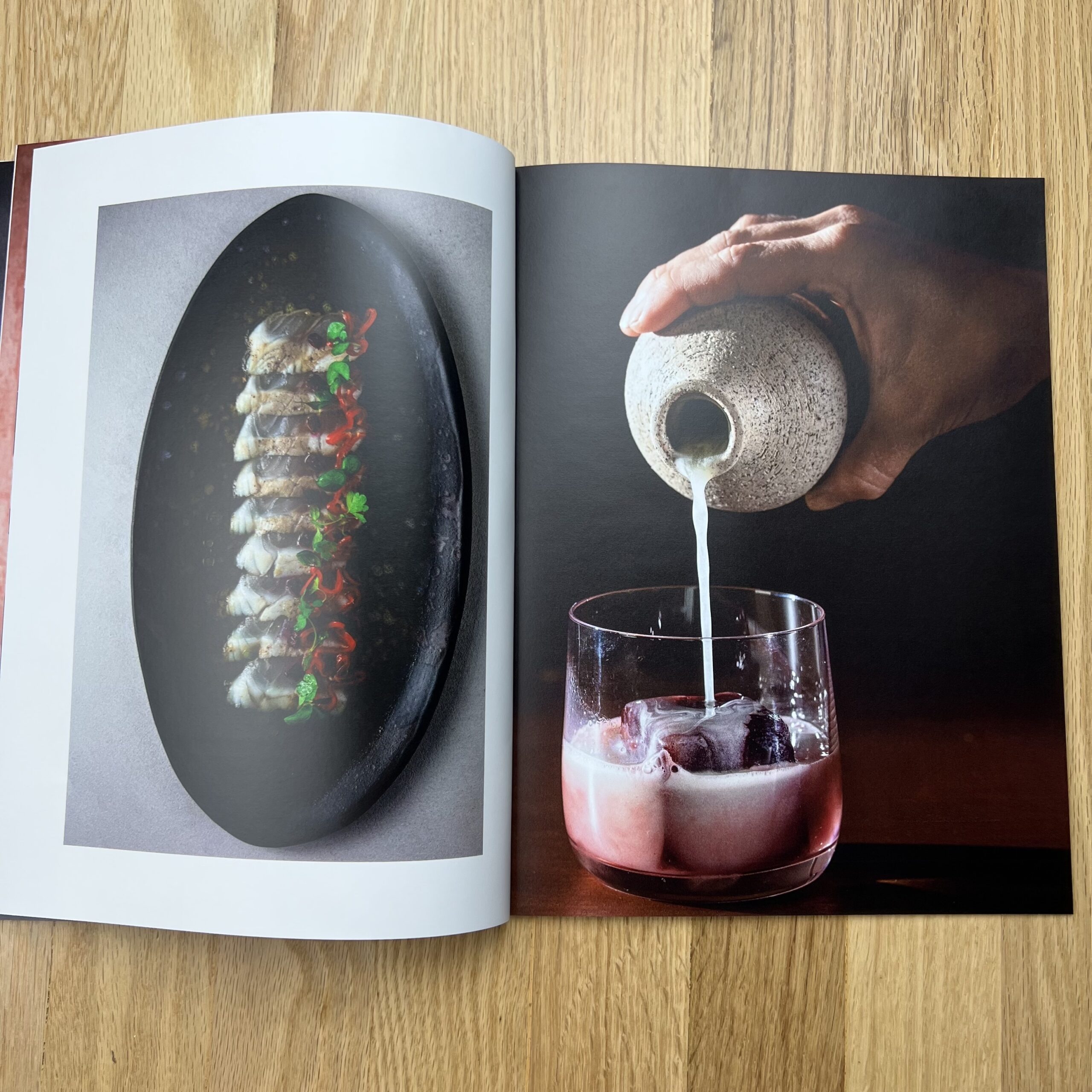
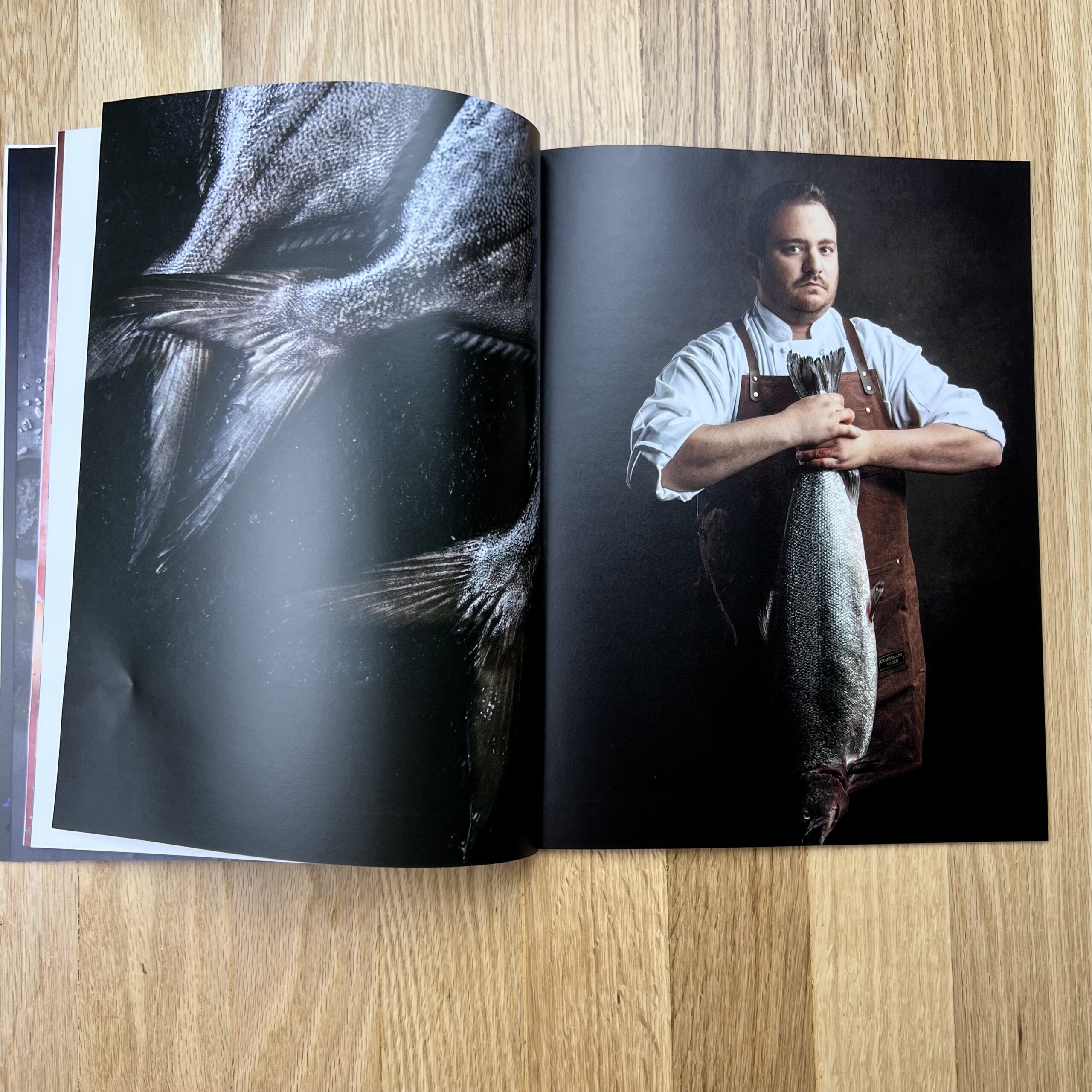
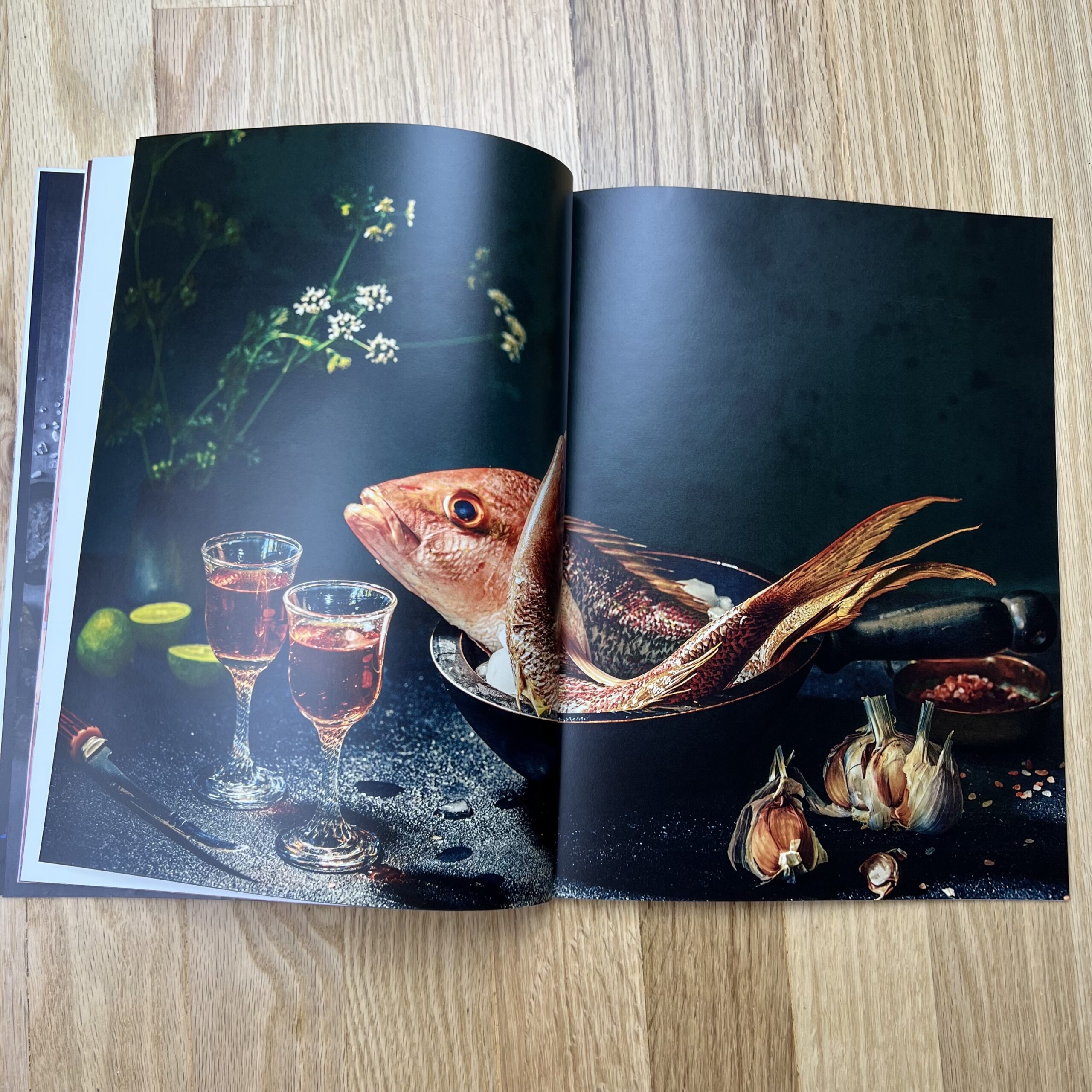
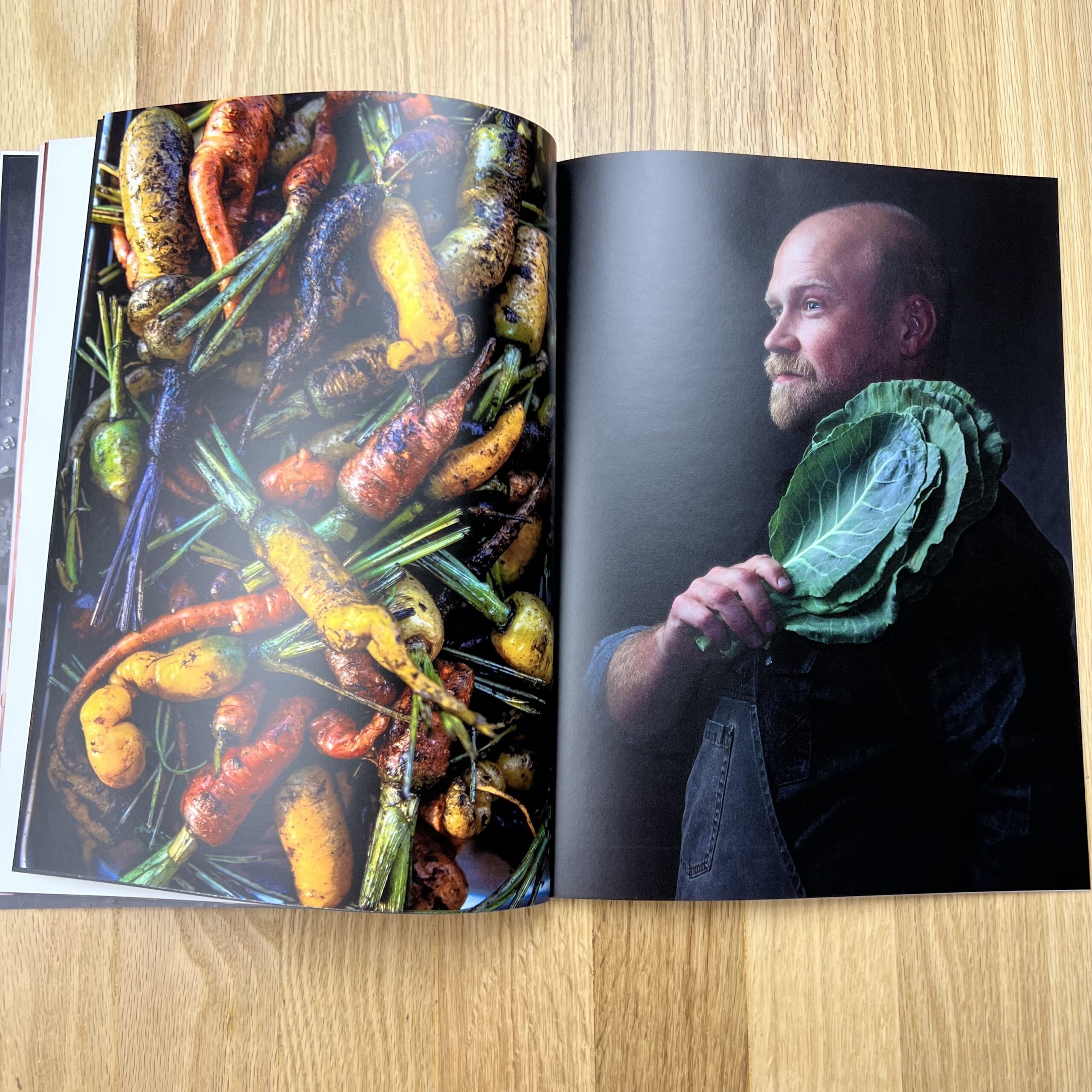
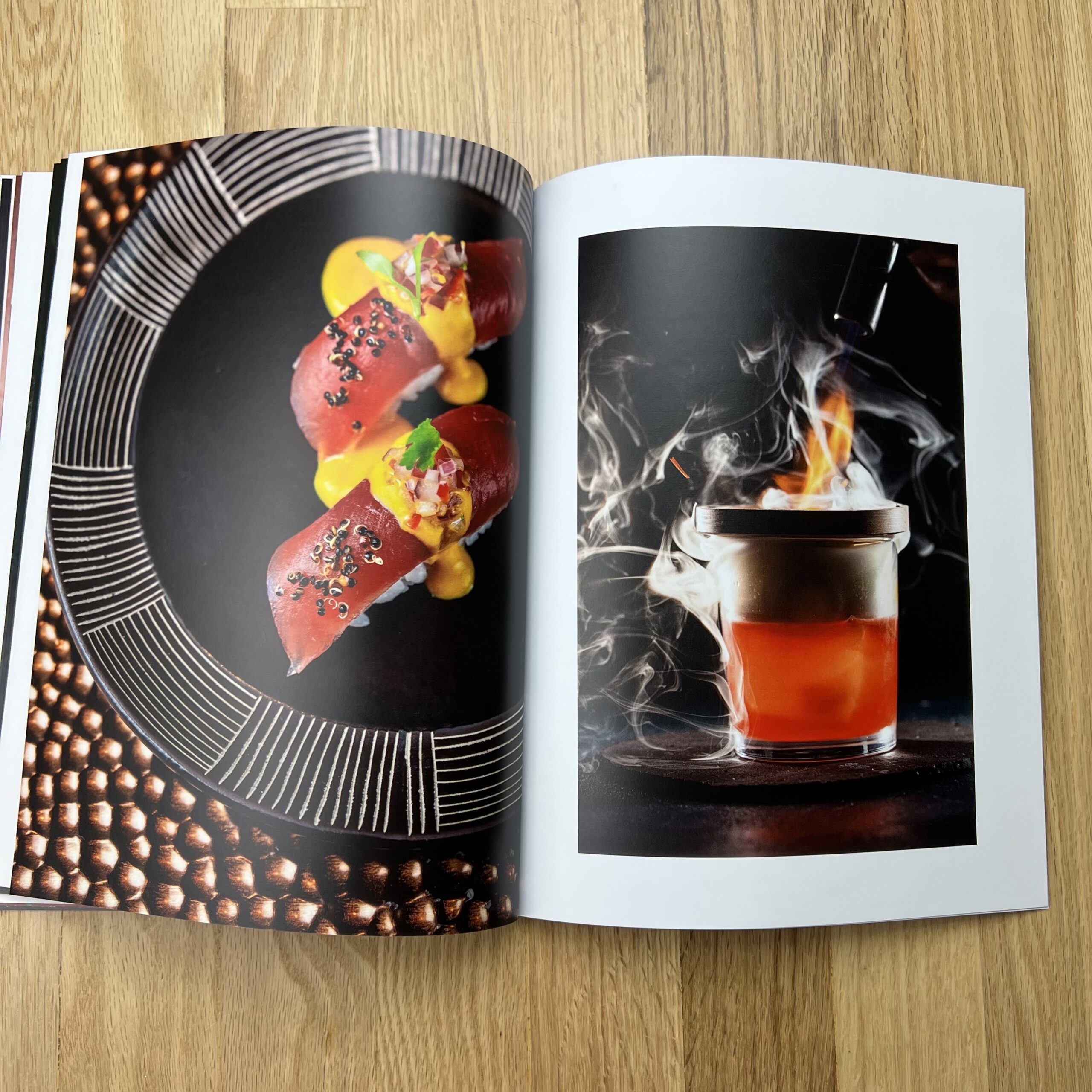
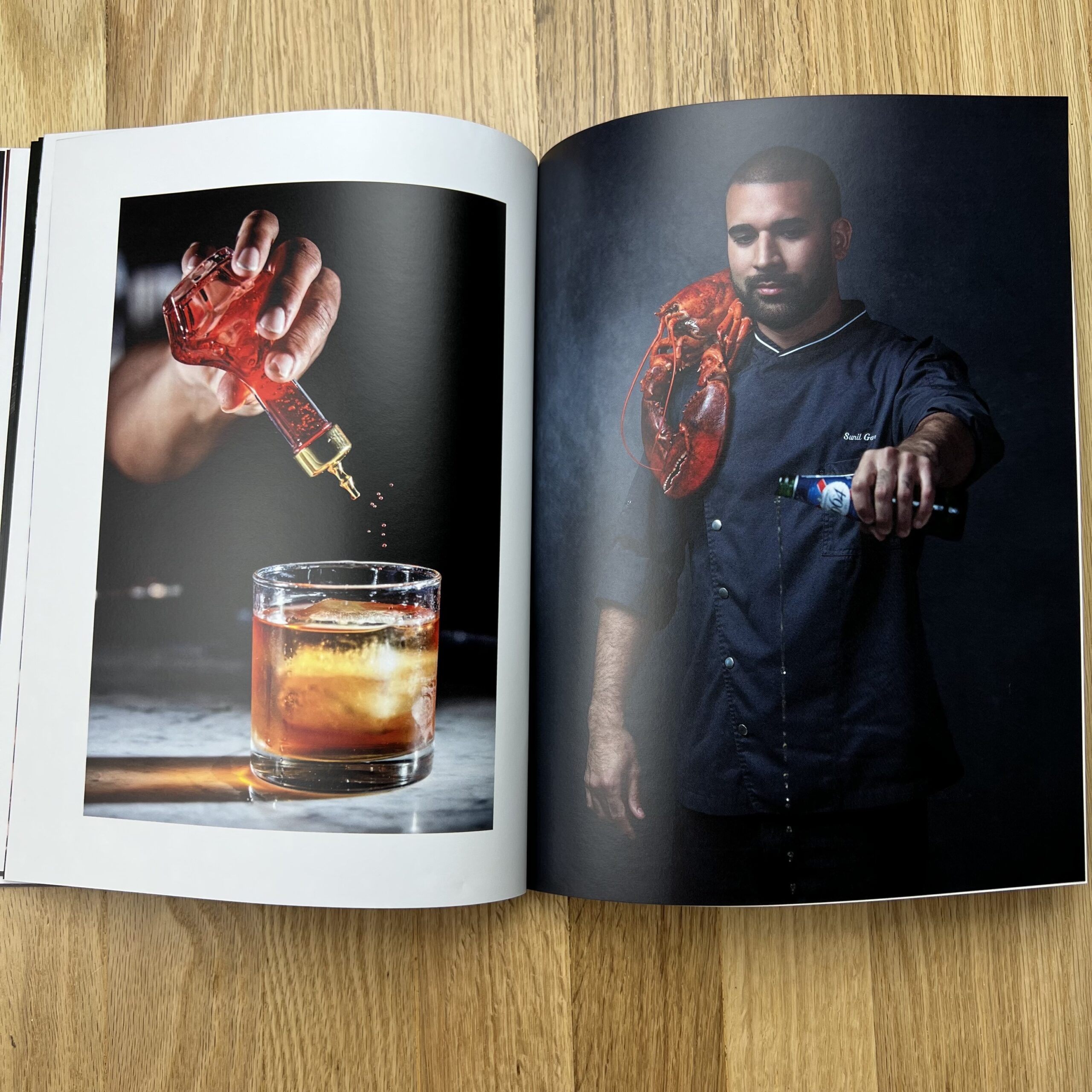
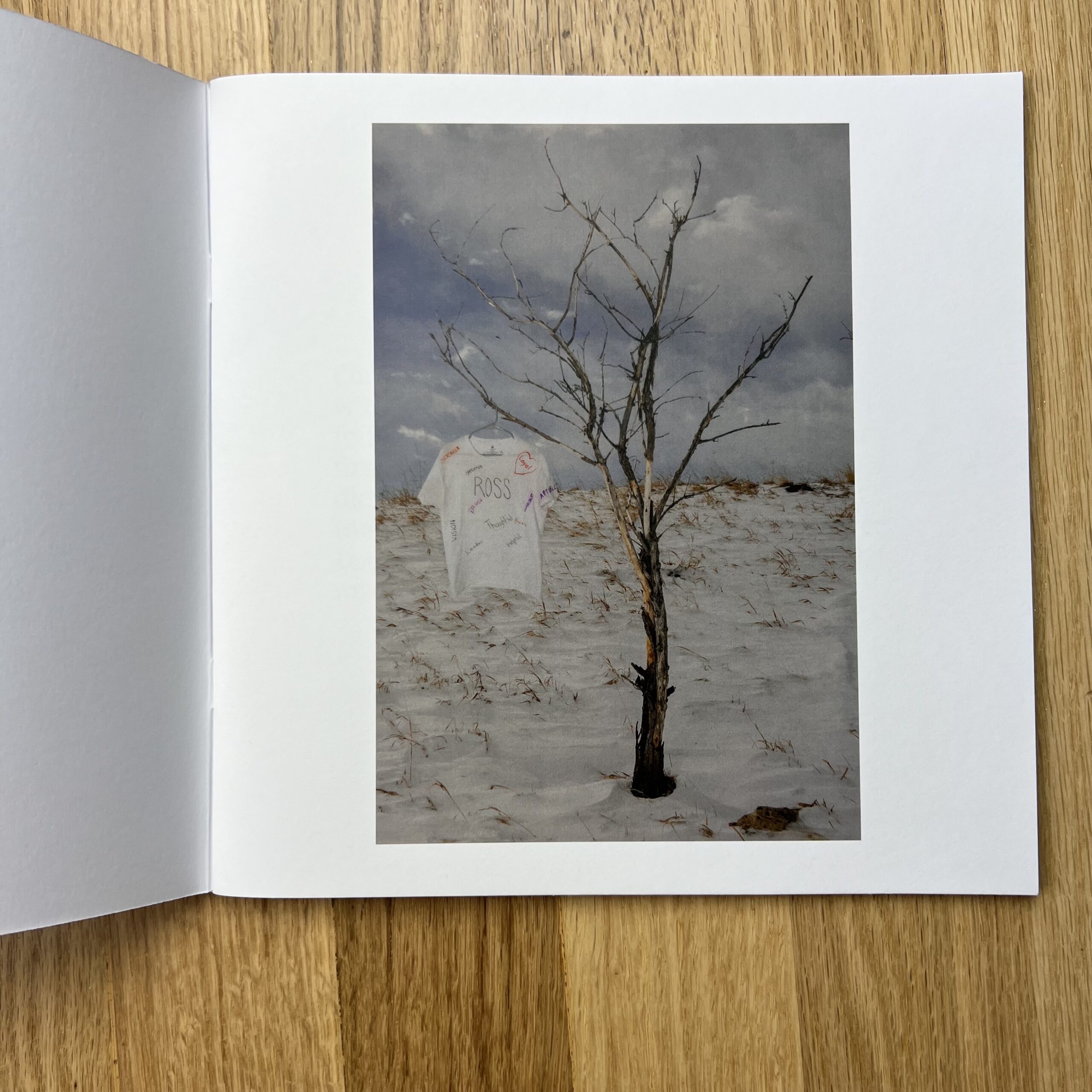
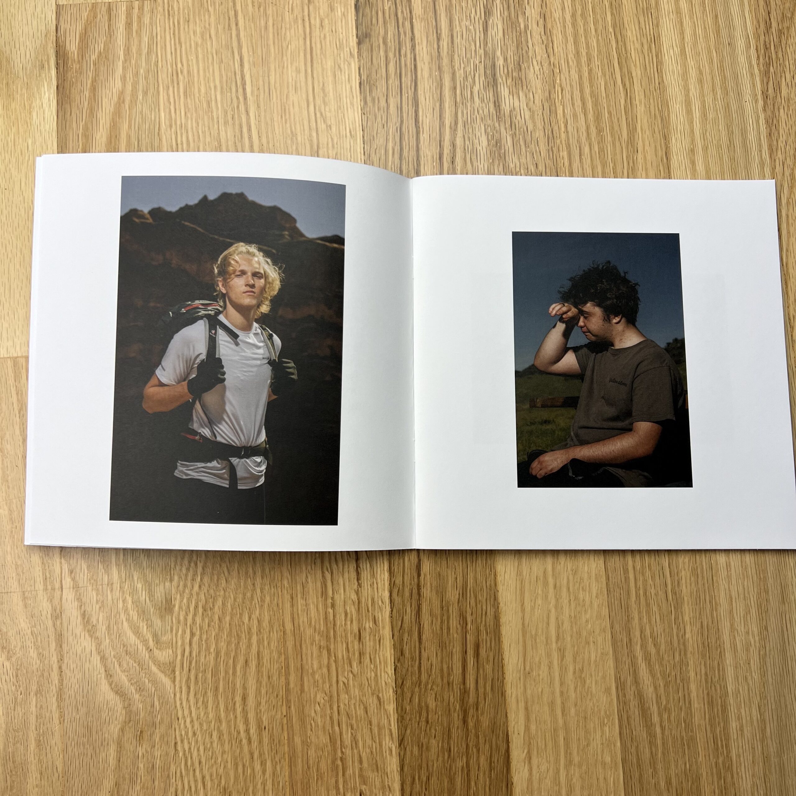
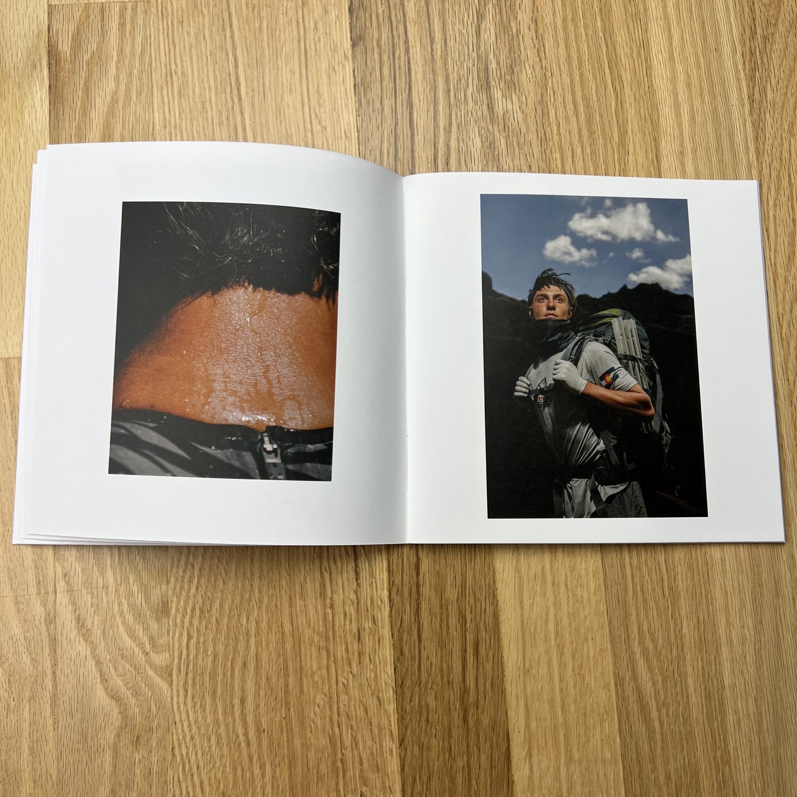
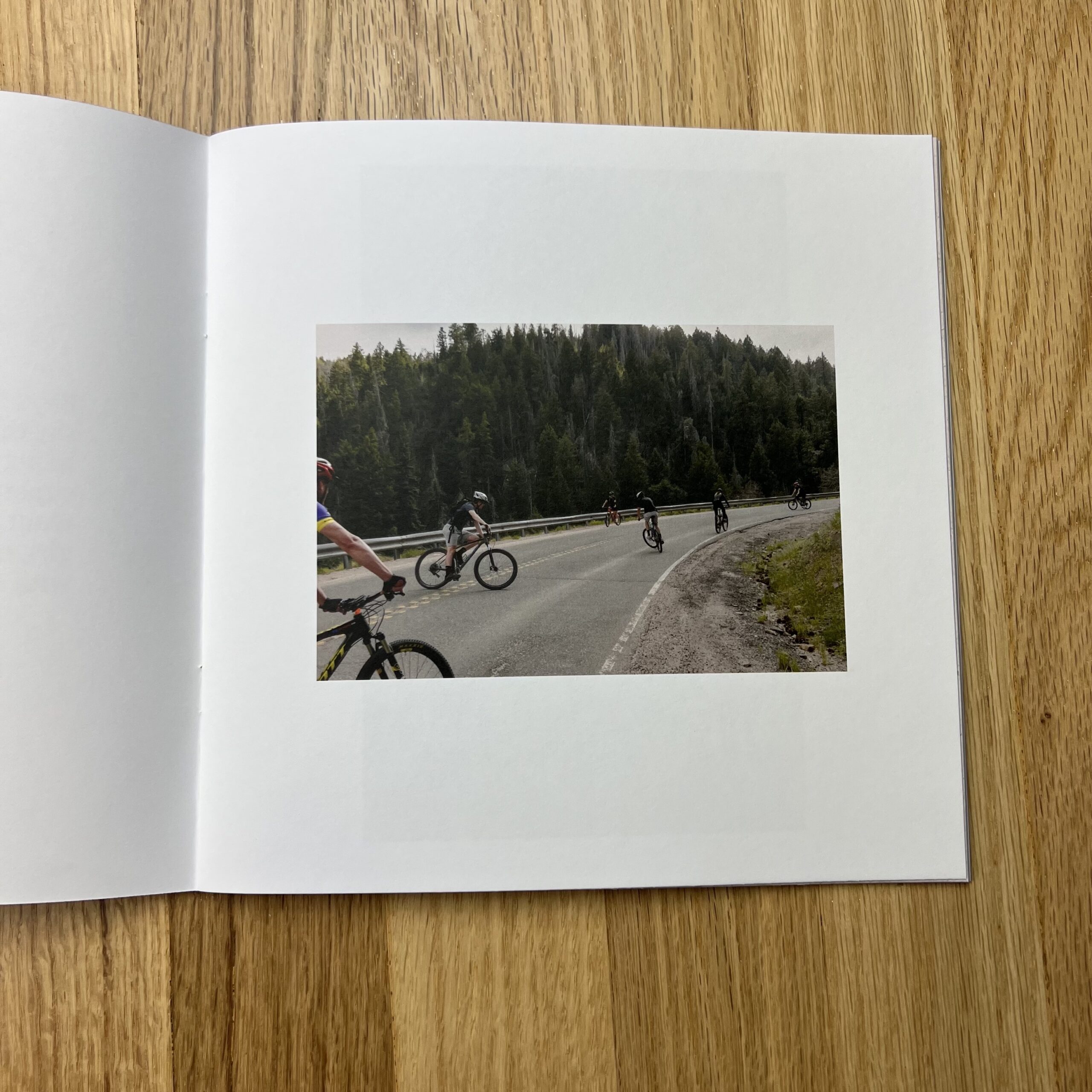
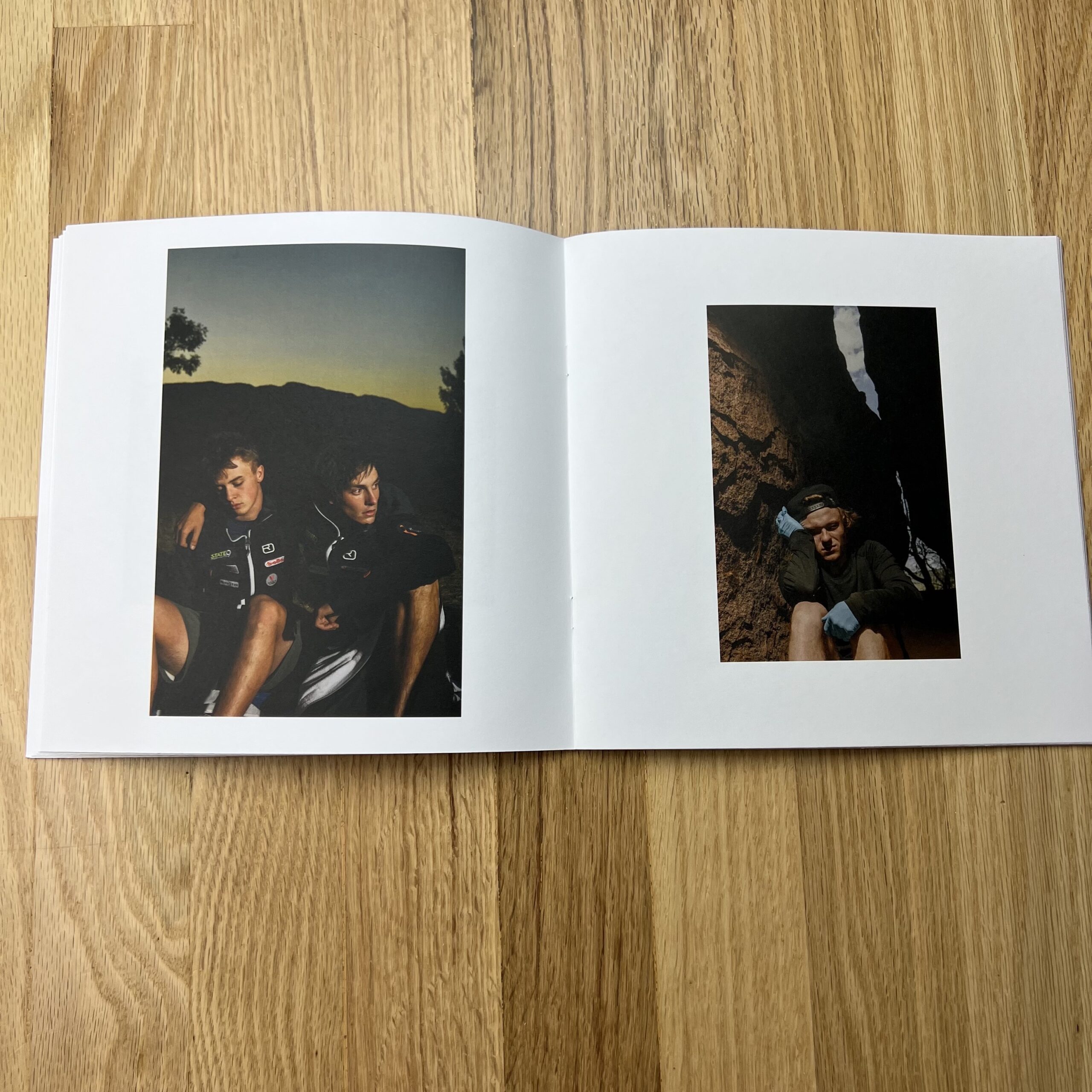
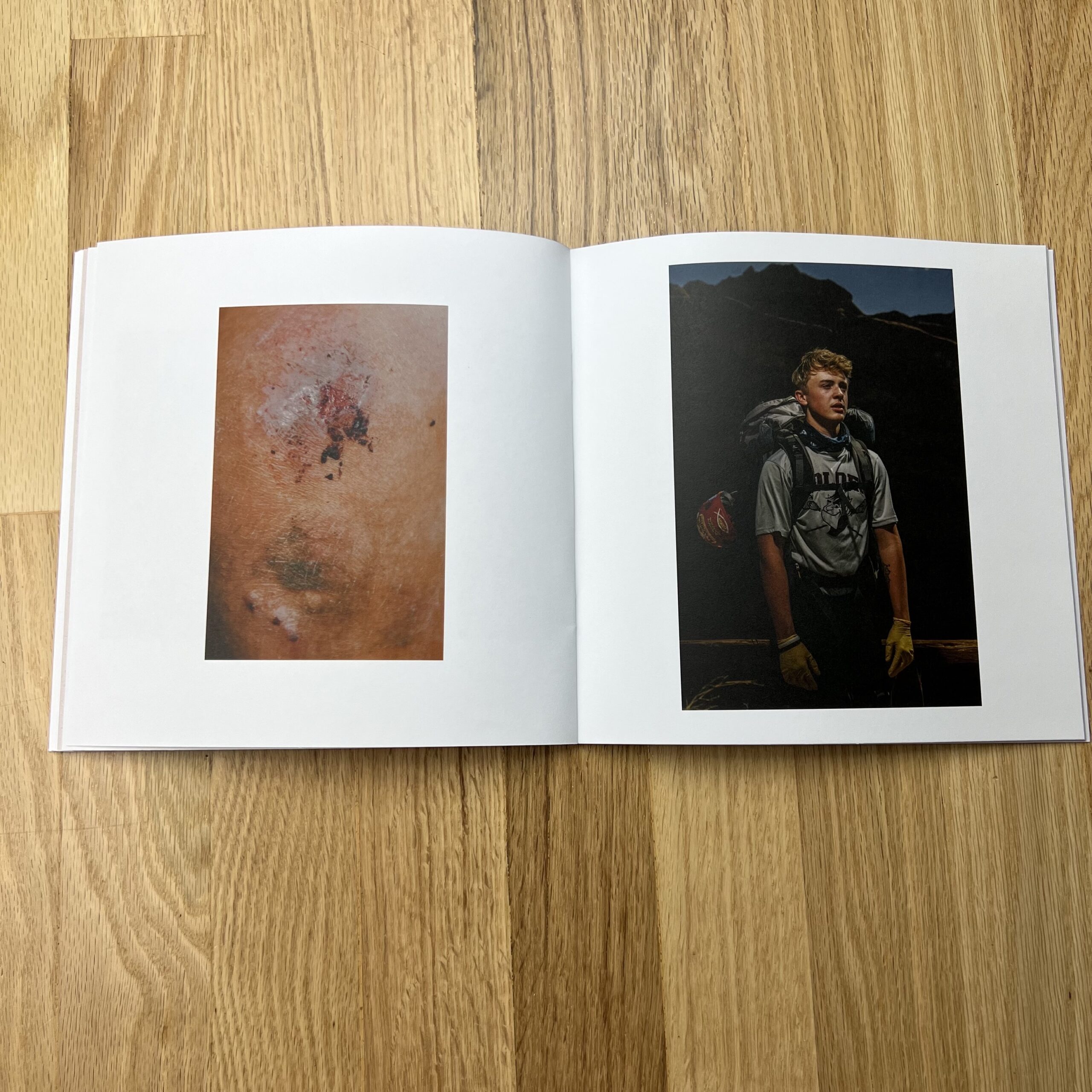
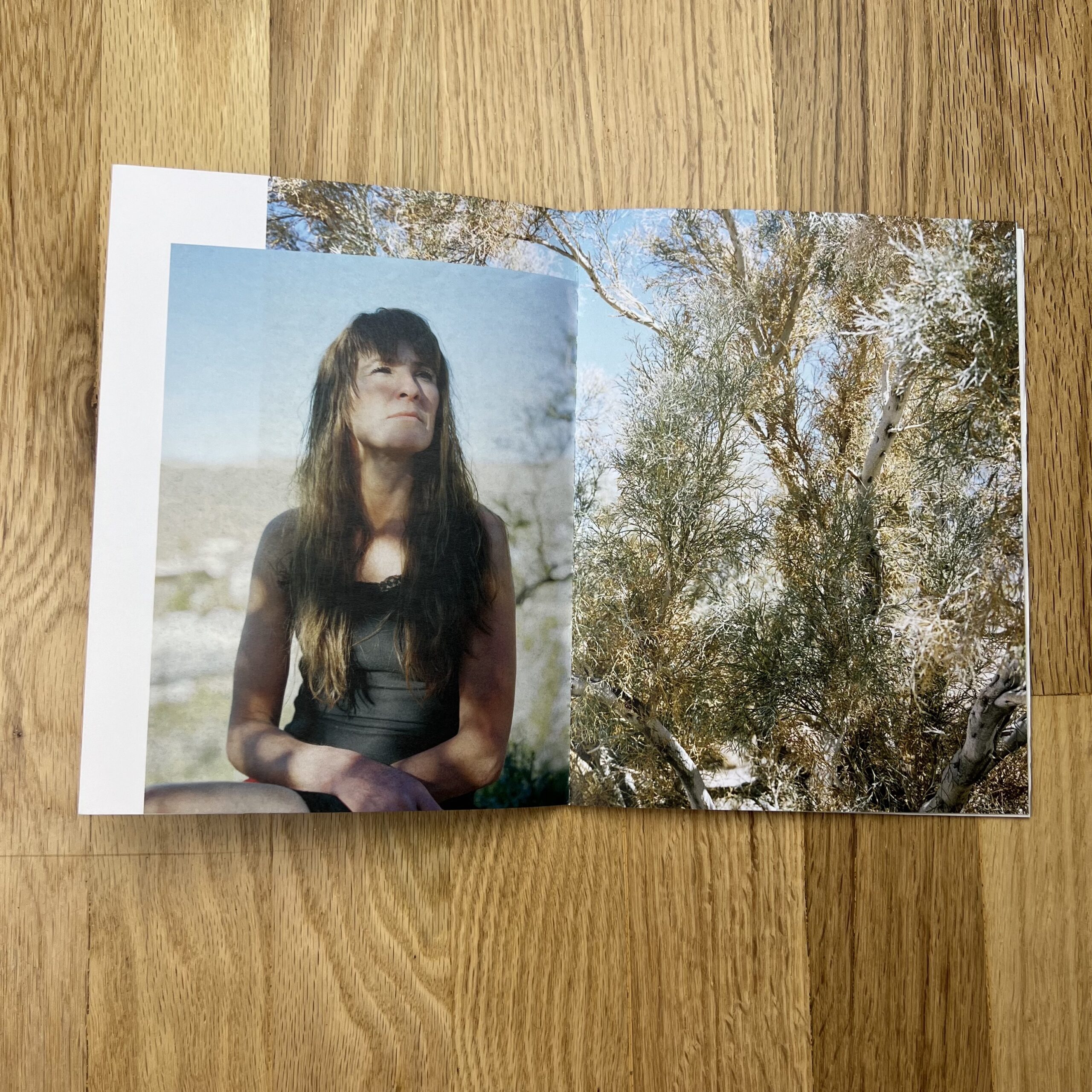
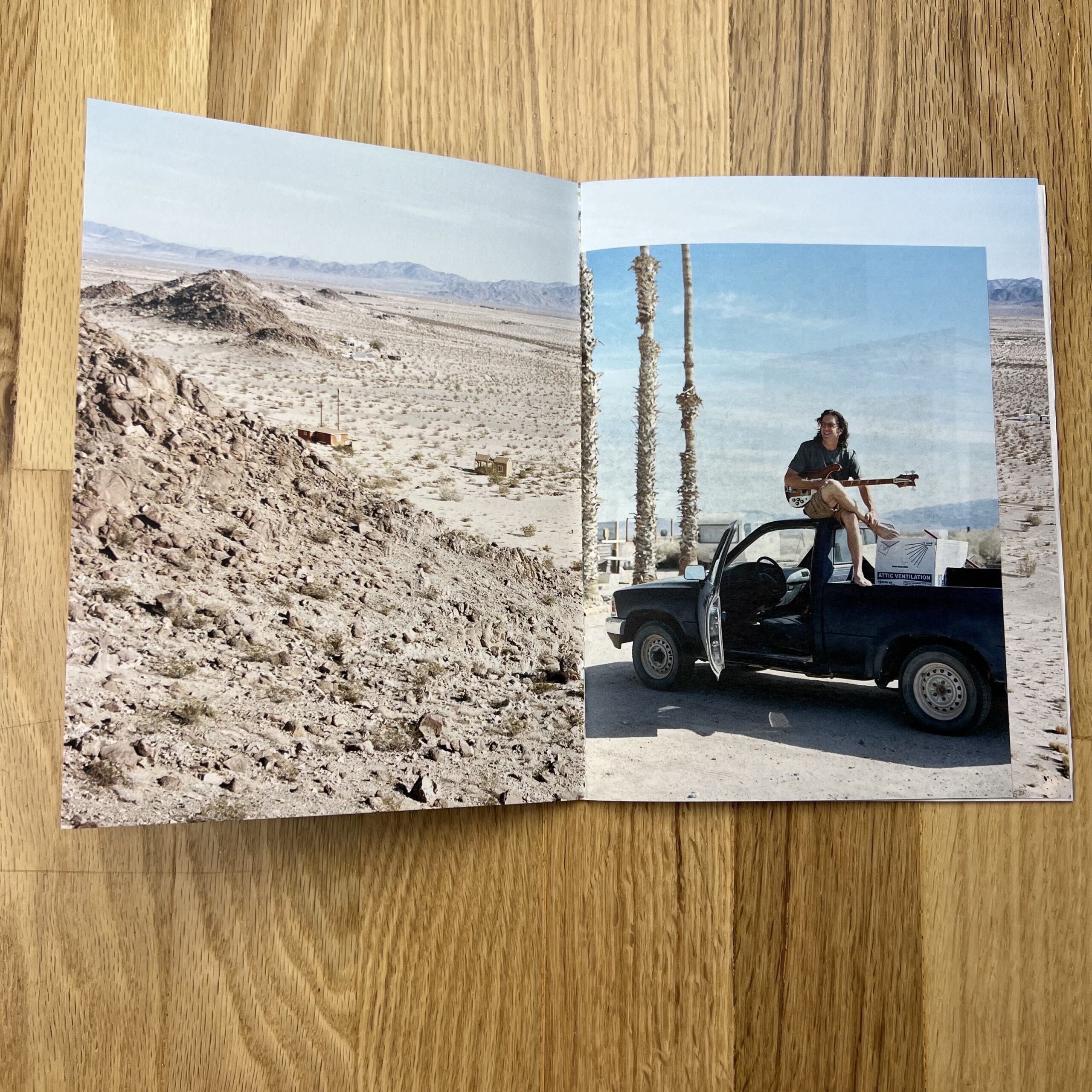
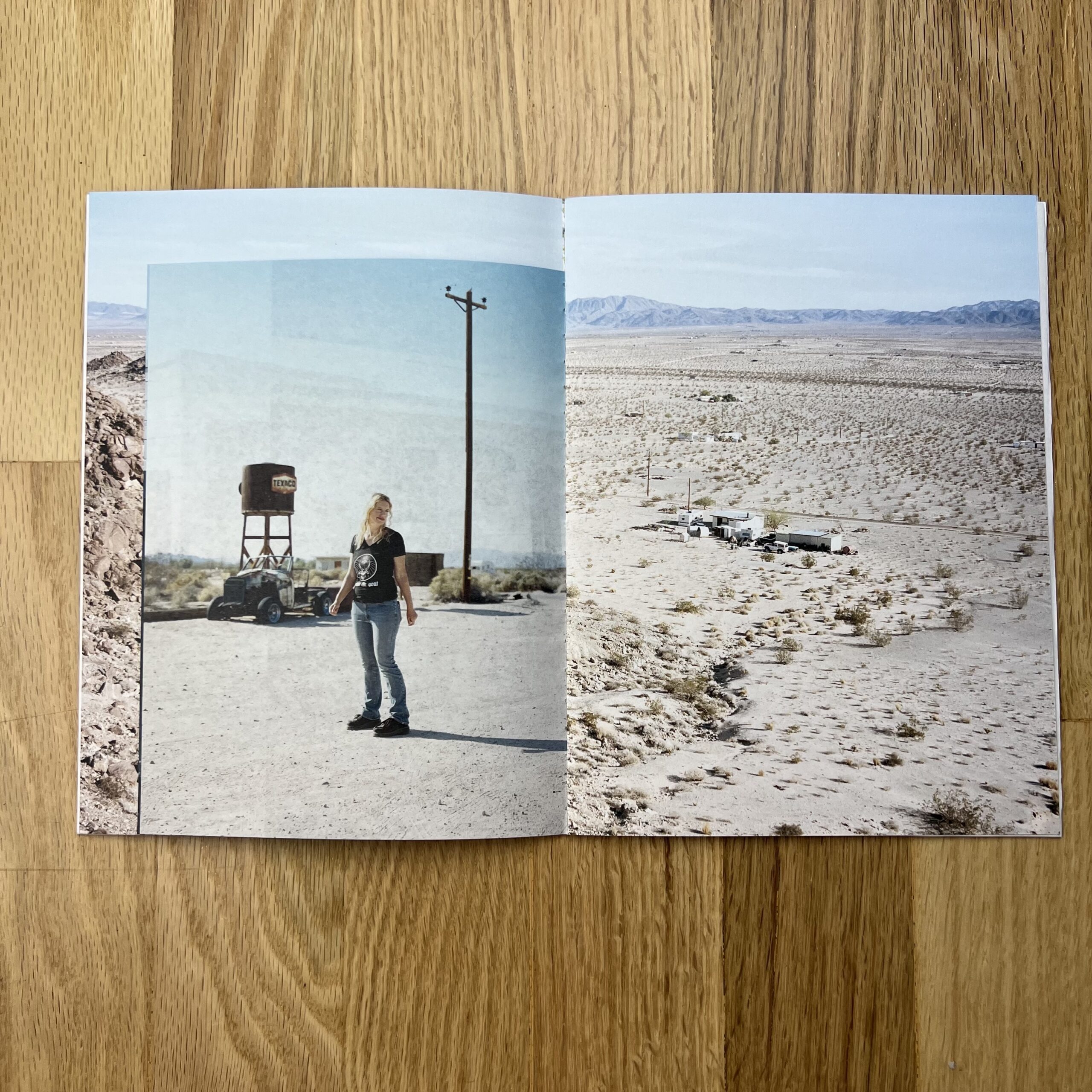
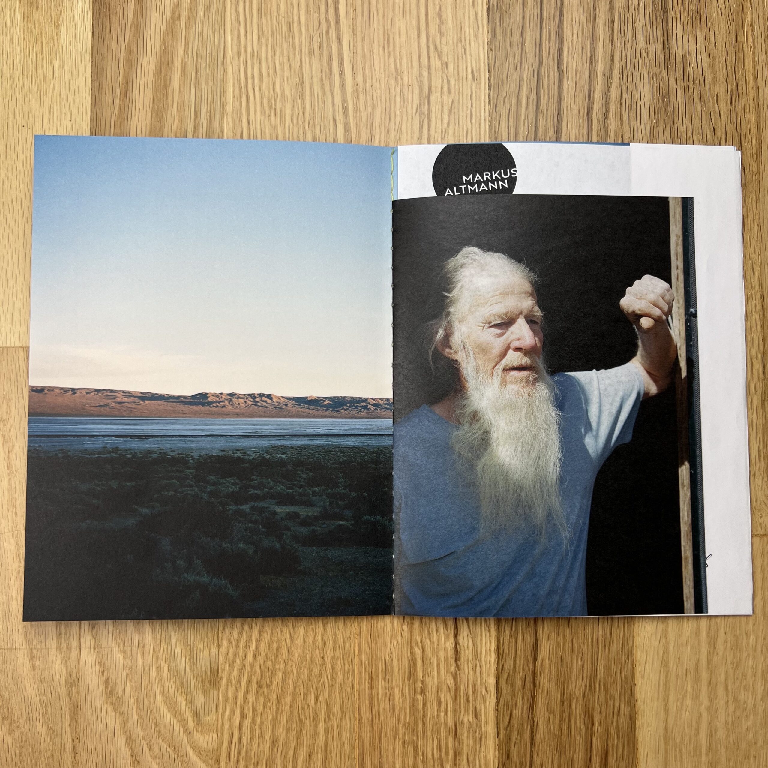
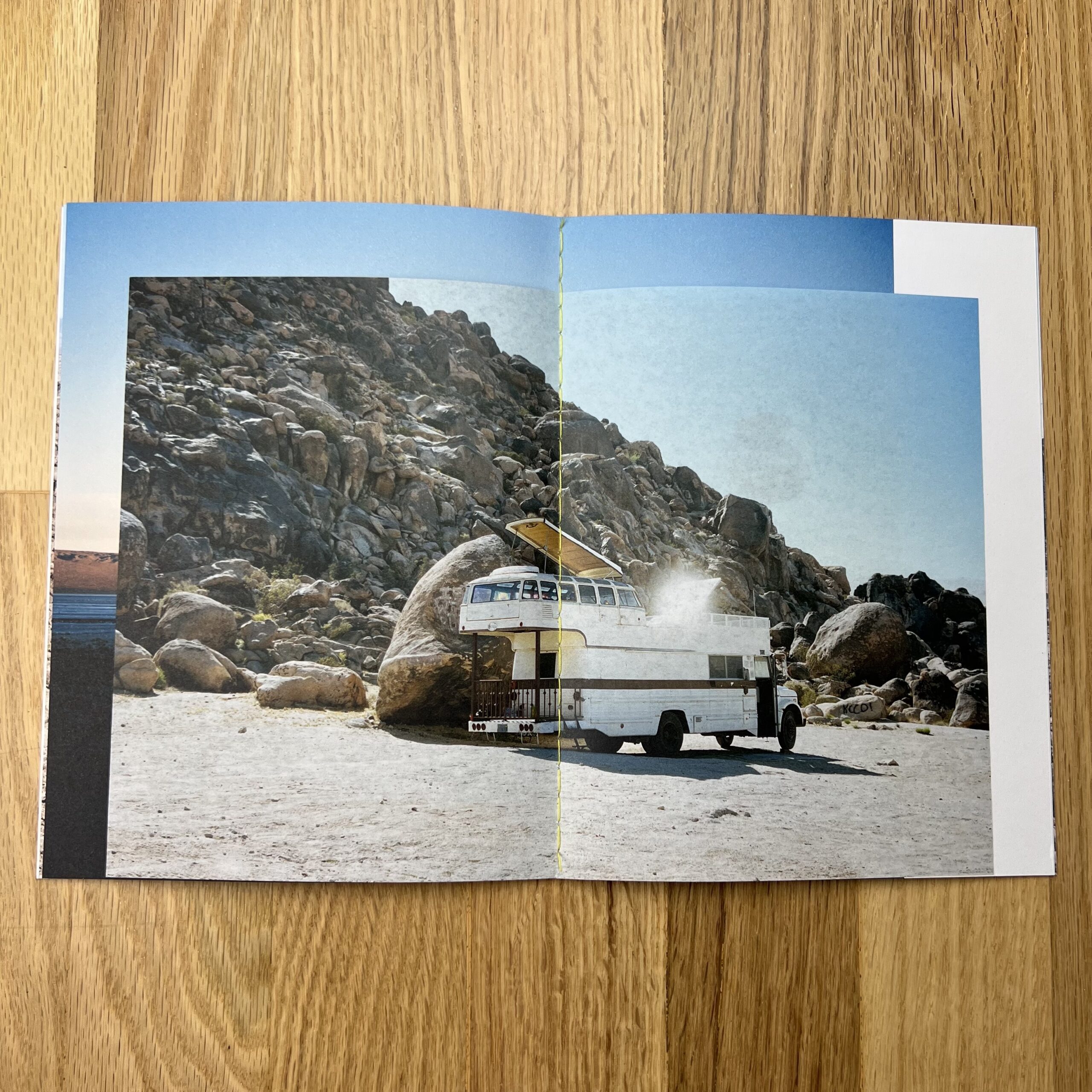
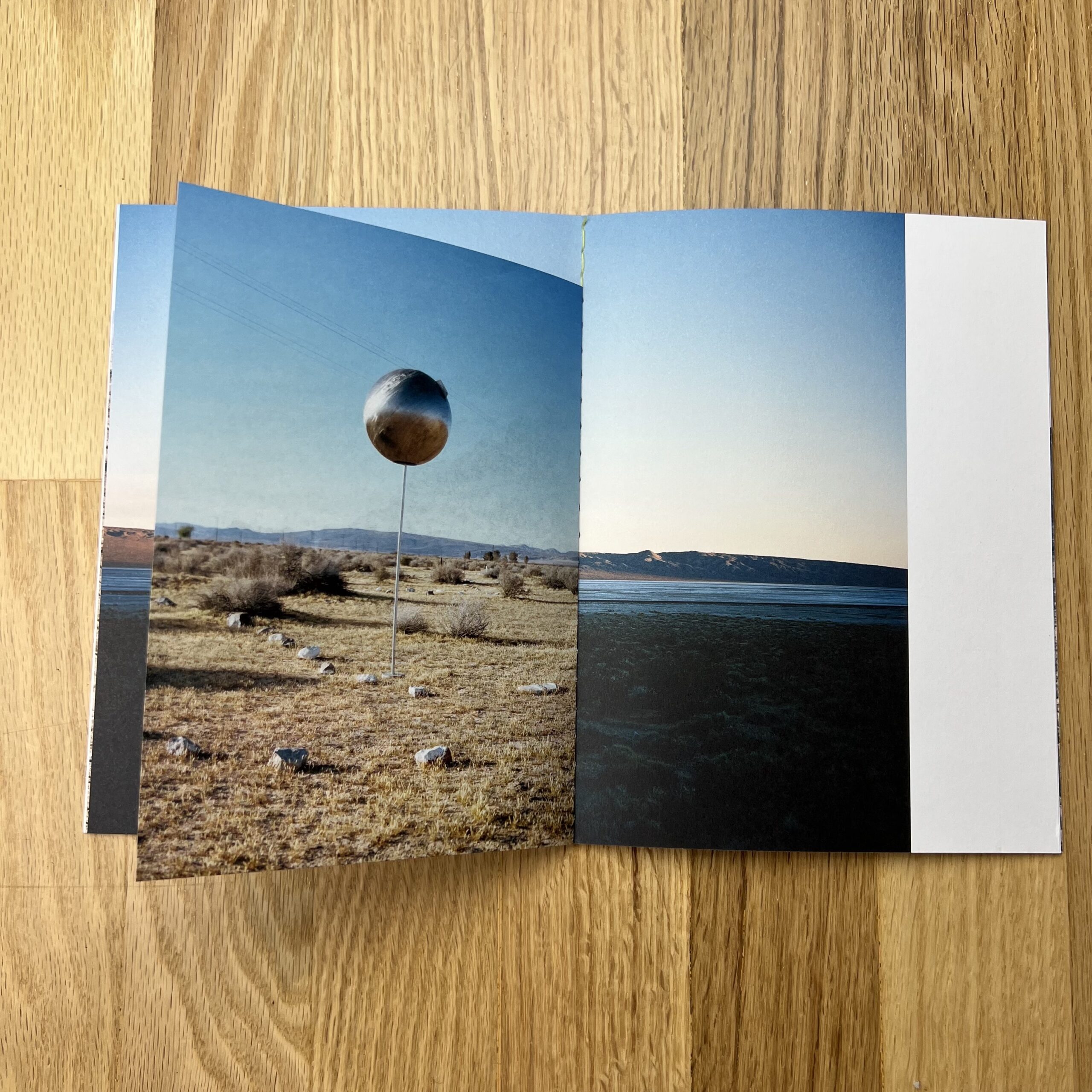
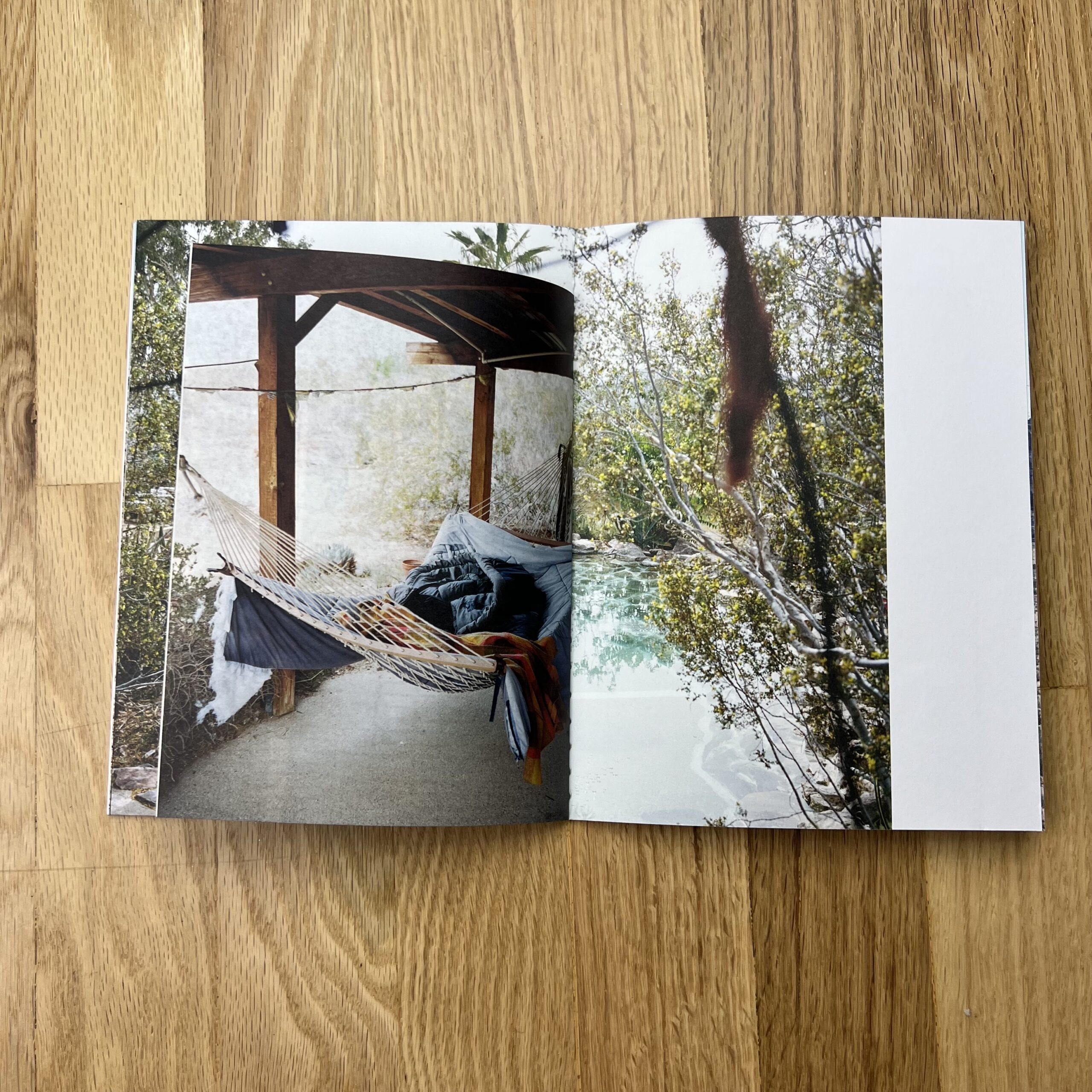
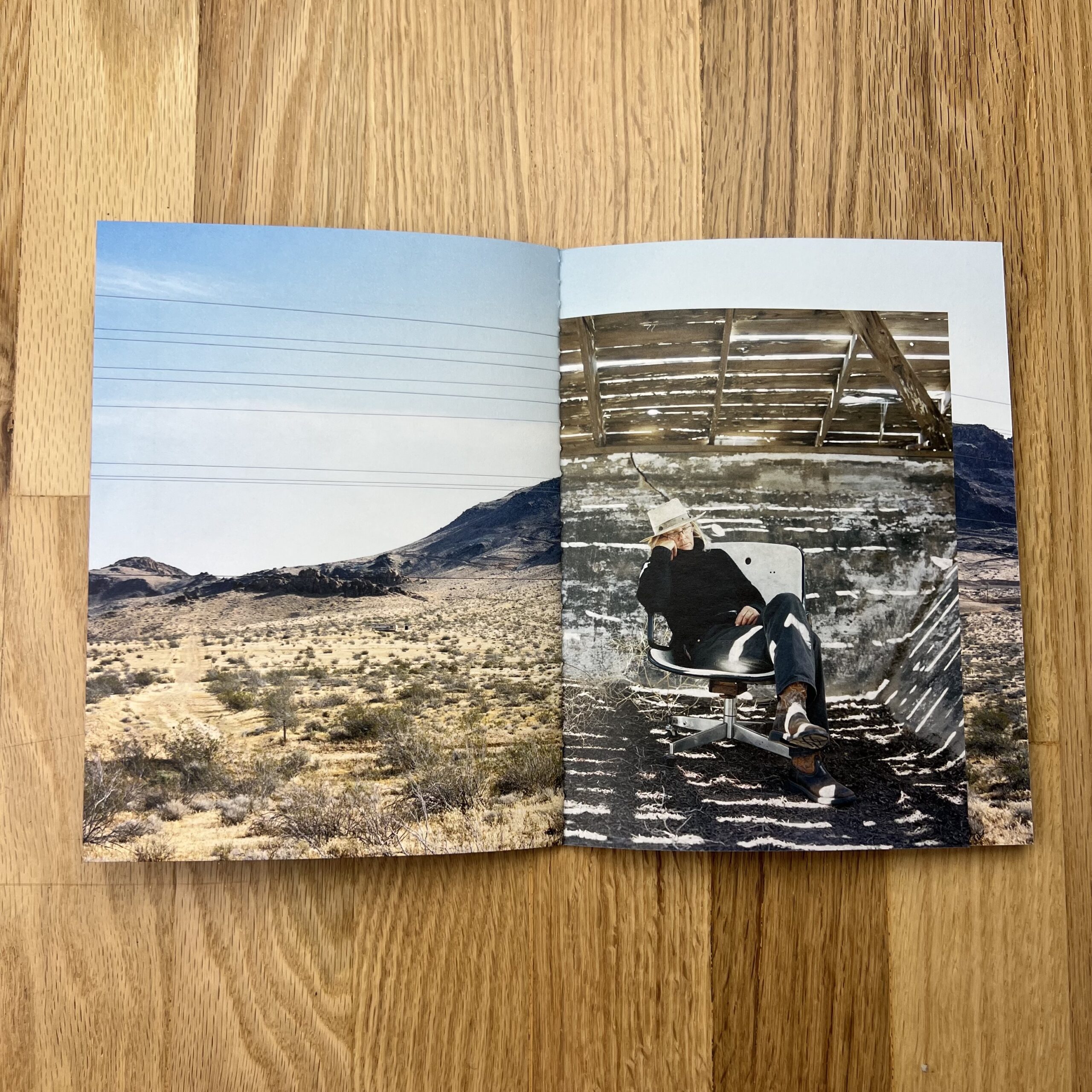
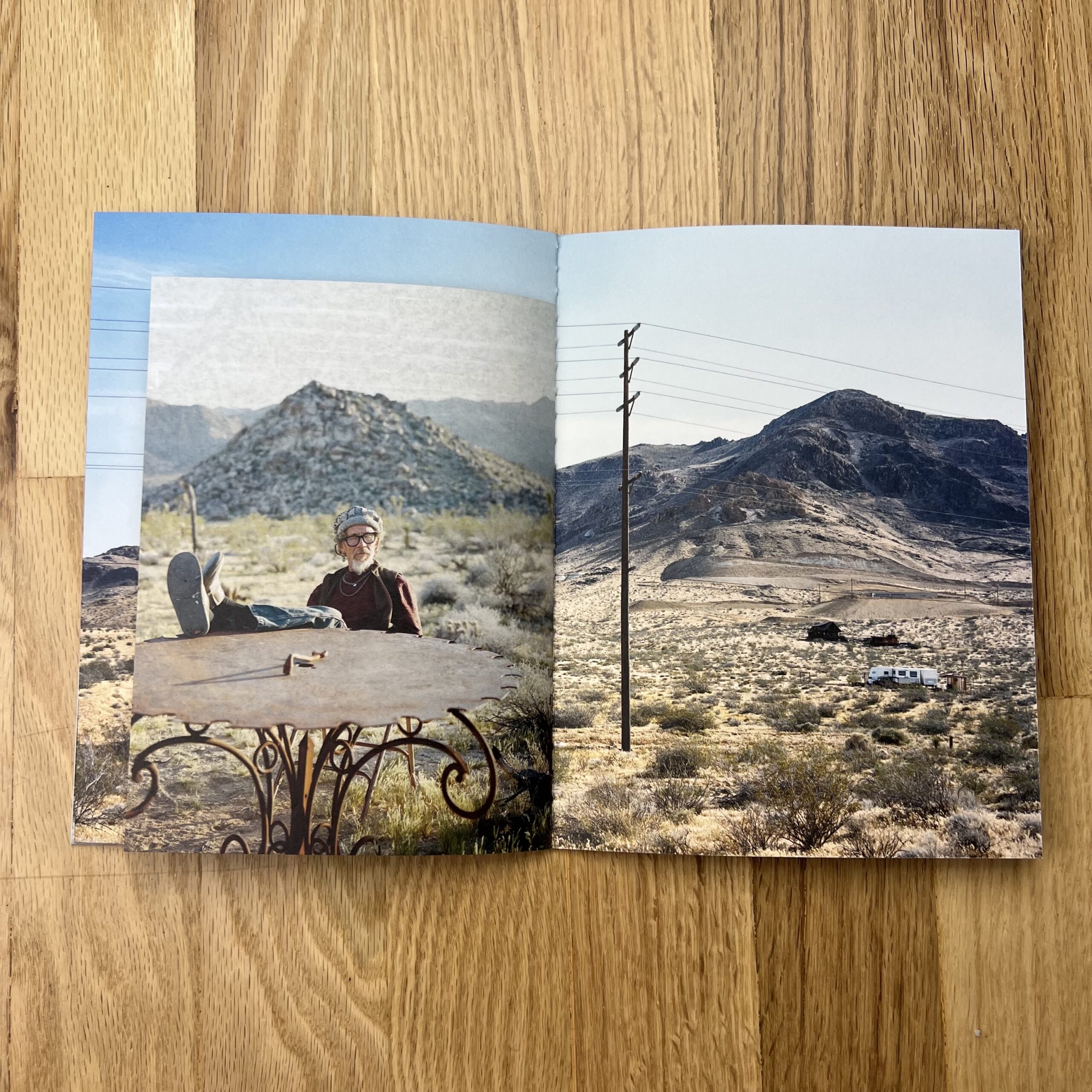
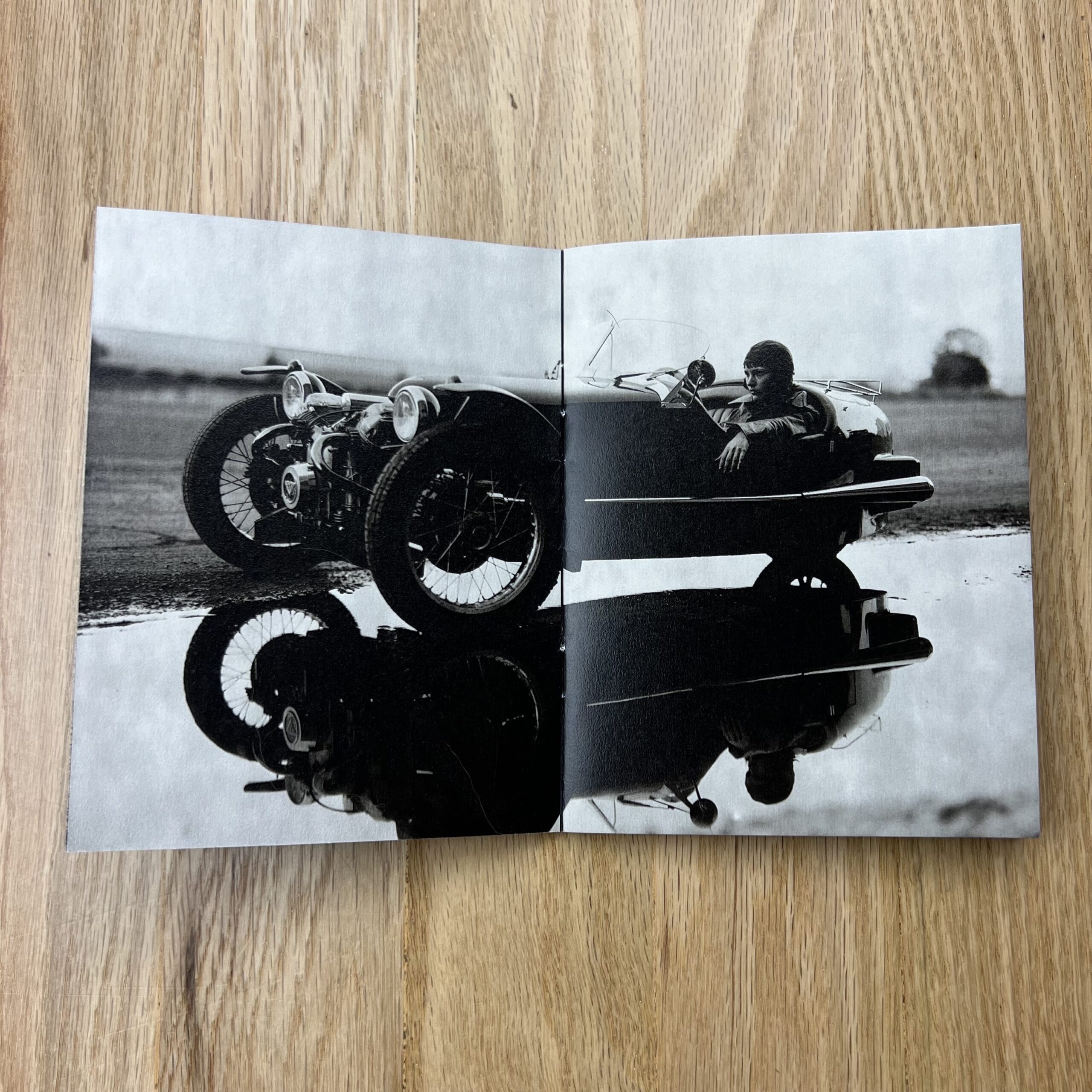
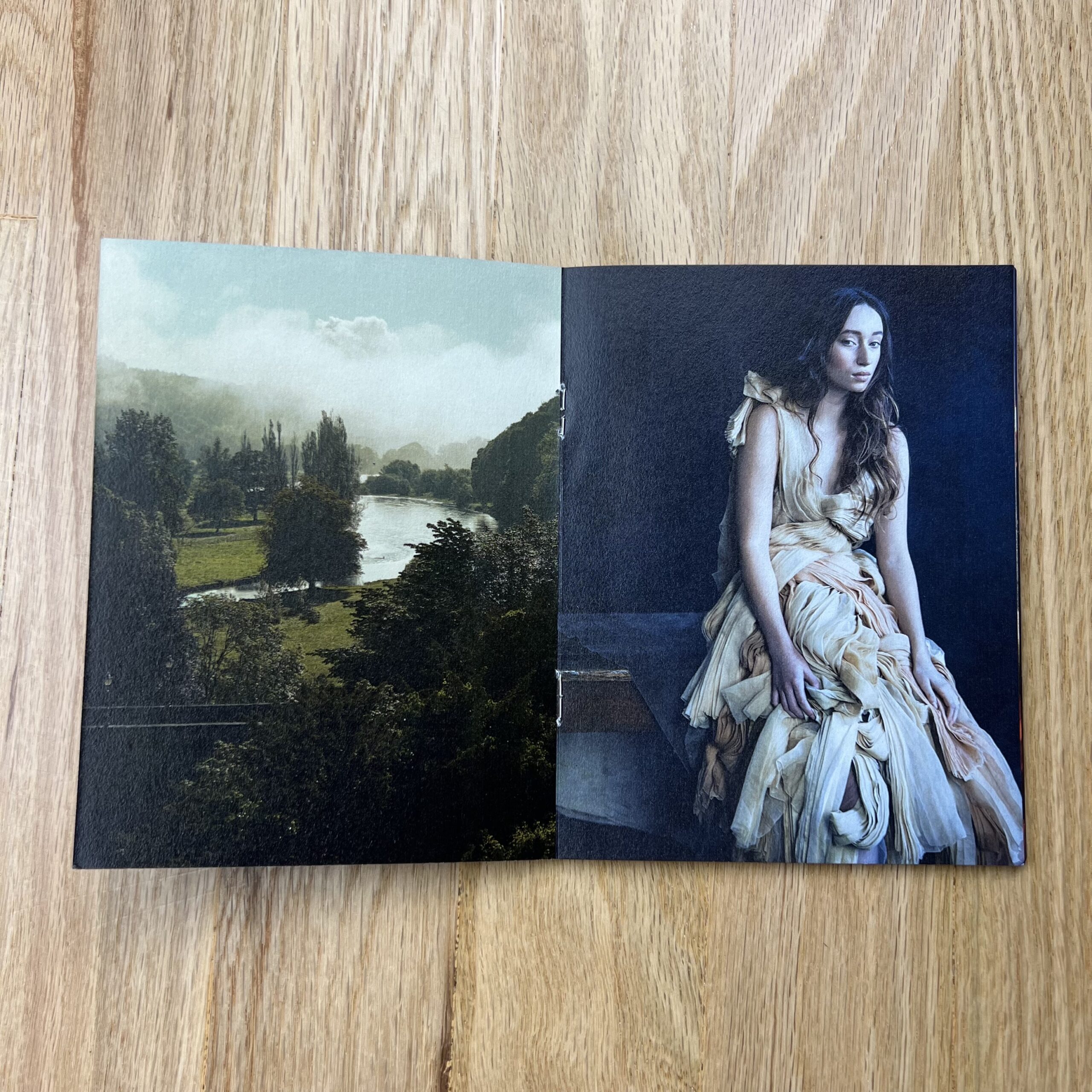
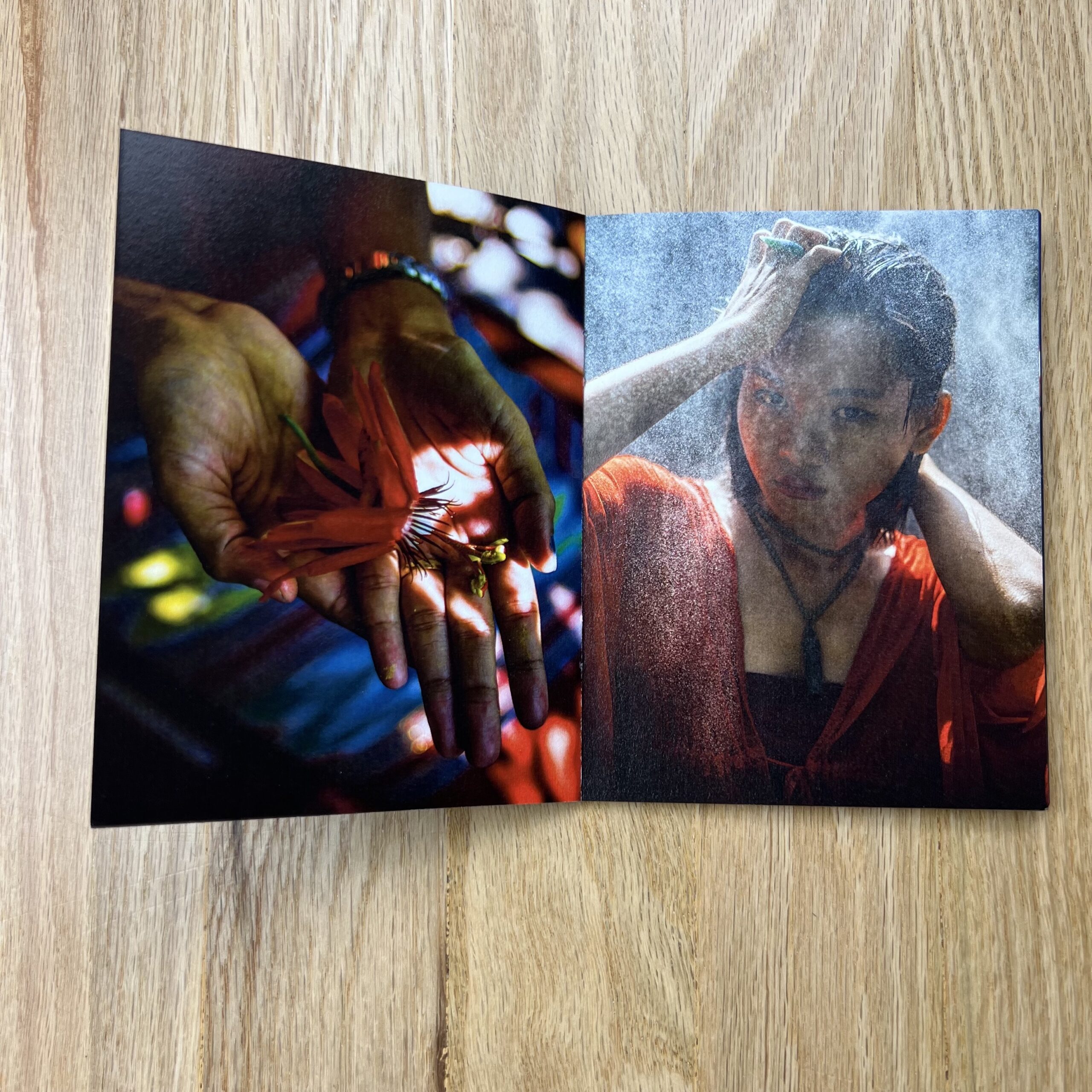
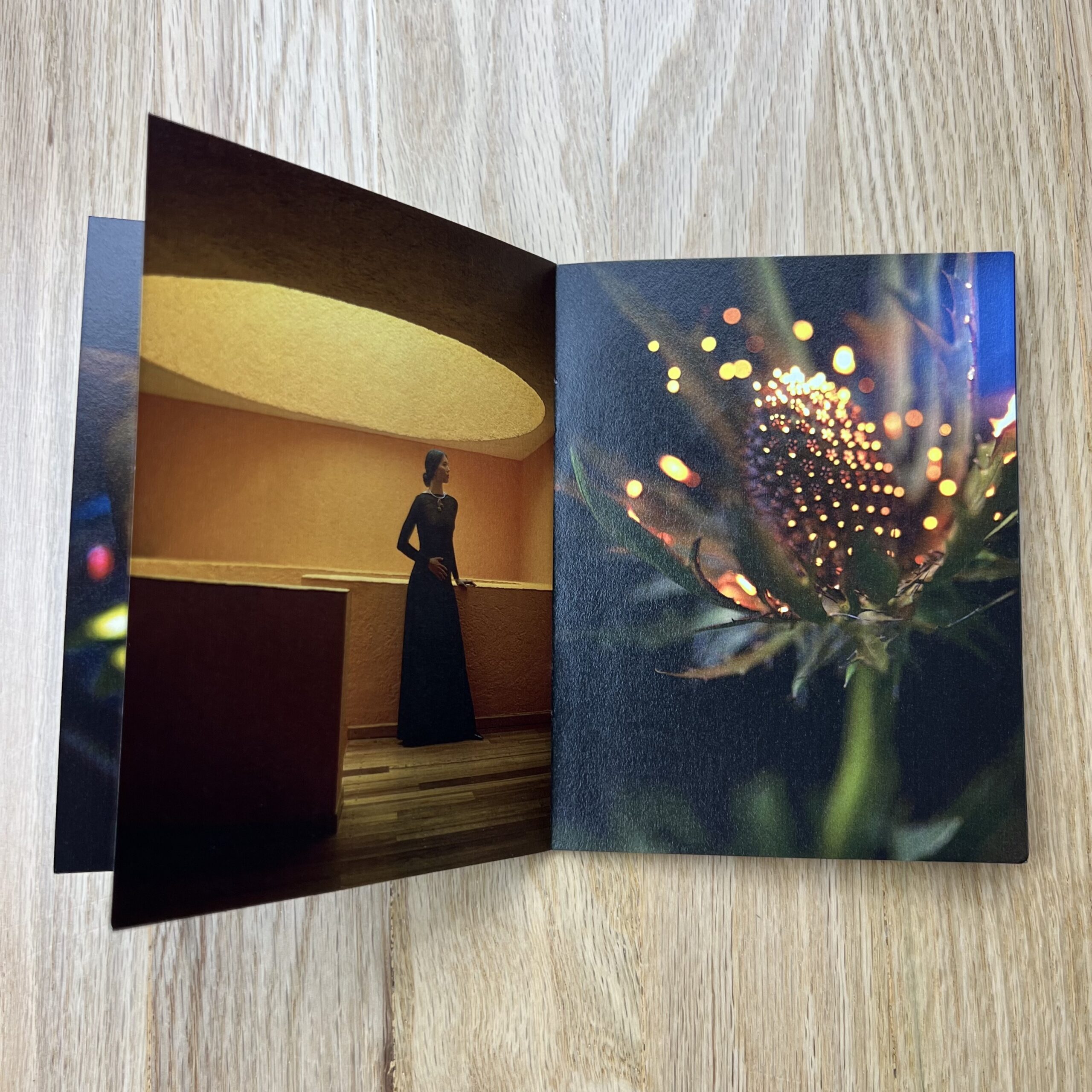
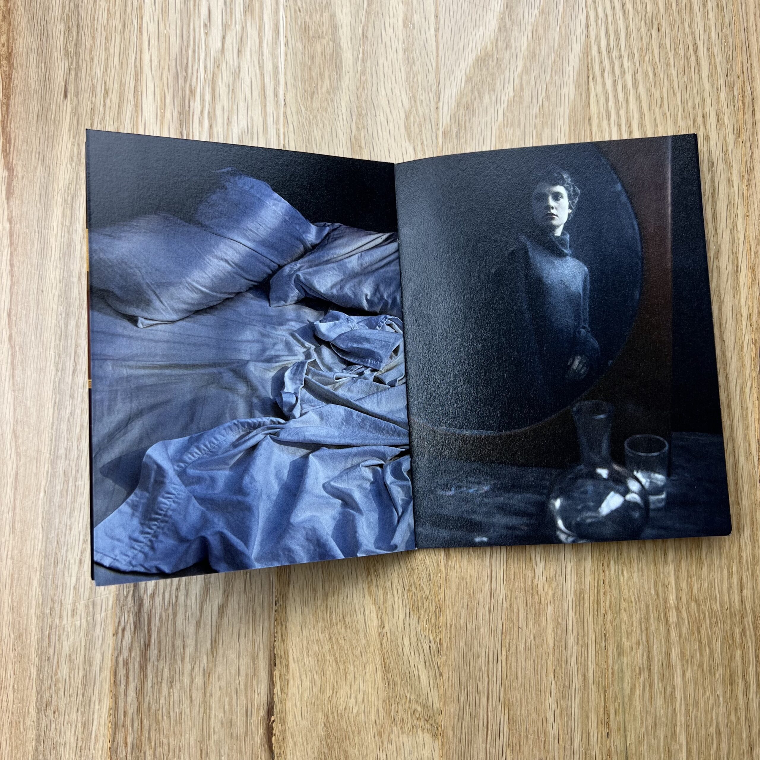
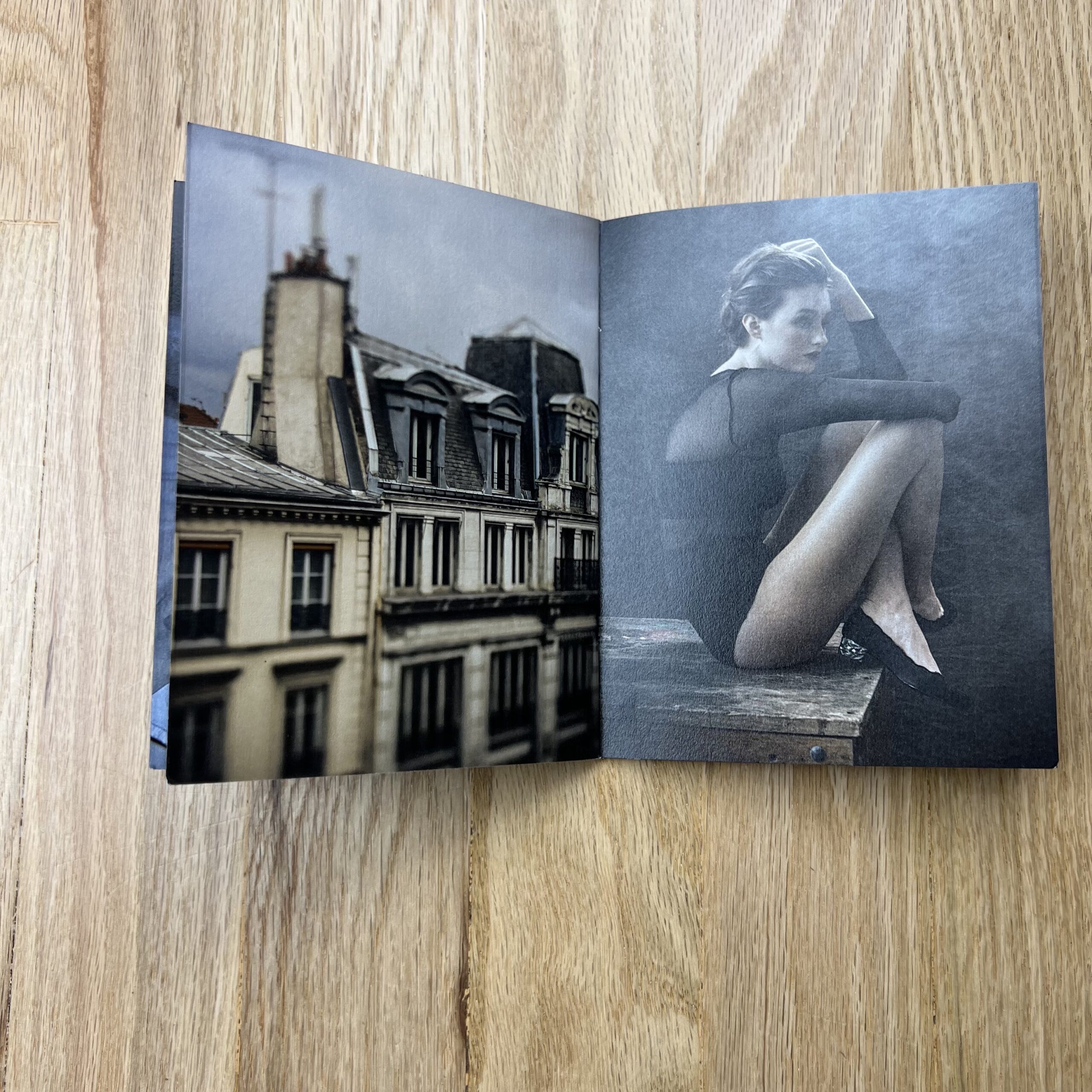
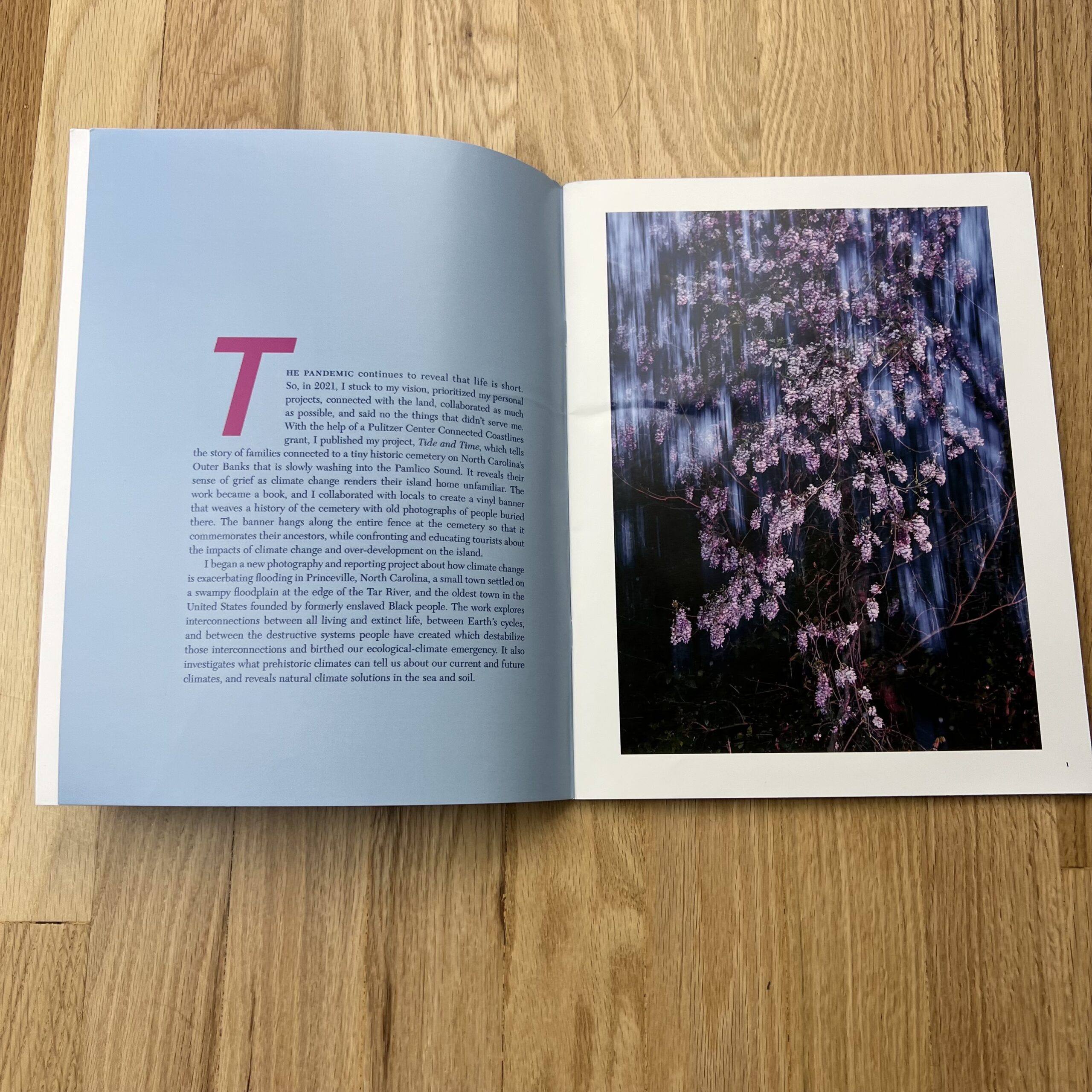
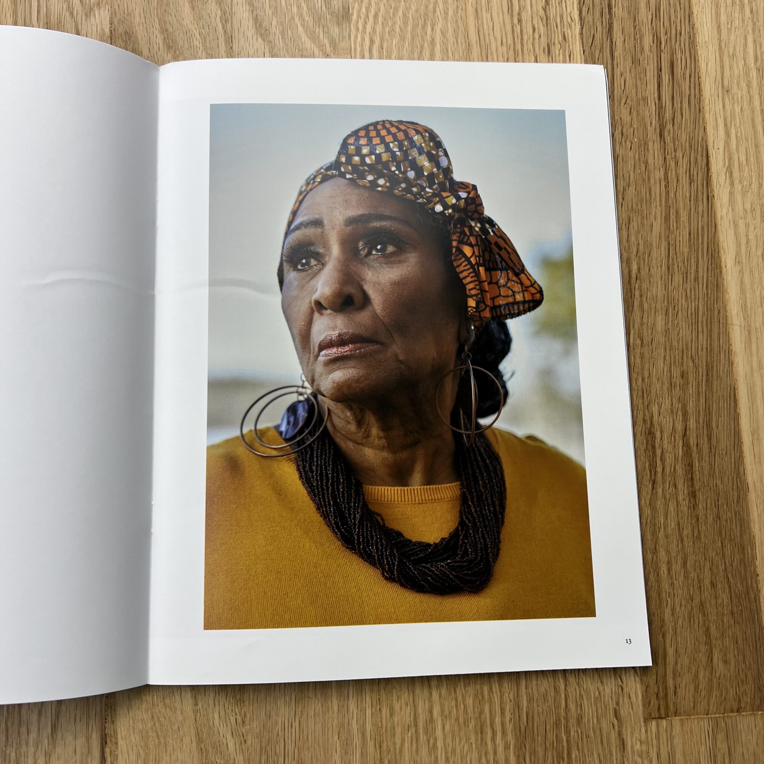
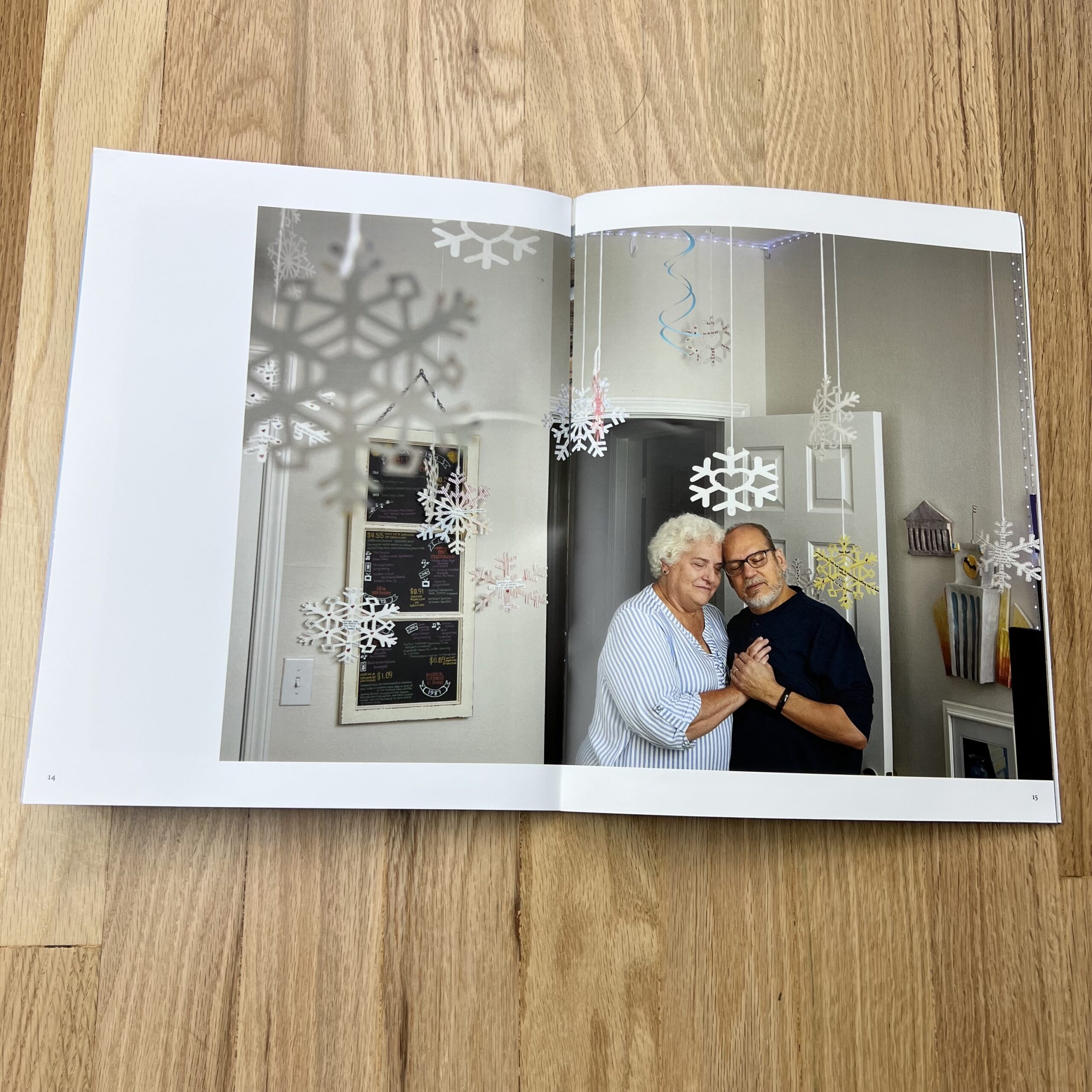
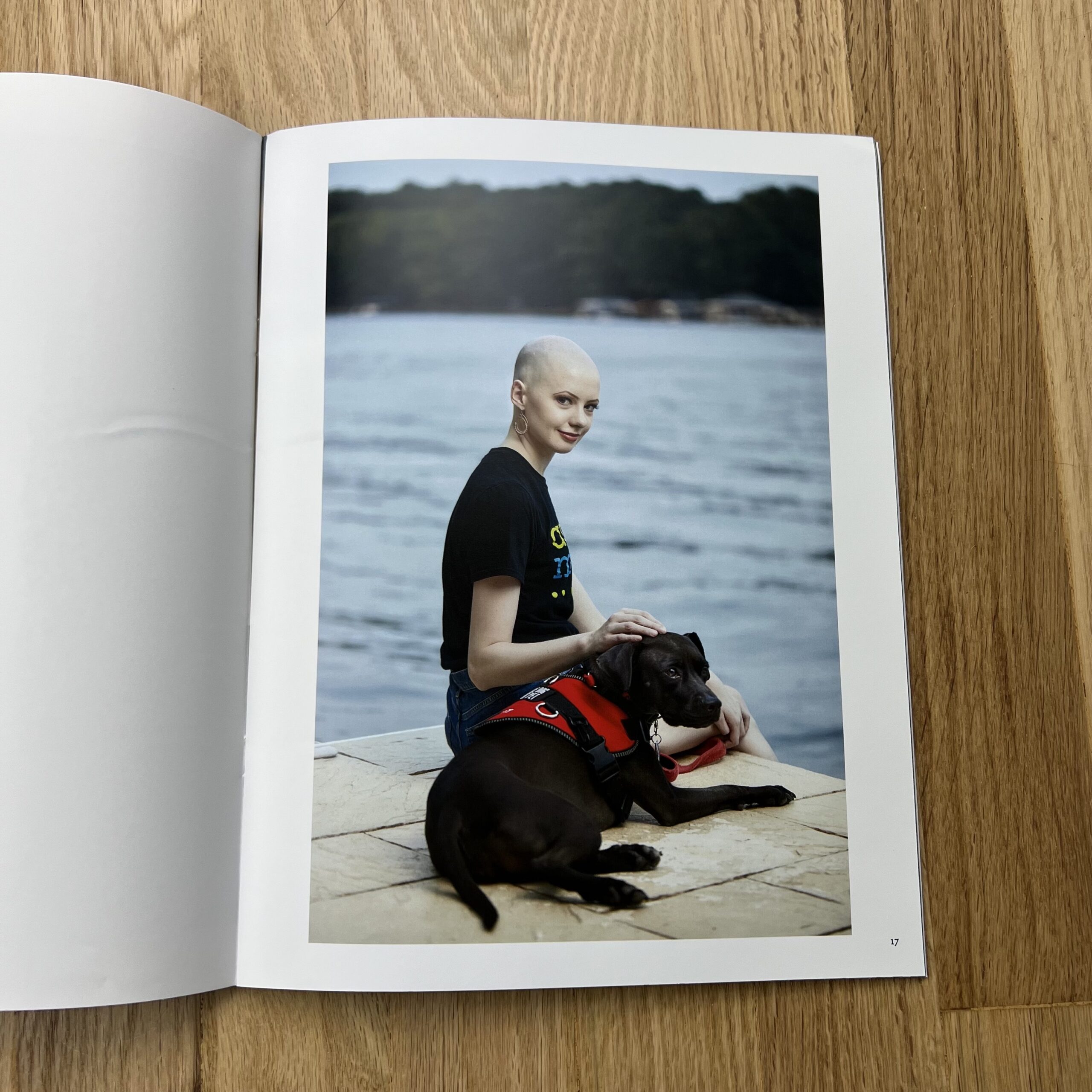
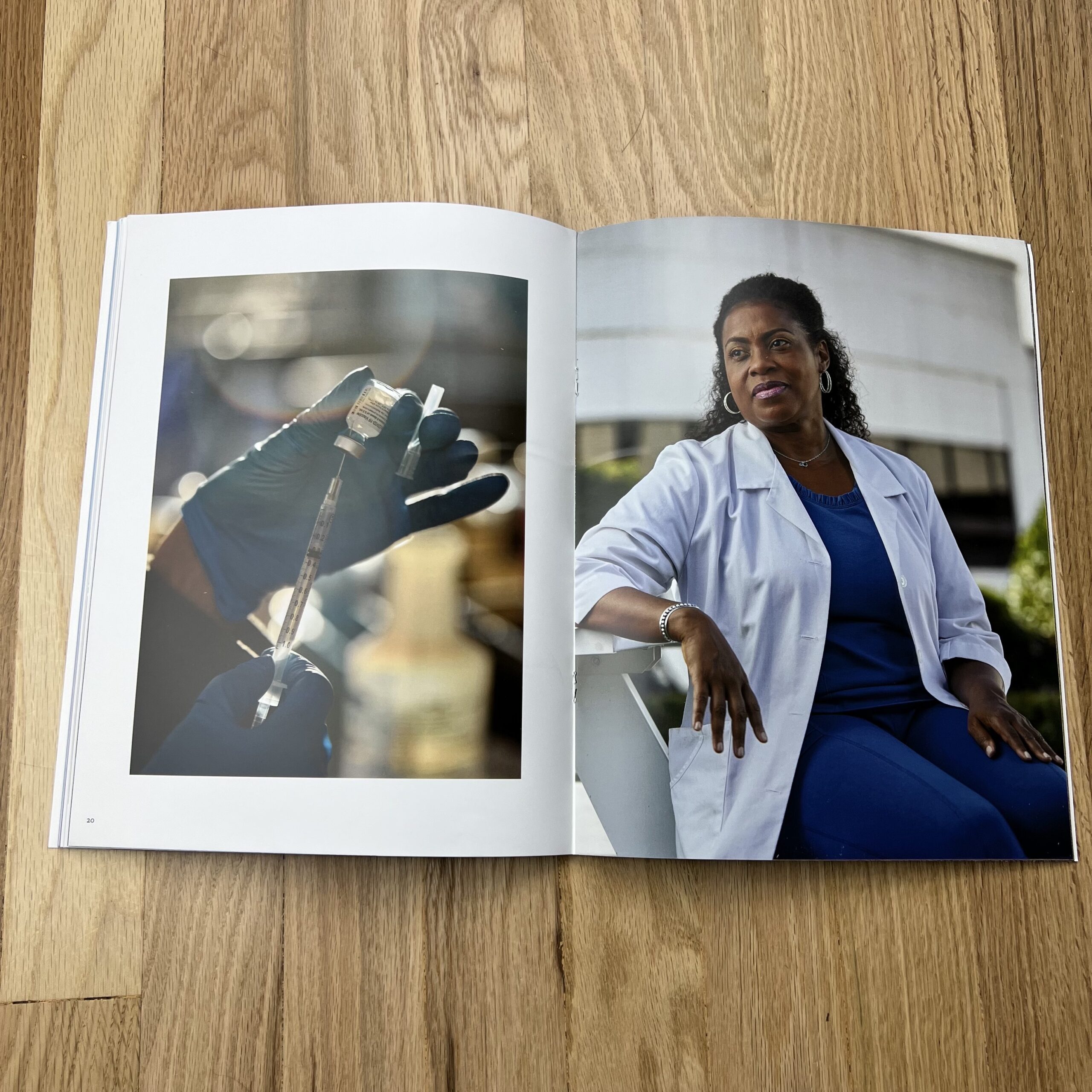
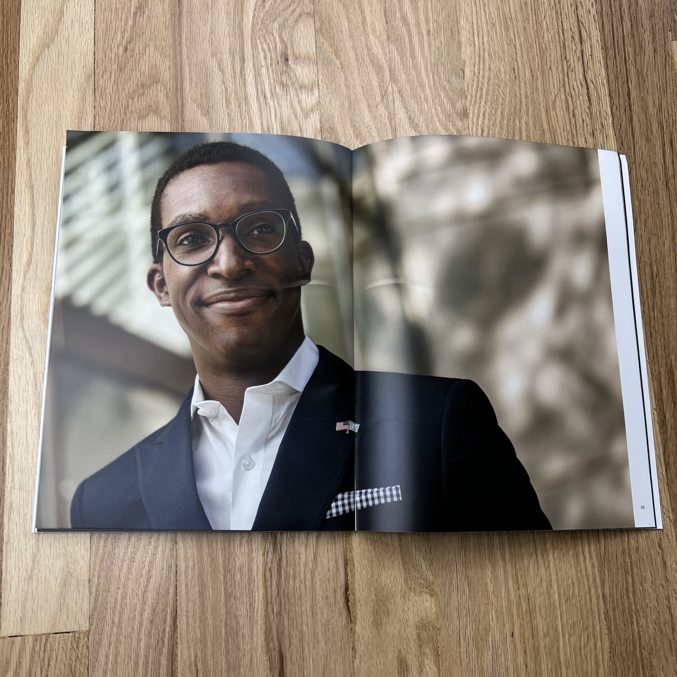
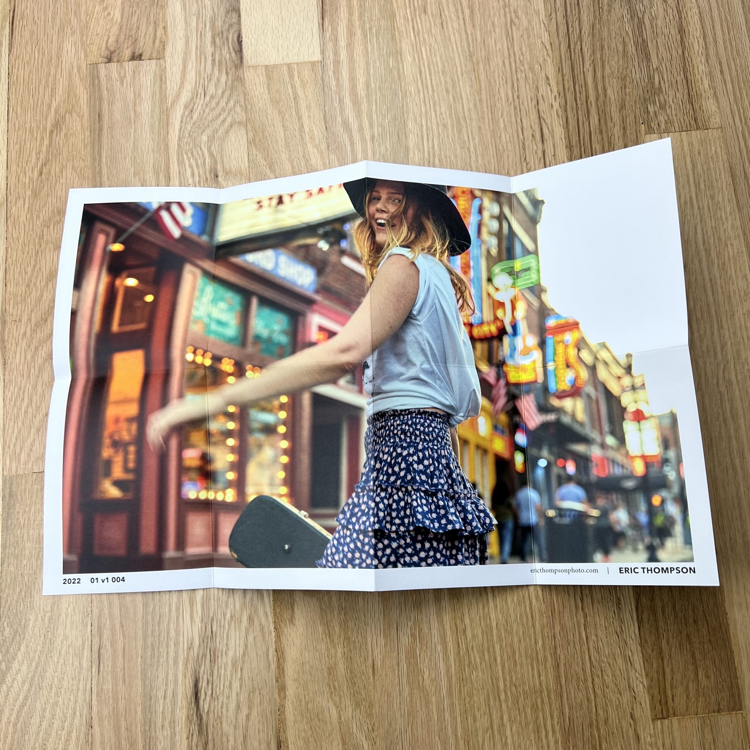
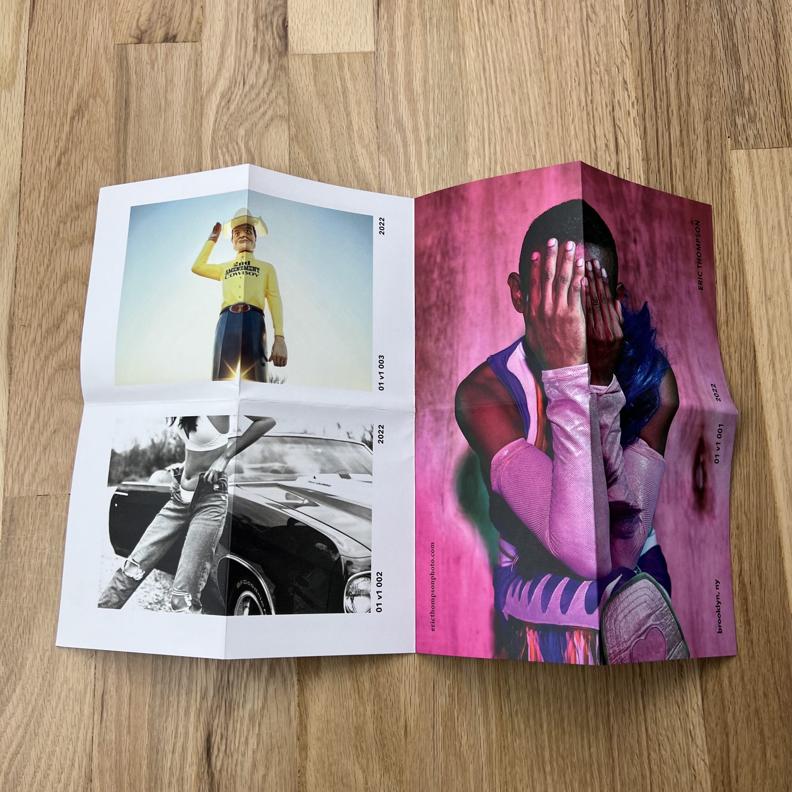
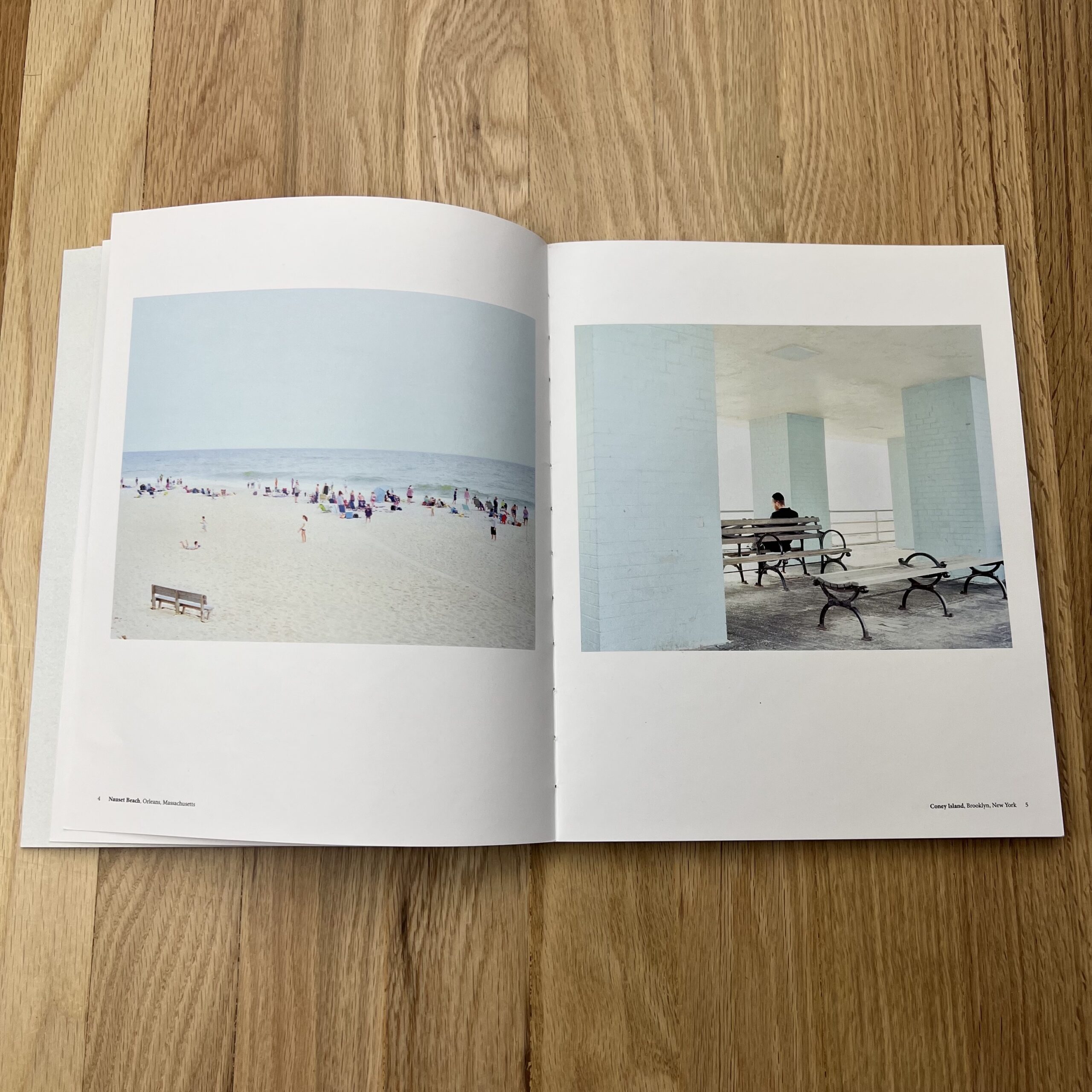
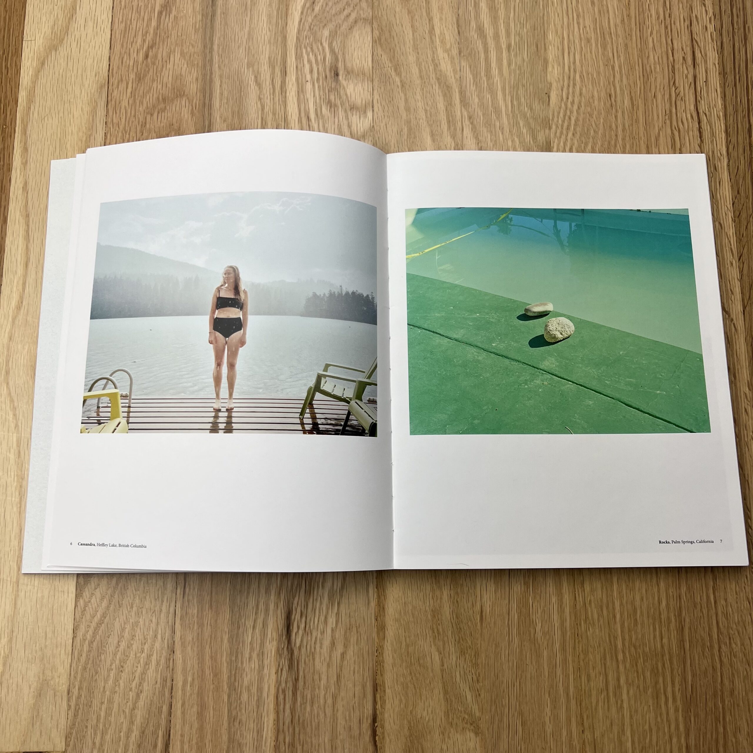
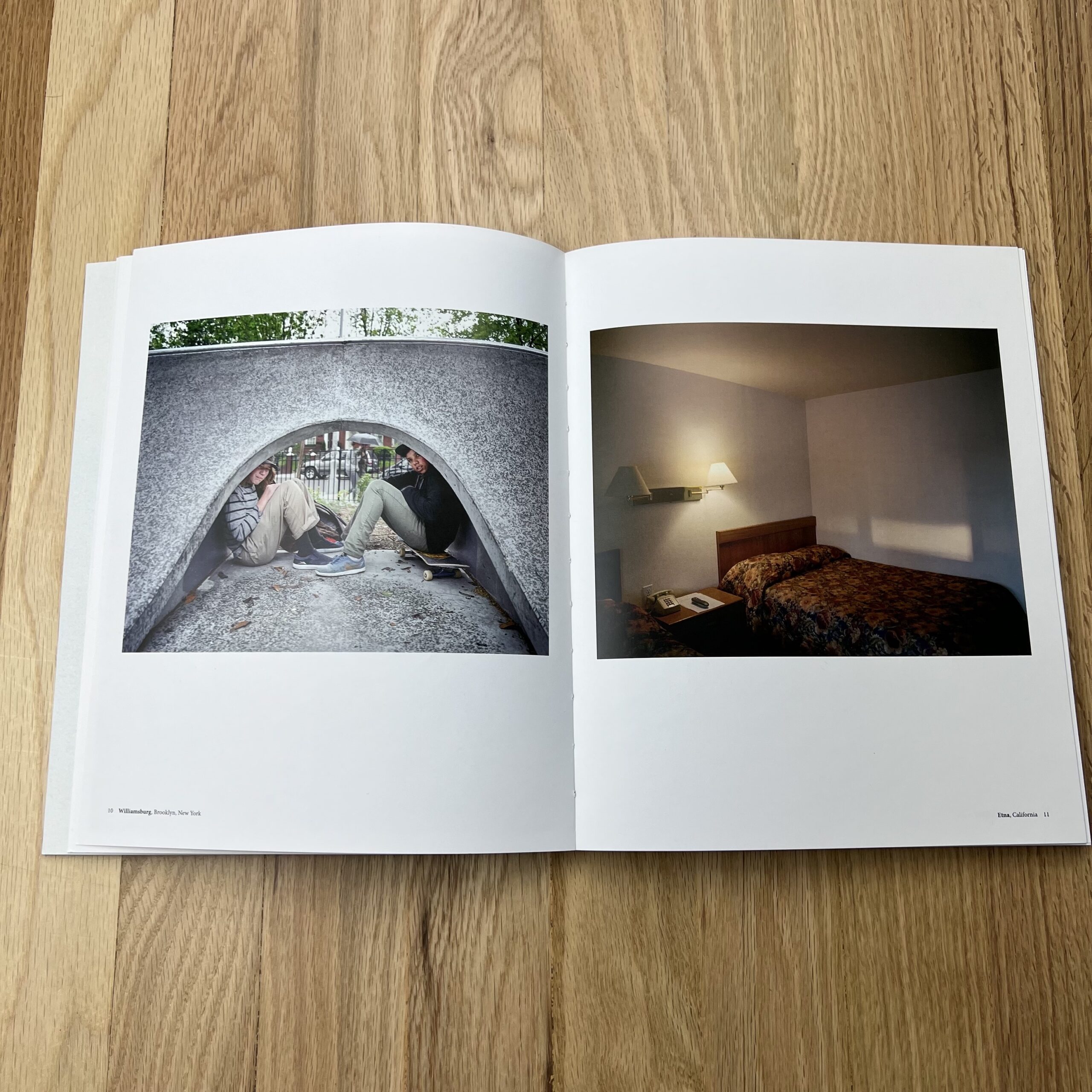
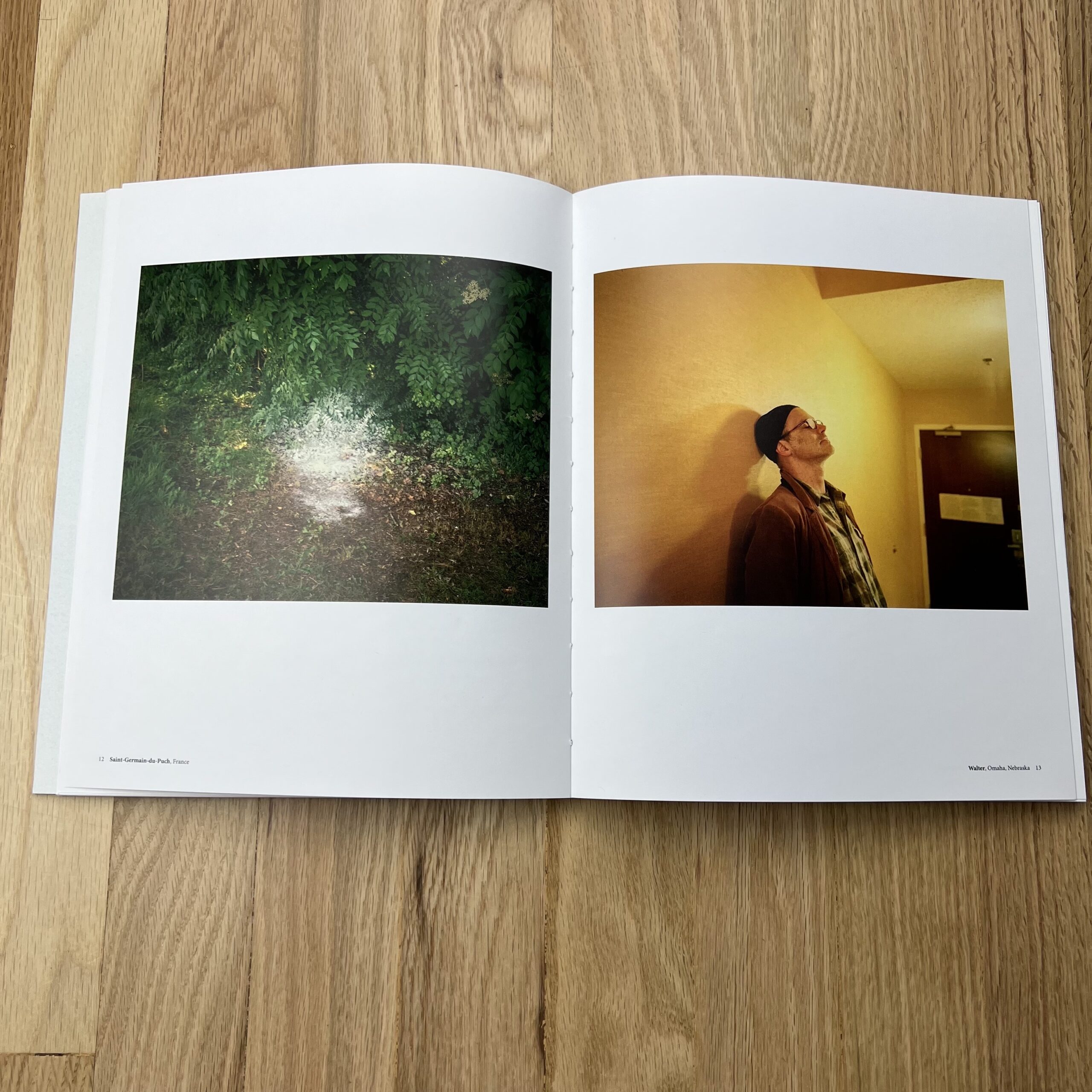
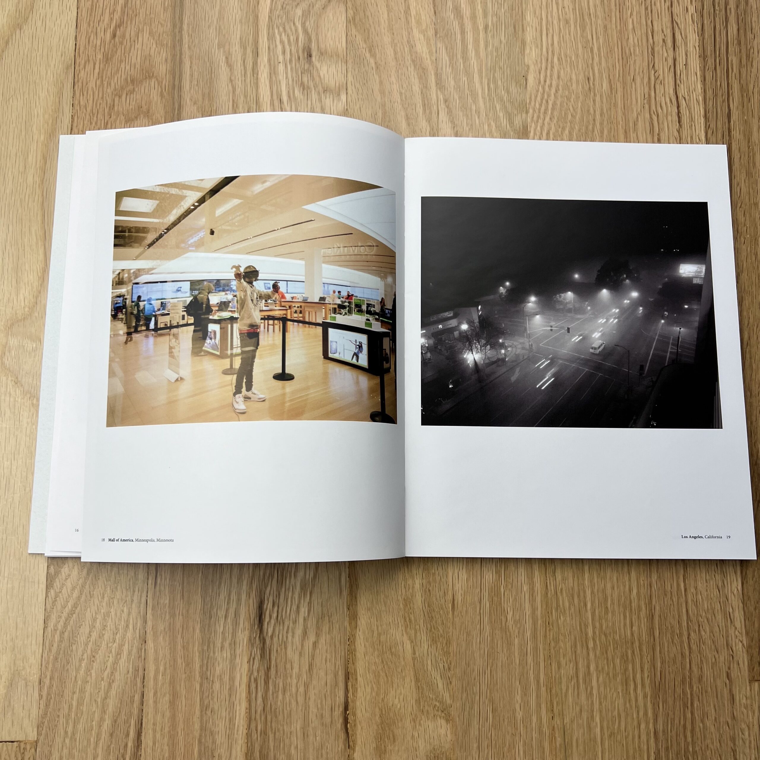
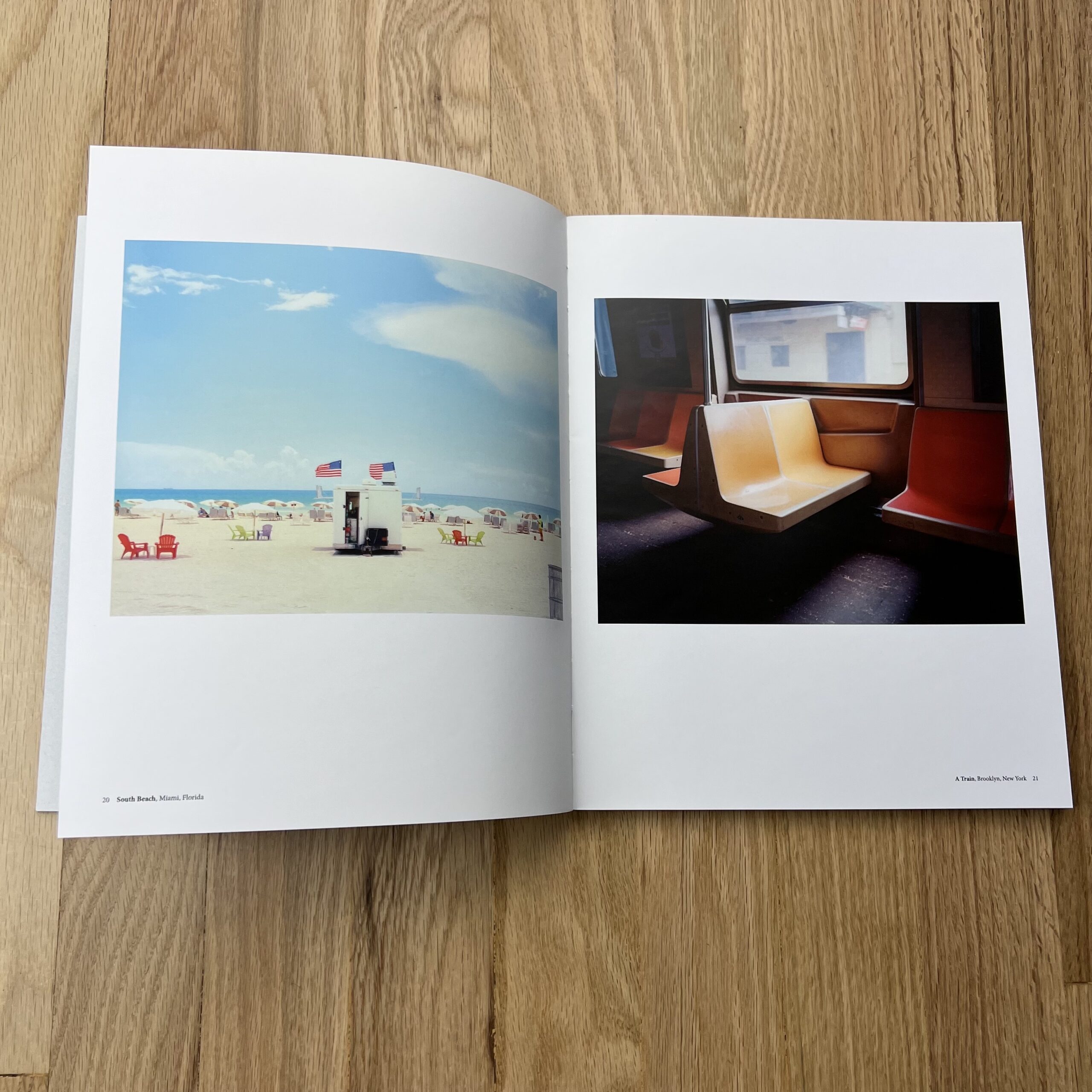
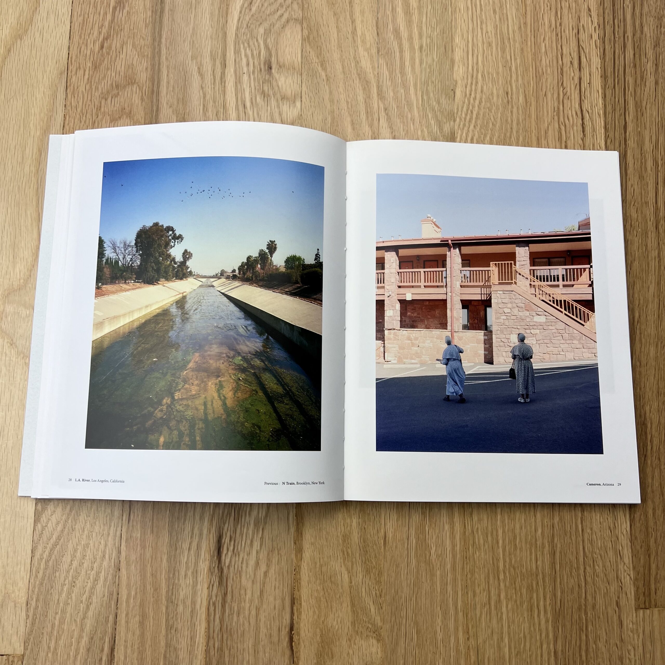
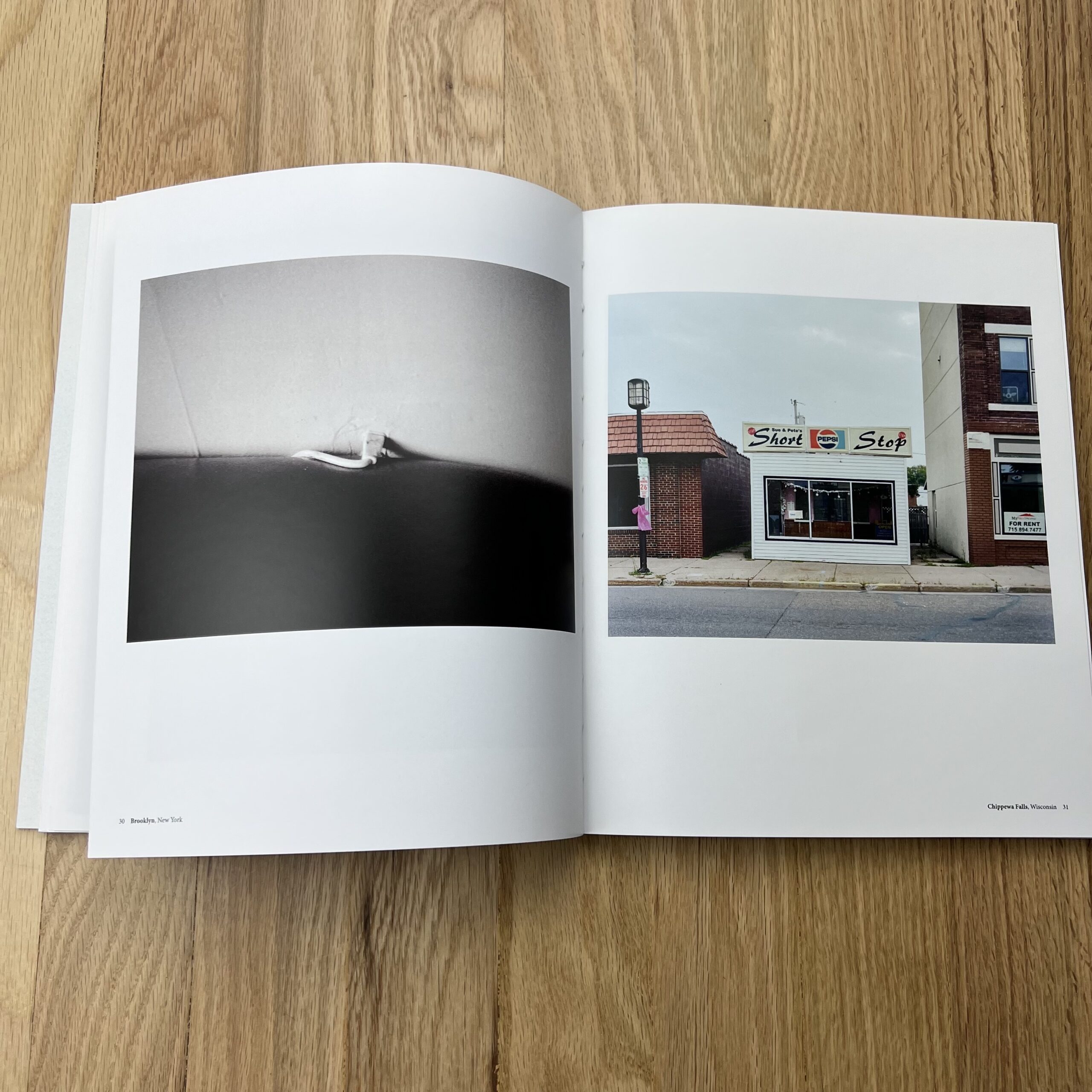
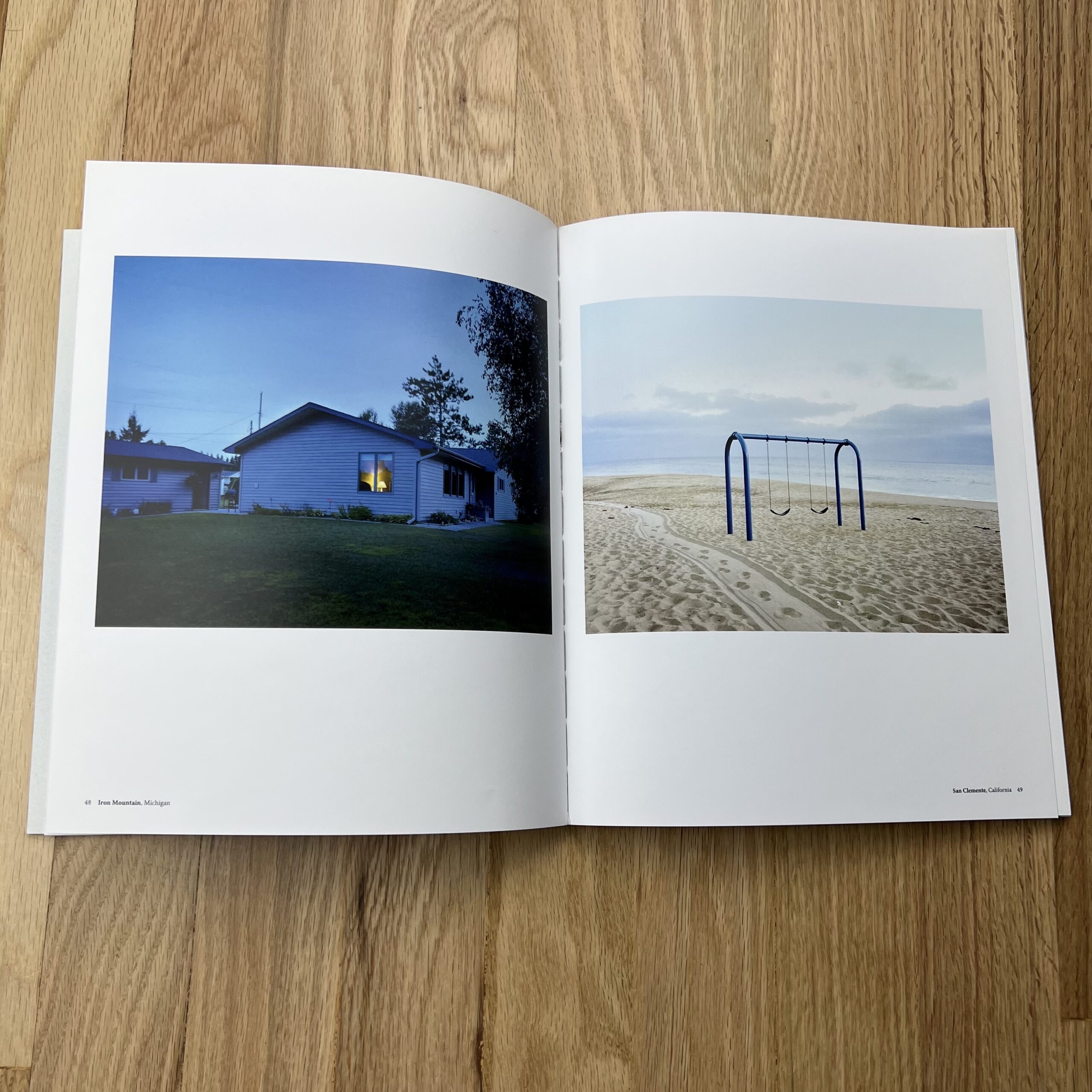
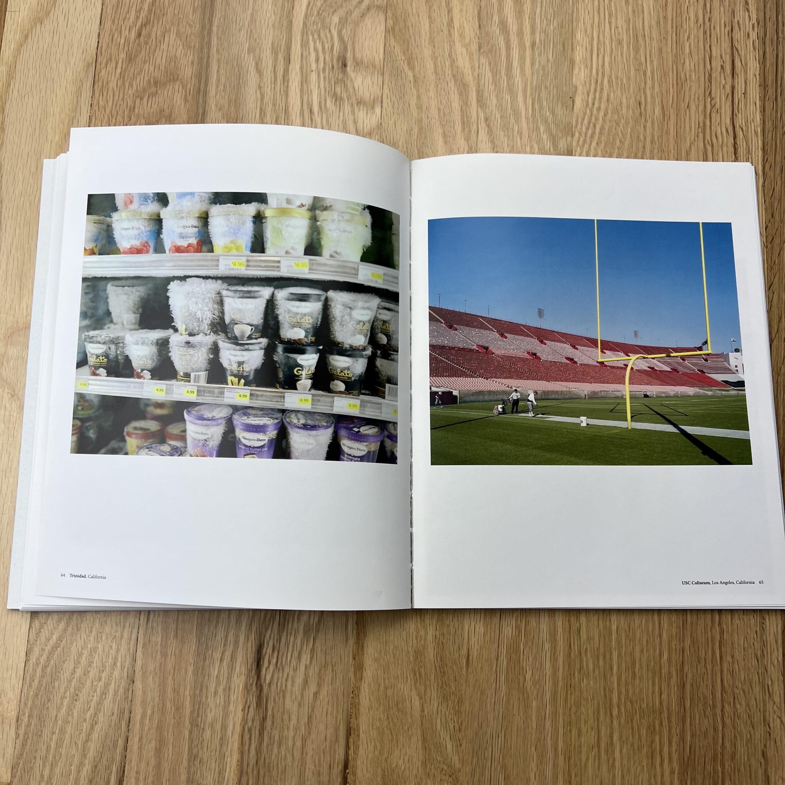
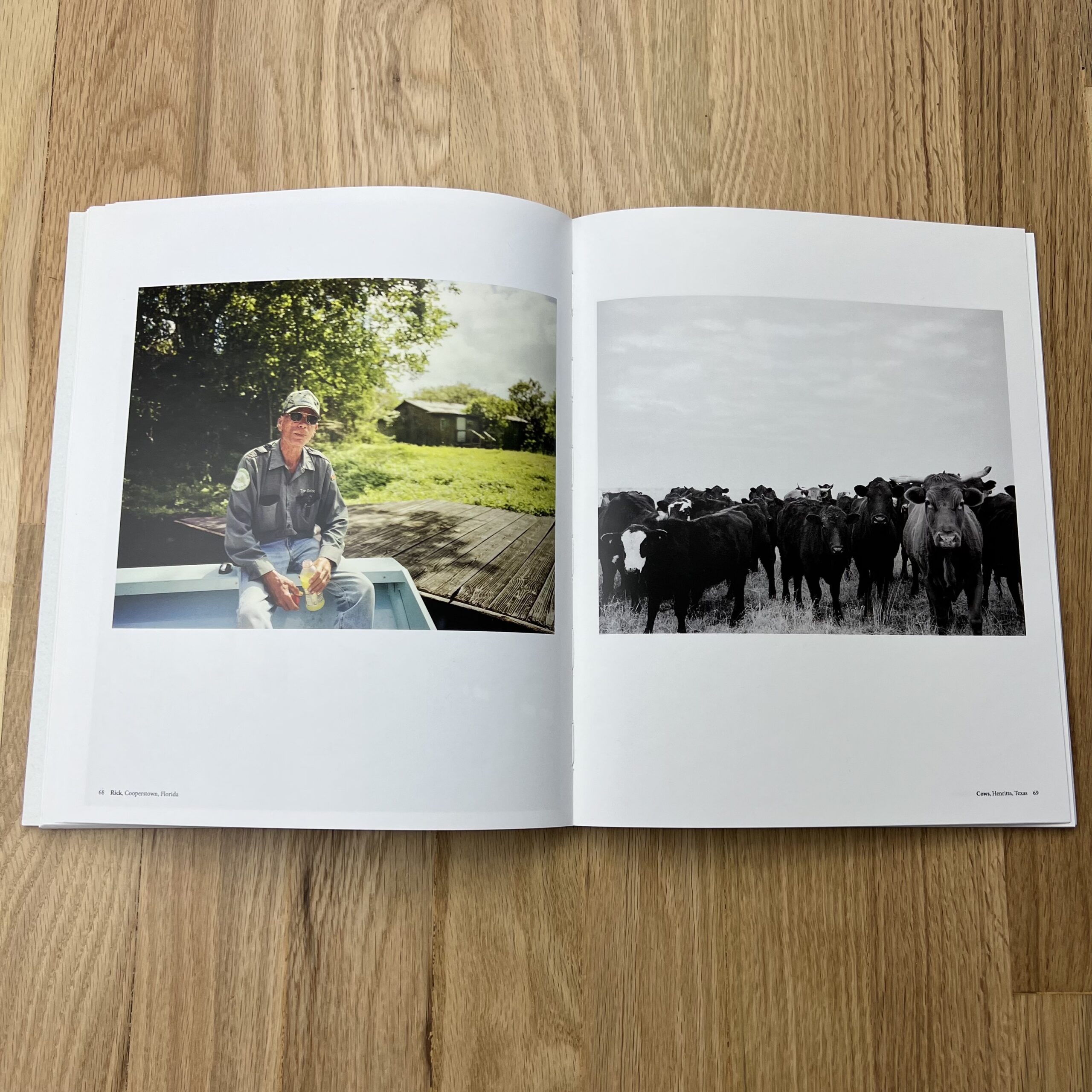
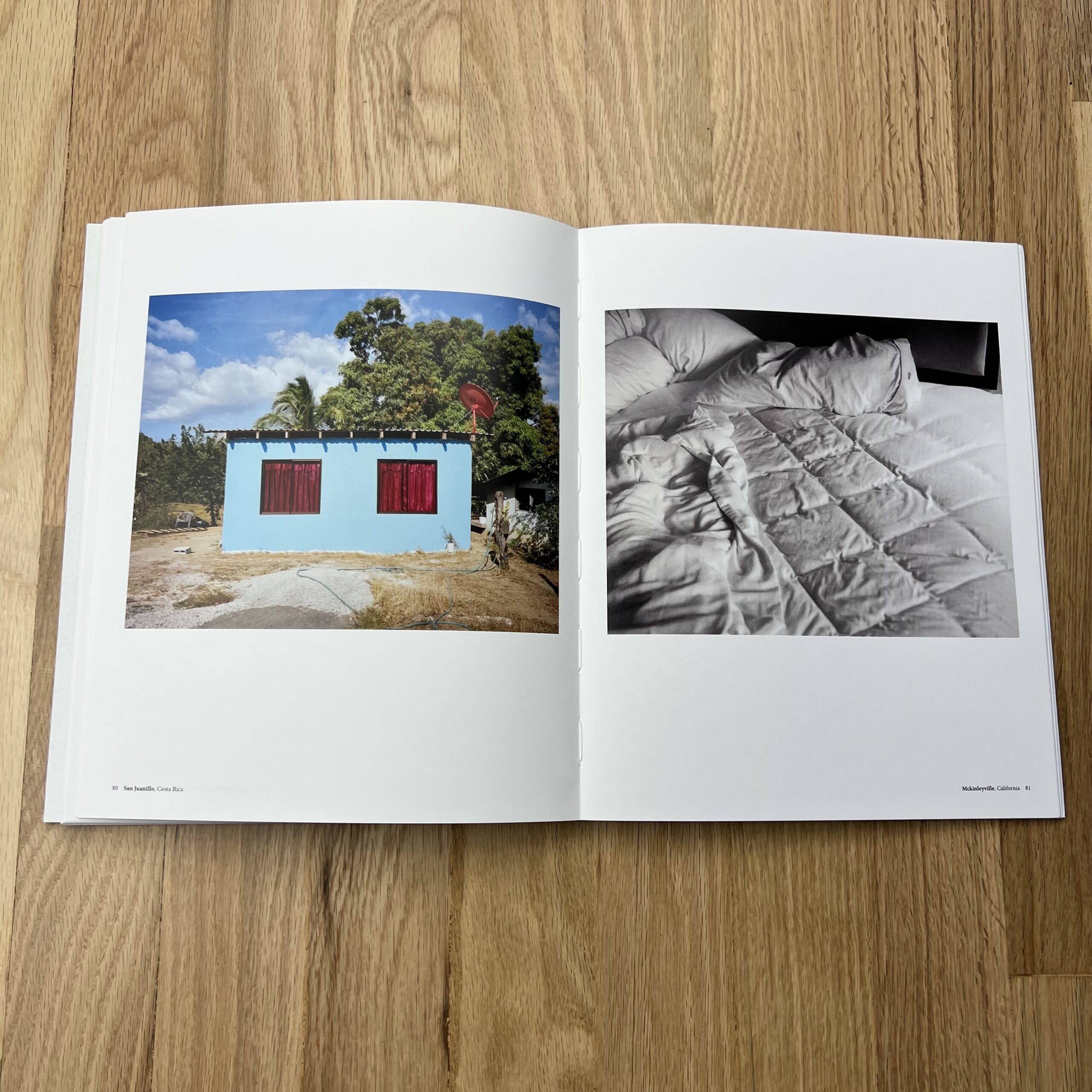
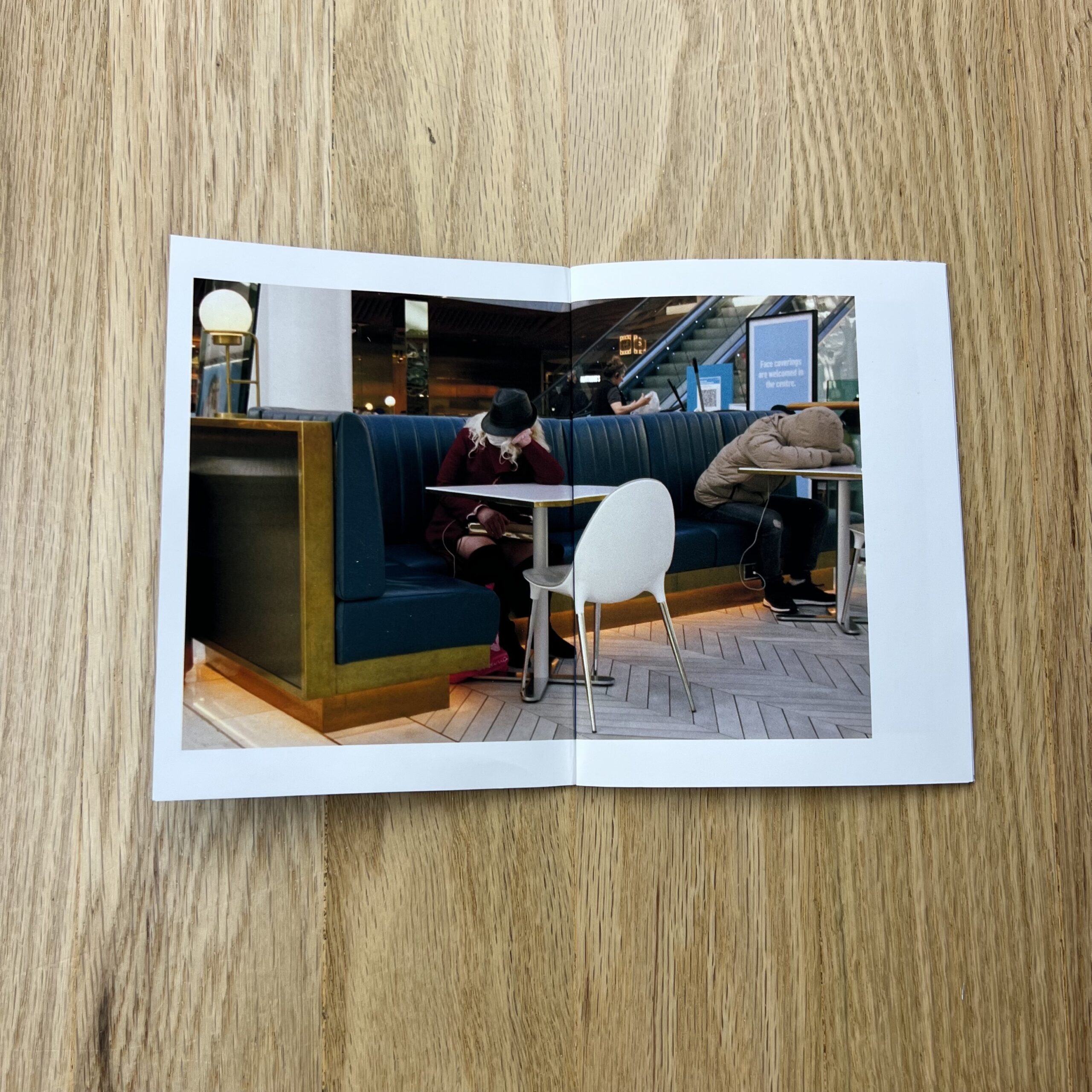
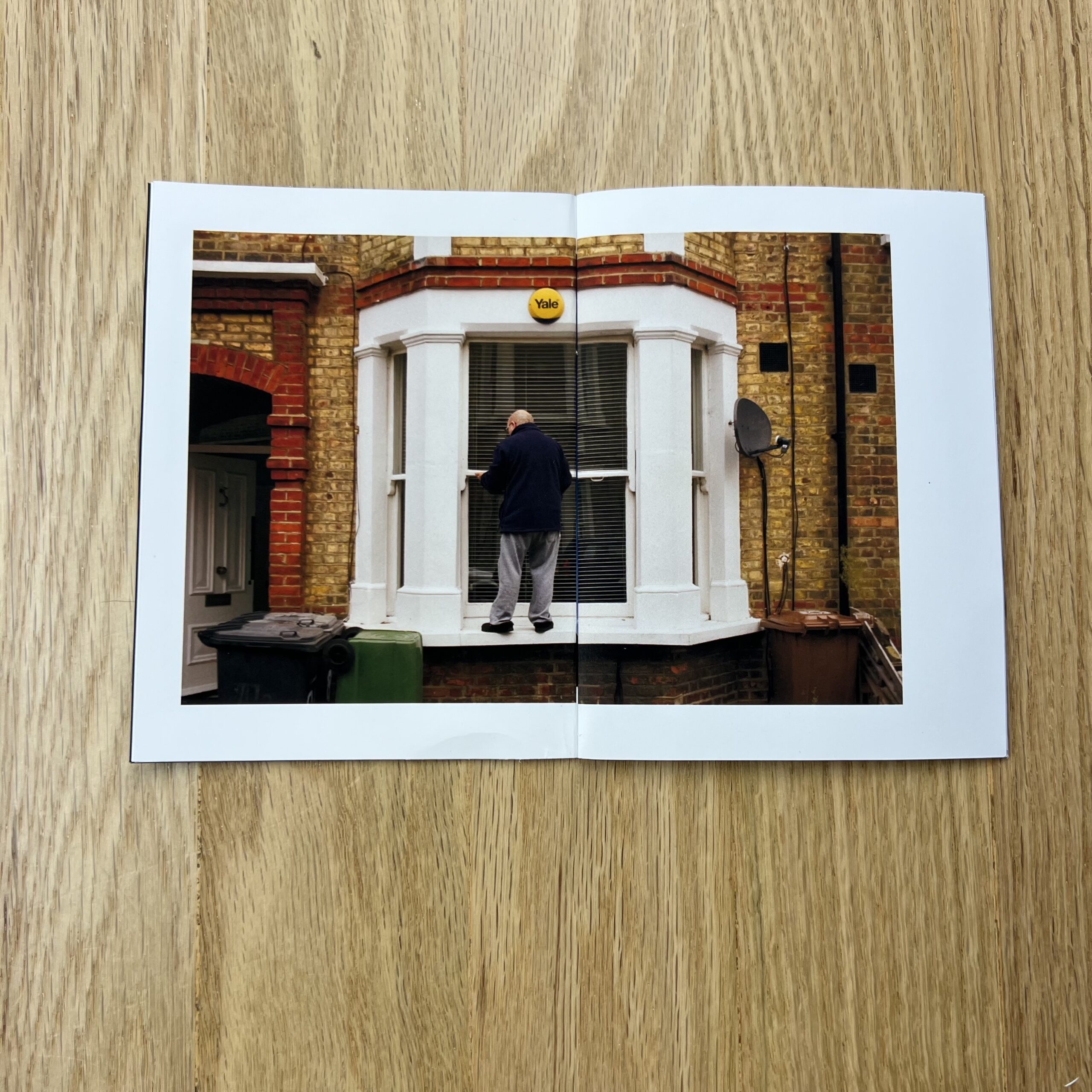
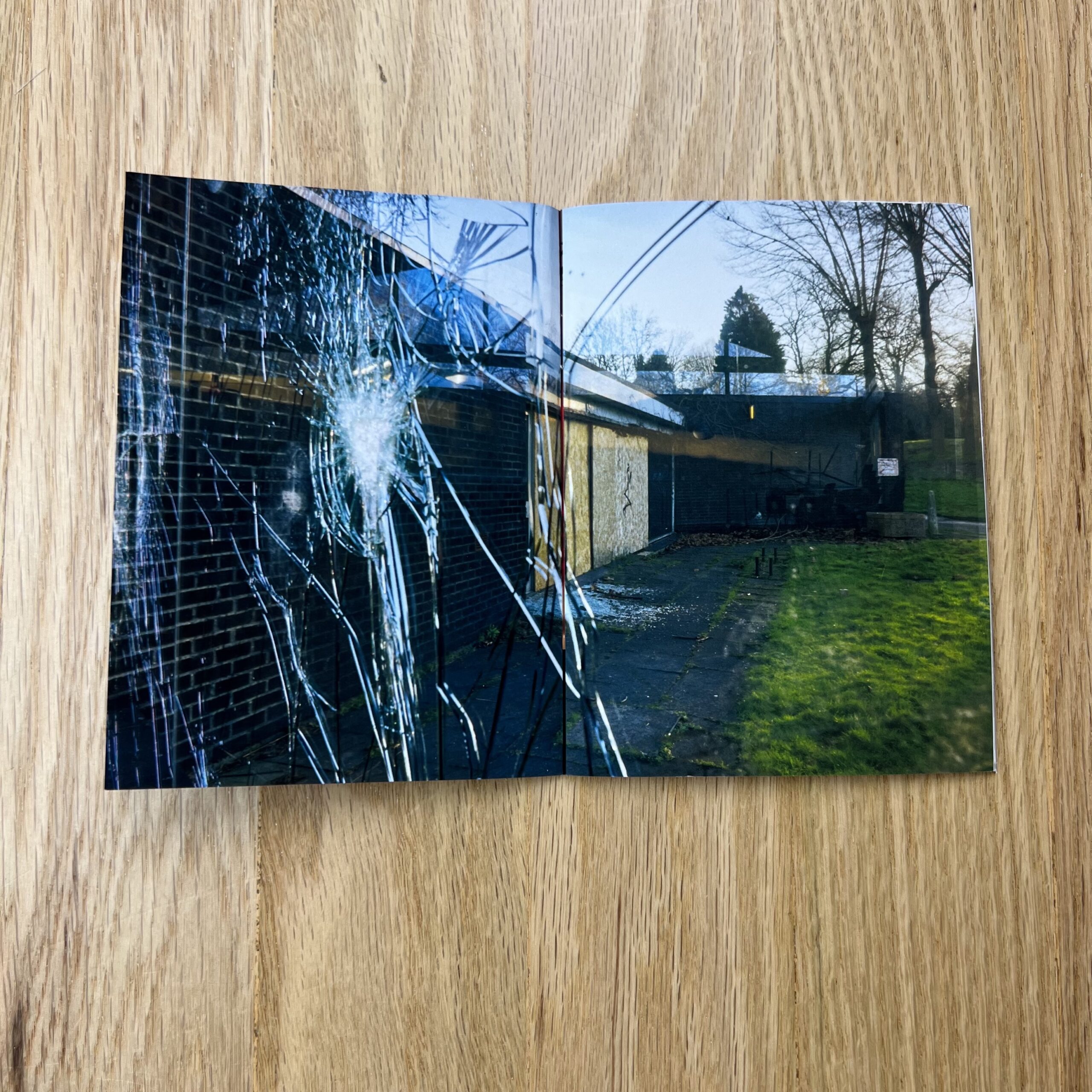
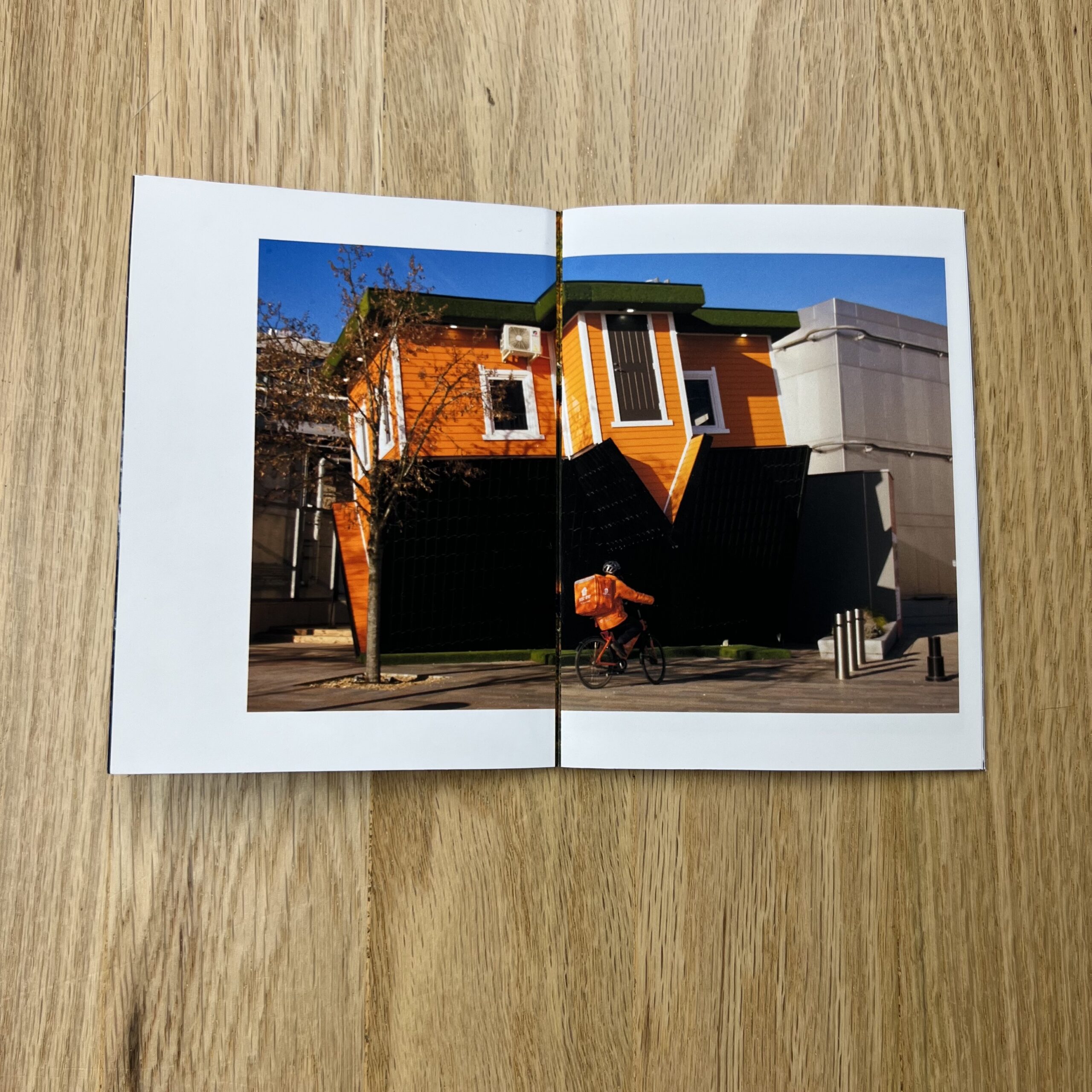
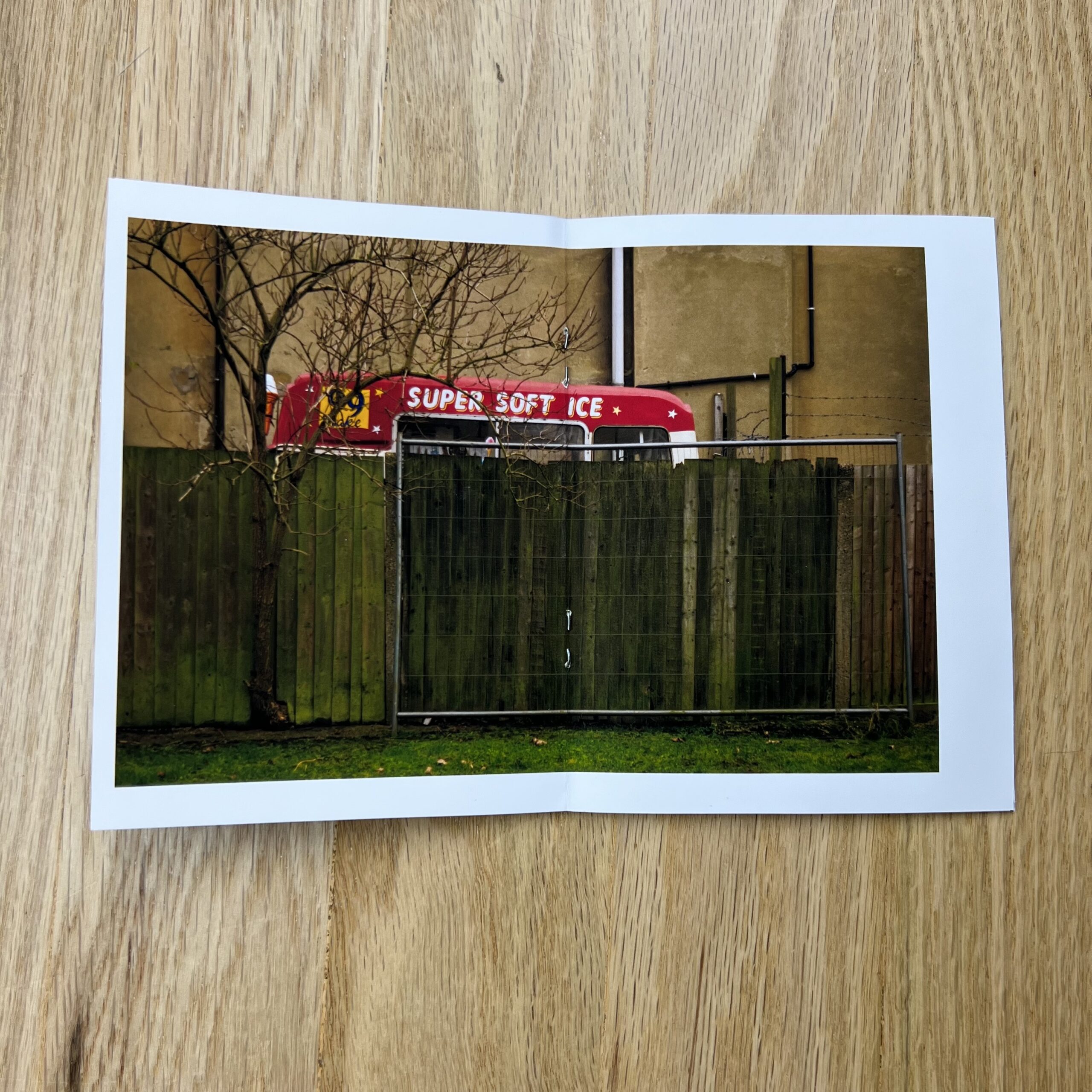
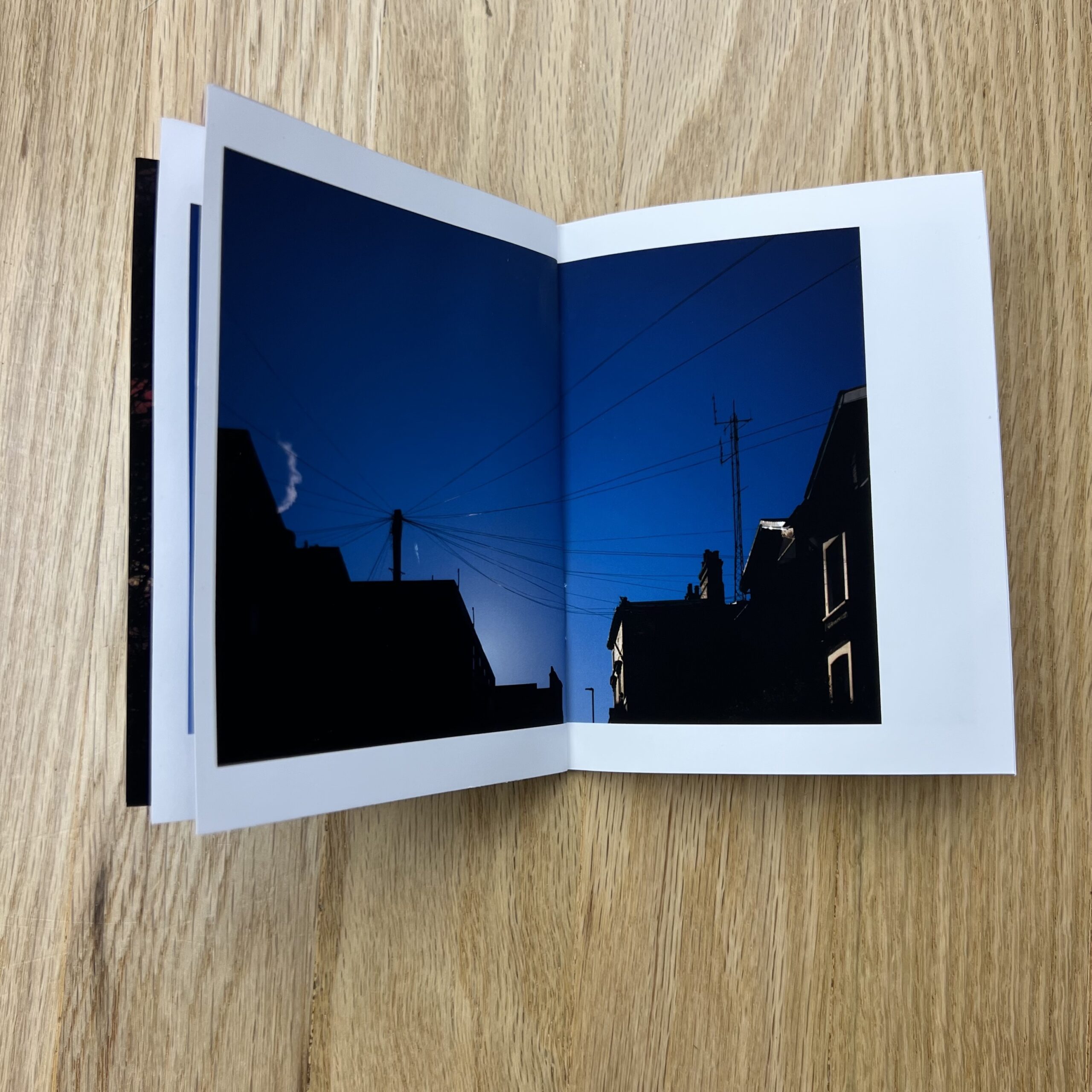
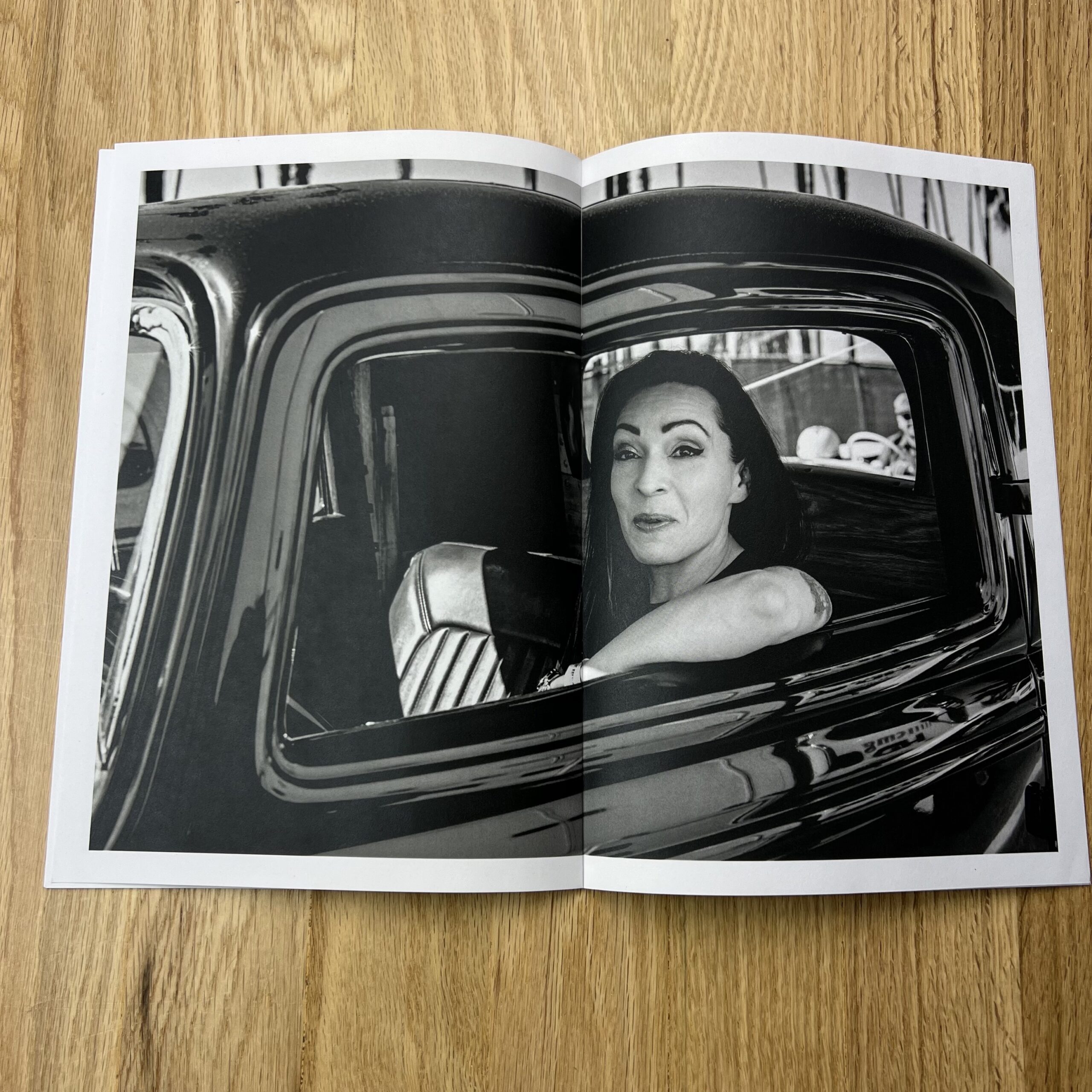
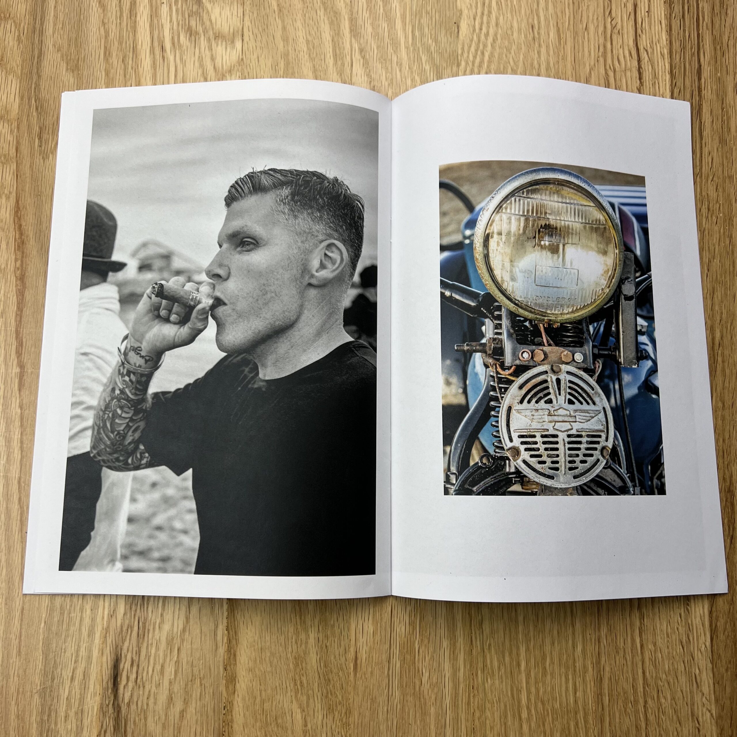
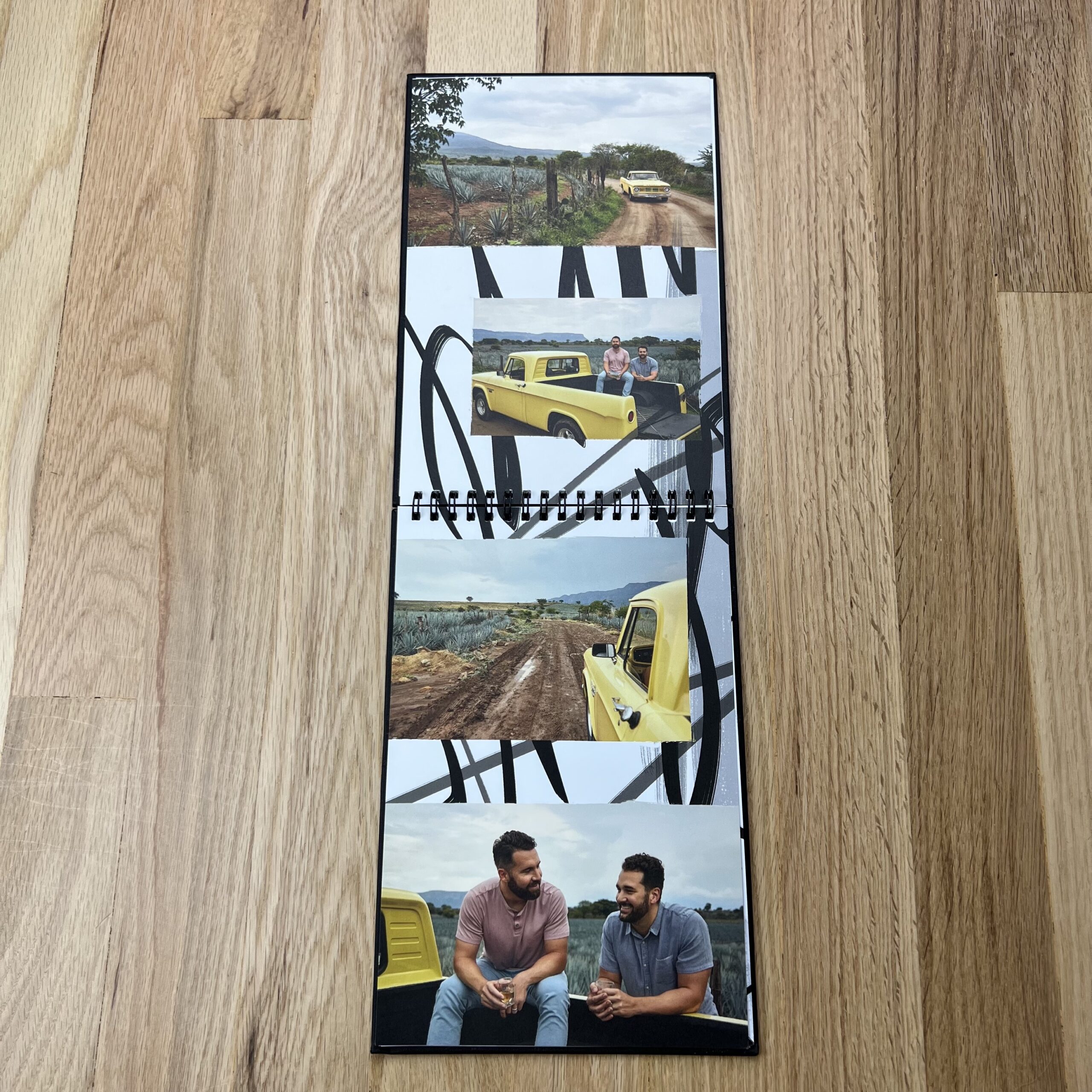
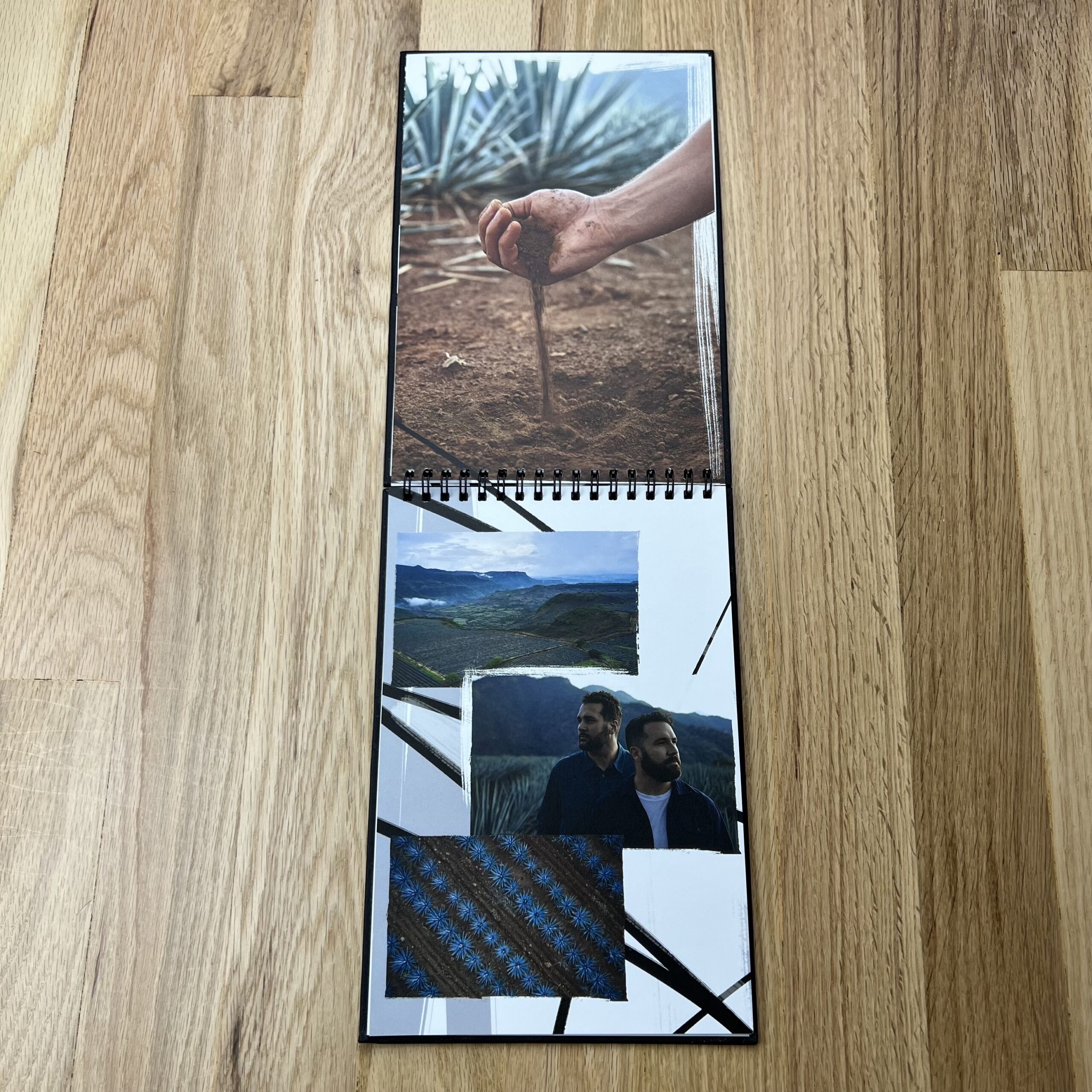
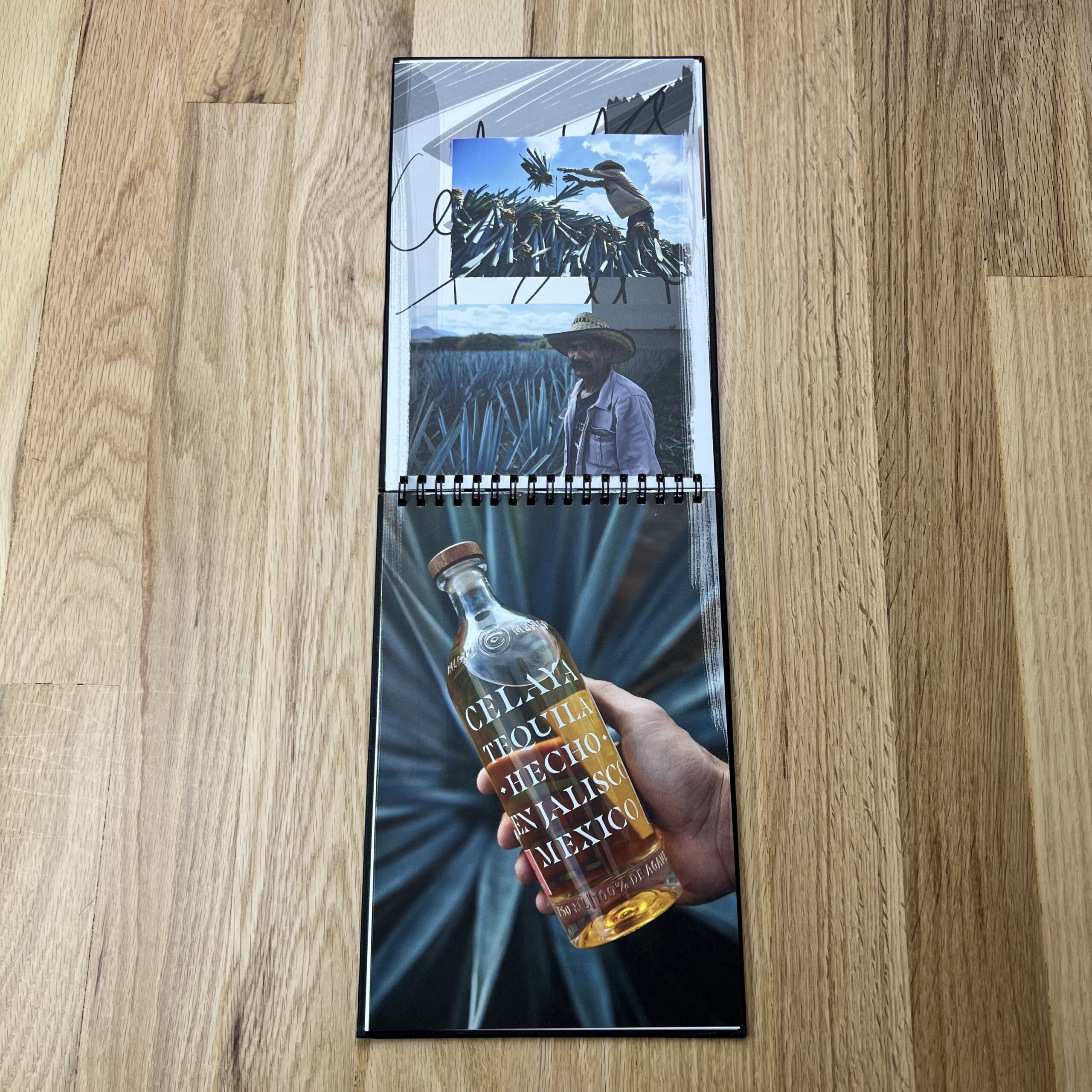
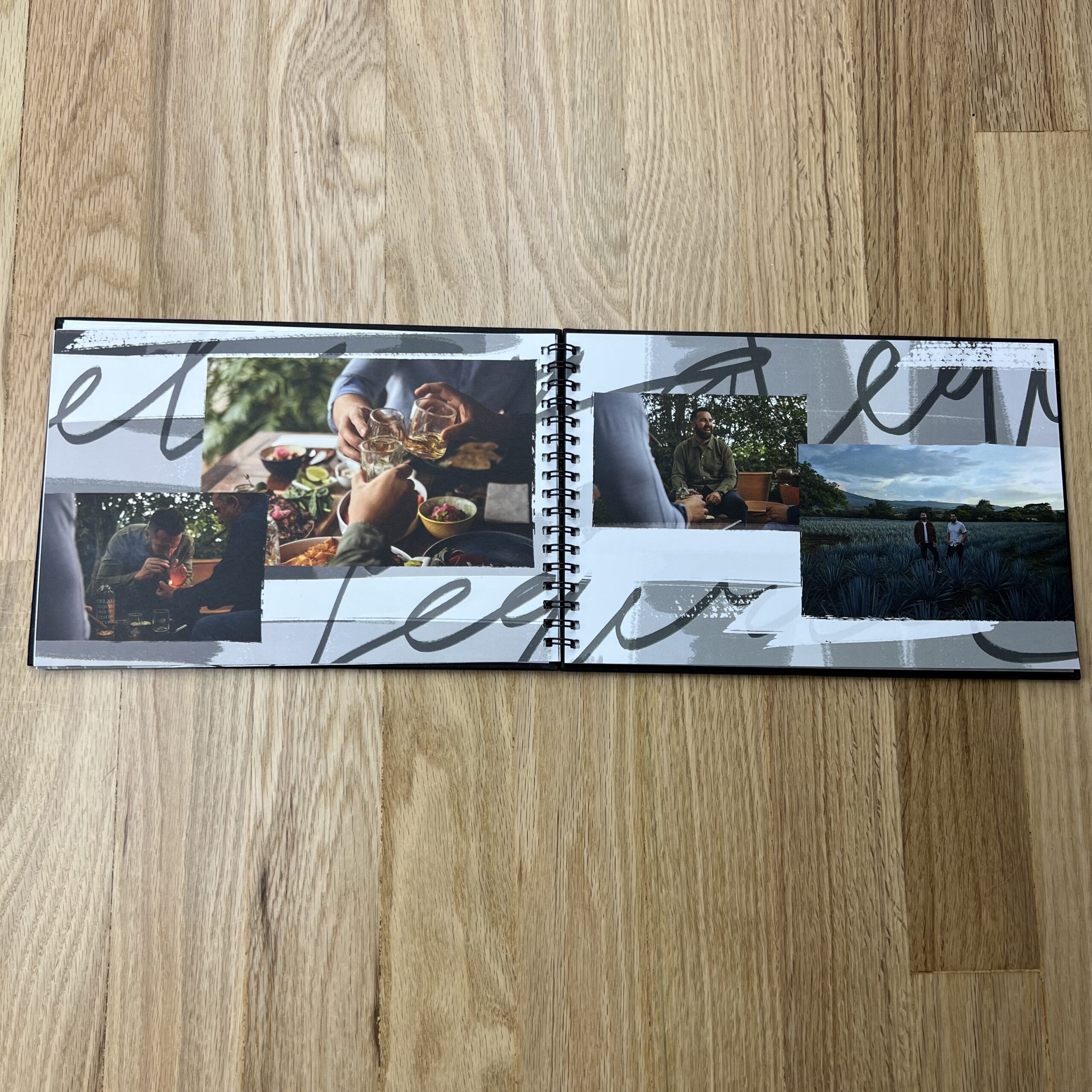
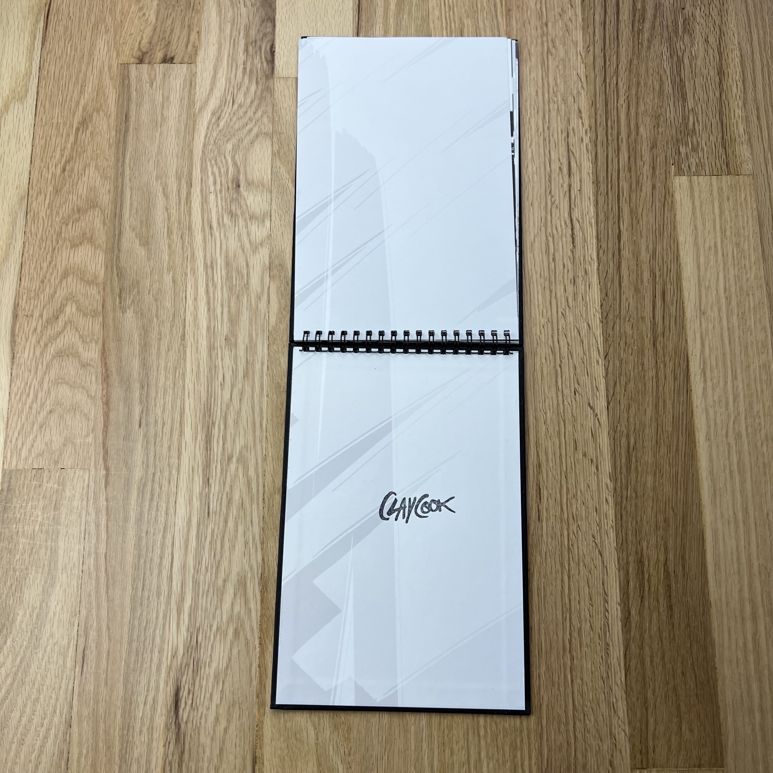
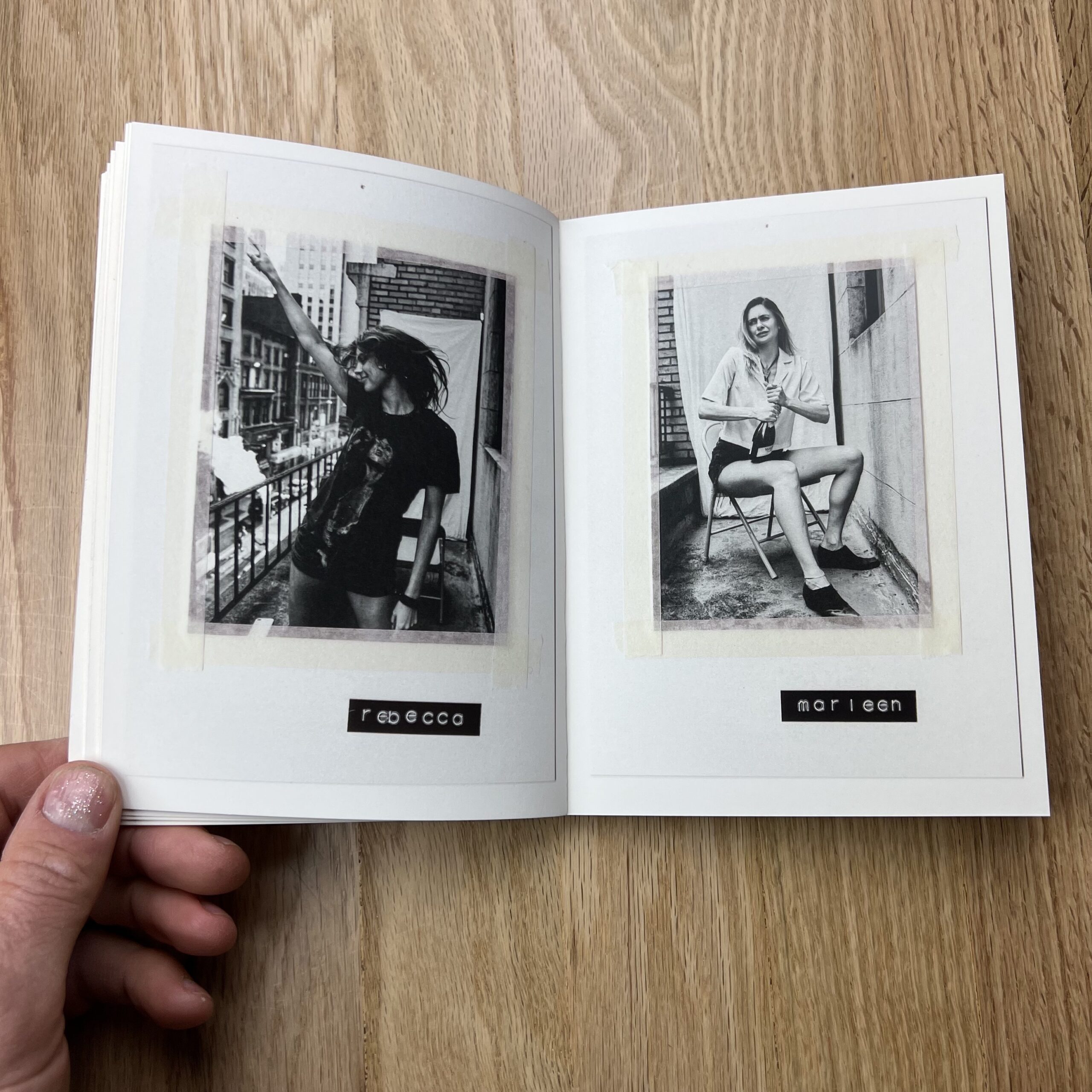
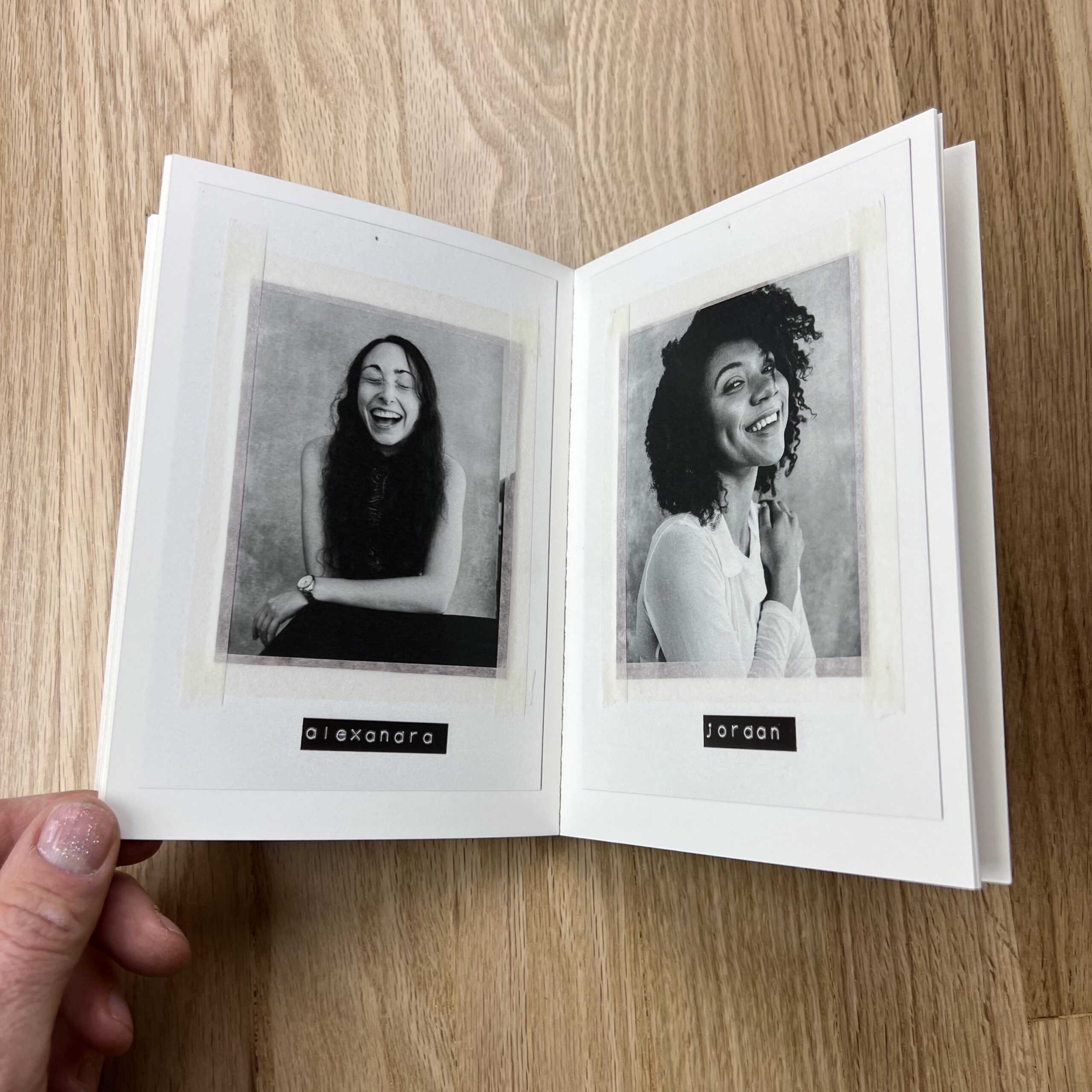
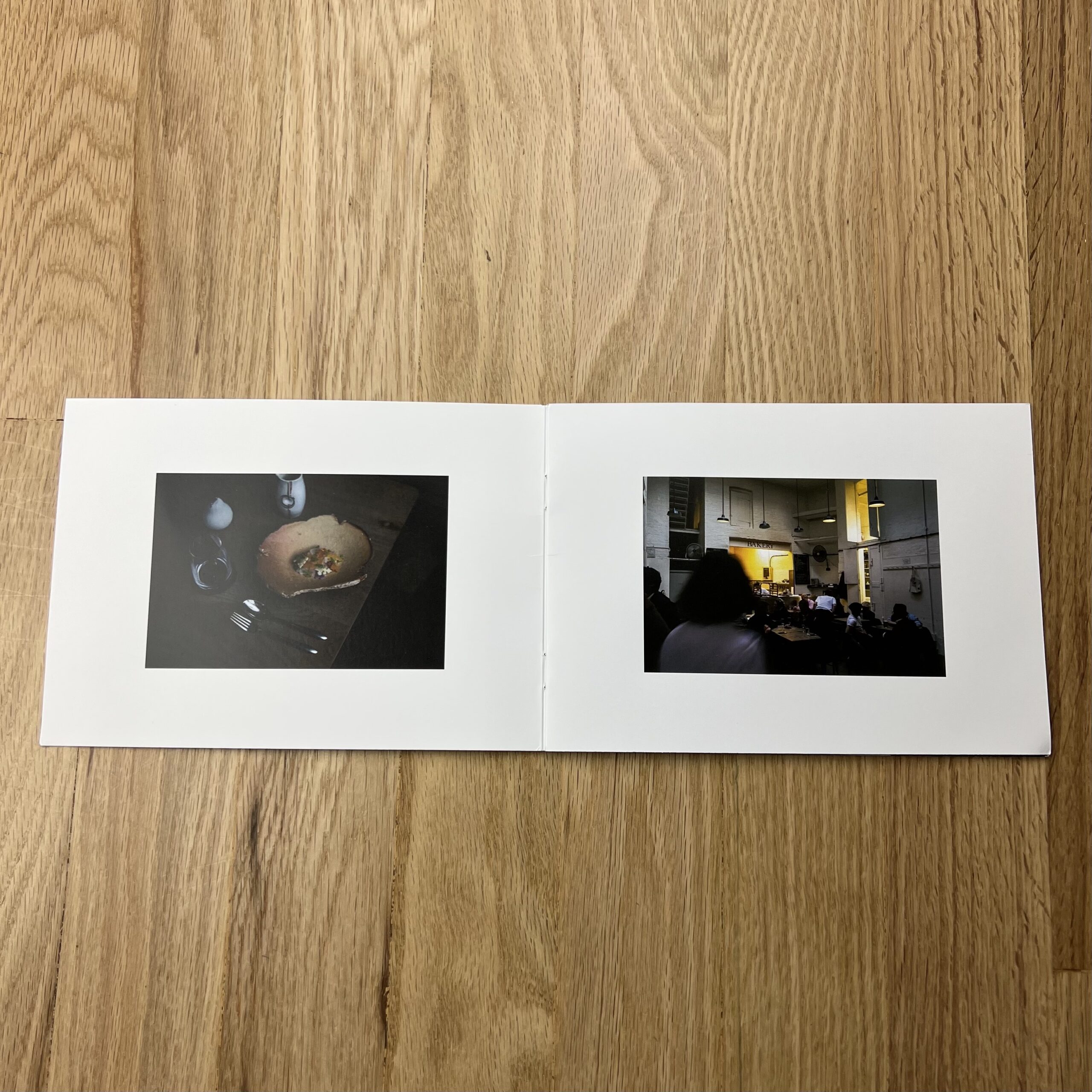
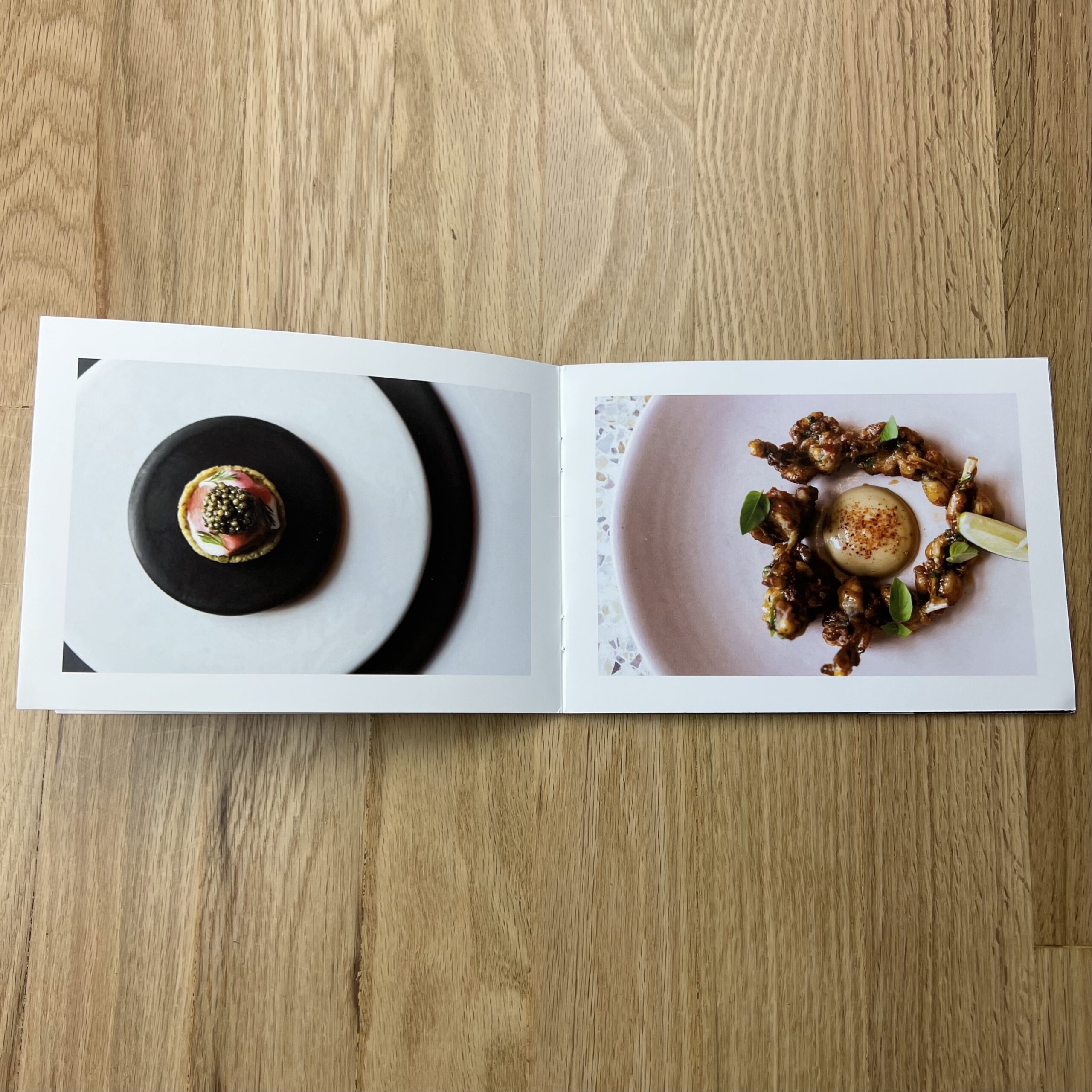
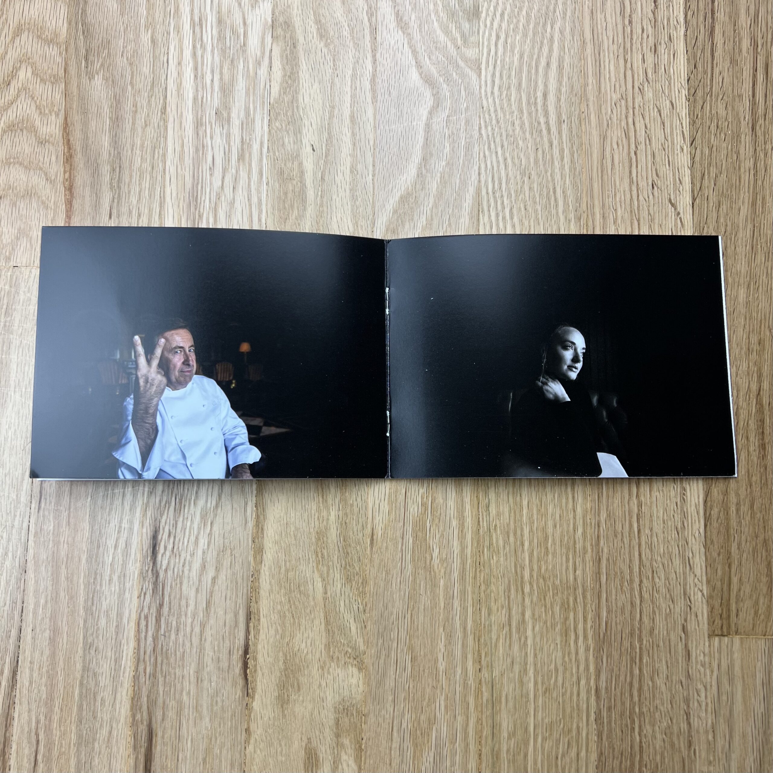
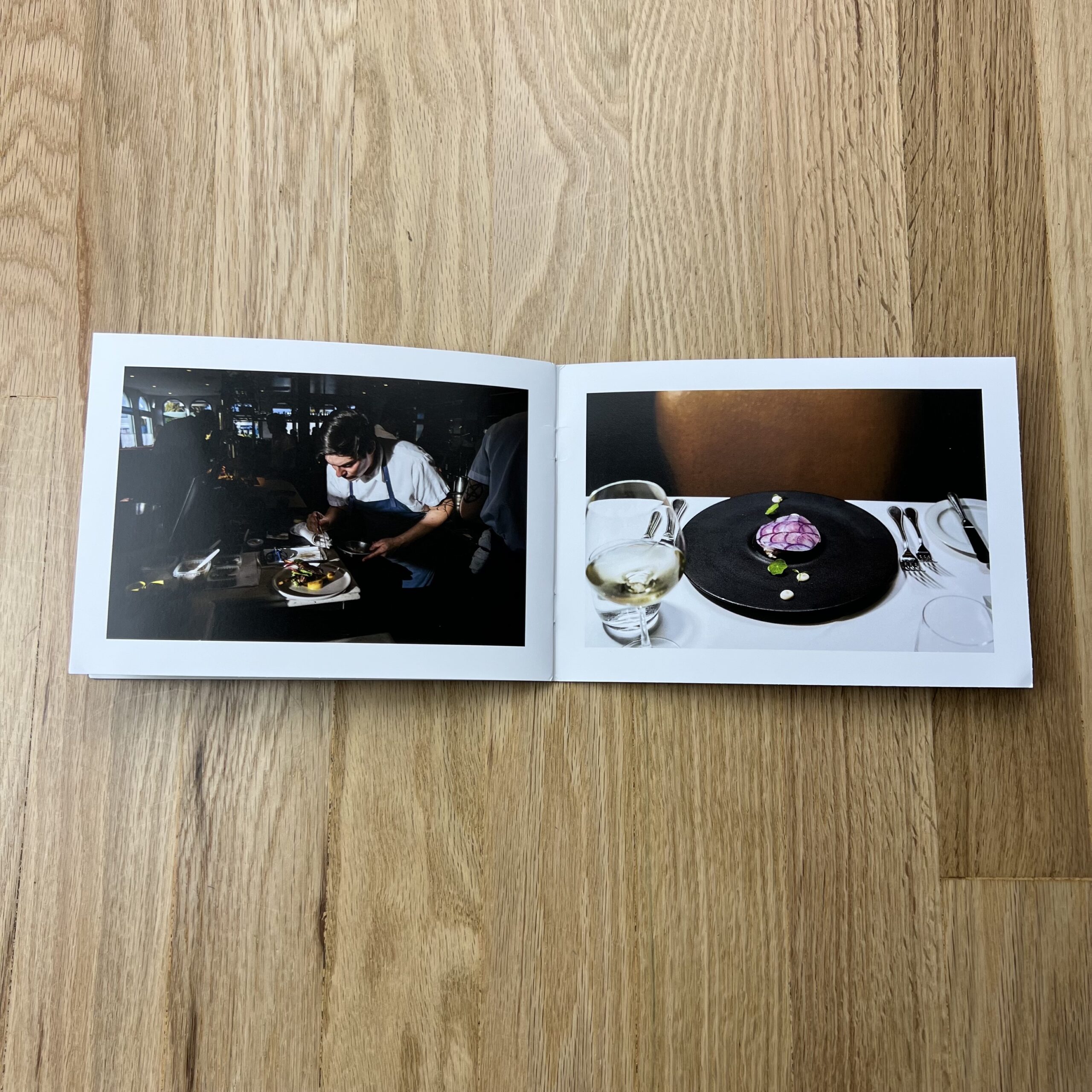
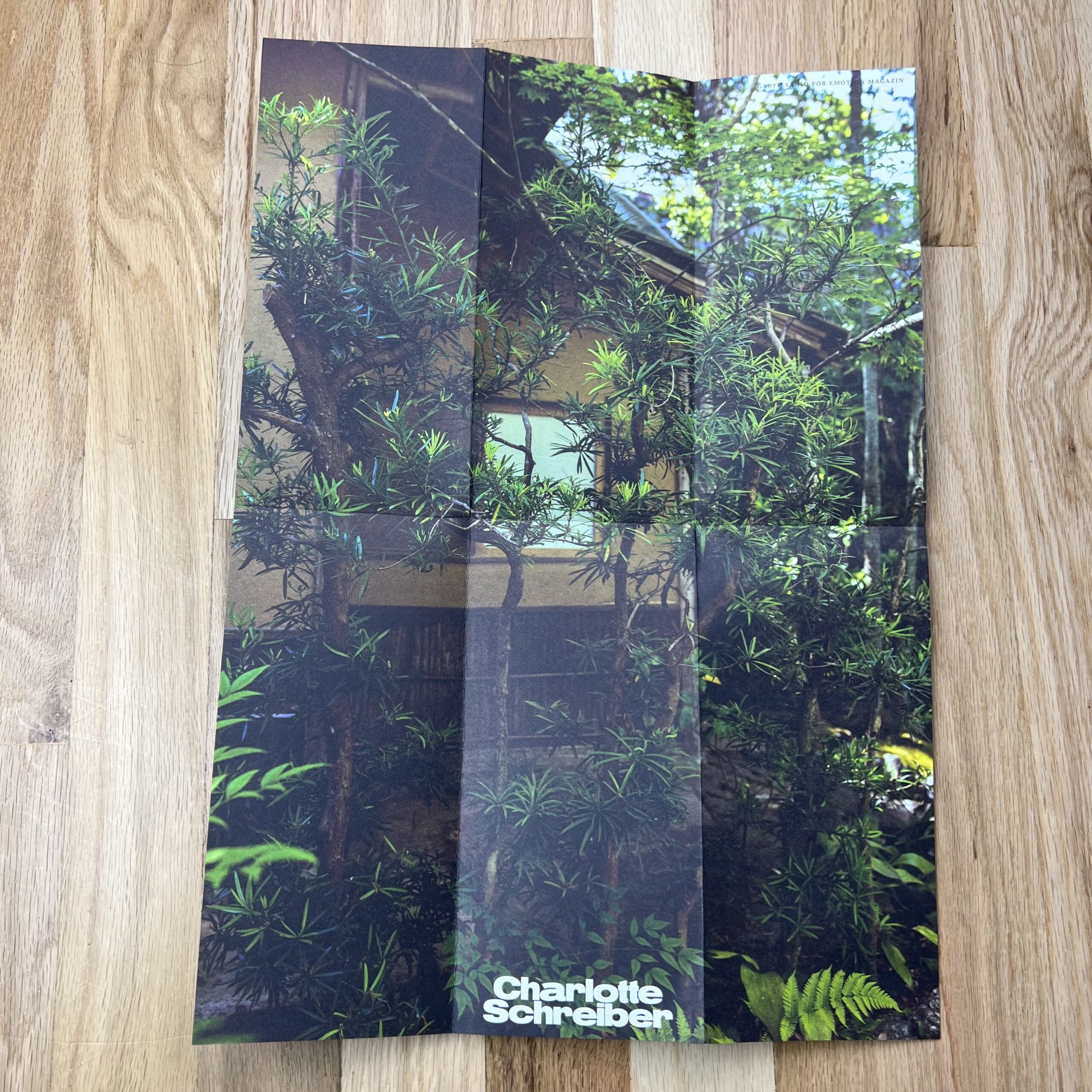
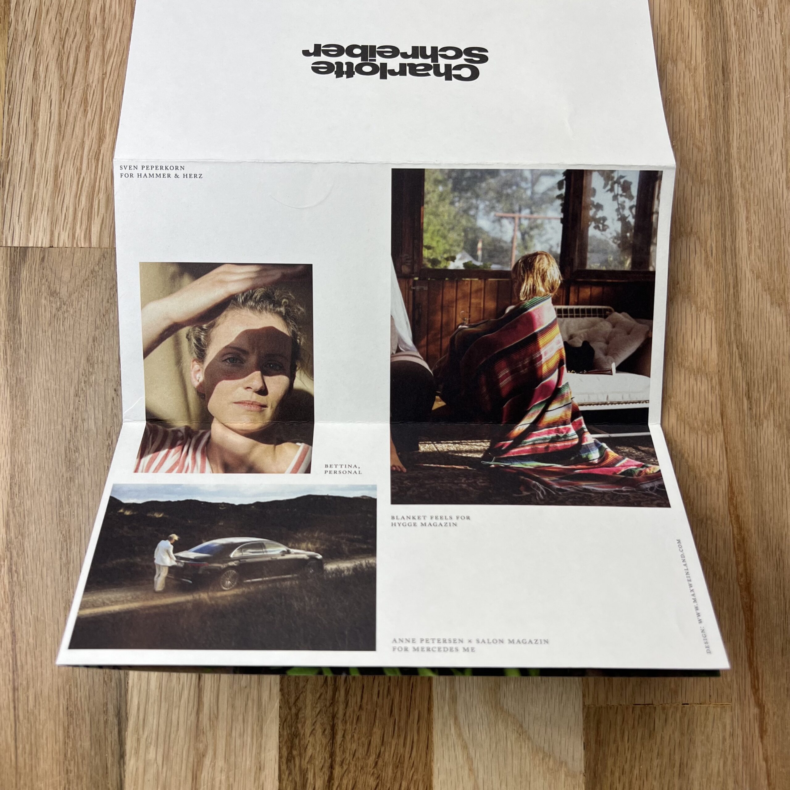
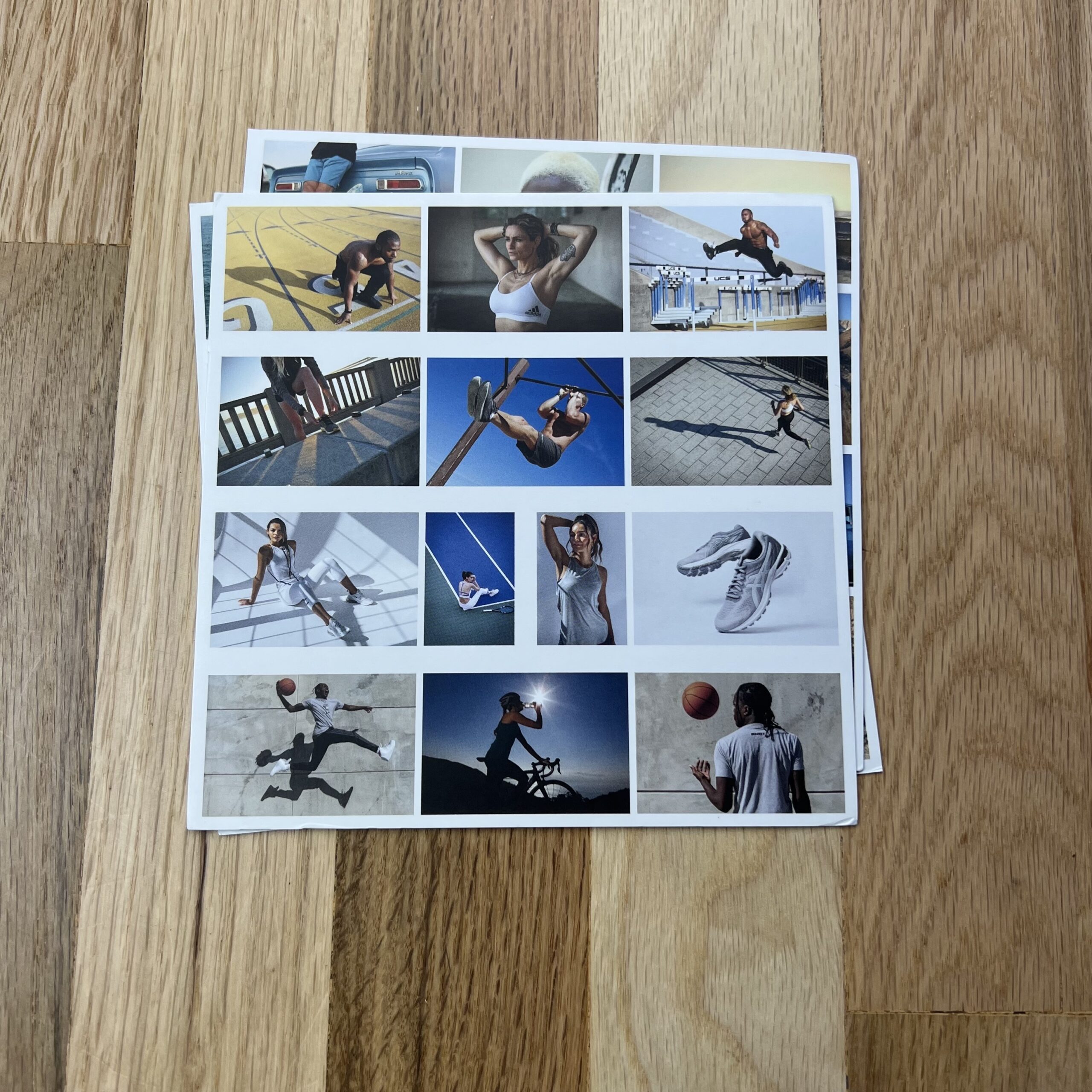
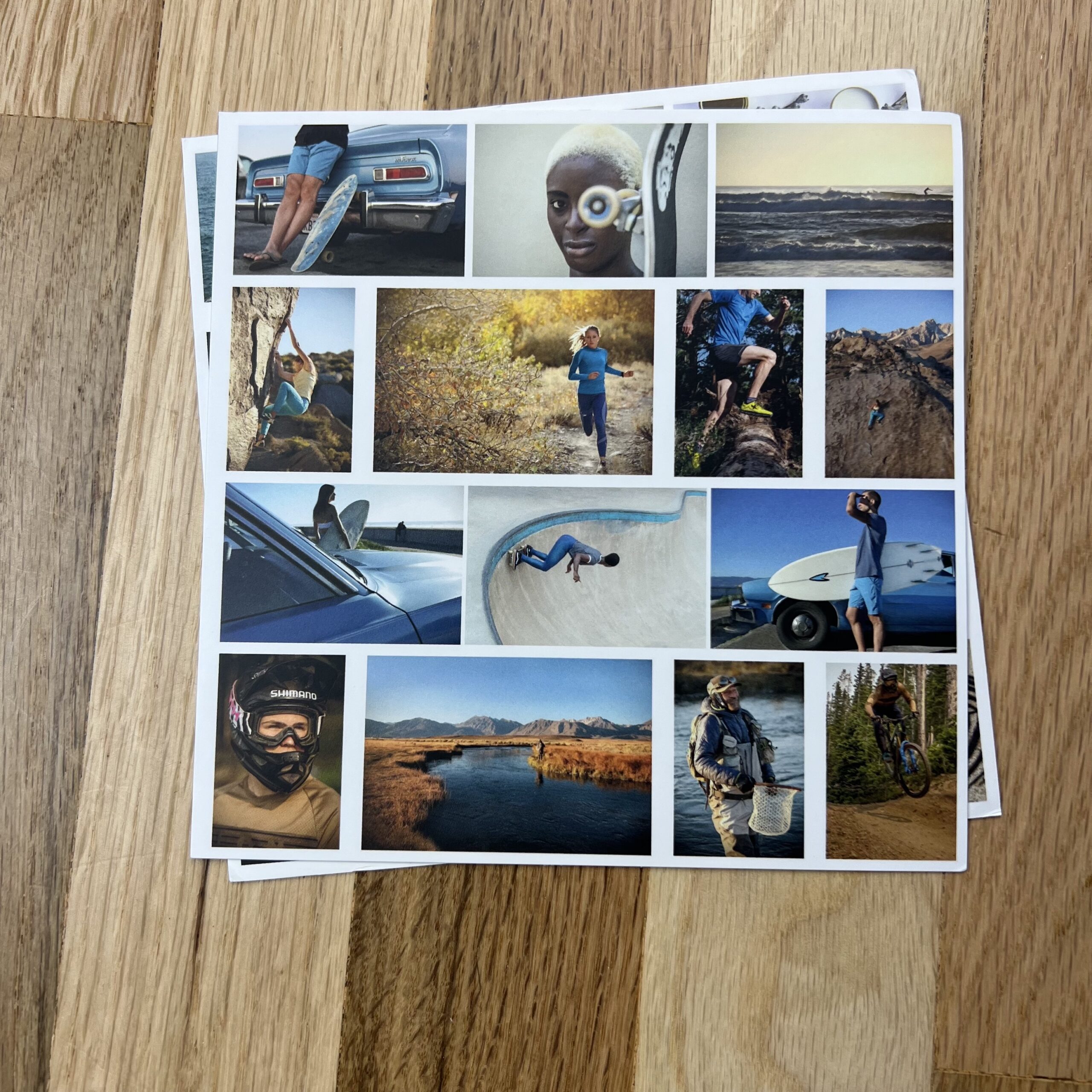
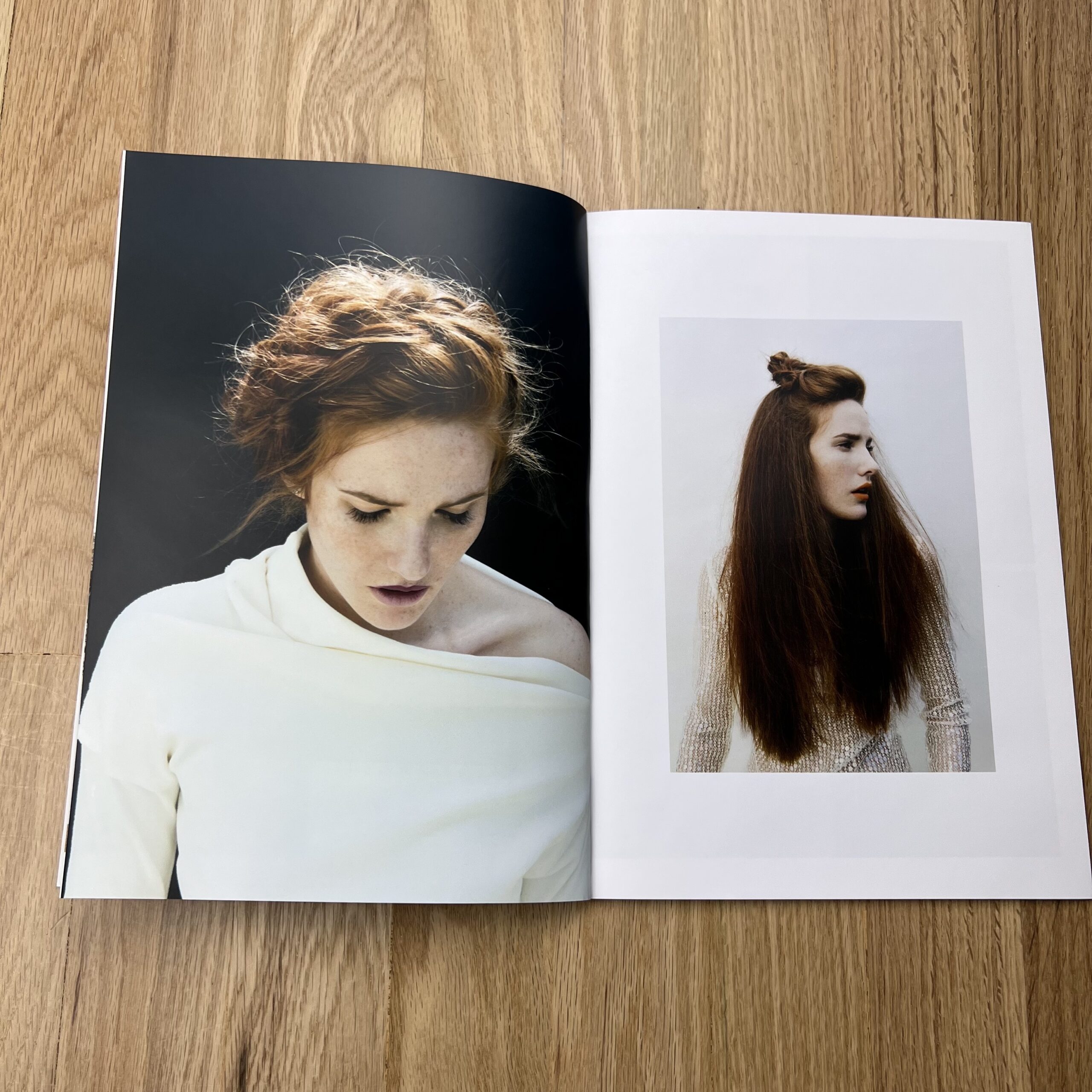
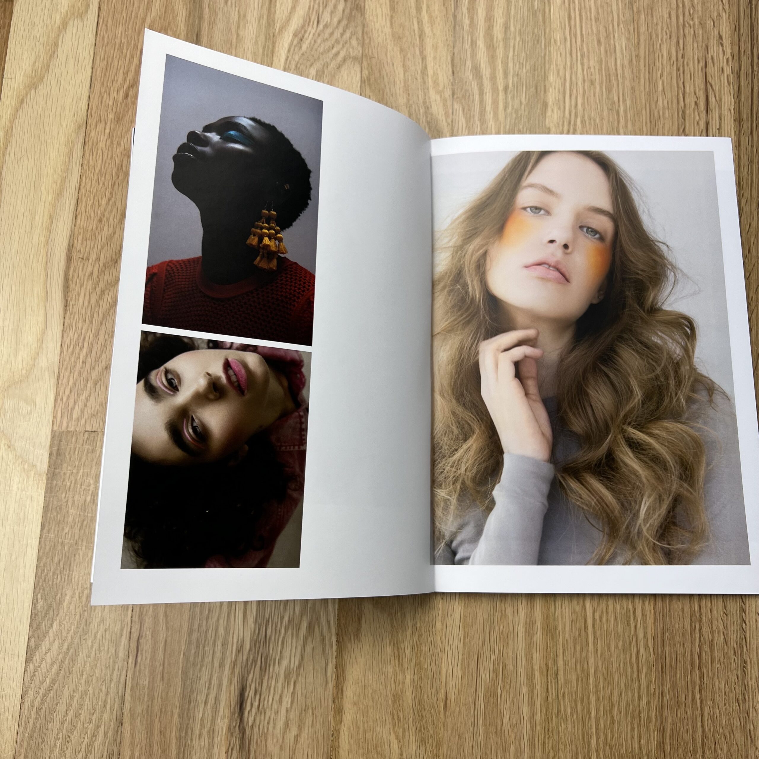
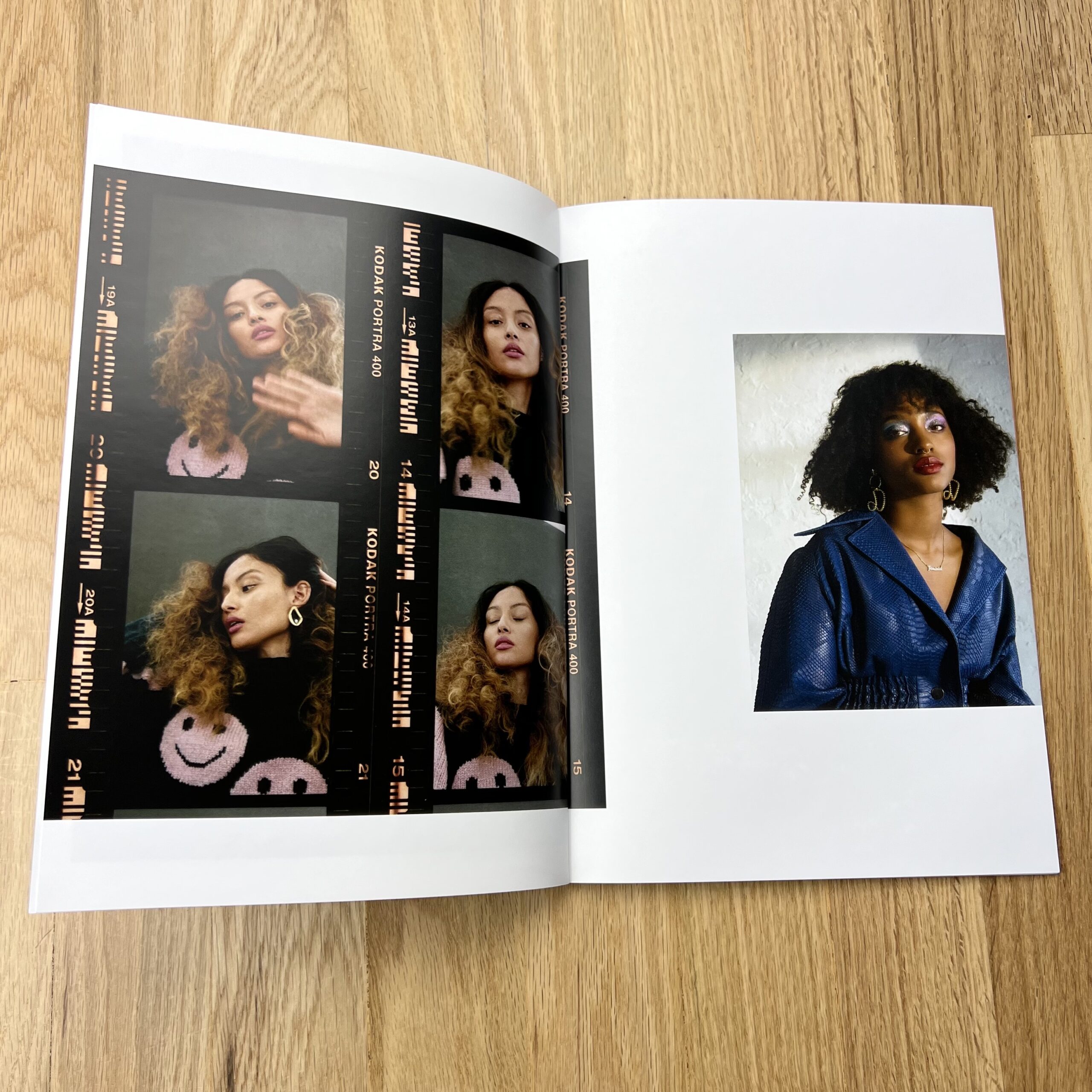
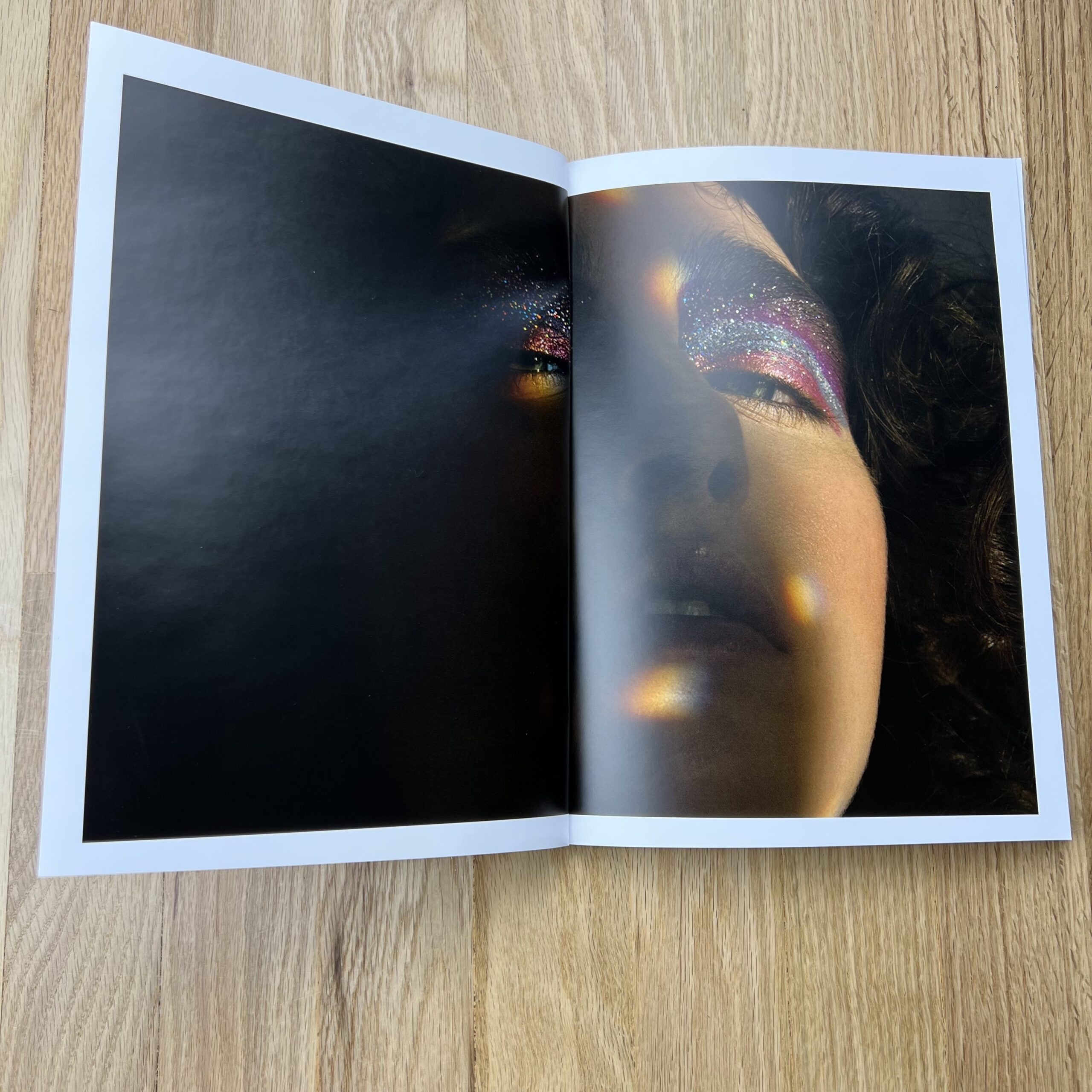
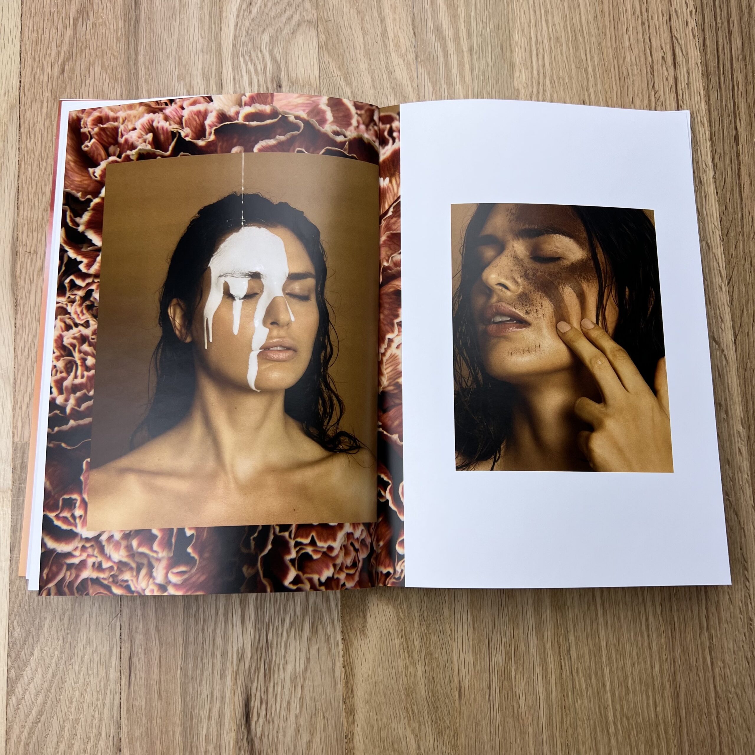
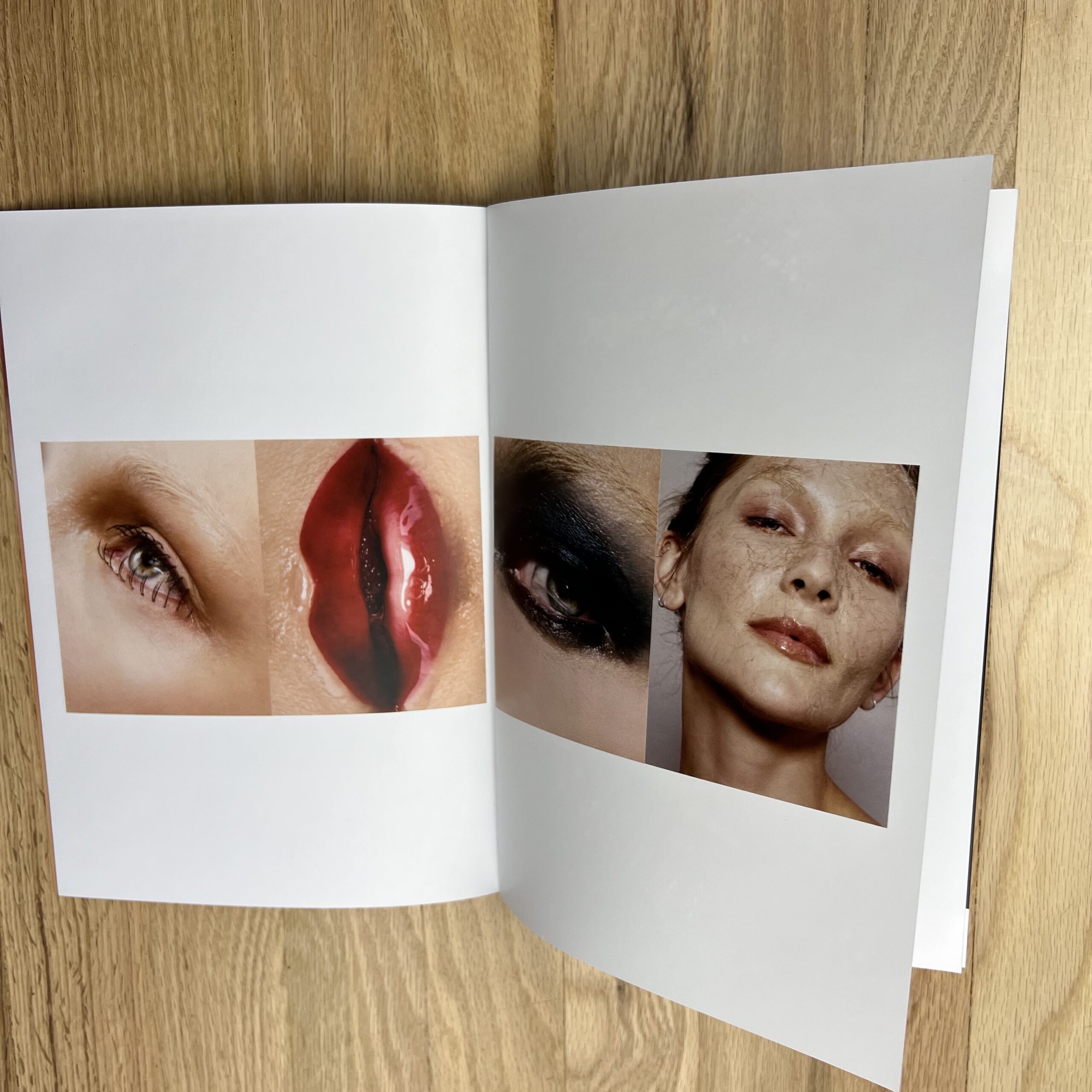
I have a fairly unusual background, [feminist, modern] art history and studio art, and I’m a self-taught photographer who learned about making images from painters, not other photographers, so the work itself feels somehow simultaneously extremely niche, and yet, can’t fully be categorized. My general understanding is that people enjoy and respond to my work, but they don’t know what to actually do with me; “I desperately want to hire you, but I don’t know if I actually can”. It’s tremendously flattering but understandably frustrating. That’s why I divide my work into Standards and Deviations, I want to offer some guidance as to how to look at my work. I’m a photographer who can shoot more classic, approachable imagery, but I’m also a photographer who isn’t afraid to experiment and really lean into that studio art background; I’ve made mixed media pieces with my prints, silkscreens using makeup instead of paint, and physically altered the composition of beauty products to use them as art supplies. I can’t have one without the other, I would feel incomplete otherwise.
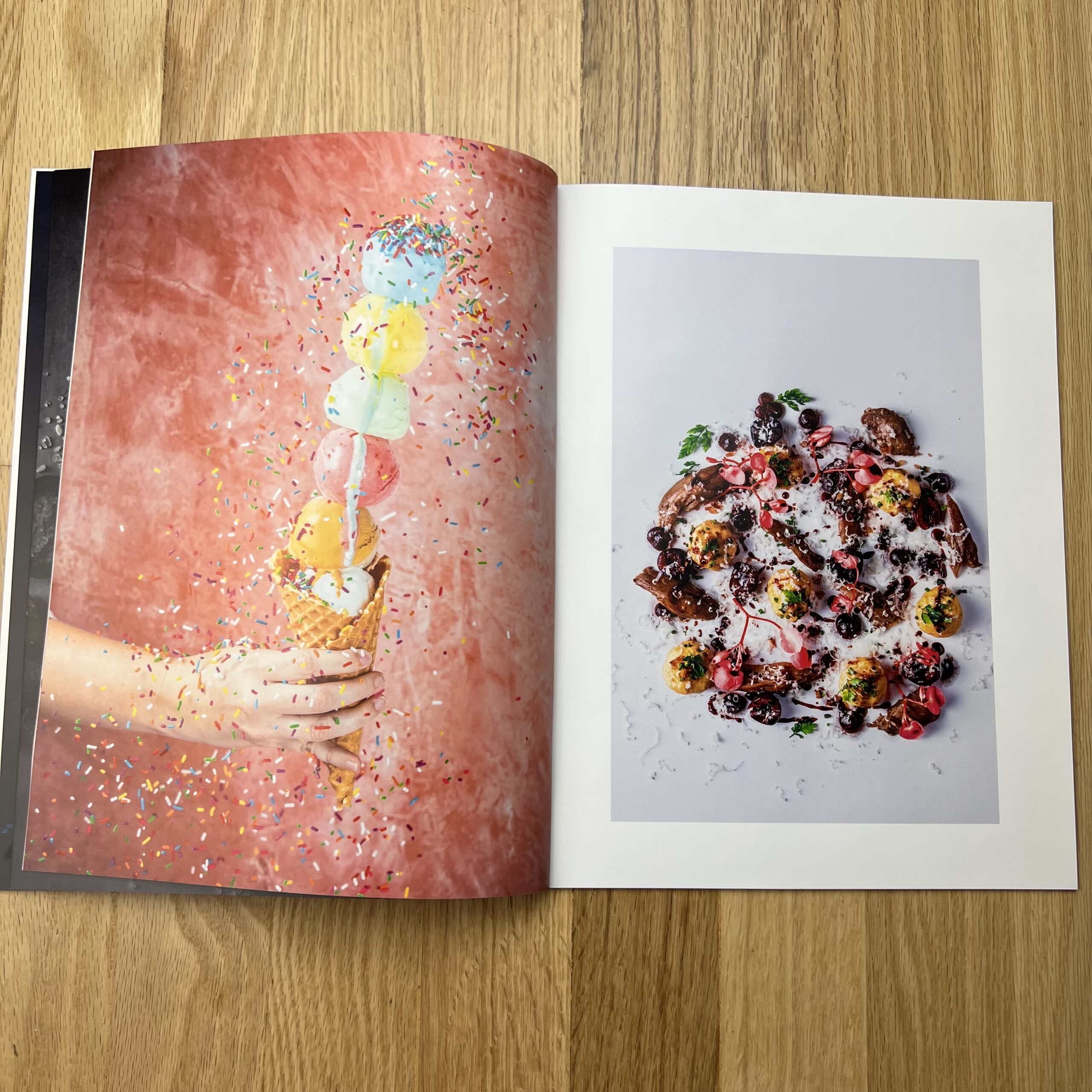
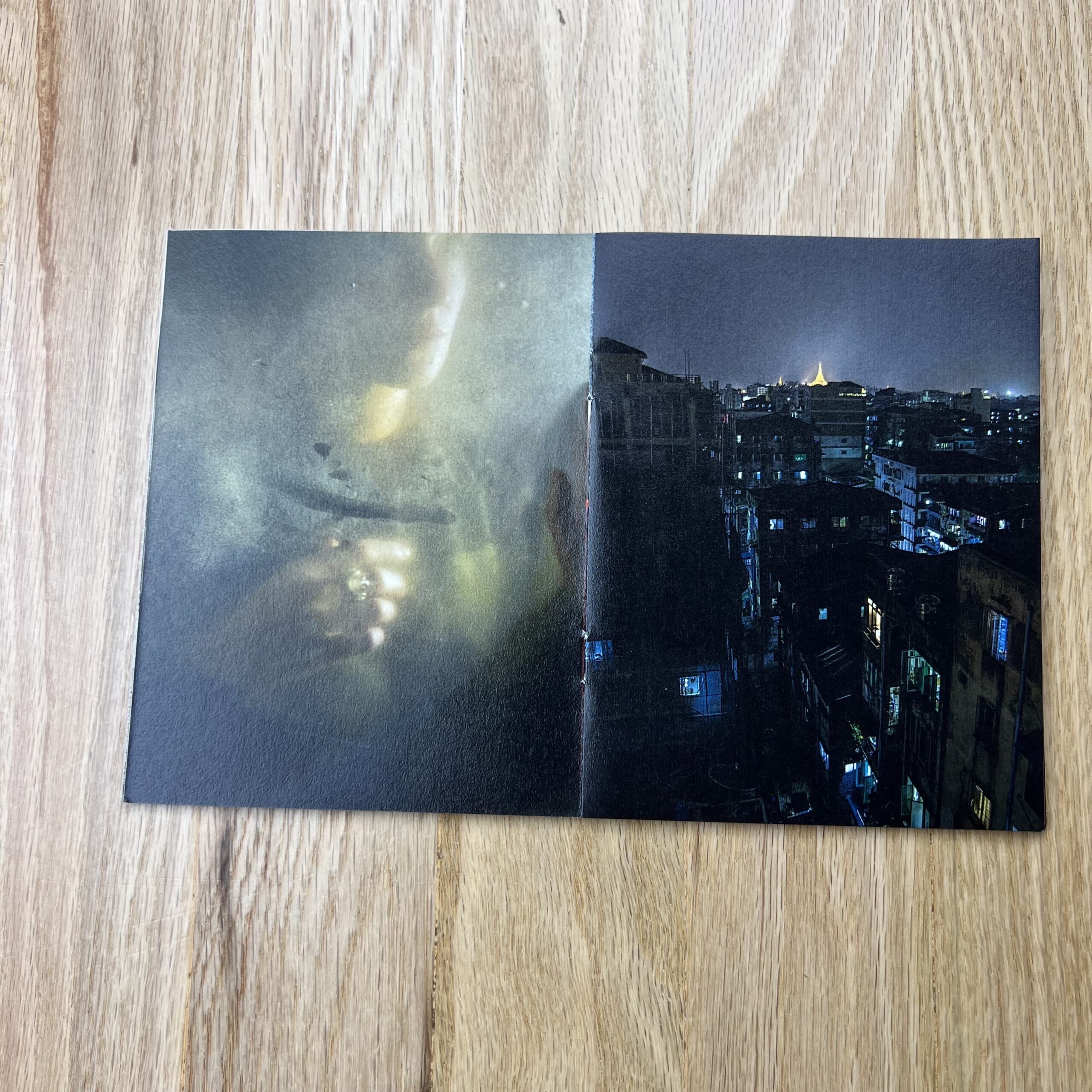
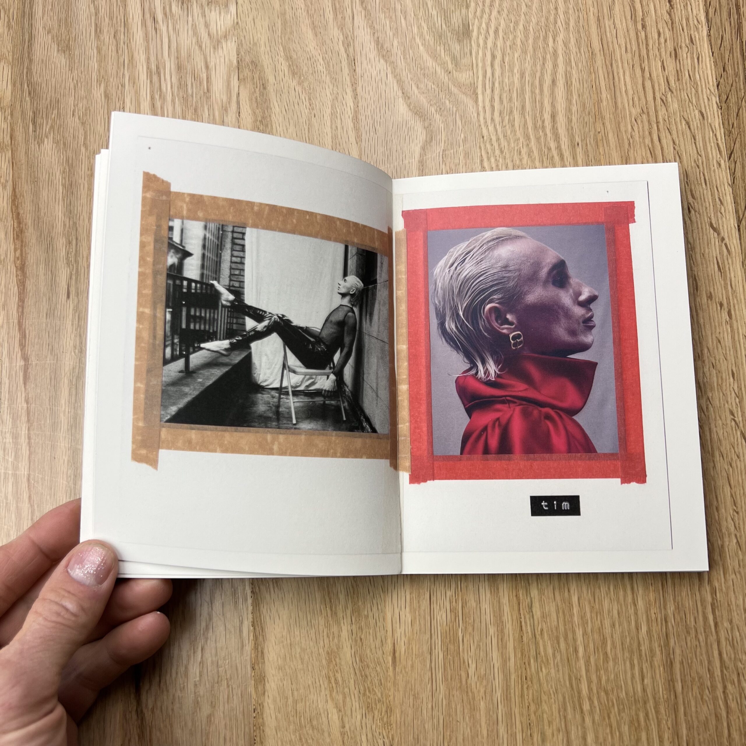
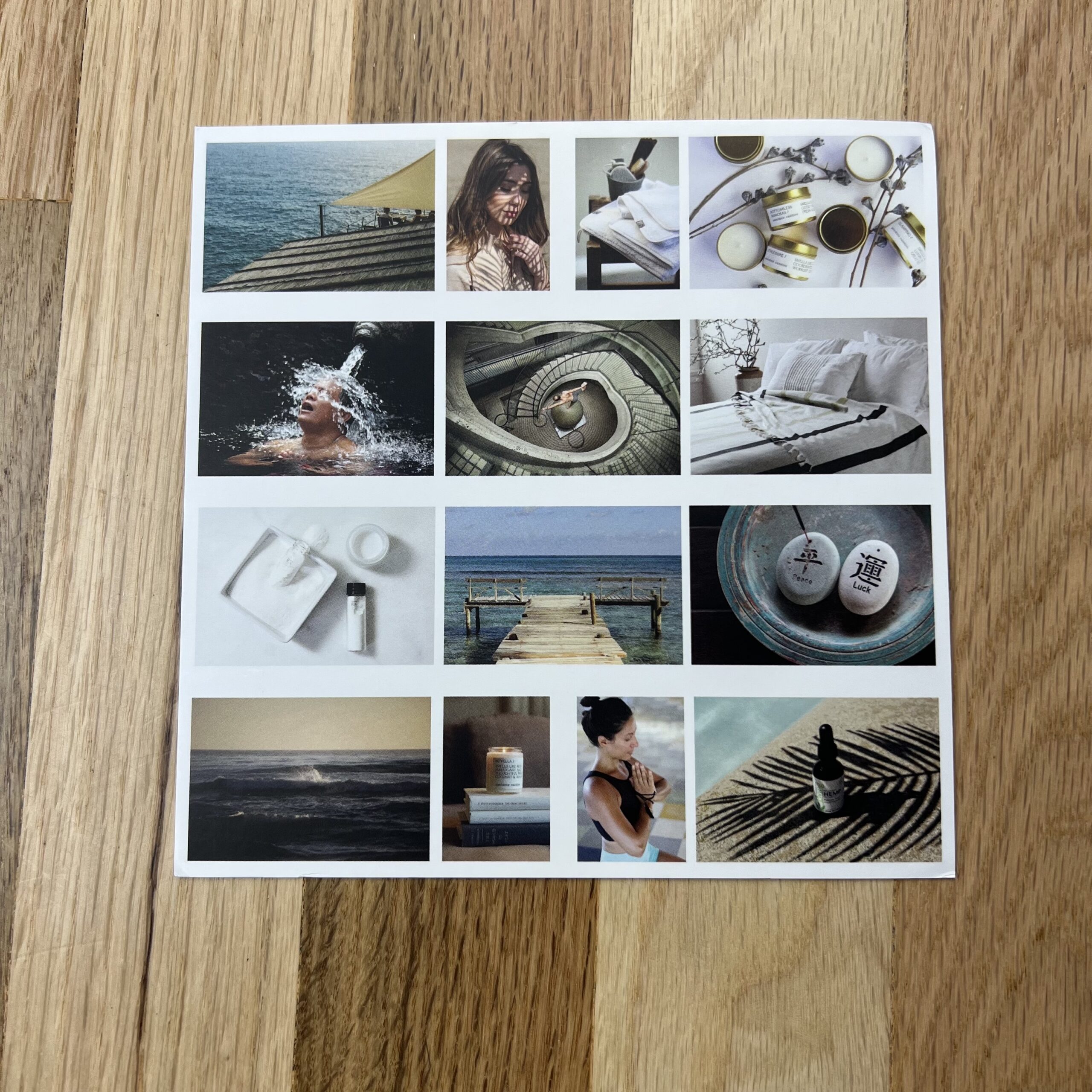
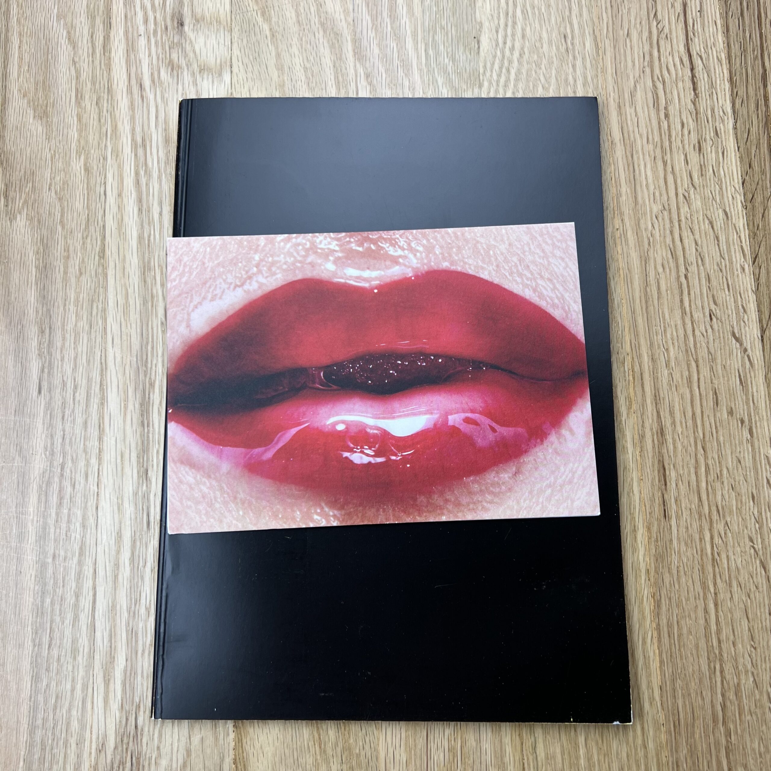
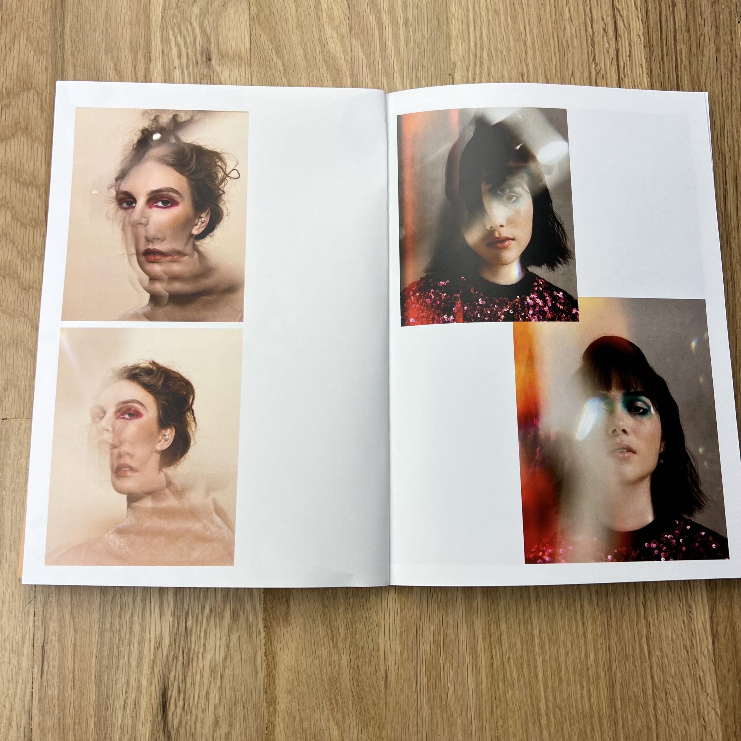
Tell me more about the images in the Deviations category.
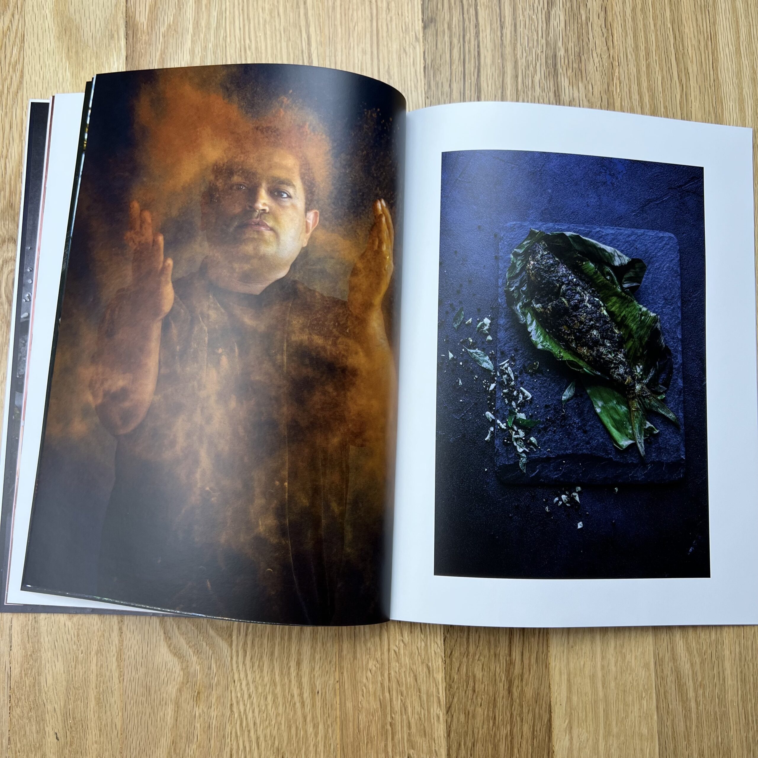
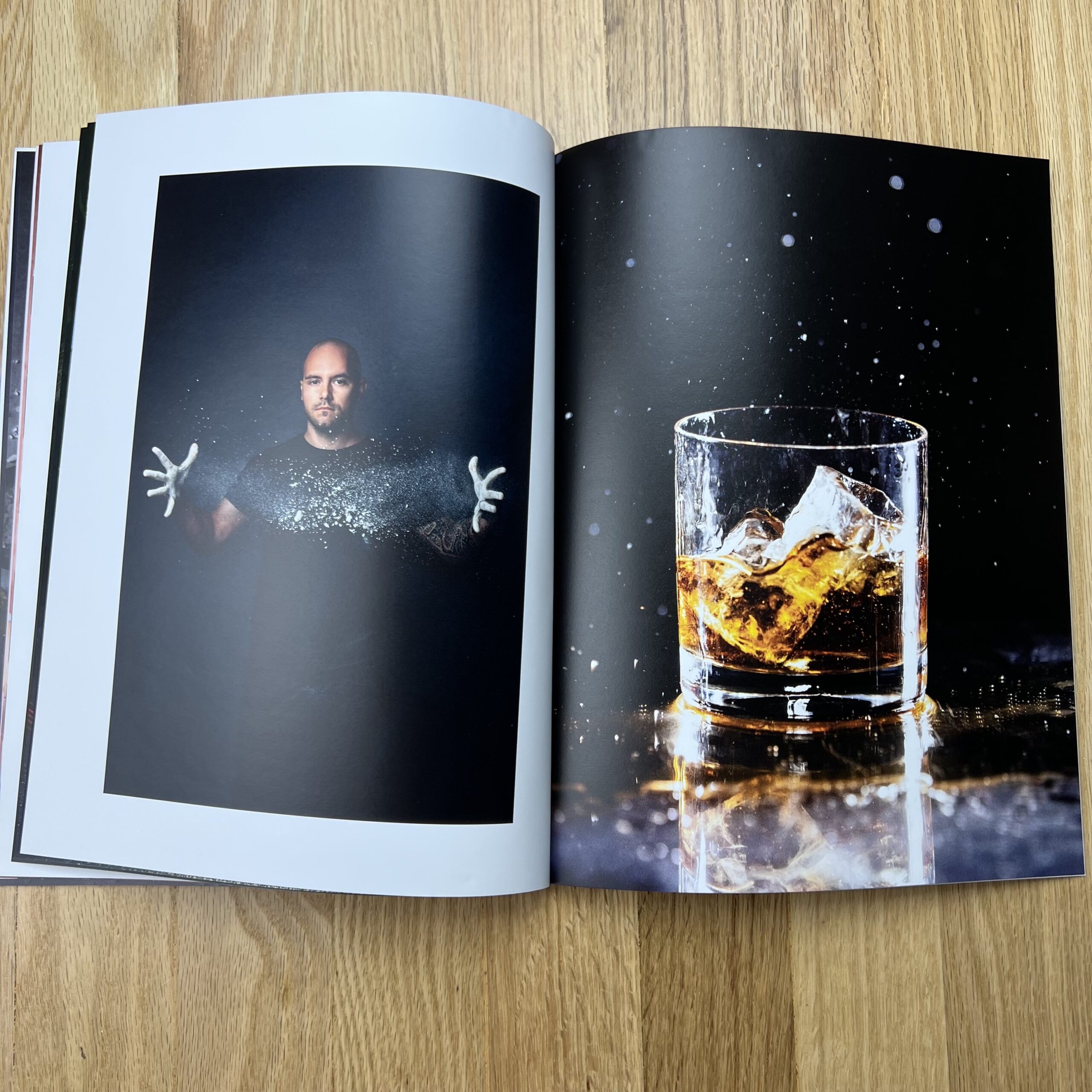
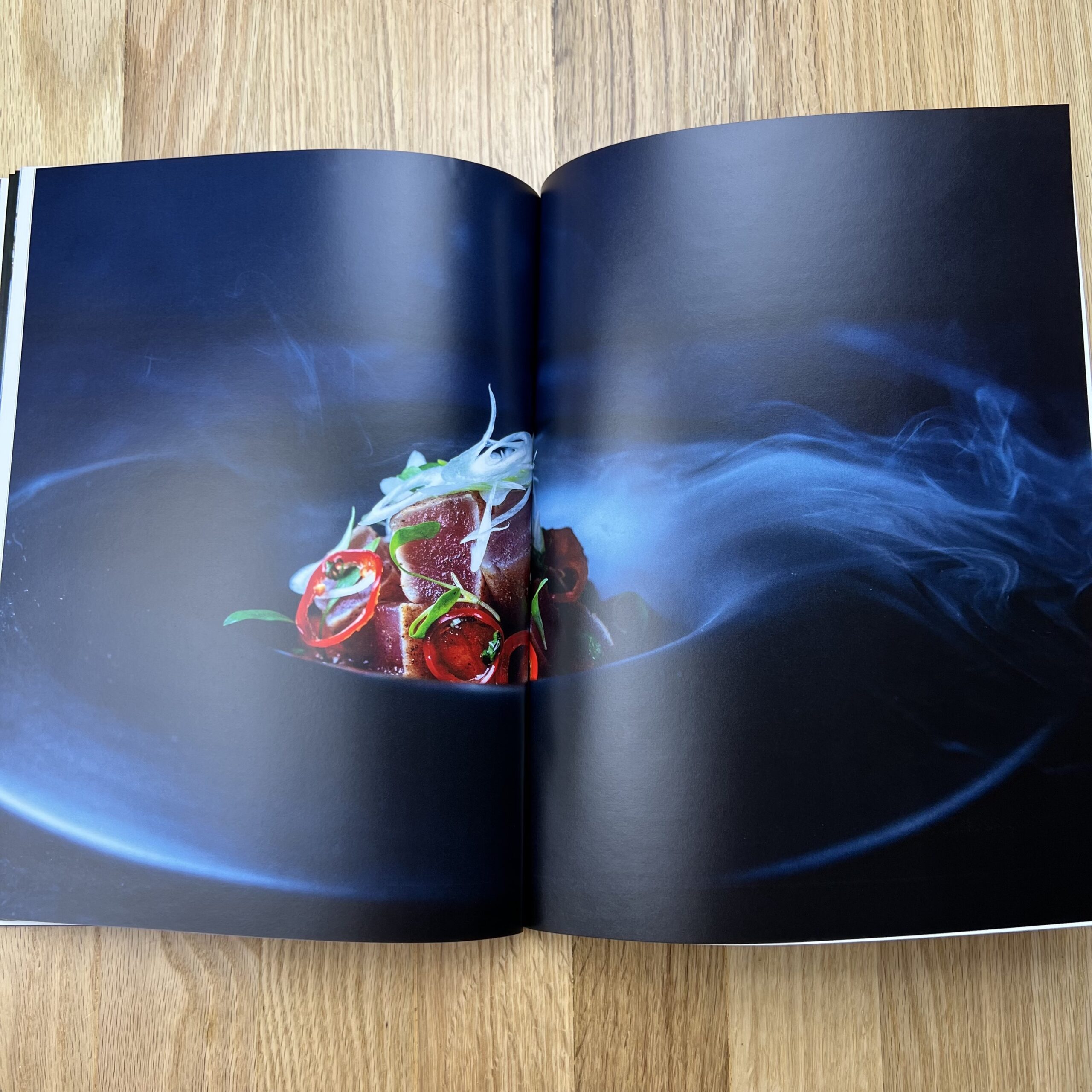
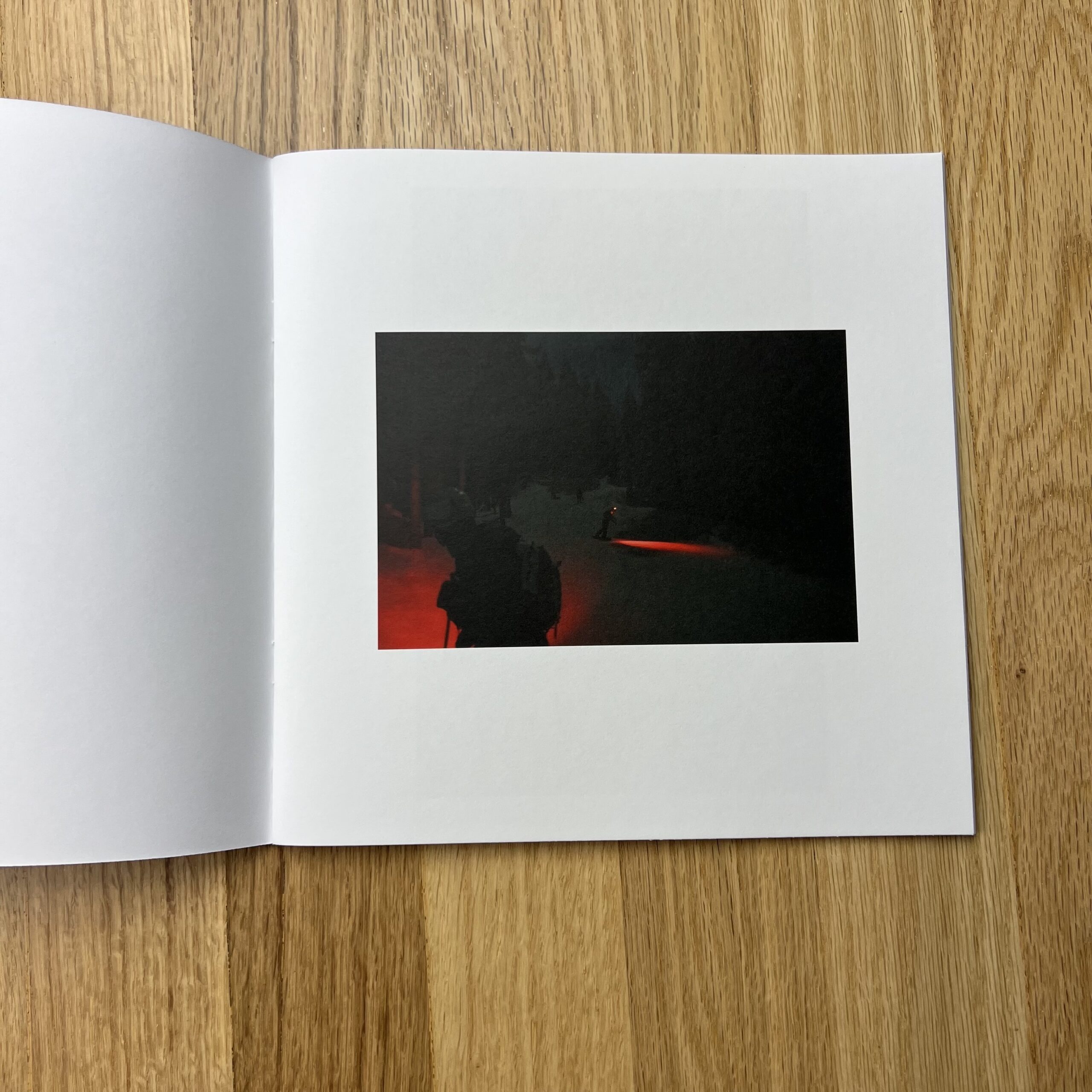
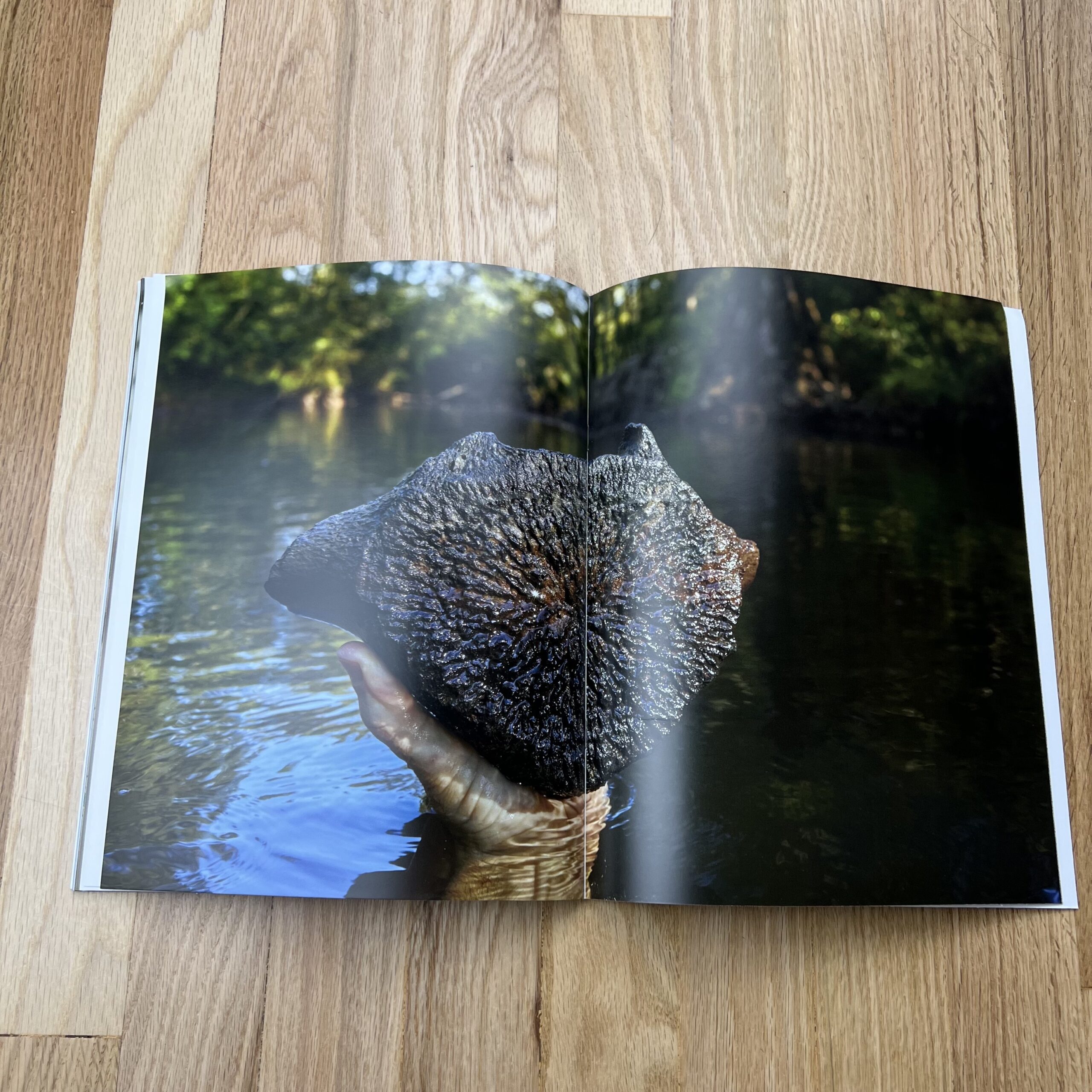
I have Sensory Processing Sensitivity, but what that means for my work is that nothing is purely visual, they appeal to at least one other sense, usually touch. For me, I need to be able to feel an image, not just look at it. I didn’t even realize it was a part of my work until I showed my work at a portfolio review, and someone said he could imagine the smell of one of my images (it featured copious amounts of sunscreen). Since then, I’ve come to understand how unique my SPS is and moving forward, I’d like to print and design booklets that feature images that better represent my mental process, not just my artistic identity.
How many did you make?
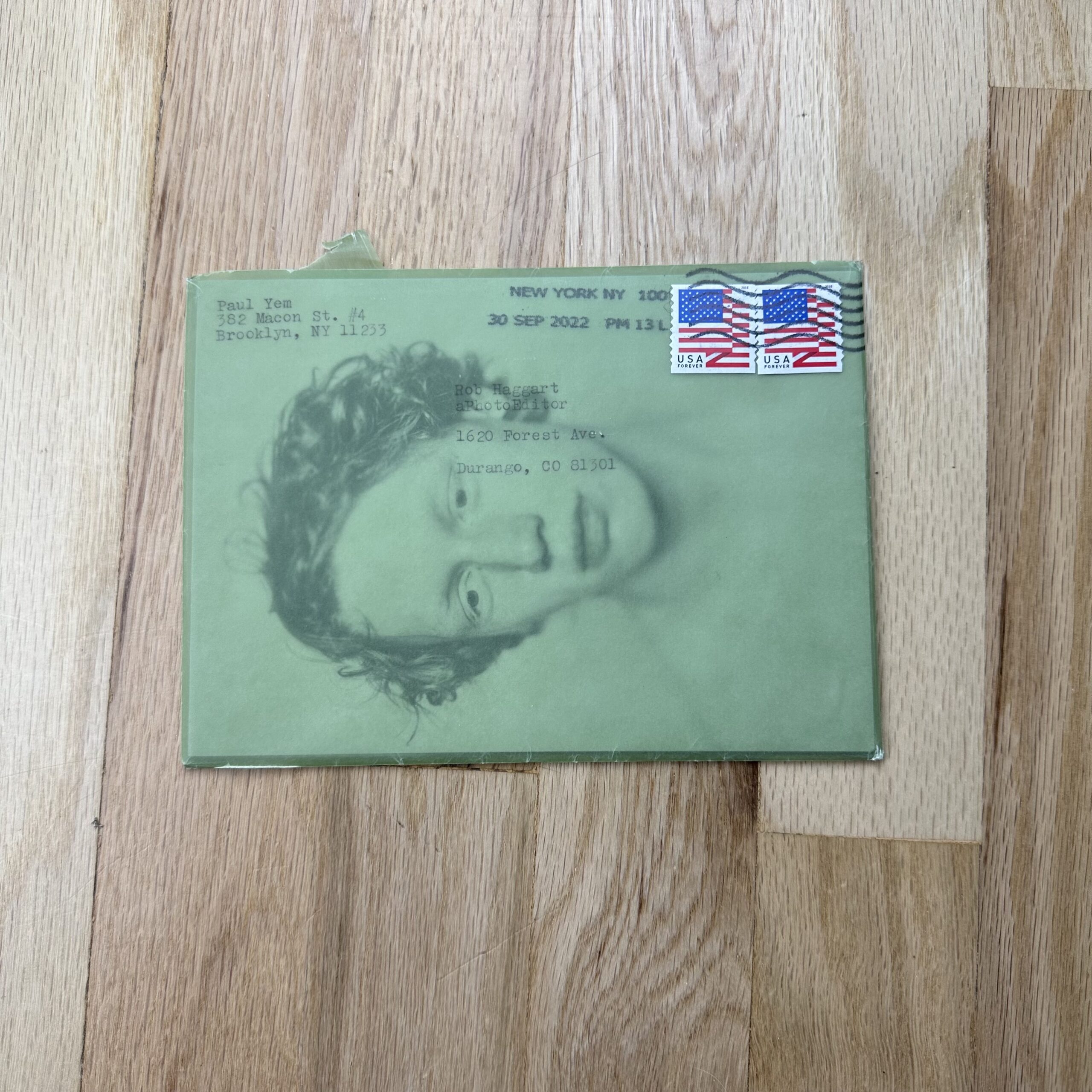
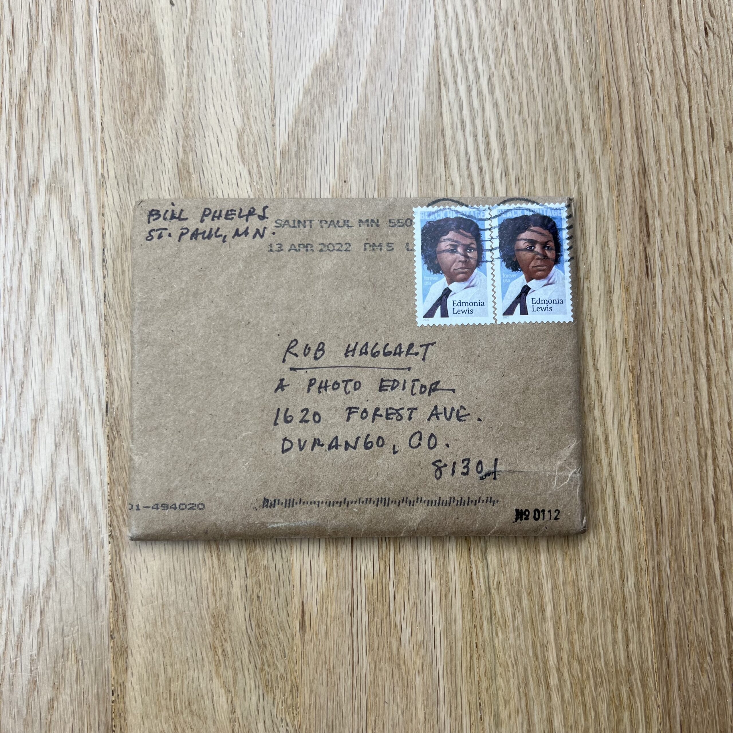
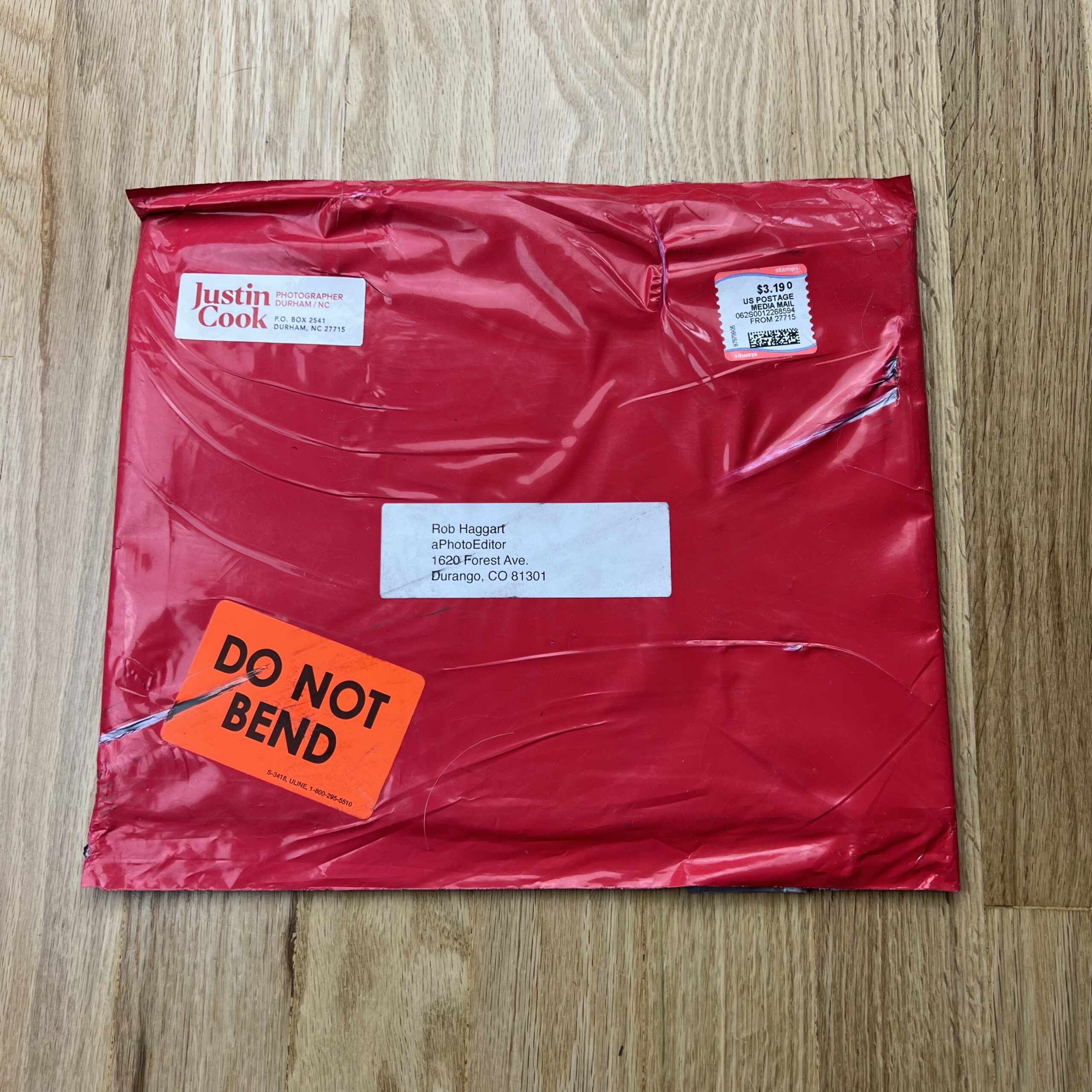
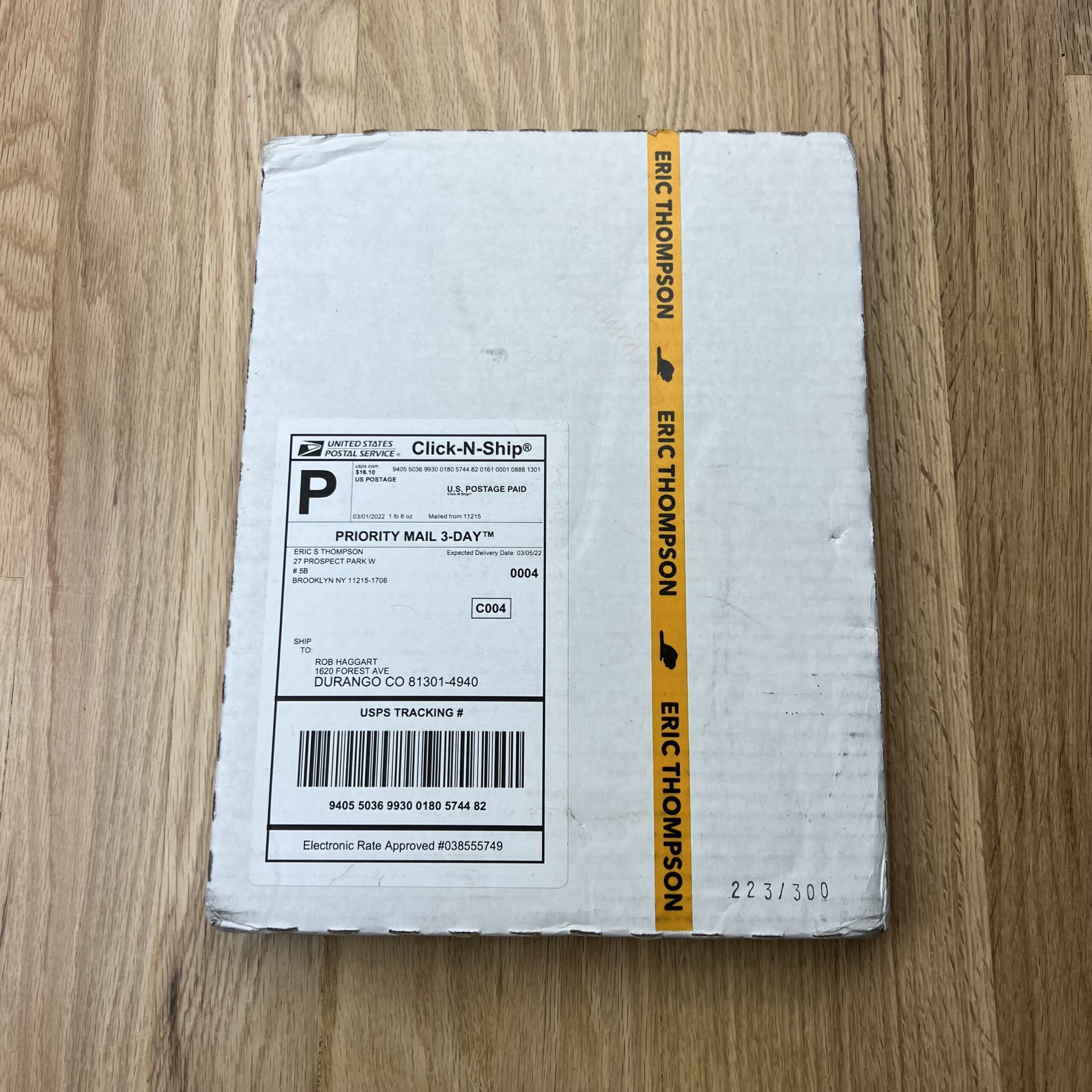
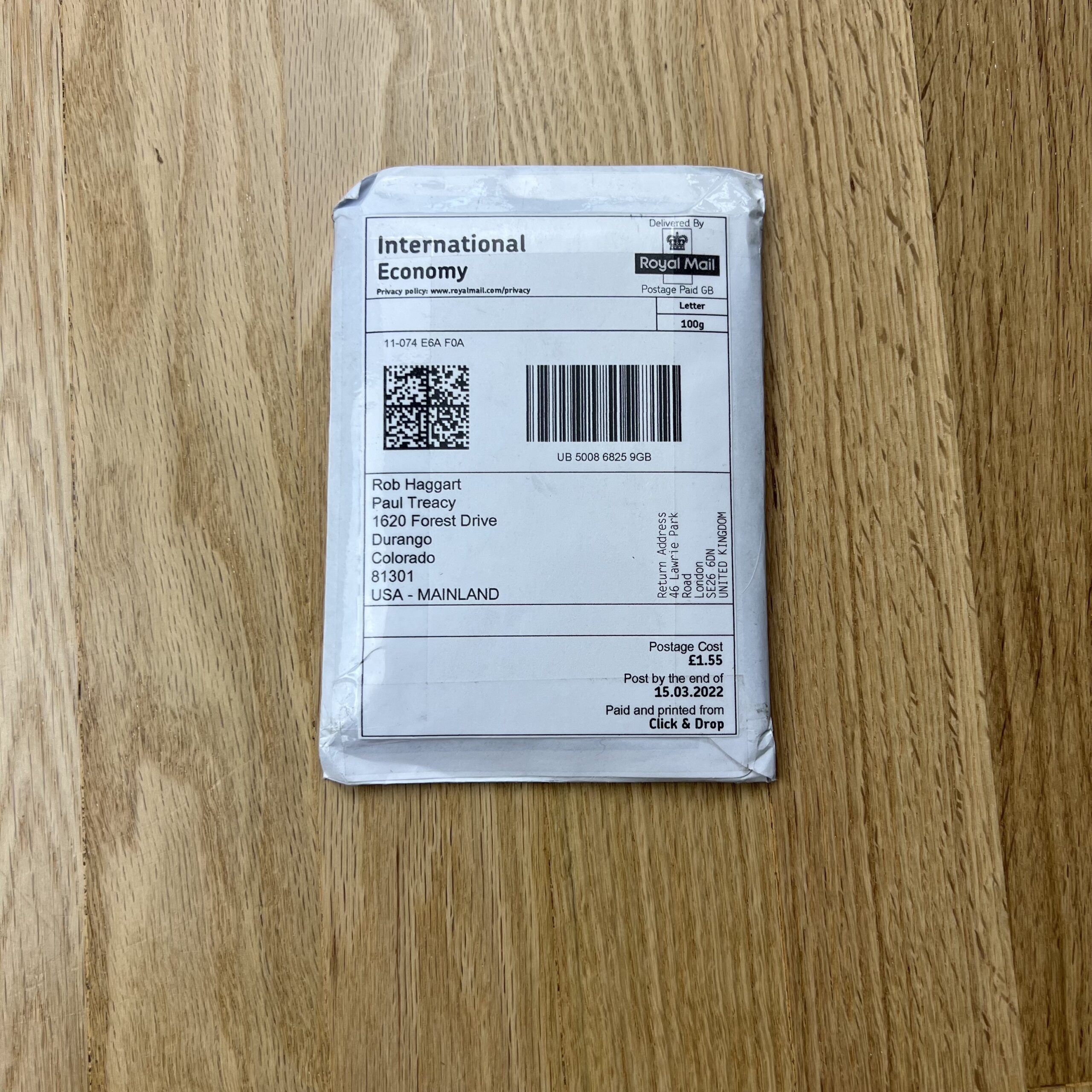
I printed 200 booklets, I believe. This was an experiment, so I didn’t want to invest too heavily, but I also wanted to make sure the booklets had a chance to make the impact I was hoping they’d have. This was also all done during COVID, and very few people are returning to offices, so my plan had been to personally reach out to every potential recipient (500+ individualized emails), explain what I was trying to do, and hoped they felt comfortable sharing the appropriate mailing address with me (I recognized most of those addresses would be personal, and I didn’t want to overstep a boundary). Miraculously, people replied. I knew statistically I would only get a small number of responses, but it was enough. I’m thankful I printed as many as I did since as best as I can tell, no one received the original booklets, mailed in November 2021. After waiting until after the holidays (thinking there might have been a massive seasonal issue), I had to mail out a second batch.
How many times a year do you send out promos?
I try to send out email promos once every two months, and in the “before times”, I sent out a printed postcard version of the same images to anyone who might not have received the email due to server blocks and whatnot. Now that RTO is hit or miss across the industry, there’s no effective way to send out printed material, but I think print mailers still have their place. Despite all the mailing issues and delays, I’d like to try this again, maybe make a new booklet once a year. I’ve always maintained that a photographer should always present their work in any medium in which it could be consumed, and for me, that includes print.
Do you think printed promos are effective for marketing your work?
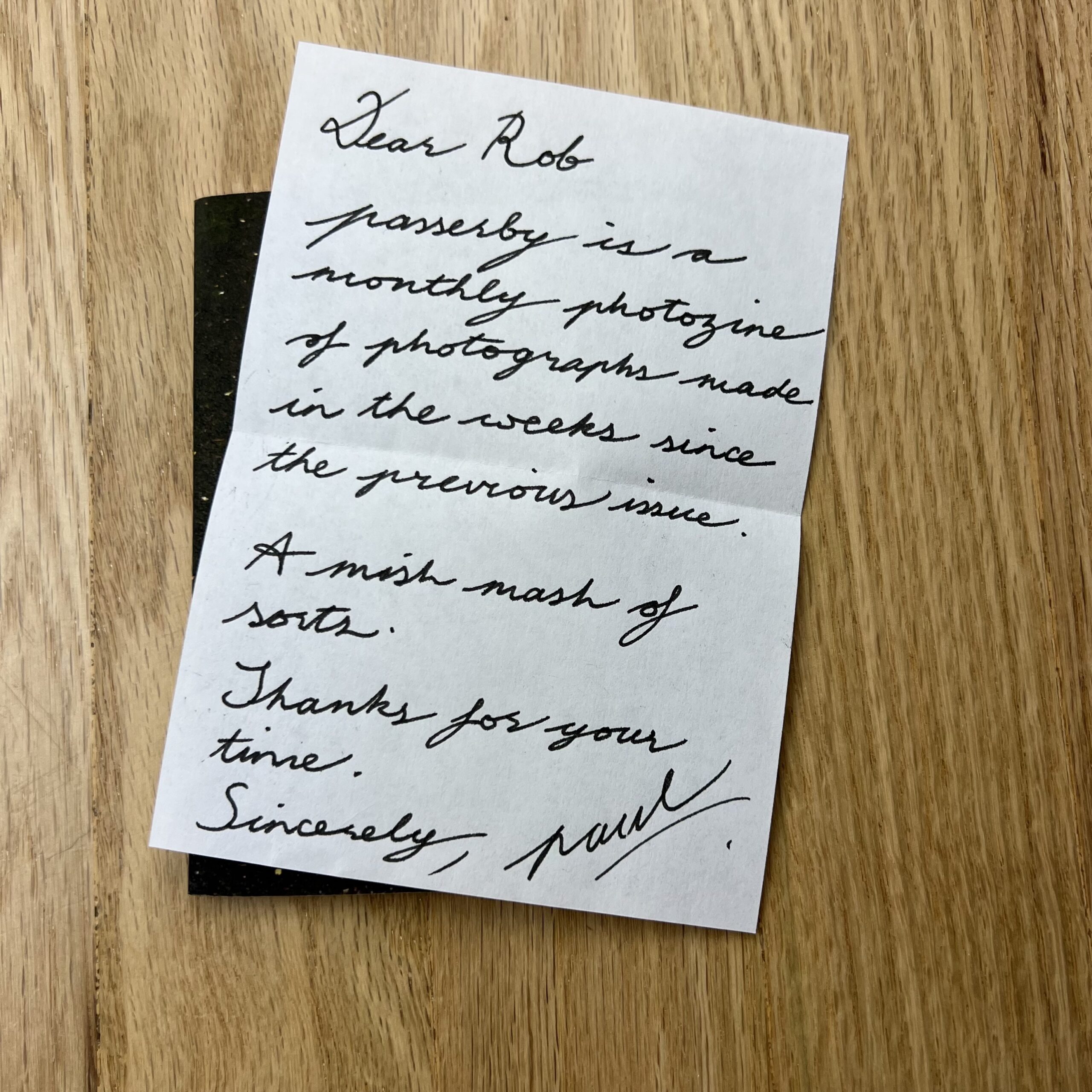
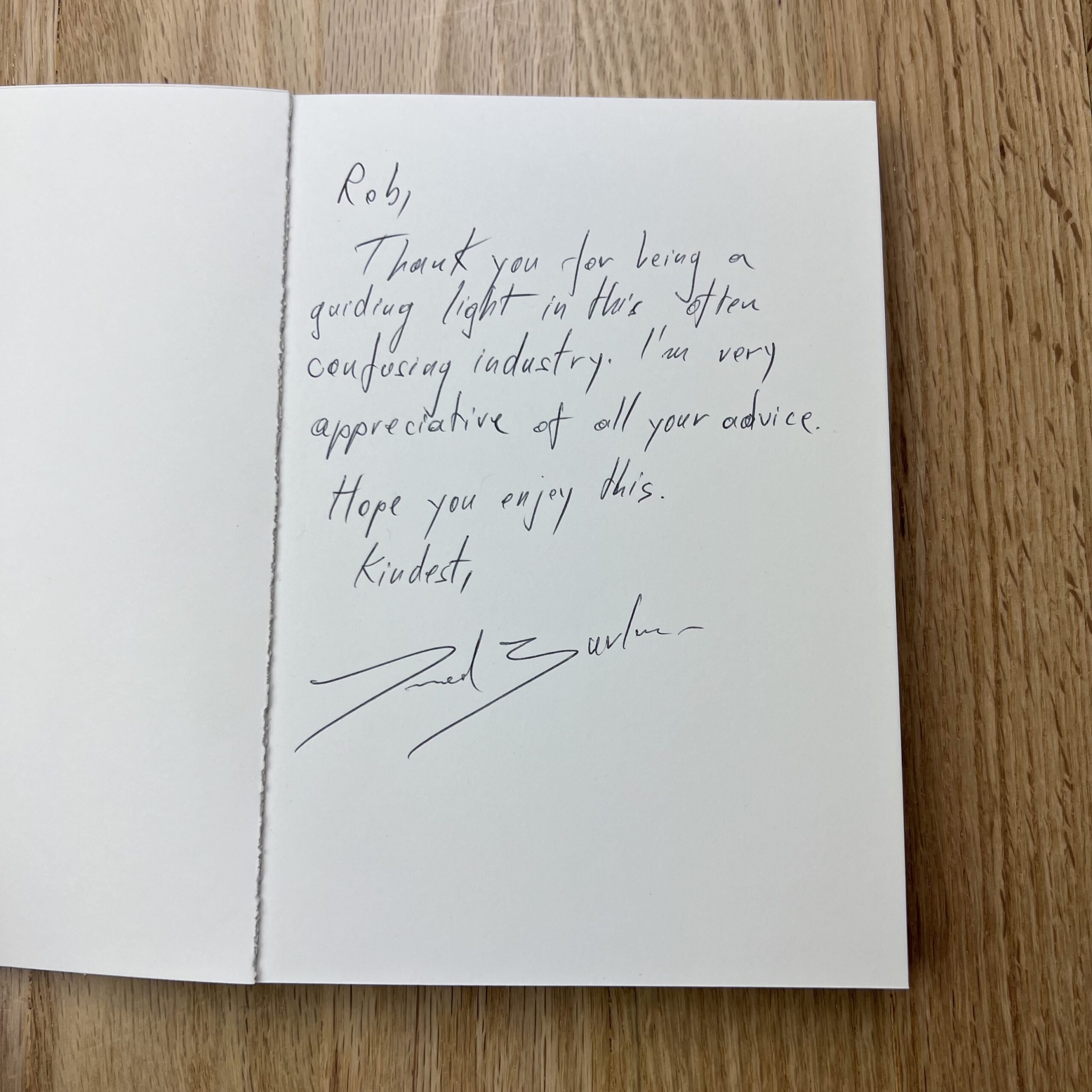
The booklets themselves? I’m not sure yet, I haven’t actually heard much about them. Oddly enough, I think what had a bigger impact was the email I would send to a potential recipient asking for a mailing address. Those were personal. I think it’s easy to forget that the names on one’s mailing list are actual people, and those people surely get bombarded on a daily basis by photographers demanding their attention, even if only for a few minutes. I take tremendous pride in being warm and personable, attributes that are nearly impossible to communicate digitally, and the emails I sent asking for addresses were a chance for me to connect with another human being, not a title. I could essentially say, “I admire the work your company produces, and I would love to work with you, but I also recognize that times are weird, and I’m a stranger asking for your address, but maybe we can meet each other halfway, and you can set a boundary for yourself while I attempt to do a somewhat awkward part of my job.” Marketing feels so anonymous, and honestly, it makes me uncomfortable. Before COVID, I attended in-person portfolio reviews religiously, and at least 75% of my jobs came from those meetings—I got booked because they liked me (which is such a wonderful compliment and never ceases to floor me). It’s much harder to make that connection with a person now, and if we’re being honest, I’m struggling with that. But with these booklets and the emails, I was able to approach someone and say, “I made a thing. I worked hard on it. I didn’t make that many. And I want you, you specifically, to have one, because I want you to have one.”