The Daily Promo – Kenneth Ruggiano

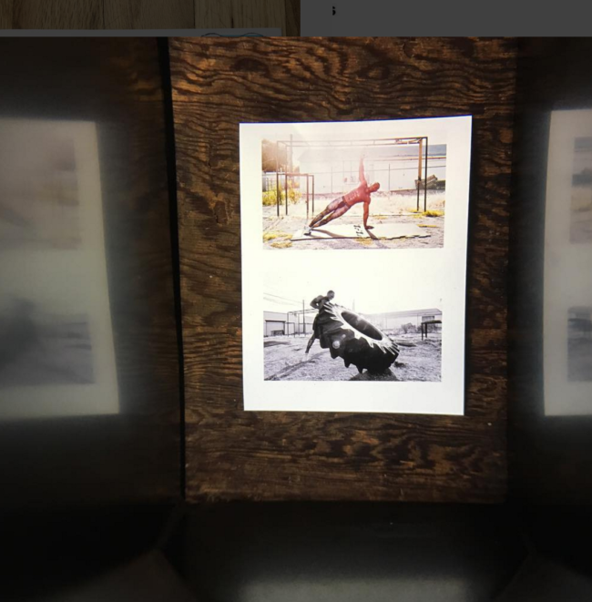
Screen Shot 2016-07-16 at 3.38.11 PM

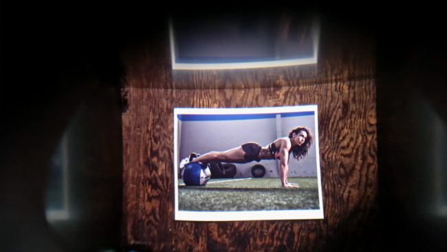
Screen Shot 2016-07-16 at 3.38.27 PM

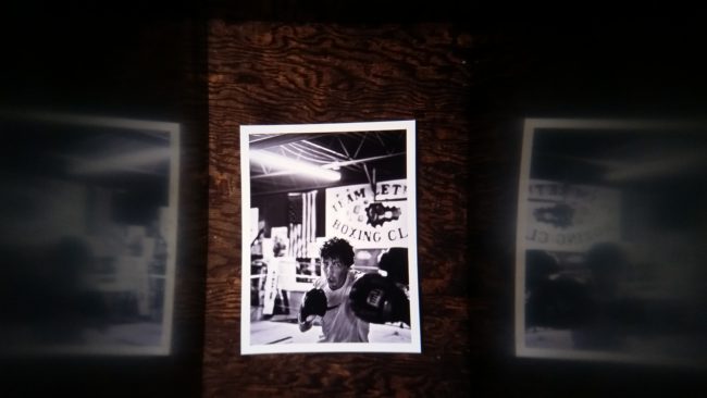
2016-07-16 14.17.07

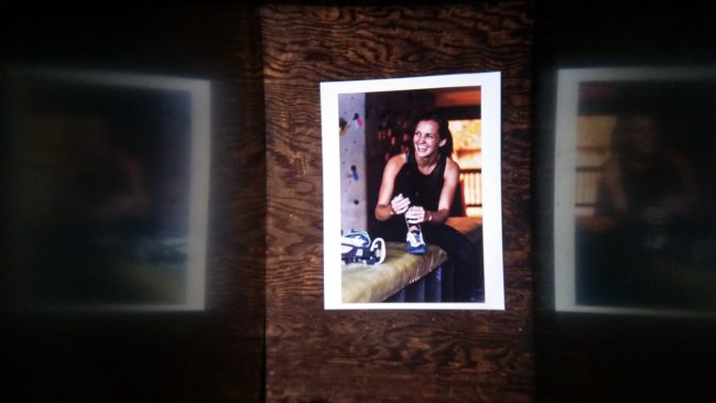
2016-07-16 14.17.18

2016-07-16 14.17.30

2016-05-12 12.16.03

Kenneth M. Ruggiano


Who printed it?
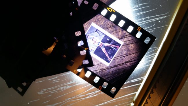
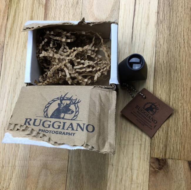
I had the prints done by Bay Photo. It’s printed on Moab Entrada. After I receive the prints I shoot them “copy stand style” onto slide film, I used Fuji Velvia. I tried a couple different slide films and liked the Velvia the best. After I’m done with the slide film I send it off to Fromex in Long Beach, California to have it processed. No one in my area process slide film any more, sad face. Once it’s back to me after a week or so I cut each positive out and place it into a slide viewer. It’s a total pain in the ass…I mean labor of love. Than I cut a piece of leather, stamp my branding on it and attach. One final piece of branding stamped on the inside of the box filled with some crinkle paper and out it goes.

Who designed it?
I designed it. The semester I was graduating  from art school at the University of Oklahoma, one of lower classes showed some of their work with viewers like this. They hung from string in the hall and you had to walk up and interact with the viewer to see the work. I was jealous I didn’t get to do it.

Who edited the images?
I edited the images. I sent @aphotoeditor one version. There are three others. Who gets what depends on who they are, but they are all fitness related.

How many did you make?
In all I’ve probably made just over a 100. The one I sent to @aphotoeditor was in the second wave.  The first set I did as a test, I got some really positive feedback so I went ahead and did another batch right away.

How many times a year do you send out promos?
I’ve been doing a targeted promo once a year. Normally in the beginning of the year but the getting ready/birth of my little girl slowed me down a bit this year.

Where did you find that viewer?
The first set of viewers I bought about five years ago when I first had the idea to do these as a promo. I think I got them from Calumet. I originally planned to find a printer that could print small enough but I couldn’t find anything I was happy with. When I bought more viewers this year I bought them from the manufacturer, Radex Inc.


The Daily Promo: Anthony Georgis

1 ANTHONY_GEORGIS_PROMO_BY_APE_COLOR_06

ANTHONY_GEORGIS_PROMO_BY_AG_Color_03

ANTHONY_GEORGIS_PROMO_BY_AG_Color_04

ANTHONY_GEORGIS_PROMO_BY_AG_Color_05

ANTHONY_GEORGIS_PROMO_BY_AG_Color_06

ANTHONY_GEORGIS_PROMO_BY_APE_COLOR_01

ANTHONY_GEORGIS_PROMO_BY_APE_COLOR_05


Anthony Georgis

Who printed it?
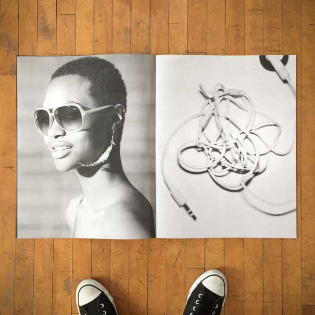
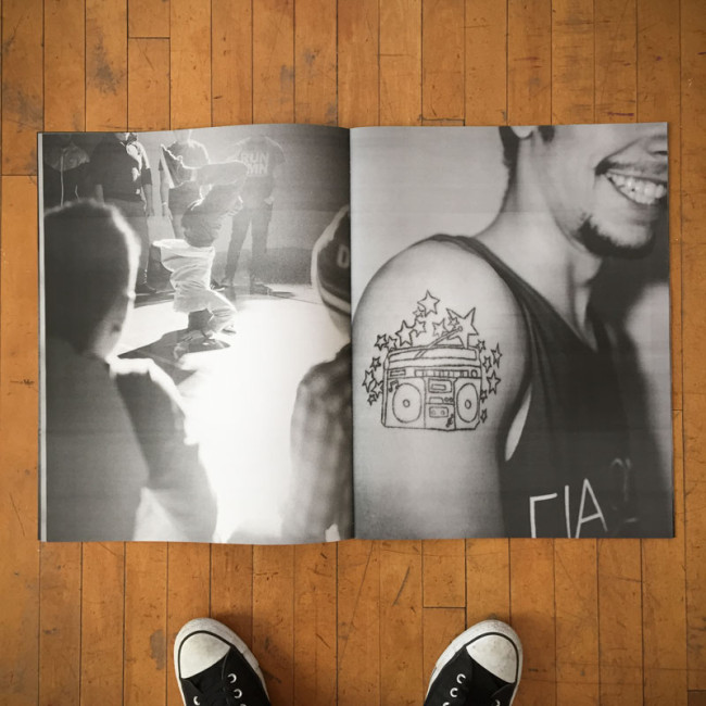
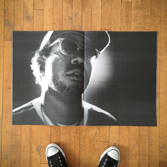
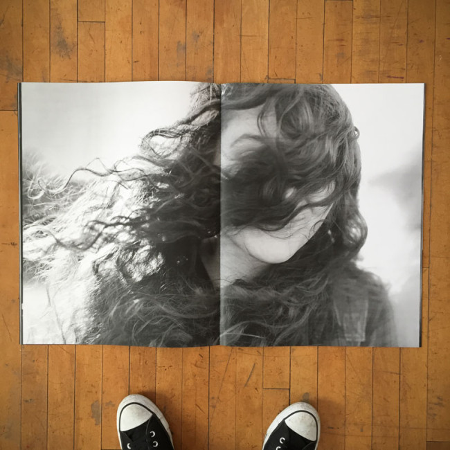
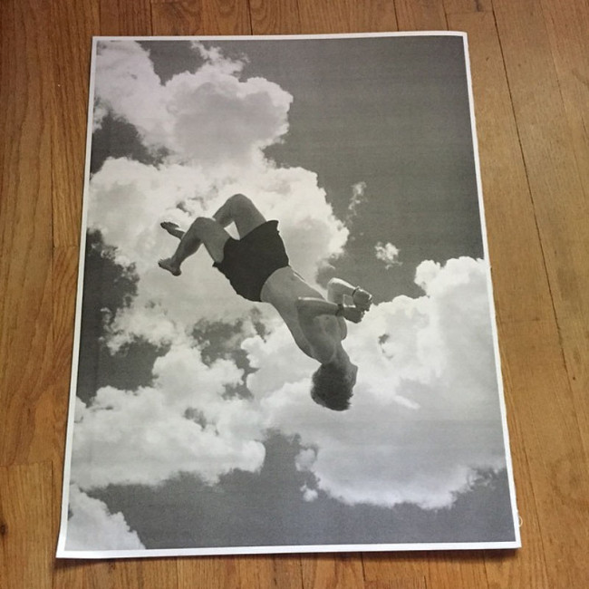
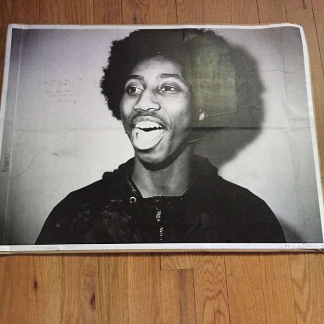
The printing was done on a 24×36” engineering copy machine that is typically used for printing B+W graphics and construction plans. It’s not meant to print photographs, so the image quality is kind of crappy, but that’s part of the magic. Assembly of the finished piece is a pretty labor intensive process and all done by hand. The printer only does one sided prints on standard bond paper, so all the impressions need to be spray mounted together, then folded, hand sewn and trimmed to size. It’s a bit of a nightmare, but the result is this cool handmade thing that shows my work in a way that feels really authentic.

Who designed it?
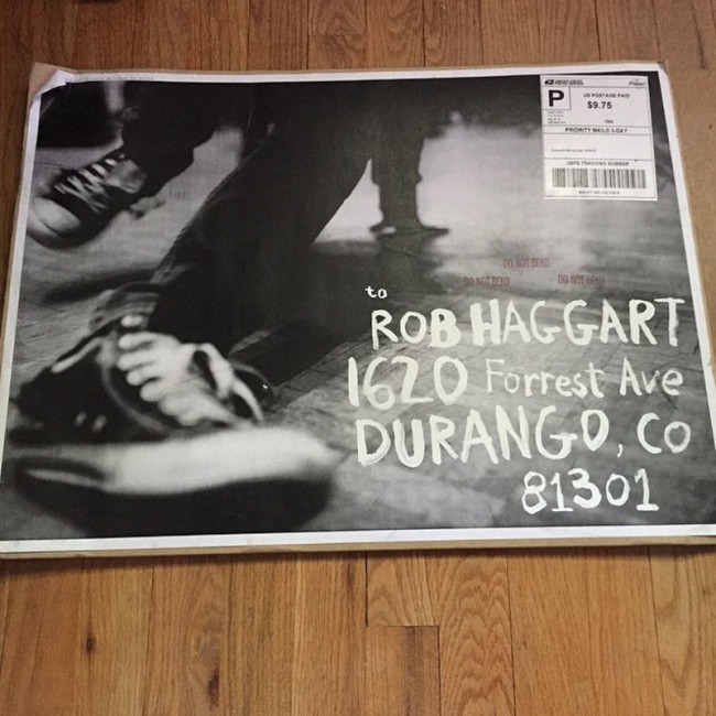
I did the layout and mock-ups. My goal was to make something that looked like it was made at a Kinko’s Copies at 3am using a glue stick. I figured it was best to just make the images as big as possible and let them speak for themselves. To avoid folding the ‘zine for shipping, it goes into a huge 18×24” stay flat mailer with a Xerox print mounted on the outside of it that’s hand addressed in true DIY fashion using White Out.

Who edited the images?
I did the first edit, then enlisted the help of my friends and studio mates to help me get everything finalized.

How many did you make?
This piece is targeted to an extremely select group of clients that I really want to work with. I’ve made 5 so far and have 5 more in the works. The response so far has been amazing. I’ve been taking one to portfolio showings and it’s the first thing that everyone wants to look at.

How many times a year do you send out promos?
I send postcards 3-4 times per year and try to send special promos like this once a year.

The inspiration for this promo piece were the indie skate and music ‘zines that I grew up with. I wanted to make something with a youthful, fun vibe and the ‘zine format had been kicking around in my head for a while. I discovered that I could make giant prints using a black and white Xerox machine and scale everything up to poster size, so I figured I’d give it a try. When I shared the mock up with one of my art director friends, he flipped out and suggested I send it as a promo.

The Daily Promo: Lori Eanes

Back_Eanes

BackAndFront_Eanes

Front_Eanes

Page1-2_Eanes

Page3-4_Eanes

Page5-6_Eanes

Page7-8_Eanes

Lori Eanes

Who printed it?
Overnight Prints

Who designed it?
I did.

Who edited the images?
I did with the help of a photographer friend, Pamela Gentile.

How many did you make?
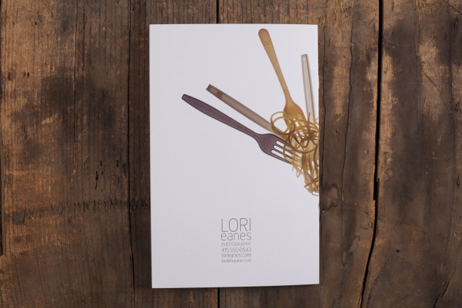
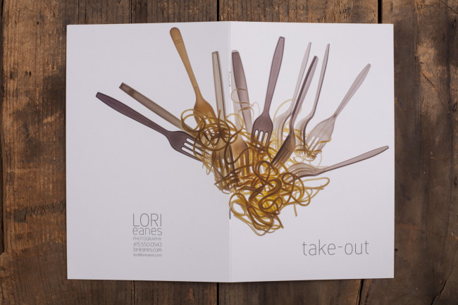
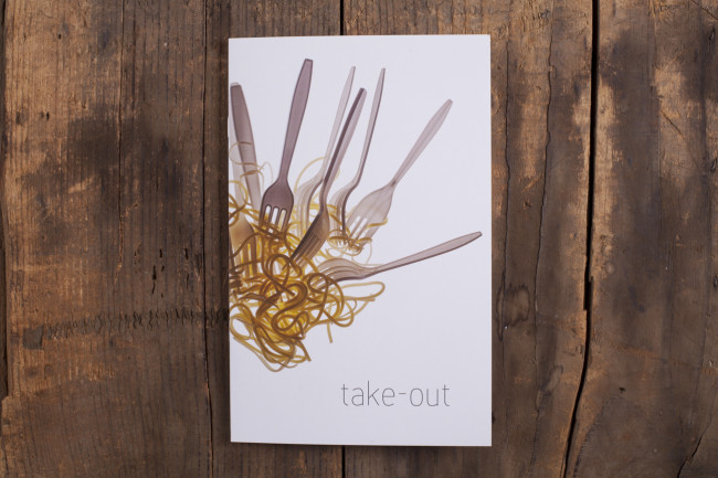
I made 50 5.5 x 8.5 inch booklets for $95.69. The cover is card stock. The inside paper is a little thin–you can see through the pages a little. Next time I’ll order the higher quality paper.

How many times a year do you send out promos?
Several times a year I send out 5 x 7 inch postcards, this is the first booklet I’ve ever made.

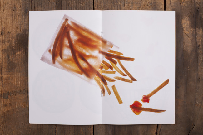
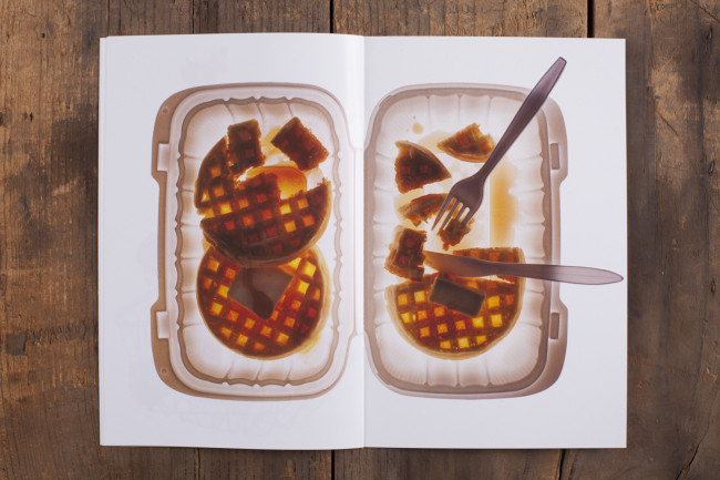
How did this series start?
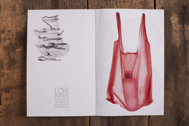
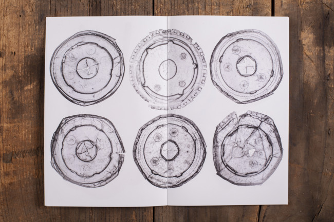
This series started with my (somewhat disgusting) interest in flattened food containers that I would find on the street. I first photographed them as objects either on a light table or on black.  I realized I liked the x-ray quality of the light table best. Then I started trying to limit the series to fast food, food containers and plastic forks, knives and spoons.  I was really limited by what I could shoot because everything had to be translucent. I tried a lot of ideas but gradually realized the best ones weren’t too literal.

The Daily Promo – Aaron Cobb

Chuck-204

Aaron Cobb

Who designed it?
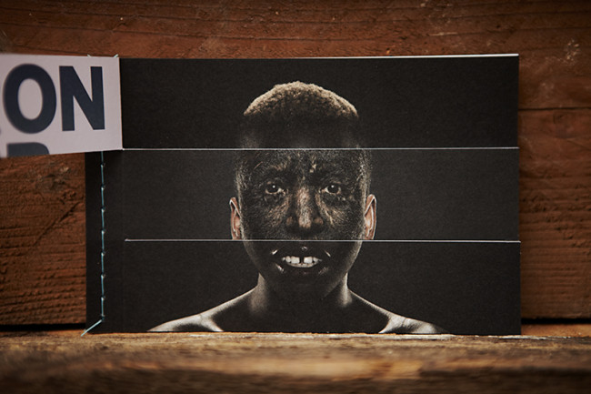
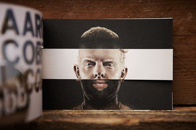
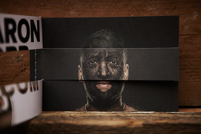
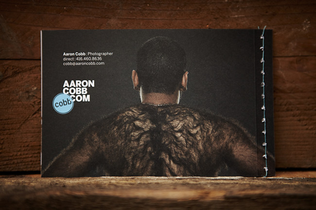
Ross Chandler Creative ( rosschandler.ca ) designed my promo.  I had the initial concept of the mix-and-match interactive triptych, and Ross helped me work through the creative process, problem-solving, finessing and printing process.  This was actually the second time I had worked with him.  Earlier that year he and I worked on designing my website, logo, and branding.  He even designed a secondary logo that uses my web URL, AARONCOBB.COM, put together cleverly with the use of images from my website.  They can also be mixed and matched.  It was a great experience all around, Ross worked his ass off.
Who printed it?
Somerset Graphics in Toronto printed my promo piece.
How many did you make?
I printed 2,000 copies, which I believe was their minimum order.
Who edited the images?
I edited the images.  I knew before the shoot days that everything needed to be clean, minimal and symmetrical.
How many times a year do you send out promos?
I have been sending out the promos about twice a year, but also as needed.  If there is a potential client I feel I would be a good fit with, I will send one their way.
Tell us about your subjects in the promo.
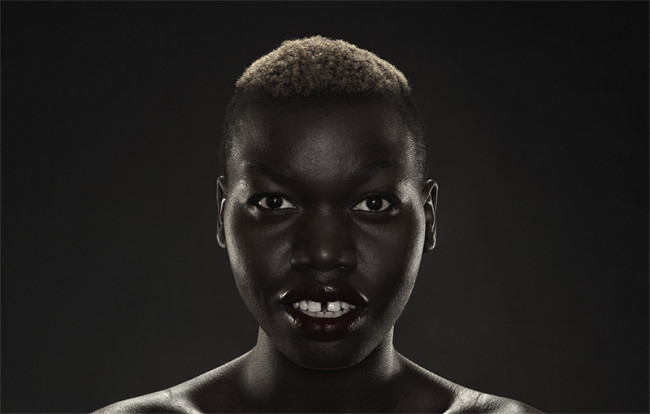
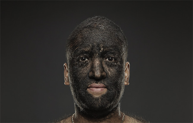
I had photographed Rashel (the female talent), and Gentleman Reg (the blonde talent) in Toronto, and had been trying to organize a shoot with the third and final talent for the project.  Larry Gomez, aka the Wolfboy, lives in Los Angeles, and works part-time in a circus there.  He has hypertrichosis which is an abnormal amount of hair growth all over the body.  It is also known as Werewolf Syndrome.  I was interested in taking his portrait before this promo idea came about, but once I was working on this promo, I knew that he was the final piece of the puzzle.  He has a circus agent in LA named Chuck Harris.  I found his contact info and gave him a call.  Chuck liked my work and agreed to help me with this creative project as long as I took his portrait as well.  It took several weeks to co-ordinate schedules and draw up a contract that the images were solely to be used for promotional purposes.  I flew down to LA for a week, rented Beachwood Studios, and photographed Chuck and Larry.  I got the images I wanted of Larry, and the added bonus of a cool image of Chuck smoking a cigar with his awesome Coke-bottle glasses.
This was my first promo, and the whole journey was a great experience, and very rewarding in its own right.


The Daily Promo: Cyndi Long Studios

Screen Shot 2015-06-03 at 1.08.41 PM

Cyndi Long Studios


Who printed it?
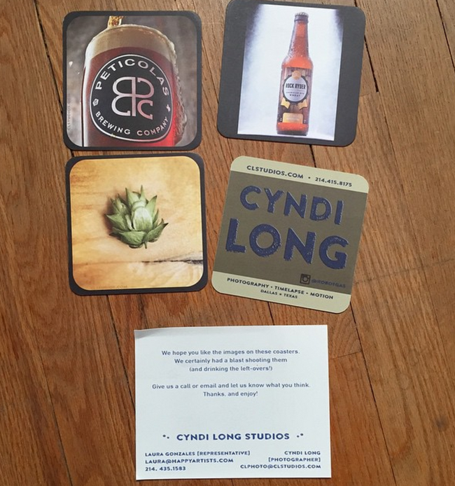
Grogtag.com printed the coasters. I went with the premium double sided. More expensive, but worth it in this instance.

Who designed it?
I designed it myself. I minored in Design/Art Direction in college, which doesn’t qualify me to handle the job, but I knew exactly what I wanted. I wanted one side with an image and a very “low key” mention of my website, and then the other side to be very clear about what my name is and how to find me.

Who edited the images?
I edited myself. I had a plan to make a set of 4 coasters. I had three images I already wanted to incorporate, so I then shot an additional image (Peticolas)  to round out the feel of the set.

How many did you make?
I started small. Only 100 of each coaster. I wanted to target the local breweries, plus the more established craft breweries across the nation. I’ve had such a great response to them, I will either print more, or make a new set to send out.

How many beers did you drink to make this?
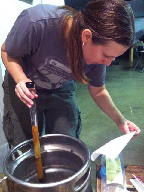
I love love love beer, but I generally won’t crack one open unless my client for the day wants to, or at least the final shot is on set.

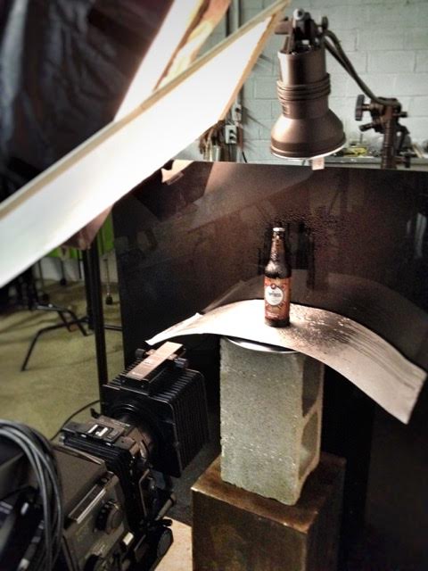
For the Peticolas image, I needed to create several “pours” which means I needed to continually empty the glass until I got the hero shot. Of course I didn’t want to move the glass (I had focus/lighting exactly how I wanted it,) so I channeled my previous rookie-drinking-self and drank from a straw.

Anyone that has enjoyed the Peticolas Velvet Hammer understands why I quickly decided it was in everybody’s best interest for me to discard instead of consuming the beer. It is truly smooth like velvet, but will quickly hit you like a hammer if you’re not careful.

How many times a year do you send out promos?
I TRY to send out quarterly, or at least twice a year.

I know you’ve been home brewing since 2012, it this what prompted a beer promo?
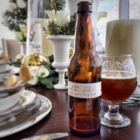
I’ve been a huge fan of craft beer for several years. Texas recently opened up the laws making it easier for small breweries to sell their brews. There’s been such an explosion of quality breweries here, I decided it was a great excuse for a promo. Unfortunately, the cost per piece is still out of reach for the smaller guys, but I look forward to working with them once they’re ready to make a bold marketing statement.

unnamed-3

unnamed-4

unnamed-5

Photo by Erin Davis Smithison

unnamed-6

The Daily Promo – Stephen Rose

Screen Shot 2015-05-08 at 7.16.23 AM Screen Shot 2015-05-08 at 7.17.04 AM Screen Shot 2015-05-08 at 7.17.25 AM
Stephen Rose 

Who printed it?
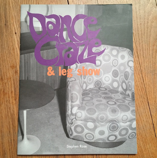
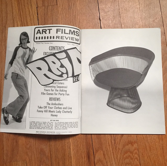
The zine was printed by Shapco in Minnesota.

Who designed it?
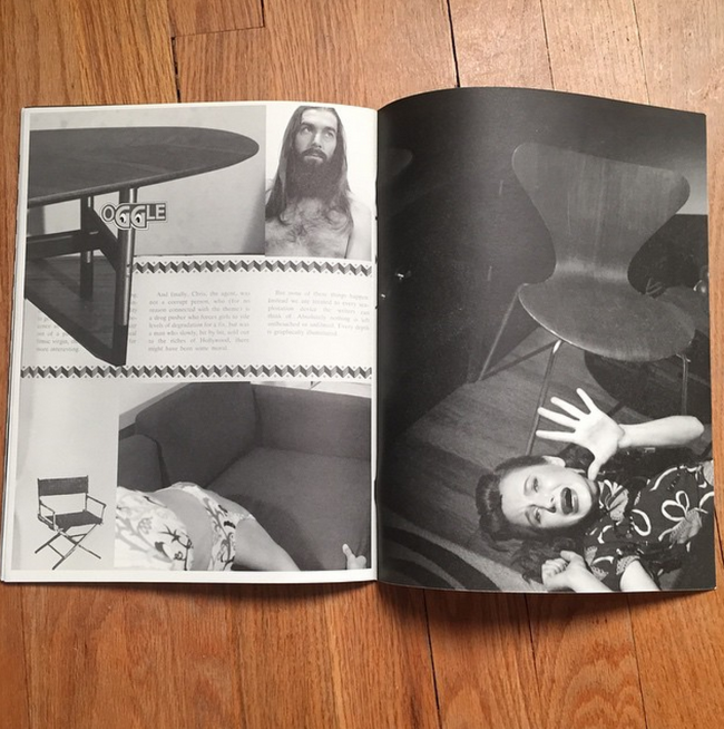
I designed it and had some (mostly production) help from my friend Seth Zucker who is a really talented designer. He works on a lot of interesting art books and publishes some of his own under the name The Kingsboro Press.

Who edited it?
I edited the images.

How many did you make?
I made 500

How often to you send out promos?
This was never intended to be a promo piece. I made it in conjunction with an exhibition I had last year of the same name. It was a site specific show at a midcentury modern furniture gallery called Regeneration. The idea is that the obsessive nature of collecting devolves into a kind of sexual obsession.

I sent some out to art galleries and art magazines but never really thought about using it as a promo until recently. I thought at the very least it’s going to stand out!! Not your typical beautifully lit promo I guess.


The Daily Promo: Justin Poulsen

Screen Shot 2015-04-08 at 4.27.25 PM

Screen Shot 2015-04-08 at 4.28.32 PM

Justin Poulsen 

Who printed it?
MSG Printing in Toronto

Who designed it?
Hans Thiessen at Rethink

Who edited the images?
The printed image was shot specifically for this project. The documentation images were edited by Hans and myself.
The post production was handled by myself.

How many did you make?
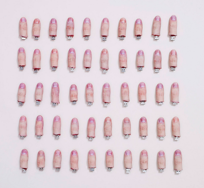
Originally there were 50. Due to the overwhelming response, I will be creating an additional 50 throughout the year for a grand total of 100.

How many times a year do you send out promos?
This was my first promo. I hope to do it once or twice a year (not necessarily containing body parts).

How did the thumb idea emerge?
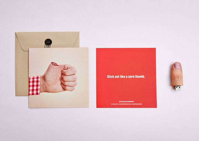
I was exchanging emails and brainstorming with Hans. We pulled together a rough list of ideas/talents I have that are uncommon. One of the ideas was to create physical thumb drives. We bounced back and forth between some other ideas, but the thumbs seemed to stick. I knew that I could pull it off because we had previously cast an entire fake hand and forearm in faux ice. Including the physical thumb drives in the promo allowed the recipient to have a small piece of the shoot, while also opening their eyes to some creative possibilities of our in-house prop building.

How did the thumbs get made?
First I cast my own thumb in a low durometer platinum cure silicone rubber. This specific rubber is commonly used in the special effect industry to have an almost-flesh-like feel. This “realistic feel” was further enhanced when paired with an internal skeleton (the rigid flash drive). The same silicone used in the thumbs also worked out to be a suitable mold rubber. Casting silicone in silicone, I used a urethane spray to ensure that the mold and thumb did not become one. I then painted/airbrushed using hand mixed solutions of FW ink + alcohol. To seal in the pigmentation the thumbs are sprayed with a solution of naphtha and silicone. With the future thumbs I’m moving to a completely silicone based pigmentation system, which is a slower process, but the end product is more durable.

Here’s a video demonstrating the process of creation

The Daily Promo – Arkan Zakharov

Arkan Zakharov

Who Printed it?
This was printed on a sheet-fed press in Toronto.

Who Designed and edited the images?
I designed and did all press prep on this book, all editing done by me as well.

How Many did you make?
I did a run of 170 copies. 150 were quarter folded for easier shipping in envelopes. The remaining 20 were folded into a book which was sent in a tube to few select locations.

How Many Times a year do you send out promos?
This was the first time I have done a promo. I am planning on sending one out annually.

Screen Shot 2015-02-24 at 8.19.27 PM

Screen Shot 2015-02-24 at 8.19.33 PM

Screen Shot 2015-02-24 at 8.19.43 PM

Screen Shot 2015-02-24 at 8.19.49 PM

Screen Shot 2015-02-24 at 8.19.55 PM

Screen Shot 2015-02-24 at 8.20.01 PM

Screen Shot 2015-02-24 at 8.20.15 PM

Screen Shot 2015-02-24 at 8.20.21 PM

———

@heidivolpe is reaching out to photographers from the Insta-Promo feed @aphotoeditor to learn more about how the promo was made. If you’d like to know more about a specific promo leave a comment on instagram.

Dwell’s New Promo Daily

Dwell Magazine has a new column online called “Promo Daily” where Photo Director Anna Alexander and  Associate Photo Editor Julia Sabot highlight promotional pieces they love. You can view their picks here:

http://www.dwell.com/people/julia-sabot

http://www.dwell.com/people/anna-goldwater-alexander

I asked Anna a few questions about the new columns and promos in general:

Tell me about the new Promo Daily?

My associate, Julia Sabot, and I were talking the other day about promos. We love them. I know we’re a rare breed, but we actually do hire people based off of their mailers. So, we started to ponder whether or not photographers knew how important they are and how awesome they are, and that promos aren’t dead. I still have a James Acomb promo from like 2004- when I was at Wired- might be because it’s of Henry Rollins and I have a huge obsession with him, but I still have it pinned to my desk.

The first & only post I did on a promo was of Noah Webb‘s FANTASTIC Berlin Passport (http://www.dwell.com/post/article/photographer-we-love-noah-webb). It blew us away. Yes, I know he’s a Dwell photographer already- but he didn’t just send it to only us. Honestly, we hadn’t commissioned him in a while and it was a big fat HELLO! reminder…so, he did our next shoot that came down the pipes. I got so much photographer feedback from posting that (not just from Noah and his beautiful agent Maren at Redeye). We already occassionally post about photography under the title Photography Focus, as well as Julia’s weekly QA, but we wanted to give something back to the photographers who give us mailers, both email and post mail. We’ll be posting our favorite promo of the day with a little info as to why it’s so awesome- because photographers need to know that they’re not just pimping their art out into the USPS system never to be seen again.

When you speak to photographers about promos what advice do you give them?

The last couple of photo portfolio review events I did, I kept getting asked about promos (including emails- which we will also post) and if photo editors/producers toss them immediately in the trash and erase them from their inbox. I actually got in an argument with Armin Harris across an auditorium of photographers at Texas Round-up…it was awesome. Maybe we’re alone here, but I personally know other PE’s who feel the same way I do about promos. We’re photo editors, it’s in our nature to look at an image and know in .5 seconds if it works. We’re all aware that promos are expensive, as well as a traditional portfolio book which is a huge reason why so many are going digital for promotional materials. It’s unfortunate. I typically advise that they make sure they’re sending it out to a current masthead, with a current address to the company/publication. We still get promos to an old address & for photo editors who left 8 years ago. Also, one should be sent to each member of the photo dept / art buying dept- It takes time, but when something is personally written to us it gets noticed. Know who you’re sending your work to, for some reason we get a lot of wedding photographers.

What’s going on at Dwell with photography these days?

Summer is actually our busiest because of the weather, even though grey days are perfect for natural interior light- the overcast sky blows out the exteriors. Also, we’re working to get more profiles on our pages because there’s too many outstanding portrait photographers out there who we need to show-off.

My photo editor readers will want to know how you became the Photo Director at Dwell. Tell us.

I started at Wired in 1997 as the Photo Intern, left for a year during the tech boom bubble to Industry Standard, then went back to Wired. In October 2011, I got a call from Dwell’s Creative Director Alejandro Chavetta and that was that- I was totally poached. Wired and Dwell photography are COMPLETELY different, that’s no secret- but it’s still the business of editorial photography, and both are known for kickass photography. it’s not like I switched to Cat Fancy (I wish).

Mail and email for your promos:

Anna Alexander
Dwell Magazine
550 Kearny St., ste 710
San Francisco, CA 94108

Julia Sabot
Dwell Magazine
550 Kearny St., ste 710
San Francisco, CA 94108

digital promos to:
photo@dwell.com

Stephanie Rausser’s Kiki & Coco Project

Stephanie Rausser’s personal project Kiki & Coco, is an awesome example of how you can use the web and social media to see if there’s interest in something you’ve created then use that demand to evolve the project into other mediums. Also, there’s simply no better way to make a connection to clients than with a personal project, it speaks volumes about your passion for photography.

Rob: Tell me how the project started?
Stephanie: In November 2007 one of my closest friends, Debra McClinton, took her life. Our daughters were the same age and we had become good friends after she assisted me for many years.

I had realized things were bad for her, and I remember after a call in the summer of 2007, thinking something needed to be done – that things had turned for the worse. Three months later it was too late and to this day I have guilt and anguish over wishing I had done more. When we worked together we worked well together and often went on trips, taking turns photographing our daughters and after her death I have had this recurring dream where she moved in with us and we become business partners and photographed every job together.

At the time, I was wrapped up with my business and life and I did not intervene. What intervening would have looked like is hard to say but my choice not to has impacted me. Sometimes things happen in your life and they are an invitation to change things. Deb’s death stopped me in my tracks and it made me start to think differently. Like no other deaths I had experienced, it made me realize how fragile and delicate life is and how important it is to take care of yourself, those that you love, and to slow down. The Kiki and Coco Project came about because it was a way to not only deal with the grief and sadness that followed Deb’s death but also it was a way for me to do something out of the ordinary, something that allowed me to connect in a more meaningful and creative way.
This is how the trip to Paris with my daughter Kiki, and her doll, Coco, came about.

So, when you got back you made a video of the images from the trip (here). What was the response to the video?
The response was great. The French music we found to go with it was adorable and it seemed the images moved people. The video (slide show) was reposted on many blogs. I think too it was the final reason my agent Sarah said yes to working together. We had met many times prior but when I got back from Paris and finished this project, I sent her the video and we met one more time and that is when we started working together. I could tell she really resonated with the Kiki and Coco slide show. After the slide show was created, we designed the calendar, printed 3000, and sent them out to art buyers, art directors, family and friends.


What was the response to the calendar?
The response to the calendar was big and it was predominantly a female response. To this day, four years later, I still get emails from women wanting to know where they can buy the doll.

Moms especially loved the calendar. I must have gotten an email a week for months from moms asking where they could purchase the doll. They would email me and mention that their daughter would love the doll appearing in the photographs but after getting quite a few of these emails I started to wonder if it was really the mom who wanted the doll.
There is now an official Coco inspired doll and is still made and available at http://shop.jessbrowndesign.com/product/coco-inspired-rag-doll
There are also several knockoffs of the doll with the same name.

Another great response to the calendar was the ad jobs that came about. The conference calls with the art directors would start something like this: “I have your calendar and what you shot for it is in the same vein as the project we are doing….” I definitely got several ad jobs as a result of the Kiki and Coco calendar.

How did it evolve from there?
I did two more calendars after “Kiki and Coco in Paris.” One was with Kiki again in Italy (same idea: 20 days away, afternoon shoot every day, a story to tell with the preface to the start of every day being: how do I make my next photo even better and at the same time keep to the parameters of the story I have already created). I sweetened the deal for Kiki and swapped out the doll for ice cream cones, lollipops & popsicles and it was called “Sweet Italia.” Originally I had thought of taking the Coco doll to Italy but as time progressed I realized my daughter was not so interested in being photographed as I had hoped she’d be. I realized it was necessary to raise the ante; to her, ice cream and lollipops were more intriguing as she had a wicked sweet tooth. She gave me her all but after the Italy calendar project she begged me to find another model.

Also, although “Sweet Italia” was beautiful it did not have the same aura, draw, and sentimentality that “Kiki and Coco in Paris” had. I did my last calendar “I left my heart in…” (2011) in San Francisco with my niece, Zeli. Then, in the Spring of 2011, Cameron + Company, a boutique book publisher in Petaluma, CA contacted me to see if we could turn “Kiki and Coco in Paris” into a children’s book. I sent Cameron and Company the roughly 5000 images from what I shot over 20 days in Paris and from those photos they came up with a story that would appeal to children. They pulled their favorites (which I asked to re-edit because they originally wanted the photo to be from the perspective of the doll but the project was shot from the perspective of the girl and the strongest images were about the girl, not the doll) They then wrote a twist to the story that I took photos for and now we have the book, Kiki and Coco in Paris.

How do you see projects like these fitting into the job of professional photographer?
It is so important for a professional photographer to be able to tell a story that engages his or her audience, especially in the competitive and saturated climate today, where images and videos are at every turn.

When you take a big project like what I did in my three calendars, where I photographed each afternoon for 20 days, it is a creative process that is vital to honing your artistic skills. When you are in the midst of a project like this, you are constantly thinking, what tells the story the best? What can I do now that is even more unexpected or unusual within the set parameters – which in this situation with Kiki and Coco was a seven-year-old girl and her obsession with a cute little doll in the beautiful city of Paris. Where do we go next to help tell the story? What could be brought in to make for a funnier photo? What can I do that will make my viewer smile, or even better, laugh out loud? I think doing projects like this makes a photographer a better problem solver on top of the fact that when you are deep in the project, it is one of the most exhilarating places to be as a creative person. The process of narrowing down 14 final images from thousands of images (12 calendar months and a cover and back image) for each of the three calendars I did has been an enjoyable creative process like no other. If I had my way I would still be doing the calendars with kiki every summer in a far away location but it turns out she prefers to be behind the camera, like me.
The Long Road From Personal Project To Payoff

When I first saw Massimo Gammacurta’s Lollipop project I knew he had a hit on his hands. 2 years later I wanted to know how a great personal project translates into paying jobs.

APE: Ok, take me back to the beginning. When did you create the lollipop project and what was the process for creating and photographing them?

Massimo: Two years ago I had this idea about making some lollipops shaped like fashion logos. I was intrigued by the possibility of “eating fashion”. When you eat food it goes into your blood, into your system and I felt that it would have been intriguing to make an edible Gucci or a Chanel lollipop. Also, the other idea was about oral fixation, “suck fashion” or it could have easily been…”fashion sucks”. Once I had the idea, then I had to deal with the process of making it. I had to learn how to make hardball candy from scratch and also how to make the molds. It wasn’t easy at all but I felt like I had to do it myself.

Can you tell me more about the process for making the candy and molds? You don’t have to give me any secrets.

I never made hard candy and it is a very volatile media. I had to heat the sugar at 300 degrees and it becomes as hot as lava, is very dangerous and it dries very fast. What makes this pieces unique is the fact that are “sloppy”. All the details work that happens after the base mold is done is what makes them interesting. I played with humidity, double dipping splashing it and ever chill blasting this pieces so they can crack internally. Believe it or not the hardest thing to do was to carry them into the studio. They are lollipop size and they are extremely fragile and i lost many just by carrying them into the studio.

What did you think would happen once you started promoting the project?

I didn’t promote it at all. I just uploaded on my site and I forgot about it for like 2 or 3 days,

Then what happened?

Someone must have seen the images on my site and started tweeting and blogging about them. I woke up one morning and I had 5000 entries on my website in one night and I couldn’t understand why. So I googled my name and the lollipops were all over the internet. Basically it started a chain reaction and I was all over the web.

Tell me about the brands you used, there was some negative reaction at first wasn’t there?

Actually the 1st email I got about this was from a store in Tokyo that wanted to order 5000 lollipops, they wanted to sell them for 12 dollars a piece. Also, I had a lot of legal firms from all over the world checking my site out but nothing really happened apart from a letter from a big fashion group that advised me to stop using their logo. We later talked to them and once I explained that it wasn’t my intention to mass produce these candies and they stop bothering me.
Tell me about the book. How did that come about and what was the result of that?

I really loved the 4 original lollipops I made and I thought it would have been cool if I could make a lollipop book of all the logos I liked. It took me a year but in the end I made and shot 50 pieces and started to send it to publishing houses until I found one (BIS publishing) that gave me a book deal and printed my book.

Now, tell me about the payoff, what jobs came because of it?

The Lolli-Pop project made a lot of noise on the internet and helped me tremendously in promoting my photography business. I shot a candy number story for Wired Magazine, started to shoot major catalogues and editorials and recently I just shot a campaign in which I used all my fine arts techniques and ideas in a commercial shoot.

Was’t there a point when you wondered if it would just make noise on the internet and not result in any paying jobs? How long was it between when you first created the project and the jobs came in because of it?

Yes it took more than a year. I think that many people thought that these were either photoshop or CGI generated. Also some were under the impression that i bought it somewhere and asked where to find them or even thought i was some kind of candy factory producing these myself. It became hysterical and frustrating at the same time. I think when Wired commissioned me the candy numbers is when people started to take notice. After that i would go into meetings with my books and a lot of people in the business knew about the “fashion lollipops”.
And finally I understand Chanel just bought some prints, but wasn’t a lawsuit a possibility at one point?

Yes, but once we explained to them that these were not mass produced pieces but art, they stopped. I’ve already sold a few prints through my gallery in Paris (http://www.visionairsgallery.com), but when Chanel approached me about a month ago to buy 2 prints for their permanent art collection I felt for the first time that this idea had come full circle and the originality of the concept had finally paid off.

Self-Promo Discussion

Jasmine DeFoore, former Redux rep and current photographer consultant, has a 3 part self-promo series running on her blog starting today. She rightly concedes that nailing down creatives on what works is impossible because if you “ask 5 different people [you will], get 5 different answers.” The general consensus as noted by DOP Brenda Milis is “not a lot of money needs to go into making a good, impactful photo promotion” and DOP Allyson Torrisi who says “great talent will stand out on a single postcard with two images. The goal is to drive me to your website to see your work.”

It’s well worth a visit (go here) because there are lots of examples and even discussion of certain promos.

Molly Roberts, Director of Photography, Smithsonian

Cool Photographer Promo Lands Serious Interest From Clients

Photographer Casey Templeton showed me some of the amazing responses he received from a promo he did recently and I thought you might want to hear more about what went into it. You can see more behind the scenes images and a video about it on his blog (here).

Templeton1

Templeton2

Here’s Casey explaining the piece:

I worked closely with Suzanne and my assistant, Rob Jefferson, starting the middle of last year to get the ball rolling. After a successful 2008 and beginning of 2009, I realized my work came mostly from word of mouth and I hadn’t done any marketing. We decided if I wanted to take my business to the next level, I needed to start marketing myself on a national level. We also knew I only had one chance to make a first impression so we had to do it right.

Rob and I met with Suzanne in her office and got a chance to see a variety of her throwback collectibles such as a Simpson’s lunch tin, figurines and print pieces which set our minds racing.

ctListThe big question was how do we fill a box with multiple items that are tied together with a common theme. Since this was going to be the first time these agencies and art buyers would have heard of me, I wanted to put in items that meant something to me and would help them to get to know me better. I started by writing a list of things I loved which could also be placed in a box.

I spent approximately $15,000 on the project between research, materials, portfolios from Lost-Luggage, assembly and shipping of the kits. A portion of this was also spent on my designer, Robb Major, that I used for every piece in the kit from the business cards to the screenprinting on the shipping box. I produced 300 promo kits and mailed 290 to a selected list of agencies, art buyers and in-house corporate groups that Suzanne and I compile using Agency Access.

The responses have been overwhelming and I am currently working on a an email blast to follow up on the delivery of the kits and start organizing meetings with various agencies that have requested to meet with me.

Here are some responses from the week they were shipped:

“As an art buyer, I get a lot of little promotional pieces. I am spoiled. BUT, yours was so well put together and well done that I stopped everything I was doing and went to your website. NOT to my suprise your work is just as thoughtful, inavative and touching as your promotional piece. I offficially have a work crush on you. Please come and see us so we can put you to work ASAP.:)”

“I just received your magic lunchbox and I gotta say it’s quite the spread. The San Cristobal just made my drive to NY tomorrow night that much better. If you’re ever in Boston for a job let me know and I’ll set you up with a portfolio review with my art producer colleagues so they can get to know you. Thank you and stay in touch.”

“Talk about getting someone’s attention. Great promo package. Fun and a great way to get your work in front of folks.”

“Thanks -for the promo package! Quite a statement. Glad you reached out. Wanted you to know that we appreciate it!”

“That was a pretty fancy promo for a recession! Thank you — and you are welcome to send email promos anytime.”

“Just received a super fun packed from you guys. Just wanted to say lots of thanks. I looked through the images in the packet, as well as your site. You guys have amazing work. Anyway, I’ll def keep you in mind for future projects, and thanks again!”

“Cool promotional box! So much so in fact that I feel compelled to use you for our next photoshoot. I have a client in ————– on March 12th. Are you available and interested? Wow, this just goes to prove the power of good advertising.”

Continued response last week:

DDB:
“This is the most amazing promo I’ve ever received in my 12 years of art buying! I truly hope to work with you soon and I hope this gets you a ton of work! Its genius!”

BBDO:
“Liked your work very much-very honest and truthful. Will def keep you in mind.”

Draft FCB:
“We want you to come and see us because this is thoughtful and your work kicks ass”

Periscope:
I LOVED the promo. I feel like I already know you, thanks!”

Templeton3

What Is England?

The first installment to the excellent What Is England? project curated by Stuart Pilkington is up (here). The project is the sister of the 50 states project (here) both are intended to paint a picture of a country and its states through photography. Both are excellent sources for finding photographers to hire and represent the kinds of things the internet is awesome for.

WhatIsEngland

Photographer iPhone Marketing Apps- Cutting Edge Promotion or Money Hole With A Fresh Coat of Paint?

I’m not surprised that the king of promotions (Monte Isom) was the first to come out with an iPhone app as a marketing piece (here). It usually pays to be the first so I’m sure it worked for him in the way that a well made mailer might and as a method for cutting through the email clutter it must have been solid gold.

Not long after Monte’s came out I saw another from Caesar Lima (here).

According to this story on the WSJ Blogs (here), companies like Net Solutions in Chandigarh, Inda build apps for clients at $3,000 to $15,000 a pop.

It will be interesting to see where this ends up. I can certainly see an app from someone like Howard Bernstein being quite valuable but how many individual photographer apps can you download before your phone is clogged.

caesariphone

Your Portfolio As A Video

Erik Wåhlström shot a 1 minute video of himself thumbing through his printed portfolio (on his blog here too). He’s a talented photographer and this is a solid book so it’s a good example for those looking to put one together. I think there’s something else interesting here for photo editors because I think I might enjoy the option of previewing a book this way to decide whether or not to call it in. Regardless it’s kind of a fun way to send your work around and might snare a few people who might not otherwise look.


from Erik Wåhlström Fotograf on Vimeo.

more

and

More On Email Promos

Unsolicited guest post from:
Deborah Dragon, Deputy Photo Editor at Rolling Stone.

The other day I received a “follow up” phone call from a photographer thanking me for checking out their site and mentioning that they were really interested in working with the magazine and since I was “interested” in their work, could we set up a meeting. I thought “did I click on something” or sometimes I see work that I like and send an email saying so and to let me know when they update their site again. This was not the case, so I googled their name, went on their site and couldn’t understand what happened, because this persons work was completely inappropriate for the magazine.

So, what ever happened to people sending or emailing appropriate mailers to magazines? I would think with the capability of tracking emails and clicks on sites, there would be the possibility of organizing these things better. I get about 150 emails a day from photographers and reps, yes, 150 emails JUST FROM PHOTOG’S and REPS, 50% of them are lifestyle and food. My goal is to visit EACH ONE…HMMM I can’t imagine why photo editors aren’t seeing peoples work. Maybe if the photographers all got together and agreed to STOP loading PE’s email boxes with giant attachments and/or links to images that are not suitable for the publication I could actually achieve my goal. Save your valuable time and figure out what magazines you really want to shoot for, then start shooting.

And, most importantly if you ask me, if I see your work, I like it, and I like it for the magazine… believe me, you will know it and I will contact you. You don’t need to follow up with my clicking on your website.