Ina Saltz Interview

by Heidi Volpe

Ina Saltz is Design Director and grand ambassador in the NYC design community.

Tell me about your Body Type books, a tattoo entitled “happy” was the start, what about that tattoo drew your attention?

Somehow I never really noticed tattoos except in the way that everyone does. But when I saw this one, I stopped in my tracks. I immediately recognized the typeface as lowercase Helvetica; it was very large (120 point) and tightly kerned, and it was unadorned by any other image; it was stark and graphic.

How did things develop from there?

I decided to write an article for STEP Inside Design, for my regular column, called STEP Out, about typographic tattoos. I went to my first tattoo convention; that was an eye opener. And as is often the case when you are attuned to something, I started seeing typographic tattoos everywhere; it was as if I had developed a kind of x-ray vision! Once the article was published, I noticed that no one had ever done a book on typographic tattoos, so I kept shooting images and interviewing people with typographic tattoos, and a kind of “portrait” began to emerge of that group; they were generally highly educated (all with college degrees or in the process of getting one) or with advanced degrees, culturally sophisticated, and highly motivated to convey a very specific message with text (as opposed to an image, which is more open to interpretation). “Body Type: Intimate Messages Etched in Flesh” became a cult hit, which led to “Body Type 2: More Typographic Tattoos.” Now I have become known as the first to identify, document and research this phenomenon. I call these “intellectual” or “highbrow” tattoos.

What sort of parameters did you give yourself in order for a type tattoo to be accepted into your book?

At first I was excited to see every typographic tattoo that I encountered. As I saw more, I became more discriminating. The two overriding factors have become the quality of the typography, and the power of the story behind the tattoo. Sometimes because the story is so important, I have compromised my typographic standards a bit, and, conversely, sometimes the tattoo is so striking in and of itself that it is worthy of inclusion on its own merit.

Did you have to reject any of the submissions? If I had a type tattoo how would I submit to you?

Oh yes, I have declined to include many images, especially when I am doing a final edit of the images for the book. I would say that 60% of the images and interviews I collected for “Body Type 2” did not make the final cut. If you wished to submit your tattoo to me, simply send an email with a jpeg and a brief description of the story behind the tattoo. I always respond to everyone who contacts me.I am well under way with some pretty amazing images for a third volume of “Body Type.” Just last week I shot someone with a passage from Homer’s “Odessey” on his shoulder blade.

How much of the book did you photograph?

I photographed about eighty percent of the images. I prefer to shoot everyone myself but it is not always possible; a number of the images are from international or otherwise too distant sources. If I cannot shoot it, I try to give guidelines about crop, backgrounds, focus, etc. so the style is as consistent as possible with my photographs.

I was at the Ink Slingers ball in here in LA photographing the crowd with John Huet for a magazine. It was really interesting to ask what people did for a living and how if at all they concealed their markings. A lot of white collar workers are secretly tattooed. Do you think it’s becoming more accepted in the work place?

While it is definitely becoming more accepted, some industries are more accepting than others. If you are a creative, you almost MUST be tattooed to be taken seriously! The stigma persists in the more conservative professions. But, because people can choose where to be tattooed, it is possible, when in professional attire, to keep one’s tattoo to oneself. In my books I have documented tattooed doctors, lawyers, bankers, etc.

What was the most peculiar tattoo you’ve seen?

There are so many (and the word “peculiar” is so, well, peculiar, that I cannot really answer this question). I have seen just about every amazing thing and every body part tattooed, even eyelids. As I mentioned before, however, I am only interested in the intellectual end of the tattoo spectrum.

Do you have a favorite type face for a tattoo?

No, because the type style should dovetail and enhance the message of the text, so for each tattoo, the typeface which would best suit it would be different. Also certain typefaces do not work well for tattoos, particularly if they have fine details or serifs which can deteriorate over time. In a recent review of my book in the New York Times Book Review, written by Steven Heller, he wondered why there were no Bodoni tattoos in my book. Bodoni’s thins do not wear well. Also, condensed typefaces are not well suited for tattoos, especially if the letterforms are small; the counter spaces tend to fill in over time as the edges of the tattoo “bleed.”

If you could choose let’s say one principal from your current book Typography Essentials: 100 Design Principles for Working with Type, what would it be?

“Everything Exists in Relation to Everything Else.”

Would you say the same principles apply for print design as for multi media tablets? If they don’t, what do we need to concern ourselves with for the future of type?

This is a very complicated issue; legibility is paramount, of course. But there is motion and interaction to be considered, and the fact that a device is light emitting rather than reflective (like the surface of a printed piece) means that spacing should be a bit more open to counteract the glow. Letterforms need to be a bit sturdier, and the default type size (and the x-height) should be a bit larger. There are other considerations as well, such as contrast between type and background, etc.

Through the years you have been a multi dimensional professional. art director, typographer and educator. What drove you to be so diverse?

I am curious about many things and I love working with people. The world is a big and fascinating place and I am always looking for new ways to explore it. As a magazine Design Director, it is a great perk to learn new things as I read the stories which will be in each issue; it is being paid to learn from the editors around you (I love smart editors!). Typography is my great passion, so I have been involved with making it, using it, writing about it, and hanging out with fellow type geeks as a board member of the Type Directors Club. For six years I had a great writing gig with STEP Inside Design; my editor, Emily Potts, gave me the widest possible mandate to write about things that you would not expect to read about in a design magazine, but which were related to design. Until STEP folded in 2009, I wrote almost fifty articles on topics as diverse as designing your own death (eco-burials, customized headstones, etc); the fetishization of sneakers, bizarre museums (The Museum of Dirt, The Museum of Lawn Mowers), the design of replacement orthopedic joints and prostheses, the Aesthetics of “Cute” design, recyclable and redeployable architecture, and, of course, typographic tattoos.

Congratulations on your current position as the Art Dept Chair at the City College of New York. Was that always on your radar as a professional?

I have been teaching since my graduation from Cooper Union; for over twenty years I taught in the evenings, when I worked full time as an art director. When I was in junior high school I actually belonged to a school club called “Future Teachers of America!” I still have the little navy and gold patch with an Alladdin’s lamp embroidered on it. Both in High School and at Cooper Union, I was very lucky to have teachers who inspired and challenged me; I have always been grateful, and now I am giving back. Teaching is truly the noblest profession; you have so much power to change someone’s life forever. I am still in touch with my teachers; recently I visited with my painting teacher, Will Barnet, at his Grammercy Park studio; he is one hundred years old and still painting! Amazingly, he loved my books on typographic tattoos. And he was very happy to hear that I have taken up painting again.

Being Chair of the Art Department at City College is a huge responsibility. It is an enormous department with twenty five full time faculty and staff and almost seventy adjuncts. We offer about 180 courses per semester; the department includes Art History and Art Education. We have three Masters degrees (soon to be four with the addition of a masters in digital media launching in Fall 2012).

What do you love about that job? and what is the most challenging?

I enjoy seeing how the college works from a larger vantage point. And I am more empowered to help students as Chair. However, as with any large entity, I am called upon to mediate disputes and resolve problems, as well as to be an effective advocate for the department. It is especially challenging in these economically tough times. But we have an amazing and talented group of students, and City College has a great history. We are also the first or second most diverse college in the country, with students from 135 countries, speaking 80 languages.

That position I would imagine is all consuming. Are you still doing magazine design work?

I try to keep my hand in with magazine design. Last year I worked on a redesign of a bridal magazine with my good friend and sometime collaborator, Donald Partyka. We also collaborated on a prototype for the launch of a wonky policy magazine for the Americas Society called “Americas Quarterly,” which Donald now art directs.

How do you find the time? Have you had to turn down any work? ( did you want to talk about the first time you backed away from a project? and how they hired an army to do what you would have done?)

I work all the time! Seriously, I believe that you do not know your limitations until you exceed them, and that most people could do more than they are doing. Life can be short, so I want to get in as much as I can; there are still so many things I want to do (like learning to play the piano!). But there are only so many hours in a day. Recently I did have to make a difficult decision. I was under contract to write a huge reference book on typography, a kind of ultimate, all encompassing work, 400 pages, 800 images, an enormous undertaking under the best of circumstances. I organized and framed out the essential content and was deep into writing and research on this book when I became Chair of the Art Department. After a few months I realized that there was no way I could complete the book and fulfill my enormous responsibilities as Chair at the same time. It was a very painful point for me, actually the very first time in my life that I could not follow through on a major commitment; I just had no choice but to stop work on the book. My editor hired five additional authors to finish it, so I will be one of six authors credited when”Typography Referenced” is published later this year.

What do you think it is the key for success in this current market for any art director or designer?

Being versed in a variety of media is critical; many top positions now require the supervision of an entire brand across all media. iPad app design, familiarity with user interfaces, motion graphics; all these are growth areas. Be an excellent writer and communicator. Network, network, network. And don’t put all of your eggs in one basket.

How much emphasis you you have on multi media in your course offerings?

We offer a full range of multimedia; we are offering our first course in iPad app design this Fall. We teach game design, animation, 3D, all the good stuff!

You are scheduled to speak at the New York Public Library on May 31 about “Body Type.” How often do you lecture? and how varied are the topics?

Well, just to give you an idea, a few days before my lecture on Body Type, on May 27th I am a general session speaker at the UCDA (University and College Designers Association) Design Education Summit; my talk is titled “Can great designers also be great teachers?” And I regularly speak to editors and publishers about magazine related topics at various publishing conferences; my presentations range from “Designing Covers That Sell” to “Effective Pacing and Flow for Magazines.”

What are your favorite resources for new type that is being created?

There are so many excellent typefaces being created now by wonderful young designers that I could not begin to enumerate them all. But I must say that I have a very special place in my heart for Jonathan Hoefler, who is extremely knowledgeable in all things typographic and who has designed astounding, eminently useful and historically respectful typefaces. He is young enough that he yet may give us much more beautifully crafted type in the years to come.

John Korpics Interview

by Heidi Volpe

FORT_20101101_C1_487267_C1_39bbc71632133c14e2f73e1dcd0a2d309b4b4cd4John Korpics, Creative Director of Fortune Magazine is a Renaissance Man. For any designer, photographer, illustrator, typographer or editor working with John should be part of the 100 Things To Do before you Die list. You need to work with him at least one in your life and here’s why:

Heidi: On your personal website you claim to be an arbiter of style at a very young age. Who picked out the tie, you or your Mom?

John: I choose all my ties, most of which are leftover freebies I got when I worked at Esquire. My mom picked the silk shirt I’m wearing in my middle school picture.

Are you wearing a tie to work today?

Indeed I am. I wear a suit and tie 3 or 4 times a week even though I don’t really have to. I could wear jeans and golf shirts every day if I wanted, but I have a theory that good things happen to those who dress well. Walk into a restaurant in a suit and ask to use the restroom. Most of the time they will say sure. Do the same thing in cargo shorts, sneakers and a bandana, and they will tell you the restrooms are for customers only. Believe it or not, this applies to life in general, not just bathrooms. Plus, I’m going to the ICP Infinity awards tonight, so I’m dressed up.

What prompted you to write the blog, My Effing Commute?

I love to write, especially about myself. I spend two hours a day on the train, so I decided to write about all the crazy, annoying, depressing, funny things you see when you spend 2 hours a day commuting. I’ve also gotten really good at taking pictures of people with my iPhone without them knowing about it, although I have accidentally left the flash on once or twice, which kind of gives me away.

I see you have an image gallery and know you have some images with Getty. Do you have aspirations of switching careers or are you doing this so you can increase your skills as an Art Director on set?

I’m not good enough or committed enough to try and make a living at it, but I like it enough to constantly try and get better at it and learn from it. By going through all the different aspects of photography: buying lenses and bodies, shooting different subjects in different situations, interacting with people, getting model releases, lighting, editing, retouching, posting images online and getting feedback, selling images as stock, creating personal books, and more, I understand a lot of what a photographer goes through to make a picture, and ultimately it makes me a better creative director because I can assign smarter, edit smarter, and direct smarter. I think if I could get a picture printed in National Geographic one day before I die, it will have all been worth it.

Why do you upload your images to Flickr? is that more of an idea cloud for you?

I load a lot of things onto Flickr, including personal photos and magazine pages. It’s a great place to gather groups of things that happen to be visual and share them. It also helps me to see my pictures in a context and organize them as stories or collections of ideas. I love the analytics aspect of it too. I can see which images resonate with viewers and which images don’t. It teaches me how to think about my images socially, and how to promote myself through them. There’s an image on my Flickr site of my daughter jumping on a trampoline. After I posted it to a group about teenagers in Converse sneakers, it got over 1000 views in a week, which was pretty remarkable for my site. I’ve given images to hospitals, non profit organizations, the Highline, the Empire State building, all because they found them through tagging and group posting. I also used to post images to Facebook for fun. Now, whenever I have new images to put up, I put them on Flickr, and then post links to my Flickr site on facebook, which gives all my pictures more exposure. I’m really just learning how to use it all, and the images are a way for me to experiment.

downloadI like your burning Xmas tree, is that indeed a family tradition once you moved out of the city?

It will be from now on! I’ve had the idea for that picture for a few years, but we didn’t have the beautiful snow covered yard and bright sunny day until this year. When I took the picture, I was so worried about the dogs getting hurt, or the fire getting out of control, that I shot the whole thing with the auto focus off and it was all soft. I had to get my friend Don Penny to sharpen them up for me. I make a lot of mistakes like that, and I learn as I go. I once shot a weekend of beach pictures with flawless blue skies and when I opened them in Lightroom I had about 1000 images that all had dirt and hair on the lens. I spent 3 days retouching them. Now I carry a cloth with me all the time and wipe as I go…

During the 1950s by Art Director and illustrator Leo Lionni illustrated some fantastic covers. (Granted they were more poster like and lacked cover lines) In your cover portfolio do you anticipate any genre/look potentially being developed?

Not really. Covers are so much about sales and branding that it’s very hard, at least for me, to develop a style that’s consistent from title to title. I will say that a lot of what Im able to do on covers, and with magazine design, is more a reflection of my personality, rather than any talent or skill I might posses. Whether I can sell my ideas internally to the people around me is a big part of what gets printed. Magazines are collaborative worlds and you need to have people skills in order to get your best work published. The work people see is better if you are equal parts designer and salesman.

Photography and design are very similar this way. When I look at pictures, I always see them as a reflection of the personality of the photographer. If it wasn’t Jim Marshall holding the camera, Johnny Cash wouldn’t be flipping him off. He’d just be looking at him wondering who the fuck this photographer was on stage. That picture doesn’t exist unless, on some level, Jim Marshall isn’t Jim Marshall, the kind of guy you just wanted flip off once in a while. If you’re shy, reserved, loud, confident, insecure, insightful, sloppy, kind, mean, shallow, subversive, detail oriented, funny, serious, whatever. Your pictures and you design reflect that. I struggle sometimes to shoot people, to get them to be the picture I want them to be. I’m getting better at it, but it takes a lot of energy. When I don’t have the energy to make people pictures, I shoot bugs.

FORT_20100816_78_468002_ARTICLE_edffb07004a901b4e862f00c93f961cc00db7824_Page_1

Fortune is an 80 yr old title, how are you moving it forward but still respecting it’s legacy?

Most importantly, you have to realize that you can’t compete with the legacy, you just need to learn from it, and embrace it when it makes sense. I ran into this at Esquire also. I’m not going to do better covers than George Lois or Walter Allner or Leo Lionni. I have those covers framed and hanging on my wall in my office. They are works of art. My covers are mostly about selling on a newsstand, and I’m happy if you keep them on your coffee table for a few weeks before you toss them.

I think about the legacy when it comes to the magazine’s visual elements. Fortune has a rich history of information graphics, CEO portraits, industrial photography, photojournalism, things like that. I look for any excuse to get these kinds of images in, because I think they help brand us as a place for excellence, and they connect us with our past while still feeling modern. I like to celebrate business as much as to show the reality of it. I love using people like Ben Baker, Greg Miller and Gregg Segal because their portraits do just that, they celebrate the individual, elevate them to almost heroic proportions. Sometimes, I need that. I love using industrial photographers like Floto & Warner and Spencer Lowell, because their work finds beauty and magnificence in industry and manufacturing. I also love getting great reportage photographers like Ben Lowy into the magazine, because as much as business can be inspirational, we all know it can be downright despicable too, and photographers like Ben help keep us grounded in reality. The one thing we still struggle with is how to be funny. Fortune was never really a funny magazine, and my readers don’t expect sarcasm or humor, so when Phil Toledano shoots a story on investing using a guy in a bear costume wandering around an office hitting on secretaries, as funny as I think it is, the readers tend to not get it. In cases like that, I tend to say screw the reader. I like bear costumes.

Business isn’t a one dimensional world. It is good and bad and impressive and ridiculous and obscene and amazing (and occasionally funny), all in one day, and my goal is to show that complex personality in each issue, all through the lens of the artists we use, and through the veneer of a design layer that fits the brand and makes sense to the reader.

FORT_20110117_18_507556_ARTICLE_947ea0fb3b614b4c02768f7224d28973c013ffcc

Why did you choose those particular display faces for the book?

Typography is always a work in progress for me. My approach is to start with a core set of Fonts that fit my perception of the brand, and then build on them. I think we are up to 7 core fonts now. When we started, I used 3, Solano, Geogrotesque and Brunel. Each one has a job to do. Solano, is a narrow, very rigid sans serif that helps us to look serious and also fits well into tight spaces. Geo is really a utility font that we use for captions and details, and Brunel is the peacock serif of the group, that we strut out when we want to be a little flashy. Brunel was actually developed by Robert Priest with Christian Schwartz at Portfolio. It’s an amazing font and you can tell that a lot of time and love when into making it, so when Portfolio shut down I just figured I’d grab it. Seemed like a shame to let it go to waste. I’ve never been that picky about who used the fonts before me or making them exclusive to my brand. I don’t think a font in and of itself can define your brand. Its how you use typography along with all the other elements that defines you.

How long did your re-design take? and what was your mission statement to the staff?

It took about a year, mostly because we did a lot of editorial research and testing with focus groups before we rolled anything out. If a redesign was simply a new coat of paint, it would take about two or three months, but when we remade Fortune, we spent a lot of time rethinking the editorial product as well as the look.

Aside having Cyrus Highsmith draw your logo what did you have custom made?

I had the section headers drawn by Tal Lemming. Beyond that, everything is off the rack.

You’ve said that once you come in to direct a magazine you first watch and then make changes you feel appropriate. What were those changes at Fortune?

It takes a while to learn the DNA of a magazine, and it doesn’t make sense to me to make sweeping changes until you get to that point. I always come in humble, willing to admit that of everyone on staff, I know the least about how the place works. I can make some cosmetic changes quickly, but mostly I watch and I learn, and over time I look for ways to improve it while still hanging on to what works.

I also spend a lot of time in the beginning going to focus groups and understanding the readership. I imagine a typical reader, and I make a lot decisions based on what I think that reader will want or what they will tolerate. Everything from type size, where the credits run, page organization, photo and illustration use, headline and subhead treatments. It all begins with who I think my reader is, and then I work in the visual elements that I think fit.

At Instyle you mentioned you were an information architecture: what is your main task at Fortune?

InStyle is a magazine that people browse. Nobody sits and “reads” InStyle, so I designed it as a browsing experience. All the type was in small chunks, no type ran from one column to the next, it all fit into clearly defined shapes. There really weren’t any “columns” of words. Just lots and lots of color and shapes and pictures and fun. Each page was its own story and was instantly “inhalable” as we like to say here at Time Inc. I imagined the reader as kind of a Doris Day movie character, because there was never any bad news in InStyle. It was always about who looked good wearing what, who was happy in their relationship, whose hair worked and how they got it, how you could make your body type work. It’s all very positive and life affirming, and a little escapist, but in a good way, like Disney World is escapist, so I just imagined a magazine made for a world that always had a happy ending. A world where nobody was ever fat and everyone’s hair looked AMAZING!!! People smiled a lot, type was bright and colorful, crisp serifs, lots of exclamation points and asterisks, lots of energy. I like immersing myself in a world that has a defined identity, no matter how real or imagined. Usually the fantasy worlds are more fun to design than the real ones.

Fortune is the complete opposite. Our words are our strength. People get Fortune specifically because they want a longer, more reported and more insightful take on the information. So my goal is to invite the reader in, and then keep them in by making the reading experince enjoyable and unobtrusive. It’s a magazine where design really needs to live below the surface. If Fortune was known first and foremost for its design, I’d think there was something wrong.

You’ve worked many places in your career, what has changed the most dramatically for you since you started working and been the most challenging?

When I started college in 1981, there was no such thing as a personal computer. No email, no internet. When I started in magazines in 1986, I was specing type, cutting repro, waxing it onto boards, shooting photostats, all very analog. Without a doubt, the biggest challenge has always been staying on top of the technological changes. I’ve gone from pasting layouts to boards, to learning Quark, to learning Indesign, Photoshop, Lightroom, and Illustrator, to now learning how to create content for tablets, websites and social media. Technology never sleeps, and sometimes I feel like I don’t either…

What do you think the future of print magazines looks like?

I think print will be archival. You’ll buy something printed when you have a sense of wanting permanence. Magazines like National Geographic, and Architectural Digest will always exist in print because they are timeless and collectable. They aren’t doing stories that get old in a month or two. They are creating a permanent record of something and they represent a level of excellence that seems appropriate to print. Magazines like Vogue and W will also always exist in print, because they are so visual and luxurious that you wont be able to replicate it on a tablet. Whenever the Prince marries his Princess, you’ll want it in print. Whenever Liz Taylor dies, or a shuttle explodes or a president is assassinated or a terrorist attack brings down the towers, you’ll want a printed record of that moment in time. Magazines that start creating issues that are themed or seem collectable will resonate with readers. The Body Issue, The Photo Issue, The Oscars, The Baseball Issue. All of that kind of stuff will continue to exist in print. Everything else will go to digital. I already don’t read my magazine in print. I read it on the iPad because its easier and I like the experience.

When you hire a designer what are 3 key things you want to see in their work?

Originality, craftsmanship, and intelligence

I see you post about the magazine and your work on Facebook. How has Facebook allowed you be a better art director and interact with your staff?

I created an internal private facebook group for our creative staff to post and share ideas. We post links, stories, artists, fonts, other magazines work. Anything that’s interesting. Nothing gets kept out and everyone is encouraged to post. Cuts way back on the group emailing, and we have a nice record of everything we’ve posted so we can go back and reference it.

For your digital editions, did you hire a new team or did that task fall on your current art department?

We handle it all internally, with some freelancers here and there. Basically, if you design a story, you design it for Print, iPad, Galaxy and Playbook (the Blackberry tablet). We’ve tried very hard to keep the formats simple enough that we get it all done in about 3-4 days after we close the print magazine. That said, it’s an enormous amount of additional work, but until the digital content starts generating revenue, I don’t think we’ll have the luxury of adding staff.

How often do you use your ipad?

Not very often, but that’s mostly because I carry a laptop, an iPhone and a blackberry with me everywhere I go. When I do use it, it’s for two things. Looking at Fortune magazine and playing angry birds.

Magazine And Newspaper Templates Rock The Publication Design Boat

Wow. Roger Black, the consummate magazine and newspaper redesign mogul has rocked the design world with the announcement of his new company Ready-Media, which seeks to sell high quality templates to publications seeking an overhaul/upgrade. The Society of Publication Designers blog has lit up with commentary from many of the top designers chewing over the ramifications of Roger’s new product. Luke Haymen, a partner at Pentagram and architect of high profile redesigns for New York Magazine, Time and The Atlantic comments that “…I think this may not be such a bad thing. These designs are decent. In fact I’d say they’re better than 90% of the magazines and newspapers out there. They are generic but of course they have to be to have broad appeal. A good designer will take them and customize them.” He and a few other super star designers seem to be the exception in the commentary with many bemoaning how this plays into the publishers hand of cost cutting at any opportunity and a demotion for unique one of a kind design.

With top names contributing templates to the collection have publication designers just been handed their Getty moment?

ready-media

George Lois Rips Today’s Magazines A New One

In a interview with Blackbook (here) George Lois doesn’t pull any punches on the state of magazine design today. I was at the SPD awards ceremony when he received a lifetime achievement award of sorts and remember getting so charged up after listening to him talk and watching a video Fred Woodward shot. Of course once back to reality, in an office filled with editors who wanted to cram information in every nook and cranny of the magazine that energy soon drained out. I can’t wait for magazines to stop trying to become websites and go back to being magazines again. George agrees:

“Magazine design is almost an oxymoron with most magazines today. It goes for even a great magazine like Vanity Fair. If you get even one inch of white space to breath you’re lucky. Everybody’s just packing in the information. Most magazines you pick up — you choke to death.”

“They say, ‘People buy magazines to read, for information.’ Well, you buy a magazine not only for that but so you can have exciting visual experiences. They try to jam words and pictures on every square-inch of the page like they’re working on a Web site.”

“Look at Vogue. Oh my God. Vogue and Harper’s once were very well designed magazines. I mean they were exciting to look at. You could not give a shit about fashion and be excited by the whole look of the magazine. You look at Vogue now: it’s not even designed. What a difference. You pick up a Vogue back in the days of [Condé Nast’s Alexander] Lieberman and those guys, and you look at it now, and it’s a disgrace.”

“Very few magazines do you look through — and I’m not talking as a designer, I’m talking as a normal person — do you look through something and you open a spread and it takes your breath away a little bit…

“I know, you’re pressured by your editor. If not the editor, the publisher: ‘Look at all this wasted space here.’ Blah, blah, blah. ‘Your readers want information.’

“Well, oh shit. Go fuck yourself.

“Meanwhile you go to a newstand, there’s about 200 magazines that all look the same. They got pictures of somebody — some asshole — I’ll never understand how editors and publishers think — showing just a famous person with blurbs all over their face. I’ll never understand why they think that would be something people would want to buy. I don’t get it.

“It’s a joke. A couple of years all the editors and publishers [at ASME] invited me to come down and kick their asses about covers. I go down. Standing ovation. ‘Wow! Wow! Wow! Wow!’ Nothing changed. It’s all bullshit.”

George Lois Video — The Great Esquire Covers

This video of George Lois was shot by GQ’s Design Director Fred Woodward for the 2004 SPD awards. George conceived and designed all those iconic Esquire covers from the 60’s (cover archive here).

From a story on Lois and the hit show Mad Men over on Fast Company (here):

So what happened to the great advertising of the sixties? It continued into the seventies but slowly got taken over by the Saatchis and guys who were buying up agencies. Before you knew it, all the creative agencies were bought. Most advertising today is group grope. The marketing people decide what a point of view should be, then they go out and test it and they come back with all kinds of opinions about strategy. That’s fed down to the copywriter and art director who are stuck with that whole approach. It’s an art but they’ve made it a science. Every businessperson today has gone to marketing school, business school or communication classes. How are you going to teach advertising? With the way I worked, a client can give me everything they know about something and then I go away and come back with advertising that knocks them out of their chair. They finally understand what kind of a company they are.

…mostly today, I could name you brands that spent a half a billion or a billion a year on advertising and I could say to you, “Okay, give me what they say in their advertising–give me the words or the visual of what their message is, and you couldn’t tell me what the fuck they do. I could name every car in America and I couldn’t tell you what the fuck their advertising is. Every beer brand, you would confuse every commercial for every other.

Thanks, BoSacks.

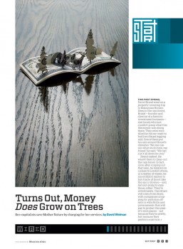
Scott Dadich, Creative Director- Wired Magazine

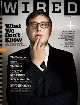
A native of Lubbock, TX, 30 year old Scott Dadich had already experienced an impressive award winning 6 year run designing Texas Monthly when he arrived at Wired Magazine in 2006. Wired quickly won a General Excellence Award from the American Society of Magazine Editors (ASME) and was runner up for Magazine of the Year at the Society of Publication Designers (SPD) to fellow Texas Monthly alum, Fred Woodward now Design Director of GQ. Scott, at the ripe old age of 32 now, recently took the crown of 800 lb. magazine design gorilla–a title held by Fred for many years–with his 2008 trifecta of awards from the SPD for Magazine of the Year and Redesign of the year and a prestigious Ellie from ASME for design.

Of course magazines with this kind of visibility have a huge influence on the way other magazines behave so I wanted to ask Scott a few questions.

Working at a magazine that reports on the front lines of technology how do you see your role in defining how printed magazines look and behave in the future?

Honestly, I don’t think too much about it. I mean, in the back of my mind, we try to be aware of what has and has not been done in terms of magazine design, photography, printing, production, but it’s not a driving force in the day-to-day nuts and bolts of what we do. We have some ideas of projects and covers that we want to be the first to do, but we’re waiting on the tech to catch up to our ideas. I love magazines for what they are and can do right now.

Based on how Wired looks I’d say your editor, Christopher Anderson is fairly hands off when it comes to design and photography. Can you tell me how that works?

Chris is a tremendous editor. As is our executive editor, Bob Cohn. I wouldn’t say that they’re hands off, because they both have strong ideas about design and magazine-making. Our ideas clash from time to time, but I’d say that’s pretty rare. When I started at WIRED, Chris and I had a dinner where we talked about our ambitions for the magazine, and I’d say they aligned perfectly. Both of us want to play with the conventions of storytelling and the role of design in magazine journalism. WIRED is about innovation. For me, my Photo Editors and designers not to innovate would do a disservice to the brand and our readers. Folks come to WIRED to be challenged and read about progress in the world.

I spend a little time on my blog talking about the dynamic between the creative director and photo editor and how many photographers assume it’s a completely hands-off process when in many cases it’s not. Can you explain how you work with your Photo Editors at Wired and how you think photo and art should work together?

Yes, I work very, very closely with my two photo editors, Zana Woods and Carolyn Rauch. My first real job was working for a photographer at Texas Tech with a really talented guy named Artie Limmer. He taught me how to assist and and how to see and shoot, so when I first went to Texas Monthly as art director and had to act as my own photo editor, I felt really well prepared. I spent 6 years there working closely with some spectacular photographers—Dan Winters, Platon, Brent Humphreys—and traveling all over the state, making great pictures with those guys. Coming to WIRED and getting to work with Zana and Carolyn has been wonderful. We’re all good friends and collaborate on a daily basis, talking about stories and shoots. Our offices are an open bullpen style, so one of us is usually at another’s desk pitching someone or arguing about another approach. We all have different styles and tastes, and I think that shows up on our pages.

How would you define the role photography has within your design and at Wired in general?

I think it’s a strong voice in the book. I believe in respecting the work and vision of our photographers. I don’t allow our designers to crop or alter any of the photography in our pages, and for the most part, we try and keep type off of images—I don’t allow captions to be reversed out of images at all. And, in as diverse a feature well as we have, there’s always at least one or two stories where photography is the primary visual voice. My tendencies have been toward more graphic photography and it’s been nice to open my taste up to the looser and more organic styles my photo colleagues prefer. It’s a good mix and allows my designers to have a lot of freedom dealing with different visual approaches.

I tell photographers that it’s fine to send promos and marketing material to the creative director but never leave the photo editor out of the loop because I want to at least pretend like I know what they’re talking about when the creative director drops by with the promo from a photographer they’d like to work with. How do you feel about photographers approaching you directly?

I love it. But, yours is a valid point. I should never receive a promo that my photo editors didn’t get. We work as a team and make decisions as a team.

Redesigning a magazine is always a touchy subject with the publisher, editor and owner but I always find it renews my interest in the publication–this happened to me after you redesigned Wired. How often should publications do a redesign and why is everyone so apprehensive about it?

I think the timetable really depends on the magazine and where it is in it’s life-cycle. Texas Monthly had a general rule of redesigning every five years or so, but we had a mature readership that was more averse to change. So I did two redesigns while I was there, one minor, one major. My redesign at WIRED launched in February of 2007, about five years after Darrin Perry’s 2002 redesign. But even now, we’re tweaking that redesign for a little front-of-book refresh. Wyatt and I want the design of WIRED to be very agile, very adaptable, and since we’re learning all of the time, we want to put those lessons on the page.

Scott will answer a follow-up question or two in the comments if you have any.