Featured Promo – Amy Roth

Amy Roth

Who printed it?
I printed my promo with Blurb. Even though I’d heard great things about their magazines, I was still blown away by the quality.

Who designed it?
I started with a template from Creative Market, then updated the fonts and adjusted the layout a bit to work better with my images.

Tell me about the images.
Like I say in the promo, cocktails are a mood and an experience to be savored. So many of us have been missing our regular social interactions for the past year-plus, whether it’s a big night out, a party at home, or just getting together with a friend or two over a tasty beverage. I guess this was my way of lifting my spirits (heh) and reminding myself that the world will become a place we recognize again.

From a practical standpoint, I’ve been a food and beverage photographer for several years, so I had quite a few drinks in my portfolio already. When northern New Jersey was locked down early last year, it made sense to lean into beverage photography because I could handle the styling on my own much more easily than I could with a full food set.

How many did you make?
I printed a single copy to check for errors, tweaked a couple of images, then printed 75.

How many times a year do you send out promos?
With so many people still working from home, I haven’t worked from a strict marketing plan for printed pieces. Ideally, I’d like to send out quarterly promos.

Do you think printed promos are effective for marketing your work?
I believe in the power of the printed photograph and a well-executed printed promo. So much of our photography exists solely in a digital space now; it’s an ephemeral, yet oddly static way of experiencing photos. Printed pieces are undeniable and demand attention — flipping through a printed magazine creates an experience you just can’t get scrolling through social media feeds. And, of course, I think there’s something magical about having a big, beautiful cocktail staring you in the face. Maybe these pieces will end up in the recycling bin, but I hope some of them have a life outside of that and leave the recipients looking forward to post-pandemic cocktail hours.

Featured Promo – Andri Tambunan

Andri Tambunan

Who printed it?
The Newspaper Club printed it. I ordered their free sample pack and decided to go with the digital tabloid size.

Who designed it?
Initially, I worked on designing the layout myself using the Book Module Lightroom. I often use this tool to create custom PDFs for moodboards and pitches. The process was familiar, starting with image selections, pairing and grouping photographs, trying out different layouts, adding and positioning text. I shared the rough draft with a couple of friends for feedback and made necessary refinements. Once the sequencing and the rhythm of the layout felt solid, my talented designer friend Cat Oshiro (catoshiro.com) added finishing touches, and she ensured that the file followed the artwork guidelines for printing.

Tell me about the images.
After spending a decade based in Indonesia and covering the South East Asia region, I moved back to my hometown Sacramento, CA in December 2019. A month before moving back, I spoke to my friend who was based in Shenzhen, China. Due to the COVID-19 outbreak, he was evacuating his family before the government closes the borders. I was keeping up with the spread of the virus. However, I didn’t expect it was going to arrive at our front door so quickly. I was still adjusting to living back in the States when the Shelter in Place order took place in March of 2020. Prior, I was on track re-establishing my career meeting with editors in LA and San Francisco, connecting with colleagues and collaborators, and networking with potential clients, and looking for a new home base in California. When the pandemic hit, all my plans and progress got put on pause, and upcoming projects and assignments got cancelled or postponed indefinitely. Almost all the available assignments were related to covering the COVID-19 pandemic. In my field of work, I’ve covered armed conflicts, violent protests, and humanitarian disasters. However, because I was staying with my mom and other family members I didn’t accept or pursue any assignment that carried a high risk of infecting my household. I had saved enough money to cover my expenses for the rest of the year and I opted to hold off from working until the pandemic was under control. However, it was necessary to record the impact of this pandemic on individuals, families, and communities around me and I found personal projects to pursue that were safe for me and the people I photographed.

The first one that I photographed was the deserted playgrounds in the Sacramento suburbs. I was walking my Mom’s dogs to a park nearby when I saw the yellow tape reminding me of a crime scene. While still adhering to the shelter in place protocol, I ended up visiting over 60 playgrounds near my home. I photographed them at times that families and children in the community would normally come to gather and play.

The pandemic had forced us to alter many aspects of how we live, work, learn, and interact with one another. My family had to cope with new sets of challenges and adapt to the norms. My biggest scare during the lockdown was when I had to take my mom to the Emergency Room. She was sleeping and woke up around 1:30 am because her blood pressure shot up to 200. My mom is healthy and she has no history of high blood pressure. The first thought that came to my mind was that it could be related to COVID-19. When I reached the ER, I wasn’t even allowed to enter inside. The nurse took her in and I waited several hours while the doctor ran multiple tests. Luckily, it wasn’t COVID. The doctor said that her test results were normal and that the high blood pressure might have been caused by stress and exhaustion. My mom is still very active and independent and she told me that she was experiencing stress from being confined inside. This experience inspired my next series “6 Feet Apart” where I photographed and interviewed individuals and families a month into the Shelter in Place mandate.

I had a personal connection to each photo series in this project. For the last 10 years, I was mainly taking photos in places that weren’t my own. At the same time, after being away for so long, my hometown felt unfamiliar because I was still a stranger and an outsider. This project had helped me in ways that I never expected. It has given me a new sense of belonging.

How many did you make?
I made 70 copies total. I sent out 50 copies to selected editors and publications in a clear vellum envelope and a handwritten note. I gave out the rest to some of the people I photographed.

How many times a year do you send out promos?
Since I relocated from Bali, Indonesia to Sacramento, CA, it was a great opportunity to create and share a new body of work. I try to send a promo out at least once a year. Nowadays we have to actively promote our work since it’s such a competitive field. I started allocating a budget and time for self-promotion a few years ago.

Do you think printed promos are effective for marketing your work?
I believe making printed promos give you an incentive to share and promote your work with current and new potential clients. I can imagine that editors are bombarded with emails daily so this approach separates you from the rest since it is more personal and thoughtful. In this digital age, it’s not often that I get to see my photos in physical form. I enjoy the process of making printed promos, especially for my personal projects because it gives me ample time and creative freedom to digest and reflect on the overall experience before moving on to the next one giving me the stamp of closure.

Featured Promo – Shell Royster

Shell Royster

Who printed it?
Magcloud

Who designed it?
Kat Slade, an AD I worked with on the Moe’s Southwest Grill account.

Tell me about the images.
The images were a selection of travel and food experiences blended with food shots from studio work, to tell a larger story as a whole about my style and skill set.

How many did you make?
It’s a weird story, but this was just pre-pandemic, I had this prescient feeling that something bad was going to happen. I got a proof and printed 12 copies to target travel and food editors. And of course, due to the circumstances it was bad timing. So I only sent out 6 to a selected audience.

How many times a year do you send out promos?
Generally, I print 1-2 promos a year, as I strongly believe in the printed promo, especially if it tells a story or is simply a stunning photo. I’ve been on the other side of the aisle and I always kept the work that stood out, and pinned them on a cork board for future reference. And I actually hired a few of those individuals.

Do you think printed promos are effective for marketing your work?
Yes, I do, for the reasons above, and emails are so ubiquitous-that I feel they are often times relegated to spam, or ignored. But if you receive a beautifully crafted, printed promo, who doesn’t enjoy that? It’s like a small gift. It also creates an awareness for editors who are not familiar with my work.

How did you intimate your personality aside from the images and the story they told?
I love humor, it comes in handy on set and puts people at ease (I’ve also performed stand up comedy in NYC, but I digress) so we brainstormed and came up with the idea of these pithy quotes from famous authors (most notably Dorothy Parker, a huge fave) and inserted those as breaks. The quotes were carefully chosen as they had to speak to my life philosophies.

Literature and visual arts go hand in hand, and I love the marriage of the two, so I sought to achieve that marriage, as opposed to visuals alone.

The back page with the quirky ads was another collaborative effort. How did we end with a bang? I wanted to take a slight risk, because, why not? We looked at graphics and decided on these retro images, with a snarky element to them. They channeled the spirit of the quotes, and that sense of sardonic humor.

Feature Promo – neil favila

neil favila

Who printed it?
printed by newspaper club.

Who designed it?
designed by @gry.space in LA.

Tell me about the images.
the images in this promo lean heavy into my lifestyle / advertising work, with a bit of personal work sprinkled in.

How many did you make?
i believe we made 500 copies on this run.

How many times a year do you send out promos?
we send out physical promos once a year, and we send out digital promos (newsletter) three times a year.

Do you think printed promos are effective for marketing your work?
i think promos can be effective if they’re thoughtfully curated, designed and printed. people seem to enjoy holding a physical copy, and seeing images printed (not on a device screen).

Featured Promo – Stefan Wachs

Stefan Wachs

Who printed it?
I had the promo printed by Smartpress (www.smartpress.com). They sent me a paper sample book from which to choose paper stock and paper weight and then I got a digital proof made of the zine before putting in the order.

Who designed it?
I worked with Jasmine DeFoore, a photo consultant based in Austin, Texas. She helped with the selection of the images and the sequencing. The layout and type were designed by Emily Kimbro, the design editor at Texas Monthly. The three of us went over several different layout designs and versions.

Tell me about the images.
This project is about falconers and falconry in the American West. It started with an assignment I did for New Mexico Magazine a couple years ago about an author and conservationist who also happened to be one of the main experts on falconry in the United States. We only spent a short time out in the field flying his hawks so that I could get some pictures for the magazine article. But it was enough to get me hooked. I started contacting various falconers throughout New Mexico and then started going to falconry meets in Texas and Wyoming. At first my fascination was primarily visual. But the more I learned about falconry and the more I got to know the falconers, the more I was interested in the history and the culture of this ancient form of hunting. The project is about the falconers, about their relationship with their birds of prey but also about the various environmental and cultural aspects that affect current day falconry such as environmental degradation, drought and the rapid decline in bird population. Falconry season is limited to the fall and winter months and the project is almost exclusively shot in medium and large format film so I work slowly and it has taken quite some time to put together this sequence of images.

How many did you make?
I only printed 10 initially so that I could view them first and make changes if necessary. The advantage with printing with Smartpress is that once you upload the printable PDF you can always order more at a later point in time. I have since ordered another 50 copies.

How many times a year do you send out promos?
This is actually my first time sending out printed promos. I didn’t start working as a freelance photographer until about 4 years ago, most of my assignments so far have come through referrals.

Do you think printed promos are effective for marketing your work?
I always wanted to do a printed promo. I still believe in the power of a printed photograph, something that people can hold in their hand and revisit over time. I do think the printed promos can have more of an impact than simply sending out emails. It is also just nice to see my own work printed and be able to show it to friends. Most of the images we make never leave our hard drives these days….

I was talking to Jasmine (photo consultant) about the effectiveness of sending out printed versions of the zine in view of the current situation with the virus. A lot of editors are still working from home and may not receive the mail sent to their office address. So we decided to also do a “flip through” digital version of the zine on Hey Zine (www.heyzine.com). The flipbook can be sent as a link in an email and allows people to view and flip through the promo online as with an actual magazine. But if I know that the person will actually receive the printed version, I will send it. I think it is more effective than viewing the images on a screen.

Featured Promo – Britta Kokemor

Britta Kokemor

Who printed it?

I had it printed locally here in Calgary at a place called All Rush.

Who designed it?

I had my PR and marketing agency Gentle Lion co-design it with me.

Tell me about the format. Do you find explaining the process helpful to potential clients?

After reading the marketing book, They Ask You Answer (I highly recommend) I wanted to create something that answers my client’s questions and needs + evokes curiosity and comfort around what it’s like to work with me. So far this is the most client work I have ever received from a promo piece!

How many did you make?

I just went through a re-brand so I only made 75 copies this year. Next year I’ll send out way more!

How many times a year do you send out promos?

My goal is to send out a promo piece once a year in the spring.

Featured Promo – Kah Poon

Kah Poon

Who printed it?
I printed the photos myself.

Who designed it?
I did the design. Back in college, I studied both graphic design and photography. When I first came to New York after graduation many years ago, I was doing both photo and graphic design. But I needed to focus on just one, so I gave up design. And yet my photos have remained very influenced by graphic design.

Tell me about the images.
I have been shooting for over 15 years. I started with fashion. Portraits came a little later, and I only started shooting dance 6 yrs ago.
In the promo box, I am showcasing all three. I shoot a lot of color as well but for this promo, I only focused on black and white.
I have been consistently told not to mix the genres but to focus on just one. I decided it’s okay to showcase the genres together as long as they reflect the same point of view and style.
For my portraits, I never have the models smile. I like for them to wear a more subdued look. This is just my personal preference.
For my dance work, it is about showcasing their unique abilities, strength, and grace. The dancers are not showing emotion in their faces but through their body language.
Finally, in the fashion pictures, there is still no emotion in the face. I am just trying to just showcase the clothes.

Tell me about your connection to dance?
I was a competitive dancer back in the day. It didn’t occur to me until many years later that I could combine my love of dance with photography. One day I was standing in the nosebleed section of a performance by the New York City Ballet with my wife. I wondered what I would need to do to photograph these beautiful dancers. It was just a passing thought. A little while later, I had the same feeling watching a performance by the Martha Graham dancers. So I befriended one of the dancers. I had a fashion shoot coming up and I convinced the creative director to use dancers instead of models. I was able to invite four dancers from Martha Graham Dance Company to my studio and the rest is history. Since then I have done several shoots with the wonderful Martha Graham dancers. They are disciplined, graceful, and simply a joy to shoot. There is an energy and power there that is quite different than what a photographer would usually find when shooting models. I discovered that combining dance photography with my black and white style had astonishing results. The musculature and shadow brought out things I didn’t plan for. It was thrilling. The dancers bring so much to the shoot and are used to pouring out every ounce of energy they have and leaving it all on the floor. They also bring a unique life experience to the set that makes them quite exciting to work with.

How many did you make?
I have made only 50 so far. They are quite time-consuming to produce. I haven’t sent out any since Covid but I plan to start again soon.

How many times a year do you send out promos?
I send them to a very targeted audience twice a year.

Do you think printed promos are effective for marketing your work?
Absolutely yes. The reaction seems to be very positive. The promo boxes don’t look mass-produced, and the people who receive them seem to appreciate the effort I put into making them. Since photographers no longer send out hard copy portfolio books, everything is viewed on the screen. But having something tangible in your hands creates a special relationship of the body to the images. Online everything is impersonal. But when you hold something small and intimate in your hands, it can change the way you think about the work. It enters your memory differently. Holding an object can be more pleasurable than looking at one.

Featured Promo – Peter Prato

Peter Prato

Who printed it?
Edition One Books, which recently moved from Berkeley to Richmond. Brandon Tauszik, who’s an amazing photographer and a dear friend, turned me onto them. They printed his book, Pale Blue Dress, which made an appearance on this very site.

Who designed it?
Mcalman.co, which is a design studio founded by George McCalman, who’s made promos for many wonderful photographers. I worked directly with him and his Design Associate, Ali Cameron. George and I have collaborated on a few things together and it was extremely helpful to begin from a place where he was familiar with my interest in images and words. He brings experience as an illustrator, writer, fine artist, and having worked closely with photographers as an art director. A real powerhouse. All of this made for an experience in which the iterations on rounds of feedback were efficient and thoughtful. George also has the kind of chemistry I need in an editor. He knows how and when to say no to ideas that will cause a project to come off the rails.

Tell me about the images?
When I first read this question I thought, “I should ask him what the word limit is on this thing.” The images represent a range of experiences. Some were made for work. Some were made in my personal life. All of them are a kind of a creative non-fiction in which I’m carving a version of reality out of the light. It’s also the genre that comes most naturally to me and that I’ve practiced the most since studying creative writing in college. Of course, I’m interested in imagery without words, but this body of work isn’t about a collection of greatest hits. I wanted the people that are sitting with this to get a sense of how I think and what’s important to me. I also wanted to give them an opportunity for context. These images could live without the words but it would change the nature of how I want to relate to my audience. An image of a man staring off into the abyss of the night in a pensive stance is one thing. Knowing that man had an impact on me, and has passed away, changes that image. That said, a little bit of mystery provides endless satisfaction. I’m not trying to tell everyone everything. I want to start a conversation.

How many did you make?
I had 150 printed. 100 of them are going to people that work in various aspects of the photo industry, some of whom I’ve worked with, some of whom I want to work with, and some of whom are people that have helped guide my career through the work they do to support photographers. A Photo Editor comes to mind. The other 50 will be a limited edition, signed, and sold with an open edition print and most likely a unique piece of writing to anyone that feels inclined to spend their money on my work.

How many times a year do you send out promos?
This is the first time I’ve done this so I don’t have a structured routine. It’s laborious and expensive and an excellent creative exercise. I’ll probably do it again in the future, but I see this is a stepping-stone to my next goal, which is a monograph of work, and for which I’m talking with another designer that’s interested in working with me.

Do you think printed promos are effective for marketing your work?
Because I’ve never done this before I can’t definitively answer it one way or another quite yet. That’s frustrating, but the question of attention is a problem all creative people face if they’re trying to make a profession out of their creativity.

I think printed work is a smart way to convey a commitment to the craft, especially to people that have dedicated themselves to careers in which they’re hiring photographers, but you have to find your way onto very crowded desks and then not get buried. I think about measuring the efficacy of the marketing in two ways. On one hand, there are the fixed costs, which I’m tracking. The production costs, the design fee, the shipping costs, and the like. There are also the soft costs, like the time it took to sequence the work, or the commutes to Lightsource to work with Ward Long on the film scanning, or the maintenance of the spreadsheet to keep track of everyone that I’m trying to reach and to whom I’ve sent it and whether or not I’ve worked with them yet (just a note here to my tech friends whose heads are swelling as they read that last line- yes, I understand there are CRM systems out there that help with this and yes, I use one of those, too). There’s the time spent trying to reach people to let them know I want to send them a copy. There’s the time I’ve spent standing in line at the post office, and hand-writing letters of thanks, and following up with people to whom I’ve sent it but haven’t heard back to gently ask if they’ve received it and, if so, to say thanks again. I haven’t tracked all of that and even if I had, I’m not sure how I’d quantify the cost unless I broke out my annual gross income into minutes. So a very basic way of determining efficacy would be, did I cover my known costs? Did I generate new business that led to a profit?

On the other hand, I brought this thing to life in collaboration with the help of hard working, talented people, along with all those that hired me, those that allowed me into their world, gave me their time, those that made themselves vulnerable, fed me, helped me navigate unknown spaces, assisted me, married me, and so on. I’m proud of this work, of this small temple and the people it represents. So with that in mind, a real profit, and a meaningful success, will be a function of the number of new relationships it generates with people that will enable the virtuous circle of making time to make work to make money to make time to keep telling stories about this world and the way I see it.

Featured Promo – Christian Tisdale

Christian Tisdale

Who printed it?
Metropol Printers in Victoria BC Canada.

Who designed it?
I designed the layout myself, but all of my design components are from my awesome designer, Lisa Korz.

I had a branding iron of my logo made a few months ago and so badly wanted to build that into this package. I ended up settling for only burning a logo onto the front envelope, but I experimented for literally days on that. Different papers burned differently, some got sticky, some smelled so bad, some ruined the images on the other side. I still haven’t fully figured out how to do it justice. But I’ve got some ideas for the next set…stay tuned.

Tell me about the images?
I was really torn on which images to include in this campaign. This was my first mailer, so I ended up including 5 standalone shots, rather than one contiguous series. I wanted these shots to be commercial enough to inspire potential connections with the creative directors I was talking to, but cool enough that if you pinned it to your wall, it didn’t feel like an ad.

How many did you make?
I sent 100 out to agencies and producers, 1 to Rob, and 1 to my mom.

How many times a year do you send out promos?
This was my first, but my current plan is to run a minor series like this once per quarter, then a bigger piece once a year. The next ones will be more focused on a series of images that are connected to one another.

Do you think printed promos are effective for marketing your work?
I’d love to think so, but I don’t have the data to prove it yet. I really enjoyed the process in any case, so if nothing else I found a lot of creative value in it for myself.

Pricing & Negotiating: Lifestyle Photo/Video Shoot For A Hospitality Brand

By  Bryan Sheffield, Wonderful Machine

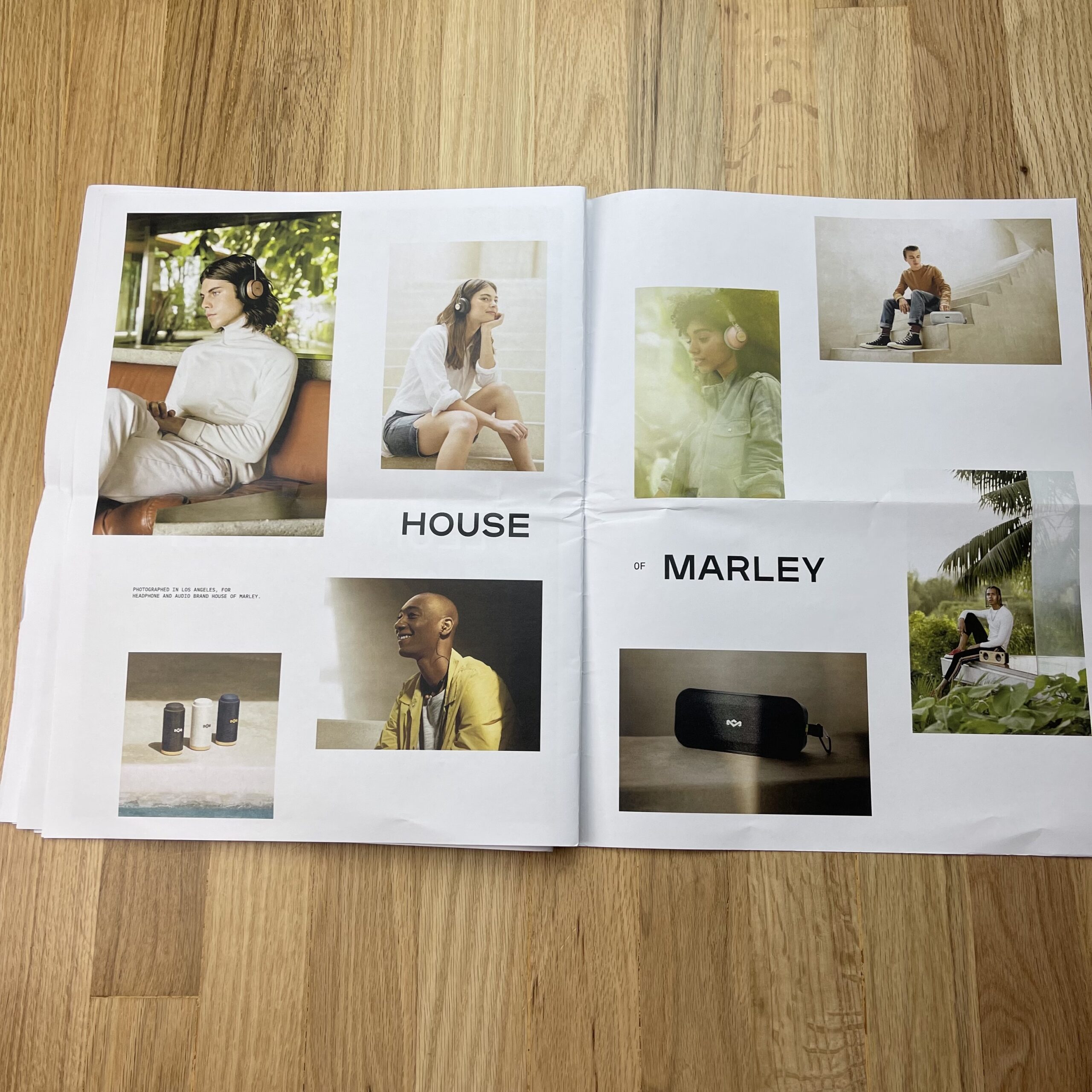
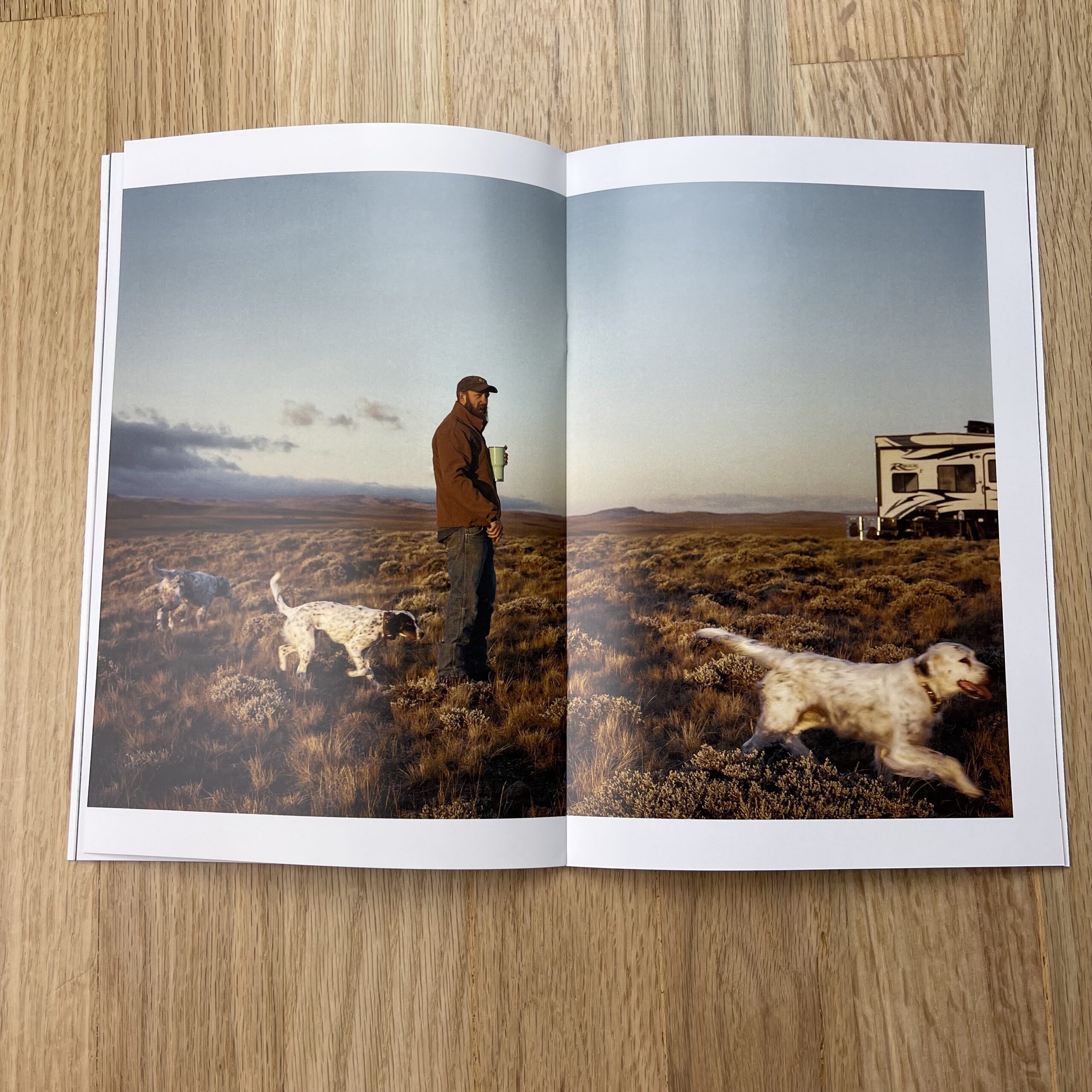
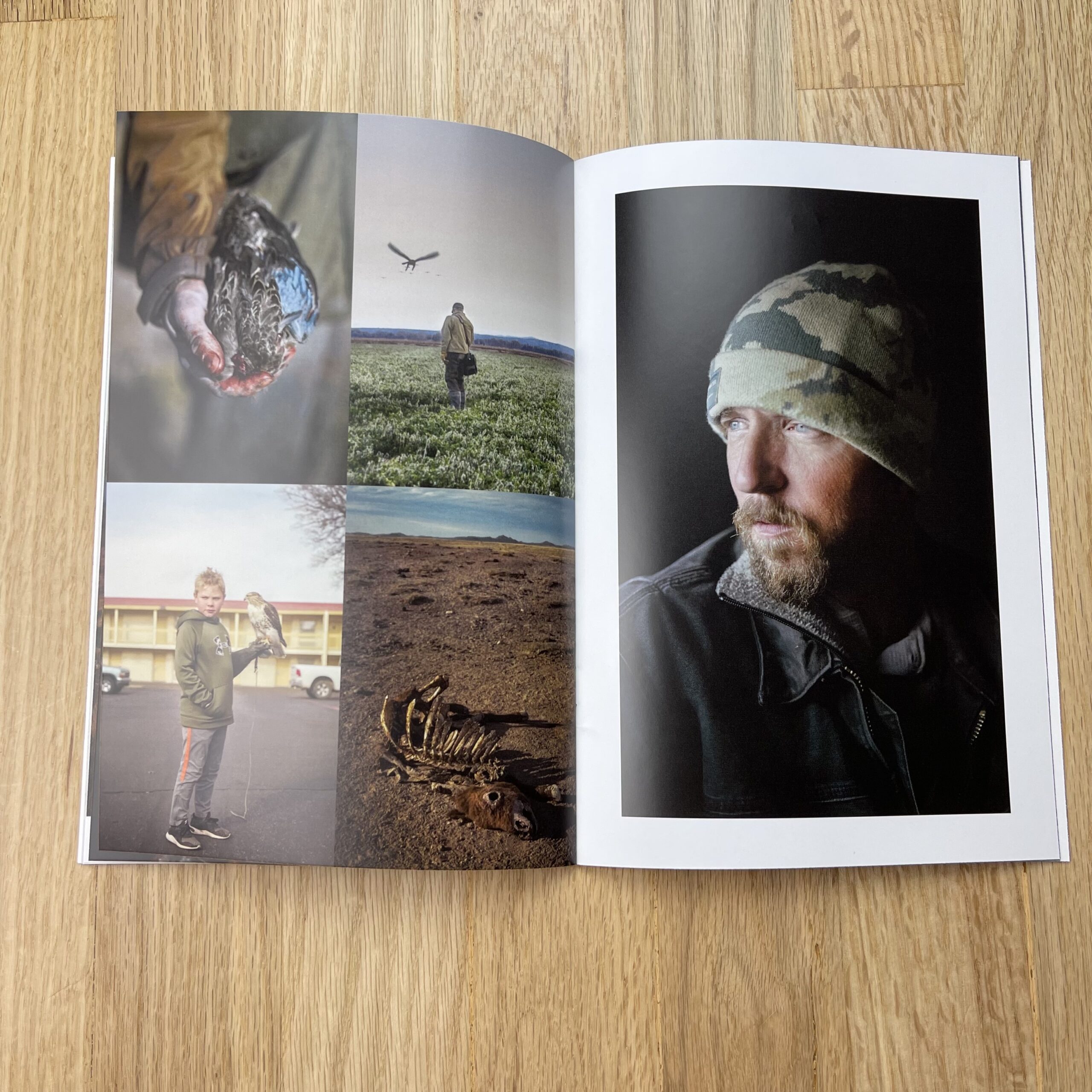
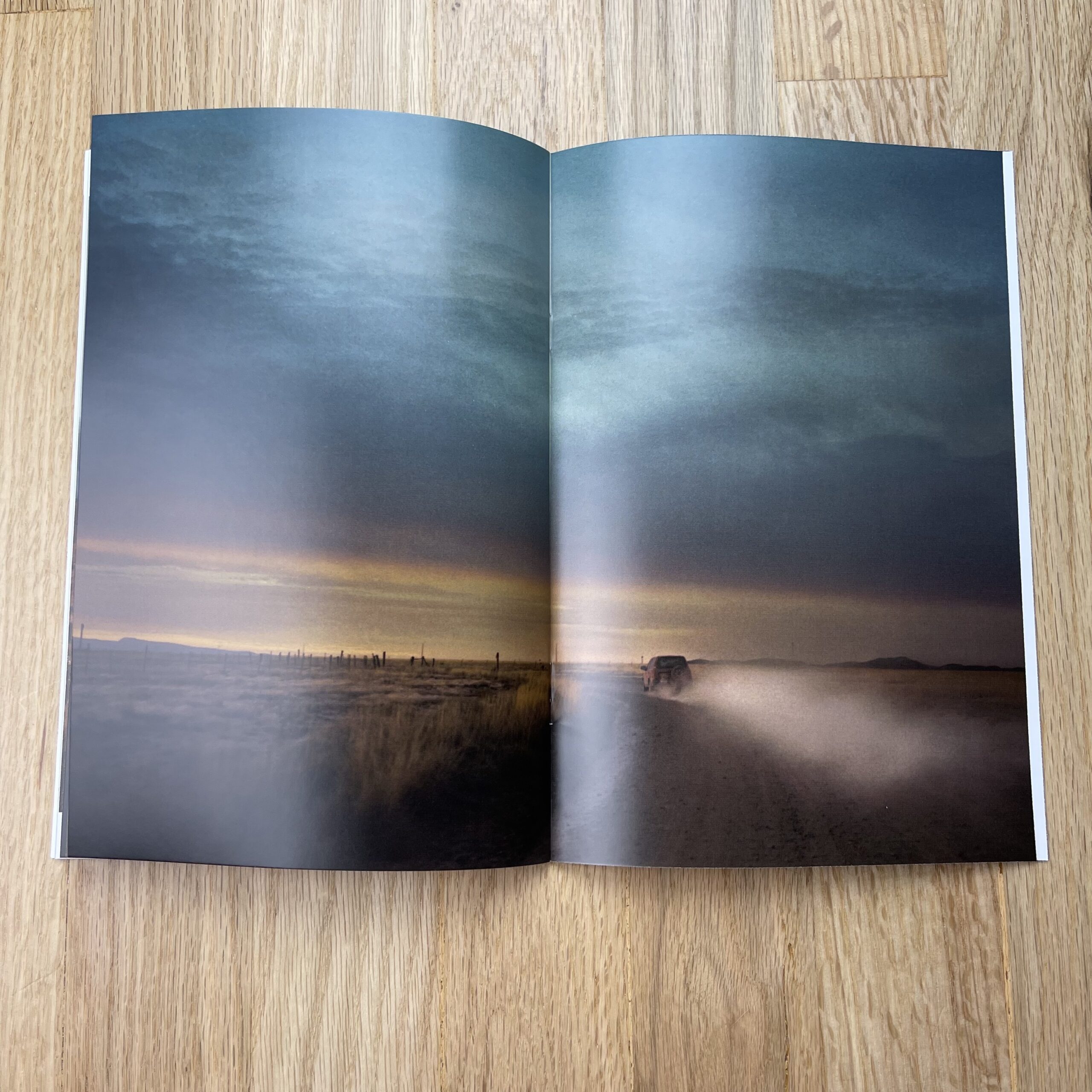
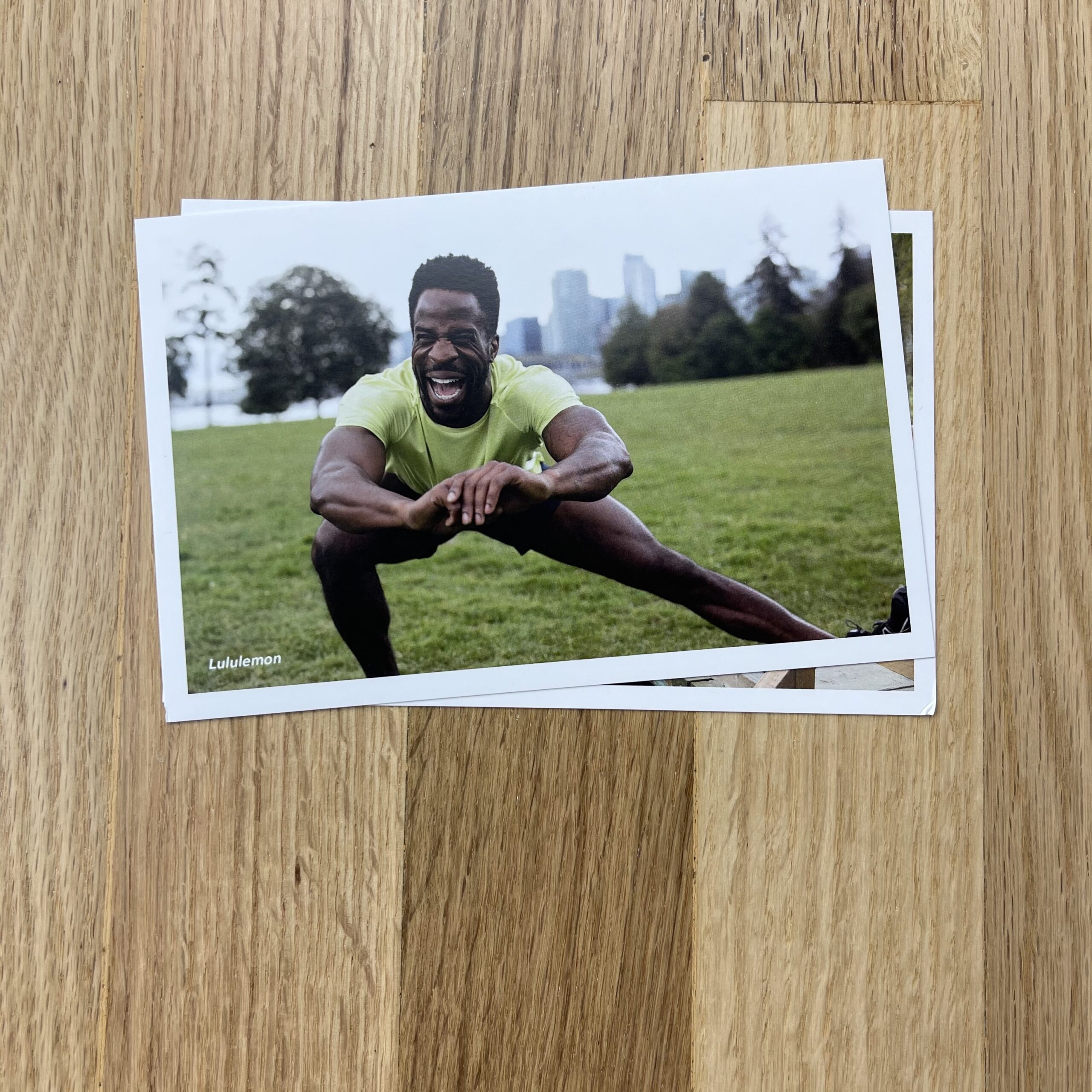
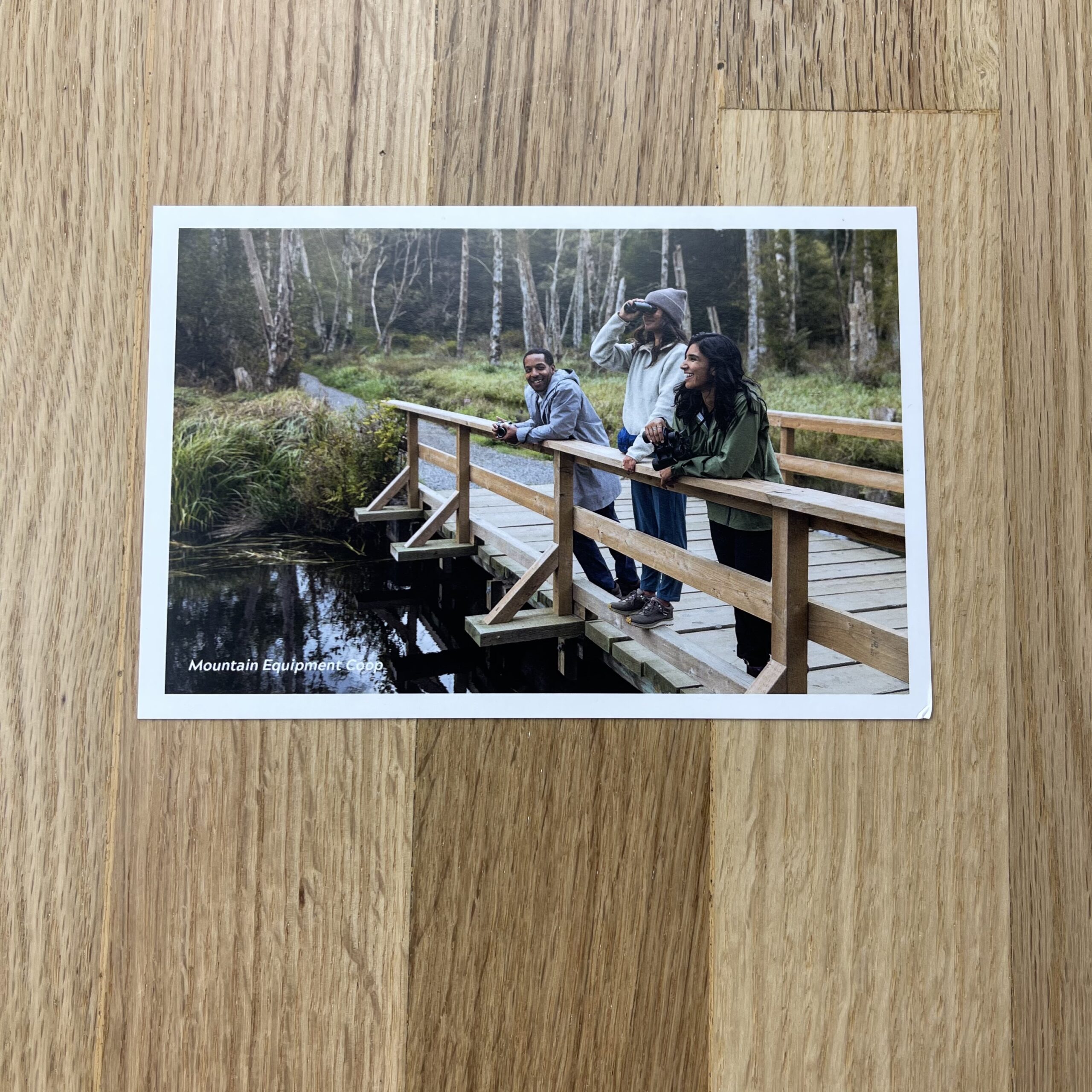
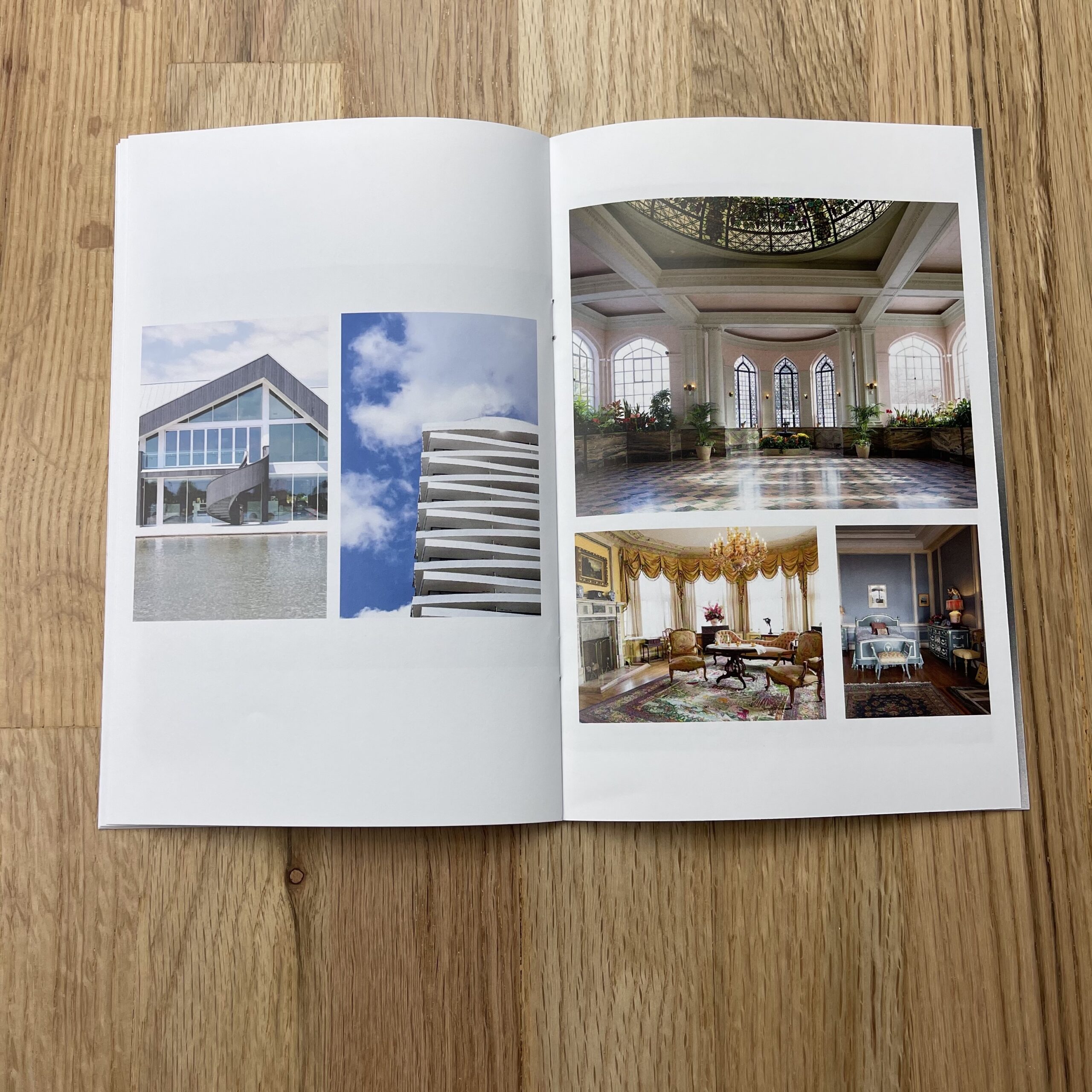
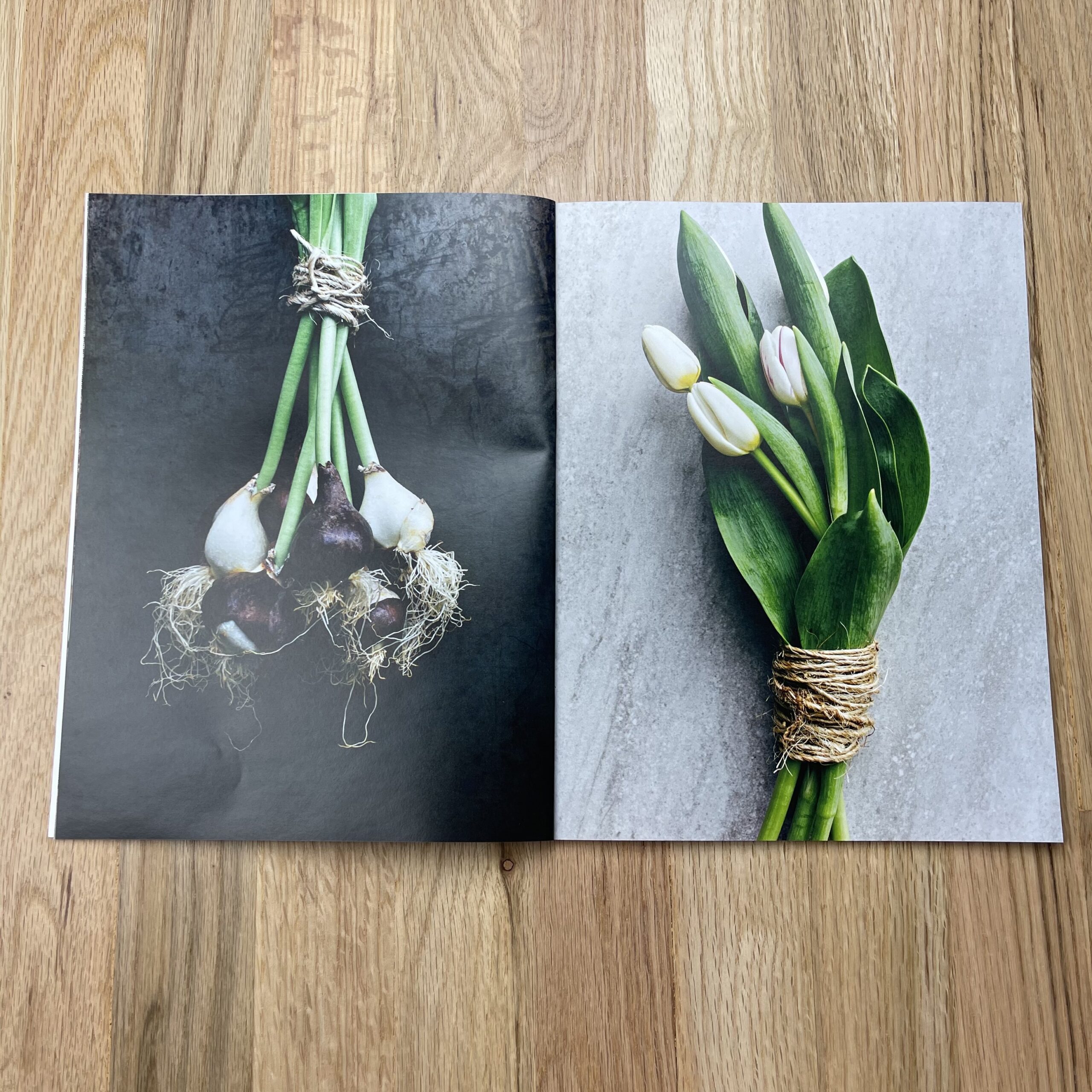
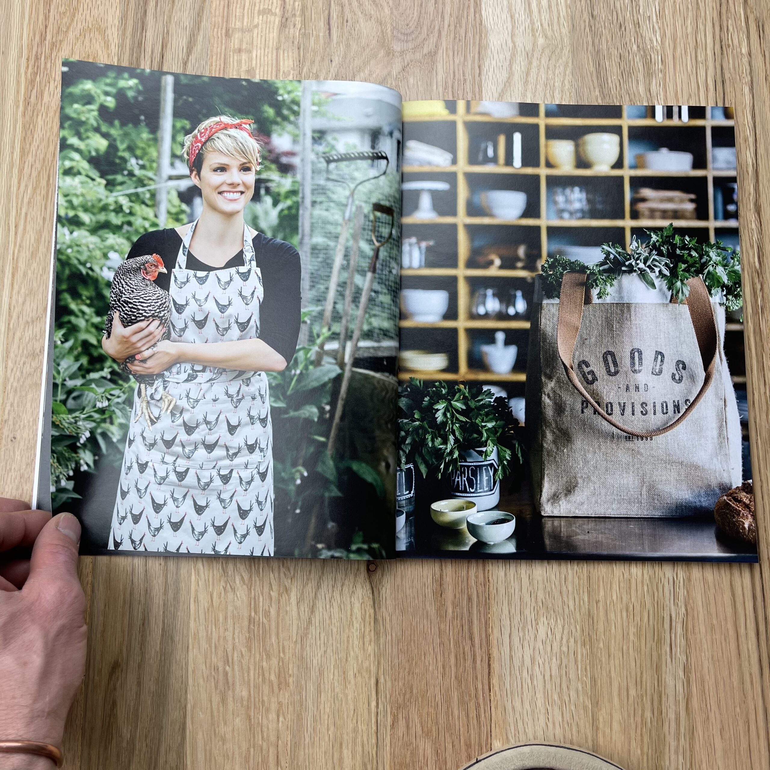
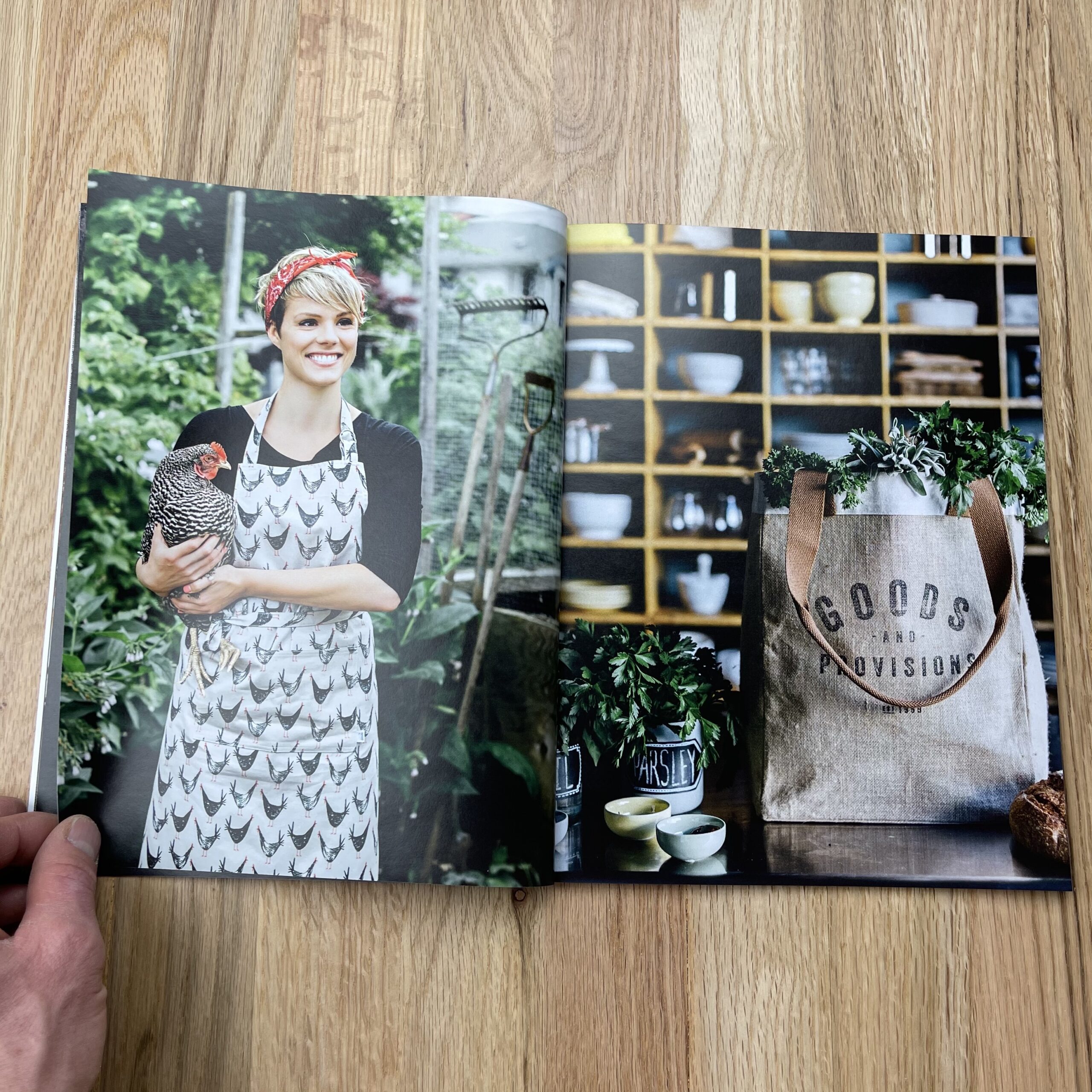
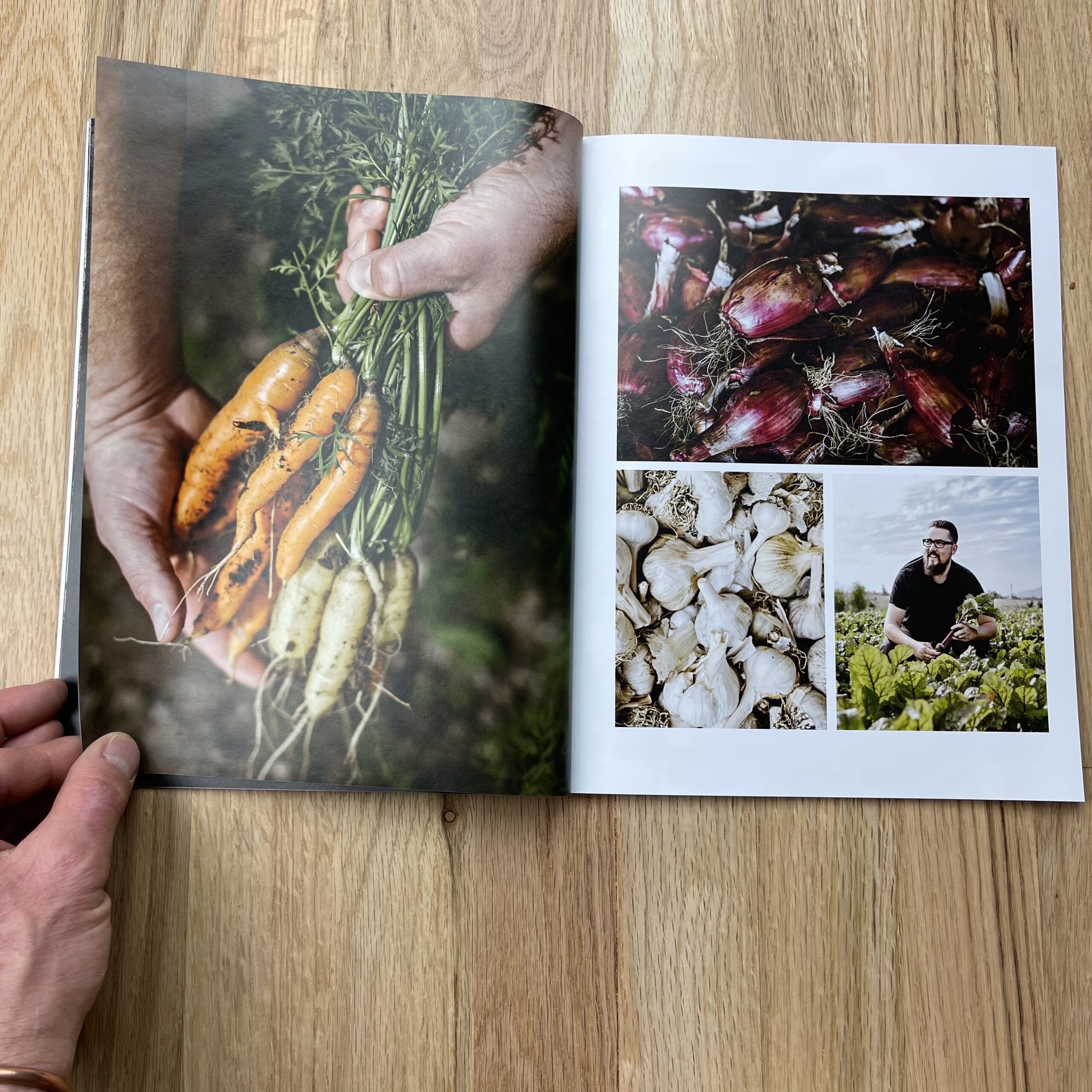
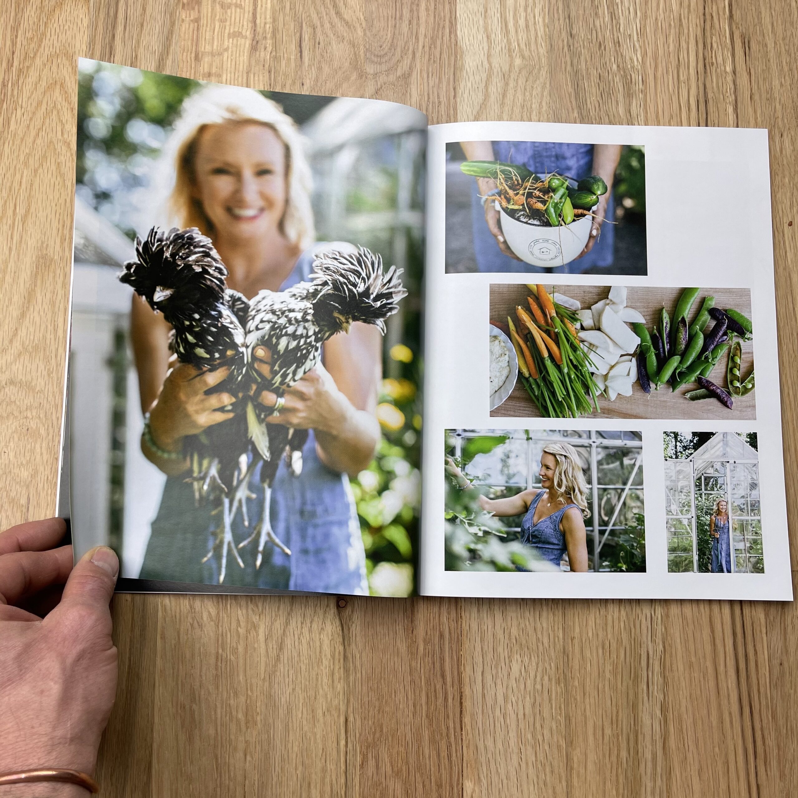
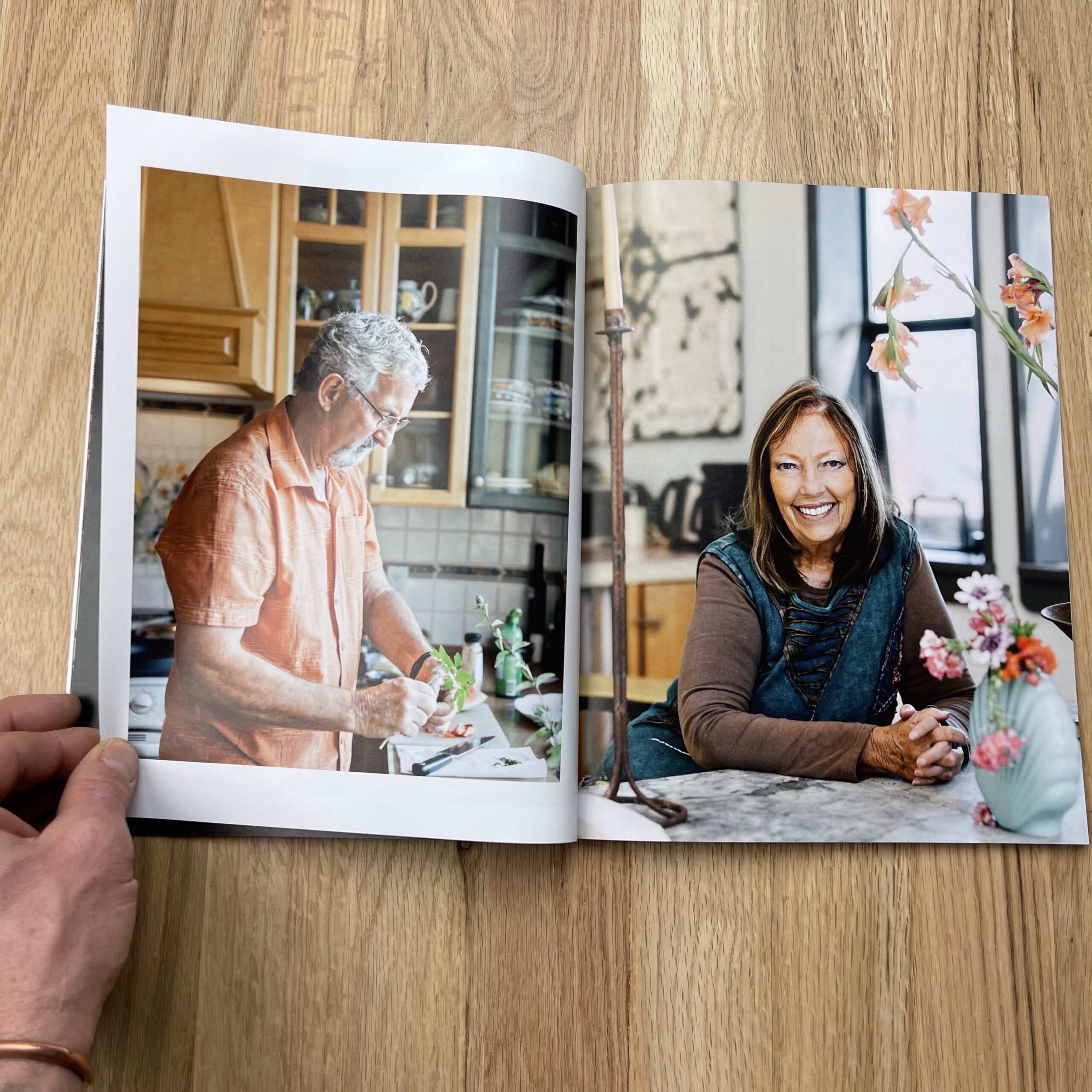
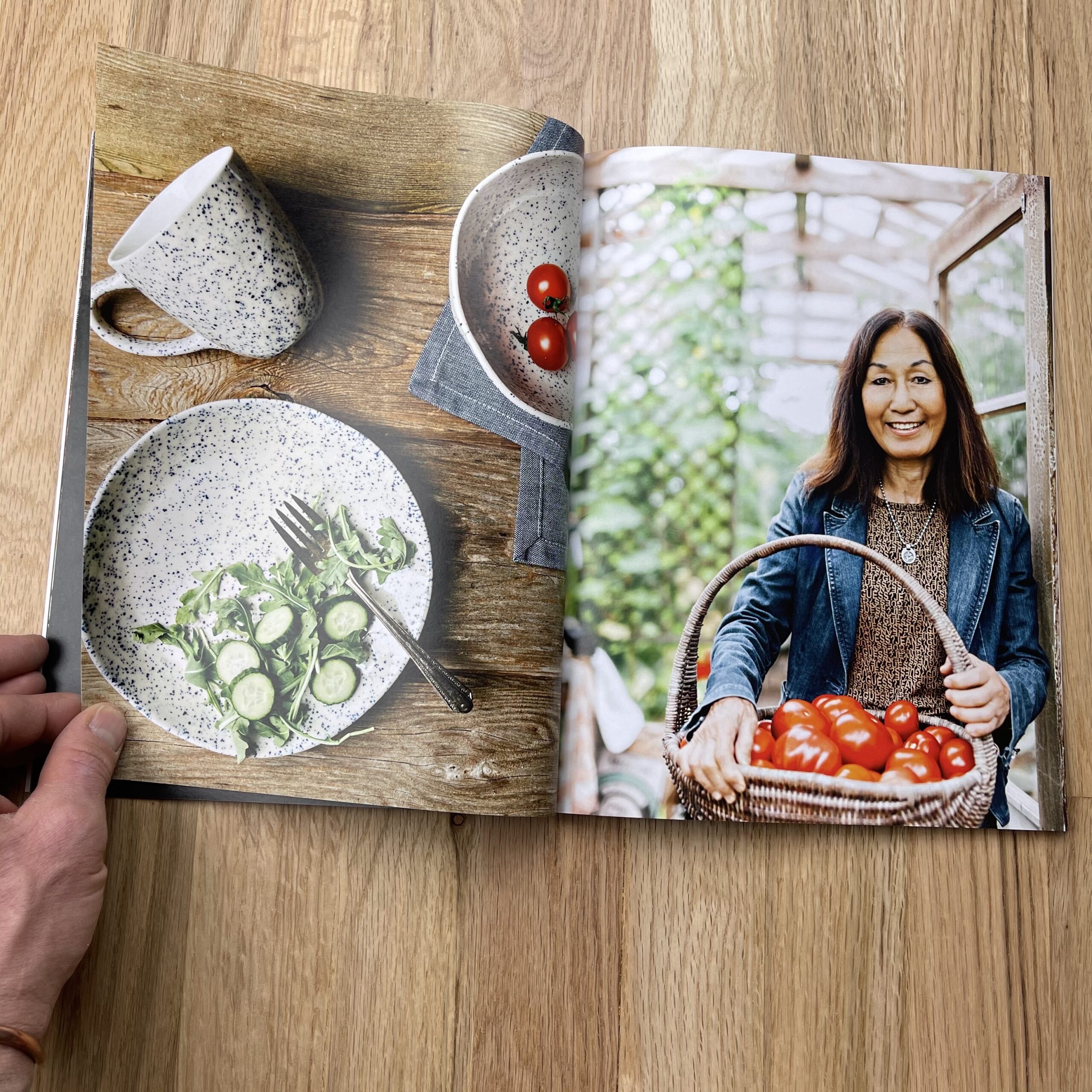
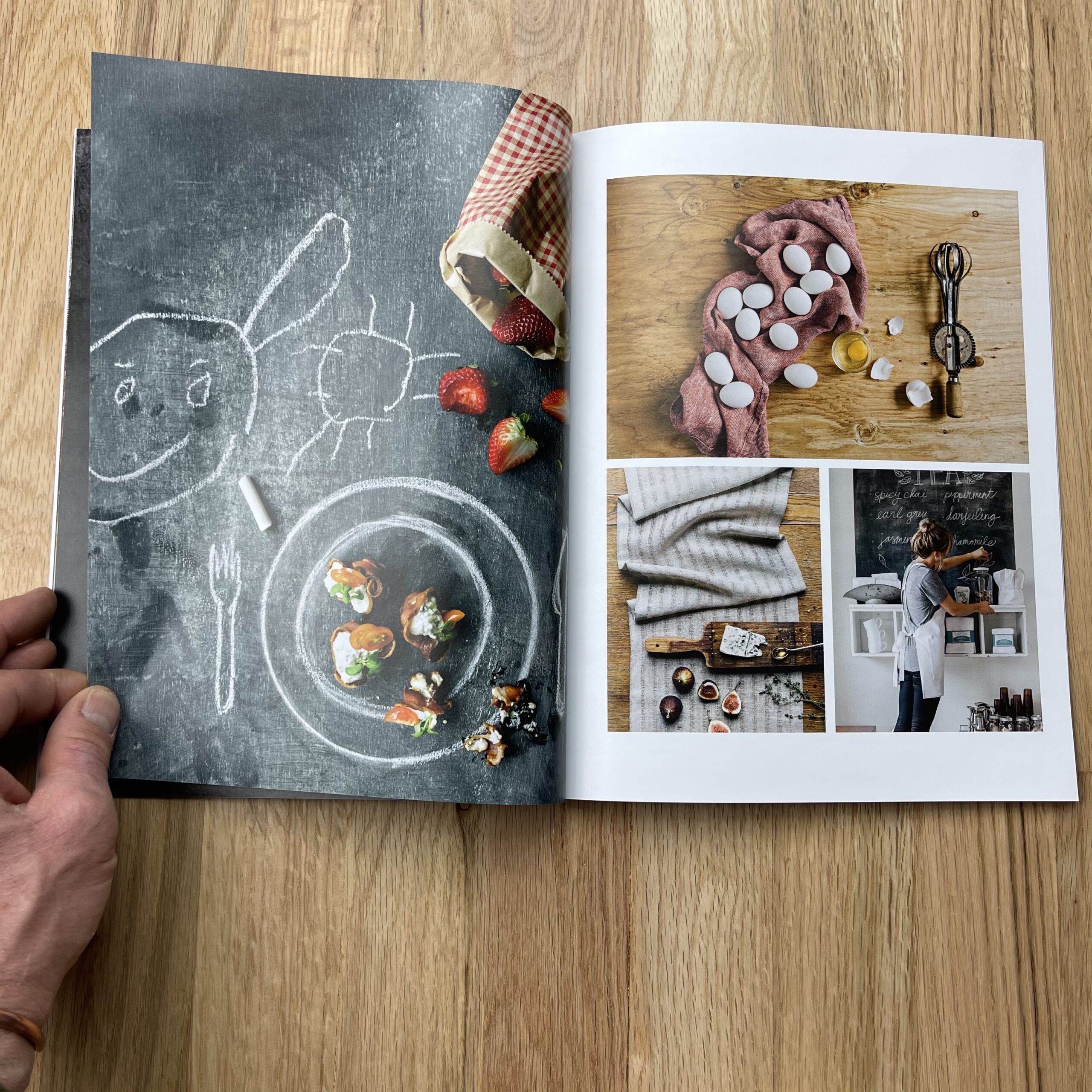
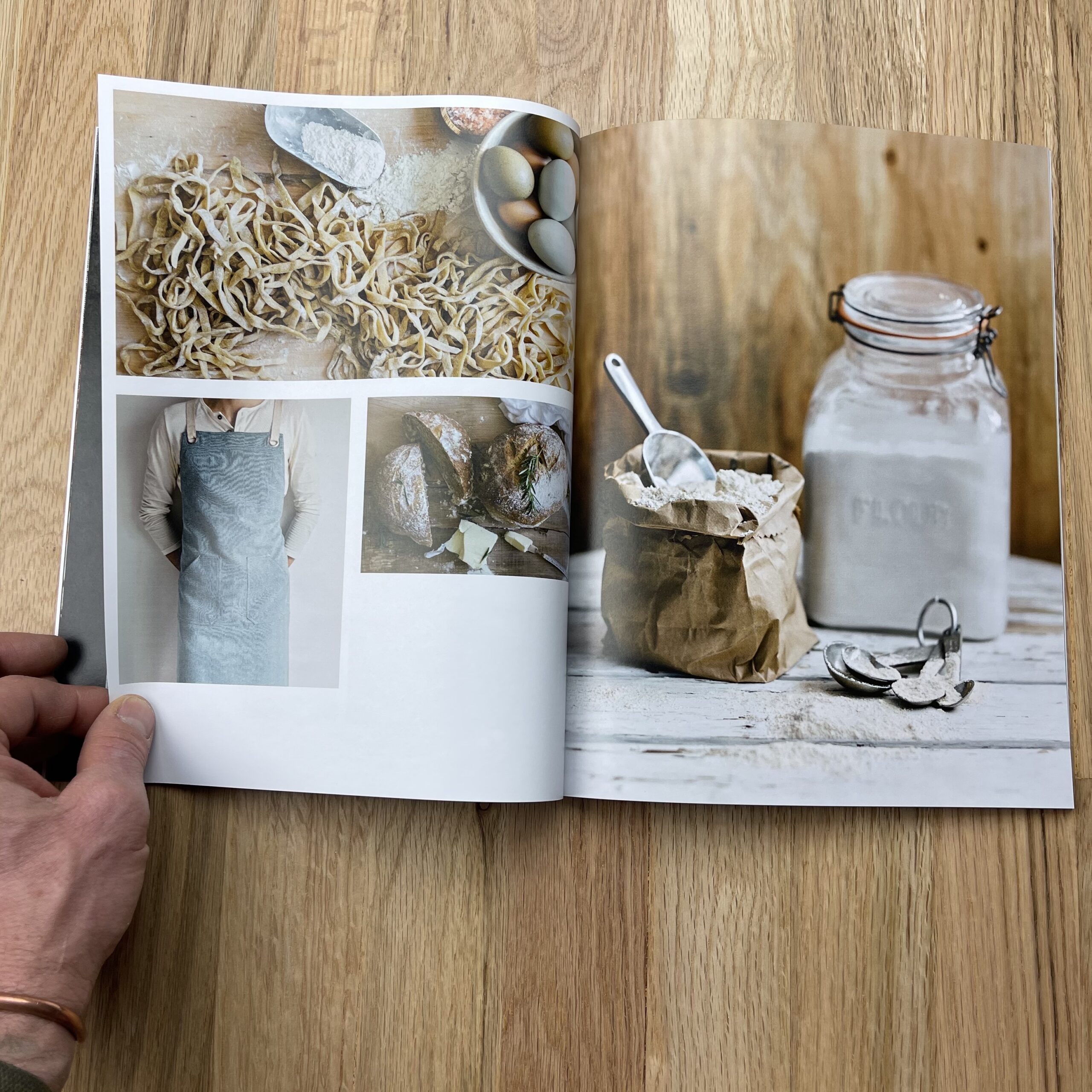
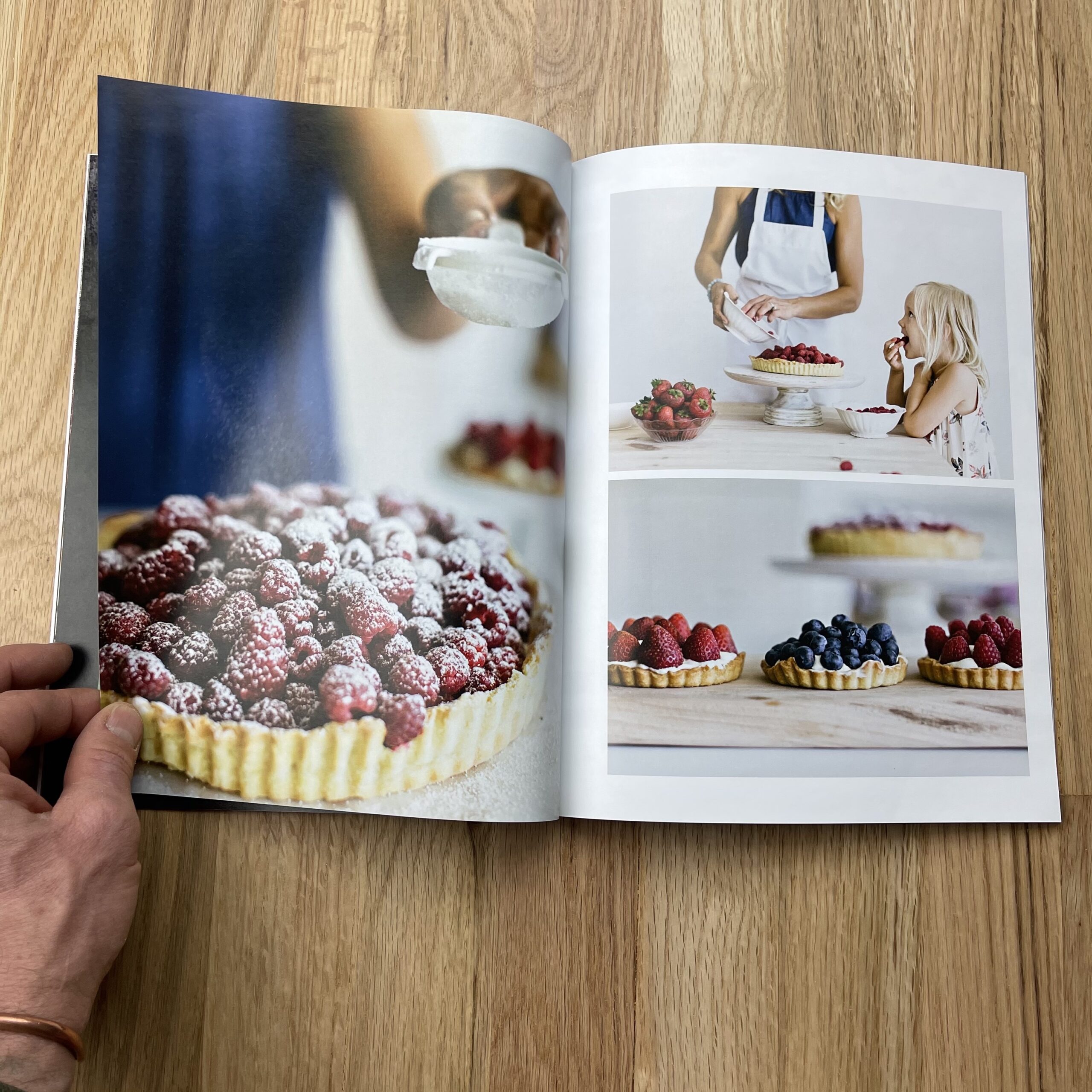
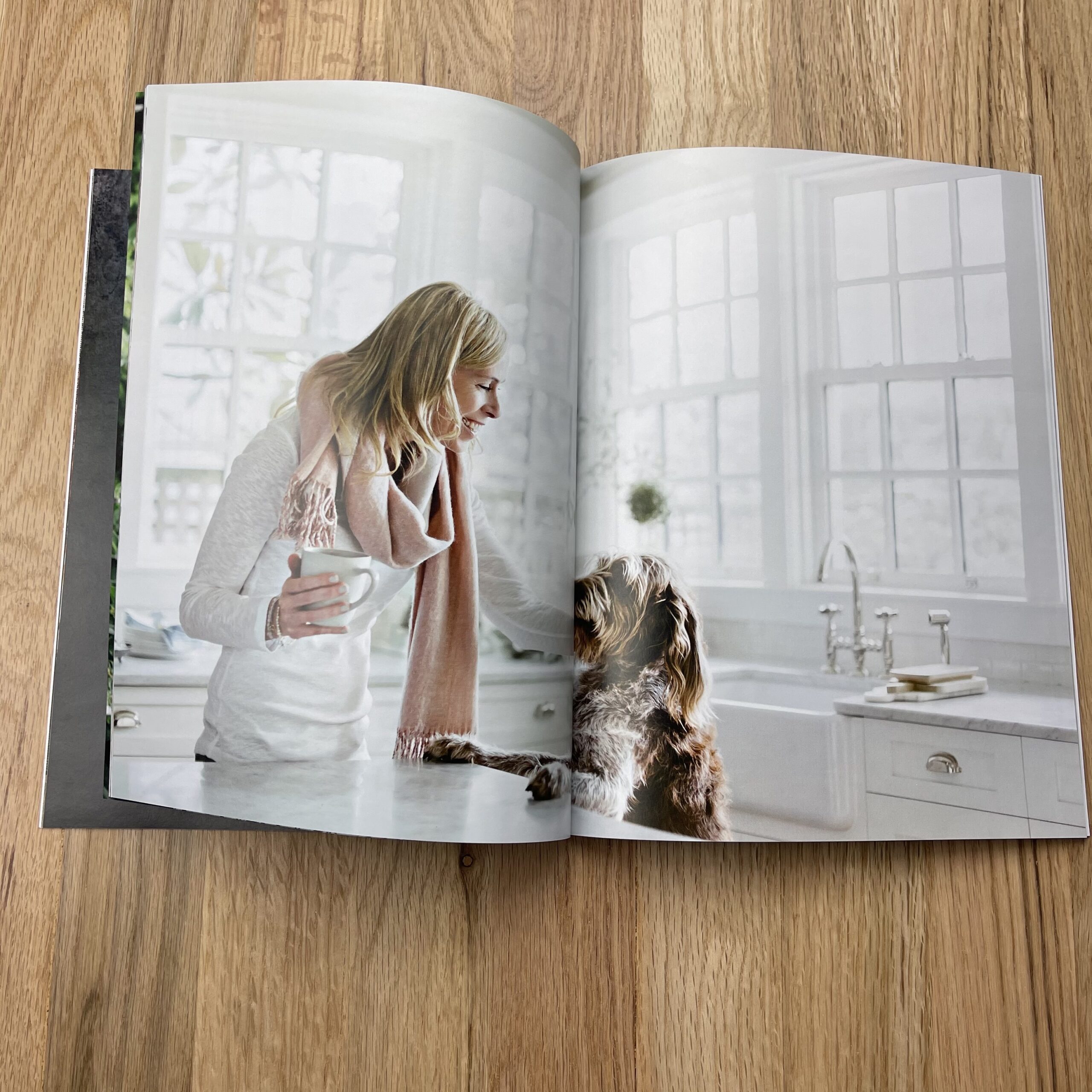
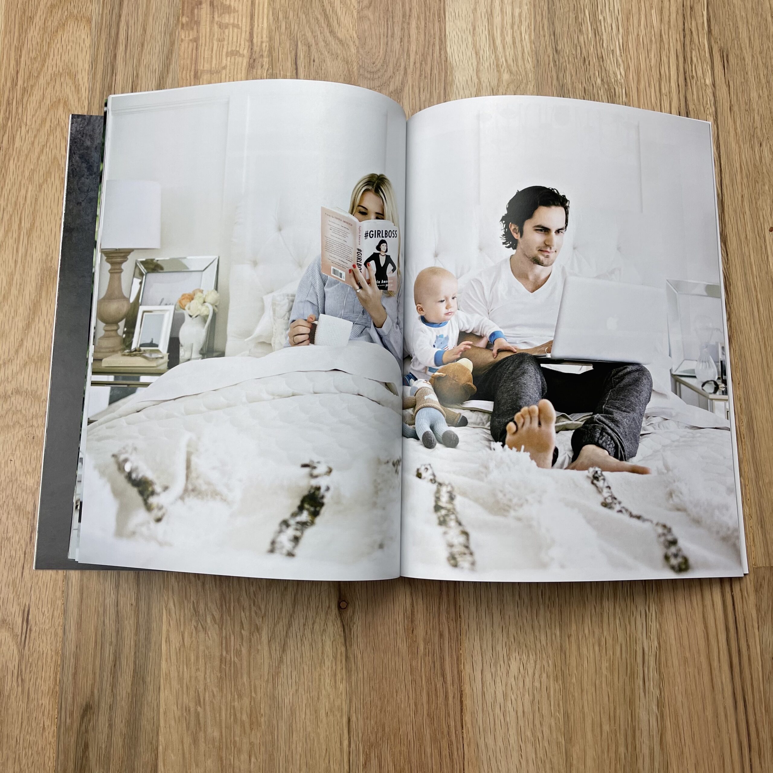
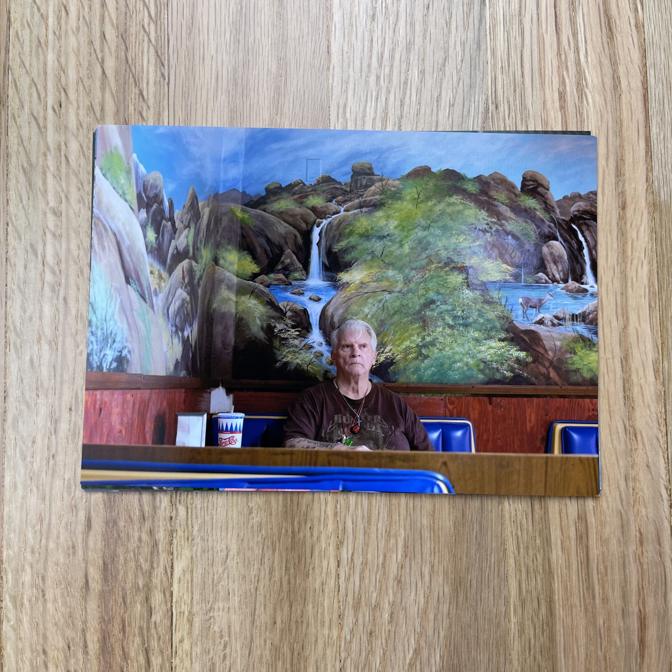
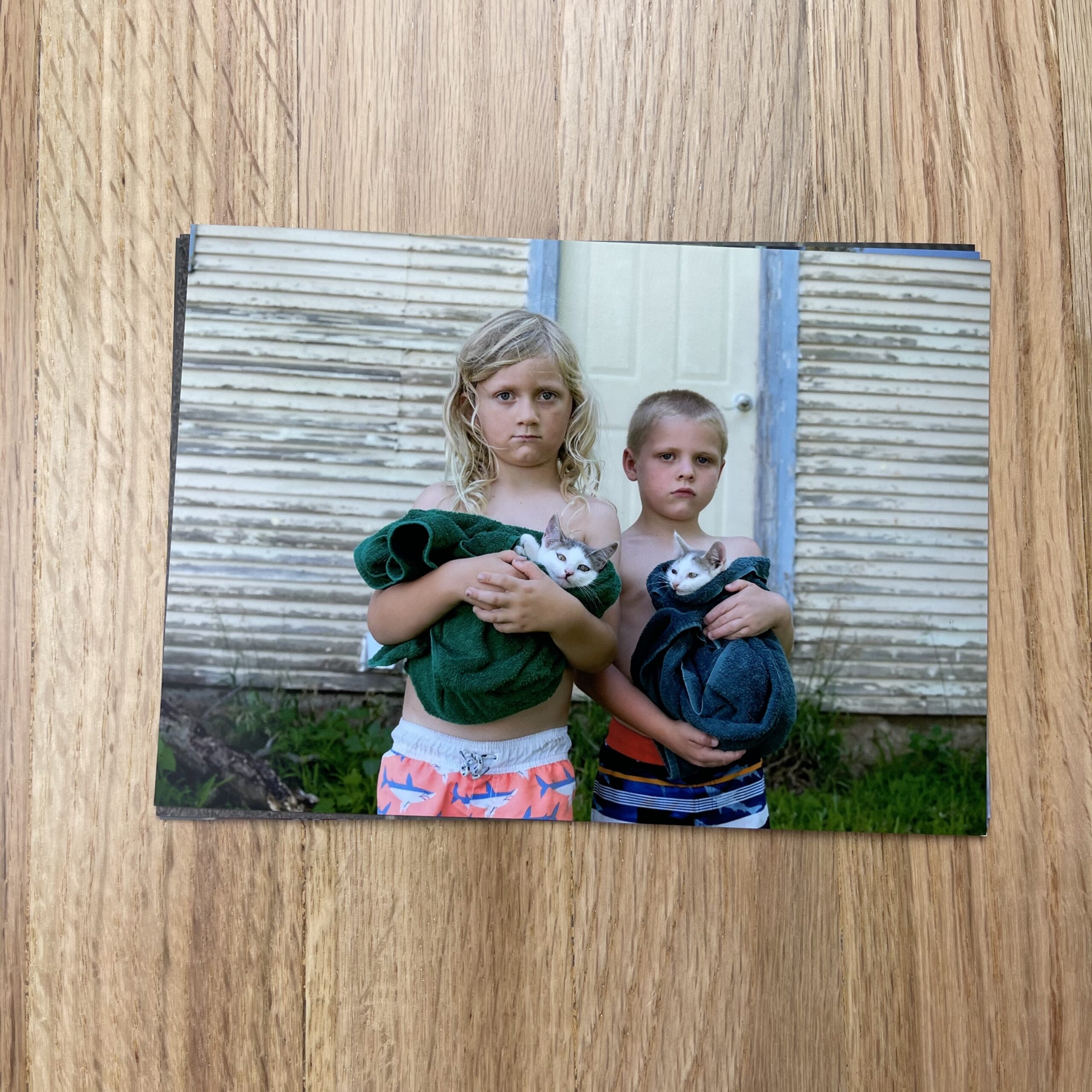
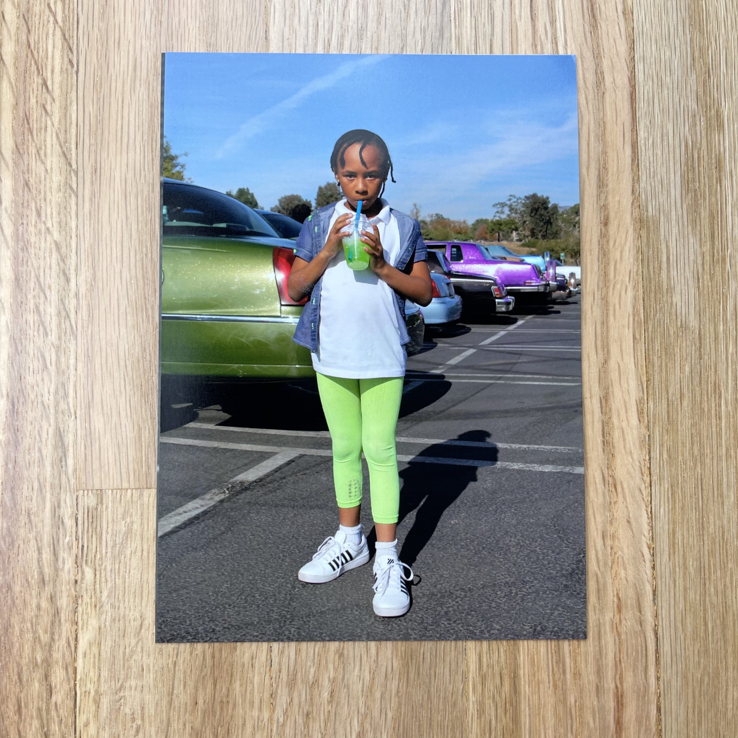
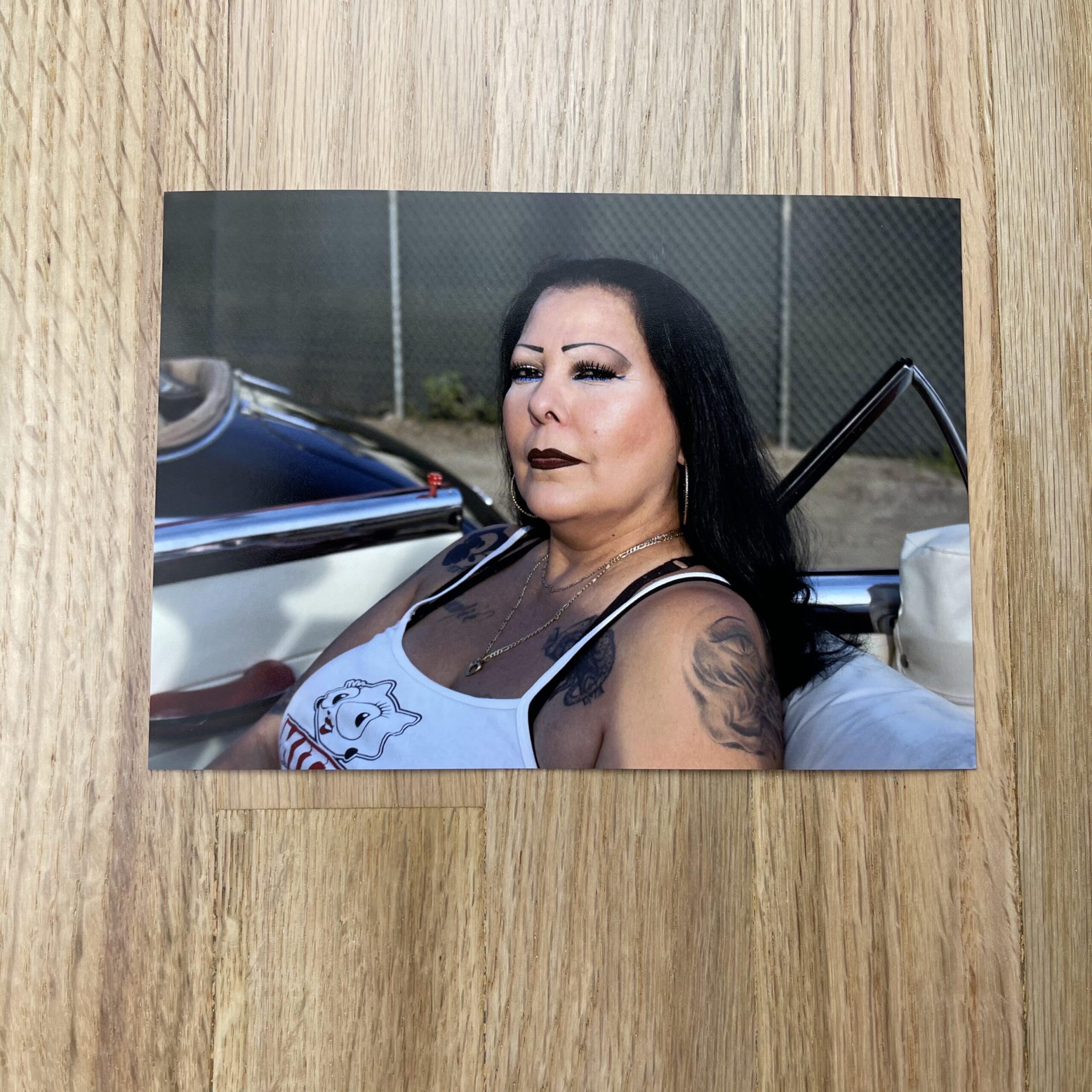
Concept: Environmental Lifestyle & Architecture images featuring hired talent using client space(s)

Licensing: Unlimited use, excluding broadcast, of all images captured for three years from first use

Photographer: Lifestyle & Architecture specialist

Client: Mid-sized Regional Hospitality Brand

Here’s the initial estimate:


Fees: The agency contacted the photographer to put together an estimate for a three-day shoot featuring talent interacting at the client’s property to showcase the location’s uniqueness, amenities, and aesthetics. The agency provided us preliminary scouting images and a creative brief and wanted to see an estimate for both stills and video, as well as robust production to include talent and styling.

Deliverables initially included up to 20 final still images and a two-minute video edit. The client had requested unlimited use excluding broadcast. We priced each image around $500, plus $8,000 for a director fee and video usage, based on the client’s intended use of the content — primarily on client web and social media platforms — and possible regional advertising. While we would’ve liked the fees to be higher, the client didn’t have a media buy plan and we got some pushback from the agency on higher creative/licensing fee rates within their budget guidelines.

Crew: Given the nature of the project, I included a producer as well as a production coordinator to help schedule the days and hire/manage the rest of the crew and styling team. We added a skilled camera operator/Director of Photography along with a first assistant for stills, a gaffer for the motion team, and a second assistant to swing. Both the DP and first assistant would accompany the photographer on the tech/scout to help inform the lighting and equipment needs within each location. We added a digital tech/media manager to handle the files on set. These rates were appropriate for the given market; the digital tech’s day rate included a $700 fee plus an additional $650/day for their workstation.

Equipment: We included $7,500 for cameras/grip/lighting, $700 for hard drives, and a modest fee to cover production needs like tables, chairs, steamer, wardrobe racks, etc.

Casting & Talent: We included $2,000+20% per talent for up to 15 people to be used over the three shoot days. We also added a $2,400 casting fee for the director and producer to take on the casting, which was to be a mix of friends/family and professional talent.

Styling: We included a hair/makeup stylist plus an assistant, a wardrobe stylist plus an assistant, a prop stylist (who would also attend the scout) plus an assistant, and appropriate wardrobe costs based on the talent, scenes, and creative direction with a TBD caveat pending final creative plans.

Meals: We estimated $5,610 for catering and craft services based on $85 per person, per day.

COVID Safety: We included three days for a COVID compliance officer, plus a PPE budget advised by the CCO. Our CCO would arrive each shoot day with a screening questionnaire, check everyone’s temperature each morning, and monitor the set throughout the day with cleaning and guidance for craft services and meal breaks. We would have all crew/talent/agency PCR Covid tested before the shoot days and included $130/test x 27 anticipated people as the cost for doing this.

Misc.: We included insurance costs for the director to cover their premium — pending any additional client insurance requirements — as well as a line item to help offset parking, possible additional meals/craft, and any other small needs that would arise during the week.

Post Production: We included $1,000 for the photographer to perform a basic cull, curves/color correction, and provide a gallery of their selects. Simple retouching for up to 20 images was estimated at one hour per image, with a TBD as a caveat, to be based on final agency creative notes. The photographer would be doing all retouching at a $125/hr. rate. Video editing was estimated at $3,500, with a “TBD” added that this would be pending final client/agency creative notes and revisions.

Feedback & Revisions: As we’ve seen more and more lately, when the initial RFP (request for proposal) came to us, the agency had not yet sold the project to the client. This estimate was being used alongside the agency creative to have the client sign off on the project. This isn’t ideal, as we’ve seen photographers jump through hoops just for a project to never get off the ground. With that said, as the client conversations continued, there were quite a few adjustments to the creative plans and costs and, as a result, our estimate was revised a number of times over several months.

As the shot list grew, the on-set days increased to four and the talent needs expanded to hired professionals — though a decreased quantity. With a casting agent present, we added additional crew to our motion team, a drone operator for two days, and a props/set decorating team to help style the location. The post-production fees expanded to cover the additional images, video editing time, and an agency request for a colorist and audio licensing to be added.

While the shoot would be rather straightforward, the ten-hour shoot days would be stuffed and required a competent team with a concise plan. As stated previously, there was some pushback on our initial creative/licensing fee, but we landed not too far off and felt that a creative/licensing fee of $22,000 was fair. We previously had a fee for the director to attend a tech/scout day on the location, but with the increased SOW (statement of work), I added an additional $1,100/day fee for a few days of pre-production needs.

Our updated estimate still had the same tenets as the original, but the new needs increased the budget by more than $50,000 to the subsequent estimate below:


Results: The photographer was awarded the assignment, and the shoot is currently in post-production. It was a very successful project and the client and agency are very happy with the work created!

If you have any questions, or if you need help estimating or producing a project, please reach out. We’re available to help with any and all pricing and negotiating needs—from small stock sales to large ad campaigns.

Featured Promo – Augusta Sagnelli

Augusta Sagnelli

Who printed it?
Jukebox

Who designed it?
@minmoostudio

Tell me about the images?
Various editorial images I made between 2018 – 2020 that I feel emulate my style and brand that I want to present to clients.

How many did you make?
I printed 100 of each image.

How many times a year do you send out promos?
I use them as thank you notes to clients/location/people on set/places I stay while traveling.

Do you think printed promos are effective for marketing your work?
I want to use this model for each one being a part of a limited “set” that you can collect and once they are all gone, I will create a new set of imagery that follows its own motif.

Featured Promo – Emily Lian Wright

Emily Lian Wright

Who printed it?
Vistaprint printed my work and I am quite happy with the results! Vistaprint is reasonably priced and produces decent quality product and as a photographer starting our budget is a huge factor.

Who designed it?
I designed my promo! I graduated from the Bachelor of Photography program at Sheridan College. The curriculum includes courses in graphic design and provides the students a well-rounded set of skills and education.

Tell me about the images?
These images have been taken over the past couple of years. In the future, I would like to keep the promo images more current.
My imagery choices range from portrait to fashion and product to architecture. I really wanted to showcase my range of capabilities! These images were from a few of my favourite shoots and ones that I had received the most positive feedback! There were also a lot of great memories that came out of these shoots. Some of my favourite memories come from working with wonderful models and stylists, and through wonderful teamwork my visions were brought to life.
It’s been interesting to do product shoots and one of my favourite was of Kavi Whisky shoot! While shooting the product, I was given a tour around the distillery and a lesson on how whisky is made. As an added perk, I also got to taste the amazing whisky! Yum!

How many did you make?
I researched different businesses in my area that I believed would benefit from my services. I printed 50 booklets, sent out 40 and saved a few for future potential clients. I always carry my business cards and a few booklets on me or in my car because you never know who you are going to meet and when that could be a potential client!

How many times a year do you send out promos?
This is my first promo! In the future, I would like to send out one or two promos a year! This way I can keep in contact with my clients and they can see new and updated work I’ve done throughout the year!

Do you think printed promos are effective for marketing your work?
I think printed promos can be very effective! The booklets are expensive so you have to do your research and be selective in who you send them too. I moved to a new town in October and needed a way to introduce myself! Promos are a good way to let new clients know I am a new business in town and to show them some of my work.

Featured Promo – Tanya Goehring

Tanya Goehring

Who printed it?
Blurb, Premium

Who designed it?
My rep/photo consultant Monashee. She is a master at pairing images from different shoots to create really nice stories and layouts.

Tell me about the images.
The images chosen were a combination of still life, portraits, and lifestyle. This was the first promo I was going to be sending out, so we wanted something that gave a good overview of my capabilities and style with an emphasis on how I approach storytelling and how I move between people, places, and objects fluidly. I shoot many different genres and what weaves it all together is my style. We also wanted to infuse my creative work (seen in some of the conceptual fashion work) into the promo so it felt connected through my overall style and creative viewpoint. In this promo, we chose to focus on conveying what I can do for a client and what I bring to the table creatively.

How many did you make?
I printed 40 promos. Because I’ve never sent a print promo before, I wanted to create a more comprehensive and special promo to introduce myself to a select few clients in a more impactful way.

How many times a year do you send out promos?
This was my first ever print promo and it was ready to go out into the world just as covid hit… so you are one of the first people to actually receive it ;). I’m looking forward to sharing it with the people I had planned, however, it’s definitely a challenge when people are still working from home. It’s a bit awkward not knowing where people are and if it’s cool to send it. My plan was to send out a larger promo every 1-2 years and do smaller print promos 2 x per year. We’ll see what happens once the world turns around.

Do you think printed promos are effective for marketing your work?
I’m very hopeful they are! I love print and I feel that seeing work in print helps show a client how it would and could be used and print is definitely one way that it would be used.

Featured Promo – Joel Goldberg

Joel Goldberg

Who printed it?
I printed it with Mixam – they were extremely helpful throughout the process, allowed for a great deal of customization, and I was very pleased with their paper options/printing quality.

Who designed it?
I did! I’ve always had an appreciation for design and took a few classes in some of the appropriate adobe programs throughout my college career. Since my design skills are limited – I kept the book simple and practical. Imitating a cookbook style was the goal since I wanted this booklet to have a purpose.

Tell me about the images?
Throughout the year 2020, as work was sporadic (pandemic…), I had more time to dedicate and brainstorm about personal projects that I wanted to execute. I had dozens of ideas written down into a notebook, but an idea I jotted down which focused on citrus seemed the most relevant and intriguing. Originally, the project was going to cover lemons, limes, and oranges, with a sweet, savory, and drink image/recipe to go along with each.

I strive to provide a purpose, or message through my photography, which can sometimes be more challenging, or secondary, when comparing food photography to portraiture, or documentary photography. I kept brainstorming about how to make this project mean something, rather than just a collection of pretty food images…That is when the cliche phrase “When life gives you lemons” popped into my head. Although cliche, I ran with it — it was the perfect way to introduce my food photography, which might seem “irrelevant” during such a trauma filled time, and make it relevant, by reminding ourselves that throughout all of the stress, anxiety, sadness, and trauma we’ve all experienced this past year, it has been up to us to find the light to keep going. For years, I’ve worked on developing an artificial light setup that replicates a very specific form of natural light, not one that is direct and harsh with shadows that are dark and defined, and not one that is diffused by clouds, but a unique in-between. I finally nailed it about 2 years ago, and this book is a great example of that.

So, I decided to ditch limes and oranges (for now!) and run with just lemons. I put together 3 recipes with some inspiration from a variety of notable food publications.

The first pair of images of a Penicillin Cocktail – which is made up of a lot of immune-boosting ingredients, like honey, ginger, lemon, etc. I thought it was the perfect cocktail combination for the topic + time.

The second pair of images, Pasta Al Limone — is a classic Italian recipe, which incorporates all the works….parm, butter, carbs, etc. The addition of lemon juice and a lemon garnish really brighten and lighten up the dish.

The third pair of images – Candied Lemon Donuts is another riff on turning sour to sweet. It’s a simple recipe that doesn’t create a frying oil mess in the kitchen. Candied lemons are great for a number of things, and in this case, I loved how they photographed on a white glazed donut.

The book’s packaging is also carefully chosen – freezer vacuum seal bags which food is typically stored in, which was perfect for a book on food!

How many did you make?
3 dozen. The 3 dozen covered my current client base, a majority of prospective clients that I’m currently building relationships with, and a couple of close friends who wanted a copy for themselves.

How many times a year do you send out promos?
Once or twice a year, no more than that unless it feels absolutely necessary. I would much rather put a great deal of time and effort into one solid promo, which will leave a lasting impression than send them out frequently, and be less effective. The timing is important too. I sent this out at the beginning of the year 2021…the book’s theme touched on turning a new page or finding light in a dark time, and the new year was a great time to capitalize on that.

Do you think printed promos are effective for marketing your work?
Absolutely…just sending out a book won’t do it though. It still takes being consistent, building and managing your relationships with clients, and great work, to leave an impression. I have to remind myself that every day!

I think of it like hammer and nail. The nails are the client outreach, emailing, the social networking, relationship building, etc. A really good promo is your hammer. It’s your tangible work that shows your style and what you can do, allowing potential clients to pin you up on their board of people they might hire.

As a photographer, I know that my clients manage hundreds, if not thousands of emails from people just like me, who are trying to get their foot in the door. This promo has helped me get my work/name out there, but on its own, it won’t win me a job. It takes a village…

I once was told by an Art Buyer, when I showed up to a meeting with a physical portfolio, despite everything going digital, she said “there’s still nothing like printed, tangible work, nothing will replace it.” My printed portfolio allows you to remove+replaces an image at any time. She took advantage and kept one print for herself during our meeting!

Featured Promo – The Collective

What is the collective?
I have been working with photographers over the internet for over ten years. It is a small group of photographers and every assignment is drawn from real-life assignments. The Collective is a group of photographers who continue on with the community as legacy members. If a student completes the course they are de-facto in The Collective if they want to be. I have worked with and trained over 500 photographers in the past ten years, and some in the book are from the very first class I did. The Collective is a name we gave the book to feature the work of any member who wanted to be in it. We have a loose collection of members from all over the world. There is no additional cost for them to be in the collective issues, and we are hoping for two per year.

Who printed it?
It is a Blurb Trade book. I am super happy with the quality of the paper and the printing. And the price makes it affordable.

Who designed it?
I designed it. My background is in photography and design. (I once owned a very large ad agency in Phoenix where I was a partner and creative director.)

I am a bit of a minimalist in design, just get the photographs onto the page and make the viewer feel welcome and comfortable. Simplicity makes it seem more ‘portfolio’ like.

Tell me about the images?
The photographs come from all over the world and from photographers with diverse and multifaceted portfolios. Each photographer has two pages, and they are limited to one photo per page. Some of the photographers choose to make a more commercial shot and some stay in the editorial/art approaches. It is up to each to decide their imagery.

How many did you make?
The initial print run was 60. The photographers purchase a copy or three as well. The price for the book at Blurb are wholesale, no money is being made on the sale of the books, we just wanted to share them in book form. https://www.blurb.com/b/10321996-the-collective-ii-fall-2020

What have you learned teaching these aspiring photographers over the years?
I have been a photographer for many decades, and my entire life has been spent in the creative arts – jazz musician, designer, photographer, creative director, and creative consultant. I watched how the system had changed from the traditional learn to use a camera / become an assistant / start business. Harder and harder to do with smaller staff, digital, and the internet’s help. All the information that would have been learned by working with a busy photographer is all but lost to those starting out these days. Especially to those who are over forty (over 25?) and I wanted to provide that education on what to charge, how to handle clients, creating a portfolio that works, shooting to layout, working with AD’s and designers, marketing, and much more and pass it on to people wanting to work in this trade. Most of my students are over 40, and all of them are working as much as they wish to.

The book is a reminder that there are many ways to enter a creative life, and from any age.

Featured Promo – Laura Thompson

Laura Thompson

Who printed it?
I used GotPrint.com because I really love the double-glossy-trading-card feel of their postcards and that you can order small batches for a reasonable price.

Who designed it?
I made the cards based on the branding kit Sharon Wagner/Swail Studio designed for me. The zig zag I used was taken from some of the logo patterns she made, the placement of the contact information mimics the business card she designed, and the rest was my application of the branding colors and fonts she recommended in the kit.

Tell me about the images?
Curly Fry Ring is one of my favorites. I took the photo around the holidays one year when a lot of people I knew were getting engaged and married. It seemed like a good way to announce that I’m new in town. The fry came from Arby’s.

How many did you make?
100

How many times a year do you send out promos?
This is my first year investing in marketing promos. The goal is 4 times a year with different clients getting different cards at different times of the year. One round of potential clients got the Ring postcard at New Years and another set got the Ring postcard at Valentine’s Day.

Do you think printed promos are effective for marketing your work?
I just moved to Nashville and it’s a brand new market for me. I’ve never done targeted printed materials like this before but I think it’s starting to catch on. In addition to sending postcards out, I had a run of stickers printed that I’m posting up around town using the same patterns and logo block for additional brand recognition.

Pricing & Negotiating: Real Patient Portraits for Pharmaceutical Company

Craig Oppenheimer, Wonderful Machine

Concept: Portraits of one patient against a solid background

Licensing: Unlimited use of all images captured for three years

Photographer: Portraiture specialist in the Midwest

Agency: Large, healthcare focused

Client: Pharmaceutical company

Pricing And Negotiating Craig Oppenheimer Feb 2021 Pharma Portraiture Estimate

Fees: The agency requested unlimited use of all images captured for three years, and they wanted us to specifically use their usage terminology, as detailed in the estimate. The concept involved photographing a real patient in a variety of ways and integrating the images into a CGI background in post. I first determined the fee by pricing what I felt was appropriate for one year, which was $12,500, and then doubled that fee to account for the requested three years, to arrive at a fee of $25,000. In addition to that creative/licensing fee, I also added a pre-production and pre-light day fees for the photographer.

Crew: While the shoot was rather straightforward, we knew the logistics of working with a real patient and the many intricacies with specialized wardrobe and styling would require a decent amount of pre-production. Therefore, we included adequate producer and production assistant days. Additionally, we included two assistants and a digital tech. Lastly, since we’d be compositing the portraits into CGI backgrounds, we included an on-site retoucher to help show the client proof of concept during the shoot to ensure we were on the right track.

Styling: In addition to a hair/makeup stylist, we included a wardrobe/prop stylist along with an assistant. The props would be minimal, but we anticipated shopping for and procuring three different outfits for the talent. On top of the actual wardrobe/prop expenses, we added additional expenses to cover shipping, transportation, and kit fees incurred by the stylists.

Health and Safety: We included a COVID compliance officer for both the pre-light day and the shoot day, along with a few hundred dollars to cover PPE and supplies.

Locations: Two days were included, for both the pre-light and shoot day.

Equipment: For both the pre-light and shoot days, we included ample expenses to cover camera, grip, lighting, tech workstation rentals, and production supplies.

Meals: We based catering for the shoot day on 12 attendees at $75 per person.

Misc.: As a buffer, we included $750 to cover unforeseen expenses, and light meals on the pre-light day for the minimal crew that would attend. We also included $1,000 for insurance.

Post Processing: We included $500 for the photographer to provide a rough edit of the shots for consideration, and then $2,000 to handle retouching. The CGI backgrounds would be provided by the agency, and the photographer would be integrating the images into those files. We anticipated this taking approximately 10 hours of work, and based the fee on $200/hour.

Results: The photographer was awarded the project.

Hindsight: Having bid projects for this agency previously, I knew they’d likely have a healthy budget. However, we’ve bid and produced very similar projects for substantially less money in the past. The photographer ultimately came in under budget upon invoicing, which helped convince the agency to have him bid on a supplemental project.

If you have any questions, or if you need help estimating or producing a project, please send us an email. We’re available to help with any and all pricing and negotiating needs—from small stock sales to large ad campaigns.

Feature Promo – Julie Grace Immink

Julie Grace Immink

Who printed it?
I just went to the DIY kiosk at my local drug store to print the photographs because I have a low-brow freelance promo budget. WizardPins is the company I used to make the enamel pin. My idea was to design an official membership emblem for my unofficial photography fan club. The inspiration came from other organizations that wear membership pins on their lapels, like the Shriners Masonic Society and the Unarius Academy of Science.

Who designed it?
I designed everything on my laptop. First, I turned my photograph of the woman with her dog into a simple line illustration by tracing her silhouette’s outlines with black. Then I choose appropriate colors to fill in the details of her dress. I sent that final image to be transformed into a grandma-brooch and stuck it through the photograph with my contact information.

Tell me about the images?
Inspired by how community shapes our identity, my documentary work often explores my family and my neighborhood. The woman with the dog lived next door to me for 20 years. My father is the man sitting in the diner, and my son is the boy on the left holding the kitten. The other boys are my nephews. The other images are of people that lived near me in East Los Angeles. I am now based in Milwaukee and deeply inspired by the river that runs through the city. I am currently sourcing new subjects for my next series of portraits.

How many did you make?
I initially made 100 pins for my photography exhibition in LA two years ago. At the reception, guests were given the pins like a door-prize. Everyone wore them in the museum to pretend we were a secret art society that was for members-only. The leftover handful, I was brainstorming on how to use them and decided to turn them into a promotional piece to get my work in front of editors.

How many times a year do you send out promos?
You are the only editor I have sent a promotional piece. I plan to mail more later this year, hoping to catch a few editors’ attention. I admire the aesthetic of the editors of The California Sunday Magazine, The New Yorker, Time, Jody Quon, and Kathy Ryan, among so many others.

Do you think printed promos are effective for marketing your work?
Hopefully, creating the members-only pin shows my aesthetic, and editors will find the piece creative and memorable.

Will you make more pins?
I plan on making another series of enamel pins from my photographs and sell them as collectibles with limited edition prints. Creating a wearable/interactive art piece is charming. Martin Parr’s coloring book, I thought, was brilliant.