Who printed it?
It was printed by a local printer to where I have desk space in East London. They’re called Calverts and are a Co-Operative too, totally employee owned and they have been going for years The whole experience with them from start to finish made me really happy, as it was my first proper bespoke printed mailer there was a lot of handholding from them.
I originally contacted some very high-end Lithographic printers who had high-end prices to match, these companies do a lot of printing for fine-art publishers and it was whilst visiting them to look at paper that someone quietly to one side and very kindly suggested to get my moneys worth and considering I was mailing them out to people (so a lot would end up in the bin), to not use litho but get them digitally print them instead. So after some hunting around and speaking to some illustrators Calverts came up, they were really helpful about suggesting different paper types and weights as the mailer was being folded and I didn’t want there to be cracking to the print. Equally as the promos were double sided on paper I didn’t want the images to show through, but the paper couldn’t be too thick as they were being folded up.
Who designed it?
My girlfriend and I in Indesign, she is an Indesign wizz. We spoke a lot about how we could do a cheap mailer but make it a little different and but with impact that it would stick in peoples mind.
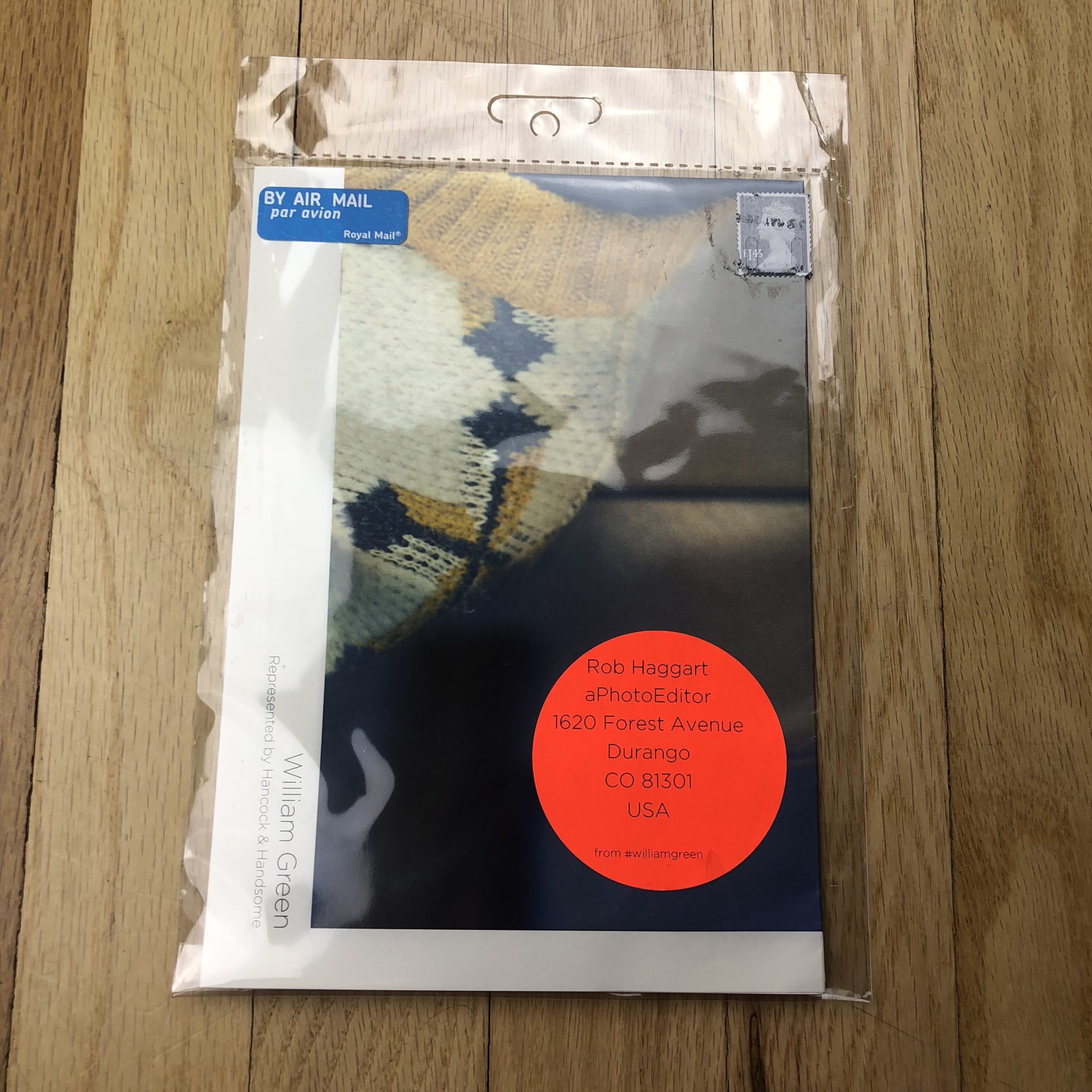
So I thought about when I was a teenager I would buy a lot 12” records -as I used to DJ- and how a lot of bands included a poster with the record that unfolded out for you to pop on your bedroom wall. So the fold-out poster idea was born, including coloured pins matched to a colour in the image. With an address label and pin pouch, with coloured matched circular address labels. We sent off for a few different samples of things when we were popping it all together.
Tell me about the images?
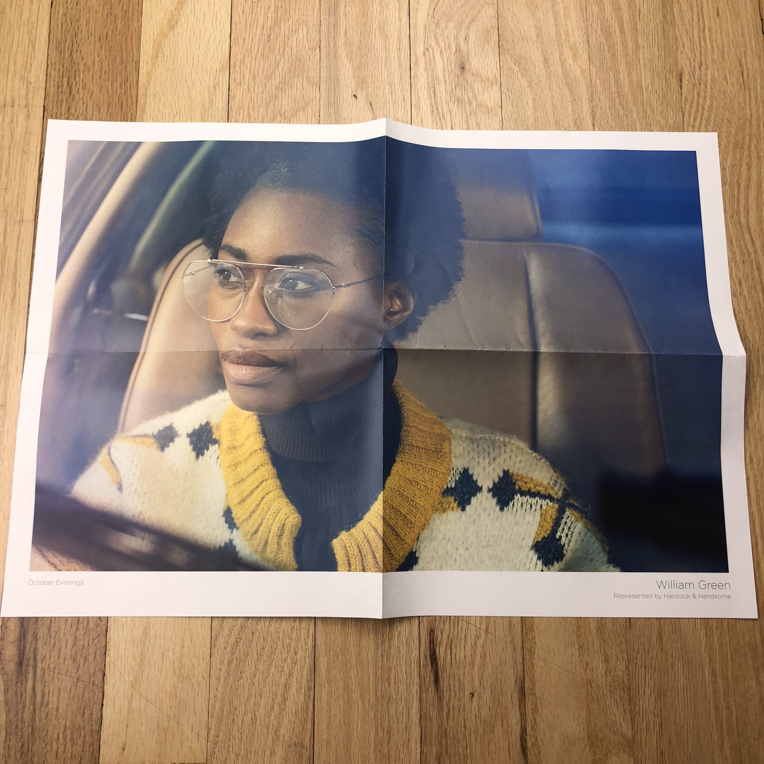
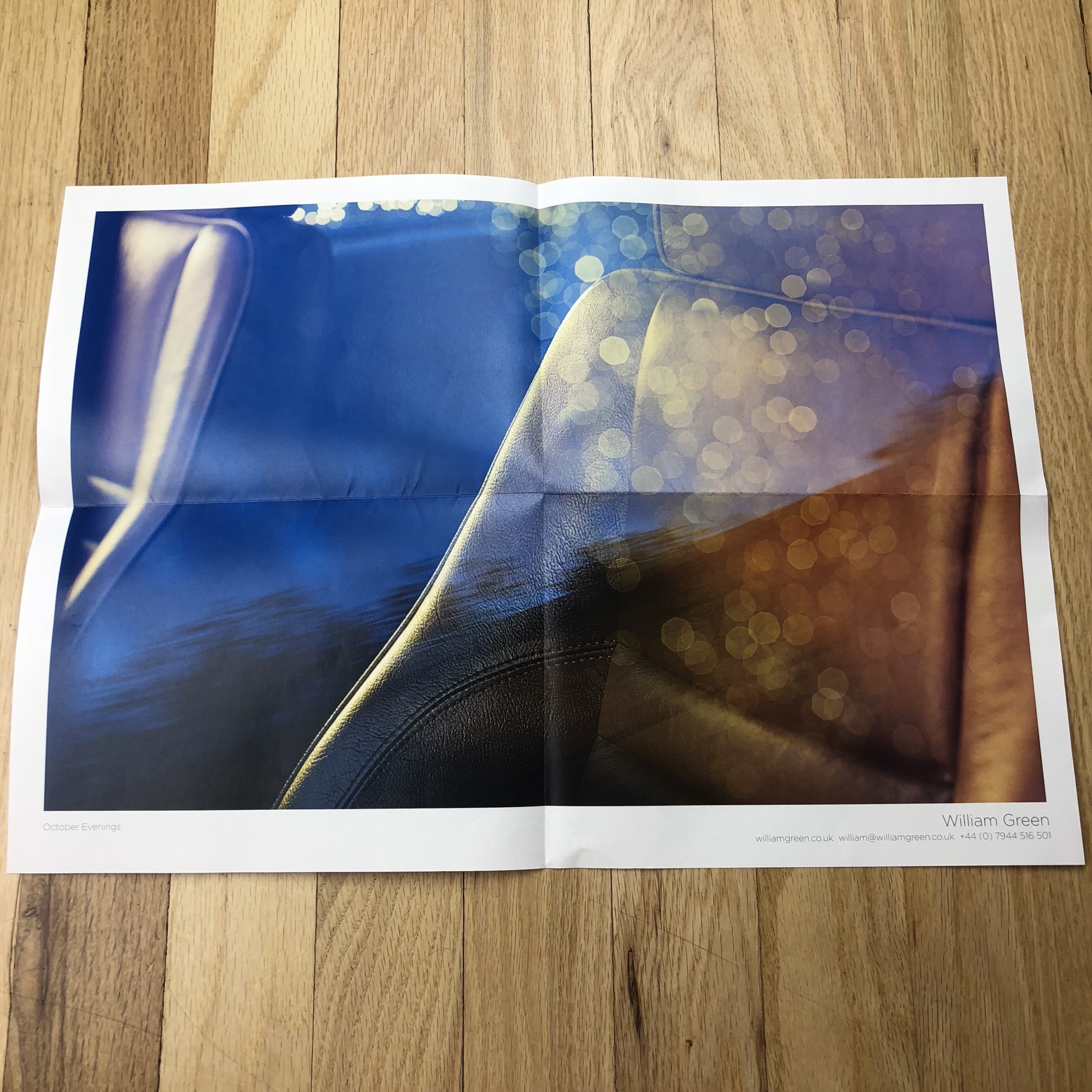
I did a series of four different mailers, with 2 different images on each, 3 of them had paired up images selected from individual projects, so they were quite easy to get to work together. It was really important that they would work on the wall as posters either way round. For this particular pairing of images they were from a shoot titled ‘October Evenings’ shot on an Autumnal evening in Britain. I wanted to take the theme of an earlier documentary project on sleeping taxi drivers in Tokyo and place in a similar setting but in a British context, the models were shot in a very British Jaguar car, but alluding to a story behind the images too. I then pulled the gold and blues tones in post to really make the images more atmospheric.
How did you get the colors looking so good?
I originally spent nearly a day prepping the images and bringing the colours back in that had gone out of gamut and running some test prints. As I tend to push and play with colours and saturation in my work it was super important to me that they were on par. After all, if it did end up on a Art Directors wall it had to look really good. After having problems with one particular mailers images reds, I ended up speaking to the printer directly who said “F*ck it mate, good digital commercial printers don’t need you to profile your prints to the paper type, we can do it for you, just send ‘em over in Adobe 1998 as an Indesign file and it’ll be perfect, we can work it out together.” That sort of approach made think they were worth their weight in gold.
How many did you make?
250 of each so a 1000 overall
How many times a year do you send out promos?
This was my first one and I sent out approximately 850, keeping the others back to hand to people directly, leave at agencies and act as business cards etc
Do you think printed promos are effective for marketing your work?
That is hard to tell, I haven’t had any jobs in yet where people have directly mentioned them but I have had really positive feedback about them and people seem to like them. They have turned up on a few insta streams and stories which is always good.